Fantastic beasts and how to measure  them! 

Sagar Karki, Master’s student in the Computer Science Department at Oregon State University 

What beasts? Good question! We are talking about gray whales in this article but honestly we can tweak the system discussed in this blog a little and make it usable for other marine animals too.  

Understanding the morphology, such as body area and length, of wild animals and populations can provide important information on animal  behavior and health (check out postdoc Dr. KC Bierlich’s post on this topic). Since 2015, the GEMM Lab has been flying drones over whales to collect aerial imagery to allow for photogrammetric measurements to gain this important morphological data. This photogrammetry data has shed light on multiple important aspects of gray whale morphology, including the facts that the whales feeding off Oregon are skinnier [1] and shorter [2] than the gray whales that feed in the Arctic region.  But, these surprising conclusions overshadow the immense, time-consuming labor that takes place behind the scenes to move from aerial images to accurate measurements.  

To give you a sense of this laborious process, here is a quick run through of the methods: First the 10 to 15 minute videos must be carefully watched to select the perfect frames of a whale (flat and straight at the surface) for measurement. The selected frames from the drone imagery are then imported into MorphoMetriX, which is a custom software developed for photogrammetry measurement [1]. MorphoMetriX is an interactive application that allows an analyst to manually measure the length by clicking points along the centerline of the whale’s body. Based on this line, the whale is divided into a set of sections perpendicular to the centerline, these are used to then measure widths along the body. The analyst then clicks border points at the edge of the whale’s body to delineate the widths following the whale’s body curve. MorphoMetriX then generates a file containing the lengths and widths of the whale in pixels for each measured image. The length and widths of whales are converted from pixels to metric units using a software called CollatriX [4] and this software also calculates metrics of body condition from the length and width measurements. 

While MorphoMetriX [3] and CollatriX [4] are both excellent platforms to facilitate these photogrammetry measurements, each measurement takes time, a keen eye, and attention to detail. Plus, if you mess up one step, such as an incorrect length or width measurement, you have to start from the first step. This process is a bottleneck in the process of obtaining important morphology data on animals. Can we speed this process up and still obtain reliable data? 

What if we can apply automation using computer vision to extract the frames we need and automatically obtain measurements that are as accurate as humans can obtain? Sounds pretty nice, huh? This is where I come into the picture. I am a Master’s student in the Computer Science Department at OSU, so I lack a solid background in marine science, but bring to the table my skills as a computer programmer. For my master’s project, I have been working in the GEMM Lab for the past year to develop automated methods to obtain accurate photogrammetry measurements of whales.  

We are not the first group to attempt to use computers and AI to speed up and improve the identification and detection of whales and dolphins in imagery. Researchers have used deep learning networks to speed up the time-intensive and precise process of photo-identification of  individual whales and dolphins [5], allowing us to more quickly determine animal location, movements and abundance. Millions of satellite images of the earth’s surface are collected daily and scientists are attempting to utilize these images to  benefit marine life by studying patterns of species occurrence, including detection of gray whales in satellite images using deep learning [6]. There has also been success using computer vision to identify whale species and segment out the body area of the whales  from drone imagery [7]. This process involves extracting segmentation masks of the whale’s body followed by length extraction from the mask. All this previous research shows promise for the application of computer vision and AI to assist with animal research and conservation. As discussed earlier, the automation of image extraction and photogrammetric measurement  from drone videos will help researchers collect vital data more quickly so that decisions that impact  the health of whales can be more responsive and effective.For instance,  photogrammetry data extracted from drone images can diagnose pregnancy of the whales [8], thus automation of this information could speed up our ability to understand population trends. 

Computer vision and natural language processing fields are growing exponentially. There are new foundation models like ChatGPT that can do most of the natural language understanding and processing tasks. Foundational models are also emerging for computer vision tasks, such as “the segment anything model” from Meta. Using these foundation models along with other existing research work in computer vision, we have developed and deployed a system that automates the manual and computational tasks of MorphoMetriX and CollatriX systems.  

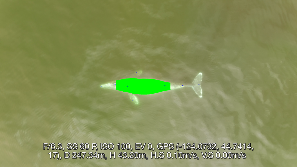
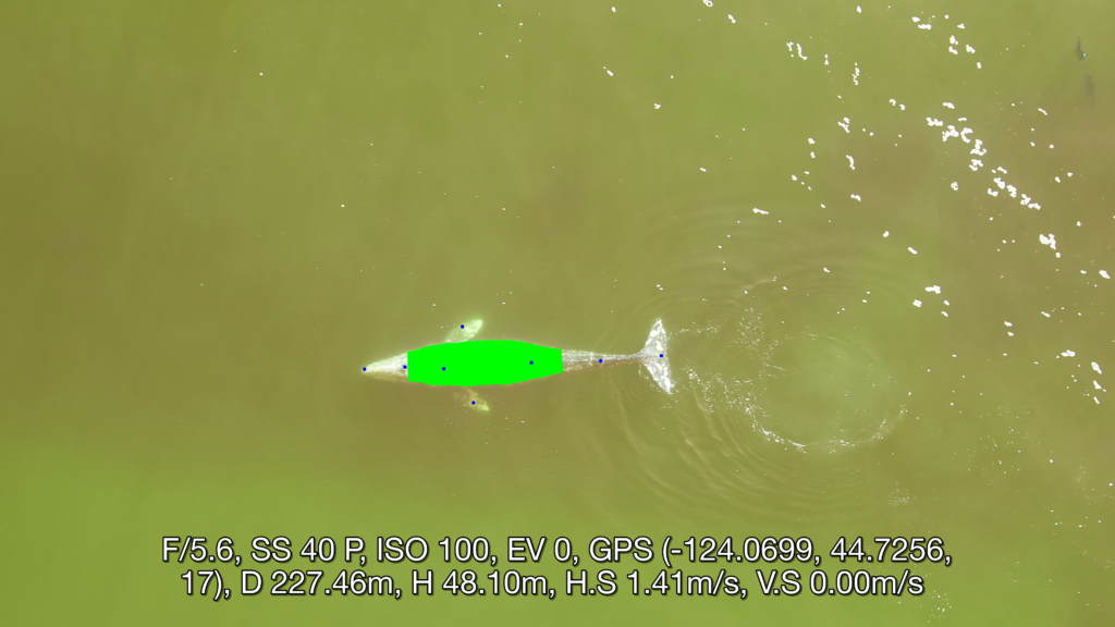
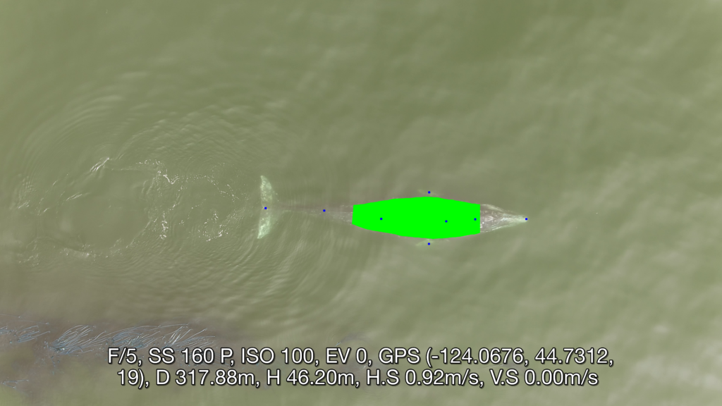
This system is currently in its testing and monitoring phase, but we are rapidly moving toward a publication to disseminate all the tools developed, so stay tuned for the research paper that will explain in detail the methodologies followed on data processing, model training and test results. The following images give a sneak peak of results. Each image  illustrates a frame from a drone video that was  identified and extracted through automation, followed by another automation process that identified important points along the whale’s body and curvature.  The user interface of the system aims to make the user experience intuitive and easy to follow. The deployment is carefully designed to run on different hardwares, with easy monitoring and update options using the latest open source frameworks. The user has to do just two things. First, select the videos for analysis. The system then generates potential frames for photogrammetric analysis (you don’t need to watch 15 mins of drone footage!). Second, the user selects the frame of choice for photogrammetric analysis and waits for the system to give you measurements. Simple! Our goal is for these softwares to be a massive time-saver while  still providing vital, accurate body measurements  to the researchers in record time. Furthermore, an advantage of this approach is that researchers can follow the methods in our to-be-soon-published research paper to make  a few adjustments enabling the software to measure other marine species, thus expanding the impact of this work to many other life forms.  
Did you enjoy this blog? Want to learn more about marine life, research, and conservation? Subscribe to our blog and get a weekly message when we post a new blog. Just add your name and email into the subscribe box below.

Loading

References 

  1. Torres LG, Bird CN, Rodríguez-González F, Christiansen F, Bejder L, Lemos L, Urban R J, Swartz S, Willoughby A, Hewitt J, Bierlich K (2022) Range-Wide Comparison of Gray Whale Body Condition Reveals Contrasting Sub-Population Health Characteristics and Vulnerability to Environmental Change. Front Mar Sci 910.3389/fmars.2022.867258 
  1. Bierlich KC, Kane A, Hildebrand L, Bird CN, Fernandez Ajo A, Stewart JD, Hewitt J, Hildebrand I, Sumich J, Torres LG (2023) Downsized: gray whales using an alternative foraging ground have smaller morphology. Biol Letters 19:20230043 doi:10.1098/rsbl.2023.0043 
  1. Torres et al., (2020). MorphoMetriX: a photogrammetric measurement GUI for morphometric analysis of megafauna. Journal of Open Source Software, 5(45), 1825, https://doi.org/10.21105/joss.01825 
  1. Bird et al., (2020). CollatriX: A GUI to collate MorphoMetriX outputs. Journal of Open Source Software, 5(51), 2328, https://doi.org/10.21105/joss.02328 
  1. Patton, P. T., Cheeseman, T., Abe, K., Yamaguchi, T., Reade, W., Southerland, K., Howard, A., Oleson, E. M., Allen, J. B., Ashe, E., Athayde, A., Baird, R. W., Basran, C., Cabrera, E., Calambokidis, J., Cardoso, J., Carroll, E. L., Cesario, A., Cheney, B. J. … Bejder, L. (2023). A deep learning approach to photo–identification demonstrates high performance on two dozen cetacean species. Methods in Ecology and Evolution, 00, 1–15. https://doi.org/10.1111/2041-210X.14167 
  1. Green, K.M., Virdee, M.K., Cubaynes, H.C., Aviles-Rivero, A.I., Fretwell, P.T., Gray, P.C., Johnston, D.W., Schönlieb, C.-B., Torres, L.G. and Jackson, J.A. (2023), Gray whale detection in satellite imagery using deep learning. Remote Sens Ecol Conserv. https://doi.org/10.1002/rse2.352 
  1. Gray, PC, Bierlich, KC, Mantell, SA, Friedlaender, AS, Goldbogen, JA, Johnston, DW. Drones and convolutional neural networks facilitate automated and accurate cetacean species identification and photogrammetry. Methods Ecol Evol. 2019; 10: 1490–1500. https://doi.org/10.1111/2041-210X.13246 
  1. Fernandez Ajó A, Pirotta E, Bierlich KC, Hildebrand L, Bird CN, Hunt KE, Buck CL, New L, Dillon D, Torres LG (2023) Assessment of a non-invasive approach to pregnancy diagnosis in gray whales through drone-based photogrammetry and faecal hormone analysis. Royal Society Open Science 10:230452 

Data Wrangling to Assess Data Availability: A Data Detective at Work

By Alexa Kownacki, Ph.D. Student, OSU Department of Fisheries and Wildlife, Geospatial Ecology of Marine Megafauna Lab

Data wrangling, in my own loose definition, is the necessary combination of both data selection and data collection. Wrangling your data requires accessing then assessing your data. Data collection is just what it sounds like: gathering all data points necessary for your project. Data selection is the process of cleaning and trimming data for final analyses; it is a whole new bag of worms that requires decision-making and critical thinking. During this process of data wrangling, I discovered there are two major avenues to obtain data: 1) you collect it, which frequently requires an exorbitant amount of time in the field, in the lab, and/or behind a computer, or 2) other people have already collected it, and through collaboration you put it to a good use (often a different use then its initial intent). The latter approach may result in the collection of so much data that you must decide which data should be included to answer your hypotheses. This process of data wrangling is the hurdle I am facing at this moment. I feel like I am a data detective.

Data wrangling illustrated by members of the R-programming community. (Image source: R-bloggers.com)

My project focuses on assessing the health conditions of the two ecotypes of bottlenose dolphins between the waters off of Ensenada, Baja California, Mexico to San Francisco, California, USA between 1981-2015. During the government shutdown, much of my data was inaccessible, seeing as it was in possession of my collaborators at federal agencies. However, now that the shutdown is over, my data is flowing in, and my questions are piling up. I can now begin to look at where these animals have been sighted over the past decades, which ecotypes have higher contaminant levels in their blubber, which animals have higher stress levels and if these are related to geospatial location, where animals are more susceptible to human disturbance, if sex plays a role in stress or contaminant load levels, which environmental variables influence stress levels and contaminant levels, and more!

Alexa, alongside collaborators, photographing transiting bottlenose dolphins along the coastline near Santa Barbara, CA in 2015 as part of the data collection process. (Image source: Nick Kellar).

Over the last two weeks, I was emailed three separate Excel spreadsheets representing three datasets, that contain partially overlapping data. If Microsoft Access is foreign to you, I would compare this dilemma to a very confusing exam question of “matching the word with the definition”, except with the words being in different languages from the definitions. If you have used Microsoft Access databases, you probably know the system of querying and matching data in different databases. Well, imagine trying to do this with Excel spreadsheets because the databases are not linked. Now you can see why I need to take a data management course and start using platforms other than Excel to manage my data.

A visual interpretation of trying to combine datasets being like matching the English definition to the Spanish translation. (Image source: Enchanted Learning)

In the first dataset, there are 6,136 sightings of Common bottlenose dolphins (Tursiops truncatus) documented in my study area. Some years have no sightings, some years have fewer than 100 sightings, and other years have over 500 sightings. In another dataset, there are 398 bottlenose dolphin biopsy samples collected between the years of 1992-2016 in a genetics database that can provide the sex of the animal. The final dataset contains records of 774 bottlenose dolphin biopsy samples collected between 1993-2018 that could be tested for hormone and/or contaminant levels. Some of these samples have identification numbers that can be matched to the other dataset. Within these cross-reference matches there are conflicting data in terms of amount of tissue remaining for analyses. Sorting these conflicts out will involve more digging from my end and additional communication with collaborators: data wrangling at its best. Circling back to what I mentioned in the beginning of this post, this data was collected by other people over decades and the collection methods were not standardized for my project. I benefit from years of data collection by other scientists and I am grateful for all of their hard work. However, now my hard work begins.

The cutest part of data wrangling: finding adorable images of bottlenose dolphins, photographed during a coastal survey. (Image source: Alexa Kownacki).

There is also a large amount of data that I downloaded from federally-maintained websites. For example, dolphin sighting data from research cruises are available for public access from the OBIS (Ocean Biogeographic Information System) Sea Map website. It boasts 5,927,551 records from 1,096 data sets containing information on 711 species with the help of 410 collaborators. This website is incredible as it allows you to search through different data criteria and then download the data in a variety of formats and contains an interactive map of the data. You can explore this at your leisure, but I want to point out the sheer amount of data. In my case, the OBIS Sea Map website is only one major platform that contains many sources of data that has already been collected, not specifically for me or my project, but will be utilized. As a follow-up to using data collected by other scientists, it is critical to give credit where credit is due. One of the benefits of using this website, is there is information about how to properly credit the collaborators when downloading data. See below for an example:

Example citation for a dataset (Dataset ID: 1201):

Lockhart, G.G., DiGiovanni Jr., R.A., DePerte, A.M. 2014. Virginia and Maryland Sea Turtle Research and Conservation Initiative Aerial Survey Sightings, May 2011 through July 2013. Downloaded from OBIS-SEAMAP (http://seamap.env.duke.edu/dataset/1201) on xxxx-xx-xx.

Citation for OBIS-SEAMAP:

Halpin, P.N., A.J. Read, E. Fujioka, B.D. Best, B. Donnelly, L.J. Hazen, C. Kot, K. Urian, E. LaBrecque, A. Dimatteo, J. Cleary, C. Good, L.B. Crowder, and K.D. Hyrenbach. 2009. OBIS-SEAMAP: The world data center for marine mammal, sea bird, and sea turtle distributions. Oceanography 22(2):104-115

Another federally-maintained data source that boasts more data than I can quantify is the well-known ERDDAP website. After a few Google searches, I finally discovered that the acronym stands for Environmental Research Division’s Data Access Program. Essentially, this the holy grail of environmental data for marine scientists. I have downloaded so much data from this website that Excel cannot open the csv files. Here is yet another reason why young scientists, like myself, need to transition out of using Excel and into data management systems that are developed to handle large-scale datasets. Everything from daily sea surface temperatures collected on every, one-degree of latitude and longitude line from 1981-2015 over my entire study site to Ekman transport levels taken every six hours on every longitudinal degree line over my study area. I will add some environmental variables in species distribution models to see which account for the largest amount of variability in my data. The next step in data selection begins with statistics. It is important to find if there are highly correlated environmental factors prior to modeling data. Learn more about fitting cetacean data to models here.

The ERDAPP website combined all of the average Sea Surface Temperatures collected daily from 1981-2018 over my study site into a graphical display of monthly composites. (Image Source: ERDDAP)

As you can imagine, this amount of data from many sources and collaborators is equal parts daunting and exhilarating. Before I even begin the process of determining the spatial and temporal spread of dolphin sightings data, I have to identify which data points have sex identified from either hormone levels or genetics, which data points have contaminants levels already quantified, which samples still have tissue available for additional testing, and so on. Once I have cleaned up the datasets, I will import the data into the R programming package. Then I can visualize my data in plots, charts, and graphs; this will help me identify outliers and potential challenges with my data, and, hopefully, start to see answers to my focal questions. Only then, can I dive into the deep and exciting waters of species distribution modeling and more advanced statistical analyses. This is data wrangling and I am the data detective.

What people may think a ‘data detective’ looks like, when, in reality, it is a person sitting at a computer. (Image source: Elder Research)

Like the well-known phrase, “With great power comes great responsibility”, I believe that with great data, comes great responsibility, because data is power. It is up to me as the scientist to decide which data is most powerful at answering my questions.

Data is information. Information is knowledge. Knowledge is power. (Image source: thedatachick.com)


The Land of Maps and Charts: Geospatial Ecology

By Alexa Kownacki, Ph.D. Student, OSU Department of Fisheries and Wildlife, Geospatial Ecology of Marine Megafauna Lab

I love maps. I love charts. As a random bit of trivia, there is a difference between a map and a chart. A map is a visual representation of land that may include details like topology, whereas a chart refers to nautical information such as water depth, shoreline, tides, and obstructions.

Map of San Diego, CA, USA. (Source: San Diego Metropolitan Transit System)

Chart of San Diego, CA, USA. (Source: NOAA)

I have an intense affinity for visually displaying information. As a child, my dad traveled constantly, from Barrow, Alaska to Istanbul, Turkey. Immediately upon his return, I would grab our standing globe from the dining room and our stack of atlases from the coffee table. I would sit at the kitchen table, enthralled at the stories of his travels. Yet, a story was only great when I could picture it for myself. (I should remind you, this was the early 1990s, GoogleMaps wasn’t a thing.) Our kitchen table transformed into a scene from Master and Commander—except, instead of nautical charts and compasses, we had an atlas the size of an overgrown toddler and salt and pepper shakers to pinpoint locations. I now had the world at my fingertips. My dad would show me the paths he took from our home to his various destinations and tell me about the topography, the demographics, the population, the terrain type—all attribute features that could be included in common-day geographic information systems (GIS).

Uncle Brian showing Alexa where they were on a map of Maui, Hawaii, USA. (Photo: Susan K. circa 1995)

As I got older, the kitchen table slowly began to resemble what I imagine the set from Master and Commander actually looked like; nautical charts, tide tables, and wind predictions were piled high and the salt and pepper shakers were replaced with pencil marks indicating potential routes for us to travel via sailboat. The two of us were in our element. Surrounded by visual and graphical representations of geographic and spatial information: maps. To put my map-attraction this in even more context, this is a scientist who grew up playing “Take-Off”, a board game that was “designed to teach geography” and involved flying your fleet of planes across a Mercator projection-style mapboard. Now, it’s no wonder that I’m a graduate student in a lab that focuses on the geospatial aspects of ecology.

A precocious 3-year-old Alexa, sitting with the airplane pilot asking him a long list of travel-related questions (and taking his captain’s hat). Photo: Susan K.

So why and how did geospatial ecology became a field—and a predominant one at that? It wasn’t that one day a lightbulb went off and a statistician decided to draw out the results. It was a progression, built upon for thousands of years. There are maps dating back to 2300 B.C. on Babylonian clay tablets (The British Museum), and yet, some of the maps we make today require highly sophisticated technology. Geospatial analysis is dynamic. It’s evolving. Today I’m using ArcGIS software to interpolate mass amounts of publicly-available sea surface temperature satellite data from 1981-2015, which I will overlay with a layer of bottlenose dolphin sightings during the same time period for comparison. Tomorrow, there might be a new version of software that allows me to animate these data. Heck, it might already exist and I’m not aware of it. This growth is the beauty of this field. Geospatial ecology is made for us cartophiles (map-lovers) who study the interdependency of biological systems where location and distance between things matters.

Alexa’s grandmother showing Alexa (a very young cartographer) how to color in the lines. Source: Susan K. circa 1994

In a broader context, geospatial ecology communicates our science to all of you. If I posted a bunch of statistical outputs in text or even table form, your eyes might glaze over…and so might mine. But, if I displayed that same underlying data and results on a beautiful map with color-coded symbology, a legend, a compass rose, and a scale bar, you might have this great “ah-ha!” moment. That is my goal. That is what geospatial ecology is to me. It’s a way to SHOW my science, rather than TELL it.

Would you like to see this over and over again…?

A VERY small glimpse into the enormous amount of data that went into this map. This screenshot gave me one point of temperature data for a single location for a single day…Source: Alexa K.

Or see this once…?

Map made in ArcGIS of Coastal common bottlenose dolphin sightings between 1981-1989 with a layer of average sea surface temperatures interpolated across those same years. A picture really is worth a thousand words…or at least a thousand data points…Source: Alexa K.

For many, maps are visually easy to interpret, allowing quick message communication. Yet, there are many different learning styles. From my personal story, I think it’s relatively obvious that I’m, at least partially, a visual learner. When I was in primary school, I would read the directions thoroughly, but only truly absorb the material once the teacher showed me an example. Set up an experiment? Sure, I’ll read the lab report, but I’m going to refer to the diagrams of the set-up constantly. To this day, I always ask for an example. Teach me a new game? Let’s play the first round and then I’ll pick it up. It’s how I learned to sail. My dad described every part of the sailboat in detail and all I heard was words. Then, my dad showed me how to sail, and it came naturally. It’s only as an adult that I know what “that blue line thingy” is called. Geospatial ecology is how I SEE my research. It makes sense to me. And, hopefully, it makes sense to some of you!

Alexa’s dad teaching her how to sail. (Source: Susan K. circa 2000)

Alexa’s first solo sailboat race in Coronado, San Diego, CA. Notice: Alexa’s dad pushing the bow off the dock and the look on Alexa’s face. (Source: Susan K. circa 2000)

Alexa mapping data using ArcGIS in the Oregon State University Library. (Source: Alexa K circa a few minutes prior to posting).

I strongly believe a meaningful career allows you to highlight your passions and personal strengths. For me, that means photography, all things nautical, the great outdoors, wildlife conservation, and maps/charts.  If I converted that into an equation, I think this is a likely result:

Photography + Nautical + Outdoors + Wildlife Conservation + Maps/Charts = Geospatial Ecology of Marine Megafauna

Or, better yet:

? + ⚓ + ? + ? + ? =  GEMM Lab

This lab was my solution all along. As part of my research on common bottlenose dolphins, I work on a small inflatable boat off the coast of California (nautical ✅, outdoors ✅), photograph their dorsal fin (photography ✅), and communicate my data using informative maps that will hopefully bring positive change to the marine environment (maps/charts ✅, wildlife conservation✅). Geospatial ecology allows me to participate in research that I deeply enjoy and hopefully, will make the world a little bit of a better place. Oh, and make maps.

Alexa in the field, putting all those years of sailing and chart-reading to use! (Source: Leila L.)


What REALLY is a Wildlife Biologist?

By Alexa Kownacki, Ph.D. Student, OSU Department of Fisheries and Wildlife, Geospatial Ecology of Marine Megafauna Lab

The first lecture slide. Source: Lecture1_Population Dynamics_Lou Botsford

This was the very first lecture slide in my population dynamics course at UC Davis. Population dynamics was infamous in our department for being an ultimate rite of passage due to its notoriously challenging curriculum. So, when Professor Lou Botsford pointed to his slide, all 120 of us Wildlife, Fish, and Conservation Biology majors, didn’t know how to react. Finally, he announced, “This [pointing to the slide] is all of you”. The class laughed. Lou smirked. Lou knew.

Lou knew that there is more truth to this meme than words could express. I can’t tell you how many times friends and acquaintances have asked me if I was going to be a park ranger. Incredibly, not all—or even most—wildlife biologists are park rangers. I’m sure that at one point, my parents had hoped I’d be holding a tiger cub as part of a conservation project—that has never happened. Society may think that all wildlife biologists want to walk in the footsteps of the famous Steven Irwin and say thinks like “Crikey!”—but I can’t remember the last time I uttered that exclamation with the exception of doing a Steve Irwin impression. Hollywood may think we hug trees—and, don’t get me wrong, I love a good tie-dyed shirt—but most of us believe in the principles of conservation and wise-use A.K.A. we know that some trees must be cut down to support our needs. Helicoptering into a remote location to dart and take samples from wild bear populations…HA. Good one. I tell myself this is what I do sometimes, and then the chopper crashes and I wake up from my dream. But, actually, a scientist staring at a computer with stacks of papers spread across every surface, is me and almost every wildlife biologist that I know.

The “dry lab” on the R/V Nathaniel B. Palmer en route to Antarctica. This room full of technology is where the majority of the science takes place. Drake Passage, International Waters in August 2015. Source: Alexa Kownacki

There is an illusion that wildlife biologists are constantly in the field doing all the cool, science-y, outdoors-y things while being followed by a National Geographic photojournalist. Well, let me break it to you, we’re not. Yes, we do have some incredible opportunities. For example, I happen to know that one lab member (eh-hem, Todd), has gotten up close and personal with wild polar bear cubs in the Arctic, and that all of us have taken part in some work that is worthy of a cover image on NatGeo. We love that stuff. For many of us, it’s those few, memorable moments when we are out in the field, wearing pants that we haven’t washed in days, and we finally see our study species AND gather the necessary data, that the stars align. Those are the shining lights in a dark sea of papers, grant-writing, teaching, data management, data analysis, and coding. I’m not saying that we don’t find our desk work enjoyable; we jump for joy when our R script finally runs and we do a little dance when our paper is accepted and we definitely shed a tear of relief when funding comes through (or maybe that’s just me).

A picturesque moment of being a wildlife biologist: Alexa and her coworker, Jim, surveying migrating gray whales. Piedras Blancas Light Station, San Simeon, CA in May 2017. Source: Alexa Kownacki.

What I’m trying to get at is that we accepted our fates as the “scientists in front of computers surrounded by papers” long ago and we embrace it. It’s been almost five years since I was a senior in undergrad and saw this meme for the first time. Five years ago, I wanted to be that scientist surrounded by papers, because I knew that’s where the difference is made. Most people have heard the quote by Mahatma Gandhi, “Be the change that you wish to see in the world.” In my mind, it is that scientist combing through relevant, peer-reviewed scientific papers while writing a compelling and well-researched article, that has the potential to make positive changes. For me, that scientist at the desk is being the change that he/she wish to see in the world.

Scientists aboard the R/V Nathaniel B. Palmer using the time in between net tows to draft papers and analyze data…note the facial expressions. Antarctic Peninsula in August 2015. Source: Alexa Kownacki.

One of my favorite people to colloquially reference in the wildlife biology field is Milton Love, a research biologist at the University of California Santa Barbara, because he tells it how it is. In his oh-so-true-it-hurts website, he has a page titled, “So You Want To Be A Marine Biologist?” that highlights what he refers to as, “Three really, really bad reasons to want to be a marine biologist” and “Two really, really good reasons to want to be a marine biologist”. I HIGHLY suggest you read them verbatim on his site, whether you think you want to be a marine biologist or not because they’re downright hilarious. However, I will paraphrase if you just can’t be bothered to open up a new tab and go down a laugh-filled wormhole.

Really, Really Bad Reasons to Want to be a Marine Biologist:

  1. To talk to dolphins. Hint: They don’t want to talk to you…and you probably like your face.
  2. You like Jacques Cousteau. Hint: I like cheese…doesn’t mean I want to be cheese.
  3. Hint: Lack thereof.

Really, Really Good Reasons to Want to be a Marine Biologist:

  1. Work attire/attitude. Hint: Dress for the job you want finally translates to board shorts and tank tops.
  2. You like it. *BINGO*

Alexa with colleagues showing the “cool” part of the job is working the zooplankton net tows. This DOES have required attire: steel-toed boots, hard hat, and float coat. R/V Nathaniel B. Palmer, Antarctic Peninsula in August 2015. Source: Alexa Kownacki.

In summary, as wildlife or marine biologists we’ve taken a vow of poverty, and in doing so, we’ve committed ourselves to fulfilling lives with incredible experiences and being the change we wish to see in the world. To those of you who want to pursue a career in wildlife or marine biology—even after reading this—then do it. And to those who don’t, hopefully you have a better understanding of why wearing jeans is our version of “business formal”.

A fieldwork version of a lab meeting with Leigh Torres, Tom Calvanese (Field Station Manager), Florence Sullivan, and Leila Lemos. Port Orford, OR in August 2017. Source: Alexa Kownacki.

Feed from the scientific network: the digital library of a millennial student

Solène Derville, Entropie Lab, Institute of Research for Development, Nouméa, New Caledonia (Ph.D. student under the co-supervision of Dr. Leigh Torres)

If you are a follower of our blog, you may have noticed that bioinformatics and statistics hold a very important role in the everyday life of the GEMM Lab. As good-old field observations remain essential to the study of animal behaviour and ecosystems, the ecology field has greatly benefited from advances in information technologies. In fact, data analysis is now a discipline in itself, as innovative solutions must continuously be developed to cope with the challenges of ever increasing dataset size and complexity.

communications-jpg-800x600_q96Artist’s impression of a complex network. ©iStock.com/Vertigo3d

So how does a poor biology student find her/his way in this digital and mathematical world? Most ecology departments will provide classes to learn the basics of statistical modelling and data analysis, but there is only so much you can learn through formal education. In practice, we ultimately always run into a problem, an exception that we have never heard of, and we have to figure it out on our own. As my initial training was in fundamental biology, self-teaching of other disciplines (statistics and bioinformatics) has taken a lot of my time as a Master’s student and now as a PhD student. This has made me feel lonely and a bit lost at times when I run into challenges that always seemed too big for me. But in the end, there is nothing more rewarding then solving problems by yourself after long hours of mind-scrambling.

Oh, sorry, did I say by myself? Nothing could be more wrong and more true at the same time! Because the place where I find all the answers to my questions, is in fact born from the contribution of thousands of scientists, which, despite not actually knowing each other, all work together to develop innovative solutions to modern world scientific challenges. The internet scientific network has been my best colleague over these past years and here I would like to share my enthusiasm for some of its best features that have helped me in my research.

If you look at my Firefox toolbar you will find two types of websites: let’s call them the “practical” and the “reflectional”.

The practical websites:

These are the websites I consult if I have a specific and practical question. Many forums exist where people exchange their experiences solving a great variety of problems. But sometimes conversations get lost in never-ending exchanges of opinions, some of which are not always scientifically well-founded. On the contrary, the StackExchange platform launched in 2009 has a strict policy on how questions should be asked (as precise and focused as possible) and should be answered (in an objective, opinion-free way). This makes it a very powerful tool to find quick and practical solutions to your everyday problems. This platform includes 136 different websites, each dedicated to a different topic. In my field, I mostly use: CrossValidated for statistical issues (e.g., Why does including latitude and longitude in a GAM account for spatial autocorrelation?) and StackOverflow for programming (e.g., plotting pie graphs on map in ggplot).

The latter will usually provide you with codes in the programming language of your choice (R, python, java, sql, etc.). Interestingly, even with more queries regarding Python to StackOverflow in 2015, R was the fastest-growing language between 2013 and 2015 on this same platform. If you haven’t decided on the language you want to “speak” yet, check out this fun infographic. But always remember that these tools keep evolving

4a9d355949d9cb77f8128dd517395405Academia can also be useful for questions regarding publications. For instance: How to reference multiple authors of a chapter from a book [APA]? Why might a journal editor reject a submission, but suggest submission to a sister journal? Or, how to best kill a manuscript as a peer reviewer?

And finally, if you’ve always wondered, “Why don’t we remove door handles and let doors open both ways (inwards, outwards)?, you’ll be pleased to know that other out-of-the-box-thinking people are sharing their opinion on the web…

Coming back to serious matters, it is important to recognize that you need the right key-word to access this gold-mine of website knowledge and sharing. The accuracy of your search answer will only be proportional to the quality of your question. In R for instance, if you keep googling “table” instead of “dataframe”, “list” instead of “vector”, or “size” instead of “dimensions”, you will likely get quickly drowned in the google-limbo. One way to be more efficient at your search strategy is to make sure you know your basics. Most of the programming languages used in ecology (e.g., R, Python, Matlab) share a similar vocabulary and structure, but before you start to run all sorts of crazy statistical analysis it is important to know what types of objects you are working with and how you want to format them. In R, I have found Hadley Wickham’s book, Advanced R, particularly useful to understand what happens back-stage.

Another good reference in the spatial ecology field is ZevRoss “Technical Tidbits From Spatial Analysis & Data Science. This website is a particularly up-to-date blog for data processing and visualization in R.

More generally, I regularly check R-bloggers or simply the Comprehensive R Archive Network. A note on the latter: I know it doesn’t look pretty and the reference manuals for R packages are rather intimidating but it is still the number one reference to check when encountering a problem with a given function. Some authors make a special effort to write more user-friendly tutorials to their packages. Check for those by looking at the CRAN page of a given package, in the “downloads” section, “vignettes” subsection (e.g., for the adehabitatLT package vignette).

4f5429df5ea6361fa8d3f08dfcdccdf9

 The reflectional websites:

The web is also an amazing media to reflect on our scientific practices, learn about current ecological theories, and acquire general knowledge across disciplines. In the scientific network, many blogs and forums exist where scientists can converse and debate ideas without the pressure of publication requirements. As a student trying to find my way in the great world of statistical modelling, I find these discussions and blogposts most useful to put my methodological choices in perspective and progressively build myself an opinion (still rather vague I’ll admit). Some of my most recent findings are: Dynamic Ecology Multa novit vulpes and From the bottom of the heap, the musings of a geographer. I am sure each of you has your own “rock star of the web”, so please share your favorite sites with us in the comments below.

Science not longer needs to wait for publication to be shared between peers and with the general public. The web offers us a new space to communicate, not only on that small part of our work that led to positive results, but also our negative results, frustrations and failures, which can at times be as informative and useful to the scientific community than our successes. So, wherever you stand, tell us about your ideas, and tell us about the challenges you have encountered, where you failed and where you succeeded. Because, this is what ecology is all about. Sharing knowledge across borders and cultures to understand the planet we live on and together take better care of it.