Demystifying the algorithm

By Clara Bird, Masters Student, OSU Department of Fisheries and Wildlife, Geospatial Ecology of Marine Megafauna Lab

Hi everyone! My name is Clara Bird and I am the newest graduate student in the GEMM lab. For my master’s thesis I will be using drone footage of gray whales to study their foraging ecology. I promise to talk about how cool gray whales in a following blog post, but for my first effort I am choosing to write about something that I have wanted to explain for a while: algorithms. As part of previous research projects, I developed a few semi-automated image analysis algorithms and I have always struggled with that jargon-filled phrase. I remember being intimidated by the term algorithm and thinking that I would never be able to develop one. So, for my first blog I thought that I would break down what goes into image analysis algorithms and demystify a term that is often thrown around but not well explained.

What is an algorithm?

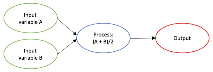
The dictionary broadly defines an algorithm as “a step-by-step procedure for solving a problem or accomplishing some end” (Merriam-Webster). Imagine an algorithm as a flow chart (Fig. 1), where each step is some process that is applied to the input(s) to get the desired output. In image analysis the output is usually isolated sections of the image that represent a specific feature; for example, isolating and counting the number of penguins in an image. Algorithm development involves figuring out which processes to use in order to consistently get desired results. I have conducted image analysis previously and these processes typically involve figuring out how to find a certain cutoff value. But, before I go too far down that road, let’s break down an image and the characteristics that are important for image analysis.

Figure 1. An example of a basic algorithm flow chart. There are two inputs: variables A and B. The process is the calculation of the mean of the two variables.

What is an image?

Think of an image as a spread sheet, where each cell is a pixel and each pixel is assigned a value (Fig. 2). Each value is associated with a color and when the sheet is zoomed out and viewed as a whole, the image comes together.  In color imagery, which is also referred to as RGB, each pixel is associated with the values of the three color bands (red, green, and blue) that make up that color. In a thermal image, each pixel’s value is a temperature value. Thinking about an image as a grid of values is helpful to understand the challenge of translating the larger patterns we see into something the computer can interpret. In image analysis this process can involve using the values of the pixels themselves or the relationships between the values of neighboring pixels.

Figure 2. A diagram illustrating how pixels make up an image. Each pixel is a grid cell associated with certain values. Image Source: https://web.stanford.edu/class/cs101/image-1-introduction.html

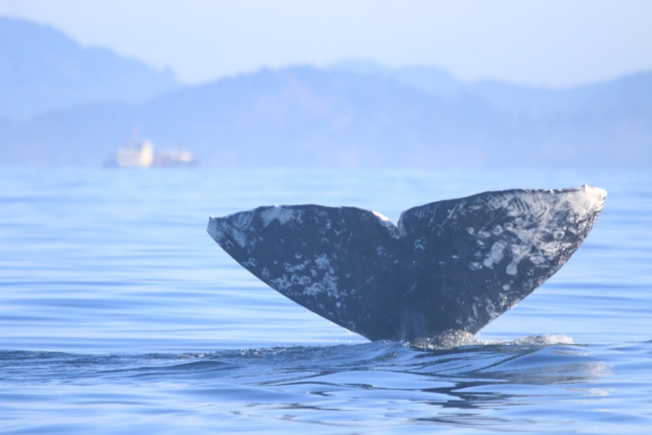
Our brains take in the whole picture at once and we are good at identifying the objects and patterns in an image. Take Figure 3 for example: an astute human eye and brain can isolate and identify all the different markings and scars on the fluke. Yet, this process would be very time consuming. The trick to building an algorithm to conduct this work is figuring out what processes or tools are needed to get a computer to recognize what is marking and what is not. This iterative process is the algorithm development.

Figure 3. Photo ID image of a gray whale fluke.

Development

An image analysis algorithm will typically involve some sort of thresholding. Thresholds are used to classify an image into groups of pixels that represent different characteristics. A threshold could be applied to the image in Figure 3 to separate the white color of the markings on the fluke from the darker colors in the rest of the image. However, this is an oversimplification, because while it would be pretty simple to examine the pixel values of this image and pick a threshold by hand, this threshold would not be applicable to other images. If a whale in another image is a lighter color or the image is brighter, the pixel values would be different enough from those in the previous image for the threshold to inaccurately classify the image. This problem is why a lot of image analysis algorithm development involves creating parameterized processes that can calculate the appropriate threshold for each image.

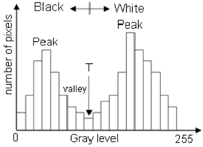
One successful method used to determine thresholds in images is to first calculate the frequency of color in each image, and then apply the appropriate threshold. Fletcher et al. (2009) developed a semiautomated algorithm to detect scars in seagrass beds from aerial imagery by applying an equation to a histogram of the values in each image to calculate the threshold. A histogram is a plot of the frequency of values binned into groups (Fig. 4). Essentially, it shows how many times each value appears in an image. This information can be used to define breaks between groups of values. If the image of the fluke were transformed to a gray scale, then the values of the marking pixels would be grouped around the value for white and the other pixels would group closer to black, similar to what is shown in Figure 4. An equation can be written that takes this frequency information and calculates where the break is between the groups. Since this method calculates an individualized threshold for each image, it’s a more reliable method for image analysis. Other characteristics could also be used to further filter the image, such as shape or area.

However, that approach is not the only way to make an algorithm applicable to different images; semi-automation can also be helpful. Semi-automation involves some kind of user input. After uploading the image for analysis, the user could also provide the threshold, or the user could crop the image so that only the important components were maintained. Keeping with the fluke example, the user could crop the image so that it was only of the fluke. This would help reduce the variety of colors in the image and make it easier to distinguish between dark whale and light marking.

Figure 4. Example histogram of pixel values. Source: Moallem et al. 2012

Why algorithms are important

Algorithms are helpful because they make our lives easier. While it would be possible for an analyst to identify and digitize each individual marking from a picture of a gray whale, it would be extremely time consuming and tedious. Image analysis algorithms significantly reduce the time it takes to process imagery. A semi-automated algorithm that I developed to count penguins from still drone imagery can count all the penguins on a one km2 island in about 30 minutes, while it took me 24 long hours to count them by hand (Bird et al. in prep). Furthermore, the process can be repeated with different imagery and analysts as part of a time series without bias because the algorithm eliminates human error introduced by different analysts.

Whether it’s a simple combination of a few processes or a complex series of equations, creating an algorithm requires breaking down a task to its most basic components. Development involves translating those components step by step into an automated process, which after many trials and errors, achieves the desired result. My first algorithm project took two years of revising, improving, and countless trials and errors.  So, whether creating an algorithm or working to understand one, don’t let the jargon nor the endless trials and errors stop you. Like most things in life, the key is to have patience and take it one step at a time.

References

Bird, C. N., Johnston, D.W., Dale, J. (in prep). Automated counting of Adelie penguins (Pygoscelis adeliae) on Avian and Torgersen Island off the Western Antarctic Peninsula using Thermal and Multispectral Imagery. Manuscript in preparation

Fletcher, R. S., Pulich, W. ‡, & Hardegree, B. (2009). A Semiautomated Approach for Monitoring Landscape Changes in Texas Seagrass Beds from Aerial Photography. https://doi.org/10.2112/07-0882.1

Moallem, Payman & Razmjooy, Navid. (2012). Optimal Threshold Computing in Automatic Image Thresholding using Adaptive Particle Swarm Optimization. Journal of Applied Research and Technology. 703.

Finding the right fit: a journey into cetacean distribution models

Solène Derville, Entropie Lab, French National Institute for Sustainable Development (IRD – UMR Entropie), Nouméa, New Caledonia

 Ph.D. student under the co-supervision of Dr. Leigh Torres

Species Distribution Models (SDM), also referred to as ecological niche models, may be defined as “a model that relates species distribution data (occurrence or abundance at known locations) with information on the environmental and/or spatial characteristics of those locations” (Elith & Leathwick, 2009)⁠. In the last couple decades, SDMs have become an indispensable part of the ecologists’ and conservationists’ toolbox. What scientist has not dreamed of being able to summarize a species’ environmental requirements and predict where and when it will occur, all in one tiny statistical model? It sounds like magic… but the short acronym “SDM” is the pretty front window of an intricate and gigantic research field that may extend way beyond the skills of a typical ecologist (even so for a graduate student like myself).

As part of my PhD thesis about the spatial ecology of humpback whales in New Caledonia, South Pacific, I was planning on producing a model to predict their distribution in the region and help spatial planning within the Natural Park of the Coral Sea. An innocent and seemingly perfectly feasible plan for a second year PhD student. To conduct this task, I had at my disposal more than 1,000 sightings recorded during dedicated surveys at sea conducted over 14 years. These numbers seem quite sufficient, considering the rarity of cetaceans and the technical challenges of studying them at sea. And there was more! The NGO Opération Cétacés  also recorded over 600 sightings reported by the general public in the same time period and deployed more than 40 satellite tracking tags to follow individual whale movements. In a field where it is so hard to acquire data, it felt like I had to use it all, though I was not sure how to combine all these types of data, with their respective biases, scales and assumptions.

One important thing about SDM to remember: it is like a cracker section in a US grocery shop, there is sooooo much choice! As I reviewed the possibilities and tested various modeling approaches on my data I realized that this study might be a good opportunity to contribute to the SDM field, by conducting a comparison of various algorithms using cetacean occurrence data from multiple sources. The results of this work was just published  in Diversity and Distributions:

Derville S, Torres LG, Iovan C, Garrigue C. (2018) Finding the right fit: Comparative cetacean distribution models using multiple data sources and statistical approaches. Divers Distrib. 2018;00:1–17. https://doi. org/10.1111/ddi.12782

There are simply too many! Anonymous grocery shops, Corvallis, OR
Credit: Dawn Barlow

If you are a new-comer to the SDM world, and specifically its application to the marine environment, I hope you find this interesting. If you are a seasoned SDM user, I would be very grateful to read your thoughts in the comment section! Feel free to disagree!

So what is the take-home message from this work?

  • There is no such thing as a “best model”; it all depends on what you want your model to be good at (the descriptive vs predictive dichotomy), and what criteria you use to define the quality of your models.

The predictive vs descriptive goal of the model: This is a tricky choice to make, yet it should be clearly identified upfront. Most times, I feel like we want our models to be decently good at both tasks… It is a risky approach to blindly follow the predictions of a complex model without questioning the meaning of the ecological relationships it fitted. On the other hand, conservation applications of models often require the production of predicted maps of species’ probability of presence or habitat suitability.

The criteria for model selection: How could we imagine that the complexity of animal behavior could be summarized in a single metric, such as the famous Akaike Information criterion (AIC) or the Area under the ROC Curve (AUC)? My study, and that of others (e.g. Elith & Graham  H., 2009),⁠ emphasize the importance of looking at multiple aspects of model outputs: raw performance through various evaluation metrics (e.g. see AUCdiff; (Warren & Seifert, 2010)⁠, contribution of the variables to the model, shape of the fitted relationships through Partial Dependence Plots (PDP, Friedman, 2001),⁠ and maps of predicted habitat suitability and associated error. Spread all these lines of evidence in front of you, summarize all the metrics, add a touch of critical ecological thinking to decide on the best approach for your modeling question, and Abracadabra! You end up a bit lost in a pile of folders… But at least you assessed the quality of your work from every angle!

  • Cetacean SDMs often serve a conservation goal. Hence, their capacity to predict to areas / times that were not recorded in the data (which is often scarce) is paramount. This extrapolation performance may be restricted when the model relationships are overfitted, which is when you made your model fit the data so closely that you are unknowingly modeling noise rather than a real trend. Using cross-validation is a good method to prevent overfitting from happening (for a thorough review: Roberts et al., 2017)⁠. Also, my study underlines that certain algorithms inherently have a tendency to overfit. We found that Generalized Additive Models and MAXENT provided a valuable complexity trade-off to promote the best predictive performance, while minimizing overfitting. In the case of GAMs, I would like to point out the excellent documentation that exist on their use (Wood, 2017)⁠, and specifically their application to cetacean spatial ecology (Mannocci, Roberts, Miller, & Halpin, 2017; Miller, Burt, Rexstad, & Thomas, 2013; Redfern et al., 2017).⁠
  • Citizen science is a promising tool to describe cetacean habitat. Indeed, we found that models of habitat suitability based on citizen science largely converged with those based on our research surveys. The main issue encountered when modeling this type of data is the absence of “effort”. Basically, we know where people observed whales, but we do not know where they haven’t… or at least not with the accuracy obtained from research survey data. However, with some information about our citizen scientists and a little deduction, there is actually a lot you can infer about opportunistic data. For instance, in New Caledonia most of the sightings were reported by professional whale-watching operators or by the general public during fishing/diving/boating day trips. Hence, citizen scientists rarely stray far from harbors and spend most of their time in the sheltered waters of the New Caledonian lagoon. This reasoning provides the sort of information that we integrated in our modeling approach to account for spatial sampling bias of citizen science data and improve the model’s predictive performance.

Many more technical aspects of SDM are brushed over in this paper (for detailed and annotated R codes of the modeling approaches, see supplementary information of our paper). There are a few that are not central to the paper, but that I think are worth sharing:

  • Collinearity of predictors: Have you ever found that the significance of your predictors completely changed every time you removed a variable? I have progressively come to discover how unstable a model can be because of predictor collinearity (and the uneasy feeling that comes with it …). My new motto is to ALWAYS check cross-correlation between my predictors, and do it THOROUGHLY. A few aspects that may make a big difference in the estimation of collinearity patterns are to: (1) calculate Pearson vs Spearman coefficients, (2) check correlations between the values recorded at the presence points vs over the whole study area, and (3) assess the correlations between raw environmental variables vs between transformed variables (log-transformed, etc). Though selecting variables with Pearson coefficients < 0.7 is usually a good rule (Dormann et al., 2013), I would worry of anything above 0.5, or at least keep it in mind during model interpretation.
  • Cross-validation: If removing 10% of my dataset greatly impacts the model results, I feel like cross-validation is critical. The concept is based on a simple assumption, if I had sampled a given population/phenomenon/system slightly differently, would I have come to the same conclusion? Cross-validation comes in many different methods, but the basic concept is to run the same model several times (number of times may depend on the size of your data set, hierarchical structure of your data, computation power of your computer, etc.) over different chunks of your data. Model performance metrics (e.g., AUC) and outputs (e.g., partial dependence plots) are than summarized on the many runs, using mean/median and standard deviation/quantiles. It is up to you how to pick these chunks, but before doing this at random I highly recommend reading Roberts et al. (2017).

The evil of the R2: I am probably not the first student to feel like what I have learned in my statistical classes at school is in practice, at best, not very useful, and at worst, dangerously misleading. Of course, I do understand that we must start somewhere, and that learning the basics of inferential statistics is a necessary step to, one day, be able to answer your one research questions. Yet, I feel like I have been carrying the “weight of the R2” for far too long before actually realizing that this metric of model performance (R2 among others) is simply not  enough to trust my results. You might think that your model is robust because among the 1000 alternative models you tested, it is the one with the “best” performance (deviance explained, AIC, you name it), but the model with the best R2 will not always be the most ecologically meaningful one, or the most practical for spatial management perspectives. Overfitting is like a sword of Damocles hanging over you every time you create a statistical model All together, I sometimes trust my supervisor’s expertise and my own judgment more than an R2.

Source: internet

A few good websites/presentations that have helped me through my SDM journey:

General website about spatial analysis (including SDM): http://rspatial.org/index.html

Cool presentation by Adam Smith about SDM:

http://www.earthskysea.org/!ecology/sdmShortCourseKState2012/sdmShortCourse_kState.pdf

Handling spatial data in R: http://www.maths.lancs.ac.uk/~rowlings/Teaching/UseR2012/introductionTalk.html

“The magical world of mgcv”, a great presentation by Noam Ross: https://www.youtube.com/watch?v=q4_t8jXcQgc


Literature cited

Dormann, C. F., Elith, J., Bacher, S., Buchmann, C., Carl, G., Carré, G., … Lautenbach, S. (2013). Collinearity: A review of methods to deal with it and a simulation study evaluating their performance. Ecography, 36(1), 027–046. https://doi.org/10.1111/j.1600-0587.2012.07348.x

Elith, J., & Graham  H., C. (2009). Do they? How do they? WHY do they differ? On finding reasons for differing performances of species distribution models . Ecography, 32(Table 1), 66–77. https://doi.org/10.1111/j.1600-0587.2008.05505.x

Elith, J., & Leathwick, J. R. (2009). Species Distribution Models: Ecological Explanation and Prediction Across Space and Time. Annual Review of Ecology, Evolution, and Systematics, 40(1), 677–697. https://doi.org/10.1146/annurev.ecolsys.110308.120159

Friedman, J. H. (2001). Greedy Function Approximation: A gradient boosting machine. The Annals of Statistics, 29(5), 1189–1232. Retrieved from http://www.jstor.org/stable/2699986

Mannocci, L., Roberts, J. J., Miller, D. L., & Halpin, P. N. (2017). Extrapolating cetacean densities to quantitatively assess human impacts on populations in the high seas. Conservation Biology, 31(3), 601–614. https://doi.org/10.1111/cobi.12856.This

Miller, D. L., Burt, M. L., Rexstad, E. A., & Thomas, L. (2013). Spatial models for distance sampling data: Recent developments and future directions. Methods in Ecology and Evolution, 4(11), 1001–1010. https://doi.org/10.1111/2041-210X.12105

Redfern, J. V., Moore, T. J., Fiedler, P. C., de Vos, A., Brownell, R. L., Forney, K. A., … Ballance, L. T. (2017). Predicting cetacean distributions in data-poor marine ecosystems. Diversity and Distributions, 23(4), 394–408. https://doi.org/10.1111/ddi.12537

Roberts, D. R., Bahn, V., Ciuti, S., Boyce, M. S., Elith, J., Guillera-Arroita, G., … Dormann, C. F. (2017). Cross-validation strategies for data with temporal, spatial, hierarchical or phylogenetic structure. Ecography, 0, 1–17. https://doi.org/10.1111/ecog.02881

Warren, D. L., & Seifert, S. N. (2010). Ecological niche modeling in Maxent: the importance of model complexity and the performance of model selection criteria. Ecological Applications, 21(2), 335–342. https://doi.org/10.1890/10-1171.1

Wood, S. N. (2017). Generalized additive models: an introduction with R (second edi). CRC press.