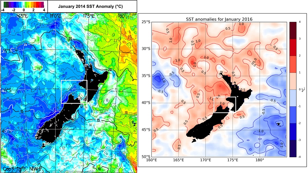
Figure 3. Comparison of sea surface temperature (SST) anomaly plots of the New Zealand region between January 2014 (left) and January 2016 (right). The white box in both plots denotes the general location of our blue whale study region. (Apologies for the different formats of these plots – the underlying data is directly comparable.)
