The idea that students learn best when they have the opportunity to apply what they are learning to real-world contexts is the basis of Experiential Learning Theory (ELT). Learning by doing is at its core, and as a high-impact practice, there is increasingly more emphasis on experiential learning in higher education. There is plenty of evidence that supports the benefits of this type of learning. It affords students an opportunity to connect knowledge to authentic situations and increases learner autonomy, motivation, and overall satisfaction (Kolb and Kolb, 2018). Many OSU Ecampus Courses feature such experiences. In fact, OSU’s Honors College requires all courses to include experiential learning components, and this is increasingly the case across disciplines at OSU.
Many of us may think of community engagement, project-based learning, or practicums when we consider what constitutes an experiential learning experience. While these are solid examples of ELT in practice, experiential learning can take many forms across learning environments. David Kolb describes experiential learning as a four-stage process in his cycle of learning (Kolb and Kolb, 2018). According to Kolb, learning is a process where knowledge is created through the transformation of experience. Students can engage with the cycle at any point in the experience as long as they engage with all four stages. The flexibility of hybrid and online learning presents rich possibilities for incorporating this process. The four stages of Kolb’s experiential learning process include:
Concrete learning: engage in a new experience or critically interpret a past experience.
Reflective observation: use experience and background knowledge to understand the relevance or meaning of the experience.
Abstract conceptualization: gain a new understanding of the experience by adjusting thinking based on reflection.
Active experimentation: engage experimentally by applying new insights to the situation in a practical way.
Kolb’s theory is not without limitations in that it does not provide clear answers about how collaboration between learners affects reflection, and it doesn’t account for learning that occurs without reflection (Psychology, 2022). While his model isn’t the final word on all of the ways learners make sense of the world, it does provide a good starting point for understanding and designing effective real-world learning opportunities.
What makes a good experiential learning experience?
Regardless of the activity, both the experience and the learning are fundamental in experiential learning scenarios, and the ongoing engagement of both the instructor and the student is critical. In experiential environments, students take ownership of their learning process by taking a more active role such as in posing questions, experimenting, and constructing meaning through their persistent participation in the experience. The role of the instructor, on the other hand, is to ensure that the experience is of high quality and in alignment with the stated learning outcomes while also supporting the learner to develop autonomy in using the principles of experiential learning as defined by The National Society of Experiential Education (NSEE).
Eight Principles of Good Practice for All Experiential Learning Activities
Intention: the activity is structured around a formal process and the purpose and rationale for why the activity was chosen is transparent and clear to students.
Preparedness and planning: students understand expectations for engaging in the learning experience and have the necessary background knowledge and preparation to participate in the planned learning with support throughout the process.
Authenticity: the learning experience is relevant and designed in response to an authentic context or situation in collaboration with those affected by it.
Reflection: the experience is transformative and allows for knowledge discovery through a process of making and testing decisions around expected or observed outcomes and through consideration of assumptions and implications related to prior and present learning.
Orientation and training: learner support and guidance include sufficient background preparation needed for successful achievement of learning outcomes.
Monitoring and continuous improvement: students receive continuous feedback and support to enhance the learning experience and ensure achievement of learning outcomes.
Assessment and evaluation: students receive helpful and timely feedback from the instructor and any external facilitators, and monitoring and adjustments to process are made as appropriate to ensure achievement of outcomes.
Acknowledgement: All students and external stakeholders or facilitators are recognized for their work, progress, and contribution to the experience.
Experiential Learning in OSU Ecampus Courses
The following examples illustrate a small selection of the many creative experiential learning opportunities OSU faculty developers have incorporated into their online and hybrid courses in collaboration with Ecampus instructional designers.
Build a community of writers online. Students read, critique, write, edit, revise, and share original pieces of creative writing. An activity modeled after the Iowa Writer’s Workshop and implemented in a creative writing course.
Discover and Promote well-being in an Online Community. Students in a philosophy class engage in activities in their local community and online to talk about topics around well-being. They then reflect on those experiences and dialogue before compiling a “happiness toolkit” and sharing it with peers.
Explore health and fitness assessment techniques used to measure cardiovascular health. Through a series of hands-on labs, students monitor volunteers’ exercise regimes and calculate cardiovascular fitness values to make recommendations based on the data collected.
Collaborate in a team to study and analyze management case studies. Students work through complex and ambiguous problems to solve a workplace challenge and find solutions before participating in an authentic human resources simulation.
Write and perform music. Students in a performance-based music course write and perform original pieces of music.
Examine poverty and its effect on students’ local communities. Students complete a public health scavenger hunt guided by specific questions, reflection, and peer collaboration. They then create a guide describing public health issues and potential solutions.
Investigate the necessary conditions for designing effective teams and work groups, including best practices and processes needed for maximum productivity, strategies to resolve common issues in teams, and methods to evaluate team performance. Students then apply their learning by leading a team in real life.
Analyze and conduct research on a local public health issue. Students partner with community organizations in their area to identify needs and apply principles of public health to authentic contexts.
The list is far from exhaustive. New courses featuring experiential learning are currently in development across disciplines. Faculty interested in learning more about how to get started learning by doing in hybrid and online courses can learn more by checking out the Ecampus experiential learning resources page.
Learning outcomes (LOs) are used in instructional design to describe the skills and knowledge that students should have at the end of a course or learning unit, and to design assessments and activities that support these goals. It is widely agreed that specific, measurable outcomes are essential for planning instruction; however, some educators question the benefits of explicitly presenting them to students. I have been asked (and wondered myself): “What is the point of listing learning outcomes in the course?” “How do they help learning? “Do students even read them?”
So, I went on a quest for research that attempted to answer such questions. I was particularly interested in unit/module-level outcomes, as those are the ones that directly steer the content, and students see them throughout the course. Here’s a brief summary of what I found.
Note: the studies use the terms “learning outcome”, “learning objective”, or “learning goal” – they all refer to the same concept: a specific and measurable description of the skills and knowledge that students are expected to have at the end of a learning unit/period of study. At OSU we use the term “outcomes”.
What Does the Research Say?
Armbruster et al. (2009) redesigned an Introductory Biology course at Georgetown University, Washington, DC, using active learning and student-centered pedagogies, leading to increased student performance and satisfaction. One of the strategies used was to include explicit learning goals in the lecture slides, and labeling exam and quiz questions with the related goals. Students’ attitudes towards the course were assessed via a questionnaire and comparison of university-administered student evaluations. Students were asked to rank lecture components in terms of helpfulness to learning, and the authors found that one of the highest-ranking elements was the inclusion of explicit learning goals.
Simon and Taylor (2009) surveyed 597 students from computer science and microbiology and immunology courses at the University of British Columbia, where instructors presented learning goals at the beginning of each lecture or topic area. The questions were open and the answers coded into a number of categories, which helped them identify several values of goals. The main value was “knowing what I need to know”: students reported that the goals showed them how to focus their efforts and felt that the goals “allowed them to organize the information more effectively and be more expertlike in their approach to the class” (Simon & Taylor, 2009, p.55). The authors did not find any difference between presenting the goals before each lecture versus at the beginning of the unit/topic area.
Brooks et al. (2014) examined students’ views of learning outcomes at the University of Leicester, UK. First, they surveyed 918 students taking Biological Sciences, English and Medicine courses. They found that 81% of participants agreed or strongly agreed that learning outcomes are useful learning aids. Additionally, 46% found LOs more useful as their courses progressed, and 49% reported that they engaged more with the LOs as the course progressed. The authors also investigated when LOs are most useful, and found that the most common answer (46%) was when reviewing the material. Moreover, 49% of students reported that LOs can only be fully understood at the end of a module. The researchers followed up on these results with a focus group, which confirmed that students use LOs in various ways and at various points during the course.
Osueke et al. (2018) looked into students’ use and perceptions of learning objectives at University of Georgia. 185 students in an undergraduate Introduction to Biochemistry and Molecular Biology course took part in the study. The instructors included instructions in the syllabus, which they also stated on the first day of class: “Focus on the learning objectives. The exams will assess your accomplishment of the learning objectives. Use the learning objectives as a guide for what to focus on when you are completing assignments and studying for exams.” Students completed two assignments requiring them to explain their use of the LOs. The researchers found that many students (33.8%) reported they had been instructed on how to use LOs to study – these instructions ranged from passively “look over” to using them as a study guide. The ways students used the LOs were: as questions to answer (47.4%), as a resource for studying (24.1%), as a self-assessment tool (14.3%), and passive use (13.5%). When asked why they find the LOs helpful, students said that they help them: narrow down the information (57.1%); organize their studying (23.3%); communicate information (5.3%); monitor their understanding (4.5%); forced them to study (1.5%).
Sana et al. (2020) conducted three experiments aiming to find to what extent presenting the LOs improve retention of information. Participants were asked to read five passages on a neuroscience topic, and then they were tested on comprehension and retention. The experiments took place at McMaster University, Ontario and employed different participants, methods, materials, and procedures. They found that: interpolating LOs throughout the lesson (as opposed to all LOs presented at the beginning) improved learning compared to not including LOs, especially when students’ attention was explicitly directed to them; converting LOs into pretest questions (that students attempted to answer) further enhanced performance; multiple-choice and short answer questions were equally effective; and withholding feedback on pretests was more effective than providing feedback – the explanation proposed by the authors for this last finding was that students may be more motivated to seek the correct answers themselves, which causes further processing of the material.
Barnard et al. (2021) investigated students’ and academics’ perspectives on the purpose of learning objectives and approaches to assessment preparation. They conducted focus groups with participants from an undergraduate Psychology course at the University of Nottingham, UK. The students reported that LOs are useful for guidance, as they “use them to create direction for some of the learning and revision strategies” (Barnard et al., 2021, p. 679).
Conclusions and Recommendations
Good news! The findings of these studies suggest that many students do appreciate clear LOs and use them to guide their learning. The LOs help them understand what they are expected to know – thus, students use them to focus their study, to review for an exam, and to self-check their knowledge.
As instructors and instructional designers, what can we do to help students take full advantage of LOs? Apart from having specific and measurable LOs, make sure that the LOs are well aligned with the activities, and make this alignment explicit. It may also be helpful to offer some guidance on how to use the LOs, for instance by prompting students to recap their learning at the end of a unit based on the LOs. Finally, we could turn the LOs into questions and use them as a pretest.
For more on creating and using LOs, check out the CBE—Life Sciences Education website, which has an informative guide, including a section on student use.
Do you have any other ideas or resources on how to use learning outcomes to improve students’ experience and study habits? If so, we’d love to hear from you!
References
Armbruster, P., Patel, M., Johnson, E., & Weiss, M. (2009). Active learning and student-centered pedagogy improve student attitudes and performance in Introductory Biology. CBE Life Sciences Education, 8(3), 203–213. https://doi.org/10.1187/cbe.09-03-0025
Barnard, M., Whitt, E., & McDonald, S. (2021). Learning objectives and their effects on learning and assessment preparation: Insights from an undergraduate psychology course. Assessment and Evaluation in Higher Education, 46(5), 673–684. https://doi.org/10.1080/02602938.2020.1822281
Brooks, S., Dobbins, K., Scott, J. J. A., Rawlinson, M., & Norman, R. I. (2014). Learning about learning outcomes: The student perspective. Teaching in Higher Education, 19(6), 721–733. https://doi.org/10.1080/13562517.2014.901964
Osueke, B., Mekonnen, B., & Stanton, J. D. (2018). How undergraduate science students use learning objectives to study. Journal of Microbiology & Biology Education, 19(2). https://doi.org/10.1128/jmbe.v19i2.1510
Sana, F., Forrin, N. D., Sharma, M., Dubljevic, T., Ho, P., Jalil, E., & Kim, J. A. (2020). Optimizing the efficacy of learning objectives through pretests. CBE Life Sciences Education, 19(3), ar43–ar43. https://doi.org/10.1187/cbe.19-11-0257
The following is a guest blog post from Aimee L. Lomeli Garcia, MLA. Aimee completed an Instructional Design internship with OSU Ecampus during the Fall of 2022.
Have you ever found yourself reading the same paragraph over and over again only to not retain any information? Or been so overwhelmed with the content you’re trying to read that you’re unable to absorb any of it? Odds are that it may not just be the content you’re trying to read; it may be the way the information is laid out. One way to help read and retain information is to make the text more readable.
Making information readable in your online course can seem overwhelming, but there are a few steps that you can take to make the content more digestible for students.
What is Readability?
First off – what is readability? Readability is defined as “the ease in which a reader can comprehend text” (Calonia, 2020). Readability is a vital aspect to keep in mind as you design online courses. It not only makes the content of the class easier to read but increases the likelihood that students will understand the faculty’s content through lectures and discussions. Better readability also decreases the risk of students misunderstanding the content, experiencing frustration, and increases the risk of students becoming disinterested in interacting with the course. Though there are multiple options to make content more readable, there are five ways that you can adapt the content in your course: chunking content, using whitespace, avoiding wordiness, creating infographics, and utilizing color.
Chunking Content
What does “chunking content” mean? Chunking means breaking content into smaller chunks to make it easier to understand. This strategy originates from the field of cognitive psychology, which has proven that the human brain can “process, understand, and remember information better when broken into smaller pieces” (Moran, 2016).
Let’s demonstrate!
Below are the first two paragraphs of Harry Potter and the Sorcerer’s Stone by J.K. Rowling:
Chapter One The Boy Who Lived Mr. and Mrs. Dursley, of number four, Privet Drive, were proud to say that they were perfectly normal, thank you very much. They were the last people you’d expect to be involved in anything strange or mysterious because they just didn’t hold with such nonsense.
When reading through this excerpt, it’s easy for your eyes to scan through the information without comprehending it. There are a few common methods that will help with chunking your material: make your paragraphs shorter, add space between your paragraphs, and develop clear hierarchies of text.
Utilizing these methods, let’s make this paragraph more readable:
Chapter One
The Boy Who Lived
Mr. and Mrs. Dursley, of number four, Privet Drive, were proud to say that they were perfectly normal, thank you very much. They were the last people you’d expect to be involved in anything strange or mysterious, because they just didn’t hold with such nonsense.
Using Whitespace
Whitespace is defined as “empty space between and around elements of a page” (Babich, 2017). Whitespace creates a backdrop or frame to make your content easier to read. Like chunking information, whitespace allows the eye to find information easily. Take these slides for example:
“Plastic Coffee Cup on Book” by Anna Shvets from Pexels
Do you notice how much easier it is to read the different types of coffee drinks on the slide that has more white space? In a study done by Wichita State University, research confirmed that increasing the amount of whitespace actually improves reading comprehension!
Avoiding Wordiness
We’ve all experienced reading material that has excessive wordiness. In a manner of speaking, “wordiness means using more words than necessary within a sentence, especially short, vague words that do not add much meaning” (Eliminating Wordiness, 2022). Unfortunately, the overuse of unnecessary words can muddle ideas and cause confusion for students.
To decrease wordiness, focus on the key points you want to convey and use an active voice instead of a passive voice. Consider the following example:
“All of the students who are new to this university are required ot attend an orientatin that has been scheduled for December 1st.”
When reading this sentence, it’s difficult to decipher what the necessary information is for the reader to understand. Instead, let’s focus on the key points and use an active voice in this sentence:
“New students are required to attend orientation on December 1st.”
Here, we eliminated the unnecessary wording, allowing readers to understand the message the sentence is trying to convey.
Use Visuals
Pictures speak louder than words! Using visual media, such as infographics, pictures, videos, animations, and films, make content easier for students to understand and could decrease the amount of writing you have to do for the class! You can obtain visual media through free online resources such as Pexels, Pixabay, or Openverse or created on your own (Canva is a favorite for me).
So, instead of using this:
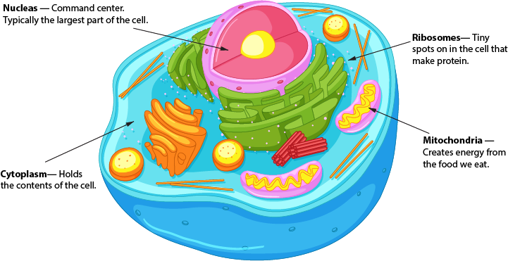
Cells are the building blocks of life. A cell is composed of cytoplasm, a nucleus, ribosomes, and mitochondria. Cytoplasm is made up of a jell-like structure that contains the contents of the cell. The nucleus serves as the command center and is typically the largest part of the inside of the cell. Ribosomes are tiny parts of the cell that make proteins and mitochondria are jelly-bean shaped and create energy from the food we eat.
Color makes a significant impact on the readability of your page. This can be easy to overlook, as we typically use the standard black font/white background combination. However, adding color to words or backgrounds can bring attention to a message you’re trying to convey. There are ways to do this successfully and ways to add color poorly.
Looking at the red text on the first example can be challenging for someone with no vision issues. Imagine the difficulty students who have a visual impairment can have – in particular, red/green color blindness.
On the second example, having a text color that is nearly the same shade as the background can make reading the text nearly impossible. It takes effort to read the quote in the example – can you imagine reading a scholarly journal with the same formatting?
Don’t let these examples dissuade you from trying text colors and backgrounds! To verify if a color combination is readable, visit the Contrast Checker page, enter the RGB or RYB codes and the website will notify you if the color combinations are reader-friendly.
Conclusion
Drafting your site can be overwhelming when considering readability, but there are several steps you can take to make the course content easier to understand.
Chunking content helps break text into smaller pieces so content is easier for students to digest.
Whitespace provides empty space for your content to pop
Avoiding wordiness can make your content and message clearer
Using visuals allows you to utilize pictures, videos, infographics, and other media to convey content
Strategic use of color on your page can make reading the material more comfortable and less straining for all students, including those with vision impairments.
Below are links to resources and tools if you’d like to dive into more information about readability and the impact it has on the success of students of online students. Thanks for reading!
As a new term begins, we are often thinking about the logistics of our courses, the Syllabus and course schedule, and ensuring everything is working properly. For our students, these early weeks set the tone for what they might expect from their courses and from their instructors. Your first announcement, the language and tone in the Syllabus, how you greet incoming students – these small actions all help to create a welcoming environment for your course. When students feel included in a positive course climate, they are more motivated and engaged in learning.
In the weeks ahead, some students will likely reach out to you with concerns or information about major events going on in their lives. Faculty are often the first to hear of health issues, death in the family, deployment, financial matters, and a variety of mental health concerns and needs. In prior surveys, Ecampus students have shared that the most important relationship in their college career is with their instructor(s), rated higher than their advisors or other student support professionals around campus. When life happens, you are often the first person a student thinks to reach out to for support and direction. Last year, Ecampus put forth the Online Teaching Principles, derived from research-based best practices. The principle “Reach Out and Refer” directly relates to what we can do when our students need some additional support.
Check in with students who may be struggling, and refer students to the appropriate technology, academic or student support services in response to their articulated or observed needs.
Oregon State University Ecampus, Online Teaching Principle: Reach Out And Refer
When students reach out, your care, concern for their well-being, and support is sometimes enough to help the student. That may look like an assignment extension, acknowledgement of their circumstances, setting up a time to speak, or a variety of other measures. At other times, there are situations when making a referral to the appropriate resource or department is the best course of action. In these instances, it is important to remain calm and formulate a plan.
There are situations when making a referral is the best option for both you and the student. For example:
You know that you can’t handle the request or the behavior. There are limits to the kinds of help a faculty or staff member can provide.
You believe that personality differences will interfere with your ability to help.
You know the student personally and believe that you could not be objective.
You feel overwhelmed, pressed for time, or stressed.
The student acknowledges a problem but is reluctant to discuss it with you.
After working with the student for some time, you realize that you don’t know how to proceed.
The student’s problems are better handled through services such as CAPS, Financial Aid, the Registrar’s Office, Affirmative Action, or Legal Advising.
How to Make a Referral
Some people accept a referral for professional help more easily than others do. Here are some tips for making a successful referral.
Let the student know that it is not necessary to know exactly what is wrong in order to seek assistance.
Assure the student that seeking help does not necessarily mean that their problems are unusual or extremely serious.
Be frank with students about your own limits of time, energy, training, objectivity, and willingness to help.
If appropriate, suggest that the student consider talking with family members, friends, clergy, community agencies, and campus offices.
CAPS provides consultations to faculty and staff who have urgent concerns about a student. If you have an immediate need, please call 541-737-2131. Phone counselors are available after hours. If you or a person of concern are experiencing an emergency, please call 911 off campus or 541-737-7000 on campus.
The Student Care Team has compiled a chart (pictured below) of Resources For Consultation and Referral for AY 22 that can be referenced via their Box folder.
Resources for instructors
There are a wide variety of concerns that a student may bring to you. It can be time-consuming to identify the available resources and get students to the right area. There are a few main webpages you can bookmark that outline the resources available to our Ecampus students.
Student Resources For Ecampus Students – This page on the Ecampus website maintains a comprehensive list of all resources available to Ecampus students. It includes academic resources, emergency food and housing, disability access services, mental health, technical support, and more. This is a great page to bookmark and/or print the PDF version that is linked at the bottom of the webpage.
Student Care Team – This Box folder contains resources for faculty including a referral and consultation chart and tips for working with distressed students.
In Crisis Support For Students (CAPS) – 24/7 support for students in crisis. Includes contact information for CAPS, Suicide & Crisis Lifeline, and more.
If You Are Concerned About A Student (CAPS) – Faculty/staff member consultation form. You can also call 541-737-2131 for a more immediate response.
Ecampus Student Services – If your student is not in crisis, but you are unsure where to start, directing them to our student services representatives is a great option. They assist students with navigating OSU resources and are the first point of contact for student inquiries. Phone:800-667-1465 (select option 1) or Email:ecampus.ess@oregonstate.edu.
Ecampus Student Success Coaching – If you feel that your student(s) could benefit from individualized, strengths-based academic counseling, you can refer them to the success coaching team. This group works with all undergraduate Ecampus students.
The following is a guest blog post from Michelle Coxey. Michelle completed an Instructional Design internship with OSU Ecampus during the Fall of 2022.
Ian Wilkins is a high school language arts teacher, but besides the students, his passion is social justice. He shares a powerful metaphor that education is like a heavily gated castle. Those inside the castle are comfortable and safe and do not realize that the people outside are hungry (Chardin & Novak, 2021). If someone opens the gate and admits a person from the outside, would that person feel comfortable and safe inside like everyone already there? Would they know the rules of the castle? Would they feel like they fit in and deserved to be there? Would the food inside reflect their own tastes, needs, and preferences? Would they stay, or would they want to return to their own comfort zone outside with their family?
If higher education is the castle, who belongs inside the castle?
Because of financial aid and diversity efforts in admissions, first-generation and low-income (FLI) students usually have access to higher education. But 90% of FLI students do not graduate from college within six years (Zinshteyn, 2016). The gates to the castle are open, but why don’t FLI students stay?
Inclusion goes beyond admissions. A student’s experience and motivation to stay is heavily influenced by the inclusiveness of the design in online courses. As a result, instructional designers are in an ideal position to design courses that are more aligned with life for FLI students outside of the virtual classroom.
Imposter Syndrome
If you are reading this, you have experienced it at some point in your career, no doubt. Imposter syndrome is that uncomfortable feeling that you are incompetent and have fooled everyone into thinking that you belong. Imposter syndrome is a nearly universal experience and has been studied since the 1970’s. However, in the last few years, researchers and social justice activists have suggested that imposter syndrome is actually the result of systemic bias. As white people, especially men, advance in their education and careers, they develop more confidence, and the feelings of imposter syndrome usually go away. However, because of systemic bias, people with marginalized identities feel more like a fraud the further they advance in their education and careers (Tulshyan & Burey, 2021).
College is a breeding ground for imposter syndrome. Most new college students have a steep learning curve and feel insecure, but the struggles are amplified for FLI students. The structure and culture of higher education is very different from the circumstances and environments they grew up in. Many FLI students blame themselves, assuming they aren’t working hard enough. Yet, cultural and social differences are to blame for their imposter feelings.
Instructional Designers Can Help
Former U.S. President Barack Obama (2010) said, “The best anti-poverty program is a world-class education.” If he is correct, instructional designers hold a lot of power because we are working to provide a world-class education for others (U.S. News, n.d.). Plus, we have managed to successfully navigate higher education ourselves and have constant access to learning in our jobs. Additionally, instructional designers are on the front lines of dismantling imposter syndrome by guiding and training instructors and designing courses and learning activities with FLI students in mind.
In addition to the research-based best practices for engagement, inclusion, and assignment transparency when designing online courses, instructional designers should consider the income demographics of online students. Online students are often FLI students. Fifty percent of online students’ family income is below $39,000 a year (Classes and Careers, 2018). Online students are likely to be working and juggling family responsibilities in addition to taking classes (OSU, 2020). They may not be taking classes online because it is the ideal learning environment for them, but because they need to fit education into their other responsibilities. Additionally, some online students pursue disciplines and majors they don’t love because of scheduling convenience or because a particular degree will bring financial security.
Instructional designers can relieve some of the pressure and insecurity for FLI students by intentionally creating an inclusive space in every course. Here are twelve research-based suggestions for how instructional designers can be inclusive of FLI students when designing courses and collaborating with instructors.
Find out who the FLI students are in each course. In addition to helping instructors understand the demographics of Ecampus students, designers could encourage instructors to learn which students are FLI students. Instructors could have an informal conversation or could give an assignment where students share how their background and culture relate to the class subject. Andragogy emphasizes the importance of student experience in learning. When instructors help students see that their social class affects their college experience, the student’s life experiences can be an anchor to attach what they learn in class (Checkoway, 2018).
Help students embrace their identity. Find opportunities for students to embrace their identity, regularly share about their lives, and solve problems in their own families and communities. Give students plenty of choice, provide examples using a variety of cultures, and consider topics and stories that people with a low-income can relate to. Students should analyze case studies involving situations and organizations they are familiar with. If material is real to the student, they can grasp it quicker. For example, students could learn velocity using the model of car they drive, or write an essay on a policy issue they care about (Checkoway, 2018).
Encourage Small group work. Higher education in the U.S. caters to an individualistic, independent, and merit-based culture. This is even more true in online courses where everyone works asynchronously. However, FLI students often come from interdependent cultures (Canning et al., 2019; Stephens et al., 2012; Townsend et al., 2021). Group activities help students collaborate and connect with each other, supporting students that struggle with imposter syndrome or that feel more comfortable working with others.
Eliminate competition between students. Competition in STEM classes increase feelings of imposter syndrome for all students, especially FLI students (Canning et al., 2019). Encourage instructors to eliminate competitive activities, such as requiring students to promote themselves in online discussions. Also, grading on a curve creates a hierarchy that causes anxiety and self-doubt in a lot of students. And last, encourage instructors to include opportunities for collaboration and cooperation and be clear that all students can succeed.
Double down on inclusion in STEM classes. Extra care should be taken to support FLI students when designing and teaching STEM classes. In STEM programs, the number of FLI students is only 20 percent (Peña et al., 2022). This is especially problematic because the stakes are high for FLI students in STEM classes because students who pursue STEM careers earn significantly higher salaries. Instructional designers should design activities that help students see themselves as scientists.
Design low-stakes formative assessments. Design several low-stakes formative assessments early in the course to address learning gaps in students with less confidence or experience. These assignments help FLI students learn the “hidden curriculum” of higher education, which includes expectations about assignments that are often “unspoken” or implied (Tyson, 2014). FLI students may not know to ask questions, so these assignments should be designed to provide early feedback, identify students needing more support resources, and clarify misunderstandings about policies and expectations.
Use Inclusive language. Encourage instructors to use supportive and inclusive language and avoid jargon in syllabi, assignment instructions, and informal videos. This helps students without experience feel like they belong in the course.
Apply course concepts to the real world. Help instructors become transparent with how assignments and course outcomes develop skills that are useful in the real-world. This effort benefits all students but especially helps students that are in danger of dropping the course see the long-term value of sticking with it.
Design social annotation activities. With social annotation, students collaborate to annotate an open educational resource (OER). This learning activity promotes interdependence and shared meaning-making among classmates. Hypothesis, NowComment, Perusal, and Diigo are a few popular tools for social annotation (Farber, 2019).
Identify career paths. FLI students may not have access to insights about careers, education, research, or internships. Encourage instructors to share details about their own career path and professional development as well as how to navigate different careers within the discipline. Instructional designers could create a discussion board for students to ask and answer questions with their peers about future careers.
Encourage financial sensitivity. Consider using low or no-cost learning resources. Use OER, older editions of textbooks, and if a high-cost text is necessary, justify it. Also, work with the campus library to see if required textbooks can be made available online. And last, encourage instructors to teach students how to access, read, bookmark, highlight, and annotate digital resources so they can get the most out of their study sessions.
Explicitly explain office hours. Explicitly state that students are encouraged to contact the instructor with questions. Explain what office hours are, that they are useful for creating supportive bonds between instructors and students, and that students are invited to go anytime. Many FLI students feel intimidated by going or do not even realize how speaking with the professor would be useful (Tyson, 2014).
Circling back to the castle metaphor, the castle is comfortable if you already are used to the structure and culture of higher education. But to help FLI students feel confident and successful, instructional designers can design courses more in line with life for FLI students outside the gates. Instead of molding FLI students to fit in at college, instructional designers can adapt to them, designing courses with a focus on interdependent and collaborative learning activities.
References
Canning, E., LaCrosse, J., Kroeper, K., & Murphy, M. (2019, November 19). Feeling like an imposter: The effect of perceived classroom competition on the daily psychological experiences of first-generation college students. Social Psychological and Personality Science, 11(5), 647-657. https://doi.org/10.1177%2F1948550619882032
Chardin, M. & Novak, K. (2021). Equity by design: Delivering on the power and promise of UDL. Corwin.
Checkoway, B. (2018, August 20). Inside the gates: First-generation students finding their way. Higher Education Studies, 8(3). https://doi.org/10.5539/hes.v8n3p72
Peña C., Ruedas-Gracia N., Cohen J.R., Tran N., & Stratton M.B. (2022, October 6). Ten simple rules for successfully supporting first-generation/low-income (FLI) students in STEM. PLOS Computational Biology, 18(10). https://doi.org/10.1371/journal.pcbi.1010499
Stephens, N., Fryberg, S., Markus, H., Johnson, C., & Covarrubias, R. (2012). Unseen disadvantage: How American universities’ focus on independence undermines the academic performance of first-generation college students. Journal of Personality and Social Psychology, 102(6), 1178–1197. https://doi-org.ezproxy.proxy.library.oregonstate.edu/10.1037/a0027143
Townsend, S., Stephens, N., & Hamedani, M. (2021, February 9). Difference-education improves first-generation students’ grades throughout college and increases comfort with social group difference. Personality and Social Psychology Bulletin, 47(10), 1510-1519. https://doi-org.ezproxy.proxy.library.oregonstate.edu/10.1177%2F0146167220982909
Ashlee M. C. Foster, MSEd | Instructional Design Specialist | Oregon State University Ecampus
This is the final installment of a three-part series on project-based learning. The first two articles, Architecture for Authenticity and Mindful Design, explore the foundational elements of project-based learning. This article shifts our attention to generating practical application ideas for your unique course. This series will conclude with a showcase of an exemplary Ecampus course project.
Over the last couple of years, as an instructional designer, I have observed my faculty developers shifting how they assess student learning. Frequent and varied low-stakes assessments are replacing high-stakes exams, in their courses. Therefore, students increasingly have more opportunities to actively engage in meaningful ways. What an exciting time!
Activity Ideas
Instructors commonly express that adopting a new, emerging, or unfamiliar pedagogical approach can be challenging for two reasons: 1) identifying an appropriate activity and 2) thoughtfully designing the activity into a course. Sometimes a brainstorming session is just the ticket. Here are a few activity ideas to get you started.
Title
Description
Resource
Oral History
Students pose a problem steeped with historical significance (e.g., racism). Students conduct research using primary sources which corroborate and contextualize the issue. Experts and/or those with direct/indirect experience are interviewed. Interviews are documented with multimedia.
Students select a problem that affects the local, regional, state, national, or global community and conduct research. Students collaboratively create scenarios that authentically contextualize the problem. Students develop solutions that utilize the main course concepts while engaging with the problem within a real-world context.
GenderMagis a process that guides individuals/groups through any form of technology (e.g., websites, software, systems) to find gender inclusivity “bugs.” After going through the GenderMag process, the investigators can then provide recommendations and fix the bugs.
While exploring project-based activities and/or assessments, it may also be helpful to consider the following questions:
Does this activity align with the course learning outcomes?
What type of prerequisite knowledge and skills do students need?
What types of knowledge and skills will students need after completing the project?
Can the activity be modified/customized to fit the needs of the course?
What strategies will be employed to foster authentic learning?
What strategies can be used to guide and/or coach teams through the activity?
How will the activity foster equitable engagement and active participation?
What strategies can be utilized to nurture and build a strong learning community?
Project Spotlight
Becky is an Associate Professor of Practice in the Adult and Higher Education (AHE) program at Oregon State University. We had the pleasure of collaborating on the Ecampus course development for AHE 623, Contemporary Issues in Higher Education. With two decades of experience in postsecondary settings, Becky came to the table with a wealth of knowledge, expertise, and strong perspectives grounded in social justice, all of which situated her to create a high-quality, engaging, and inclusive Ecampus course. When interviewing her for this article, she shared her pedagogical approach to teaching online and hybrid courses, which provides a meaningful context for the project design
“At the start of every term, I take time to explain the idea that shapes the approach I take as an educator and the expectations that I have of the class: ‘we are a community.’ Inspired by educational heroes like Paulo Freire, bell hooks, and Marcia Baxter Magolda, as well as the excellent teachers who shaped me as a student, I take a constructivist approach to teaching. I also center the ‘so what’ and ‘now what’ of the material we cover through active learning exercises that create space for students to reflect on their learning and its applicability to the real world. Admittedly, such active learning exercises are engaging. Research also highlights their effectiveness as a pedagogical strategy. More importantly, however, they provide a means of disrupting power structures within the classroom (i.e., the students are positioned as experts too), and they serve as mechanisms through which the students and I can bring our full selves to the course.” ~Becky Crandall
The Project
In AHE 623, students complete a term-long project entitled the “Mini-Conference.” The project situates students as the experts, “by disrupting traditional classroom power structures” and provides an opportunity to “simulate the kind of proposal writing and presenting they would do at a professional conference.” The project’s intended goal is to foster deep learning through the exploration of contemporary real-world higher education issues.
Design
The project is a staged design with incremental milestones throughout the 11-week academic term. The project design mimics the process of a professional conference, from proposal to presentation. The project consists of“two elements: (1) a conference proposal that included an abstract, learning outcomes, a literature review, policy and/or practice implications, and a presentation outline and (2) a 20-minute presentation.” As the term concludes, students deliver the presentation (i.e., conference workshop) that actively engages the audience with the self-selected topic. Students have varied opportunities to receive peer and instructor feedback. The information gleaned from the feedback helps to refine student proposals for submission to a professional organization.
Becky shared how she conceptualized and designed the project using backward design principles. “Specifically, I began by considering the goals of the course and the project. I then researched professional associations’ conference proposal calls to determine what elements to include in the project.When developing learning exercises, I often ask, ‘How might the students use this in the real world?’” By using an intentional design process, the result is a project which is strongly aligned, structures learning, and has authentic application.
Delivery
The first delivery of AHE 623 was successfully launched in the Spring of 2022 with minimal challenges other than the limited time. “The students engaged fully in the mini-conference. As reflected in the outcomes, they not only learned but were left hungry for more.” Requests flew in for additional opportunities to apply what they had learned! “The students raved about this project such that they even asked if they could host a virtual conference using their presentations.” The project proved to be a transformational experience for students. “Multiple students noted that this opportunity helped them refine their dissertation ideas and related skills.”As Becky looks forward, she hopes to consider restructuring the design into a rotating roundtable format. Doing so will ensure that students are exposed to their peers’ perspectives in the course.
Remember that course design and development is an iterative process. Please know you do not have to get it right the first time or even the tenth. Your students do value your enthusiasm for the subject and appreciate the effort you have put into crafting valuable learning experiences for them. You have got this!
Inspire!
Visit the Ecampus Course Development and Training team blog for application tips, course development and design resources, online learning best practices and standards, and emerging trends in Higher Education. We look forward to seeing you there.
Acknowledgments
Dr. Becky Crandall, thank you for candidly sharing your core pedagogical approaches, philosophy of teaching, and the course project with the Oregon State community. Your commitment to social justice continues to shine in your course designs and instructional delivery.
If you design or teach online courses, and the term Regular and Substantive Interaction (RSI) is unfamiliar to you, not to worry. It’s likely that you’ve already implemented some degree of RSI in your online courses. RSI is the US Department of Education (DoE) requirement for institutions receiving federal funds to “ensure that there is regular and substantive interaction between students and instructors” in their online courses. It was intended as a quality assurance and consumer protection measure, but it is also a key component of high-quality online learning. Simply put, student-teacher interactions must be consistent and meaningful throughout the delivery of an online course. There is a mountain of research supporting this idea by now, and we have long known that this type of interaction is an essential component of learning and has a deep impact on student experience and satisfaction with online learning.
Word cloud created via WordItOut.com
Characteristics of RSI
You may be thinking that you already have plenty of quality interaction in your course. If you’re familiar with the Ecampus Essentials standards for course development (based on the Quality Matters course design rubric) or the Ecampus Online Teaching Principles, you know that teacher-student interaction is a basic component of effective online course design and delivery. You may also be thinking that “interaction” is a vague term. After all, interactions can occur synchronously or asynchronously via many different platforms. They can occur in response to student progress in a particular course or be an intentional aspect of the instructor’s course delivery plan. So, what exactly does quality interaction in the context of RSI entail? The DOE guidelines outline the main characteristics of regular and substantive interaction as follows:
Instructor-initiated
Instructor-student interaction should be an intentional component of the course design and delivery. While students should also be encouraged to reach out to the instructor as needed, interactions should be required and initiated by the instructor to be considered RSI. For example, ad hoc office hours and auto-graded objective quizzes would not be considered RSI, but requested office visits, individualized feedback on assignments or open-ended quizzes, and instructor-facilitated online discussion forums would qualify as regular and sustained interactions. Likewise, announcements tailored to the course content during the term of the delivery would also meet the guidelines for RSI.
Frequent and consistent
Simply put, frequent and consistent interaction means that you are present in your course in an intentional manner regularly throughout the term. Instructor presence in online courses deeply impacts student learning, satisfaction, and motivation, so this is probably not a new idea for those who have taught online. Many online instructors maintain instructor presence through regular announcements or videos providing updates on student progress or feedback, adding to ideas presented in student discussions or other submissions, offering clarifications to questions regarding content or assignments, etc. There are many ways for instructors to be present in a course so that students feel that they are part of a community of learners. To meet the standards for RSI, the instructor presence should also be planned and occur regularly throughout the term.
Focused on the course subject
Interactions should be related to the academic content and help students to achieve the course outcomes. Assignments should provide a space for instructors to assess student learning through substantive feedback. Non-specific feedback (Good job!) or a grade entered without comments related to work on the assignment at hand would not count as RSI. However, communications providing reading guidance, posting examples with explanations, sending an announcement clarifying concepts students may have missed in a discussion are all good examples of interactions focused on the course subject. That’s not to say that sending a message of encouragement or celebration to students (Go Beavs!) would not be an important component of social presence in a course.
Faculty member meets accreditation standards
This requirement presents a little bit of a murky area, and each institution will need to decide who would be considered a qualified subject matter expert based on their accrediting body standards. For example, Teaching Assistants (TAs) may or may not be considered qualified subject matter experts depending on where they are in their postgraduate journey. However, regardless of the level of expertise, the role of any TA or other course mentor can never be in lieu of the instructor interaction in a course.
Increasing RSI in your course
Meaningful interaction may already be an integral part of your course design and delivery, or you may have some work to do in that area. Whatever your current level of RSI, there are many ways to increase or vary the interaction in your course. Some practitioners note that what constitutes “meaningful interaction” for the purposes of RSI compliance can be difficult to measure. In response, the DoE updated their definition of Regular and Substantive Interaction (RSI) in 2021 to further clarify the issue for practitioners. To be considered regular and substantive, interaction, “…must engage students in teaching, learning, and assessment, as well as two of these five actions:
providing direct instruction;
assessing or providing feedback on a student’s course work;
providing information or responding to questions about the content of a course or competency;
facilitating a group discussion regarding the content of a course or competency;
or other instructional activities approved by the institution’s or program’s accrediting agency.”
The good news is that the DoE definition is broad enough to include a huge range of activities giving course developers and instructors many options for choosing how and when interaction occurs in a course. While not an exhaustive list, a few recommendations to boost RSI in your course include:
Set expectations
Make your plan for interaction clear to students, and include them in setting expectations for both the instructor and the students. Your communication policy stating the response time students can expect from you on emails and assignment feedback should be stated in the syllabus and posted in the course. You should also tell learners how to communicate with you. Make participation expectations clear through discussion guidelines and rubrics for participation. You might also create an introductory activity in which students and the instructor make their expectations explicit through a negotiated process.
Provide timely and individualized feedback
There are many methods for delivering feedback (written, video, audio, conferences, etc). In fact, using a combination of methods is good practice for incorporating elements of Universal Design for Learning (UDL). Regardless of how you deliver feedback, it should add to or extend students’ understanding, make concrete suggestions for improvement, highlight what they are doing well, or provide models.
Send regular announcements
Announcements are handy for sending reminders about due dates and other housekeeping items. As an RSI strategy, announcements present a useful vehicle for digging into course content and helping students to synthesize important information. You might use announcements to extend concepts from the previous week’s activities, contextualize content students will see in the coming week, or to identify sticky points or patterns seen in student work. While announcements can be used for on the fly reminders or clarifications, it is a good idea to establish a pattern for sending substantive announcements whether that be on Sunday evenings or at other intervals so that students know when to expect them.
Incorporate tools for meaningful interaction
VoiceThread, Padlet, and Perusall are just a few examples of platforms that instructors can use to facilitate interaction. While it may be tempting to incorporate several tools to boost engagement, a more effective approach would be to avoid using technology for the sake of using technology. Instead, try incorporating one or two tools and create meaningful tasks around them. Use each two or more times during the term so that students spend their time engaging with each other and the content via the tool rather than learning how to use it.
Conduct surveys and evaluations
Midterm surveys on students’ experience in the course are helpful for second-half tweaks to stay on track toward the goals you set out to accomplish. They can also be useful for making adjustments for the next time you deliver the course. Ask students how they feel about the interactions with other students and the instructor. Ask how they could be improved, and encourage them to reflect on their own contributions. If there is group work involved, solicit opinions about how it is going and how you can support their collaborations. In doing so, you give learners the opportunity to ask for help where they need it, and you gain information to give you ideas for how to structure interactions for the next iteration of the course. A trusted colleague or an instructor designer can also be helpful in evaluating the level of RSI in your course. When you feel you have reached your goals around interaction and other markers of high-quality course design, consider asking for a formal review of your course to become Quality Matters certified.
Hold regular office hours
In order to qualify as RSI, office hours must be predictable, scheduled, and required rather than an optional feature of the course. While synchronous sessions should be kept to a minimum to allow for student flexibility, you can also facilitate meaningful interaction via a virtual meetings. If you give mini-lectures or provide models for specific lessons, for example, you might consider recording your explanations so all students, including those who cannot attend a particular session, benefit from the extra guidance.
Resources
Poulin, R. (2016) Interpreting what is Required for “Regular and Substantive Interaction”. WCET Frontiers. Retrieved from https://wcet.wiche.edu/frontiers/2016/09/30/interpreting-regular-and-substantive-interaction/
Regular & Substantive Interaction (RSI) in Online Learning. Chemeketa Center for Academic Innovation. Retrieved from https://facultyhub.chemeketa.edu/instruction/rsi/
How to Increase Regular and Substantive Interaction (RSI) in Online and Distance Learning. OLC Webinar 2021. Retrieved from https://onlinelearningconsortium.org/webinar/how-to-increase-regular-and-substantive-interaction-rsi-in-online-and-distance-learning/
Quality Online Practices: Regular and Substantive Interaction (RSI). University of Tennessee Knoxville. Retrieved from https://onlinelearning.utk.edu/online-teaching-learning-resources/quality-online-practices/rsi/
In my last post, I wrote about how designing an ‘open course‘ empowers others to make desired edits more easily. One major component of an open course is providing adequate and accurate documentation for your intended audience. If you were handed a course to teach or redesign, what aspects about the course would you like to know? Probably as much as possible, which would require a strong set of documentation detailing design processes and decisions, learning outcomes, tutorials for using novel course elements, and so on. If you care about having a solid set of documentation for your courses, then you may be a ‘Documentarian‘. In this post, I look into some components of good documentation design from the software field, and apply them to instructional design.
Informing the recommendations of this post are the Documentation Principles of Write the Docs, a “global community of people who care about documentation”. As described by the Write the Docs authors, their set of principles:
“seeks to define similar standards for software documentation that, when practiced, will foster clean and intuitive content”
While software is the stated primary purpose of these principles, much of it is applicable across a wider range of subjects, with aspects of instructional design (such as design and code choices) falling into similar categories.
Why is documentation important?
Every Instructional Designer will work with many different people, known as stakeholders, across every project. The stakeholders of a project fulfill different roles and have distinct requirements. Fellow Instructional Designers, eLearning Developers, Middle and Senior Managers, Subject Matter Experts, and the learners themselves are all examples of stakeholders with different needs and roles. Each of the stakeholders on any particular project will require a certain level of documentation matching their needs. Use of an external tool, for example warrants instructions for how to incorporate the tool into an LMS and its functions for designers, but also instructions on how to use the tool as a user for the learners on the course.
Perhaps some of the most important people to consider when designing a course are the ones who will inherit it later on when the original designers have moved onto other projects. Because of this inevitability, proper documentation is key to understanding how a course was designed, the original intended audience or needs analysis (in case any prerequisite courses are changed in a way that breaks the flow of this one – example: switching from one programming language to another in the classes leading up to this, resulting in it not being fit for purpose), decisions made and why they were taken, how certain features work, just to name a few.
With these reasons for well-structured documentation in mind, what should designers include in documentation? For that, Write the Docs has some advice.
General recommended documentation principles
Write the Docs breaks down “good documentation” into multiple components. The full explanation of each can be found on their Documentation Principles page. Here, I will just use the summary of each one from the page.
The components state:
Documentation should be:
Precursory
Begin documenting before you begin developing.
Participatory
In the documentation process, include everyone from developers to end users.
The content (meaning how documentation is written) should be:
Arid
Accept (some) Repetition In Documentation.
Skimmable
Structure content to help readers identify and skip over concepts which they already understand or see are not relevant to their immediate questions.
Exemplary
Include (some) examples and tutorials in content.
Consistent
Use consistent language and formatting in content.
Current
Consider incorrect documentation to be worse than missing documentation.
Sources (meaning where content creators store documentation) should be:
Nearby
Store sources as close as possible to the code which they document.
Unique
Eliminate content overlap between separate sources.
Each publication (meaning the end product that users see) should be:
Discoverable
Funnel users intuitively towards publications through all likely pathways.
Addressable
Provide addresses to readers which link directly to content at a granular level.
Cumulative
Content should be ordered to cover prerequisite concepts first.
Complete
Within each publication, cover concepts in-full, or not at all.
Beautiful
Visual style should be intentional and aesthetically pleasing.
A documentation body should be:
Comprehensive
Ensure that together, all the publications in the body of documentation can answer all questions the user is likely to have.
Documenting course designs
Taking the above principles, which were initially designed for software, as a guide, we can see how they would fit into the field of instructional design.
General ideas
The principles of documentation being precursory and participatory are simple to follow, especially if one takes on a project management role in course design. Intake meetings and early plans are the first steps to crafting course design documentation. It is at this stage that the initial course design plans are mapped out by the stakeholders on the project. This includes Designers, Faculty, Project Managers and Product Owners (if these are separate people), to name a few. The initial plans for learning outcomes, assessments, and general ideas for activities on a more granular scale can all be converted into documentation on the structure of the course. These would usually fit into a ‘Design Solution’ document that gives an overview of how higher level course decisions are put into practice, or at least intended to be, once the course is running. An ID and the rest of the course design team could revisit this documentation during an evaluative stage to see if things were still going to plan, or modify it based on feedback.
Intended learner journey
I use the phrase “learner journey” a lot, but I am not entirely sure how well known it is, nor if I am using it in a standard way. So for this instance, my meaning of “learner journey” is the following: How the course developer is expecting the learner(s) to interact with the course site. This includes things such as: what learners are expected to click on when reaching the course landing page, the order in which they are expected to complete modules, how assignments are completed, etc. There is room here for interpretation, but it does not hurt to note the intended learner interactions and progression through a course. That way, other faculty members who may be teaching the course in the future can quickly understand learner progression too. This could take the form of a more technical document for fellow instructors, and a quick video for students (or more, depending on how in-depth you wish to go in the learner-facing side of things).
As an Instructional Designer, I often take on the role of the learner sometime during a course development. I will set out a specific meeting time with a faculty member to go through how I would approach this content as a learner, and ask them if this was an intended way for the learners to interact with the content. I usually start by following the order of the module, which is usually set up in the order a learner should complete tasks. What happens, though, if a learner decides that they are just not going to bother reading the Overview page for that week (or any week) and skips right to the Assessments? Is there anything preventing the learner from completing an assignment before they know important background information? Maybe some sort of purpose statement would help (e.g. “This assignment will test your knowledge of learning materials for Week 3. You should complete this week’s background reading tasks before submitting your work.”)?
Content, or how documentation is written
Most Instructional Designers will know about how to make a page more readable by including headings, descriptive hyperlinks, and other stylized formatting like ample paragraph breaks and correctly set up list items (ordered and unordered, for example). If you can create documentation in this way, it meets the skimmable principle and helps readers quickly identify the section they are looking for. I would also recommend adding a unique ID to each distinct section of each page so readers can quickly jump to it using a navigation menu. To find out more about this, see the W3Schools HTML id Attribute page. Once these are set up, you can link anyone to a specific part of the page.
In the previous article on designing the open course, I included a section on the “Side by Side Code Block Tutorials” I use to demonstrate new and complex course elements. This aims to hit the exemplary principle, as it gives readers a quick example of how certain elements work and how to manipulate them in the future.
Video tutorials
Video tutorials are another way to give examples using a step by step process, and provide an additional level of personalization that is often missing from text-only tutorials. There are some downsides to video tutorials, however, which may influence the decision to create them.
Each of the following involve the time commitment required to create videos in the first place, and the principle of staying current.
Scripting and editing
Usually a video tutorial, or series of videos, involves scripting
what the person giving the tutorial is going to say. With written
documentation, this would usually be the end of the process – but with
videos, it is only step one. The written form then needs to be spoken,
correctly, and edited to make sure any mistakes are removed or audio
synched up with what is happening on the screen.
Editing mistakes or changes
It advisable before creating a video tutorial to check if the
procedure, process, or system is going to remain in place for long
enough to make the time investment making a decent tutorial video worth
it. It is a lot easier to change text-based tutorials when something
changes than record another video. Additionally, videos are a more
personalized version of a tutorial, and if the initial video creator
moves on to another position or institution, it would no longer be
possible to keep the consistency of any other videos in the
documentation.
Those who write documentation with others will know about the importance of an agreed upon style guide. Using the same style of writing, formatting, and terminology across pages and writers ensures that no one section or page stands out or looks jarring in comparison to another, thus fulfilling the consistency principle.
Sources, or where content creators store documentation
For an Instructional Designer, it is not always possible to include documentation directly next to the thing it is explaining. For example, certain Learning Management Systems will remove code comments from all pages, leaving just the content. This is contrary to software development in general, where comments can be left inside code without issue. Therefore I recommend expanding the definition of ‘nearby’ when it comes to documentation for online courses to get around this potential problem.
How you, or your institution, store documentation will have a large effect on how people interact with it. Some institutions use specialized software such as the well-known Confluence by Atlassian, which allows collaboration between users. Other platforms such as Google Workspace are easier to start using for universities and colleges, which often already have Google accounts ready to go, and can be used without extra costs. A similar outcome is offered by other platforms such as a WordPress installation with multiple users creating and contributing to existing articles. Depending on the Learning Management System, it is possible to include documentation closer to the course files (such as attaching files to pages), which is recommended under the nearby principle. Using a single repository for documentation is important so that similar and identical information (such as tutorials on the same topic) are not unnecessarily duplicated (i.e. kept unique) in multiple places such as on an LMS, blog, shared docs. For example, a user of Canvas duplicating tutorial pages across courses leads to problems if part of the tutorial needs to change. This means numerous edits across multiple courses as opposed to pointing to one central location that requires edits only once.
Publications, or how someone can find what they are looking for
Continuing from the previous paragraph on Sources (where the writers store documents), the discoverability of the documentation is key. Where are faculty, designers, and support staff likely to look for help on various topics? Consider linking to the established repository where possible – rather than duplicating it across multiple sites. This will make it easier for others to find the help they require. In a previous section, I included a link to the W3Schools HTML id Attribute page. Specifically here, we are interested in the “HTML Bookmarks with ID and Links” section which tells us about how to jump to different “bookmarks” of a very long page. This is handy when you want to point someone directly to a smaller part of a more complicated and longer page. Doing this manually, however, can take a lot of time, but there are shortcuts for creating these IDs.
When writing documentation, I often use Markdown and then export to HTML. During this conversion process, the headings are automatically given a unique ID in HTML. When pointing people to this part of the documentation, I just need to append a # and the ID name of the heading to the end of the URL. This is known as making the documentation addressable, and links the reader directly to where they would be helped the most. For example, I might want you to go directly to the General recommended documentation principles section of this page, and you can do so with that previous link.
The Write the Docs authors ask the following question:
Can a reader follow your entire body of documentation, linearly, from start to finish without getting confused?
Answering “yes” to this would fulfill the requirements of being cumulative, and this is important when writing something like a tutorial for faculty from start to finish. I try to structure HTML tutorial documentation with the absolute basics first, using headings to structure the page, so that if an instructor already knows basic HTML/CSS principles, they can just skip to the sections that are important to them. If they know nothing about it, however, they should be able to start at the beginning and go through the steps in order.
Completeness of a document increases in complexity depending on what you are writing about. Rather than overpromising what will be in the documentation, state to the reader which parts are covered and stick to those. For example, if there are five assessment criteria for an essay titled Essay 1, only covering three of those in a document titled “Assessment Criteria for Essay 1, Explained” would be misleading.
The beauty of a page is subjective, but proper document structure can help enormously. Things like logical reading order of headings, use of whitespace, properly sized images with captions/alt-text go a long way to making documents more readable.
Documentation Body
The time required to make your institution’s documentation comprehensive also depends on the complexity of the systems in use. Write The Docs defines comprehensive documentation as being able to answer all the questions a user is likely to have. Instructional Designers are often connected to all aspects of the course, and can work with the various teams involved to provide the informative questions and answers required to be as comprehensive as possible for all stakeholders.
Conclusion
Creating successful documentation in the Instructional Design field starts from the inception of a project. It begins with the very first needs analysis and ends with a fully comprehensive set of publications that are easy to access by both writers and readers. It is a collaborative process and involves promotion and discoverability. but once created, it provides opportunities for learning, understanding, and importantly, modification and revisions to existing projects. For those thinking of designing an open course, or if you simply like learning more about how things work, perhaps you too are a Documentarian.
When I hear the word presence, I’m reminded of a teacher taking attendance at the beginning of class. I picture the teacher calling out each student’s name, the students responding either “here!” or “present!” in turn. In this scenario, though, while the students each affirm their presence, the teacher’s presence is a given. The teacher doesn’t mark herself present in the attendance record. The teacher doesn’t need to prove they taught class or prove they exist to students. As one might suspect, this is an area where online asynchronous courses differ from traditional classrooms: one’s presence is not a given. Presence becomes even more important in online settings. Perhaps that’s why we hear so much about it. Online presence. Social presence. Instructor presence. But, what do these words really mean in virtual classrooms?
There are many ways to define presence. The first entry in Merriam Webster’s online dictionary defines presence as “the fact or condition of being present.” This entry directs readers to present (adjective, entry 3 of 4), which defines present as “now existing or in progress.” There is an immediacy to these words, a temporal aspect, and a physicality: Presence. How do we reconcile the temporal and physical connotations of this term with online, asynchronous interactions?
In this digital age, I think most folks would agree that it’s possible to experience presence online, to feel that someone is real, even if they’re not standing in front of you. But, how do we define it within this context? How do we describe presence to someone who’s attempting to achieve it virtually? For myself and other instructional designers tasked with guiding faculty to design and prepare to facilitate an online course, where they’re told their ability to establish presence will directly impact student success, what advice do we offer? Simply put, how is presence communicated in an online, asynchronous course?
To begin answering these questions, I’ll provide an overview of Garrison et al.’s (2000) Community of Inquiry (CoI) framework, which defines three presences for computer-mediated communication (i.e., the communication that occurs in online courses and other digital environments). Then, we’ll briefly consider how you might think about presence in your own online courses.
Overview of Community of Inquiry (COI)
We’ll start with a brief overview of Garrison et al.’s (2000) model of Community of Inquiry (CoI). CoI is a conceptual model that identifies three presences that are essential for online classrooms. It’s worth noting, too, that this model was created to provide a framework for presence mediated through the use of digital technologies. The three presences are 1) cognitive presence, 2) social presence, and 3) teaching presence.
Cognitive presence refers to the opportunities learners have “to construct meaning through sustained communication” (Garrison et al., 2000, p. 89). This is considered a foundational element of the model and might include, for example, an instructor providing feedback to students or students engaging in peer review.
Social presence includes opportunities the instructor and students have to share personal details within the classroom environment. Social presence supports cognitive presence and plays an important role in meeting course goals that are explicitly affective (Garrison et al., 2000).
Teaching presence is divided into two functions: structure and process. The structure can be thought of as the design of the educational environment and the process is often thought of as the facilitation of the environment (Garrison et al., 2000). Although different people may be involved in each function (e.g., an instructional designer and teacher might design a course, but a different instructor and a TA might be responsible for facilitating the course), both functions play a role in teaching presence.
While we don’t have enough space here to dig into each of these presences, I highly recommend checking out the article, “Designing a community of inquiry in online courses” (Fiock, 2020), which lists many instructional activities that can be implemented to support each type of presence.
Suggestions for Moving Forward
Ultimately, you might find it hard to keep these presences straight, and that’s okay! Richardson and Lowenthal (2017) point out that academic publications don’t even use the same terms to describe various online presences. Acknowledging that there are different interpretations of presence in online contexts and different approaches for achieving presence online is the point of this post. In the future, you can always refer back here or save the resources listed below for reference later. In Ecampus, we try to emphasize instructor-student, student-student, and student-content interaction, an approach you might find easier to remember.
What I hope you take away from this post is that it’s not as important to remember the differences between each of these presences as much as it is important to include a variety of strategies in your course to communicate and establish presence. I’d also encourage you to occasionally try new approaches and to strive to communicate presence in multiple ways, without getting locked into a narrow view of presence and what it means in online classrooms.
References & Resources
Fiock, H. (2020). Designing a Community of Inquiry in online courses. The International Review of Research in Open and Distributed Learning, 21(1), 135-153. https://doi.org/10.19173/irrodl.v20i5.3985
Garrison, Anderson, T., & Archer, W. (1999). Critical inquiry in a text-based environment: Computer conferencing in higher education. The Internet and Higher Education, 2(2), 87–105. https://doi.org/10.1016/S1096-7516(00)00016-6
In Dr. Freeman Hrabowski’s TED Talk “4 Pillars of College Success in Science”, he told the story of Nobel laureate Isidor Isaac Rabi’s mother’s famous question: Did you ask a good question today? Let’s pause for a minute and reflect: What is a good question? What questions do you ask most frequently? What questions do your students or children ask most?
Question
Types of Questions
Teachers usually encourage students to ask questions. Dr. Peter Liljedahl, author of “Building Thinking Classrooms in Mathematics” and professor of Mathematics Education at Simon Fraser University in Canada, however, points out that not all questions need and should be answered directly. According to Liljedahl, there are three types of questions and only one type of questions requires direct answers. Liljedahl categorizes questions in K-12 mathematics classrooms into the following three types:
Proximity Questions
Stop Thinking Questions
Keep Thinking Questions (Liljedahl, 2020)
Building Thinking Classrooms Book Cover
Proximity questions refer to questions students ask when the teacher is close by, as the name suggests. Liljedahl’s research showed that the information gained from such proximity questions was not being used at all. Stop-Thinking Questions are questions students ask just to get the teacher to do the thinking for them, with the hope that the teacher will answer it and they can stop thinking, such as “Is this right?”, “Do we have to learn this?”, or “Is this going to be on the test?” Unlike the first two types of questions, keep-thinking questions are often clarification questions or about extensions the students want to pursue. According to to Liljedahl, if you have an authentic and level-appropriate task for students to work on, 90% of the questions being asked are proximity questions or stop-thinking questions and only 10% of questions students ask are keep-thinking questions. Liljedahl pointed out that answering proximity questions and stop-thinking questions are harmful to learning because it stops students from thinking.
Next, how could teachers differentiate the types of questions being asked? Liljedahl offers a simple solution to separate keep-thinking questions from the other two types of questions: Are they asking for more activity or less, more work or less, more thinking or less?
After differentiating the types of questions, what should teachers do with these proximity questions and stop-thinking question? Ignore them? No, not at all! Liljedahl emphasizes that there is a big difference between having students’ questions heard and not answered, and having their questions not heard. How should teachers answers these proximity questions and stop-thinking questions then?
Ten Things to Say to Proximity And Stop-Thinking Questions
Liljedahl provides the following list of ten responses to a proximity or stop-thinking question so that you are not giving away the answer and taking the thinking opportunity away from students. Basically, you turn the questions back to your students!
Isn’t that interesting?
Can you find something else?
Can you show me how you did that?
Is that always true?
Why do you think that is?
Are you sure?
Does that make sense?
Why don’t you try something else?
Why don’t you try another one?
Are you asking me or telling me? (Liljedahl, 2021, p. 90)
Cross-Discipline Nature of Good Questions
“Building Thinking Classrooms“ is recommended to me by some college biology teachers in the US. Biology teachers recommending math teaching book, isn’t that interesting? The reasoning behind this recommendation is that the techniques being taught in this book could be easily applied to any other teaching context to get your students engaged in thinking, whether it is K12 education or college education, math teaching or teaching of another subject.
Asking Good Questions for Management and Education Administration
If you are not directly involved in teaching and learning, but in administrative or management role in an organization, Dr. Amy Edmondson has some practical suggestions for asking good questions to keep organization growing healthily. Dr. Amy Edmondson, author of “The Fearless Organization”, Novartis professor of Leadership and Management at the Harvard Business School, states that good questions focus on what matters, invite careful thought, and give people room to respond. Edmondson also suggests three strategies for framing good questions:
To broaden the discussion. For example: What do others think?
What are we missing? For example: What other options could we consider?
How would XXX (such as our role model, our mentor, or our competitor) approach this? For example: Who has a different perspective?
With the above tips for asking questions, are you ready to ask a good question today?
References
Edmondson, A. (2018). The Fearless Organization: Creating Psychological Safety in the Workplace for Learning, Innovation and Growth. Hoboken, NJ: John Wiley & Sons, Inc.
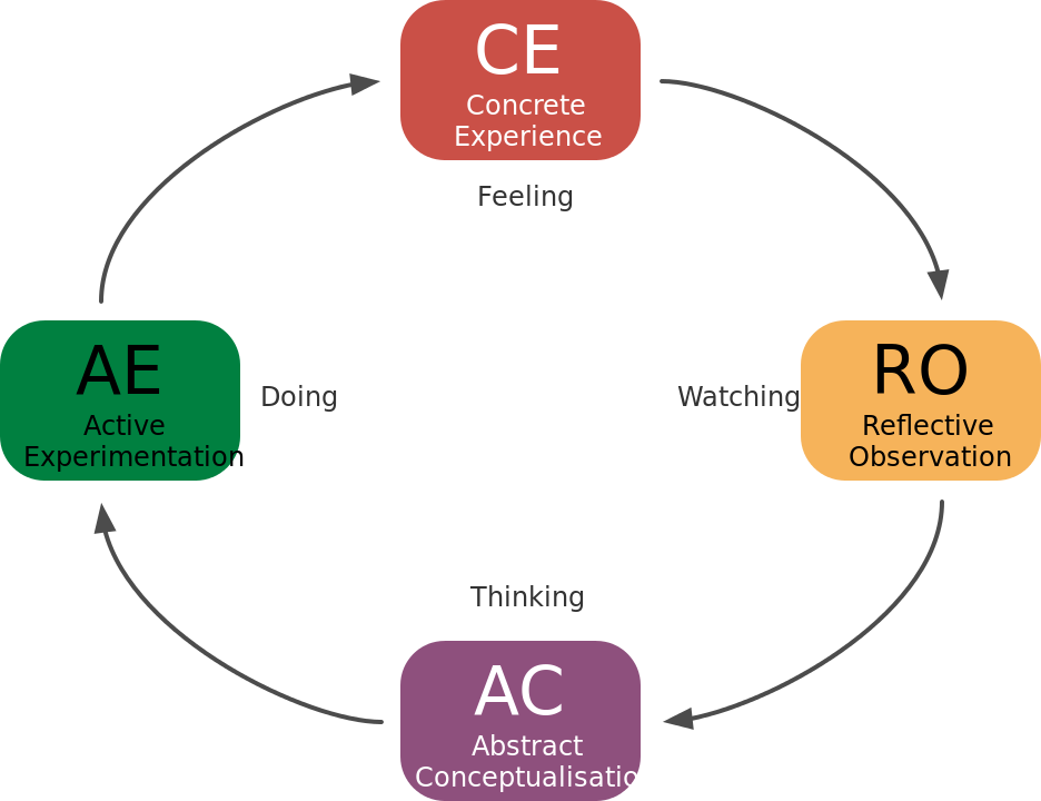