This month brings the new and improved QM Higher Education Rubric, Seventh Edition! To see the detailed changes, you can order the new rubric or take the Rubric Update Session, which is a self-paced workshop that will be required for all QM role holders. In the meantime, if you’d like a short summary of the revisions, continue reading below.

The main changes include:

  • The number of Specific Review Standards has increased from 42 to 44.
  • The points value scheme was also slightly revised, with the total now being 101.
  • A few terminology updates were implemented.
  • The descriptions and annotations for some of the general and specific standards were revised.
  • The instructions were expanded and clarified, with new additions for synchronous and continuous education courses.

Most of the standards (general or specific) have undergone changes consisting of revised wording, additional special instructions, and/or new examples to make the standards clearer and emphasize the design of inclusive and welcoming courses. In addition, some standards have received more substantial revisions – here are the ones that I found the most significant:

Standard 3: There is a new Specific Standard: SRS 3.6: “The assessments provide guidance to the learner about how to uphold academic integrity.” This standard is met if “the course assessments incorporate or reflect how the institution’s academic integrity policies and standards are relevant to those assessments.” SRS 3.6 is the main addition to the 7th edition, and a very welcome one, especially considering the new complexities of academic integrity policies.

Standard 4: SRS 4.5 (“A variety of instructional materials is used in the course.”) has received an important annotation revision – this standard is met if at least one out of three of the following types of variety are present in the course: variety of type of media; different perspectives/representations of ideas; diverse, non-stereotypical representations of persons or demographic groups. I was really happy to see this clarification, since it’s always been a little difficult to evaluate what constitutes “variety”, and reviewers will certainly appreciate the recognition of diversity of people and ideas.

Standard 8: SRS 8.3 was divided into two separate Specific Standards: SRS 8.3 “Text in the course is accessible.” and SRS 8.4 “Images in the course are accessible.” At the same time 8.5 (former 8.4) was turned into “Video and audio content in the course is accessible.” This should allow for a more nuanced evaluation of the various accessibility elements, and it is nice to see the focus on captions for both video and audio materials. Moreover, these three standards (SRS 8.3, 8.4, and 8.5) now include publisher-created content – this is an important step forward in terms of advocating for all educational materials to be made accessible upfront.

In addition to the standards themselves, some changes were made to the Course Format Chart, the Course Worksheet, and the Glossary. Notably, a course/alignment map is now required with the Course Worksheet – a change that is sure to spark delight among QM reviewers. The definitions of activities and assessments were also revised to clarify the distinction between the two – another much-needed modification that should eliminate a common point of confusion.

Overall, the new edition brings about clearer instructions, more relevant examples, and a deeper inclusion of diversity, accessibility, and academic integrity. Reviewers and course designers should find it easier to evaluate or create high quality courses with this updated guidance.

As educators and instructional designers, one of our tasks is to create online learning environments that students can comfortably use to complete their course activities effectively. These platforms need to be designed in such a way as to minimize extraneous cognitive load and maximize generative processing: that is, making sure that the learners’ efforts are spent on understanding and applying the instructional material and not on figuring out how to use the website or app. Research and practice in User Experience (UX) design – more specifically, usability – can give us insights that we can apply to improve our course page design and organization.

Getting Started: General Recommendations

Steve Krug, in his classic book Don’t Make Me Think: A Common Sense Approach to Web Usability, explains that, in order for a website or app to be easy to use, the essential principle can be stated as “don’t make me think” (Krug, 2014). That may sound like a strange principle in an educational context, but what Krug referred to is precisely the need to avoid wasting the users’ cognitive resources on how a particular platform works (thus reducing extraneous cognitive load), and to make them feel comfortable using that product (enhancing generative processing). When looking at a web page or app, it should be, as much as possible, obvious what information is on there, how it is organized, what can be clicked on, or where to start; this way, the user can focus on the task at hand.

Krug (2014) provided a few guidelines for ensuring that the users effortlessly see and understand what we want them to:

  • Use conventions: Using standardized patterns makes it easier to see them quickly and to know what to do. Thus, in online courses, it helps to have consistency in how the pages are designed and organized: consider using a template and having standard conventions within a program or institution.
  • Create effective visual hierarchies: The visual cues should represent the actual relationships between the things on the page. For instance, the more important elements are larger, and the connected parts are grouped together on the page or designed in the same style. This saves the user effort in the selection and organization processes in the working memory.
  • Separate the content into clearly defined areas: If the content is divided into areas, each with a specific purpose, the page is easier to parse, and the user can quickly select the parts that are the most relevant to them.
  • Make it obvious what is clickable: Figuring out the next thing to click is one of the main things that users do in a digital environment; hence, the designer must make this a painless process. This can be done through shape, location or formatting—for example, buttons can help emphasize important linked content.
  • Eliminate distractions: Too much complexity on a page can be frustrating and impinges on the users’ ability to perform their tasks effectively. Thus, we need to avoid having too many things that are “clamoring for your attention” (Krug, 2014, Chapter 3). This is consistent with the coherence principle of multimedia learning, which states that elements that do not support the learning goal should be kept to a minimum and that clutter should be avoided. Related to this, usability experts recommend avoiding repeating a link on the same page because of potential cognitive overload. This article from the Nielsen Norman Group explains why duplicate links are a bad idea, and when they might be appropriate.
  • Format text to support scanning: Users often need to scan pages to find what they want. We can do a few things towards this goal: include well-written headings, with clear formatting differences between the different levels and appropriate positioning close to the text they head; make the paragraphs short; use bulleted lists; and highlight key terms.

Putting It to the Test: A UX Study in Higher Education

The online learning field has yet to give much attention to UX testing. However, a team from Penn State has recently published a book chapter describing a think-aloud study with online learners at their institution (Gregg et al., 2020). Here is a brief description of their findings and implications for design:

  • Avoid naming ambiguities – keep wording clear and consistent, and use identical terms for an item throughout the course (e.g., “L07”, “Lesson07)
  • Minimize multiple interfaces – avoid adding another tool/platform if it does not bring significant benefits.
  • Design within the conventions of the LMS – for example, avoid using both “units” and “lessons” in a course; stick to the LMS structure and naming conventions as much as possible.
  • Group related information together – for example, instead of having pieces of project information in different places, put them all on one page and link to that when needed.
  • Consider consistent design standards throughout the University – different departments may have their own way of doing things, but it is best to have some standards across all classes.

Are you interested in conducting UX testing with your students? Good news: Gregg et al. (2020) also reflected on their process and generated advice for conducting such testing, which is included in their chapter and related papers. You can always start small! As Krug (2014, Chapter 9) noted, “Testing one user is 100 percent better than testing none. Testing always works, and even the worst test with the wrong user will show you important things you can do to improve your site”.

References

Gregg, A., Reid, R., Aldemir, T., Gray, J., Frederick, M., & Garbrick, A. (2020). Think-Aloud Observations to Improve Online Course Design: A Case Example and “How-to” Guide. In M. Schmidt, A. A. Tawfik, I. Jahnke, & Y. Earnshaw (Eds.), Learner and User Experience Research: An Introduction for the Field of Learning Design & Technology. EdTech Books. https://edtechbooks.org/ux/15_think_aloud_obser

Krug, S. (2014). Don’t make me think, revisited: A common sense approach to Web usability. New Riders, Peachpit, Pearson Education.

Loranger, H. (2016). The same link twice on the same page: Do duplicates help or hurt? Nielsen Norman Group. https://www.nngroup.com/articles/duplicate-links/

Learning outcomes (LOs) are used in instructional design to describe the skills and knowledge that students should have at the end of a course or learning unit, and to design assessments and activities that support these goals. It is widely agreed that specific, measurable outcomes are essential for planning instruction; however, some educators question the benefits of explicitly presenting them to students. I have been asked (and wondered myself): “What is the point of listing learning outcomes in the course?” “How do they help learning? “Do students even read them?”

So, I went on a quest for research that attempted to answer such questions. I was particularly interested in unit/module-level outcomes, as those are the ones that directly steer the content, and students see them throughout the course. Here’s a brief summary of what I found.

Note: the studies use the terms “learning outcome”, “learning objective”, or “learning goal” – they all refer to the same concept: a specific and measurable description of the skills and knowledge that students are expected to have at the end of a learning unit/period of study. At OSU we use the term “outcomes”.

What Does the Research Say?

Armbruster et al. (2009) redesigned an Introductory Biology course at Georgetown University, Washington, DC, using active learning and student-centered pedagogies, leading to increased student performance and satisfaction. One of the strategies used was to include explicit learning goals in the lecture slides, and labeling exam and quiz questions with the related goals. Students’ attitudes towards the course were assessed via a questionnaire and comparison of university-administered student evaluations. Students were asked to rank lecture components in terms of helpfulness to learning, and the authors found that one of the highest-ranking elements was the inclusion of explicit learning goals.

Simon and Taylor (2009) surveyed 597 students from computer science and microbiology and immunology courses at the University of British Columbia, where instructors presented learning goals at the beginning of each lecture or topic area. The questions were open and the answers coded into a number of categories, which helped them identify several values of goals. The main value was “knowing what I need to know”: students reported that the goals showed them how to focus their efforts and felt that the goals “allowed them to organize the information more effectively and be more expertlike in their approach to the class” (Simon & Taylor, 2009, p.55). The authors did not find any difference between presenting the goals before each lecture versus at the beginning of the unit/topic area.

Brooks et al. (2014) examined students’ views of learning outcomes at the University of Leicester, UK. First, they surveyed 918 students taking Biological Sciences, English and Medicine courses. They found that 81% of participants agreed or strongly agreed that learning outcomes are useful learning aids. Additionally, 46% found LOs more useful as their courses progressed, and 49% reported that they engaged more with the LOs as the course progressed. The authors also investigated when LOs are most useful, and found that the most common answer (46%) was when reviewing the material. Moreover, 49% of students reported that LOs can only be fully understood at the end of a module. The researchers followed up on these results with a focus group, which confirmed that students use LOs in various ways and at various points during the course.

Osueke et al. (2018) looked into students’ use and perceptions of learning objectives at University of Georgia. 185 students in an undergraduate Introduction to Biochemistry and Molecular Biology course took part in the study. The instructors included instructions in the syllabus, which they also stated on the first day of class: “Focus on the learning objectives. The exams will assess your accomplishment of the learning objectives. Use the learning objectives as a guide for what to focus on when you are completing assignments and studying for exams.” Students completed two assignments requiring them to explain their use of the LOs. The researchers found that many students (33.8%) reported they had been instructed on how to use LOs to study – these instructions ranged from passively “look over” to using them as a study guide. The ways students used the LOs were: as questions to answer (47.4%), as a resource for studying (24.1%), as a self-assessment tool (14.3%), and passive use (13.5%). When asked why they find the LOs helpful, students said that they help them: narrow down the information (57.1%); organize their studying (23.3%); communicate information (5.3%); monitor their understanding (4.5%); forced them to study (1.5%).

Sana et al. (2020) conducted three experiments aiming to find to what extent presenting the LOs improve retention of information. Participants were asked to read five passages on a neuroscience topic, and then they were tested on comprehension and retention. The experiments took place at McMaster University, Ontario and employed different participants, methods, materials, and procedures. They found that: interpolating LOs throughout the lesson (as opposed to all LOs presented at the beginning) improved learning compared to not including LOs, especially when students’ attention was explicitly directed to them; converting LOs into pretest questions (that students attempted to answer) further enhanced performance; multiple-choice and short answer questions were equally effective; and withholding feedback on pretests was more effective than providing feedback – the explanation proposed by the authors for this last finding was that students may be more motivated to seek the correct answers themselves, which causes further processing of the material.

Barnard et al. (2021) investigated students’ and academics’ perspectives on the purpose of learning objectives and approaches to assessment preparation. They conducted focus groups with participants from an undergraduate Psychology course at the University of Nottingham, UK. The students reported that LOs are useful for guidance, as they “use them to create direction for some of the learning and revision strategies” (Barnard et al., 2021, p. 679).

Conclusions and Recommendations

Good news! The findings of these studies suggest that many students do appreciate clear LOs and use them to guide their learning. The LOs help them understand what they are expected to know – thus, students use them to focus their study, to review for an exam, and to self-check their knowledge.

As instructors and instructional designers, what can we do to help students take full advantage of LOs? Apart from having specific and measurable LOs, make sure that the LOs are well aligned with the activities, and make this alignment explicit. It may also be helpful to offer some guidance on how to use the LOs, for instance by prompting students to recap their learning at the end of a unit based on the LOs. Finally, we could turn the LOs into questions and use them as a pretest.

For more on creating and using LOs, check out the CBE—Life Sciences Education website, which has an informative guide, including a section on student use. 

Do you have any other ideas or resources on how to use learning outcomes to improve students’ experience and study habits? If so, we’d love to hear from you!

References

Armbruster, P., Patel, M., Johnson, E., & Weiss, M. (2009). Active learning and student-centered pedagogy improve student attitudes and performance in Introductory Biology. CBE Life Sciences Education, 8(3), 203–213. https://doi.org/10.1187/cbe.09-03-0025

Barnard, M., Whitt, E., & McDonald, S. (2021). Learning objectives and their effects on learning and assessment preparation: Insights from an undergraduate psychology course. Assessment and Evaluation in Higher Education, 46(5), 673–684. https://doi.org/10.1080/02602938.2020.1822281

Brooks, S., Dobbins, K., Scott, J. J. A., Rawlinson, M., & Norman, R. I. (2014). Learning about learning outcomes: The student perspective. Teaching in Higher Education, 19(6), 721–733. https://doi.org/10.1080/13562517.2014.901964

Osueke, B., Mekonnen, B., & Stanton, J. D. (2018). How undergraduate science students use learning objectives to study. Journal of Microbiology & Biology Education, 19(2). https://doi.org/10.1128/jmbe.v19i2.1510

Sana, F., Forrin, N. D., Sharma, M., Dubljevic, T., Ho, P., Jalil, E., & Kim, J. A. (2020). Optimizing the efficacy of learning objectives through pretests. CBE Life Sciences Education, 19(3), ar43–ar43. https://doi.org/10.1187/cbe.19-11-0257

Simon, B., & Taylor, J. (2009). What is the value of course-specific learning goals? Journal of College Science Teaching, 39(2), 52–57. Retrieved from: https://www.colorado.edu/sei/sites/default/files/attached-files/what_is_the_value_of_course-specific_learning_goals.pdf
One of the major advantages of digital learning is that we can ensure our materials are accessible to all students. As such, at Ecampus, we are striving – and encouraging others to strive – for universal design, that is, design that anyone can use comfortably regardless of any impairments. In past posts, we have covered various ways of improving accessibility in a course, including how to fix PowerPoint or Word files. Today I’d like to focus on making Canvas pages accessible and making use of the on-page Accessibility Checker available in the Canvas Rich Content Editor.

Common Issues

Here are the main things you can do to ensure your Canvas pages (including assignments, discussions etc.) are accessible:

  1. Use proper hierarchy of headings and do not skip heading levels. You want to start with Heading 2 (Heading 1 is the title), then subordinate to that will be Heading 3 and so on. This is especially useful for screen reader users because it helps with logical page navigation. Some people choose their headings by the font size – not a good idea! If you want to adjust the size of your text, use the “Font sizes” option in the editor, after designating the correct heading level.
  2. Add an alt text description to any image or mark it as decorative. This is helpful for screen reader users and people for whom the images are not loading.
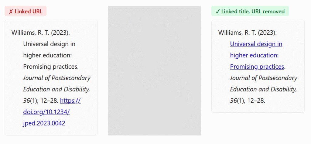
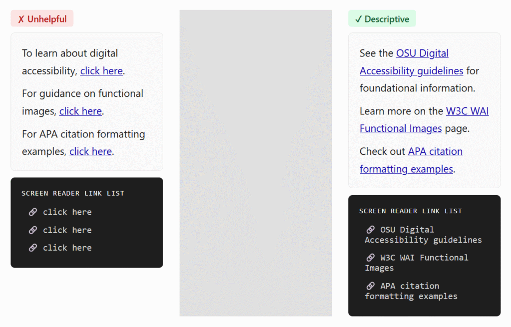
  3. Make the link names descriptive, rather than just pasting the url. For example, you would write Student Resources instead of https://experience.oregonstate.edu/resources. Also, avoid linking “click here” type of text. This helps screen reader users (which would read a url letter by letter), and it also makes it easier for everyone to scan the page and find the needed information.
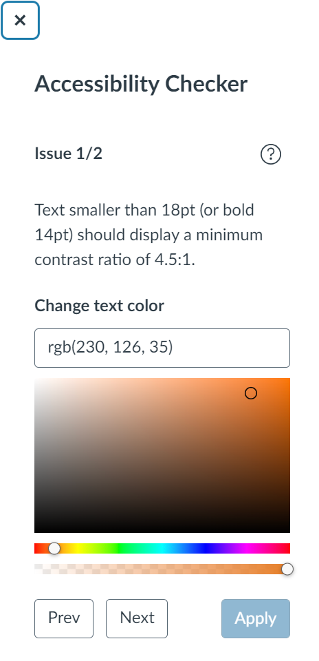
  4. Ensure good color contrast. I often see instructors making their text colorful – in particular, red seems to be very popular. Indeed, a touch of color can make the page more visually pleasing and help bring out headings or important information! The danger lies in using colors that don’t have enough contrast with the background. This is especially problematic for people with less-than-optimal eyesight, but good contrast really just makes it easier for all of us to read. Also, a word of caution: Canvas has recently rolled out dark mode for mobile platforms and many people like to use it. Some colored or highlighted text may not look clear in dark mode.
  5. Add caption and header row to tables. These are extremely helpful for screen reader users, and the caption helps everyone to quickly see what the table is about. To add these things, you actually have to rely on the on-page accessibility checker – it will flag the issues and walk you through fixing them. While we’re on the subject of tables, you also want to avoid complex tables with merged cells because they are hard to navigate for a screen reader.
  6. Avoid underlining text. Underlining is normally reserved for links. Try using other means of highlighting information, such as bold, italics or caps.

Find and Fix

Canvas has a very useful tool that can help you find some accessibility issues as you edit your page. At the bottom of the editor, the icon representing a human in a circle will show notification when something is amiss.

Screenshot of bottom of editor showing the accessibility checker icon

When you click on that icon, the checker will open on the right-hand side, explaining each issue and allowing you to fix it right there.

Screenshot of the accessibility checker dialog window

This tool can find:

  • Skipped heading levels/starting with the wrong heading
  • Missing alt text
  • Insufficient color contrast – you can find a suitable color right here
  • Missing table caption and header row

It will NOT flag poorly formatted links or underlined text. So, for these issues, you’ll have to watch out yourself!

For a full list of problems verified by this checker, see this article from Canvas Community.

When you’ve finished building your course, you can also use UDOIT, the global accessibility checker, or Ally, if your institution has installed it. These tools can help you find additional problems, including embedded materials with accessibility issues.

To conclude, following these simple rules can greatly enhance the usability of your Canvas course. The built-in accessibility checker will help you spot and fix some common issues. Once you start paying attention, building instructional content with accessibility in mind will become second nature!

In this post I’m returning to an important topic: accessibility. In a previous blog my colleague Susan Fein explained how everyone benefits from more accessible materials and that a large number of our students have some degree of disability.

Word documents are ubiquitous in our courses, as well as for other work-related activities. If a Word document is designed for digital consumption – such as posting in the Learning Management System or on a website – it needs to comply with accessibility standards. Fortunately, Word includes excellent tools for making your file accessible! I will first go over the main accessibility features, and then show you how to implement them in the video below.

  • Accessibility checker: Word includes a tool that helps you check your work. It is useful but it doesn’t catch all the errors.
  • Structure: headings, spacing, lists: Marking these properly will let screen reader users skim the content and understand its organization easily. Structure a document in a hierarchical manner: the title should be Heading 1 (NOT the “Title” style – that one just gets read as simple text). The next major sections should be Heading 2, subsections of a Heading 2 are Heading 3, and so on. Do not skip levels. You can change the appearance of all these styles to match your aesthetic. If you wish, you can also save style sets to have them ready to use.
  • Images: There are two main things to take care of here: adding alt text (so screen reader users can listen to the description) and making sure that the image is in line with the text (to keep the reading order clear).
  • Colors: If you use colors, make sure there is enough contrast between text and background.  Even people with good eyesight can struggle to read something if the contrast is not strong. In addition, remember that many people are color blind, so do not rely on color to convey essential information. For example, avoid something like “The readings in blue are very important, make sure you read them carefully! The optional resources are in green”. Use other means of signaling instead, such as bold or italics.
  • Links: Links need to include meaningful text rather than the URL. A screen reader will read the URL one letter at a time, which is not very helpful. In addition, descriptive links help both screen reader users and sighted users skim the document to get an idea of the content or find specific information.
  • Tables: Tables can cause trouble to screen reader users – do not use them for layout! Only use them for actual tabulated information. When you use tables, the main rule is to keep them simple and avoid split cells, merged cells and nested tables. Then, make sure you have a designated header row, which helps screen reader users navigate the data.
  • Document properties: The document needs to have a title set in its properties. This title is helpful for blind users because the screen reader announces it as the document is loaded in the program.

Save to PDF – yay or nay? Avoid turning your document into a PDF file, if the document is meant for online reading. PDFs are hard to make accessible. If you must make a PDF, start with a fully accessible Word file. It is recommended to use PDFs only when the design includes complex or unusual elements (for example special/technical fonts, musical notes etc.). If you are using a PDF because you have a complex layout, consider posting both the PDF and a simplified Word file, in case someone needs the fully accessible version.

Watch this 10-minute video that walks you through an example of making a document accessible. I’m using Microsoft 365 on Windows – if you’re using another version of Word or platform, things may look slightly different. Timestamps:

  • Accessibility checker – 00:38
  • Headings – 01:46
  • Lists – 04:56
  • Spacing – 05:27
  • Images – 06:16
  • Colors – 07:29
  • Links – 08:09
  • Tables – 08:49
  • Title Property – 09:33

As you can see, the process of creating accessible Word documents is straightforward. Turning this into a standard practice will greatly help people who access information electronically, with or without assistive devices. Let’s make it happen!

References:

Copyright, Creative Commons, Public Domain, Fair Use… what are they and how to use them correctly? You might be a course creator in need of images to use in your materials. Or you could be an author wondering how best to share your work. This post features a brief interactive lesson on these concepts, along with recommended resources that you can explore to learn more.

You can navigate the lesson by answering the prompts or by using the menu. Click on the image below to get started!

The Educator's Guide to Copyright - Begin

Do you have any other resources that you found particularly helpful? Share them with us!

Instructors and course designers often use quizzes or forms for assessment, retrieval practice, self-checks, or collecting information from students. Did you know that Qualtrics surveys can take your interaction game to an even higher level of sophistication?

Qualtrics surveys can easily be linked to or embedded in a page in your Learning Management System. They can also be added as an assignment through the LTI integration.

The LTI integration has recently become an available feature for Oregon State University Canvas users. The integration links the survey to the student’s LMS account and is useful for awarding points automatically for completing the survey. In addition, several types of questions can be scored; thus, a survey can be used as a quiz and the integration tool will send the points to the gradebook.

If your LMS doesn’t have a Qualtrics LTI integration, or you don’t want to go through all the steps of setting it up, you can still use Qualtrics activities, but you will have to add any points manually in your gradebook.

Ideas for Qualtrics activities

Here are a few ways to use a Qualtrics survey:

  1. Self-check activity / formative assessment / quiz: design a survey to increase active learning or assess content. Qualtrics can be your tool of choice because:
    • It’s more versatile than a quiz or Google form (e.g. more types of questions, complex branching possible based on answer).
    • It can be customized with different colors, fonts, and backgrounds.
    • The instructor can access student answers and use this information to provide individualized support or improve course materials.
  2. Class pulse: Send a survey during the term to ask students how they are doing.
  3. Suggestion box: Have a permanent page in your course where students can submit suggestions.
  4. Voting ballot / poll: Create a survey to allow students to vote on a topic, favorite presentation, meeting time, etc. or to answer a poll.
  5. Topic selection tool: Provide an easy way for students to claim their topic through a survey that eliminates an option once it’s chosen.
  6. Muddiest point survey: Gather students’ input on the week’s materials: which concepts were unclear? Which information was particularly compelling?
  7. Team member evaluation: In group work, it can be a good idea to have students evaluate their team members, to increase accountability and make sure that everyone is pulling their weight. You can create a survey asking students to rate their peers on specific criteria and provide comments on performance.

How to create a survey

Creating a survey in Qualtrics is very straightforward. Log into your account and create a new project. You can choose from a variety of question types, including multiple choice, ranking, slider, matrix, etc. Make sure to check which questions are accessible to screen-reading programs. If you’d like to track or manage the time a student spends on a page, you can use a timing question.

For Oregon State University users, the default look is the OSU theme. Through the Look and Feel menu section, you can choose a different theme or customize the layout, style, background, colors and text size to fit your needs and your course aesthetic.

How to link a survey

Linking to a survey is the easiest way to include it in your course. In your survey, go to Distributions and choose the Anonymous link. If you need the student’s identification information, make sure to add a question asking for their name or email.

How to embed a survey

Embedding a survey instead of linking it can make for a smoother learning experience by integrating the questions with other learning material on that page. To embed a survey on a page, use a simple iframe like this: <iframe src=”insert survey link here” width=”1000px” height=”500px”></iframe> and adjust the dimensions or style it as desired.

How to integrate a survey via LTI

Integrating via LTI is a bit more complex and will depend on your LMS and your organization’s settings. For Oregon State University users, instructions are provided in this article: Use Qualtrics in Canvas.

Conclusion

Qualtrics is a useful tool for adding more interactivity into your course. Setting up the surveys can be very simple or more involved depending on the task. Watch out for future posts in which we will give examples and details on how to design and create some of the more complex types of Qualtrics activities.

This post was written in collaboration by Deborah Mundorff and Dana Simionescu.

Memory plays the central role in learning – it is “the mechanism by which our teaching literally changes students’ minds and brains” (Miller, 2014, p. 88). Thus, understanding how memory works is important for both instructional designers and instructors. According to modern theories, memory involves three major processes: encoding (transforming information into memory representations), storage (the maintenance of these representations for a long time), and retrieval (the process of accessing the stored representations when we need them for some goal or task) (Miller, 2014). Let’s briefly review these processes and see how they may inform our course design and instruction.

Encoding – What Is the Role of Attention and Working Memory?

How does encoding happen? We receive information from our senses (visual, auditory, etc.), and then we perform a preconscious analysis to check whether it is important to survival and if it is related to our current goals. If it is, this information is retained and will be further processed and turned into mental representations. Thus, attention is the major process through which information enters our consciousness (MacKay, 1987). Attention is limited, and it is to some extent under voluntary control, but it can be easily disrupted by strong stimuli. Attention is crucial for memory, and without attention we cannot remember much (Miller, 2014).

How attention is directed depends on the way the content is presented and on the nature of the content itself (Richey et al., 2011). If the content is intrinsically motivating for the student, it will catch their attention more readily. But beyond that, the manner we design our instructional materials can influence how learners focus their attention to select and process the information, and in turn on what and how much gets stored in their memory. For example, we can ensure that students are guided to the most relevant content first by making that content more visually salient. Or we can tell an engaging story to focus their attention to the concepts that come next.

Baddeley and Hitch's multicomponent model of working memory (1974).
Baddeley and Hitch’s multicomponent model of working memory (1974)

Working memory is a concept introduced in the 1970s by Alan Baddeley. This model describes immediate memory as a system of subcomponents, each of them processing specialized information such as sounds and visual-spatial information. This system also performs operations on this information and are managed by a mechanism called the central executive. The central executive combines the information from the various subcomponents, draws on information stored in long-term memory, and integrates new information with the old one (Baddeley, 1986).

Some researchers consider attention and working memory to be the same thing; while not everyone agrees, it is clear that they are highly interconnected and overlapping processes (Cowan, 2011; Engle, 2002). Attention is the process that decides what information stays in working memory and keeps it available for the current task. It is also involved in coordinating the working memory components and allocating resources based on needs and goals (Miller, 2014).

The capacity of each of the working memory components is limited. However, these components are mostly independent: visual information will interfere with other visual information, but not much with another type such as verbal information (Baddeley, 1986). Therefore, the most effective instructional materials will include a combination of media, such as images and text (or better yet, audio narration), rather than just images or just text.

Graphic by Cheese360 at English Wikipedia is licensed under CC BY-SA 3.0

Storage – How Fast Do We Forget?

Ebbinghaus's forgetting curve (1885) - the graph shows the percentage of words recalled declining sharply after one day and then more slowly
Ebbinghaus’s forgetting curve (1885)

In the late 1800s, Hermann Ebbinghaus conducted his famous series of experiments on the shape of forgetting. The result was the forgetting curve (also called the retention curve), which is a function showing that the majority of forgetting takes place soon after learning, after which less information will be lost (Ebbinghaus, 1885). A recent review of studies on the retention curve concluded that the rate of forgetting may increase up to seven days, and slows down afterwards (Fisher & Radvansky, 2018). This interval is useful to consider when planning instruction. A well-designed course will include sufficient opportunities for practice and retrieval during this time, so as to minimize the forgetting that naturally occurs.

Graphic from MIT OpenCourseWare is licensed under CC BY-NC-SA 4.0

Retrieval – How Do We Get It Out of Our Heads and Use It?

While long-term memory is considered unlimited, retrieval (or recall) can be challenging. Its success depends on a few factors. To retrieve memory representations, we use cues—information that serves as a starting point. Since a memory can include different sensory aspects, information with rich sensory associations is usually remembered more easily (Miller, 2014). Visual and spatial cues are particularly powerful: memory athletes perform some mind-blowing feats by using a special technique called “the memory palace”—imagining a familiar building or town and placing all content inside it in visual form (to learn more about this technique, check out this TED talk by science writer Joshua Foer).

Recall is also influenced by how the information was first processed: deep processing (focusing on meaning) will yield superior retrieval performance compared to shallow processing (focusing on superficial features like some key words or the layout of the information). However, equally important is a match between the type of processing that happens during encoding and the one that happens during retrieval (Miller, 2014). For instance, if the final exam contains multiple-choice questions, learners will perform better if they also practiced with multiple-choice questions when they learn the content. Finally, emotions have been shown to boost memory (Kensinger, 2009), and even negative emotions (such as fear or anger) can have a strong effect on recall (Porter & Peace, 2007).

Conclusion – Implications for Instruction

What can we do to maximize our students’ memory potential? Based on these memory characteristics, here are a few strategies that can help:

  1. Make use of graphic design and multimedia learning principles to create attention-grabbing, well-organized instructional materials that include a combination of media.
  2. Include plenty of retrieval practice activities, such as polling during lectures, quizzes, or flashcards. The website Retrieval Practice is a fantastic resource for quick tips, detailed guides, and research. Top things to keep in mind:
    • Boost retrieval practice through spacing (spreading sessions over time) and interleaving (mixing up related topics during a practice session).
    • Make sure you plan some sessions for the critical seven-day period after introducing the material.
  3. Consider teaching students the memory palace technique for content that requires heavy memorization.
  4. Support every type of content visually where possible.
  5. Encourage deep processing of the material, for example through reflections, problem-solving, or creative activities.
  6. Ensure that students have opportunities to engage with the material during learning in the same way as they will during the exam.
  7. Try to stimulate emotions in relation to the content. While negative affect can help (for example, recounting a sad story to illustrate a concept), it is probably best to focus on positive emotions through exciting news, inspiring anecdotes, and even more “extrinsic” factors such as humor, uplifting music, or attractive visual design.

Using these strategies will help you create learning experiences where students encode, store, and retrieve information efficiently, allowing them to use it effectively in their lives, studies, and work. Do you have any related experience or tips? If so, share in a comment!

References

Baddeley, A. D. (1986). Working memory. Oxford University Press.

Cowan, N. (2011). The focus of attention as observed in visual working memory tasks: Making sense of competing claims. Neuropsychologia, 49(6), 1401–1406. https://doi.org/10.1016/j.neuropsychologia.2011.01.035

Ebbinghaus, H. (1885). Memory: A contribution to experimental psychology.

Engle, R. W. (2002). Working memory capacity as executive attention. Current Directions in Psychological Science, 11(1), 19–23. https://doi.org/10.1111/1467-8721.00160

Fisher, J. S., & Radvansky, G. A. (2018). Patterns of forgetting. Journal of Memory and Language, 102, 130–141. https://doi.org/10.1016/j.jml.2018.05.008

Kensinger, E. A. (2009). How emotion affects older adults’ memories for event details. Memory, 17(2), 208–219. https://doi.org/10.1080/09658210802221425

MacKay, D. G. (1987). The organization of perception and action: A theory for language and other cognitive skills. Springer New York. http://dx.doi.org/10.1007/978-1-4612-4754-8

Miller, M. D. (2014). Minds online: Teaching effectively with technology. Harvard University Press.

Porter, S., & Peace, K. A. (2007). The scars of memory. Psychological Science, 18(5), 435–441. https://doi.org/10.1111/j.1467-9280.2007.01918.x

Richey, R., Klein, J. D., & Tracey, M. W. (2011). The instructional design knowledge base: Theory, research, and practice. Routledge.