The golden rule of link accessibility: links should be descriptive! For foundational information on the why and the how, see OSU Digital Accessibility – Links.) Let’s dig deeper into a few common questions:
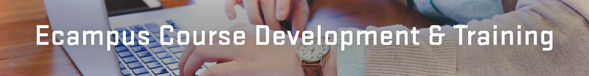
Can I use “click here” or “this” for my link text?
This practice is not ideal, and it’s best to avoid it. While WCAG does permit it when surrounding context provides enough information, you would not be creating a good experience for your audience. That type of text is not descriptive enough to show the user where the link will go, and it’s especially problematic if this text appears multiple times! Think of people skimming the content – whether visually or via assistive technologies. It’s much more helpful when the text clearly conveys the link’s function or destination. See an example below.
Can I link an image?
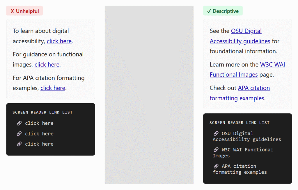
Yes, you can use an image directly as a link or button. But! If the image serves as a link on its own, make sure to write alt text that describes the action initiated by the link. The example image below is linked to an interactive lesson about cat behavior. Therefore, you would use the alt text “Cat Behavior Interactive Lesson”, NOT describe the image. See more explanations and examples on the W3C WAI Functional Images page.
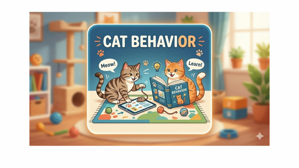
Proper citations include URLs. How do we make those accessible?
Citation styles may be strict, but they do allow some flexibility for online-only resources and materials outside of formal papers. The recommended practice is to link the work title and ditch the DOI or URL, like in the example below. Check out more examples and explanations for APA and for MLA.
Is it ok to repeat a link multiple times on a page?
Canvas is flagging some links that don’t seem to exist!
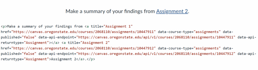
You may have noticed, on occasion, “ghost links” in Canvas. The link validator or accessibility checker says there’s a broken or duplicate link, but when you look at the text, there’s nothing there. However, if you switch to the HTML editor, you’ll find the link lurking underneath. In the example below, you can see that there are actually two links instead of one: the Assignment 1 link was not completely deleted when I replaced it with Assignment 2.
What happens is that sometimes, if you delete text without unlinking first, the link may persist. To avoid this situation, make sure to remove the links before deleting or pasting in text.
BONUS link-related tip: Don’t underline regular text
Usually, links are underlined, and most people think of links when they see underlined text. This may be confusing when they try to access the link and it doesn’t work. In addition, underlining is just not a good way of highlighting information. For more information, see an article and video from Boise State University: Underlined text.
These practices make your course more readable, easy to navigate, and overall, more enjoyable for your students!
Accessibility is a hot topic these days, and alt text is one of its most significant building blocks. There are many comprehensive resources and tutorials out there, so I won’t get into what alt text is or how to write it (if you need an intro, start here: OSU Digital Accessibility – Alternative Text for Images). In this post, I’ll address a few issues where guidance is less clear-cut and that have come up in my conversations with instructors.
Does alt text have a character limit?
You’ve done the work and written a detailed alt text that you’re proud of. You hit “done” and, much to your frustration, the Canvas editor is flagging your image and saying: “Alt attribute text should not contain more than 120 characters.” What’s going on here? Is there really a limit, and why is it so?
Well, this is one of those things where you’ll find lots of conflicting information. Some people say that assistive devices only read the first 140 characters; others, the first 150; yet others argue there are no such limits with modern tech. See this article: 100, 150, or 200? Debunking the Alt text character limit, which has more info and references, including a nod to NASA’s famous alt text for the James Webb telescope images.
One thing is clear though: alt text should be short and sweet, to make it easy on the users. Keep the purpose in mind and address it as succinctly as you can. However, if your carefully written alt text still exceeds Canvas’s limit of 120 characters, don’t fret – that constraint is probably too restrictive anyway. But if the image is complex and needs a much longer description, use a different method (see more options below).
How should I use a long description?
When you have an image that contains a lot of information, such as a graph or a map, you need both alt text and a long description. The alt text is short (e.g., “Graph of employment trends 2025”), while the long description is detailed (e.g., it would describe the axes and bars, numbers etc.). The W3C Web Accessibility Initiative (WAI) – Complex Images Tutorial explains a few ways you can add a long description. The most common ones (and that I would recommend) are:
Put the long description on a separate page or in a file and add a link to it next to the image.
Put the long description on the same page in the text (under a special heading or simply in the main content) and include its location in the alt text (e.g., “Graph of employment trends 2025. Described under the heading Employment Trends”.)
The advantage of these methods is that everyone, not just people using assistive technologies, can access them. The description can benefit people with other disabilities or those who simply need more help understanding complex graphics.
But wait, what about image captions? Do they duplicate alt text?
Image captions can be used in various ways: as a short title for the picture, as related commentary, or as a full explanation (see an example of alt text vs. caption). In any case, avoid duplicating content between the caption and the alt text. If the caption doesn’t include a sufficient description, make sure you have that in the alt text. Alternatively, you can keep the alt text very short and use the caption for a longer description that everyone can read (I wouldn’t recommend very long ones, though – those may be better placed elsewhere, as described above).
For web pages, it’s best to add the caption using the <figcaption> element. This ensures that your caption is semantically linked to its image. If you like editing the HTML in your LMS, check out the W3Schools tutorial on the HTML <figcaption> Tag.
Should the alt text describe people’s gender, race, age etc.?
It really depends on what you are trying to convey and how much you know about the individuals in the image. Are those details significant? If yes, you should include them. Are you making any assumptions? Make sure not to project your own ideas about who the person is. This guide from University of Colorado Boulder: Identity and Inclusion in Alt Text is a great resource to refer to when faced with these decisions.
It’s 2026! Can’t I just get AI to write the alt text?
You’re right that AI tools can be a great help in writing alt text or long descriptions! We often recommend ASU’s Image Accessibility Creator. But, as you’re aware, LLMs are not always correct. Moreover, they don’t know what exactly you want your students to get from that image (well, you could tell them, but that may be as much effort as writing the alt text yourself…). Make sure you always check the output for accuracy and revise it to fit your purpose and context.
This post was written in collaboration with Mary Ellen Dello Stritto, Director of Ecampus Research Unit.
Quality Matters standards are supported by extensive research on effective learning. Oregon State University’s own Ecampus Essentials build upon these standards, incorporating OSU-specific quality criteria for ongoing course development. But what do students themselves think about the elements that constitute a well-designed online course?
The Study
The Ecampus Research Unit took part in a national research study with Penn State and Boise State universities that sought student insight into what elements of design and course management contribute to quality in an online course. Data was collected from 6 universities across the US including Oregon State in Fall of 2024. Students who chose to participate completed a 73-item online survey that asked about course design elements from the updated version of the Quality Matters Rubric. Students responded to each question with the following scale: 0=Not important, 1=Important, 2=Very Important, 3=Essential. A total of 124 students completed survey, including 15 OSU Ecampus students. The findings reveal a remarkable alignment between research-based best practices and student preferences, validating the approach taken in OSU’s Ecampus Essentials.
See the findings in data visualization form below, followed by a detailed description.
What Students Consider Most Important
Students clearly value practical, research-backed features that make online courses easier to navigate, more accessible, and more supportive of learning. The following items received the most ratings of “Essential” + “Very Important”:
QM Standards and Study Findings
Related Ecampus Essentials
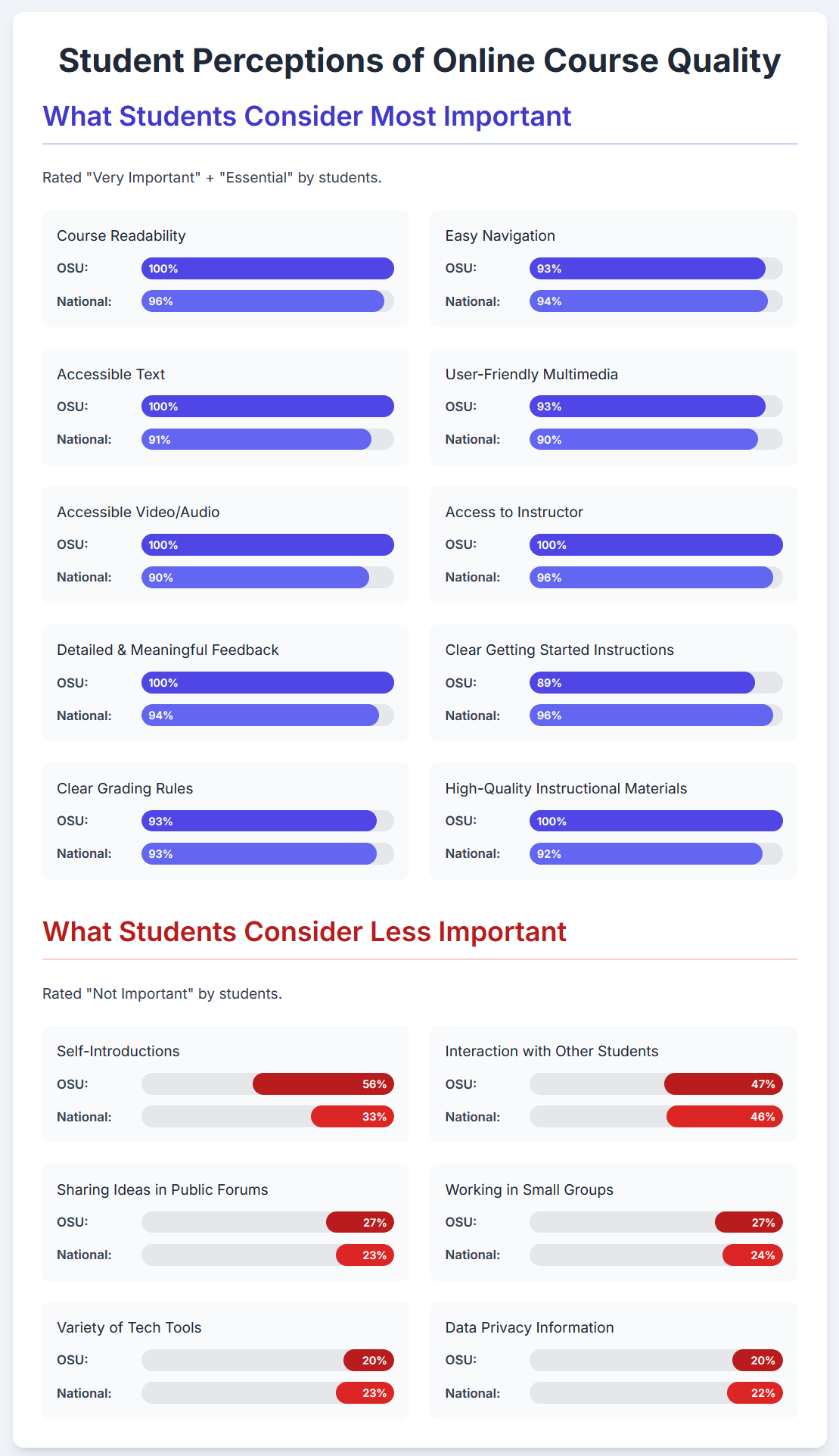
Accessibility and Usability (QM Standards 8.2, 8.3, 8.4, 8.5, 8.6): Every OSU student rated course readability and accessible text as “Very Important” or “Essential” (100%). Nationally, this was also a top priority (96% and 91%, respectively). Accessibility of multimedia—like captions and user-friendly video/audio—was also highly rated (100% OSU, 90% nationally).
Text in the course site is accessible. Images in the course are accessible (e.g., alt text or long description for images). The course design facilitates readability. All video content is accurately captioned.
Clear Navigation and Getting Started (QM Standards 1.1, 8.1): 93% of OSU students and 94% of the national sample rated easy navigation highly, while 89% of OSU students and 96% nationally said clear instructions for how to get started and where to find things were essential.
Course is structured into intuitive sections (weeks, units, etc.) with all materials for each section housed within that section (e.g., one page with that week’s learning materials rather than a long list of files in the module). Course is organized with student-centered navigation, and it is clear to students how to get started in the course.
Meaningful Feedback and Instructor Presence (QM Standards 3.5, 5.3): Students placed high importance on receiving detailed feedback that connects directly to course content (100% OSU, 94% nationally). The ability to ask questions of instructors was also essential (100% OSU, 96% nationally).
Assessments are sequenced in a way to give students an opportunity to build knowledge and learn from instructor feedback. The instructor’s plan for regular interaction with students in substantive ways during the course is clearly articulated. Information about student support specific to the course (e.g., links to the Writing Center in a writing course, information about TA open office hours, etc.) is provided.
Clear Grading Criteria (QM Standards 3.2, 3.3): 93% of OSU students and the full sample found clear, detailed grading rules to be essential.
Specific and descriptive grading information for each assessment is provided (e.g., detailed grading criteria and/or rubrics).
Instructional Materials (QM Standard 4.1): All OSU students and 92% nationally rated high-quality materials that support learning outcomes as very important or essential.
Instructional materials align with the course and weekly outcomes. A variety of instructional materials are used to appeal to many learning preferences (readings, audio, visual, multimedia, etc.). When pre-recorded lectures are utilized, content is brief and integrated into course learning activities, such as with interactive components, discussion questions, or quiz questions. Longer lectures should be shortened to less than 20 min. chunks.
What Students Consider Less Important
The study also revealed areas where students expressed less enthusiasm:
Study Findings
Related Ecampus Essentials
Self-Introductions (QM Standard 1.9): Over half of OSU students (56%) and a third nationally (33%) rated opportunities to introduce themselves as “Not Important”.
No specific EE
Peer Interaction (QM Standard 5.2): Students were lukewarm about peer-to-peer learning activities. Nearly half said that working in small groups is not important (47% OSU, 46% nationally). About a quarter didn’t value sharing ideas in public forums (27% OSU, 24% nationally) or having learning activities that encourage them to interact with other students (27% OSU, 23% nationally).
Three forms of interaction are present, in some form, in the course (student/content, student/instructor, student/student).
Technology Variety and Data Privacy Info (QM Standards 6.3, 6.4): Some students questioned the value of using a variety of tech tools (20% OSU, 23% nationally rated this as “Not Important”) or being given info about protecting personal data (20% OSU, 22% nationally).
Privacy policies for any tools used outside of Canvas are provided.
Student Comments
Here are a few comments from Ecampus students that illustrate their opinions on what makes a quality course:
“Accessible instructional staff who will speak to students in synchronous environments. Staff who will guide students toward the answer rather than either treating it like cheating to ask for help at all or simply giving out the answer.”
“A lack of communication/response from teachers and no sense of community” – was seen as a barrier.
“Mild reliance on e-book/publisher content, out-weighed by individual faculty created content that matches student deliverables. In particular, short video content guiding through the material in short, digestible amounts (not more than 20 minutes at a go).”
“When there aren’t a variety of materials, it makes it hard to successfully understand the materials. For example, I prefer there to be lectures or videos associated with readings so that I understand the material to the professor’s standards. When I only have reading materials, I can sometimes misinterpret the information.”
“Knock it off with the discussion boards, and the ‘reply to 2 other posts’ business. This is not how effective discourse takes place, nor is it how collaborative learning/learning community is built.”
Conclusion and Recommendations
The takeaways? This research shows that students recognize and value the same quality elements emphasized in OSU’s Ecampus Essentials:
Student preferences align with research-based standards – Students consistently value accessibility, clear structure, meaningful feedback, and purposeful content.
Universal design benefits everyone – Students’ strong preference for accessible, well-designed courses supports the universal design principles embedded in the Ecampus Essentials.
However, there is always room for improvement, and these data provide some hints. Many students don’t immediately see value in peer interactions and collaborative activities, even though extensive educational research shows these are among the most effective learning strategies. Collaborative learning is recognized as a High Impact Practice that significantly improves student outcomes and critical thinking. This disconnect suggests we need to design these experiences more thoughtfully to help students recognize their benefits. Here are some suggestions:
Frame introductions purposefully: Instead of generic “tell us about yourself” posts, connect introductions to course content (“Introduce yourself and share an experience related to the topic of this course”).
Design meaningful group work: Create projects that genuinely require collaboration and produce something students couldn’t create alone.
Show the connection: Explicitly explain how peer interactions help students learn and retain information better, and the value of teamwork for their future jobs.
Start small: Begin with low-stakes peer activities before moving to more complex collaborations.
This is a guest post by Winter 2025 Ecampus Instructional Design Intern Terrence Scott.
Creating Online Learning Spaces Where Adult Learners Belong
Today’s college students are increasingly adults returning to education to pursue career shifts, personal growth, or new credentials. Yet, this return often brings discomfort. Adult learners find themselves in a liminal space, caught between who they were and who they are becoming as students. This “in-between” state is a psychological and social threshold where identity and belonging are in flux (Maksimović, 2023; Turner, 1969).
Liminal space is defined as “characterized by the questioning and reexamination of one’s identity, often as a result of transitional moments in an individual’s life such as separation, loss, and conflicts” (Maksimović, 2023). Rather than a moment, adult learners experience the entire educational journey—from enrollment to graduation—as a liminal space. Supporting learners through this journey requires intentional course design that centers on inclusion and belonging.
Online Learning as a Threshold
As Johnson (2022) and Maksimović (2023) describe, adult learners often navigate identity shifts as they move from familiar roles in work or family life into the unfamiliar space of studenthood. For some, prior negative school experiences further intensify feelings of isolation during this transition.
Adult learners in liminal space often struggle with:
Imposter Syndrome: “Am I really capable of doing this?”
Identity Conflict: “Am I a student now, or still just a working professional?”
Social Isolation: “Do I belong here, or am I too different from my classmates?”
Fear of Failure: “What if I don’t succeed and let myself or my family down?”
Without a strong sense of belonging, these feelings can lead to disengagement or dropout. But when courses are designed to recognize this liminal space, learners are more likely to persist and thrive (Mezirow, 1991).
The Role of Belonging in Adult Learning
Belonging is a powerful driver of student success, especially for those from nontraditional backgrounds. It’s not just about showing up—it’s about feeling seen, respected, and included. When learners experience psychological safety and validation, motivation and commitment grow (Strayhorn, 2019).
How Does Belonging Develop?
Representation: Course content should reflect diverse identities and lived experiences.
Identity Validation: Recognize the knowledge adult learners bring with them.
Connection: Encourage interaction through group work, discussion forums, or mentorship.
Flexibility: Design with life responsibilities in mind—multiple paths to participation and success.
These elements help learners cross the threshold from “outsider” to “insider,” evolving from questioning their role in higher education to fully embracing it.
UDL 3.0: Designing for Inclusion and Belonging
Universal Design for Learning offers a framework for inclusive online course design. The latest iteration, UDL 3.0, centers identity, belonging, and engagement more explicitly than ever (CAST, 2024). It urges instructors to create spaces where students feel welcomed and recognized, not just accommodated.
How UDL Supports Adult Learners in Liminal Spaces
Engagement: Make content relevant with real-world examples, reflection exercises, and collaborative activities.
Representation: Use varied media—text, video, podcasts, interactive tools—and include voices that reflect learners’ identities.
Action & Expression: Offer multiple ways to demonstrate understanding with flexible formats, low-stakes practice, and accommodations for life’s demands.
When courses reflect these principles, adult learners gain the confidence to move through uncertainty and emerge with a stronger academic identity.
Conclusion
Liminal spaces—the uncertain, transitional moments in adult learning—can be both challenging and transformative. While some learners struggle with identity shifts, imposter syndrome, or social isolation, institutions that prioritize belonging and inclusive design can help them navigate these transitions successfully.
Higher education can foster a sense of belonging and empowerment for adult learners by integrating UDL 3.0 principles into course design and student support services. Welcoming students, valuing their diverse experiences, and establishing supportive learning environments are essential to addressing students’ unique needs and ensuring their success.
References
CAST (2024). UDL Guidelines 3.0: Universal Design for Learning.
De Abreu, K. (2023, August 7). Extreme coming of age rituals. ExplorersWeb. Link
Johnson, K. (2022). Beginning, Becoming and Belonging: Using Liminal Spaces to Explore How Part-Time Adult Learners Negotiate Emergent Identities. Widening Participation and Lifelong Learning, 24(2).
Maksimović, M. (2023). Insights from Liminality: Navigating the Space of Transition and Learning. Sisyphus–Journal of Education, 11(1).
Mezirow, J. (1991). Transformative dimensions of adult learning. Jossey-Bass.
Turner, V. (1969). The ritual process: Structure and anti-structure. Cornell University Press.
Strayhorn, T. L. (2019). College Students’ Sense of Belonging: A Key to Educational Success for All Students (2nd ed.). Routledge.
One of my favorite design strategies is to make a small adjustment that delivers a big impact. When it comes to creating a welcoming online course, certain small adjustments can do just that and go a long way in warming up the online classroom. But first, let us look at why online courses ought to be welcoming and then what it means to be welcoming in the online space.
Why Welcoming Students Is Important
First, why is it important to design a welcoming course? According to the OSU Ecampus Online Teaching Principles, which are supported by research and endorsed by Quality Matters, it is recommended to “[m]ake facilitation choices that support diverse students and make each student feel welcomed and valued.” Additionally, specific review standard 1.8 from the Quality Matters Higher Education Rubric, 7th Edition, states that “The self-introduction by the instructor is welcoming and is available in the course site.” Furthermore, UDL 3.0 Guidelines were updated recently and include “Design Options for Welcoming Interests & Identities.” While all of those are evidence-based recommendations, I think it is safe to say that many faculty also have plenty of anecdotal evidence for the benefits to students when feeling welcome in a course. If one has been working in the higher education context for several years, it is easy to forget that many students struggle to feel that they belong in this context. Warm communication and greetings is one way to begin connecting with students who are skeptical that their experience matters or that their presence is valued.
What Does It Mean To Be Welcoming?
Next, let’s look at what it means to be welcoming in the online classroom. If we get down to basics and turn to a dictionary definition, we see that Merriam-Webster has defined welcoming as “to greet hospitably and with courtesy and cordiality; to accept with pleasure the occurrence or presence of.” For the online modality then, we can ask ourselves some questions: Where in the course can facilitators greet students? When students inquire about office hours or email with a question, can their presence be warmly accepted? Next let’s look at actions that faculty or other course facilitators, such as graduate teaching assistants, can take to be welcoming.
Creating a Welcoming Online Classroom
The following tips are just a few of the actions that can be taken to create a welcoming online classroom:
Greet each student in the introduction discussion. Replying to each student is one of those actions that is small but has a big impact.
Many online students are older than the traditional college age, so they often have extensive work experience and life experiences to draw upon. Acknowledging this life experience can go a long way in welcoming students.
Rename office hours to something like Coffee Chat, Afternoon Tea, or Q&A Hour. Here is an example to consider: Which description of office hours sounds more welcoming, Example 1 or Example 2? Example 1: “Office Hours are held by appointment. Please email to make an appointment.” Let’s compare that to Example 2: “Please join me for a Coffee Chat this term! Coffee Chats are held three times per term, as an open Zoom room for our class. If you can’t attend any of the scheduled Coffee Chats, please email me and schedule a time to meet. I want to get to know each of you. Furthermore, when I get to know students, I am better positioned to serve as a reference for educational or professional opportunities that come up in our field. I look forward to meeting with you!”
Consider how students are described in the course site. Alternative descriptions besides “students” could be fellow scholars, colleagues, participants, etc.
Consider these two different introduction discussion prompt designs, 1 and 2:
Design 1: “Students: Post an introduction that includes the following: Your major and why you are taking this course. Reply to two other students.”
Design 2 (designed to be more welcoming): “Welcome, fellow engineering scholars! Please introduce yourselves so that we may all begin to get to know each other. In your post, include 1) an educational or professional goal that you have connected to this course, 2) a time management tip that you have found helpful that you are willing to share with others, and 3) a photo or fun fact about yourself. Replies to other participants are optional but encouraged.”
Ecampus Online Teaching Principles, endorsed by Quality Matters, recommend “referring to each student by name with their chosen pronouns.” Sometimes students who use a shortened nickname will say so in their introductory post, but it is also nice to include instructions for students on how to change their display name in the course site. That way, facilitators of the course, including graduate teaching assistants, if applicable, do not have to refer back to the introduction post to remember what students prefer to be called.
Takeaway
Adding a welcoming tone to a course does not mean that the whole course needs to be redesigned. A few small adjustments here and there can make a difference.
As educators and instructional designers, one of our tasks is to create online learning environments that students can comfortably use to complete their course activities effectively. These platforms need to be designed in such a way as to minimize extraneous cognitive load and maximize generative processing: that is, making sure that the learners’ efforts are spent on understanding and applying the instructional material and not on figuring out how to use the website or app. Research and practice in User Experience (UX) design – more specifically, usability – can give us insights that we can apply to improve our course page design and organization.
Getting Started: General Recommendations
Steve Krug, in his classic book Don’t Make Me Think: A Common Sense Approach to Web Usability, explains that, in order for a website or app to be easy to use, the essential principle can be stated as “don’t make me think” (Krug, 2014). That may sound like a strange principle in an educational context, but what Krug referred to is precisely the need to avoid wasting the users’ cognitive resources on how a particular platform works (thus reducing extraneous cognitive load), and to make them feel comfortable using that product (enhancing generative processing). When looking at a web page or app, it should be, as much as possible, obvious what information is on there, how it is organized, what can be clicked on, or where to start; this way, the user can focus on the task at hand.
Krug (2014) provided a few guidelines for ensuring that the users effortlessly see and understand what we want them to:
Use conventions: Using standardized patterns makes it easier to see them quickly and to know what to do. Thus, in online courses, it helps to have consistency in how the pages are designed and organized: consider using a template and having standard conventions within a program or institution.
Create effective visual hierarchies: The visual cues should represent the actual relationships between the things on the page. For instance, the more important elements are larger, and the connected parts are grouped together on the page or designed in the same style. This saves the user effort in the selection and organization processes in the working memory.
Separate the content into clearly defined areas: If the content is divided into areas, each with a specific purpose, the page is easier to parse, and the user can quickly select the parts that are the most relevant to them.
Make it obvious what is clickable: Figuring out the next thing to click is one of the main things that users do in a digital environment; hence, the designer must make this a painless process. This can be done through shape, location or formatting—for example, buttons can help emphasize important linked content.
Eliminate distractions: Too much complexity on a page can be frustrating and impinges on the users’ ability to perform their tasks effectively. Thus, we need to avoid having too many things that are “clamoring for your attention” (Krug, 2014, Chapter 3). This is consistent with the coherence principle of multimedia learning, which states that elements that do not support the learning goal should be kept to a minimum and that clutter should be avoided. Related to this, usability experts recommend avoiding repeating a link on the same page because of potential cognitive overload. This article from the Nielsen Norman Group explains why duplicate links are a bad idea, and when they might be appropriate.
Format text to support scanning: Users often need to scan pages to find what they want. We can do a few things towards this goal: include well-written headings, with clear formatting differences between the different levels and appropriate positioning close to the text they head; make the paragraphs short; use bulleted lists; and highlight key terms.
Putting It to the Test: A UX Study in Higher Education
The online learning field has yet to give much attention to UX testing. However, a team from Penn State has recently published a book chapter describing a think-aloud study with online learners at their institution (Gregg et al., 2020). Here is a brief description of their findings and implications for design:
Avoid naming ambiguities – keep wording clear and consistent, and use identical terms for an item throughout the course (e.g., “L07”, “Lesson07)
Minimize multiple interfaces – avoid adding another tool/platform if it does not bring significant benefits.
Design within the conventions of the LMS – for example, avoid using both “units” and “lessons” in a course; stick to the LMS structure and naming conventions as much as possible.
Group related information together – for example, instead of having pieces of project information in different places, put them all on one page and link to that when needed.
Consider consistent design standards throughout the University – different departments may have their own way of doing things, but it is best to have some standards across all classes.
Are you interested in conducting UX testing with your students? Good news: Gregg et al. (2020) also reflected on their process and generated advice for conducting such testing, which is included in their chapter and related papers. You can always start small! As Krug (2014, Chapter 9) noted, “Testing one user is 100 percent better than testing none. Testing always works, and even the worst test with the wrong user will show you important things you can do to improve your site”.
References
Gregg, A., Reid, R., Aldemir, T., Gray, J., Frederick, M., & Garbrick, A. (2020). Think-Aloud Observations to Improve Online Course Design: A Case Example and “How-to” Guide. In M. Schmidt, A. A. Tawfik, I. Jahnke, & Y. Earnshaw (Eds.), Learner and User Experience Research: An Introduction for the Field of Learning Design & Technology. EdTech Books. https://edtechbooks.org/ux/15_think_aloud_obser
Krug, S. (2014). Don’t make me think, revisited: A common sense approach to Web usability. New Riders, Peachpit, Pearson Education.
The following is a guest blog post from Michelle Coxey. Michelle completed an Instructional Design internship with OSU Ecampus during the Fall of 2022.
Ian Wilkins is a high school language arts teacher, but besides the students, his passion is social justice. He shares a powerful metaphor that education is like a heavily gated castle. Those inside the castle are comfortable and safe and do not realize that the people outside are hungry (Chardin & Novak, 2021). If someone opens the gate and admits a person from the outside, would that person feel comfortable and safe inside like everyone already there? Would they know the rules of the castle? Would they feel like they fit in and deserved to be there? Would the food inside reflect their own tastes, needs, and preferences? Would they stay, or would they want to return to their own comfort zone outside with their family?
If higher education is the castle, who belongs inside the castle?
Because of financial aid and diversity efforts in admissions, first-generation and low-income (FLI) students usually have access to higher education. But 90% of FLI students do not graduate from college within six years (Zinshteyn, 2016). The gates to the castle are open, but why don’t FLI students stay?
Inclusion goes beyond admissions. A student’s experience and motivation to stay is heavily influenced by the inclusiveness of the design in online courses. As a result, instructional designers are in an ideal position to design courses that are more aligned with life for FLI students outside of the virtual classroom.
Imposter Syndrome
If you are reading this, you have experienced it at some point in your career, no doubt. Imposter syndrome is that uncomfortable feeling that you are incompetent and have fooled everyone into thinking that you belong. Imposter syndrome is a nearly universal experience and has been studied since the 1970’s. However, in the last few years, researchers and social justice activists have suggested that imposter syndrome is actually the result of systemic bias. As white people, especially men, advance in their education and careers, they develop more confidence, and the feelings of imposter syndrome usually go away. However, because of systemic bias, people with marginalized identities feel more like a fraud the further they advance in their education and careers (Tulshyan & Burey, 2021).
College is a breeding ground for imposter syndrome. Most new college students have a steep learning curve and feel insecure, but the struggles are amplified for FLI students. The structure and culture of higher education is very different from the circumstances and environments they grew up in. Many FLI students blame themselves, assuming they aren’t working hard enough. Yet, cultural and social differences are to blame for their imposter feelings.
Instructional Designers Can Help
Former U.S. President Barack Obama (2010) said, “The best anti-poverty program is a world-class education.” If he is correct, instructional designers hold a lot of power because we are working to provide a world-class education for others (U.S. News, n.d.). Plus, we have managed to successfully navigate higher education ourselves and have constant access to learning in our jobs. Additionally, instructional designers are on the front lines of dismantling imposter syndrome by guiding and training instructors and designing courses and learning activities with FLI students in mind.
In addition to the research-based best practices for engagement, inclusion, and assignment transparency when designing online courses, instructional designers should consider the income demographics of online students. Online students are often FLI students. Fifty percent of online students’ family income is below $39,000 a year (Classes and Careers, 2018). Online students are likely to be working and juggling family responsibilities in addition to taking classes (OSU, 2020). They may not be taking classes online because it is the ideal learning environment for them, but because they need to fit education into their other responsibilities. Additionally, some online students pursue disciplines and majors they don’t love because of scheduling convenience or because a particular degree will bring financial security.
Instructional designers can relieve some of the pressure and insecurity for FLI students by intentionally creating an inclusive space in every course. Here are twelve research-based suggestions for how instructional designers can be inclusive of FLI students when designing courses and collaborating with instructors.
Find out who the FLI students are in each course. In addition to helping instructors understand the demographics of Ecampus students, designers could encourage instructors to learn which students are FLI students. Instructors could have an informal conversation or could give an assignment where students share how their background and culture relate to the class subject. Andragogy emphasizes the importance of student experience in learning. When instructors help students see that their social class affects their college experience, the student’s life experiences can be an anchor to attach what they learn in class (Checkoway, 2018).
Help students embrace their identity. Find opportunities for students to embrace their identity, regularly share about their lives, and solve problems in their own families and communities. Give students plenty of choice, provide examples using a variety of cultures, and consider topics and stories that people with a low-income can relate to. Students should analyze case studies involving situations and organizations they are familiar with. If material is real to the student, they can grasp it quicker. For example, students could learn velocity using the model of car they drive, or write an essay on a policy issue they care about (Checkoway, 2018).
Encourage Small group work. Higher education in the U.S. caters to an individualistic, independent, and merit-based culture. This is even more true in online courses where everyone works asynchronously. However, FLI students often come from interdependent cultures (Canning et al., 2019; Stephens et al., 2012; Townsend et al., 2021). Group activities help students collaborate and connect with each other, supporting students that struggle with imposter syndrome or that feel more comfortable working with others.
Eliminate competition between students. Competition in STEM classes increase feelings of imposter syndrome for all students, especially FLI students (Canning et al., 2019). Encourage instructors to eliminate competitive activities, such as requiring students to promote themselves in online discussions. Also, grading on a curve creates a hierarchy that causes anxiety and self-doubt in a lot of students. And last, encourage instructors to include opportunities for collaboration and cooperation and be clear that all students can succeed.
Double down on inclusion in STEM classes. Extra care should be taken to support FLI students when designing and teaching STEM classes. In STEM programs, the number of FLI students is only 20 percent (Peña et al., 2022). This is especially problematic because the stakes are high for FLI students in STEM classes because students who pursue STEM careers earn significantly higher salaries. Instructional designers should design activities that help students see themselves as scientists.
Design low-stakes formative assessments. Design several low-stakes formative assessments early in the course to address learning gaps in students with less confidence or experience. These assignments help FLI students learn the “hidden curriculum” of higher education, which includes expectations about assignments that are often “unspoken” or implied (Tyson, 2014). FLI students may not know to ask questions, so these assignments should be designed to provide early feedback, identify students needing more support resources, and clarify misunderstandings about policies and expectations.
Use Inclusive language. Encourage instructors to use supportive and inclusive language and avoid jargon in syllabi, assignment instructions, and informal videos. This helps students without experience feel like they belong in the course.
Apply course concepts to the real world. Help instructors become transparent with how assignments and course outcomes develop skills that are useful in the real-world. This effort benefits all students but especially helps students that are in danger of dropping the course see the long-term value of sticking with it.
Design social annotation activities. With social annotation, students collaborate to annotate an open educational resource (OER). This learning activity promotes interdependence and shared meaning-making among classmates. Hypothesis, NowComment, Perusal, and Diigo are a few popular tools for social annotation (Farber, 2019).
Identify career paths. FLI students may not have access to insights about careers, education, research, or internships. Encourage instructors to share details about their own career path and professional development as well as how to navigate different careers within the discipline. Instructional designers could create a discussion board for students to ask and answer questions with their peers about future careers.
Encourage financial sensitivity. Consider using low or no-cost learning resources. Use OER, older editions of textbooks, and if a high-cost text is necessary, justify it. Also, work with the campus library to see if required textbooks can be made available online. And last, encourage instructors to teach students how to access, read, bookmark, highlight, and annotate digital resources so they can get the most out of their study sessions.
Explicitly explain office hours. Explicitly state that students are encouraged to contact the instructor with questions. Explain what office hours are, that they are useful for creating supportive bonds between instructors and students, and that students are invited to go anytime. Many FLI students feel intimidated by going or do not even realize how speaking with the professor would be useful (Tyson, 2014).
Circling back to the castle metaphor, the castle is comfortable if you already are used to the structure and culture of higher education. But to help FLI students feel confident and successful, instructional designers can design courses more in line with life for FLI students outside the gates. Instead of molding FLI students to fit in at college, instructional designers can adapt to them, designing courses with a focus on interdependent and collaborative learning activities.
References
Canning, E., LaCrosse, J., Kroeper, K., & Murphy, M. (2019, November 19). Feeling like an imposter: The effect of perceived classroom competition on the daily psychological experiences of first-generation college students. Social Psychological and Personality Science, 11(5), 647-657. https://doi.org/10.1177%2F1948550619882032
Chardin, M. & Novak, K. (2021). Equity by design: Delivering on the power and promise of UDL. Corwin.
Checkoway, B. (2018, August 20). Inside the gates: First-generation students finding their way. Higher Education Studies, 8(3). https://doi.org/10.5539/hes.v8n3p72
Peña C., Ruedas-Gracia N., Cohen J.R., Tran N., & Stratton M.B. (2022, October 6). Ten simple rules for successfully supporting first-generation/low-income (FLI) students in STEM. PLOS Computational Biology, 18(10). https://doi.org/10.1371/journal.pcbi.1010499
Stephens, N., Fryberg, S., Markus, H., Johnson, C., & Covarrubias, R. (2012). Unseen disadvantage: How American universities’ focus on independence undermines the academic performance of first-generation college students. Journal of Personality and Social Psychology, 102(6), 1178–1197. https://doi-org.ezproxy.proxy.library.oregonstate.edu/10.1037/a0027143
Townsend, S., Stephens, N., & Hamedani, M. (2021, February 9). Difference-education improves first-generation students’ grades throughout college and increases comfort with social group difference. Personality and Social Psychology Bulletin, 47(10), 1510-1519. https://doi-org.ezproxy.proxy.library.oregonstate.edu/10.1177%2F0146167220982909
One of the major advantages of digital learning is that we can ensure our materials are accessible to all students. As such, at Ecampus, we are striving – and encouraging others to strive – for universal design, that is, design that anyone can use comfortably regardless of any impairments. In past posts, we have covered various ways of improving accessibility in a course, including how to fix PowerPoint or Word files. Today I’d like to focus on making Canvas pages accessible and making use of the on-page Accessibility Checker available in the Canvas Rich Content Editor.
Common Issues
Here are the main things you can do to ensure your Canvas pages (including assignments, discussions etc.) are accessible:
Use proper hierarchy of headings and do not skip heading levels. You want to start with Heading 2 (Heading 1 is the title), then subordinate to that will be Heading 3 and so on. This is especially useful for screen reader users because it helps with logical page navigation. Some people choose their headings by the font size – not a good idea! If you want to adjust the size of your text, use the “Font sizes” option in the editor, after designating the correct heading level.
Add an alt text description to any image or mark it as decorative. This is helpful for screen reader users and people for whom the images are not loading.
Make the link names descriptive, rather than just pasting the url. For example, you would write Student Resources instead of https://experience.oregonstate.edu/resources. Also, avoid linking “click here” type of text. This helps screen reader users (which would read a url letter by letter), and it also makes it easier for everyone to scan the page and find the needed information.
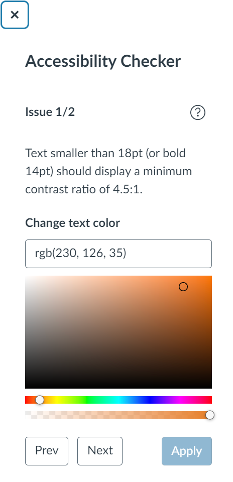
Ensure good color contrast. I often see instructors making their text colorful – in particular, red seems to be very popular. Indeed, a touch of color can make the page more visually pleasing and help bring out headings or important information! The danger lies in using colors that don’t have enough contrast with the background. This is especially problematic for people with less-than-optimal eyesight, but good contrast really just makes it easier for all of us to read. Also, a word of caution: Canvas has recently rolled out dark mode for mobile platforms and many people like to use it. Some colored or highlighted text may not look clear in dark mode.
Add caption and header row to tables. These are extremely helpful for screen reader users, and the caption helps everyone to quickly see what the table is about. To add these things, you actually have to rely on the on-page accessibility checker – it will flag the issues and walk you through fixing them. While we’re on the subject of tables, you also want to avoid complex tables with merged cells because they are hard to navigate for a screen reader.
Avoid underlining text. Underlining is normally reserved for links. Try using other means of highlighting information, such as bold, italics or caps.
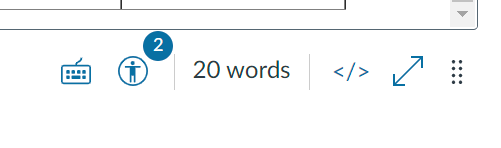
Find and Fix
Canvas has a very useful tool that can help you find some accessibility issues as you edit your page. At the bottom of the editor, the icon representing a human in a circle will show notification when something is amiss.
When you click on that icon, the checker will open on the right-hand side, explaining each issue and allowing you to fix it right there.
This tool can find:
Skipped heading levels/starting with the wrong heading
Missing alt text
Insufficient color contrast – you can find a suitable color right here
Missing table caption and header row
It will NOT flag poorly formatted links or underlined text. So, for these issues, you’ll have to watch out yourself!
When you’ve finished building your course, you can also use UDOIT, the global accessibility checker, or Ally, if your institution has installed it. These tools can help you find additional problems, including embedded materials with accessibility issues.
To conclude, following these simple rules can greatly enhance the usability of your Canvas course. The built-in accessibility checker will help you spot and fix some common issues. Once you start paying attention, building instructional content with accessibility in mind will become second nature!
In this post I’m returning to an important topic: accessibility. In a previous blog my colleague Susan Fein explained how everyone benefits from more accessible materials and that a large number of our students have some degree of disability.
Word documents are ubiquitous in our courses, as well as for other work-related activities. If a Word document is designed for digital consumption – such as posting in the Learning Management System or on a website – it needs to comply with accessibility standards. Fortunately, Word includes excellent tools for making your file accessible! I will first go over the main accessibility features, and then show you how to implement them in the video below.
Accessibility checker: Word includes a tool that helps you check your work. It is useful but it doesn’t catch all the errors.
Structure: headings, spacing, lists: Marking these properly will let screen reader users skim the content and understand its organization easily. Structure a document in a hierarchical manner: the title should be Heading 1 (NOT the “Title” style – that one just gets read as simple text). The next major sections should be Heading 2, subsections of a Heading 2 are Heading 3, and so on. Do not skip levels. You can change the appearance of all these styles to match your aesthetic. If you wish, you can also save style sets to have them ready to use.
Images: There are two main things to take care of here: adding alt text (so screen reader users can listen to the description) and making sure that the image is in line with the text (to keep the reading order clear).
Colors: If you use colors, make sure there is enough contrast between text and background. Even people with good eyesight can struggle to read something if the contrast is not strong. In addition, remember that many people are color blind, so do not rely on color to convey essential information. For example, avoid something like “The readings in blue are very important, make sure you read them carefully! The optional resources are in green”. Use other means of signaling instead, such as bold or italics.
Links: Links need to include meaningful text rather than the URL. A screen reader will read the URL one letter at a time, which is not very helpful. In addition, descriptive links help both screen reader users and sighted users skim the document to get an idea of the content or find specific information.
Tables: Tables can cause trouble to screen reader users – do not use them for layout! Only use them for actual tabulated information. When you use tables, the main rule is to keep them simple and avoid split cells, merged cells and nested tables. Then, make sure you have a designated header row, which helps screen reader users navigate the data.
Document properties: The document needs to have a title set in its properties. This title is helpful for blind users because the screen reader announces it as the document is loaded in the program.
Save to PDF – yay or nay? Avoid turning your document into a PDF file, if the document is meant for online reading. PDFs are hard to make accessible. If you must make a PDF, start with a fully accessible Word file. It is recommended to use PDFs only when the design includes complex or unusual elements (for example special/technical fonts, musical notes etc.). If you are using a PDF because you have a complex layout, consider posting both the PDF and a simplified Word file, in case someone needs the fully accessible version.
Watch this 10-minute video that walks you through an example of making a document accessible. I’m using Microsoft 365 on Windows – if you’re using another version of Word or platform, things may look slightly different. Timestamps:
Accessibility checker – 00:38
Headings – 01:46
Lists – 04:56
Spacing – 05:27
Images – 06:16
Colors – 07:29
Links – 08:09
Tables – 08:49
Title Property – 09:33
As you can see, the process of creating accessible Word documents is straightforward. Turning this into a standard practice will greatly help people who access information electronically, with or without assistive devices. Let’s make it happen!
If you use slide presentations to deliver information and then provide a digital version of the slides to support learners, this post is for you!
Instructors teaching online or who use a companion LMS or website to accompany in-person classes often upload the slide file to aid students in notetaking. However, you may not be aware that digital files are not automatically accessible to those using assistive technologies, such as screen readers. Following a few simple and easy guidelines will improve accessibility of your materials for all students and demonstrate your thoughtful attention to inclusivity and equity.
Who Benefits from Accessibility?
Everyone, not only those with disabilities, benefit from accessible learning materials. The U.S. Census Bureau estimates that there are more than 40 million people in the U.S. with a disability, so odds are good that some of them will be in your courses.
Accessibility practices support all learners, not just those who require them. In 2016, the OSU Ecampus Research Unit conducted a nationwide survey about student use of video closed captions. In that study, 70% of respondents who did not self-identify as having a disability used captions at least some of the time.
I asked OSU’s disability access center how many online students request disability-related accommodations. So far this year, 23.9% of those served by their office are Ecampus students. Last year, nearly 40% of all Ecampus courses had at least one student with an accommodation, and nearly 15% of all online-only students used a disability-related accommodation.
To ensure equity, regardless of who does or does not depend on accessibility support, it is vital to make all learning materials compliant with accessibility standards. When educators intentionally create fully accessible materials, we more equitably serve all online learners.
What Can You Do?
Here are five easy-to-follow tips that elevate your commitment and ability to create accessible materials.
Tip #1. Use a template. Templates are important because basic formatting for accessibility is already built in. By inserting your content into designated sections, you preempt some accessibility issues without any extra effort. For example, when you insert the topic of each slide into the designated title field, the slide structure maintains the correct sequence in which a screen reader encounters the various elements on the slide. If you are concerned about being too constrained or predictable, these designated fields accommodate your creativity! It is okay to reshape, resize, or reposition a field if you do not like its default appearance or location.
Regardless of which end of the design spectrum you lean, always start with a template. If you are not fond of colorful designs or fancy formats, there is a basic, unadorned template you can use. If you are a fan of fun, frivolity, or fabulous, select one of many free template options found online to suit your theme or topic. Check out the different templates Ecampus has developed with college-specific themes. One of them might be a good fit for you.
Tip #2. Enter a unique title on each slide. Each slide in your presentation must have a unique title. This permits a screen reader to navigate easily from one slide to the next. What happens when you have segments of the presentation that require two or more slides to fully deliver the information? No problem! There are various ways to address this.
When several slides focus on a different aspect of the primary topic, use that in the title. For example, you are creating a presentation about Health and Wellness and have multiple slides on the topic of Cooking. You want to introduce the topic, describe meal preparation, and offer ideas for healthy snacks. Since these are three distinct subtopics, a good approach is to label the slides as Cooking: Overview, Cooking: Meal Preparation, and Cooking: Healthy Snacks. Repeating the main topic in the title helps the learner connect each segment but still delineates separate subtopics.
If the subject matter does not neatly break into clear subgroups, it is fine to use a sequential number, such as Cooking Part 1, Cooking Part 2, etc. Since most creators develop a presentation’s content, sequence, and flow thoughtfully and logically, if you take a moment to consider why you grouped together specific ideas, the unique titles will likely emerge.
Tip #3. Follow best practices. If you search online for guidance about how to create effective slide presentations, you will discover that many sources offer similar suggestions. Most of these include recommendations about text (contrast, font size, font style), use of images, page structure, and so on. Use this short list as a helpful reminder of these other accessible-friendly best practices.
Text should be easy to read, with good contrast. Black text on a white background is ideal and classic. Be cautious of templates with too subtle contrast. They might not meet accessibility guidance for visually disabled learners. Use 18-point (or larger) sans serif font for readability.
Use images judiciously. Pictures convey themes, present an idea, or evoke a mood. However, too many can detract from the message, be confusing, or appear unprofessional. Aim for a “less is more” approach. (Learn more about accessibility for images in the next tip.)
Include adequate white space to separate and group content. Bullets are optional. Keep slide structure simple. Use phrases or a few words rather than full sentences. Break up content into multiple slides to avoid crowding.
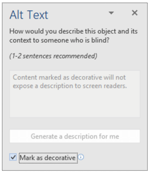
Tip #4. Create alt-tags for images. A screen reader recognizes the presence of an image but it cannot discern the content. To be accessible, that information is provided as a text description or alt-tag.
If you have images in your slide deck, each must have an alternate text description. The alt-tag describes and explains the content of an image. Usually it is not accessible or helpful to use the file name. And beware of tools that try to divine the content of an image and insert descriptions. These are usually wildly inaccurate and unhelpful.
The majority of images in an effective presentation should be essential to the learner’s experience; the image is required for accurate comprehension of the content. The are images such as charts, graphs, photos, maps, or data. Other images may be optional or decorative; nice to have but not essential to the learning and, if not seen by the student, do not impede the learner’s ability to grasp the material.
For essential images, write a brief (1-3 sentences) text description. No need to include lead-in words like “this is an image of…” Describe the key educational value of that image. What about it is important to the learner? What is the essence of the information you want the learner to know about that chart, graph, or photo?
Screen image from Office 365 PowerPoint
Decorative images have two options: enter a description or skip over the image. To skip, enter null text (“ ”) as the alt tag or, if available in your version of PowerPoint, select the “decorative” option. Both choices direct the screen reader to ignore the image. If you prefer to tag a non-essential image, use a simple description, such as “team logo” or “Professor Kumar.”
Understand that writing good alt tags is a challenging skill that takes time and practice to master, so do your best. You may want to confer with the Disability Access Center, an instructional designer, or other faculty support group if you need assistance.
For more information about how to write effective alt tags, refer to these or other resources.
Tip #5. Use meaningful text to format links. Please do not insert a full URL on your slide. Screen readers recognize a URL link and read aloud every individual letter and symbol, often in a monotone mechanical voice, depending on the specific assistive tool. Think about how frustrating, confusing, and unhelpful that is. Instead, format each link using meaningful text, as demonstrated in this post. For example, the two resources linked above use the article’s full title as the meaningful text. Also, avoid the over-used, too generic “Click here for more information,” with the word “here” formatted as the hyperlink. Instead, select text that specifically identifies the URL content, such as “Visit the Disability Access Services web page for more information.”
Accessibility Supports Equity
Demonstrate your commitment to equity! With just a few extra minutes, you can easily meet minimum accessibility standards by following these tips and using the accessibility checker tool built right into PowerPoint!
Reference
Linder, K. (2016). Student uses and perceptions of closed captions and transcripts: Results from a national study. Corvallis, OR: Oregon State University Ecampus Research Unit.