Over the last couple of terms, I joined a series of reading sessions with instructional design colleagues to read Alfie Khon and Susan Blum’s book Ungrading. Why Rating Students Undermines Learning (and What to Do Instead) and discuss the practices and implications of this approach to reconceptualize assessment design and the place of grading. This two-part blog aims to capture the takeaways from those discussions including the main concepts, approaches, types of activities, implications, and challenges of adopting ungrading practices. This first part of the blog covers a brief overview of the concept of ungrading, its major benefits, and design considerations; and the second blog will include a summary of the types of ungrading practices and challenges to implementation ––all derived from the authors’ extensive arguments and examples. For a detailed review and summary of the book chapters, you can also check the blog Assessment Design: Ideas from Ungrading Book.

Overview of Ungrading

The concept of ungrading is sparking widespread interest only recently even though educators have been studying and using ungrading approaches for quite some time. The foundational premise of ungrading is to move away from a focus on grades that judge, rank, sort, and quantify student learning to adopting an approach that focuses on using alternative and authentic means to assess learning such as self-evaluation, reflection, student-generated questions, peer feedback, to name a few. Along with that premise is the questionable ranking that comes with grading which makes students compete with one another in an artificial way. Sorensen-Unruh (chapter 9) sees ungrading as a conversational method that facilitates the communication between instructors and students about how students perform in the class. If, as underscored by the authors, grading and the fact of assigning point values to students’ performance makes more harm than good, then, why use grading? Considering that grading is rooted in our educational systems, many of these authors conclude that it becomes inevitable to grade student learning as it is currently done today.  

A clock and a checklist

Several scholars and instructors consider grading to be problematic. First, grades are not good indicators of learning. Blum (chapter 3) argues that grading assumes all students are the same, does not provide accurate information about student learning gains, is consequential, adds fear and avoidance of negative consequences, and is arbitrary and instructor-led. Second, the overemphasis on grades can lead to a decrease in intrinsic motivation, students’ excessive anxiety, and the complexity of quantifying how learning happens (Stommel, chapter 1). Third, it can also decrease interest in learning, students may feel inclined for easier tasks, and critical thinking is lacking (Alfie Khon, foreword). Fourth, grading makes students be fixated more on their grades than on the process of learning, leading them to believe that grades are all that matters in school (Khon & Blum; Talbert, 2020). And finally, too much focus on grades can be detrimental to students’ mental health (Eyler, 2022). However, ungrading does not mean dismissing grades altogether. Instead, Stommel proposes creating a learning space that fosters critical thinking, reflection, and metacognition– all skills that are valuable for 21st-century education. Likewise, Alfie Khon contends that grading can be participatory since it does not require a unilateral decision, and thus, students can also propose their own grades (with the instructor’s reservation to accept them). 

“Ultimately ungrading— eliminating the control-based function of grades, with all its attendant harms— means that, as long as the noxious institutional requirement to submit a final grade remains in place, whatever grade each student decides on is the grade we turn in, period.”

(Khon, 2020, p. xv)

While ungrading may be an innovative approach to assessments, it should be thought of carefully and adopted with a clear objective. Ungrading, as pointed out by Katopodis and Davison (chapter 7), needs a structure to be effective, allowing students to envision themselves as authoritative, creative, confident, and active, thus achieving a high impactful goal. As ungrading requires instructors to evolve in their approach to assessment, it does too for students who are expected to engage in a process of self-evaluation, self-assessment, and reflection. This requires engagement in metacognitive practices that many students might not be ready to embark on or don’t know how to do it. In addition, while ungrading is believed to be student-centered, it can deepen equity gaps if guideposts are entirely removed. Sorensen-Unruh (chapter 9) believes that ungrading is a matter of social justice –going beyond the expected student agency and aiming at having students exercise their voice and participate in assessment decisions. 

As a whole, Blum (introduction chapter) provokes us all to rethink the nature of grading considering that students’ learning conditions vary, with many enduring inequities at many levels. Blum wants us to keep focused on how “varying assessment and feedback methods contribute to the real learning of real individual learners, rather than imposing an arbitrary method of sorting.” (p. xxii); all for the sake of healthy learning. 

These are a few key points about the arguments for ungrading. While this assessment practice is taking force in higher education, there are also many critics and skeptics. The purpose of this blog is not to enter into the discussion and controversy of ungrading, but to share a few perspectives and takeaways after an intense and well-structured book club discussion. In the following section of this part-one blog, I will share considerations for designing for ungrading. 

Assessment Design Considerations

Tasks and activities from a laptop computer

The educational system requires all instructors to submit grades at the end of every term. There is dissatisfaction with the current grading practices among many instructors and students as explained at large in the book. Here is where the ungrading movement takes force to provide alternative ways to account for evidence of student learning. Riesbeck (chapter 8) argued that by implementing ungrading practices, students can focus more on the content and feedback than on the grades. The use of critique-driven learning allows for more easily quantifiable efforts, progress, and accomplishment. Each ungrading consideration is dependent on a myriad of factors that may or not apply to each instructor’s context. The bottom line in ungrading is re-envisioning the teaching and learning process, engaging students in active learning, and active self-assessment through feedback. The following are design considerations:

Decenter grading and communicate (un)grading practices

Instructors can encourage students to focus on the process of learning, instead of talking about grades, Blums says, we should talk about the purpose and goals of the activities with students. These conversations can help develop relationships with students to encourage them to own their learning and have a voice in that process. Decentering grades also involves having an ongoing conversation with students, colleagues, and administrators about assessment decisions. Although each instructor exercises their academic freedom, it is also essential to share assessment practices that work and possible changes to implement.  In these conversations, it is also important to carefully use language that conveys a clear understanding of the concept and practice of ungrading to avoid confusion, anxiety, misunderstandings, and reactions that prevent its implementation. Having these kinds of conversations can help shift the mind from a grade-focused to a learning-focused approach. A key element in these conversations is to ensure that the pedagogical reason behind the adoption of ungrading practices is not only clear but well understood (and this may take time).

Set a structure for ungrading

As with other elements of exemplary course design considerations, the structure of assessment practices is necessary. Adding a structure for ungrading assignments gives students a clear objective, steps, and flow that allow them to be consistent and accountable to their own learning goals and strategies. 

Reflect on pedagogical and assessment practices

Instructors are invited to examine more in-depth their grading policies, why they grade in the way they do, what they are grading, and how they grade. In many cases, the path to ungrading is a response to dissatisfaction with grading policies. Aaron Blackwelder (chapter 2) says that, over time, he turned into a gatekeeper; he lost focus and was more interested in meeting institutional and “rigor” requirements than building relationships with students. His students had turned into competitive grade seekers. He questioned what a grade really suggests and posits that grades fail to communicate learning. The fact that grading allocates a specific number or letter that can bring some negative feelings to students, can also negatively affect the potential for learning. Sackstein (chapter 4) calls for a change in mindset to identify the way in which learning can be communicated and understood beyond the traditional use of numbers and letters.  While Blum also argues for assessing the entire learning experience (with portfolios, for example), Sacksatein suggests considering changes in the language of grading which can provide students with an opportunity to shift the way they feel and think about their own learning. 

Teach students to view mistakes as a necessary step in the learning process

Instructors are invited to reflect on how traditional grading practices are punitive, dehumanizing, and demotivating. Gibbs (chapter 6) points out that a system that punishes students for making mistakes reinforces the notion that all learning is flawless and therefore mistakes need to be avoided. Ungrading, on the other hand, aims to implement and cement the idea that learning is a process that needs constant feedback for that learning to be consolidated. Therefore, students need to be given opportunities not only to learn from their mistakes but to act on them in an interactive way. This requires instructors to plan for assessments that include steps for review (e.g., self, peer) to help the student build their skills, and knowledge over time.

Care for students and their learning

Instructors are also invited to demonstrate more explicitly that they care and validate students’ work. Further, Gibbs (Chapter 6) argues that her teaching philosophy is better summarized by the word “freedom”, the freedom that learners have to learn and grow at their rhythm and the freedom to make mistakes and learn from them. The role of the instructor is then to be supportive in that process through feedback and empathy. Ungrading, as it is overall discussed throughout the book, does not mean that there are no assessments or grading at all. On the contrary, the assessments should focus on helping students build their knowledge and understanding in less stressful ways, allowing students to build learning habits, develop creativity, become better communicators, and connect to their lived experiences and contexts. Caring for students also involves valuing their identity as learners and what they bring into the learning environment.  

Be aware that ungrading can increase student anxiety and uncertainty

It is critical that instructors who are considering ungrading be cognizant that it involves a high level of anxiety and uncertainty on the part of students. Let’s recognize that students are so used and “conditioned” to grades that they will find it confusing not to have a grade associated with each assignment in the course. Many students consider being successful if they score a perfect grade which can be overwhelming and obscure the value of learning. Instructors who adopt ungrading should explain why and how ungrading will be done in certain classes. This will add transparency to the expectations and assumptions that instructors have about students.

Implement student voice and choice supported with personalized feedback

Instructors can help students take ownership of their learning through hands-on, real-life activities that allow students to use the content they are learning in projects of their interest, conduct research, and solve problems. Students can choose their topics and projects and the instructors can guide them to narrow topics and ensure the projects are feasible within the course timeframe. Consider feedback as a formative assessment approach that enables students to make choices about their learning strategies and needs to improve their learning tasks. Sackstein (chapter 4 ) suggests teaching students to collect feedback and identify the strategies that work for different kinds of assignment revisions. This way, students can develop better strategies that move them from lower-thinking to higher-thinking processes. 

Since ungrading promotes the use of student-self assessment and reflection practices, it implies that instructors will need to personalize and tailor feedback to meet students where they are. In addition, instructors can consider setting a culture of feedback (Gibbs, chapter 6) where instructors teach students to use feedback to improve their work, provide peer feedback effectively, and see the value of learning from their mistakes. 

Promote peer support

Authors of several chapters in this book have posited that students are more likely to give each other better feedback in the absence of grades. This kind of feedback can allow students to help each other, learn from one another, expand their awareness of their own understanding, and develop skills for life. Peer support will also help students build their confidence and autonomy to learn from each other. 

Trust students

One critical aspect of assessment is trust –trust that students do the work they are expected to do by themselves. Instructors have legitimate reasons to express their concerns and create course policies about academic integrity that lead them to adopt plagiarism systems and surveillance tools to monitor and proctor students’ work. In adopting ungrading, trust is fundamental to change the way learning and performances are assessed. It involves helping students think differently about what it means to learn. Instructors can help students evolve in their approach to learning to move away from grades to focus on their learning by including in assessments strategies for building capacity for metacognition, confidence in their skills, life-long learning goals, and owning their learning. 

Ungrading does not mean instructors don’t grade and students don’t receive grades on their work. Ungrading, as posited by the authors in the Ungrading book, is a mindset to approach student learning differently. In the second part of this blog, I will share the types of ungrading practices, implications, and challenges as presented in the book. 

References

This blog post is an Instructor Spotlight authored by Xiaohui Chang. Xiaohui is a Toomey Faculty Fellow and Associate Professor of Business Analytics in the College of Business. This post is a follow up to Improving Student Engagement and Connection in Online Learning: Part I, Proactive Support.


Introduction

Since the first post in the series appeared a few months ago, we have received plenty of feedback from other instructors who are actively engaged in online education. Some of the stories shared by them reiterate the points we discussed, and others included tips and techniques that have worked particularly well for them. Almost all of them agreed that teaching well online remains a challenging task.

“I love the notes on proactive student support … especially the notes on checking in with those who are behind. Sometimes all they need is a little empathy!”

Vic Matta, Associate Professor, College of Business, Ohio University 

“I regularly incorporate each of these in my relationships with my students, to include weekly zoom “what’s up” meetings with my students. I check in on them if they’re behind on assignments…Yes, it takes effort; but my mission is to help these students find the greatness within themselves to succeed.”

To quickly recap what we have discussed in Part 1, we touched on how to employ empathy statements in communications with students, restructure and promote the office hours, provide personal feedback for students, and periodically check in with students who are behind. You may also refer to the first article here: Improving Student Engagement and Connection in Online Learning: Part I, Proactive Support.

Continuing from the first post, Part II will revolve around six specific practices that I have found particularly helpful for online teaching and learning.

Practice 1: Adopt a variety of communication methods

I provide assignment instructions and guidance using a variety of communication methods including texts, diagrams, images, and short video clips. I have learned that instructions with screenshots and videos tend to be better in explaining complicated procedures than text alone.

Video Tutorial Example: Creating a random sample using XLSTAT

Practice 2: Create a Q&A Discussion Board

I have a separate discussion on Canvas for students to address issues with the class in general (content questions, technical issues, deadlines). Instead of emailing the instructor regarding issues other students may also have questions about, students are encouraged to use this forum so that all can benefit from the questions and answers. I usually wait for a few hours for students to answer each other’s questions first before I provide mine.

When students email me questions that are a good fit for the Q&A Discussion Board, I’d respond through email first and then recommend the students submit the questions to the discussion board so that other students can learn from the questions and answers. This discussion board also creates an inviting and engaging learning environment for the students who don’t get to meet their classmates in a face-to-face setting.

Practice 3: Estimate the amount of time taken for each assignment

I was skeptical of this at first as the time taken would vary drastically for each individual. However, student feedback indicates that estimated times helped them plan for the week and set aside an appropriate amount of time. We don’t need to worry too much about making the estimates accurate for everyone as students will automatically adjust given their own work styles. A workload calculator that I have found helpful is developed by the Center for Advancement of Teaching at Wake Forest University, called the Workload Estimator 2.0.

For more information about estimation rates, see the explanation here – Workload Estimator: How We Calculated.

Practice 4: Ensure timely replies

This practice is obvious, but difficult to do when one is teaching multiple sessions with hundreds of students. For online classes, timely replies make students feel as though they are taking an in-person class with all of the built-in support and resources. I understand that we all have different teaching priorities and schedules, however, it all comes down to figuring out how to most efficiently organize our days so that we can be available to students.

Setting aside a couple of times a day for handling emails has worked quite well for me, e.g., the first thing in the morning, after noon, and before the end of the day. I try my best to respond to students’ emails within 24 hours and check my mailbox at least once every day on the weekends.

The timely replies in discussions were super helpful. It really felt as though I took this in person with all of the built-in help and support.

Student quote

Practice 5: Synchronize assignments with Canvas calendar

I have also synced all assignments and my office hours (renamed as Ask Me Anything Hours) on Canvas so that there are office hours available around when assignments are due. This proves to be incredibly convenient and useful for both students and instructors.

Practice 6: Reorganize course content

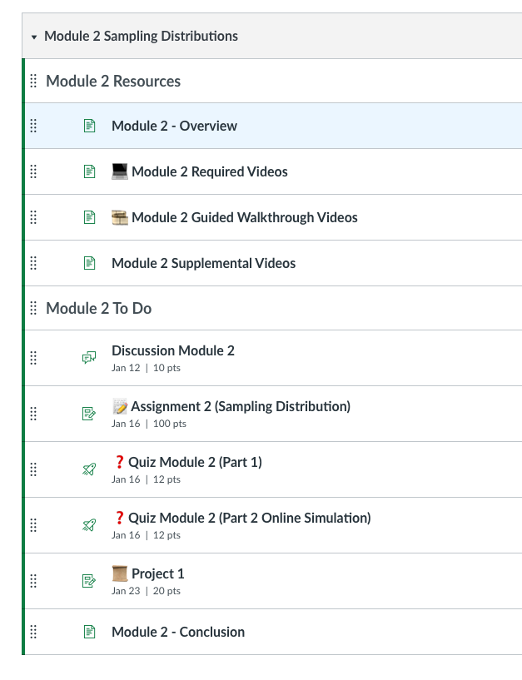
Here are several Canvas LMS tips that have helped in organizing the course content and saved my time. I try to organize everything in modules. Under each module, all items are split into two main components: resources and to-do lists, so students know exactly what assignments they would need to complete for each module. I also adopt a fixed set of systems for titling Canvas items. Items within modules are indented to help with organization.

Weekly agenda and announcements are also hyperlinked to guide students with the course navigation. I could not emphasize enough how much I value the internal messaging in the Canvas grade book that was briefly discussed in my previous post. This feature allows instructors to message students who haven’t submitted yet or who scored less than a certain point. Definitely a slick way to send quick emails to a target group.

Recently, I have been experimenting with a range of visual cues (e.g., emojis) to categorize course content. An example is provided below.

Screenshot of the module view of the course, demonstrating using of emojis as visual cues next to assignments. A written assignment has a pencil and paper emoji, a quiz has a question mark emoji, etc.

There was also a recent post on using emojis for visual way finding and fostering a friendly tone in online classes here: My Experience with Emojis in Online Courses: Affordances and Considerations.

Conclusion

It’s always best to keep an open mind when trying out new teaching practices and adapt them to your individual style and subject matter.

If you have any online teaching practices that you’re fond of, please feel free to contact me at Xiaohui.Chang@oregonstate.edu as I will be very excited to hear them and test them out. 

In this post I’m returning to an important topic: accessibility. In a previous blog my colleague Susan Fein explained how everyone benefits from more accessible materials and that a large number of our students have some degree of disability.

Word documents are ubiquitous in our courses, as well as for other work-related activities. If a Word document is designed for digital consumption – such as posting in the Learning Management System or on a website – it needs to comply with accessibility standards. Fortunately, Word includes excellent tools for making your file accessible! I will first go over the main accessibility features, and then show you how to implement them in the video below.

  • Accessibility checker: Word includes a tool that helps you check your work. It is useful but it doesn’t catch all the errors.
  • Structure: headings, spacing, lists: Marking these properly will let screen reader users skim the content and understand its organization easily. Structure a document in a hierarchical manner: the title should be Heading 1 (NOT the “Title” style – that one just gets read as simple text). The next major sections should be Heading 2, subsections of a Heading 2 are Heading 3, and so on. Do not skip levels. You can change the appearance of all these styles to match your aesthetic. If you wish, you can also save style sets to have them ready to use.
  • Images: There are two main things to take care of here: adding alt text (so screen reader users can listen to the description) and making sure that the image is in line with the text (to keep the reading order clear).
  • Colors: If you use colors, make sure there is enough contrast between text and background.  Even people with good eyesight can struggle to read something if the contrast is not strong. In addition, remember that many people are color blind, so do not rely on color to convey essential information. For example, avoid something like “The readings in blue are very important, make sure you read them carefully! The optional resources are in green”. Use other means of signaling instead, such as bold or italics.
  • Links: Links need to include meaningful text rather than the URL. A screen reader will read the URL one letter at a time, which is not very helpful. In addition, descriptive links help both screen reader users and sighted users skim the document to get an idea of the content or find specific information.
  • Tables: Tables can cause trouble to screen reader users – do not use them for layout! Only use them for actual tabulated information. When you use tables, the main rule is to keep them simple and avoid split cells, merged cells and nested tables. Then, make sure you have a designated header row, which helps screen reader users navigate the data.
  • Document properties: The document needs to have a title set in its properties. This title is helpful for blind users because the screen reader announces it as the document is loaded in the program.

Save to PDF – yay or nay? Avoid turning your document into a PDF file, if the document is meant for online reading. PDFs are hard to make accessible. If you must make a PDF, start with a fully accessible Word file. It is recommended to use PDFs only when the design includes complex or unusual elements (for example special/technical fonts, musical notes etc.). If you are using a PDF because you have a complex layout, consider posting both the PDF and a simplified Word file, in case someone needs the fully accessible version.

Watch this 10-minute video that walks you through an example of making a document accessible. I’m using Microsoft 365 on Windows – if you’re using another version of Word or platform, things may look slightly different. Timestamps:

  • Accessibility checker – 00:38
  • Headings – 01:46
  • Lists – 04:56
  • Spacing – 05:27
  • Images – 06:16
  • Colors – 07:29
  • Links – 08:09
  • Tables – 08:49
  • Title Property – 09:33

As you can see, the process of creating accessible Word documents is straightforward. Turning this into a standard practice will greatly help people who access information electronically, with or without assistive devices. Let’s make it happen!

References:

By Susan Fein, Ecampus instructional designer

If you use slide presentations to deliver information and then provide a digital version of the slides to support learners, this post is for you!

Instructors teaching online or who use a companion LMS or website to accompany in-person classes often upload the slide file to aid students in notetaking. However, you may not be aware that digital files are not automatically accessible to those using assistive technologies, such as screen readers. Following a few simple and easy guidelines will improve accessibility of your materials for all students and demonstrate your thoughtful attention to inclusivity and equity.

Who Benefits from Accessibility?

Everyone, not only those with disabilities, benefit from accessible learning materials. The U.S. Census Bureau estimates that there are more than 40 million people in the U.S. with a disability, so odds are good that some of them will be in your courses.

Accessibility practices support all learners, not just those who require them. In 2016, the OSU Ecampus Research Unit conducted a nationwide survey about student use of video closed captions. In that study, 70% of respondents who did not self-identify as having a disability used captions at least some of the time.

I asked OSU’s disability access center how many online students request disability-related accommodations. So far this year, 23.9% of those served by their office are Ecampus students. Last year, nearly 40% of all Ecampus courses had at least one student with an accommodation, and nearly 15% of all online-only students used a disability-related accommodation.

To ensure equity, regardless of who does or does not depend on accessibility support, it is vital to make all learning materials compliant with accessibility standards. When educators intentionally create fully accessible materials, we more equitably serve all online learners.

What Can You Do?

Here are five easy-to-follow tips that elevate your commitment and ability to create accessible materials.

Tip #1. Use a template. Templates are important because basic formatting for accessibility is already built in. By inserting your content into designated sections, you preempt some accessibility issues without any extra effort. For example, when you insert the topic of each slide into the designated title field, the slide structure maintains the correct sequence in which a screen reader encounters the various elements on the slide. If you are concerned about being too constrained or predictable, these designated fields accommodate your creativity! It is okay to reshape, resize, or reposition a field if you do not like its default appearance or location.

Regardless of which end of the design spectrum you lean, always start with a template. If you are not fond of colorful designs or fancy formats, there is a basic, unadorned template you can use. If you are a fan of fun, frivolity, or fabulous, select one of many free template options found online to suit your theme or topic. Check out the different templates Ecampus has developed with college-specific themes. One of them might be a good fit for you.

Tip #2. Enter a unique title on each slide. Each slide in your presentation must have a unique title. This permits a screen reader to navigate easily from one slide to the next. What happens when you have segments of the presentation that require two or more slides to fully deliver the information? No problem! There are various ways to address this.

When several slides focus on a different aspect of the primary topic, use that in the title. For example, you are creating a presentation about Health and Wellness and have multiple slides on the topic of Cooking. You want to introduce the topic, describe meal preparation, and offer ideas for healthy snacks. Since these are three distinct subtopics, a good approach is to label the slides as Cooking: Overview, Cooking: Meal Preparation, and Cooking: Healthy Snacks. Repeating the main topic in the title helps the learner connect each segment but still delineates separate subtopics.

If the subject matter does not neatly break into clear subgroups, it is fine to use a sequential number, such as Cooking Part 1, Cooking Part 2, etc. Since most creators develop a presentation’s content, sequence, and flow thoughtfully and logically, if you take a moment to consider why you grouped together specific ideas, the unique titles will likely emerge.

Tip #3. Follow best practices. If you search online for guidance about how to create effective slide presentations, you will discover that many sources offer similar suggestions. Most of these include recommendations about text (contrast, font size, font style), use of images, page structure, and so on. Use this short list as a helpful reminder of these other accessible-friendly best practices.

  • Text should be easy to read, with good contrast. Black text on a white background is ideal and classic. Be cautious of templates with too subtle contrast. They might not meet accessibility guidance for visually disabled learners. Use 18-point (or larger) sans serif font for readability.
  • Use images judiciously. Pictures convey themes, present an idea, or evoke a mood. However, too many can detract from the message, be confusing, or appear unprofessional. Aim for a “less is more” approach. (Learn more about accessibility for images in the next tip.)
  • Include adequate white space to separate and group content. Bullets are optional. Keep slide structure simple. Use phrases or a few words rather than full sentences. Break up content into multiple slides to avoid crowding.

Tip #4. Create alt-tags for images. A screen reader recognizes the presence of an image but it cannot discern the content. To be accessible, that information is provided as a text description or alt-tag.

If you have images in your slide deck, each must have an alternate text description. The alt-tag describes and explains the content of an image. Usually it is not accessible or helpful to use the file name. And beware of tools that try to divine the content of an image and insert descriptions. These are usually wildly inaccurate and unhelpful.

The majority of images in an effective presentation should be essential to the learner’s experience; the image is required for accurate comprehension of the content. The are images such as charts, graphs, photos, maps, or data. Other images may be optional or decorative; nice to have but not essential to the learning and, if not seen by the student, do not impede the learner’s ability to grasp the material.

For essential images, write a brief (1-3 sentences) text description. No need to include lead-in words like “this is an image of…” Describe the key educational value of that image. What about it is important to the learner? What is the essence of the information you want the learner to know about that chart, graph, or photo?

Screen shot of alt text box for an image from Office 365 PowerPoint
Screen image from Office 365 PowerPoint

Decorative images have two options: enter a description or skip over the image. To skip, enter null text (“ ”) as the alt tag or, if available in your version of PowerPoint, select the “decorative” option. Both choices direct the screen reader to ignore the image. If you prefer to tag a non-essential image, use a simple description, such as “team logo” or “Professor Kumar.”

Understand that writing good alt tags is a challenging skill that takes time and practice to master, so do your best. You may want to confer with the Disability Access Center, an instructional designer, or other faculty support group if you need assistance.

For more information about how to write effective alt tags, refer to these or other resources.

Tip #5. Use meaningful text to format links. Please do not insert a full URL on your slide. Screen readers recognize a URL link and read aloud every individual letter and symbol, often in a monotone mechanical voice, depending on the specific assistive tool. Think about how frustrating, confusing, and unhelpful that is. Instead, format each link using meaningful text, as demonstrated in this post. For example, the two resources linked above use the article’s full title as the meaningful text. Also, avoid the over-used, too generic “Click here for more information,” with the word “here” formatted as the hyperlink. Instead, select text that specifically identifies the URL content, such as “Visit the Disability Access Services web page for more information.”

Accessibility Supports Equity

Demonstrate your commitment to equity! With just a few extra minutes, you can easily meet minimum accessibility standards by following these tips and using the accessibility checker tool built right into PowerPoint!

Reference

Linder, K. (2016). Student uses and perceptions of closed captions and transcripts: Results from a national study. Corvallis, OR: Oregon State University Ecampus Research Unit.

In your work as an instructor or instructional designer, what kinds of course design problems have you been trying to solve lately? Perhaps there’s a discussion board assignment that you’d like to make more engaging, or maybe there’s a lab activity that students struggle with.


According to recent research findings published in the journal Nature, “…people are more likely to consider solutions that add features than solutions that remove them, even when removing features is more efficient” (Meyvis, T. and Yoon, H., 2021). In a course design context, this means we will probably reach for something we can add to our course to fix a problem: a shiny new tool we learned about at a conference, an extra video lecture, or an additional step for that lab activity that students struggle with. We do need to include quality tools and fresh media to our courses, certainly. However, because there is so much to cover in any given course, we should strategically subtract all unnecessary elements. The aforementioned Nature article has brought to my attention that I may be regularly neglecting the powerful design move that subtraction offers. As a result of reflecting on that, I’ve collected a few examples of how instructors and instructional designers can use subtraction in course design.

Subtraction example #1: Remove formal requirements from informal practice activities

Let’s take a look at a discussion board assignment as an example. Sometimes discussion boards are treated more like formal writing opportunities than discussions. For example, do you require students to not only respond to the prompt but also use a formal style of discourse and cite evidence in accordance with APA style guidelines and do so in a certain number of words? We don’t require students to use APA style or converse with a word count in our in-person discussions, so why would we do this in an online course (Darby, 2020)? Consider subtracting those formal writing requirements for discussion boards, and reserve the APA citations and formal requirements for polished writing assignments. That way, online discussions can be a place to practice and informally grapple with new concepts and ideas the way that face-to-face discussions are. Then, after students have a chance to work through topics in an informal way, they will be ready to try more formal tasks on the topic, such as constructing an argument and appropriately citing evidence according to a particular style guide.

Subtraction example #2: Reduce the frequency of office hours

If you hold office hours at a set time each week, and you notice that few students attend, consider doing away with the set weekly “office hours” altogether. Instead, invite students to make an appointment with you at least once during the term, at a time and in a modality that works well for them, or reduce the frequency of office hours to two or three timely sessions (optional attendance) per term, such as before each exam. Take questions in advance so that students too busy to attend can still benefit from the sessions, and post a recording of the session afterward in an announcement. According to Lowenthal, Dunlap, and Snelson (2017), less frequent but more focused office hours increased participation from students. Lastly, consider renaming your new infrequent office hours to something warm and inviting, such as “Coffee Break” or “Consultations” (Darby, 2019), which students may find more welcoming. Building in plans for facilitation and instructor presence in the early stages of course development allows faculty to focus more on teaching while the course is running and less on reactive problem solving.

Subtraction example #3: Dethrone teaching “folklore”

Teaching “folklore,” which John Warner calls the ineffective “practices handed down instructor to instructor” (p. 207, 2020), shows up uninvited, particularly when you have been assigned a course to teach that you had no hand in developing. One example of teaching folklore is the stubborn assumption that serious scholars are gatekeepers for their fields. Evidence of this exclusionary approach may show up in the form of a stern, overly formal, or cold tone in a syllabus. Consider removing verbiage that conveys a cold tone, since we now know that warm-tone syllabi encourage students to reach out to their professors (Gurung and Galardi, 2021). Another example of this is inflexible class “policies” that reflect an individual instructor’s preferences and not university policies. Consider reviewing the policies stated in the syllabus and delete any that are not aligned with actual university policies. Further, the idea that students must achieve a level of eloquence and scholarly sophistication on par with faculty in order to be considered for a grade of “A” on an assignment is another example of this. Evidence of this type of folklore could be found in rubrics with benchmarks that are nearly impossible to achieve. The element that could be subtracted here is not the rubric, but rather the specific language in the rubric that makes it impossible for students to succeed in the assignment. Neuromyths, which are false beliefs about the brain and learning, could also be included in the category of teaching folklore. If you spot neuromyths in a course, remove them. In summary, if you spot one of these ineffective teaching folklore elements in your course, consider removing the “folklore” item.

For this design challenge, try subtracting ineffective design elements before adding new items to solve course design problems. If you are unsure if something should stay or go, ask yourself what purpose this element serves in the course. It should then become clear whether the item belongs or needs adjustment. Even small adjustments can transform learners’ experiences. What have you removed from your course? Share how the process was for you by leaving a comment.

References:

Blum, S. D. (Ed.). (2020). Ungrading : Why rating students undermines learning (and what to do instead). West Virginia University Press.

Darby, Flower. The Secret Weapon of Good Online Teaching: Discussion Forums 6 ways to lead meaningful class discussions in an asynchronous online forum. August 24, 2020.

Darby, Flower, and James M. Lang. Small Teaching Online : Applying Learning Science in Online Classes, John Wiley & Sons, Incorporated, 2019. ProQuest Ebook Central, http://ebookcentral.proquest.com/lib/osu/detail.action?docID=5780349.

Created from osu on 2022-01-18 23:50:41.

Gasiewski, J.A., Eagan, M.K., Garcia, G.A. et al. From Gatekeeping to Engagement: A Multicontextual, Mixed Method Study of Student Academic Engagement in Introductory STEM Courses. Res High Educ 53, 229–261 (2012). https://doi.org/10.1007/s11162-011-9247-y

Gurung, R. A. R., & Galardi, N. R. (2021). Syllabus Tone, More Than Mental Health Statements, Influence Intentions to Seek Help. Teaching of Psychology. https://doi.org/10.1177/0098628321994632

Lowenthal, P. R., Dunlap, J. C., & Snelson, C. (2017). Live synchronous web meetings in asynchronous online courses: Reconceptualizing virtual office hours. Online Learning , 21 (4). https://doi.org/10

Meyvis, T. & Yoon, H. (2021). Adding is favoured over subtracting in problem solving. Nature.

Shi, T. Debunking Neuromyths and Applications for Online Teaching and Learning: Part 1. February 13, 2019. Ecampus Course Development and Training Blog.

Warner, J. “Wile E. Coyote, the Hero of Ungrading” from Chapter 13 of Ungrading.

“Annotation provides information, making knowledge more accessible. Annotation shares commentary, making both expert opinion and everyday perspective more transparent. Annotation sparks conversation, making our dialogue – about art, religion, culture, politics, and research – more interactive. Annotation expresses power, making civic life more robust and participatory. And annotation aids learning, augmenting our intellect, cognition, and collaboration. This is why annotation matters.” 

                                          -Kalir and Garcia

Annotation 

When you think back to your early college years, you may remember your professor assigning a text to annotate. Annotating a text has long been a common task in higher education, one that ideally promotes deeper reading, interaction with, and comprehension of important texts. Annotation assignments vary widely but the traditional paper-based type of annotation asks readers to respond to a text as it is read, physically marking or highlighting the text itself and perhaps writing in the margins. This approach allows students to enter into a dialogue with the text by recording their responses to the text, adding reflections or critiques, and anchoring those reactions to a specific place in the text. When students annotate a text, they are working their way through skills that span the levels of Bloom’s Taxonomy, from remembering to predicting, connecting, analysing, and evaluating. Annotation, at its best, encourages active engagement with a text beyond the surface level, promoting deeper critical thinking and stronger retention of concepts. 

While this is, of course, fantastic individual practice, the nature of traditional annotation assignments is primarily solitary. Today’s classrooms place more of an emphasis on 21st century skills such as group and collaborative study, and new digital tools have been developed that have revolutionized what, how, and with whom we can annotate. So-called social annotation has picked up speed with the growing popularity of two major players, Perusall and Hypothes.is, bolstered by the sudden shift to remote learning in 2020. Online instructors seeking ways to replicate the back and forth, robust discussion of a face-to-face class have found these tools a fitting substitute, and the asynchronous format of the discussion means these tools have a place in all modalities. 

Equity, Inclusion, & Community

“As a teaching method, critical social annotation allows for equitable conversations to unfold in-line with the knowledge being presented in course texts. In this way, it can potentially subvert or even redress instances of inequity in course content.” 

                                                                                                         – Brown and Croft

Social annotation platforms increase equity and inclusion in a course in several ways. Digital annotation platforms offer students a variety of ways to connect with material, allowing students to post links, images, video, and more in response to the text, their peers, and other annotators. By putting students’ ideas front and center, social annotation can empower learners to take initiative and experience more feelings of control over their educational process. Unlike the fast paced back and forth of traditional face-to-face discussions, the nature of digital social annotation allows students more time to engage with the text and to take as long as they need to post and respond (within the assignment boundaries). Additionally, the major platforms discussed in this post feature easy-to-use controls that require little technical expertise to use. They also boast comprehensive accessibility features that combine to provide inclusivity to a wide range of student needs. 

Social Annotation as Collective Construction of Meaning

One major difference between today’s digital social annotation and traditional solitary practice is that when students in a particular class collectively annotate a text using one of the digital platforms available today, they are actively building knowledge and understanding as a group. By sharing the document for collective annotation, the act of annotating itself becomes a social activity and contributes to the interaction of individuals within the group.  Socially annotating a text is one of the best ways to encourage close and active reading skills, with many studies reporting higher levels of student comprehension of socially annotated materials. Students who collectively annotate a text are entering into an exchange of questions, opinions, perspectives, and reactions to a text, engaging in a discourse with their peers (and facilitator, usually) and by extension learning from and with them. The process of a social annotation assignment allows students to see knowledge creation in action and become co-creators. 

Use of social annotation in asynchronous online courses can also increase sociability within an otherwise geographically remote, disparate group of students. Asynchronous instructors sometimes struggle to provide opportunities for real social interaction and building of community given the limits of the modality. An often unstated goal of higher education is to socialize students to academic community norms, and social annotation allows students to experience and practice some of these. For example, students annotating collectively learn appropriate language for responding to peers’ ideas and criticisms, develop online academic social identities, and gain experience with navigating power dynamics within the higher education classroom. 

Ready to Try It Out?

Adding social annotation to a course involves matching the task to your learning outcomes, deciding which readings would be best suited to annotation, and choosing your online annotation platform. 

Assignments can be tailored to meet a variety of instructional purposes and goals:

  • Recognizing formatting of various documents
  • Providing background or contextual information 
  • Learning academic norms for responding to peers- supporting, agreeing, disagreeing
  • Drafting questions and responses that are rigorous and meaningful
  • Determining main points vs. supporting details
  • Distinguishing fact from opinion
  • Identifying themes, tone, biases, author’s purpose, rhetorical devices, etc.
  • Learning and practicing discipline-specific writing and reading conventions 
  • Connecting the material to the field of study, to their own practice, or to other course materials
  • Developing evaluative and analytical skills
  • Considering differing perspectives and viewpoints in constructing knowledge
  • Facilitating a deeper understanding of difficult passages

Some best practices to consider when using collective annotation online:

  • Remind students that they have already practiced annotation in their everyday lives (reading and making your own notes in your inherited cookbook, reading your teacher’s remarks on your essay, leaving comments on a colleague’s report)
  • Model annotation with a fun text first
  • Seed the reading with your own comments, questions, and notes to help guide students 
  • Situate the social annotation assignment within the context of the course and make clear the intentions you have for the activity
  • If the activity is to be graded, be sure students know the grading criteria, preferably by providing a rubric
  • Annotation assignments are ideal for small group activities, and some platforms automatically create groups
  • Be prepared to provide guidelines for behavior and etiquette among students and to need to enforce these guidelines if students step out of line
  • Monitor the discussion and provide nudges, likes, upvotes, or validations, and otherwise engage with the dialogue throughout the assignment
  • If the platform allows tagging, do so- students get notified when someone responds to their post or asks a question, a convenience which increases the likelihood of them returning to the assignment for further interaction 

Social Annotation Tools: The Major Players

Perusall (stand-alone site/integrated into various LMS, including canvas)

Perusall is a collective annotation platform developed by Harvard University following a major research initiative into online collective annotation. Perusall offers free accounts for teachers and students at the basic level with options for institutions to integrate the tool into their LMS. The platform allows educators to use Perusall directly for stand-alone courses and upload their own materials for annotation as well as partner with their textbook catalog to purchase and annotate textbooks directly. For integrated LMS users, Perusall offers seamless grade pass back and options for pass/no pass grading as well as a robust automatic AI grading system that saves time and effort. Some instructors have also used Perusall for peer review to great effect using student-uploaded documents. *recommended tool for Ecampus courses

Sample Perusall annotation assignment

Hypothes.is (Google Chrome browser extension)

Hypothes.is is a groundbreaking new tool that bypasses restrictions of the classroom and enables anyone anywhere to annotate any webpage via a unique delivery system- as a browser extension that creates a layer over any webpage. This open source, free tool can revolutionize how we view and interact with web pages as well as texts by allowing us to save our annotations privately as well as publicly, inviting the world at large to socially annotate with us. Hypothes.is is also available as an integrated tool in most LMSs. The company also hosts the AnnotatED community, a group of users that hosts events, studies, and conferences to learn best practices for the tool. *recommended tool for research with a wider audience.

Hypothes.is Introduction Video

Sources

Adapting to Disciplinary Literacy Conventions – Open English @ SLCC

Home : Hypothesis

Innovation | Cégep Vanier College

Kalir, Remi H., and Garcia, Antero. Annotation. United States, MIT Press, 2021.

https://www.google.com/books/edition/Annotation/ejoiEAAAQBAJ?hl=en&gbpv=0

Pedagogy | ANNOTATION TOOLS

Perusall

Social Annotation | Center for Teaching Innovation

Social Annotation – Pedagogical Support and Innovation Pedagogical Support and 

Social Annotation and an Inclusive Praxis for Open Pedagogy in the College Classroom

Tools for Social Annotation in the Digital Age

Part I: Role of Course Developer as Media Curator 

This post is Part I of a two-part series on video selection and use in online courses. Part I provides the reasoning behind understanding course videos selection by course developers as a curatorial process. Part II will explore video curation in practice in course development and provide a course design perspective on video presentation and management issues.

Recent Video Use Trends

In September of 2020 the enterprise video company Kaltura Inc. conducted its seventh annual State of Video in Education 2020 report. The report included responses from across the education system spectrum with higher education institutions making up 53% of all respondents (Figure 1.).

Chart showing percentages of educator sectors in response to Kaltura survey.
Figure 1. Percentage of respondents to video survey by education sector.

This report described how remote teaching-driven course changes impacted video adoption and use in education. Remote teaching and learning was the most common use of video (83% of respondents). Lecture captured as video was used by 69% of the responding institutions.

The executive summary identified a number of key insights and trends related to changes in video use in education. A select few can be seen below:

  • Use of video for remote teaching and learning grew by 28% over 2019.
  • Video use is viewed as positive. Respondents (84%) saw video as having a positive impact on student satisfaction, 73% seeing video increase student achievements and 76% believe it increased instructor satisfaction.
  • Students as creators of video increased by 13% from 2019 to 2020.
  • In higher education there was rising video use for remote teaching, lecture capture, and flipping the classroom.
  • Actual growth in the use of video for remote teaching and learning grew by 28%.
  • A majority of respondents (68%) want to continue to blend traditional teaching with today’s virtual innovations; such as video.

In some ways this is not surprising. This past year forced many instructors in higher education to convert face-to-face courses to remote instruction. Much of that transition was accomplished with synchronous sessions via ZOOM or some other video conferencing program. Live video conference sessions, if recorded, also served as a support resource for students. In response to the challenges of the past year both live and recorded video were adopted to make remote learning doable. Fully online courses do not have this live element as they are asynchronous and did not have to adapt in this way.

In asynchronous courses at Oregon State University our Ecampus course developers utilize video differently. Video is as a key media element in delivering course content to learners, promoting faculty presence, and to build depth into projects and assignments. Video content may be produced internally by course developers (e.g., instructors) and used in courses via an enterprise video system (e.g., Kaltura). Video content may also be sourced from external video-based social media sites (e.g., YouTube and Vimeo) or educational and commercial collections (e.g., Kanopy or Amazon) and via syndicated video sources (e.g., podcasts and Twitter).

Given the plethora of video available and a trend toward increased video integration into instruction the challenge to course developers is the selecting, managing, and presenting video content to support and compliment course learning outcomes. Ultimately this also becomes a course design challenge for instructional designers who must adapt to manage the integration of increasing levels of video in the course in a way that makes sense from a pedagogical perspective as well as visual design aesthetic.

Course Developers as Media Curators

What is a Curator?

The growing value of video in the experience of a course suggests that course developers (e.g., instructors) consider a new way of thinking about how video is selected, managed and presented. In essence, I am suggesting that for a given course the course developer serves as a curator of video content.

But what is curator? Should a course developer really think like a curator? How might curated media shape course development and instructional design?

In order to explore this notion of course developers as media curators a bit more I would like to share the definition of what a curator is from the American Alliance of Museum (AAM) Curators Committee (2009). The preamble to the curator core competencies of a curator defined the term curator as:

Curators are highly knowledgeable, experienced, or educated
in a discipline
relevant to the museum’s purpose or mission. 

Curators are further described as having nine core competencies and related applied skills. The competencies are:

Collection planning       Scholary Research              Exhibition Development
Collecting                        Object Research                  Education
Collection Care               Applied Research               Outreach & Advocacy

In Figure 2. we see these same foundational roles expressed by the AAM coupled with a definition of curator and description of the work of a curator. Also included is the domain of the work. Those domains are preservation, research, and communication. The global context of curation is, in this definition, a museum. The more discrete context is the exhibition, or exhibit application. Yet it is all part of a curator’s work.

Curator defined with context.
Figure 2. Definition of the term curator and select context example.

What we see in this definition in Figure 2. is the premise that curators select, gather, care for, and prepare presentations of single items that in aggregate make up a curated collection. That collection becomes a resource and object of education, outreach, advocacy and presentation.

This makes the act of curatorship a scholarly and creative practice that is deeply intentional and based upon the definitional parameters of the organization doing the work.

Course Developers – Curators of Video Collections

Now let us think about what an online course developer is and what they do. At Ecampus course developers collaborate with instructional designers to plan an online course. Instructional designers advise and take content selected by the course developer and build that content into Canvas, our learning management system.  The created courses are then shared with students. Course developers are considered content experts much like museum curators are. Let’s look at that a bit more closely.

In Figure 3. below we can see a comparison between the definitional role and duties of a museum curator and course developer. There are striking parallels between these roles. So much so that it would seem reasonable to think about what a course developer does as also a curatorial practice. A practice focused on the learning content, including video, for a given course.

Perhaps the greatest difference between these to two curatorial practices is the context of each. In asynchronous course development it is not uncommon for instructors to perform many of these same functions as museum curators but on a more discrete scale. The scope and context of their focus is obviously different.

In essence a course developer actively gathers and in may cases, creates unique course elements that form the curated media collection for a course. That collection of texts (readings), images, web resources and video is then used for education, research, and perhaps outreach with a constant eye on student access to media. Ultimately a course media collection is intended to permit the course developer to fulfill the purpose of the course and guide students in achieving the course learning outcomes.

The physical design of the course, with its media collection, is the domain of the instructional designer. The collaboration between the course developer and instructional designer are key in preparing the course as an “education exhibition” of sorts that has clear learning outcomes.

Course Video Selection: The Art of Curatorship

We began this discussion with the importance of video in online course development and design. With that in mind it is logical that video curation is an important element of course-wide media collection identification.

Video collection, cataloging, arranging and assembling for display in a course fits quite well within the parameters of curating. Any curation is also about a level of storying, opportunities for engagement, information sharing and perspective sharing (Potter, 2017). In course development these processes as applied to course media, and in particular video, have the potential to create and shape the nature, experience, and associated learning in an online course.

In making decisions about video use in online courses, a course developer would apply their knowledge and expertise to curate the selections. Clear learning outcomes provide a pedagogical and content structure to the video curation process. Once a video collection is established other decisions may come into play that reference an aesthetic for the collection. This is the art of curatorship.

The art of curatorship has been viewed as closely aligned  to a design process (Shuey, 2014) and may be guided by an interpretation of the universal visual design principles as conceptual guides to the education exhibition that is the online course. In this sense the curator is not thinking as much about the collection items per se but more about how the collection fits together to provide and support a narrative, flow, or education scaffolding for the course.

Thinking Like A Curator 

As an exercise in curatorial thinking let’s take some re-interpreted concepts of visual design and see if they help us think through how we curate not only individual videos but also a video collection. This brief list includes accompanying questions that are informed by the identified principle and may shape the curation of video. In these examples found videos are outside video sources where created videos are those made by the course developer.

  • Balance: What is the intended balance between: Created and found curated videos? Permanent video and temporary (single-use) video content?
  • Emphasis: How does found video reinforce or extend created video? Is there a particular focus or intention of video use?
  • Movement: Is there a scaffolding of curated video that matches the scaffolding of the course progression? How does the video curation contribute to that progression?
  • Pattern: Is curated content focused, more general in nature, or quite diverse in source, topic or message? 
  • Rhythm: Does video use and viewing support or promote a rhythm of engagement for the course that compliments course objectives?
  • Repetition: Are curated videos reinforcing similar ideas or concepts? Are videos used consistently for certain aspects of the course (i.e., narrated lectures)?
  • Proportion: Does the video collection time commitment fit within the time expectations for the course? What is the ideal proportion of video to text, image, and other course media?
  • Variety: Are curated videos from different content sources and types? What is the ideal balance for the course?
  • Unity: Does the video collection promote a sense of wholeness to the course? Could the video collection, on its own, communicate identifiable ideas, patterns of ideas, or a range of perspectives on a topic?
    Does video accessibility contribute to the overall course accessibility?

In working through this exercise, we begin to move beyond video collecting by subject toward a more complete analysis of video collection selection and use that includes intertwined pedagogic and aesthetic considerations. This helps create a video collection that is intentional in its item selection, organization and use.

Final Thoughts

Recent research by Kaltura Inc. indicates that video use in education is on the rise in the past year. A continued growth of access to video and ability to create video coupled with an interest in integrating video in education efforts suggests course developers have a challenging task regarding media selection and use.

This article presents the idea that course developers, whether obvious or not, are actively engaged in a curatorial process regarding media selection and use. In addition, because of the importance and prevalence of video, its curation is presented as a key element of the larger course media curation effort. Lastly, we have explored how video collections contribute to academic and aesthetic value of a course and provided some key considerations based upon extending classic visual design principles to a curatorial practice.

It is interesting that the term curation has Latin roots in the verb curare; which means to take care of. Course developers conducting intentional video curation contribute to meaningful media curation for a course. This engagement in the practice of a curator is truly a professional act of caring about the quality of course development and the impact on student learning.

In Part II of this series we will address the practice of video curation in the context of an online course and explore instructional design considerations for video use that balance and complement a sample course video collection.

References

American Alliance of Museums. (2009). Curators Committee (CurCom): Curator’s core competencies. https://www.aam-us.org/professional-networks/curators-committee/ 

Kaltura Inc. (2020) The state of video in education 2020: Insights and trends [seventh edition].
https: //corp.kaltura.com/resources/the-state-of-video-in-education-2020/

Potter, J. (2017). Curation. In K. Peppler (Ed.), The SAGE encyclopedia of out of school learning (pp. 4-6). SAGE Publications Inc., Thousand Oaks, CA.

Shuey, G. (2014, October 21). The art of content curation. RELEVANCE.
https: //www.relevance.com/the-art-of-content-curation/

Wikipedia (n.d.). Definition of term collection.
https://en.wikipedia.org/wiki/Collection_(artwork)

Wikipedia (n.d.). Definition of term curator.
https://en.wikipedia.org/wiki/Curator

Video Resources 

Special thanks for the following individuals for their contributions to this article.

  • Chris Lindberg, Instructional Design Specialist, Oregon State University, Ecampus, Corvallis, Oregon.
  • Cody Rademacher, Curator, Holocaust Museum & Cohen Education Center. Naples, Florida.

Audio in Online Learning banner.

Audio is a term we all understand on some level. Commonly we think of audio as the transmission, reception, or reproduction of sound. Audible sound is what we hear. So, when we consider audio as an element of course design we are thinking about how sound can be used to communicate or support learning in an online course environment. Integrating audio in course delivery can be quite powerful if done well.

Perhaps the most common method of using sound in an asynchronous online course is via narrated lecture. The narrated lecture is typically a voice over a slide presentation or screencast. It can be an essential tool of instruction if designed effectively.

Another way the voice of an instructor can be incorporated into a course is via audio feedback on student assignments. These are short audio recordings that have been found to help build a sense of instructor presence in an online course.

Highly focused use of audio is also utilized in subjects where audio is, in essence, the topic at hand. Here we are considering language, music, and media arts courses as examples.

Other valued voices are often brought into the online learning experience via guest interviews in either audio or video format. Not to be left out, the voices of students are increasingly present in online course via tools such as VoiceThread and university provided video portals such as Kaltura Media Space. And with tools such as Zoom recording audio interviews and voice overs is easier than ever. With the availability of media platforms such as YouTube, Vimeo, Amazon Prime, Audible, and Apple Music and Podcasts the ability to bring external audio resources into the online experience seems almost limitless.

Audio is also used as a supporting resource for text-based content in online courses. In this case screen readers may typically provide the audio support. When using audio as a primary learning resource it is necessary to provide text-based transcripts as accessibility options. A fuller description of making audio accessible can be found at the W3C website.

The examples listed above are common ways we integrate audio elements into online learning. Are there other perhaps different ways we might consider? In the next few paragraphs we will explore a few ideas of how we might use audio in specialized ways in course design.

Specialized Audio Use

Orientation & Review Audio

Audio is a great tool to use when smaller segments of media should be used to orient students to a part of an online course. Think about short, more ephemeral, voice messages that can be easily produced and updated from term to term as the course changes. These audio segments need not be highly produced but should be of good quality. This type of audio segment reconnects students with the instructor via voice.

Listen to the orientation audio sample below that was used in an online course: RE 270 – Outdoor Recreation Resources, Behavior and Values | Module III Orientation by Dr. Craig Rademacher; Northern Michigan University c. 2012. (00:02:56).  [download orientation audio transcript  from Temi.com]

Similar short segments of audio may be used to review sections of content. The review audio may be produced by instructors or students. These audio reviews may be used in preparation for an exam, major project, or collaborations within the course. The goal of such reviews may vary but certainly one goal would be to re-focus the listener to the task at hand while providing timely tips or learning objectives.

One of the things you may have noticed about the audio clip above is the integration of music to the orientation message. Purposeful music selections can support the emotional feel of a course or module being introduced. Music can also serve as an audio cue, or audio branding, for a course. So, selecting audio stingers, or music introductions, can highlight that a particular message or topic is coming or reinforce an emotional tone if carefully planned.

The primary benefit of using audio for orientation and review is that audio is less production intensive making it a quick way to provide feedback. Audio is also fairly easy to edit with a free cross-platform audio tool such as Audacity.

Narrative

The oral traditions of learning go back centuries. Prior to print, learning was interwoven in spoken traditions, legends, and cultural stories. Today story remains a potent vehicle for learning. As you might imagine audio is a great vehicle for story.

An example of this is an Oregon State University political science course titled Governing after the Zombie Apocalypse which was designed and taught by Dr. Rorie Solberg. The story that underpins this course is that a natural disaster has caused the breakdown of the U.S. government. In response citizens must create a new government including a bill of rights and constitution. Students become the citizens creating that new government taking into account marginal populations such as the surviving zombies which are called “blues”due to their virus-caused color.

Audio is used creatively in the course by periodically inserting radio broadcasts about odd happenings around the country. Although not the heart of the effort of the course, these audio presentations, really imagined radio newscasts, provide situational tenor and decision points as students go about creating a new government. Listen to a segment of a mock radio broadcast below.

Mock radio broadcast excerpt: Story by Dr. Rorie Solberg. Produced by Oregon State University Ecampus. Voice acting credit: Warren Blyth (00:02:04)

This segment highlights how audio can be used to shape and carry a narrative through an online course. You might imagine how different narrative audio presentations may support history, literature, or science courses.

Soundscapes & Nature Sounds

Experiencing authentic places or environments is believed to be a valuable form of learning. This idea is a driving force behind field-based learning and experiential learning. Audio soundscapes provide access to authentic acoustic environments that can support online learning about the context of an environment. The environment may be urban, rural, or perhaps in a wilderness-like setting. Soundscapes may also be used to create sense of cognitive and emotional world building that can be used in instruction. Soundscapes typically feature a molar perspective of the acoustic environment.

Listen to an example of such a soundscape titled Elk Rut and Rain Shower — Rocky Mountain National Park in Colorado by Gayi immersions (00:28:03) at SoundCloud. (link will open in a new tab)

Other, more specific sounds of nature are potentially positive resources for online instruction. Below is a sound sample of the call of a common raven. Listen to the raven’s call.

Audio recorded in the Beaver Basin Wilderness at Pictured Rocks National Lakeshore in Michigan in 2010 | Craig Rademacher. (00:00:26)

Now imagine how this simple recording may be utilized in a course. It might be used to help identify ravens from crows in an ornithology course. Perhaps this audio clip could be used to help communicate a sense of isolation for listeners studying wilderness values. Or, perhaps it could be used to introduce the poem by Edgar Allen Poe titled The Raven. In each case the audio would be used intentionally to deepen the context or experience of the learner.

Fidelity Matters

Sound quality is an important factor when selecting and using audio in an online course. Audio files need to be of sufficient quality to clearly indicate what you are expecting students to hear. Poor audio, or a confusing sound recording, is experienced as distracting and student will likely tune out. Recording and editing audio does require some knowledge and practice. And there are many places where you can learn to produce audio. LinkedIn Learning offers courses in audio production, podcasting, and even how to select a microphone. So, if you are interested give it a try.

If you are not inclined to produce your own audio content there are resources available where you can find high quality audio for use in courses. Some of these resources are royalty free. Others may require licensing of audio for use.

Final Thoughts

We have reviewed how audio is commonly used in online courses and how we might think about new ways of integrating audio. As you explore the links to resources below start to think about your next course design. How can you augment the text and video you normally use with audio? How might you leverage voice, narrative, or soundscapes to connect online students to the context, authenticity, and humanity of learning? You might want to experiment with audio at first. Start small. If it works, then you will have truly found a sound idea for online course design.

Select Audio Resources

Royalty free online resources:

Podcast Resources
There are several ways to find audio podcasts to review for inclusion in a course. Apple Podcasts is a dominant resource in this area. Apple streams over 750,000 podcast shows with over 20 million episodes. Google Play Music is another good resource. Podcast feeds can also be found simply by browsing for podcasts online.

Audiobooks
Audiobooks are found in many online book seller sites such as Amazon (Audible.com). Additionally some more specific sites such as audiobooks.com also provide resources.

Soundscapes and Nature Sound Resources


**Special thank to Matt Djubasak and Chris Lindberg for their contributions to this post.

Canvas Survey with Mud Card Questions

New online instructors often express concern about the loss of immediate student feedback they get by teaching in person. These educators count on in-class interaction to help shape their lesson plans in real-time. Student questions, lack of interaction, or even blank looks, help them understand what concepts are difficult for their learners. Others just feel more comfortable with the two-way nature of in-classroom communication.

But teaching in an online environment doesn’t have to be mutually exclusive from gauging student interest and comprehension.

Mud Cards

child in mud puddle in rain boots

I was first introduced to the concept of “Mud Cards” or “Muddiest Points” through an open course MIT offered in Active Learning in College-Level Science and Engineering Courses. The instructor described handing out index cards to each student at the end of class asking students to write down an answer to one or more of a few prompts (MIT OpenCourseWare, 2015).

In an online course, this could easily take the form of a weekly survey that looked something like this:

  • What concept from this week did you find confusing?
  • Is there anything you found particularly compelling?
  • What would you like to know more about?

Potential Benefits

The answers received have multiple potential benefits. First of all, instructors will get to look for trends in a particular class.

  • Are learners missing something central to a course learning outcome?
  • Is there a concept they need additional resources to master prior to an upcoming exam?
  • What excites them the most?

Getting this information weekly can provide information that is normally gathered during in-class interactions. It may even be more informative, as participation is likely to be higher (or can be incentivized through participation points). This feedback can be used to add content, perhaps through an announcement at the beginning of the next unit, addressing any common problems students reported. It can also help improve the content or activities for the next iteration of the online course.

The second benefit of an activity like this one is that it is an easy way to introduce active learning to your online course. Active learning, with origins in Constructivism, includes the idea that students build knowledge through “doing things and thinking about what they are doing.”

Rather than passively watching narrated slide-based lectures or videos, or completing assigned readings, they are asked to think about what is being taught to them. Each student, by reflecting on questions like the examples above, takes some responsibility for their own mastery of the content.

3-2-1 (a similar tool)

I recently attended the keynote at the Oregon state Ecampus Virtual Faculty Forum by Tracey Tokuhama-Espinosa (Tokuhama-Espinosa, 2020). At the beginning of her presentation, she told all of us we were going to be asked to email her our “3-2-1.” A 3-2-1, she defined as:

  • Three things that are new to me
  • Two things so interesting I will continue to research or share with someone else
  • One thing I will change about my practices based on the information shared today

Even though I was very familiar with the underlying pedagogical practice she was leveraging, I paid significantly more attention than I would have otherwise to an online presentation. I wanted to come up with something helpful to say. To be honest, suffering from COVID related ZOOM fatigue, it also made sense to ensure the hour of my time resulted in something actionable.

A Word of Caution

The use of a tool like the Mud Cards or 3-2-1 will be successful only if used consistently and students see the results of their efforts. If not introduced early and repeated regularly, students won’t develop the habit of consuming content through the lens of reflecting on their own learning. Similarly, students who never see a response to their input, through a summary or additional explanations, will get the message that their feedback is not important and lose the incentive to continue to provide it.

Conclusion

Introducing a reflection activity like those suggested is a simple, quick way to incorporate active learning into a course while simultaneously filling a void instructors sometimes miss through being able to ask questions of their students in a classroom.

Canvas allows for building anonymous graded or ungraded surveys in which a weekly activity like this would be easy to link to in a list of tasks for a unit of study. It is a low development effort on the part of the instructor, and participation from students shouldn’t take more than 5 minutes.

I will link below to some of the resources mentioned that discuss the use and benefits of Mud Cards and active learning in instruction. If you try it out in an online course, I would love to hear how it works for you.

Resources


Rainboots photo by Daiga Ellaby on Unsplash

Awe – A Shared Uncommon Human Experience

Can you recall the last time you experienced awe? It is likely you can because awe is an emotion that tends to be a positive memorable experience. What were you doing during your awe experience? Did you learn anything from it? Do you still think about it? This post will profile the nature of awe and will conceptualize how we may integrate awe in learning design for online instruction. We will begin with exploring what awe is and how it occurs. Then our focus will turn to how awe might impact cognition and therefore learning. Lastly some examples of how awe integration might be conceptualized for online instruction and remote experiential learning.


Photo of the North Shore of Lakes Superior by Lawren Harris.
Figure 1. North Shore of Lake Superior by Lawren Harris (1926). Paintings are examples of art that may elicit the awe response. Photographed in situ by Craig Rademacher.

It is understood that awe is a common feeling associated with experiencing art, music, panoramic views, and other beauty (Keltner & Haidt, 2003). Awe is considered a positive emotion with a prototypical facial display (Shiota, Campos, and Keltner, 2003). Awe is a state experience that is differentiated from other positive emotions such as amusement, interest, love, joy, contentment, and  pride (Campos et al., 2013). As an emotional state it is transient but may produce feelings of transformation, or openness, due to its impact on cognition (Danvers & Shiota, 2017). Course developers and instructional designers often value new ways of creating learning experiences in course design. The nature of awe suggests it may be useful in that regard. Before we can integrate awe into online course design we must have a better understanding of how it occurs.


What Makes Awe Happen?

The awe experience is elicited by two key features in a stimulus: perceptual vastness and need for acommodation (Shiota & Keltner, 2007). Although perceptual vastness is often experienced when viewing grand landscapes, vastness may also be found in any stimulus that expands a person’s accustomed frame of reference.

From this perspective vastness may be understood as a function of space, time, number, complexity, ability, or the mass of human experience. Shiota and Keltner (2007) further suggest vastness may be implied by a stimulus, making even a mathematic equation feel vast due to its ability to explain a large number of phenomena. Even people like Henry Ford, Rachel Carson, Queen Elizabeth II, Nelson Mandela, and Bill Gates might elicit a sense of vastness due to their understood expansive impact on the lives of others and society.


Panoramic photo of a lone person standing in the vast landscape of Bad Water Basin in Death Valley National Park in California.
Figure 2. A hiker stands alone in the vast landscape of  Death Valley. Encountering vast landscapes like those in Death Valley National Park have the potential to elicit awe in park visitors.   Image by Craig Rademacher.

When facing this sense of vastness that challenges personal understanding, we adapt. Cognitive accommodation is a process of changing our thinking patterns, or frames of reference, in the face of perceptually vast stimuli. This differs from assimilation which brings a new experience in line with existing schemas or experiences. In contrast, accommodation stimuli reshape or alter existing cognitive schema. This sense of a need for accommodation is the second key feature of the stimuli that elicit awe.


How Awe Impacts Us

From a cognitive perspective awe occurs during the engagement with novel, complex, patterned information that is accessible yet, as previously has been stated, is outside a normal understanding of the world (Keltner & Haidt, 1999). This cognitive challenge creates a feeling of wonder and astonishment and humans respond (Shiota et al., 2017). Rather than depend on default cognitive frames of references  or scripts, awe encourages cognitive accommodation, prompting the taking in of new information to update understanding.

The accommodation process fostered by awe focuses a more detailed analysis of the information-rich stimulus under consideration. In this process individuals in awe shift their awareness away from normal concerns. In a sense, awe changes our vantage point to something greater than ourselves and opens the mind to new information, perspectives, and understandings.

Awe not only leads to new ways of processing information it also changes how we see the world, making life a richer experience. Research has shown that awe elicits self- relevant thoughts and connectedness leading to an experience of a “small self” (Nelson-Coffey et al., 2019). These self-transcendent feelings are positive and contribute to awe being an emotion that is pleasant and calming and inspires an interest in social responsibility.


Integrating Awe in Online Instruction

After an awe experience it is likely we have changed our thinking, feeling, and perhaps behaivor. Isn’t this one of the great purposes of education and a goal of learning? How might we leverage this awe in online instruction?

A recent op-ed by Goldie Blumenstyk in The Chronicle of Higher Education (2020) addressed the topic of what kind of higher education is needed now and beyond the current pandemic. Blumenstyk  identified a number of issues. Two are salient to a discussion of integrating awe into online learning. In brief these were:

  • A need for more applied learning that can be evaluated through guided reflection and mentoring to prepare students for careers of purpose in society.
  • Customized education, leveraging the online environment and technology that is both values-based and experiential.

As we have seen in the research, awe theory addresses the needs identified by Blumenstyk. Awe is a positive emotional experience that fosters personal reflection. It is individualistic, or personally customized, and inspires consideration of ideas and actions outside the self and increases prosocial behavior (Piff et al, 2015). It is clearly experiential in nature. Awe as a goal and vehicle for learning seems worth exploring. How might we integrate awe into course design and development of online instruction. Let’s look at three different examples as a starting point.

Example #1: Referencing Awe Experiences in Learning

One of the most obvious and perhaps easiest way to bring awe into online instruction is to have learners reference past awe experiences as part of their course work. This may seem daunting to faculty who cannot identify or manage what experiences will be brought forward. However, that is part of the benefit. Referencing awe experiences is a personal application of learned experience to the online environment. As an example, an instructor may post a discussion prompt that might look like this.

Discussion Prompt – Topic: Poverty and the Social Safety Net
For this assignment I would like you to recall a time you experienced awe. Where were you? How did you feel in that moment of awe? Did it change your perspective in any way? Once you have thought about your awe experience post a response to the following questions:

What ideas or feelings about your role in society are related to your awe experience? Are your beliefs about poverty and the role of government in providing a social safety net informed by your perceived role in society? How is your perspective aligned with government policies concerning social aide?

Although not completely fleshed out in terms of response posts or a rubric this discussion prompt encourages individualized learning related to the course topic of poverty in the local community. It encourages reflection, analysis, and logical comparison. It brings awe into the discussion as an individualized reflective element.

Example #2: Stimulate Awe Experiences in Learning

Research on awe has used writing about awe and video viewing to stimulate awe in study subjects. Stimuli that creates a sense of perceptual vastness and accommodation shapes the awe emotional response. Can we create these opportunities for students? Below is an example to consider.

Interactive Timeline – Topic: Anthropology and Early Human Migration
At Oregon State University we often use a proprietary timeline tool in online courses. The scale of this timeline can be varied and it typically is media enriched with images, video, text, and links. Any timeline can be built entirely by the instructor or students can contribute to the timeline as part of an assignment.

In this example of a senior level Anthropology course the instructor provides a timeline chronicling physical appearance of the Bering Land Bridge and the migration of humans across the land bridge into North America. The assignment may read something like what is seen below:


Illustration of the Beringia gene flow map.
Figure 3. Map of Gene Flow in Beringia. Some concepts include vast ideas such as the scale of geologic time. This too can elicit awe in learners. Erika Tamm et al / CC BY (https://creativecommons.org/licenses/by/2.5)

Paper Assignment Prompt

For this assignment review the contents of the Bering Land Bridge timeline that addresses the migration of humans in the Beringia region during the Ice Age. In your review pay close attention to the process of glaciation and how it impacts both the land bridge and human and animal migration patterns. Note the length of this time period.

Once your review is complete write a paper about Beringia and the scale of both the time period and human/animal migration. What impressed you about the history and geography of the migration? How does this migration inform your thinking about how species adapt to survive?

Although a cursory assignment, it illustrates an intent to engage students with the vastness of geology and geography and immense physical/cultural change over time. It also asks learners to reflect on new information and how it may inform current thinking about the human experience and nature. It is designed with an awe experience in mind. And it is presented and completed entirely online.

Example #3: Awe In Experiential Learning – Art Appreciation

In an earlier post on this site Rademacher (2019) described the process of experiential learning. That process is depicted in the experiential learning model below (Kolb & Kolb, 2018).


Model of the Experiential Learning Cycle.
Figure 4. Model of the Experiential Learning Cycle. Model depicts the four stages of the experiential learning cycle.

The starting point of the experiential learning process is the concrete experience. Incorporating awe into experiential learning is about designing learning that integrates an awe eliciting concrete experience. Once that is complete, then the experiential learning cycle can be completed. Interestingly, the four stages of the experiential learning cycle seem to parallel the awe experience process. In the table below, you can see the parallels that might be conceptualized. This teases the idea that awe may be an archetype of experiential learning.


Image showing the parallels between the Experiential Learning Cycle and the Awe Experience Process
Figure 5. Conceptual Parallels: The Experiential Learning Cycle and The Awe Experience Process.

So in this example the goal is to create a remote learning experience where students seek out a setting where they may, or have, experienced awe. As various forms of art elicit awe let’s use an art example.

Experiential Learning Assignment Description

The major assignment for this term is to examine the purpose of art in the human experience. Your assignment is to visit a local art gallery or museum of your choice. During your visit identify several art pieces that you feel inspired by. Spend focused time looking over and reading about your favorite piece of art. If permitted, take a photograph of that piece of art for future reference.

Compose a paper about your art experience. Before you write, reflect on how the artwork you photographed inspired you. With that in mind provide answers to the following questions:

  • Describe your thoughts and feelings about experiencing the artwork in person?
  • Did your understanding of art change from this experience? How?
  • How might you approach viewing art differently in the future?
  • How do you think your experience might be like that of other people viewing this art?
  • Describe how your art experience affirms or contrasts the purpose of art as defined by the authors of the course text.

Submit your paper via the learning management system by…

These three examples were provided as a way to begin thinking about how we might integrate awe as part of online instruction. Each example is incomplete and would need further details. Each does, however, provide a kernel of an idea of how awe integration might be pursued.


Final Thoughts

Awe is a common human emotion that has been shown to be important from the perspectives of spirituality, philosophy, health, wellness, and defining ourselves (Keltner, 2016; TED, 2016). This article posits that awe may also be valuable as a vehicle for online instruction and learning. As course designers we often look for ways to connect real life experience with the online learning environments. The conceptual parallels between awe and the experiential learning cycle highlighted earlier may be worth examining in greater depth.

In her 2016 TED Talk, awe researcher Lani Shiota defined awe:

Awe is an emotional response to physically or conceptually extraordinary stimuli that challenge our normal frame of reference and are not already integrated in our understanding of the world.

Shiota’s definition suggests that awe serves as a form of new learning originating from things we do not readily understand. Yet it is not simply taking in new knowledge, it is adapting to ideas and physical stimuli that we perceived as vastly bigger than our selves. It may prove valuable for course developers and designers to think about what awe opportunities might exist in the design of online instruction. We might begin that process by better understanding how awe shapes cognition and emotion. Integrating awe into online instruction could very well help online learners find the vastness and beauty of new subjects, new ideas, or new experiences.


References

Blumenstyk, G. (2020, April, 22). The higher ed we need now. Leadership & Governance | The Chronicle of Higher Education. Retrieved from https://www.chronicle.com/article/The-Higher-Ed-We-Need-Now/248591

Campos, B., Shiota, M.N., Keltner, D., Gonzaga, G.C., & Goetz, J.L. (2013) What is shared, what is different? Core relational themes and expressive displays of eight positive emotions. Cognition and Emotion, 27 (1), 37-52.

Danvers, A.F. & Shiota, M.N. (2017). Going off script: Effects of awe on memory for script-typical and irrelevant narrative detail. Emotion, 17 (6), 938-952.

Keltner, D. (2016, May 10). Why do we feel awe?. Greater Good Magazine.
Retrieved from https://greatergood.berkeley.edu/article/item/why_do_we_feel_awe

Keltner, D., & Haidt, J. (1999). The social functions of emotions at four levels of analysis. Cognition and Emotion, 13, 505–522.

Keltner, D. & Haidt, J. (2003). Approaching awe, a moral, spiritual and aesthetic emotion. Cognition and Emotion, 17 (2), 297-314.

Kolb, A. & Kolb, D. (2018). Eight important things to know about The Experience Learning Cycle. Australian Educational Leader, 40 (3), 8-14.

Nelson-Coffey, S.K., Ruberton, P.M., Chancellor, J. Cornick, J.E. & Lyubomirsky, J. (2019). The proximal experience of awe. Public Library of Science (PLoS One), 14 (5), p. e0216780.

Piff, P.K., Dietz, P., Feinberg, M., Stancato, D.M., & Keltner, D. (2015). Awe, the small self, and prosocial behavior.Journal of Personality and Social Psychology, 108(6), 883-889.

Rademacher, C. (2019, February 16). Experiential learning in online instruction. Ecampus Course Development & Training (Oregon State University). Retrieved from http://blogs.oregonstate.edu/inspire/2019/02/06/experiential-learning-in-online-instruction/

Shiota, M.N., Campos, B., and Keltner, D. (2003). The faces of positive emotion: Prototype displays of awe, amusement, and price. Annals New York Academy of Science, 1000, 296-299.

Shiota, M.N. & Keltner, D. (2007). The nature of awe: Elicitors, appraisals, and effects on self-concept. Cognition and Emotion 21 (5), 944-963.

Shiota, M.N., Thrash, T.M., Danvers, A.F., & Dombrowski, J.T. (2017). Transcending the self: Awe, elevation, and inspiration. In M. Tugade, M. N. Shiota & L. Kirby  (Eds.), Handbook of positive emotion (pp. 362–395). New York, NY: Guilford Press.

TED (2016). Why awe is such an important emotion | Dacher Keltner [Video] YouTube. https://www.youtube.com/watch?v=ysAJQycTw-0

TED (2016). Why awe is such an important emotion | Lani Shiota [Video] YouTube. https://www.youtube.com/watch?v=uW8h3JIMmVQ