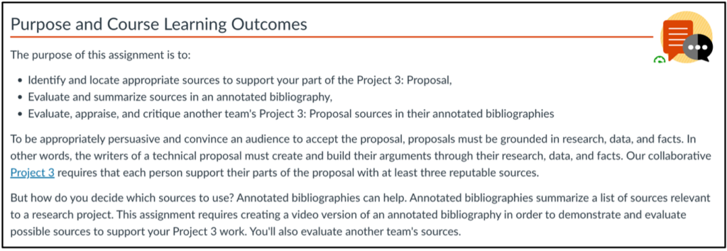
Learning outcomes (LOs) are used in instructional design to describe the skills and knowledge that students should have at the end of a course or learning unit, and to design assessments and activities that support these goals. It is widely agreed that specific, measurable outcomes are essential for planning instruction; however, some educators question the benefits of explicitly presenting them to students. I have been asked (and wondered myself): “What is the point of listing learning outcomes in the course?” “How do they help learning? “Do students even read them?”

So, I went on a quest for research that attempted to answer such questions. I was particularly interested in unit/module-level outcomes, as those are the ones that directly steer the content, and students see them throughout the course. Here’s a brief summary of what I found.

Note: the studies use the terms “learning outcome”, “learning objective”, or “learning goal” – they all refer to the same concept: a specific and measurable description of the skills and knowledge that students are expected to have at the end of a learning unit/period of study. At OSU we use the term “outcomes”.

What Does the Research Say?

Armbruster et al. (2009) redesigned an Introductory Biology course at Georgetown University, Washington, DC, using active learning and student-centered pedagogies, leading to increased student performance and satisfaction. One of the strategies used was to include explicit learning goals in the lecture slides, and labeling exam and quiz questions with the related goals. Students’ attitudes towards the course were assessed via a questionnaire and comparison of university-administered student evaluations. Students were asked to rank lecture components in terms of helpfulness to learning, and the authors found that one of the highest-ranking elements was the inclusion of explicit learning goals.

Simon and Taylor (2009) surveyed 597 students from computer science and microbiology and immunology courses at the University of British Columbia, where instructors presented learning goals at the beginning of each lecture or topic area. The questions were open and the answers coded into a number of categories, which helped them identify several values of goals. The main value was “knowing what I need to know”: students reported that the goals showed them how to focus their efforts and felt that the goals “allowed them to organize the information more effectively and be more expertlike in their approach to the class” (Simon & Taylor, 2009, p.55). The authors did not find any difference between presenting the goals before each lecture versus at the beginning of the unit/topic area.

Brooks et al. (2014) examined students’ views of learning outcomes at the University of Leicester, UK. First, they surveyed 918 students taking Biological Sciences, English and Medicine courses. They found that 81% of participants agreed or strongly agreed that learning outcomes are useful learning aids. Additionally, 46% found LOs more useful as their courses progressed, and 49% reported that they engaged more with the LOs as the course progressed. The authors also investigated when LOs are most useful, and found that the most common answer (46%) was when reviewing the material. Moreover, 49% of students reported that LOs can only be fully understood at the end of a module. The researchers followed up on these results with a focus group, which confirmed that students use LOs in various ways and at various points during the course.

Osueke et al. (2018) looked into students’ use and perceptions of learning objectives at University of Georgia. 185 students in an undergraduate Introduction to Biochemistry and Molecular Biology course took part in the study. The instructors included instructions in the syllabus, which they also stated on the first day of class: “Focus on the learning objectives. The exams will assess your accomplishment of the learning objectives. Use the learning objectives as a guide for what to focus on when you are completing assignments and studying for exams.” Students completed two assignments requiring them to explain their use of the LOs. The researchers found that many students (33.8%) reported they had been instructed on how to use LOs to study – these instructions ranged from passively “look over” to using them as a study guide. The ways students used the LOs were: as questions to answer (47.4%), as a resource for studying (24.1%), as a self-assessment tool (14.3%), and passive use (13.5%). When asked why they find the LOs helpful, students said that they help them: narrow down the information (57.1%); organize their studying (23.3%); communicate information (5.3%); monitor their understanding (4.5%); forced them to study (1.5%).

Sana et al. (2020) conducted three experiments aiming to find to what extent presenting the LOs improve retention of information. Participants were asked to read five passages on a neuroscience topic, and then they were tested on comprehension and retention. The experiments took place at McMaster University, Ontario and employed different participants, methods, materials, and procedures. They found that: interpolating LOs throughout the lesson (as opposed to all LOs presented at the beginning) improved learning compared to not including LOs, especially when students’ attention was explicitly directed to them; converting LOs into pretest questions (that students attempted to answer) further enhanced performance; multiple-choice and short answer questions were equally effective; and withholding feedback on pretests was more effective than providing feedback – the explanation proposed by the authors for this last finding was that students may be more motivated to seek the correct answers themselves, which causes further processing of the material.

Barnard et al. (2021) investigated students’ and academics’ perspectives on the purpose of learning objectives and approaches to assessment preparation. They conducted focus groups with participants from an undergraduate Psychology course at the University of Nottingham, UK. The students reported that LOs are useful for guidance, as they “use them to create direction for some of the learning and revision strategies” (Barnard et al., 2021, p. 679).

Conclusions and Recommendations

Good news! The findings of these studies suggest that many students do appreciate clear LOs and use them to guide their learning. The LOs help them understand what they are expected to know – thus, students use them to focus their study, to review for an exam, and to self-check their knowledge.

As instructors and instructional designers, what can we do to help students take full advantage of LOs? Apart from having specific and measurable LOs, make sure that the LOs are well aligned with the activities, and make this alignment explicit. It may also be helpful to offer some guidance on how to use the LOs, for instance by prompting students to recap their learning at the end of a unit based on the LOs. Finally, we could turn the LOs into questions and use them as a pretest.

For more on creating and using LOs, check out the CBE—Life Sciences Education website, which has an informative guide, including a section on student use. 

Do you have any other ideas or resources on how to use learning outcomes to improve students’ experience and study habits? If so, we’d love to hear from you!

References

Armbruster, P., Patel, M., Johnson, E., & Weiss, M. (2009). Active learning and student-centered pedagogy improve student attitudes and performance in Introductory Biology. CBE Life Sciences Education, 8(3), 203–213. https://doi.org/10.1187/cbe.09-03-0025

Barnard, M., Whitt, E., & McDonald, S. (2021). Learning objectives and their effects on learning and assessment preparation: Insights from an undergraduate psychology course. Assessment and Evaluation in Higher Education, 46(5), 673–684. https://doi.org/10.1080/02602938.2020.1822281

Brooks, S., Dobbins, K., Scott, J. J. A., Rawlinson, M., & Norman, R. I. (2014). Learning about learning outcomes: The student perspective. Teaching in Higher Education, 19(6), 721–733. https://doi.org/10.1080/13562517.2014.901964

Osueke, B., Mekonnen, B., & Stanton, J. D. (2018). How undergraduate science students use learning objectives to study. Journal of Microbiology & Biology Education, 19(2). https://doi.org/10.1128/jmbe.v19i2.1510

Sana, F., Forrin, N. D., Sharma, M., Dubljevic, T., Ho, P., Jalil, E., & Kim, J. A. (2020). Optimizing the efficacy of learning objectives through pretests. CBE Life Sciences Education, 19(3), ar43–ar43. https://doi.org/10.1187/cbe.19-11-0257

Simon, B., & Taylor, J. (2009). What is the value of course-specific learning goals? Journal of College Science Teaching, 39(2), 52–57. Retrieved from: https://www.colorado.edu/sei/sites/default/files/attached-files/what_is_the_value_of_course-specific_learning_goals.pdf

The following is a guest blog post from Aimee L. Lomeli Garcia, MLA. Aimee completed an Instructional Design internship with OSU Ecampus during the Fall of 2022.

Have you ever found yourself reading the same paragraph over and over again only to not retain any information? Or been so overwhelmed with the content you’re trying to read that you’re unable to absorb any of it? Odds are that it may not just be the content you’re trying to read; it may be the way the information is laid out. One way to help read and retain information is to make the text more readable.

Making information readable in your online course can seem overwhelming, but there are a few steps that you can take to make the content more digestible for students.

What is Readability?

First off – what is readability?  Readability is defined as “the ease in which a reader can comprehend text” (Calonia, 2020). Readability is a vital aspect to keep in mind as you design online courses. It not only makes the content of the class easier to read but increases the likelihood that students will understand the faculty’s content through lectures and discussions.  Better readability also decreases the risk of students misunderstanding the content, experiencing frustration, and increases the risk of students becoming disinterested in interacting with the course.  Though there are multiple options to make content more readable, there are five ways that you can adapt the content in your course: chunking content, using whitespace, avoiding wordiness, creating infographics, and utilizing color.

Chunking Content

What does “chunking content” mean? Chunking means breaking content into smaller chunks to make it easier to understand. This strategy originates from the field of cognitive psychology, which has proven that the human brain can “process, understand, and remember information better when broken into smaller pieces” (Moran, 2016).

Let’s demonstrate!

Below are the first two paragraphs of Harry Potter and the Sorcerer’s Stone by J.K. Rowling:

Chapter One
The Boy Who Lived
Mr. and Mrs. Dursley, of number four, Privet Drive, were proud to say that they were perfectly normal, thank you very much. They were the last people you’d expect to be involved in anything strange or mysterious because they just didn’t hold with such nonsense.

When reading through this excerpt, it’s easy for your eyes to scan through the information without comprehending it.  There are a few common methods that will help with chunking your material: make your paragraphs shorter, add space between your paragraphs, and develop clear hierarchies of text.

Utilizing these methods, let’s make this paragraph more readable:

Chapter One

The Boy Who Lived

Mr. and Mrs. Dursley, of number four, Privet Drive, were proud to say that they were perfectly normal, thank you very much. They were the last people you’d expect to be involved in anything strange or mysterious, because they just didn’t hold with such nonsense.

Using Whitespace

Whitespace is defined as “empty space between and around elements of a page” (Babich, 2017). Whitespace creates a backdrop or frame to make your content easier to read.  Like chunking information, whitespace allows the eye to find information easily.  Take these slides for example:

“Plastic Coffee Cup on Book” by Anna Shvets from Pexels

Do you notice how much easier it is to read the different types of coffee drinks on the slide that has more white space? In a study done by Wichita State University, research confirmed that increasing the amount of whitespace actually improves reading comprehension!

Avoiding Wordiness

We’ve all experienced reading material that has excessive wordiness. In a manner of speaking, “wordiness means using more words than necessary within a sentence, especially short, vague words that do not add much meaning” (Eliminating Wordiness, 2022). Unfortunately, the overuse of unnecessary words can muddle ideas and cause confusion for students.

To decrease wordiness, focus on the key points you want to convey and use an active voice instead of a passive voice. Consider the following example:

All of the students who are new to this university are required ot attend an orientatin that has been scheduled for December 1st.”

When reading this sentence, it’s difficult to decipher what the necessary information is for the reader to understand. Instead, let’s focus on the key points and use an active voice in this sentence:

“New students are required to attend orientation on December 1st.”

Here, we eliminated the unnecessary wording, allowing readers to understand the message the sentence is trying to convey.

Use Visuals

Pictures speak louder than words! Using visual media, such as infographics, pictures, videos, animations, and films, make content easier for students to understand and could decrease the amount of writing you have to do for the class! You can obtain visual media through free online resources such as Pexels, Pixabay, or Openverse or created on your own (Canva is a favorite for me).

So, instead of using this:

Cells are the building blocks of life. A cell is composed of cytoplasm, a nucleus, ribosomes, and mitochondria. Cytoplasm is made up of a jell-like structure that contains the contents of the cell. The nucleus serves as the command center and is typically the largest part of the inside of the cell. Ribosomes are tiny parts of the cell that make proteins and mitochondria are jelly-bean shaped and create energy from the food we eat.

Try this!

Labeled animal cell
Image by brgfx on Freepik

Color

Color makes a significant impact on the readability of your page. This can be easy to overlook, as we typically use the standard black font/white background combination. However, adding color to words or backgrounds can bring attention to a message you’re trying to convey. There are ways to do this successfully and ways to add color poorly.

Color choice example - difficult to read.

Looking at the red text on the first example can be challenging for someone with no vision issues. Imagine the difficulty students who have a visual impairment can have – in particular, red/green color blindness.

On the second example, having a text color that is nearly the same shade as the background can make reading the text nearly impossible. It takes effort to read the quote in the example – can you imagine reading a scholarly journal with the same formatting?

Don’t let these examples dissuade you from trying text colors and backgrounds! To verify if a color combination is readable, visit the Contrast Checker page, enter the RGB or RYB codes and the website will notify you if the color combinations are reader-friendly.

Color showing higher contrast

Conclusion

Drafting your site can be overwhelming when considering readability, but there are several steps you can take to make the course content easier to understand.

  • Chunking content helps break text into smaller pieces so content is easier for students to digest.
  • Whitespace provides empty space for your content to pop
  • Avoiding wordiness can make your content and message clearer
  • Using visuals allows you to utilize pictures, videos, infographics, and other media to convey content
  • Strategic use of color on your page can make reading the material more comfortable and less straining for all students, including those with vision impairments.

Below are links to resources and tools if you’d like to dive into more information about readability and the impact it has on the success of students of online students. Thanks for reading!

References

Babich, N. (2017, June 30). The power of whitespace. UX Planet. Retrieved November 28, 2022, from https://uxplanet.org/the-power-of-whitespace-a1a95e45f82b

Calonia, J. (2020, September 2). What is readability? Grammarly Blog. Retrieved November 28, 2022, from https://www.grammarly.com/blog/readability/

Eliminating wordiness. (2022). Hamilton College. Retrieved November 28, 2022, from https://www.hamilton.edu/academics/centers/writing/writing-resources/eliminating-wordiness

Moran, K. (2016, March 20). How chunking helps content processing. Nielsen Norman Group. Retrieved November 28, 2022, from https://www.nngroup.com/articles/chunking/

Sabo, C. (2018, June 19). Getting started guide: using infographics for teaching and learning. Learning Technologies. Retrieved November 28, 2022, from http://www.codlearningtech.org/2018/06/19/getting-started-guide-using-infographics-for-teaching-and-learning/

Wordiness. (2022). Las Positas College Reading & Writing Center. Retrieved November 28, 2022, from http://www.laspositascollege.edu/raw/wordiness.php#:~:text=Wordiness%20means%20using%20more%20words,main%20focus%20of%20the%20sentence

One of the major advantages of digital learning is that we can ensure our materials are accessible to all students. As such, at Ecampus, we are striving – and encouraging others to strive – for universal design, that is, design that anyone can use comfortably regardless of any impairments. In past posts, we have covered various ways of improving accessibility in a course, including how to fix PowerPoint or Word files. Today I’d like to focus on making Canvas pages accessible and making use of the on-page Accessibility Checker available in the Canvas Rich Content Editor.

Common Issues

Here are the main things you can do to ensure your Canvas pages (including assignments, discussions etc.) are accessible:

  1. Use proper hierarchy of headings and do not skip heading levels. You want to start with Heading 2 (Heading 1 is the title), then subordinate to that will be Heading 3 and so on. This is especially useful for screen reader users because it helps with logical page navigation. Some people choose their headings by the font size – not a good idea! If you want to adjust the size of your text, use the “Font sizes” option in the editor, after designating the correct heading level.
  2. Add an alt text description to any image or mark it as decorative. This is helpful for screen reader users and people for whom the images are not loading.
  3. Make the link names descriptive, rather than just pasting the url. For example, you would write Student Resources instead of https://experience.oregonstate.edu/resources. Also, avoid linking “click here” type of text. This helps screen reader users (which would read a url letter by letter), and it also makes it easier for everyone to scan the page and find the needed information.
  4. Ensure good color contrast. I often see instructors making their text colorful – in particular, red seems to be very popular. Indeed, a touch of color can make the page more visually pleasing and help bring out headings or important information! The danger lies in using colors that don’t have enough contrast with the background. This is especially problematic for people with less-than-optimal eyesight, but good contrast really just makes it easier for all of us to read. Also, a word of caution: Canvas has recently rolled out dark mode for mobile platforms and many people like to use it. Some colored or highlighted text may not look clear in dark mode.
  5. Add caption and header row to tables. These are extremely helpful for screen reader users, and the caption helps everyone to quickly see what the table is about. To add these things, you actually have to rely on the on-page accessibility checker – it will flag the issues and walk you through fixing them. While we’re on the subject of tables, you also want to avoid complex tables with merged cells because they are hard to navigate for a screen reader.
  6. Avoid underlining text. Underlining is normally reserved for links. Try using other means of highlighting information, such as bold, italics or caps.

Find and Fix

Canvas has a very useful tool that can help you find some accessibility issues as you edit your page. At the bottom of the editor, the icon representing a human in a circle will show notification when something is amiss.

Screenshot of bottom of editor showing the accessibility checker icon

When you click on that icon, the checker will open on the right-hand side, explaining each issue and allowing you to fix it right there.

Screenshot of the accessibility checker dialog window

This tool can find:

  • Skipped heading levels/starting with the wrong heading
  • Missing alt text
  • Insufficient color contrast – you can find a suitable color right here
  • Missing table caption and header row

It will NOT flag poorly formatted links or underlined text. So, for these issues, you’ll have to watch out yourself!

For a full list of problems verified by this checker, see this article from Canvas Community.

When you’ve finished building your course, you can also use UDOIT, the global accessibility checker, or Ally, if your institution has installed it. These tools can help you find additional problems, including embedded materials with accessibility issues.

To conclude, following these simple rules can greatly enhance the usability of your Canvas course. The built-in accessibility checker will help you spot and fix some common issues. Once you start paying attention, building instructional content with accessibility in mind will become second nature!

Ashlee M. C. Foster, MSEd | Instructional Design Specialist | Oregon State University Ecampus

This is the final installment of a three-part series on project-based learning. The first two articles, Architecture for Authenticity and Mindful Design, explore the foundational elements of project-based learning. This article shifts our attention to generating practical application ideas for your unique course. This series will conclude with a showcase of an exemplary Ecampus course project. 

Over the last couple of years, as an instructional designer, I have observed my faculty developers shifting how they assess student learning. Frequent and varied low-stakes assessments are replacing high-stakes exams, in their courses. Therefore, students increasingly have more opportunities to actively engage in meaningful ways. What an exciting time!

Activity Ideas

Instructors commonly express that adopting a new, emerging, or unfamiliar pedagogical approach can be challenging for two reasons: 1) identifying an appropriate activity and 2) thoughtfully designing the activity into a course. Sometimes a brainstorming session is just the ticket. Here are a few activity ideas to get you started.

TitleDescriptionResource
Oral HistoryStudents pose a problem steeped with historical significance (e.g., racism). Students conduct research using primary sources which corroborate and contextualize the issue. Experts and/or those with direct/indirect experience are interviewed. Interviews are documented with multimedia. 
Oregon State University SCARC Oral History Program
Renewable Course MaterialsStudents write, design, and edit a course website that takes the place of a course textbook.Open Pedagogy Notebook
App LabStudents collaboratively design an application that will serve a relevant societal need, resolve barriers, or fix a problem.CODE
Problem solved!Students select a problem that affects the local, regional, state, national, or global community and conduct research. Students collaboratively create scenarios that authentically contextualize the problem. Students develop solutions that utilize the main course concepts while engaging with the problem within a real-world context.Oregon State University Bioenergy Summer Bridge Program
GenderMag ProjectGenderMagis a process that guides individuals/groups through any form of technology (e.g., websites, software, systems) to find gender inclusivity “bugs.” After going through the GenderMag process, the investigators can then provide recommendations and fix the bugs.The GenderMag Project

Take a moment to explore a few of the following resources for additional project ideas:

While exploring project-based activities and/or assessments, it may also be helpful to consider the following questions: 

  • Does this activity align with the course learning outcomes? 
  • What type of prerequisite knowledge and skills do students need?
  • What types of knowledge and skills will students need after completing the project?
  • Can the activity be modified/customized to fit the needs of the course?
  • What strategies will be employed to foster authentic learning? 
  • What strategies can be used to guide and/or coach teams through the activity?
  • How will the activity foster equitable engagement and active participation?
  • What strategies can be utilized to nurture and build a strong learning community?

Project Spotlight

Becky Crandall

Becky is an Associate Professor of Practice in the Adult and Higher Education (AHE) program at Oregon State University. We had the pleasure of collaborating on the Ecampus course development for AHE 623, Contemporary Issues in Higher Education. With two decades of experience in postsecondary settings, Becky came to the table with a wealth of knowledge, expertise, and strong perspectives grounded in social justice, all of which situated her to create a high-quality, engaging, and inclusive Ecampus course. When interviewing her for this article, she shared her pedagogical approach to teaching online and hybrid courses, which provides a meaningful context for the project design

“At the start of every term, I take time to explain the idea that shapes the approach I take as an educator and the expectations that I have of the class: ‘we are a community.’ Inspired by educational heroes like Paulo Freire, bell hooks, and Marcia Baxter Magolda, as well as the excellent teachers who shaped me as a student, I take a constructivist approach to teaching. I also center the ‘so what’ and ‘now what’ of the material we cover through active learning exercises that create space for students to reflect on their learning and its applicability to the real world. Admittedly, such active learning exercises are engaging. Research also highlights their effectiveness as a pedagogical strategy. More importantly, however, they provide a means of disrupting power structures within the classroom (i.e., the students are positioned as experts too), and they serve as mechanisms through which the students and I can bring our full selves to the course.” ~Becky Crandall

The Project

In AHE 623, students complete a term-long project entitled the “Mini-Conference.” The project situates students as the experts, “by disrupting traditional classroom power structures” and provides an opportunity to “simulate the kind of proposal writing and presenting they would do at a professional conference.” The project’s intended goal is to foster deep learning through the exploration of contemporary real-world higher education issues.

Design

The project is a staged design with incremental milestones throughout the 11-week academic term. The project design mimics the process of a professional conference, from proposal to presentation. The project consists of “two elements: (1) a conference proposal that included an abstract, learning outcomes, a literature review, policy and/or practice implications, and a presentation outline and (2) a 20-minute presentation.”  As the term concludes, students deliver the presentation (i.e., conference workshop) that actively engages the audience with the self-selected topic. Students have varied opportunities to receive peer and instructor feedback. The information gleaned from the feedback helps to refine student proposals for submission to a professional organization.

Becky shared how she conceptualized and designed the project using backward design principles. “Specifically, I began by considering the goals of the course and the project. I then researched professional associations’ conference proposal calls to determine what elements to include in the project. When developing learning exercises, I often ask, ‘How might the students use this in the real world?’” By using an intentional design process, the result is a project which is strongly aligned, structures learning, and has authentic application.

Project Overview Page

Delivery

The first delivery of AHE 623 was successfully launched in the Spring of 2022 with minimal challenges other than the limited time. “The students engaged fully in the mini-conference. As reflected in the outcomes, they not only learned but were left hungry for more.”  Requests flew in for additional opportunities to apply what they had learned! The students raved about this project such that they even asked if they could host a virtual conference using their presentations.The project proved to be a transformational experience for students. “Multiple students noted that this opportunity helped them refine their dissertation ideas and related skills.” As Becky looks forward, she hopes to consider restructuring the design into a rotating roundtable format. Doing so will ensure that students are exposed to their peers’ perspectives in the course.

Remember that course design and development is an iterative process. Please know you do not have to get it right the first time or even the tenth. Your students do value your enthusiasm for the subject and appreciate the effort you have put into crafting valuable learning experiences for them. You have got this!

Inspire!

Visit the Ecampus Course Development and Training team blog for application tips, course development and design resources, online learning best practices and standards, and emerging trends in Higher Education. We look forward to seeing you there.

Acknowledgments

Dr. Becky Crandall, thank you for candidly sharing your core pedagogical approaches, philosophy of teaching, and the course project with the Oregon State community. Your commitment to social justice continues to shine in your course designs and instructional delivery.

courage
courage

Are you passionate for what you do? I do. I enjoy, treasure, relish what I do as an instructional designer. But I also realize that not everyone is able to work on something they are passionate about. As an educator, I believe we ought to stir up passion and values in the learners we serve. So, I started searching for ways to motivate, to stir up and help people find their passion. And I found these resources: books and podcast by Todd Henry on passion, and book and podcast by Liz Forkin Bohannon.


Todd Henry shared his recipe for finding the power to keep your passion firing for a lifetime by starting with a few simple questions.

  • What is something that you are willing to suffer on behalf of it?
  • What makes you angry?
  • What moves you emotionally?
  • What gives you hope?


Quotes from Todd Henry, author and experts on creativity, productivity, and passion for work.
Goal of life is not comfort, but conquest!
The love of comfort is often the enemy of greatness.
The seeds of tomorrow’s greatness is planted in today’s activities.
If you are intentional, and if you live by design, not by default, someday, in the distant future, when you lay your head down for the last time you can point to a delta, a body of work and you can say “yes, that represents me.”


Beginner’s Pluck is a 2019 book by Liz Forkin Bohannon (Podcast host, and co-founder of Sseko Designs). In this book, Liz teaches us that passion is not discovered, as we were told for so long, but rather passion is built step by step! And the first step is to find an interesting problem. And to have a posture of curiosity over criticism. The good news is the world is full of interesting problems!

This is a totally new perspective to me: passion is built and the first step to build passion is to find interesting problems. And this new perspective leads me to think how I could and should plan my instructional design work to provide room and opportunities in any course for asking questions that guide learners to build their passion. It could be in the syllabus, in each module’s content page, before or after learners work on the readings and lecture videos, or at the end of the module as a self-assessment. There are many different ways and places we can incorporate the building of passion into course design!


Conclusion: Build your Passion starting with questions and interesting problems. My questions for you, dear educator, “is there room in your teaching to ask an inspiring question that points your learners towards building their passion for life?” Or if you are reading this for your own benefit, consider what problems are interesting to you and start working on solving the problems, little by little. If you need to someone to brainstorm design ideas for infusing questions into your teaching, feel free to contact me at tianhong.shi@oregonstate.edu

References:

Bohannon, L.F. (2019). Beginner’s Pluck. Baker books.

Henry, T. (2013). Die Empty. Penguin Publishing Group

If you design or teach online courses, and the term Regular and Substantive Interaction (RSI) is unfamiliar to you, not to worry. It’s likely that you’ve already implemented some degree of RSI in your online courses. RSI is the US Department of Education (DoE) requirement for institutions receiving federal funds to “ensure that there is regular and substantive interaction between students and instructors” in their online courses. It was intended as a quality assurance and consumer protection measure, but it is also a key component of high-quality online learning. Simply put, student-teacher interactions must be consistent and meaningful throughout the delivery of an online course. There is a mountain of research supporting this idea by now, and we have long known that this type of interaction is an essential component of learning and has a deep impact on student experience and satisfaction with online learning.

word cloud containing high- frequency words from post
Word cloud created via WordItOut.com

Characteristics of RSI

You may be thinking that you already have plenty of quality interaction in your course. If you’re familiar with the Ecampus Essentials standards for course development (based on the Quality Matters course design rubric) or the Ecampus Online Teaching Principles, you know that teacher-student interaction is a basic component of effective online course design and delivery. You may also be thinking that “interaction” is a vague term. After all, interactions can occur synchronously or asynchronously via many different platforms. They can occur in response to student progress in a particular course or be an intentional aspect of the instructor’s course delivery plan. So, what exactly does quality interaction in the context of RSI entail? The DOE guidelines outline the main characteristics of regular and substantive interaction as follows: 

Instructor-initiated 

Instructor-student interaction should be an intentional component of the course design and delivery. While students should also be encouraged to reach out to the instructor as needed, interactions should be required and initiated by the instructor to be considered RSI. For example, ad hoc office hours and auto-graded objective quizzes would not be considered RSI, but requested office visits, individualized feedback on assignments or open-ended quizzes, and instructor-facilitated online discussion forums would qualify as regular and sustained interactions. Likewise, announcements tailored to the course content during the term of the delivery would also meet the guidelines for RSI.

Frequent and consistent 

Simply put, frequent and consistent interaction means that you are present in your course in an intentional manner regularly throughout the term. Instructor presence in online courses deeply impacts student learning, satisfaction, and motivation, so this is probably not a new idea for those who have taught online. Many online instructors maintain instructor presence through regular announcements or videos providing updates on student progress or feedback, adding to ideas presented in student discussions or other submissions, offering clarifications to questions regarding content or assignments, etc. There are many ways for instructors to be present in a course so that students feel that they are part of a community of learners. To meet the standards for RSI, the instructor presence should also be planned and occur regularly throughout the term.

Focused on the course subject

Interactions should be related to the academic content and help students to achieve the course outcomes. Assignments should provide a space for instructors to assess student learning through substantive feedback. Non-specific feedback (Good job!) or a grade entered without comments related to work on the assignment at hand would not count as RSI. However, communications providing reading guidance, posting examples with explanations, sending an announcement clarifying concepts students may have missed in a discussion are all good examples of interactions focused on the course subject. That’s not to say that sending a message of encouragement or celebration to students (Go Beavs!) would not be an important component of social presence in a course. 

Faculty member meets accreditation standards

This requirement presents a little bit of a murky area, and each institution will need to decide who would be considered a qualified subject matter expert based on their accrediting body standards. For example, Teaching Assistants (TAs) may or may not be considered qualified subject matter experts depending on where they are in their postgraduate journey. However, regardless of the level of expertise, the role of any TA or other course mentor can never be in lieu of the instructor interaction in a course. 

Increasing RSI in your course

Meaningful interaction may already be an integral part of your course design and delivery, or you may have some work to do in that area. Whatever your current level of RSI, there are many ways to increase or vary the interaction in your course. Some practitioners note that what constitutes “meaningful interaction” for the purposes of RSI compliance can be difficult to measure. In response, the DoE updated their definition of Regular and Substantive Interaction (RSI) in 2021 to further clarify the issue for practitioners. To be considered regular and substantive, interaction, “…must engage students in teaching, learning, and assessment, as well as two of these five actions: 

  • providing direct instruction;
  • assessing or providing feedback on a student’s course work; 
  • providing information or responding to questions about the content of a course or competency; 
  • facilitating a group discussion regarding the content of a course or competency; 
  • or other instructional activities approved by the institution’s or program’s accrediting agency.”

The good news is that the DoE definition is broad enough to include a huge range of activities giving course developers and instructors many options for choosing how and when interaction occurs in a course. While not an exhaustive list, a few recommendations to boost RSI in your course include: 

Set expectations

Make your plan for interaction clear to students, and include them in setting expectations for both the instructor and the students. Your communication policy stating the response time students can expect from you on emails and assignment feedback should be stated in the syllabus and posted in the course. You should also tell learners how to communicate with you. Make participation expectations clear through discussion guidelines and rubrics for participation. You might also create an introductory activity in which students and the instructor make their expectations explicit through a negotiated process. 

Provide timely and individualized feedback

There are many methods for delivering feedback (written, video, audio, conferences, etc). In fact, using a combination of methods is good practice for incorporating elements of Universal Design for Learning (UDL). Regardless of how you deliver feedback, it should add to or extend students’ understanding, make concrete suggestions for improvement, highlight what they are doing well, or provide models. 

Send regular announcements

Announcements are handy for sending reminders about due dates and other housekeeping items. As an RSI strategy, announcements present a useful vehicle for digging into course content and helping students to synthesize important information. You might use announcements to extend concepts from the previous week’s activities, contextualize content students will see in the coming week, or to identify sticky points or patterns seen in student work. While announcements can be used for on the fly reminders or clarifications, it is a good idea to establish a pattern for sending substantive announcements whether that be on Sunday evenings or at other intervals so that students know when to expect them. 

Incorporate tools for meaningful interaction

VoiceThread, Padlet, and Perusall are just a few examples of platforms that instructors can use to facilitate interaction. While it may be tempting to incorporate several tools to boost engagement, a more effective approach would be to avoid using technology for the sake of using technology. Instead, try incorporating one or two tools and create meaningful tasks around them. Use each two or more times during the term so that students spend their time engaging with each other and the content via the tool rather than learning how to use it. 

Conduct surveys and evaluations 

Midterm surveys on students’ experience in the course are helpful for second-half tweaks to stay on track toward the goals you set out to accomplish. They can also be useful for making adjustments for the next time you deliver the course. Ask students how they feel about the interactions with other students and the instructor. Ask how they could be improved, and encourage them to reflect on their own contributions. If there is group work involved, solicit opinions about how it is going and how you can support their collaborations. In doing so, you give learners the opportunity to ask for help where they need it, and you gain information to give you ideas for how to structure interactions for the next iteration of the course. A trusted colleague or an instructor designer can also be helpful in evaluating the level of RSI in your course. When you feel you have reached your goals around interaction and other markers of high-quality course design, consider asking for a formal review of your course to become Quality Matters certified. 

Hold regular office hours

In order to qualify as RSI, office hours must be predictable, scheduled, and required rather than an optional feature of the course. While synchronous sessions should be kept to a minimum to allow for student flexibility, you can also facilitate meaningful interaction via a virtual meetings. If you give mini-lectures or provide models for specific lessons, for example, you might consider recording your explanations so all students, including those who cannot attend a particular session, benefit from the extra guidance. 

Resources

Poulin, R. (2016) Interpreting what is Required for “Regular and Substantive Interaction”. WCET Frontiers. Retrieved from https://wcet.wiche.edu/frontiers/2016/09/30/interpreting-regular-and-substantive-interaction/

Regular and Substantive Interaction. SUNY Online. Retrieved from https://oscqr.suny.edu/rsi/

Regular & Substantive Interaction (RSI) in Online Learning. Chemeketa Center for Academic Innovation. Retrieved from https://facultyhub.chemeketa.edu/instruction/rsi/

How to Increase Regular and Substantive Interaction (RSI) in Online and Distance Learning. OLC Webinar 2021. Retrieved from https://onlinelearningconsortium.org/webinar/how-to-increase-regular-and-substantive-interaction-rsi-in-online-and-distance-learning/

Quality Online Practices: Regular and Substantive Interaction (RSI). University of Tennessee Knoxville. Retrieved from https://onlinelearning.utk.edu/online-teaching-learning-resources/quality-online-practices/rsi/