The following is a guest blog post from Aimee L. Lomeli Garcia, MLA. Aimee completed an Instructional Design internship with OSU Ecampus during the Fall of 2022.

Have you ever found yourself reading the same paragraph over and over again only to not retain any information? Or been so overwhelmed with the content you’re trying to read that you’re unable to absorb any of it? Odds are that it may not just be the content you’re trying to read; it may be the way the information is laid out. One way to help read and retain information is to make the text more readable.

Making information readable in your online course can seem overwhelming, but there are a few steps that you can take to make the content more digestible for students.

What is Readability?

First off – what is readability?  Readability is defined as “the ease in which a reader can comprehend text” (Calonia, 2020). Readability is a vital aspect to keep in mind as you design online courses. It not only makes the content of the class easier to read but increases the likelihood that students will understand the faculty’s content through lectures and discussions.  Better readability also decreases the risk of students misunderstanding the content, experiencing frustration, and increases the risk of students becoming disinterested in interacting with the course.  Though there are multiple options to make content more readable, there are five ways that you can adapt the content in your course: chunking content, using whitespace, avoiding wordiness, creating infographics, and utilizing color.

Chunking Content

What does “chunking content” mean? Chunking means breaking content into smaller chunks to make it easier to understand. This strategy originates from the field of cognitive psychology, which has proven that the human brain can “process, understand, and remember information better when broken into smaller pieces” (Moran, 2016).

Let’s demonstrate!

Below are the first two paragraphs of Harry Potter and the Sorcerer’s Stone by J.K. Rowling:

Chapter One
The Boy Who Lived
Mr. and Mrs. Dursley, of number four, Privet Drive, were proud to say that they were perfectly normal, thank you very much. They were the last people you’d expect to be involved in anything strange or mysterious because they just didn’t hold with such nonsense.

When reading through this excerpt, it’s easy for your eyes to scan through the information without comprehending it.  There are a few common methods that will help with chunking your material: make your paragraphs shorter, add space between your paragraphs, and develop clear hierarchies of text.

Utilizing these methods, let’s make this paragraph more readable:

Chapter One

The Boy Who Lived

Mr. and Mrs. Dursley, of number four, Privet Drive, were proud to say that they were perfectly normal, thank you very much. They were the last people you’d expect to be involved in anything strange or mysterious, because they just didn’t hold with such nonsense.

Using Whitespace

Whitespace is defined as “empty space between and around elements of a page” (Babich, 2017). Whitespace creates a backdrop or frame to make your content easier to read.  Like chunking information, whitespace allows the eye to find information easily.  Take these slides for example:

“Plastic Coffee Cup on Book” by Anna Shvets from Pexels

Do you notice how much easier it is to read the different types of coffee drinks on the slide that has more white space? In a study done by Wichita State University, research confirmed that increasing the amount of whitespace actually improves reading comprehension!

Avoiding Wordiness

We’ve all experienced reading material that has excessive wordiness. In a manner of speaking, “wordiness means using more words than necessary within a sentence, especially short, vague words that do not add much meaning” (Eliminating Wordiness, 2022). Unfortunately, the overuse of unnecessary words can muddle ideas and cause confusion for students.

To decrease wordiness, focus on the key points you want to convey and use an active voice instead of a passive voice. Consider the following example:

All of the students who are new to this university are required ot attend an orientatin that has been scheduled for December 1st.”

When reading this sentence, it’s difficult to decipher what the necessary information is for the reader to understand. Instead, let’s focus on the key points and use an active voice in this sentence:

“New students are required to attend orientation on December 1st.”

Here, we eliminated the unnecessary wording, allowing readers to understand the message the sentence is trying to convey.

Use Visuals

Pictures speak louder than words! Using visual media, such as infographics, pictures, videos, animations, and films, make content easier for students to understand and could decrease the amount of writing you have to do for the class! You can obtain visual media through free online resources such as Pexels, Pixabay, or Openverse or created on your own (Canva is a favorite for me).

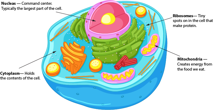
So, instead of using this:

Cells are the building blocks of life. A cell is composed of cytoplasm, a nucleus, ribosomes, and mitochondria. Cytoplasm is made up of a jell-like structure that contains the contents of the cell. The nucleus serves as the command center and is typically the largest part of the inside of the cell. Ribosomes are tiny parts of the cell that make proteins and mitochondria are jelly-bean shaped and create energy from the food we eat.

Try this!

Labeled animal cell
Image by brgfx on Freepik

Color

Color makes a significant impact on the readability of your page. This can be easy to overlook, as we typically use the standard black font/white background combination. However, adding color to words or backgrounds can bring attention to a message you’re trying to convey. There are ways to do this successfully and ways to add color poorly.

Color choice example - difficult to read.

Looking at the red text on the first example can be challenging for someone with no vision issues. Imagine the difficulty students who have a visual impairment can have – in particular, red/green color blindness.

On the second example, having a text color that is nearly the same shade as the background can make reading the text nearly impossible. It takes effort to read the quote in the example – can you imagine reading a scholarly journal with the same formatting?

Don’t let these examples dissuade you from trying text colors and backgrounds! To verify if a color combination is readable, visit the Contrast Checker page, enter the RGB or RYB codes and the website will notify you if the color combinations are reader-friendly.

Color showing higher contrast

Conclusion

Drafting your site can be overwhelming when considering readability, but there are several steps you can take to make the course content easier to understand.

  • Chunking content helps break text into smaller pieces so content is easier for students to digest.
  • Whitespace provides empty space for your content to pop
  • Avoiding wordiness can make your content and message clearer
  • Using visuals allows you to utilize pictures, videos, infographics, and other media to convey content
  • Strategic use of color on your page can make reading the material more comfortable and less straining for all students, including those with vision impairments.

Below are links to resources and tools if you’d like to dive into more information about readability and the impact it has on the success of students of online students. Thanks for reading!

References

Babich, N. (2017, June 30). The power of whitespace. UX Planet. Retrieved November 28, 2022, from https://uxplanet.org/the-power-of-whitespace-a1a95e45f82b

Calonia, J. (2020, September 2). What is readability? Grammarly Blog. Retrieved November 28, 2022, from https://www.grammarly.com/blog/readability/

Eliminating wordiness. (2022). Hamilton College. Retrieved November 28, 2022, from https://www.hamilton.edu/academics/centers/writing/writing-resources/eliminating-wordiness

Moran, K. (2016, March 20). How chunking helps content processing. Nielsen Norman Group. Retrieved November 28, 2022, from https://www.nngroup.com/articles/chunking/

Sabo, C. (2018, June 19). Getting started guide: using infographics for teaching and learning. Learning Technologies. Retrieved November 28, 2022, from http://www.codlearningtech.org/2018/06/19/getting-started-guide-using-infographics-for-teaching-and-learning/

Wordiness. (2022). Las Positas College Reading & Writing Center. Retrieved November 28, 2022, from http://www.laspositascollege.edu/raw/wordiness.php#:~:text=Wordiness%20means%20using%20more%20words,main%20focus%20of%20the%20sentence

I was recently assigned to be the Instructional Designer for an introductory programming course here at OSU. While working with the instructor, I was happy to see his inventiveness in assessment design. As one example, the instructor created an assignment to introduce loops, a block of code in a computer program that repeats while a condition is true. Here’s how he described the assignment to the students:

Your assignment is to simulate the progression of a zombie epidemic as it spreads through Portland, Oregon, beginning in the year 2001 (which was about the time that zombies became unnervingly popular). This assignment will test whether you can use loops when translating from a problem to a computational solution.

(Scaffidi, 2019)

I was excited about the design possibilities this introduced to a usually dry topic. Zombies! I built the page in our LMS, Canvas, and was excited to review it with him.

“Isn’t this fun?” I asked, showing him the assignment page I had created:

Zombie epidemic programming assignment introduction

“I guess so,” he said, “is there any research to indicate that decorative graphics support learning?” he asked me. I guess that’s fair to ask, even if it was a bit of a buzzkill.

I had no idea if including cool pictures was a research-based best practice in online course design. While I really wanted it to be true and felt like it should be true, I could not immediately cite peer-reviewed studies that supported the use of zombie images to improve learner engagement; I had never seen such research. But, I was determined to look before our next meeting.

The instructor’s research challenge led me to discover Research Rabbit. Research Rabbit is a relatively new online platform that helps users find academic research. Research Rabbit has users organize found research into collections. As articles are added to a collection, Research Rabbit helps identify related research.

Without realizing how much time I was exploring, four hours quickly passed in which I was wholly engrossed in the search to justify including a zombie picture in one assignment for one instructor. Below, I will share a few of the features that enamored me with Research Rabbit and why I continue to use it regularly.

Why I love Research Rabbit

Visualization of Search Results

Rather than combing through reference lists at the bottom of a paper, you can quickly view any works cited by a paper you have selected or change views and get a list of articles that have cited the selected document. Those results are presented in a list view, a network view, or on a timeline.

A Tool for Discovery

Research Rabbit starts generating suggested additions as soon as you add a paper to a collection. The more papers you add, the more accurate these recommendations become. It works somewhat like personalized Netflix or Spotify recommendations (ResearchRabbit, n.d.), helping you discover research you may not have been aware of in this same area of study.

Using their discovery functionality, you can identify clusters of researchers (those that have published together or frequently cite each other’s work). You can also use the “Earlier Work” option to see when research on a particular topic may have started and identify foundational papers in the field. Looking for “Later Work” helps you find the latest research and stay current on your research topic.

Free Forever

The Research Rabbit founders explain their reasoning for keeping their tool Free Forever as follows:

Why? It’s simple, really.

Researchers commit years of time, energy, and more to advance human knowledge. Our job is to help you discover work that is relevant, not to sell your work back to you.

(Research Rabbit FAQ)

Research Rabbit Syncs Collections to Zotero

I would have lost a lot of enthusiasm for Research Rabbit if I had to manually add each new paper to my Zotero collection. But Research Rabbit integrates with Zotero, and automatically syncs any designated collections. If you use a different reference tool, you can also export Research Rabbit collections in common bibliographic formats.

A Tool for Sharing and Collaboration

Once you have created a collection, you can invite other researchers to view or edit a collection based on the permissions you set. Collaborators can also add comments to individual items. Research Rabbit also gives you an opportunity to create public collections that can be shared with a custom link.

How to Explore Research Rabbit on Your Own

The feature set of Research Rabbit is beautifully demoed on the Research Rabbit website. From there, you can explore how to visualize papers, discover author networks, and start building collections. There is also a growing list of introductory and instructional videos by the academic community online.

So What Happened with the Zombies?

You can review some of the research yourself by checking out my Research Rabbit Collection of Articles on Visual Design in Online Learning.  Much to my delight, after conducting my (4-hour) search, I did find some research-based evidence that aesthetics improved engagement and recall (Deanna Grant-Smith et al., 2019). Many of the studies, however, also suggested that visuals in online courses should also have some instructional function and help communicate ideas to avoid cognitive overload (Rademacher, 2019).

Maybe next time, I’ll suggest embedding this:

A flowchart of a conditional loop feature Zombie images.
Zombie Images by Freepik

References

Deanna Grant-Smith, Timothy Donnet, James Macaulay, Renee Chapman, & Renee Anne Chapman. (2019). Principles and practices for enhanced visual design in virtual learning environments: Do looks matter in student engagement? https://doi.org/10.4018/978-1-5225-5769-2.ch005

Rademacher, C. (2019, May 13). Value of Images in Online Learning. Ecampus Course Development & Training. http://blogs.oregonstate.edu/inspire/2019/05/13/the-value-of-images-in-online-learning/

Research Rabbit FAQ. (n.d.). [Online tool]. Research Rabbit. Retrieved October 3, 2022, from https://researchrabbit.notion.site/Welcome-to-the-FAQ-c33b4a61e453431482015e27e8af40d5

ResearchRabbit. (n.d.). ResearchRabbit. Retrieved October 4, 2022, from https://www.researchrabbit.ai

Scaffidi, C. (2019). CS 201: Computer Programming for Non-CS Majors.

What is it?

Image of animator’s face in Character Animator program showing the facial data points used for animation creation.

Facial motion capture (Mo-Cap) is a process that uses a camera to map and track points on the user’s face. Software such as Adobe’sCharacter Animator derive data from the camera to animate cartoon characters in real time. This can greatly reduce the amount of time needed to create an animation and breathes subtle life into the character that would be otherwise difficult to achieve. Character Animator harnesses the power of the webcam to map several parts of the face to the respective parts of the character allowing it to record in real time. This includes your eyebrows, eyes, mouth, and head position. It also intakes audio to change mouth shapes to match what the user is speaking. In addition to the webcam, the user can operate their keyboard to trigger additional movements, effects, and walk motions. All these different aspects combine and give the character a personalized feel.

How does it help?

Image of character being rigged into a puppet showing the mesh and body tags.

Cartoon animations currently do not have a large presence in online learning. This is mostly because they take a long time to create and not everyone has had the resources to create them. Normally, character animation for cartoons requires drawing each frame or using a pose-to-pose process called key framing. With innovative technology such as Character Animator, it greatly reduces the barrier to create cartoon animations for online learning. Each motion of the face records instantly and gives the character life by adding subtle movements to the face and head. The bulk of the work is completed early on to draw, rig, and add triggers to the character, or in this case, the puppet. Once the puppet is set up to record, it is smooth sailing from there. All movements, audio, and facial expressions are recorded in one take; greatly reducing the amount of time for development. However, Character Animator allows you to choose which aspects you want to record, so you can record the eye movements one time, then the eyebrows another time. This is helpful for the perfectionists out there who cannot seem capture it all at once.

How does it work?

To create an animation using Character Animator, there are a handful of stages to complete. The first step is to draw the character in either Photoshop or Illustrator. Next, Character Animator imports the graphics and they are rigged into puppets to prepare for recording. This means the eyes, nose, mouth, etc. are tagged with their respective labels. Also during this time, you can create keyboard triggers. These are animations such as arm movements, walk motions, and more, that the pressing of certain keys on the keyboard triggers the character to perform. After the puppets are prepared, it is time to record. It does not have to be shot perfectly all at once; you can blend the best bits from different recordings into one masterpiece. The last step is to export the character’s recording and composite it into a story using video software such as Premiere Pro or After Effects. Once you achieve the flow of facial Mo-Cap, you can start cranking out animations faster than ever before.

Click Image to View Video

Below is a quick rundown of what it takes to set up a character and how to record it. At the end of the video, there is a sample of multiple characters in one scene.

What does the process look like?


Author: Zach Van Stone, Oregon State University Ecampus

If you’ve ever needed an excessive amount of photographs or diagrams to accurately describe a physical object for your class, you may benefit from a 3D model.

Standard media types, including text, photographs, illustrations, audio, video, and animation, are crucial to the online learning experience. A 3D model is essentially another media type with a lot of unique qualities.

What is a 3D model?

3D Skull with annotation

3D models, in this case, are digital representations of physical objects. 3D models generally consist of a polygon mesh and a surface texture. The polygon mesh is a “shell” comprised of the different surfaces of a 3-dimensional object. There are three main components that make up this shell: vertices (points), edges (lines), and faces (planes). For what should be clear from the previous sentence, polygon meshes are often referred to as simply “geometry.” There are a lot of other technical terms associated with polygon meshes, but in practical application, you may never need to learn them.

The surface texture, at its most basic, is an image, mapped onto the surface of the polygon mesh.

A texture can be as simple as a solid color, or as complex as a high-resolution photograph. The texture will be wrapped onto the surface of the geometry with the help of a set of instructions called UVs. UVs are a complex topic in and of themselves, so it’s good enough that you just know they exist conceptually.

These textures can have physics-based properties that interact with light to produce effects such as transparency, reflection, shadows, etc.

You’re probably thinking to yourself now, that 3D models are too complicated to be of use in your courses, but that’s not necessarily true. The composition and inner workings of 3D models are complicated, for sure, but you don’t need to be an expert to benefit from them.

Where did they come from, and how are they used?

There probably isn’t a day that goes by where you don’t experience a 3D model in some way. They are everywhere.

3D models, in digital form, have been around for decades. They have been used in industrial applications extensively. 3D models are used to generate toolpaths for small and large machines to manufacture parts more consistently than a human could ever hope to. 3D models are also used to generate toolpaths for 3D printers.

3D models are used in movies, animations, and video games. Sometimes entire worlds are created with 3D models for use in virtual and augmented reality.

Modern interfaces for computers and smartphones are awash in 3D graphics. Those graphics are rendered on the screen from 3D models!

How can they help me as an educator?

If you’re still not convinced that 3D models hold any benefit to you, I’ll explain a few ways in which they can enrich your course materials.

  1. 3D models are easily examined and manipulated without damage to physical specimen.
    • If you are involved in teaching a course with physical specimens, you are no doubt familiar with the concept of a “teaching collection.” A teaching collection is a high-turnover collection that gets handled and examined during class. Normally these collections break down quickly, so instructors are hesitant to include rare and fragile specimens. Having digital proxies for these rare and fragile specimens will allow students access to otherwise unknown information. This has even bigger benefits to distance students, as they don’t have to be anywhere near the collection to examine its contents.
  2. 3D models give students unlimited time with a specimen
    • If you have a biology lab, and the students are looking at skull morphology, there’s a distinct possibility that you would have a skull on hand to examine. If there are 30 students in the course, each student will have only a short amount of time to examine the specimen. If that same skull was scanned and made into a 3D model, each student could examine it simultaneously, for as long as they need.
  3. 3D models are easily shared
    • Many schools and universities around the world are digitizing their collections and sharing them. There is a fair amount of overlap in the models being created, but the ability to add regionally exclusive content to a global repository would be an amazing benefit to science at large. Smaller schools can have access to a greater pool of materials, and that is good for everyone.
  4. 3D models have presence
    • A 3D model is a media object. That means it can be examined, but it’s special in the way that it can be interacted with. Functionality can be built on and around a 3D model. Models can be manipulated, animated, and scaled. A photograph captures the light bouncing off of an object, that is closer to a description of the object.  A 3D model is a representation of the actual physical properties of the object, and that strikes at the nature of the object itself. This means that a 3D model can “stand in” for a real object in simulations, and the laws of physics can be applied accurately. This realistic depth and spatial presence can be very impactful to students. Much more so than a simple photograph.
  5. 3D models can be analyzed
    • Because 3D models are accurate, and because they occupy no physical space, they lend themselves to analysis techniques unavailable to the physical world. Two models can be literally laid on top of one another to highlight any differences. Measurements of structures can be taken with a few clicks. In the case of a machined part, material stress tests can be run over and over without the need to replace the part.

These are only a few of the ways that an educator could leverage 3D models. There are many more. So, if you still find 3D models interesting, you’re probably wondering how to get them, or where to look. There are a lot of places to find them, and a lot of techniques to build them yourself. I’ll outline a few.

Where do I get them?

3D models are available all over the internet, but there are a few reputable sources that you should definitely try first. Some will allow you to download models, and some will allow you to link to models on their site. Some will allow you to use the models for free, while others will require a fee. Some will have options for all of the aforementioned things.

How do I create them?

The two main ways to create 3D models are scanning and modeling.

Scanning can be prohibitively expensive, as the hardware can run from a few hundred dollars, to many thousands of dollars. But, like anything else technological, you get what you pay for. The quality is substantially better with higher-end scanners.

For something a little more consumer-grade, a technique called photogrammetry can be employed. This is a software solution that only requires you to take a large series of photographs. There is some nuance to the technique, but it can work well for those unable to spend thousands of dollars on a 3D scanner. Some examples of photogrammetry software include PhotoScan and COLMAP.

Modeling has a steep learning curve. There are many different software packages that allow you to create 3D models, and depending on your application, some will be better suited than others. If you are looking to create industrial schematics or architectural models, something likeFusion 360, AutoCad, or Solidworks might be a good choice. If you’re trying to sculpt an artistic vision, where the precise dimensions are less important, Maya, Blender, Mudbox or Zbrush may be your choice.

How to use them in your class:

There are a number of ways to use 3D models in your class. The simplest way is to link to the object on the website in which it resides. At OSU Ecampus, we use the site, SketchFab, to house our 3D scans. The source files stay with us as we create them, but we can easily upload them to SketchFab, brand them, and direct students to view them. SketchFab also allows us to add data to the model by way of written descriptions andannotations anchored to specific structures in the model.

The models hosted on SketchFab behave similarly to YouTube videos. You can embed them in your own site, and they are cross-platform compatible. They are even mobile-friendly.

As you can see, there is a lot to learn about 3D models and their application. Hopefully, I’ve broken it down into some smaller pieces that you can reasonably pursue on your own. At the very least, I hope that you have a better understanding of how powerful 3D models can be.

A big THANK YOU to Nick Harper, Multimedia Developer, Oregon State University Ecampus

In the classroom we often discuss readings and other sources of information. Because students are often accustomed to digital communications in which sources are rarely cited, they can benefit from guidance concerning your expectations regarding citation. The instructor for TCE 512, Psychology of the Adolescent, worked with Ecampus to create an infographic through which she provides such guidance.

This infographic is licensed under a Creative Commons license, so you can feel free to download and post it in your own courses. Also, remember that we enjoy collaborating with Ecampus instructors to create innovative resources, so if you have any interesting ideas we would love to work with you!

Citations in Discussions Infographic


Here is a series of illustrations done for Neil Bell’s class on Plant Problem Diagnosis. These simple images will be shown along side real photos of diseased or otherwise inflicted plants to help students determine possible causes for the displayed symptoms. Illustrations are important for learning in this situation because the photos alone are so busy that they can be confusing.

Continue reading

This is one illustration in a series on how water molecules are attracted to each other. As you can see here, 2 positive hydrogen atoms are fused with one negative oxygen. The negative oxegen attracts neighboring hydrogens but does not fuse.

Here we see how the polarization of water allows it to crawl up a small opening in a tube against gravity.


Here we see how different pollutants soak into soil flow through the water table.


Project Name: Clay and Sand
Media: Flash Vector Drawings
Class: Waterwise

This little animation shows how water is obsorbed differently in sand vs clay. This understanding will help gardeners make wiser choices when choosing how to water their plants.

Click the image to play the animation