In December 2021, CNN published a news story that went viral, featuring a Tennessee professor who hid in his syllabus a combination that led to a locker with a crisp $50 bill for the taking. When he announced at the end of the term that not a single student had claimed the prize, few were actually surprised. Hiding an Easter egg of this sort in the text of your syllabus is certainly a fun idea and a nice bonus for the most diligent student(s) who might find it, but there are other ways to get students to read what could arguably be the most important document in your course.
A course syllabus has traditionally served many overlapping purposes. From an institutional perspective, a syllabus is a vehicle for sharing important policies, rules, and resources available to students. At some institutions, syllabi can be considered contracts between the instructors and students. For the instructor of the course, the syllabus serves as a published planning document, typically listing important information about the course such as dates, times, and locations of classes, office hours, required and supplemental materials and texts, course schedule and activities, learning goals or outcomes, descriptions of grading, and course or departmental policies. In addition to listing basic elements of the course, syllabi often include instructor contact information and explicitly provide course expectations and how to succeed in the course. One inclusion that has recently become important for OSU instructors to remember when creating syllabi is the recently passed Oregon Bill requiring schools to publish all materials costs and fees associated with a course.
As students generally receive the syllabus in advance of or at the beginning of a course, it often serves as an introduction to the class and the professor. Students might get their first impression of the course and instructor based on this single document and it may weigh heavily in a student’s decision to register for or drop a course. Students often return to this foundational document throughout the course for guidance, and as such, it is important to make it easy to access repeatedly. Yet despite the fact that a syllabus is such an important document, unless there is a syllabus quiz they must take, students often merely skim or even skip reading it altogether. However, there are a few tips you can follow to make your syllabus more attractive and increase the chance that it will be read. Making your syllabus more visually appealing, providing a video tour or infographic, and using inclusive language with a warm tone are three student-friendly ways of increasing the likelihood of students reading the full document, and, coincidentally, have a positive effect on student impressions of the instructor.
Student-friendly Strategies for Increasing Readership
1- Make it Visually Appealing
One way to increase the likelihood of your students actually perusing your syllabus at length is to make it visually appealing. If your syllabus could have been created with an old fashioned typewriter, you are missing out on a chance to use new tools to make a more modern and interactive document.
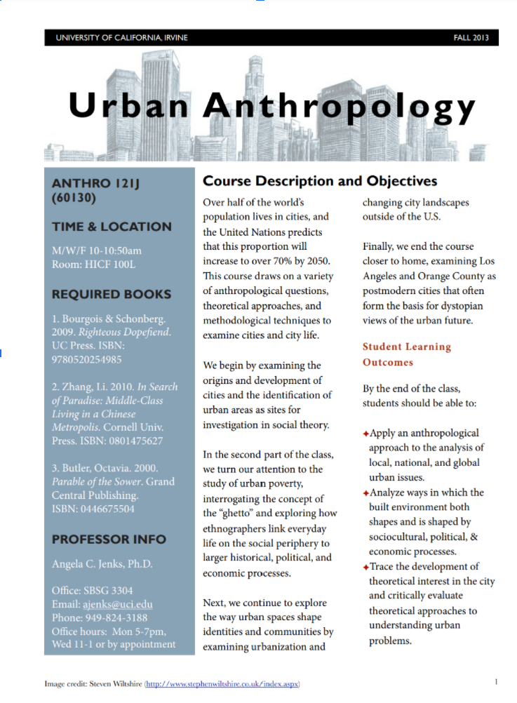
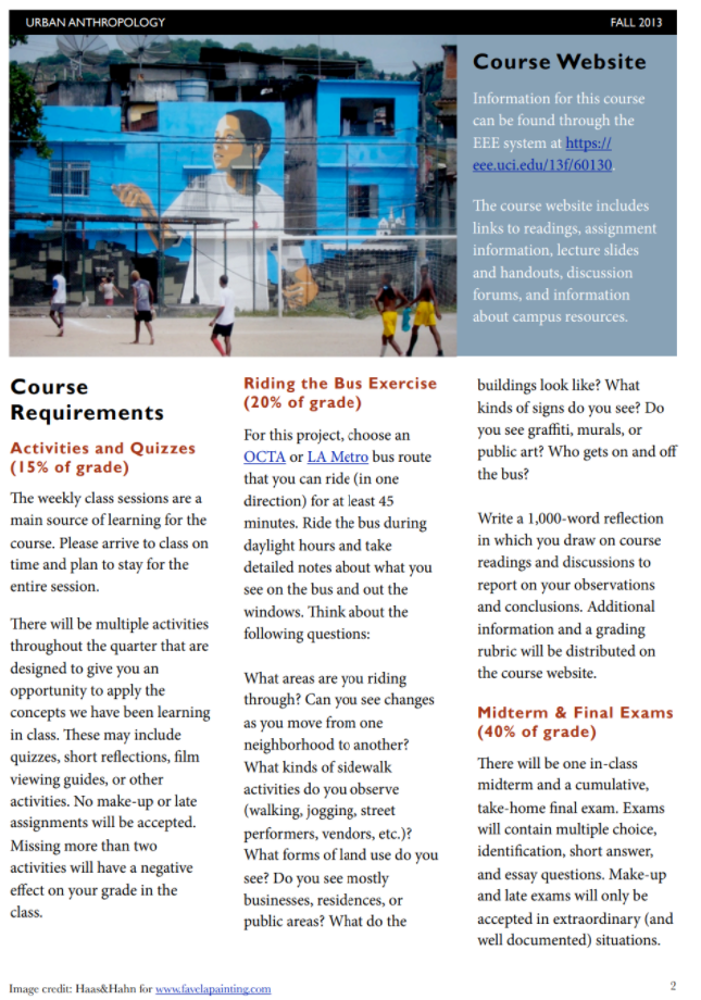
Most students today already spend up to several hours a day reading, watching, and responding to online social media content, so asking students to read a text-heavy document can backfire due to overload. Enticing readers to take a closer look with interesting images and visuals such as graphs or diagrams, along with visually appealing organization, can be an effective strategy. Take a look at the sample redesigned syllabus above to see how one professor, Dr. Jenks, changed the format of hers to make it more visually appealing and readable. You don’t have to be a great designer to redo your own syllabus, as there are plenty of free templates available online (see resources below).
A beautifully designed syllabus can often open the door, encouraging text-weary students to take a look, but design alone will probably not keep them reading for long. Strategies employed in teaching reading are relevant in the discussion of syllabus language and design. Just as you would in an essay, writing a great opening or ‘hook’ can grab the reader’s attention and motivate them to continue reading. When deciding how to design a syllabus, instructors may want to consider using signaling (visually reinforcing important concepts), segmenting (chunking information into smaller units for better comprehension), and weeding (ridding of extraneous information), all of which can help create a concise yet effective document. Placing the most important information first for those inclined to give your document only a cursory glance is another great idea. Also, remember to ensure that your design does not interfere with and preferably increases accessibility. Additionally, some students might need a purely text document, so providing your syllabus in several ways is best practice.


If you have experience building Canvas pages, you could try out using some in-Canvas tricks to create a more visually appealing syllabus page, such as this example of a creative syllabus page design in Canvas: CS 271, Computer Architecture & Assembly Language.
2- Turn it into a Video or Infographic
You are probably already aware that if given the choice, many students tend to choose to view videos more often than read text documents. Recent research suggests that students increasingly expect video content to be part of their learning experience. You can use this to your advantage by recording a video tour of your syllabus to supplement the digital or physical document. Especially in Ecampus asynchronous courses where most of the work will be performed in Canvas, walking through the highlights of your syllabus and connecting what is written there to the pages, modules, and assignments in the Canvas course can help students gain a big picture view of the course and prevent questions later.
Especially in Ecampus asynchronous courses where most of the work will be performed in Canvas, walking through the highlights of your syllabus and connecting what is written there to the pages, modules, and assignments in the Canvas course can help students gain a big picture view of the course and prevent questions later. Using a video to introduce your course can help students better comprehend and remember the important parts of your syllabus by activating both the visual (pictorial) and auditory (verbal) processing channels that working memory uses. The same strategies mentioned as important for designing a visual syllabus can be employed (signaling, chunking, and weeding) to ensure viewers are not overwhelmed. This is one of the most effective ways to introduce your course to new students, with the added value of enhancing your instructor presence. It’s not as difficult as you may assume- OSU’s Canvas LMS has a built-in video recording tool, Kaltura Capture, with which you can create a screencast video.
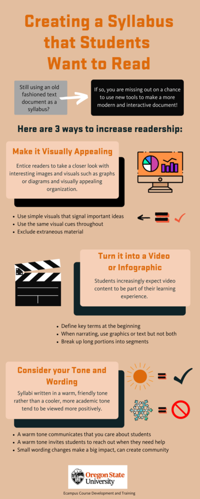
Another option is to try something completely new- turning your staid, static syllabus into an infographic. Infographics have become more popular with the advent of quite a few online tools that provide a multitude of templates with simple drag and drop functionality, enabling instructors to reimagine how their syllabus information is presented (see below for resources). Infographics are appealing as a supplementary document even when a text version is evident, as they distill the elements of a course into easily presentable and understandable chunks, highlighting important information and saving longer descriptions for later.

3- Consider your Tone and Wording
Another way to encourage students to read the entire syllabus in your course is to consider how the tone of the text is understood from the students’ perspective. Writing your syllabus in a warm (student-focused) tone communicates to students that you care about them as individuals and are rooting for them to succeed, which in turn motivates them to want to succeed, whereas writing in a cool (content focused) tone can negatively impact students’ perceptions of the instructor and the course. There may be some hesitancy among instructors to shift from what is typically considered ‘proper’ academic language due to a conception that a syllabus should model this type of language. Some may be concerned that using informal or conversational language may muddy power dynamics, preferring an instructor-as-expert approach and mirroring that in their syllabus.
While this may be the established norm, there are compelling reasons to tweak your writing style when drafting this first contact between instructor and students. Whereas in past decades teachers might have been expected to produce standard syllabi with purely academic, formal language, the more recent focus on concepts such as inclusivity, promoting diversity, and working toward equity has spurred many to take a closer look at how their syllabus language and presentation affects students and their sense of belonging when accessing higher education. Interestingly, using warmer language in your syllabus can actually impact how motivated students perceive YOU to be as well. Research from Richard J. Harnish and K. Robert Bridges determined that “a syllabus written in a friendly rather than unfriendly tone evoked perceptions of the instructor being more caring, more approachable, and more motivated to teach the course.” Recent research from OSU’s own Regan A. R. Gerung and Nicole R. Galardi supports this, finding that syllabi written in a warm, friendly tone rather than a cooler, more academic tone tend to be viewed more positively (and resulted in more positive teacher ratings in evaluations). Instructors are often missing out on a wonderful opportunity to invite students into a mutually respectful class experience by distancing themselves by using an overly cold and academic tone in their syllabus.
OSU has expressed a strong commitment to using inclusive and affirming language, recognizing that how we use language reflects how we view the world and impacts others’ sense of belonging.One of the first things to consider is your audience- are you teaching a freshman level intro course, where students may be entering the world of formal academia for the first time? Many OSU Ecampus students identify as first generation college students or non-native English speakers, which might impact how they interpret the writing in your syllabus. If your syllabus uses language that seems cold, distant, formal, or unwieldy due to overly complex structures and style, students may fail to understand, become disinterested, and/or discontinue their reading of your syllabus. Are you teaching graduate students who might have a better comprehension of academic language? Even if you are, your syllabus may not be the place to showcase this type of language, which can impact comprehension.
In addition to how friendly your tone is, consider the underlying message sent by how you choose to discuss subjects, especially aspects that are traditionally the sole purview of the instructor, such as the turning in of work, granting extensions or incompletes, and grading policies. If a syllabus contains frequent mentions of the penalties students will face, punitive measures that will be taken, or absolutes that will be enforced, students may be put off and decide the instructor is authoritarian, controlling, or overly strict. A lack of flexibility can seem particularly uncaring, causing students to be less likely to reach out if they encounter difficulties that may impact their ability to turn in work on time and participate fully. Instead, consider how you could offer more student friendly policies that offer students flexibility, choice, and empathy for students’ complicated lives.
The key, as in most areas of life, is finding the right balance that represents what you want to convey to students. The image below, taken from the OSU Center for Teaching and Learning publication Pedagogical Pragmatics (P2): Writing a Warm SYLLABUS, shows some examples of cool vs. warm syllabus statements. Small changes in wording can be enough to convey warmth and friendliness.

Looking to improve your syllabus? Check out these resources:
- Gauge how student- or content-focused your own syllabus is using this syllabus rubric, complete with user guide, from University of Virginia’s Center for Teaching Excellence
- Need some inspiration?
- Find a visually appealing syllabus template
- Find an infographic template
- Research and theory for using video
Sources and Resources
A professor hid a cash prize on campus. All students had to do was read the syllabus – CNN
Creating the Foundation for a Warm Classroom Climate
Principles of Multimedia Learning
STATE OF VIDEO IN EDUCATION 2019
Utilizing Inclusive and Affirming Language | Institutional Diversity
