Those two words can be the cause of stress and anxiety for some but it doesn’t have to be that way. The creation of staged assignments can help!
For students, the looming deadline of a paper near the end of the term can be complicated by poor planning and/or leaving inadequate time to complete the assignment. This procrastination means an assignment gets done all at once and possibly poorly.
For faculty, papers done in a rush at the end not only require attention on a shorter time frame but the quality is often poor and grading can be arduous.
What is “staging”?
Staging is the sequencing assignments and activities to allow ample time to develop ideas and make revisions.
To do this, look at the large assignment in your class. Think about how it could be divided up and assigned throughout the term to allow for greater success (and less procrastination).
You’ll likely find some breaking points that students could do in smaller assessments. This will build in structure that doesn’t allow them to procrastinate as much and give you more opportunities to provide feedback.
How do I stage an assignment?
Let’s take a research term paper and break it down.
The expectation is that the paper has a title, an abstract, the body of the paper with organized content, and references in order to have a complete paper and for it to be free of grammatical errors. How can we stage this assignment?
Week 2: Article Abstracts – Find articles that relate to what your project might be, cite, and provide a summary.
Week 4: Project Proposal – Based upon your articles and feedback from your instructor, create a proposal
Week 6: Outline of Paper including references
Week 8: Rough Draft of entire paper to be instructor and peer reviewed
End of term: Final paper with revisions based upon peer and instructor feedback.
With this staging, both you and the student will know the paper is on track and will have both have had the time to head off problems before the final submission. It’s a win-win!
Build Instructor Presence & Student Engagement in Online Discussions
At the OLC Innovate Conference, I attended a presentation that laid out a strategy often used for in-person discussions but retooled for use in online courses. This strategy resonated strongly with me as it addresses questions I often get from instructors I work with in course development. How do I increase student engagement in discussions? How do I increase instructor presence in the course?
The presentation was given by Zora M. Wolfe, Ed.D. (Widener University) and Christopher A. Bogiages, Ph.D. (U. Of South Carolina) and was titled “A Brick-and-Mortar Strategy to Online Discussion Boards”. The strategy derives from the “5 Practices” framework developed initially for in-person mathematics course discussions. The basic structure is broken down into the following 5 steps; anticipate, monitor, select, sequence and connect. In this blog post I cover how these steps can be adapted to an online environment based on the presentation and a brief discussion I had with the presenters.
Proper planning and setting realistic deadlines for student posts, replies and follow-ups is an important part of this process. The instructor will not be present to monitor discussions synchronously, as you would in a face-to-face class. You’ll want to allow time for thoughtful responses and self-reflections (if you require them).
Anticipate
In this first step, build the requirements and instructions for the discussion. Present clear instructions about expectations for student responses. Use language and keywords that you expect students to use. Prompt their thinking. Anticipate how students may respond to questions. This will help clarify your instructions to guide student thinking. A bonus here is that getting students to use anticipated language and keywords will allow you to more quickly find (control-f) responses that you can use for your follow up engagement.
In a larger class, it can be beneficial to break students into discussion groups as you would in an in-person course.
Monitor
As the discussion opens and unfolds, the instructor will periodically monitor student responses. Pay attention to how students are thinking about the subject. Consider stepping in with a comment if the discussion needs guidance (as you would in a face-to-face discussion). What should be emphasized? Are there misconceptions that can be used as a learning opportunity? Are students connecting their thinking to previous discussions?
Select
In this step, the instructor will choose student posts as examples to emphasize the learning outcomes. The responses selected will depend on the pedagogy used. Did a student briefly hit all the points? Has anyone gone in-depth on a point you want to emphasize? Did a student connect concepts in a creative way, or build on previous knowledge? The instructor may discover new ideas that hadn’t been anticipated.
For a discussion that has been broken into groups, consider having each group write a summary of their conclusions. This is another strategy used in face-to-face discussions that will help an instructor manage a course with a larger enrollment.
Sequence
In these last two steps the instructor will develop a summary of the discussion and any follow up activities they will have students participate in. Take the selections made in the previous step and sequence them in a way that will emphasize the subject matter and where you want to guide student thinking.
Connect
In this final step, present your summary to the students. Use this opportunity to connect student responses with the learning objectives, course material or previous discussions and content. Where does this discussion fit in with the overall course goals? How might it shape their thinking for upcoming material and learning objectives? The main goal here is that the instructor is using the students own words and thoughts to guide learning.
The strength of this discussion summary is that the instructor is engaging with the ideas presented by students and using them to build knowledge towards meeting weekly outcomes and course goals. This will also build motivation as students begin to realize that they will be recognized for thoughtful responses.
You can record your summary as a video to further increase instructor presence or you can simply add the summary as a page in the course. Another option is to follow up with personal self-reflection assignment. Post your discussion summary as an introduction to the self-reflection to help prompt their thinking
While this strategy requires more ‘maintenance’ by the instructor, it can help move student and instructor engagement to a central position in the learning process.
Universal Design for Learning (UDL) is a practical tool for guiding course design to ensure that every learner succeeds, based on scientific insights into how humans learn (cast.org).
As seen from the illustration below, there are three main principles of UDL, namely:
multiple means of representations,
multiple means of engagement, and
multiple means of expressions
(image by Tianhong Shi, CC0)
There are many applications of UDL design principles in OSU Spring 2018 online courses.
A. Multiple Means of Representations as seen in BA 354 S18’s weekly content planning.
reading in text (Chapter 1 of Trevino and Nelson, Managing Business Ethics)
listening to podcast (Ponzi Supernova podcast audio from Radio-lab
watching instructor lectures in video (Course Introduction)
Watching complicated assignment explained in video and graphics:
B. Multiple Means of Engagement as seen in BA 354’s discussion forums and assignment feedback:
Students submit Personal Ethical Action Plan Initial submission – Instructor provides feedback students incorporate feedback from instructor and submit final submission;
Discussion forums: students post answers to prompts; students reply to peer classmates’ canvas discussion forum.
C.Multiple Means of Expressions as seen in BB 481/581 S18 and BA 354’s assignments:
Graphic expression – Assignment #1: Create a three-dimensional image
Audio/visual expression – Assignment #2: Create a video to explain what “reciprocal space” mean to you
Textual expression – Assignment #3 & #4: Literature search & Quizzes & Discussions & write a letter to a relative to explain why the Fourier transform is so important to NMR spectroscopy
Textual expression of application – Application type of project: Personal Ethical Action Plan
A student persona is a summary of a specific type of student. This persona represents archetypes NOT stereotypes of a broader student segment or group. A student persona summarizes who the student users are and why they are using the learning system, as well as what behaviors, assumptions, and expectations determine their view of the learning system.
Why Create Student Personas?
There are many reasons why instructors and instructional designers and developers create and use student personas, such as:
To represent the major needs of the key student user groups.
To provide a reliable and accurate representation of your targeted student audience.
To enable you to focus on a manageable and memorable group of students.
To help you create different designs for different kinds of students and to tailor the design to meet the needs of the most important student user groups.
To inform on the functionality of the learning system, uncover gaps in instructional design and development, or highlight new ways to deliver learning.
What Makes Up a Student Persona?
Like all personas, student personas generally include several key pieces of information, which are outlined on usability.gov
Here is an example of a student persona that I created for an online Intro to Permaculture MOOC that includes the essential elements of a persona.
Description of the user research conducted to create the student persona:
Student user research was conducted through an online Welcome survey that was embedded in the online course. As in all persona creations, user research should be conducted and the collected data should be used in order to ensure accurate representations of your users. Student user research can be conducted online or face-to-face through student surveys, interviews, or observations.
More than one student persona (3-5 student personas) should be used for an instructional development project from the analysis phase to the design, development, implementation and evaluation. As such, these student personas can be used in numerous ways.
While there is no one way to create and use a persona, there are plenty of examples, free templates, and instructional videos and readings available to help you get started to create personas of the students that you serve and to use them in your instructional developments. These resources are available through the following links.
How to Create UX Personas (3:01)
(Note: This video talks about service design for customers, but for student personas, you will want to keep in mind that the students and learners are the customers)
The New Science of Learning is a slim but instructive volume designed to guide college students to better attune their learning efforts with how their brains function. Authors Terry Doyle and Todd Zakrajsek apply the findings of neuroscience to the daily learning that takes place in higher education. Though the book is written for students, it’s a valuable quick-read for everyone involved in blended and online teaching and student success efforts.
As you look ahead to spring term, let’s consider two ways you can employ Doyle and Zakrajsek’s advice in online and hybrid teaching environments:
Tip 1 – Learning is significantly strengthened by encountering the content in multiple formats or modalities.
Problem: Much of the information we encounter online is still largely presented in the form of text. This is unfortunately true even in some poorly designed lecture videos, which are principally a narration of wordy PowerPoint slides, bullet point by boring bullet point.
Online teaching strategy: Quality online learning has moved well beyond “text under glass.” Your students will benefit when they are guided beyond text to view visually rich videos, listen to podcasts and other audio, to talk, write, think, reflect, respond and explore content in tactile or kinesthetic ways. Learning is enhanced in a multimodal environment that helps students build connections by experiencing subject matter in diverse forms. The learner may not initially comprehend a difficult concept from reading it in a text, but may “get it” by interacting with peers in an online discussion or by watching an instructor-created video. Engage your students in online interaction–with the content, with each other and with you–to ensure that they are not merely passive consumers of course materials.
Tip 2 – The distributed practice effect (or “spacing effect”) refers to learning through study of content multiple times, with time gaps between these learning episodes. Extended periods of time with repeated exposure to the content helps form stronger memories. What duration of distributed practice is optimal? See the research on Optimizing Distributed Practice.
Problem: In a traditional college course, a student sometimes encounters a particular piece of content only once or twice, say in a lecture and then perhaps a brief mention in a textbook. There can be a tendency for both instructors and students to move through topics rapidly and superficially to get everything on the syllabus covered before the term ends. And, worse yet, study may be compressed into harried late-night sessions before a big exam. Cramming is not a pathway to true learning that endures over time.
Online teaching strategy: Facilitate distributed practice by designing assignments and pacing learning activities that encourage repeated engagement with course material over a period of many weeks. By skillfully staging assignments, for example, a term-long group project to develop a collaborative presentation, you guide students to interact with the content many times over a substantial time period. Interim deliverables, such as an annotated bibliography or lit review, an outline or storyboard, and a rough draft, will foster distributed practice. Clear rubrics and ample timely feedback on these various stages increases the probability of more students achieving the course learning outcomes.
Do you use these or similar techniques in your hybrid or fully online teaching? How does the science of learning inform your teaching strategies?
References
Cepeda, N. J., Coburn, N., Rohrer, D., Wixted, J. T., Mozer, M. C., & Pashler, H. (2009). Optimizing distributed practice: Theoretical analysis and practical implications. Experimental Psychology, 56(4), 236.
Doyle, T., & Zakrajsek, T. (2013). The new science of learning: How to learn in harmony with your brain. Stylus Publishing, LLC.
This article is the first of a two-part series on producing video interviews featuring guest experts for online courses. Part I focuses on planning while Part II will address the faculty role in the video interview production process.
Part I: Planning With A Purpose
Interviews of guest experts are valuable forms of course media because they can serve a number of instructional purposes. Traditionally classroom instructors might consider including guest experts as part of instruction to…
Connect learning with an authority in the field.
Communicate what the practices are in a given field.
Describe the nature of work of a professional in a given field.
Show important work environments or processes.
Introduce a second, collaborative voice to instruction (Laist, 2015).
One of the common ways instructors incorporate the expert’s voice into a course is by inviting a guest speaker into the classroom. Or, class members might travel to a field location where the person being interviewed works. In both cases the experience of the guest expert interview is live and located where the interview occurs. The synchronous live interview, a staple of on-campus courses, is problematic for online instruction.
Online instruction is shaped by the nature of the online environment. Asynchronous class sessions, the remoteness of learners, and limited access to field sites would seem to limit the use of guest experts. Ecampus instructors are moving beyond those limitations by creating carefully planned and professionally produced video interviews of guest experts in order to leverage the instructional benefits of interviews for their online courses. An example of this is a media project produced for Dr. Hilary Boudet’s course PPOL 441/541 Energy and Society, offered by Oregon State University’s School of Public Policy.
Dr. Boudet worked with the Ecampus video team to re-imagine a traditional live field site visit to the O.H. Hinsdale Wave Research Lab at Oregon State University as a series of guest expert video interviews. Dr. Boudet carefully planned the interview process and served as the on-camera host in the video interview series. Three OSU scientists served as the guest experts in the on-site interviews. Because of careful planning, primary interviews and recording were completed in half a day.
The guest expert interview recordings, and subsequent video editing, resulted in the production of four videos ranging in length from ten to twenty minutes each. The interviews represent approximately one hour of video content for the PPOL 441/541 Energy and Society course. You can view the first of the four video interviews by clicking on the image from the video below.
Hilary Boudet interviews guest expert Pedro Lomónaco. Click on image to watch the video.
As the video interview planner, Dr. Boudet made a number of key decisions regarding video interview structure and content. We will highlight these decisions as answers to the 5 W’s of video interviews: Who, What, When, Where, Why and also How.
You may want to think through answers to these questions when you plan a similar project. Let’s take a look at each of these questions in the context of the PPOL 441/551 video.
Why are you doing the video interview?
In the case of PPOL 441/541, Dr. Boudet wanted to capture the instructional value of a field site visit and conversations with scientists related to that site. So being on location was essential. She wanted to show the O.H. Hinsdale Wave Research Lab and use it as a vehicle to discuss how the lab and Oregon State University researchers contribute to the larger social conversation about wave energy and social issues related to its use in coastal communities.
What is the subject of the video interview (s)? Dr. Boudet identified four independent but related topics she wanted to address with the guest experts. The topics are listed below.
Introduction to the O.H. Hinsdale Wave Research Lab
Introduction to Wave Energy Technology
Human Dimensions of Wave Energy
Community Outreach and Engagement
Each of these topics fits well within the learning outcomes for the Energy and Society course. In this instance, Dr. Boudet had a clear story arc in mind when selecting topics. She structured the video segments to address each topic and conducted each interview as its own story that supported the larger learning arc. Having a clear vision for the use of guest expert video interviews helps guide video production on-site and also informs the final video editing process.
Where will the interview be recorded? Prior field visits to the O.H. Hinsdale Wave Research Lab helped Dr. Boudet work with both the guest experts and video production team in thinking through locations for interviews and what needed to appear in the video. Understanding the O.H. Hinsdale Wave Research Lab also helped in deciding what aspects of the lab and props would be ideal to record for each video interview. It is clear What and Where are two closely related planning questions. In general on-site video production requires a large space for staging and a quiet space for recording. The interview recording site must also be relevant to the subject being addressed. If you do not have a recording space available Ecampus has a studio facility that can be used.
Who is to be interviewed? Dr. Boudet had a clear plan to bring expert voices into the video interview. The guests to the class served as scientific experts as well as guides to the facility being visited. In the case of the PPOL 441/541 video interviews, Dr. Boudet chose to have the scientists appear on screen and to also appear herself. This is a key decision that shapes the planning and production process of the video interviews. As you might imagine, the technical demands of having one person on camera is different from having two people. Recording equipment needs and subsequent editing approaches are impacted by the number of people included “on camera” in any interview scenario.
When will the interview occur?
Scheduling interview recording involves coordinating your own schedule with Ecampus video staff and your guest expert(s). In the case of PPOL 441/541, Dr. Boudet arranged to have all interviews recorded at the same facility but in different spaces. Additionally, the interview times were coordinated to facilitate the video production team being present for a large block of time when all guest expert interviews could be recorded. After primary recording, the video production staff returned briefly to the O.H. Hinsdale Wave Research Lab to record b-roll content; shots of the facility without any people. This is a common process in video production.
The last important question to be asked is…
How will you prepare? Part of preparation for a video interview is embedded in the answer to our previous questions. But preparing the content of the actual interview also requires planning. Dr. Boudet prepared a list of questions that she wanted to have addressed as part of the interview. She shared the purpose of the interview and her questions with the guest experts in advance. This collaborative effort contributed to a clear understanding of the intent of learning for all parties.
Sharing your questions with interviewees can be helpful. Asking guest experts not to memorize answers but to prepare with bullet points in mind will help the interview feel spontaneous.
There are obvious types of questions you will want to avoid. For instance, yes or no type questions can stunt an interview. Remember, the idea is get the instructional information you need. Be prepared to ask a question again if it is not answered the first time. Or, ask for clarifications to a response as part of the interview. Also provide opportunities at the end of the interview for experts to add anything they like. Remember you might get some great information and if it is not useful it can be edited out.
Preparing the physical interview space and interviewees is part of what the Ecampus video team does. They can provide tips on how to dress for a given interview, where to stand, where to look, and how to stage the interview space.
Now that we have answered some of the key questions in the video interview planning process watch the sample video posted above again. Can you see or hear the answers to the questions we have addressed?
About Part II:
Planning a guest expert video interview with a clear purpose in mind will shape the relevance, structure, and focus of the final video interview. In Part II of this video interview series, we will address the second half of video interview creation process; faculty collaboration with Ecampus video staff in the final stages of video interview production
References
Laist, R. (2015). Getting the Most out of Guest Experts Who Speak to Your Class. Faculty Focus | Higher Ed Teaching & Learning. Retrieved from https://www.facultyfocus.com/articles/curriculum-development/getting-the-most-out-of-guest-experts-who-speak-to-your-class/
Special thanks to Hilary Boudet, Heather Doherty, Rick Henry, Chris Lindberg, and Drew Olson for their contributions to this article.
Sunrise, Eureka, NV, 12/30/2017, on highway 50, the longliest road in America
Beauty is everywhere and in every moment, if we pay attention. I saw this beautiful sunrise driving by Eureka, Nevada on Highway 50, the loneliest road in America, during the tail of my one-week road trip vacation. Similarly, good teaching practices are flourishing in OSU online courses as we discover from our talks with Ecampus instructors. To inspire you to expand your teaching toolkit, here are some ready to use online teaching tips from the book “Small Teaching: Everyday Lessons from the Science of Learning” by James Lang.
Teaching Strategies
Online Teaching Tips
Retrieving
Syllabus Quiz
Weekly reading journals
Frequent quizzing such as quizlet practices or weekly quizzes
predicting
Pretesting with immediate grading and immediate feedback including exposure of content teaching;
Role play: how might a person in a different role approach the problem?
Asking students to predict what will be covered in next week’s lesson/reading, etc..
Interleaving
Open or close each class session with small opportunities for students to retrieve older knowledge, to practice skills developed earlier in the course, or to apply old knowledge or skills to new contexts.
Weekly mini review session applying that week’s content to some new question or problem.
Stagger deadlines and quiz dates to ensure that students benefit from the power of spaced learning.
Connecting
Solicit the prior knowledge of your students at the beginning of the term or individual lesson (such as private journaling or public introductory discussion)
Ask students to create concept maps that answer questions or solve problems; use concept maps multiple times throughout the semester with different organizational principles.
As much as possible, offer examples or cases from everyday or common experience but also – and more importantly – give students the opportunity to provide such examples on their own.
Practicing
Before the semester begins, brainstorm a comprehensive list of cognitive skills your students will need to develop to succeed in your course. (Identify Learning outcomes)
Prioritize them; decide which ones students will need to develop most immediately and which ones can emerge only after they have developed some basic skills.
Review your course schedule and decide where you can make space for small practice sessions in key skills prior to your major assessments; mark those sessions on the syllabus schedule.
Prior to any major assessment, ensure that students have had multiple opportunities to practice the skills they will need to do well, from creating slides or writing paragraphs to answering multiple-choice questions.
Self-Explaining
For online homework or readings, create spaces for students to self-explain while they work;
When students are demonstrating their homework, create a regular schedule of opportunities or requirements for them to self-explain their process.
Use Peer Instruction: students provide an answer, pause and explain it to their peers, and then revise their answers.
In all forms of self-explanation, push students to tie their knowledge of information, principles, theories and formula to the specific task they are completing.
Motivating
Spend time to get to know your students; learn about their lives and their interests, creating a positive social atmosphere in the virtual class space.
Open each lesson by eliciting student emotions: give them something to wonder about, tell them a story, present them with a shocking fact or statistic. Capture their attention and prepare their brains for learning.
Consider how practitioners in your field, or the skills you are teaching them, help make a positive difference in the world; remind them continually about the possibilities that their learning can do the same, from the opening of the course.
Keep the overarching purpose of any lesson/ learning activity in view while students are working. Make it clear why they are doing this activity.
Show enthusiasm for your discipline, for individual texts or problems or units, and for your hope that they will find them as fascinating as you do.
Growing
Provide early success opportunities through assignment sequencing or assessment design;
Consider offering some reward for effort or improvement in the course (heavier weighting of your assessment toward the latter half or through a portion of the grade set aside for that purpose)
Provide examples of initial failures or setbacks in your own intellectual journey or in those of famous or recognizable figures in your field to demonstrate that such failures can be overcome.
Give feedback to students in growth language; convey the message that hey are capable of improvement, and offer specific instructions on how to achieve the improvement.
Ask top students to write letters to future students about how they succeeded in the course; select and pass along the ones that highlight the power of effort and perseverance.
Include a “Tips for Success in this course” section on your syllabus, and refer to it throughout the semester.
Expanding
Commit to reading at least one new book on teaching and learning every year.
Subscribe to an e-mail list from Faculty Focus or Chronicle of Higher Education
Create a personal learning network on Twitter.
Attend a conference on Teaching and Learning in higher education (the Teaching Professor or the Lilly Conference on College and University Teaching)
Attend events on campus sponsored by Center for Teaching and Learning.
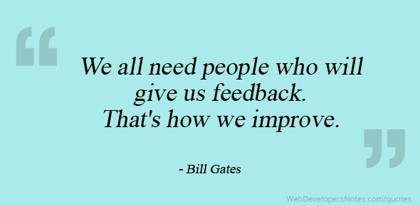
In online education courses, providing effective feedback is essential. It’s can be easy to provide students with a number or letter grade on their assignments, but it is the additional feedback where the opportunity for student growth occurs. While there are many forms of effective feedback, there are 5 elements that can help you provide more meaningful and effective feedback regardless of the method of delivery.
Give Timely Feedback
Timely feedback to students sends the message that you are engaged in the course and the student’s work. Having just finished an assignment, the student is also going to be more open to the feedback you provide because their work is still fresh in their mind. They have the opportunity to immediately incorporate your feedback into the next assignment, improving their overall performance going forward. Students in a master’s degree program were more likely to ignore feedback comments on their written work that were not provided promptly. (Draft & Lengel, 1986) Including a statement in the syllabus about your expected time of feedback on assignments, and sticking to it, helps students understand your timeline and will reduce questions to you later on.
Start with a positive message
Creating a feedback sandwich (compliment, suggestions for correction, compliment) for your student pairs together both specific positive feedback and any elements the students should work on. The positive feedback encourages the student and prepares them with a positive outlook when hearing about areas that need improvement. Finishing again with positive feedback such as “I look forward to seeing your next assignment” tells the student that even though they have corrections to make, their work is still valued and that they can improve on future assignments.
Use Rubrics
One of the best tools that can be used are rubrics. A detailed rubric sets clear expectations of the student for that particular assignment. While completing their assignment they can constantly check their work against what you expect to see in their finished work. Another benefit to creating the rubric is that you can use it to analyze their papers with that same criteria. Some instructors have found that by using a rubric, it helps to be more consistent and fair with grading. No matter if it is the first paper, the last paper, or if you might be having a good or bad day, the rubric helps.
Give personal feedback and help the students make the connection between the content and their lives
Connection is key. Providing personal feedback to your students while helping them see the connection between the content and their lives will show that you have taken time to personally respond to them instead of using “canned responses.” Students who don’t feel as if the content in the class will ever relate to their lives now, or in their careers later on, will often lose interest in assignments in general as well as feedback because they don’t see the connection. Getting to know your students at the beginning of the term assists in giving good personal feedback while helping them see the connection between the content and their life.
Consider using alternative formats of feedback
Students are used to getting feedback in written form and while that format can be very effective, using an alternative way to provide feedback can be equally or more effective. They enjoy the personal connections that can be created through audio and/or video feedback. Students appreciate receiving specific feedback relating to the grade, rubric, and overall assessment. In fact, some students say that: “..video encouraged more supportive and conversational communication.” (Borup, West, Thomas, 2015) Give it a try!
By employing these strategies, your students will be appreciative of the feedback you provide and you might just get some fantastic feedback yourself. In one case, an instructor shared a great comment from one of their students comparing past courses to the instructor’s:
“…I never received personal feedback [in some other courses]. Your course however has been wonderful. Thank you for putting so much time into each of your comments on my writing. I can tell you really made personal feedback a priority. You don’t know how nice it was to really know that my professor is reading my work.” The student goes further to say; “Thank you for taking your teaching seriously and caring about your students. It shows.”
Getting personal and effective feedback like this should inspire you to begin or continue that great feedback!
References:
Borup, J., West, R.E., Thomas, R. (2015) The impact of text versus video communication on instructor feedback in blended courses Education Tech Research Dev 63:161-184 doi: 10.1004/s11426-015-9367-8
Draft, R.L. & Lengel, R.H. (1986. Organizational information requirements, media richness and structural design. Management Science, 32(5), 554-571
Are you looking for ways to bring active learning into your online classroom? Some might suggest that active learning is more difficult online, but we offer examples of Ecampus courses that do a great job of increasing student engagement, boosting interactive participation, and improving outcomes through implementation of active learning strategies.
This blog focuses on tools, techniques, and approaches originally designed for the face-to-face classroom that have been successfully adapted into Oregon State University Ecampus classes. Feel free to steal!
Telling Time
Marking events in time or identifying the chronology of significant milestones is important in many disciplines, but especially vital in history classes. An American History professor felt that merely listing events sequentially was not particularly interesting or creative, even for his in-person class. When asked to develop an Ecampus course, he wanted to stimulate and inspire students. The solution? Timeline JS, a free tool from Knight Lab, developed at Northwestern University. Timeline JS allows students to build an image-rich chronology, add descriptive text, and work collaboratively. The result? A highly interactive, hands-on activity where students more easily formed connections, identified important patterns, and analyzed relationships. The instructor reported that Timeline JS helped his students to “understand the interrelation of topics and events more deeply.”
Sticker Shock
As noted in an infographic by Top Hat, print textbook “prices have spiraled out of control.” Since 1977, textbook prices have increased more than 1,000%, and a whopping 65% of students skip buying textbooks due to cost. The number of print books sold in the U.S. during the past 11 years has declined by 125 million! Clearly, students are looking for less expensive options. Enter the interactive digital textbook. And saving money isn’t the only benefit. An interactive textbook changes a dry, passive task into a media-rich, engaging, and appealing experience. Filled with visual elements and engrossing practice, the digital textbook goes well beyond being a mere repository of information to offering a complete, immersive experience. The Geography department at the University of Oregon embraced Top Hat, with tremendous success. Hear what they have to say about increased student engagement and learning outcomes. Visit the Top Hat website to learn more.
We will bring you more examples of active learning online in future blog posts. In the meantime, if you have questions or ideas, please post your thoughts in the comments section, or reach out to Oregon State University Ecampus directly. We’re happy to help!
Why should I care about humanizing online learning?
First of all, the United States Department of Education requires regular and substantive interaction between students and faculty in distance learning courses (Policy from DOE & interpreting the Policy from DOE).
Secondly, it is well documented that instructor-student interactions and quality and timely instructor feedback in online learning are prominent faculty behaviors that impact student retention and student satisfaction of online learning (Riedel, Dinauer, Jobe, Lenio, And Walsh, 2016; Bawa, 2016; Shaw, Burrus, Ferguson, 2016; Boling, Hough, Krinsly, Saleem and Stevens, 2012; Liaw, 2008).
How do we humanize online learning?
Think of the task for humanizing your students’ online learning experience as building a house. And there are three major pillars to this house, namely, Presence, Empathy and Awareness.
3 Pillars Of Humanizing Online Learning
Presence
Here are a few strategies for building/improving online instructor presence:
Instructor self-introduction video/message/page
Weekly message to students through announcements, emails, weekly overview pages, weekly video, etc.
Discussion forum interactions with students (greet each student in first week’s class introduction discussion, pop in whenever appropriate to confirm, compliment, encourage, redirect, etc.
Comments in grades center and encourage students to take action on your comments (revise writing and resubmit; study and retake quizzes, etc. )
Communicate to your students as a whole group, in a small group, or individually whenever appropriate.
Empathy
For improving online instructor empathy, it is as simple as 1 and 2:
Admit your vulnerability: “I am new to online teaching. I welcome your honest feedback to help me improve this course so we can all have a meaningful learning experience.” “I am human. I make mistakes. help me if you spot one.”
Clear reasonable communication policy for the online course: “I am human. I have a life besides my online teaching. I will respond to students questions within 48 hour business day. Do not expect me to respond to you late hours or 20 minutes before an assignment is due.”
Fuller (2012) summarizes eight themes for building empathy in online teaching:
Theme 1. Instructors provide a “tips for online course success” document prior to class beginning.
Theme 2. Empathetic interactive instructors use synchronous chat rooms, besides the asynchronous announcements and email communications and discussion forum postings.
Theme 3. Instructors used a conversational tone.
Theme 4. Interaction is promoted through careful facilitation in the discussion boards.
Theme 5. Empathetic presence is practiced. Instructors related that they practice the use of presence so students know the instructor is there but more so than this. This is accomplished through selective discussion board postings, but also through frequent email contacts individually and to the group, usually responding within the same day or a few hours of an email.
Theme 6. Design “think forward type lessons” that offer clarity for student understanding. Instructors provide a high degree of redundancy and consistency of structure so concepts and instructions are clear. Lessons and modules are laid out similarly from week to week, so students get used to a consistent easy to follow format that allows them to focus on content and not waste time figuring out what to do or where to go in the LMS. Each weekly format allows the students to think ahead as to what is expected and required for success and learning to occur.
Theme 7. Instructors will frequently check that learning is occurring and that students understand structure by opening up a dialogue about an area or issue as they deem needed (i.e. formative assessment).
Theme 8. Instructors make a personal connection at the start of class. ” In the opening introductions (as students introduce themselves to the group through a discussion board) I make a concerted effort to respond to each student’s posting making a positive personal connection with something the student posted.”
Awareness
Several strategies for building awareness in online courses:
Survey students at the start of term: what can I do to help you be successful in this course? Do you have personal challenges that might hinder you from successful completion of the course?
Through formative assessments
At the end of each assessments (summary; Just-in-time teaching; Personalized teaching)
Fuller, R. G. (2012). Building empathy in online courses: effective practical approaches. International Journal of Information and Communication Technology Education. 8.4. (October – December 2012): p38


 Graphic expression – Assignment #1: Create a three-dimensional image
 Audio/visual expression – Assignment #2: Create a video to explain what “reciprocal space” mean to you
 Textual expression – Assignment #3 & #4: Literature search & Quizzes & Discussions & write a letter to a relative to explain why the Fourier transform is so important to NMR spectroscopy
 Textual expression of application – Application type of project: Personal Ethical Action Plan
 Description of the user research conducted to create the student persona:
 The New Science of Learning


 Marking events in time or identifying the chronology of significant milestones is important in many disciplines, but especially vital in history classes. An American History professor felt that merely listing events sequentially was not particularly interesting or creative, even for his in-person class. When asked to develop an Ecampus course, he wanted to stimulate and inspire students. The solution?
  As noted in an