By Susan Fein, Ecampus instructional designer
If you use slide presentations to deliver information and then provide a digital version of the slides to support learners, this post is for you!
Instructors teaching online or who use a companion LMS or website to accompany in-person classes often upload the slide file to aid students in notetaking. However, you may not be aware that digital files are not automatically accessible to those using assistive technologies, such as screen readers. Following a few simple and easy guidelines will improve accessibility of your materials for all students and demonstrate your thoughtful attention to inclusivity and equity.
Who Benefits from Accessibility?
Everyone, not only those with disabilities, benefit from accessible learning materials. The U.S. Census Bureau estimates that there are more than 40 million people in the U.S. with a disability, so odds are good that some of them will be in your courses.
Accessibility practices support all learners, not just those who require them. In 2016, the OSU Ecampus Research Unit conducted a nationwide survey about student use of video closed captions. In that study, 70% of respondents who did not self-identify as having a disability used captions at least some of the time.
I asked OSU’s disability access center how many online students request disability-related accommodations. So far this year, 23.9% of those served by their office are Ecampus students. Last year, nearly 40% of all Ecampus courses had at least one student with an accommodation, and nearly 15% of all online-only students used a disability-related accommodation.
To ensure equity, regardless of who does or does not depend on accessibility support, it is vital to make all learning materials compliant with accessibility standards. When educators intentionally create fully accessible materials, we more equitably serve all online learners.
What Can You Do?
Here are five easy-to-follow tips that elevate your commitment and ability to create accessible materials.
Tip #1. Use a template. Templates are important because basic formatting for accessibility is already built in. By inserting your content into designated sections, you preempt some accessibility issues without any extra effort. For example, when you insert the topic of each slide into the designated title field, the slide structure maintains the correct sequence in which a screen reader encounters the various elements on the slide. If you are concerned about being too constrained or predictable, these designated fields accommodate your creativity! It is okay to reshape, resize, or reposition a field if you do not like its default appearance or location.
Regardless of which end of the design spectrum you lean, always start with a template. If you are not fond of colorful designs or fancy formats, there is a basic, unadorned template you can use. If you are a fan of fun, frivolity, or fabulous, select one of many free template options found online to suit your theme or topic. Check out the different templates Ecampus has developed with college-specific themes. One of them might be a good fit for you.
Tip #2. Enter a unique title on each slide. Each slide in your presentation must have a unique title. This permits a screen reader to navigate easily from one slide to the next. What happens when you have segments of the presentation that require two or more slides to fully deliver the information? No problem! There are various ways to address this.
When several slides focus on a different aspect of the primary topic, use that in the title. For example, you are creating a presentation about Health and Wellness and have multiple slides on the topic of Cooking. You want to introduce the topic, describe meal preparation, and offer ideas for healthy snacks. Since these are three distinct subtopics, a good approach is to label the slides as Cooking: Overview, Cooking: Meal Preparation, and Cooking: Healthy Snacks. Repeating the main topic in the title helps the learner connect each segment but still delineates separate subtopics.
If the subject matter does not neatly break into clear subgroups, it is fine to use a sequential number, such as Cooking Part 1, Cooking Part 2, etc. Since most creators develop a presentation’s content, sequence, and flow thoughtfully and logically, if you take a moment to consider why you grouped together specific ideas, the unique titles will likely emerge.
Tip #3. Follow best practices. If you search online for guidance about how to create effective slide presentations, you will discover that many sources offer similar suggestions. Most of these include recommendations about text (contrast, font size, font style), use of images, page structure, and so on. Use this short list as a helpful reminder of these other accessible-friendly best practices.
- Text should be easy to read, with good contrast. Black text on a white background is ideal and classic. Be cautious of templates with too subtle contrast. They might not meet accessibility guidance for visually disabled learners. Use 18-point (or larger) sans serif font for readability.
- Use images judiciously. Pictures convey themes, present an idea, or evoke a mood. However, too many can detract from the message, be confusing, or appear unprofessional. Aim for a “less is more” approach. (Learn more about accessibility for images in the next tip.)
- Include adequate white space to separate and group content. Bullets are optional. Keep slide structure simple. Use phrases or a few words rather than full sentences. Break up content into multiple slides to avoid crowding.
Tip #4. Create alt-tags for images. A screen reader recognizes the presence of an image but it cannot discern the content. To be accessible, that information is provided as a text description or alt-tag.
If you have images in your slide deck, each must have an alternate text description. The alt-tag describes and explains the content of an image. Usually it is not accessible or helpful to use the file name. And beware of tools that try to divine the content of an image and insert descriptions. These are usually wildly inaccurate and unhelpful.
The majority of images in an effective presentation should be essential to the learner’s experience; the image is required for accurate comprehension of the content. The are images such as charts, graphs, photos, maps, or data. Other images may be optional or decorative; nice to have but not essential to the learning and, if not seen by the student, do not impede the learner’s ability to grasp the material.
For essential images, write a brief (1-3 sentences) text description. No need to include lead-in words like “this is an image of…” Describe the key educational value of that image. What about it is important to the learner? What is the essence of the information you want the learner to know about that chart, graph, or photo?
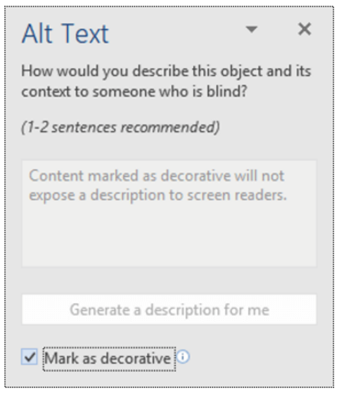
Decorative images have two options: enter a description or skip over the image. To skip, enter null text (“ ”) as the alt tag or, if available in your version of PowerPoint, select the “decorative” option. Both choices direct the screen reader to ignore the image. If you prefer to tag a non-essential image, use a simple description, such as “team logo” or “Professor Kumar.”
Understand that writing good alt tags is a challenging skill that takes time and practice to master, so do your best. You may want to confer with the Disability Access Center, an instructional designer, or other faculty support group if you need assistance.
For more information about how to write effective alt tags, refer to these or other resources.
Tip #5. Use meaningful text to format links. Please do not insert a full URL on your slide. Screen readers recognize a URL link and read aloud every individual letter and symbol, often in a monotone mechanical voice, depending on the specific assistive tool. Think about how frustrating, confusing, and unhelpful that is. Instead, format each link using meaningful text, as demonstrated in this post. For example, the two resources linked above use the article’s full title as the meaningful text. Also, avoid the over-used, too generic “Click here for more information,” with the word “here” formatted as the hyperlink. Instead, select text that specifically identifies the URL content, such as “Visit the Disability Access Services web page for more information.”
Accessibility Supports Equity
Demonstrate your commitment to equity! With just a few extra minutes, you can easily meet minimum accessibility standards by following these tips and using the accessibility checker tool built right into PowerPoint!
Reference
Linder, K. (2016). Student uses and perceptions of closed captions and transcripts: Results from a national study. Corvallis, OR: Oregon State University Ecampus Research Unit.