What should you know about emojis if you plan to use them in your online courses? Not being an extremely online person and not, perhaps, of the right generation, I came to emojis later than others and felt uncertain using them. What did these symbols communicate to others, and how would it reflect on me if I used them in my work with instructors and students? Without research-based answers to these questions, I nonetheless began using emojis in online course designs for the purpose of visual wayfinding and for fostering a friendly, playful tone. After several terms of using emojis in this way, I wondered whether they were accomplishing my goals. Now I’d like to share the background on emojis I’ve researched—and wish I had had earlier—so that you can avoid any missteps.
Wayfinding
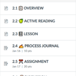
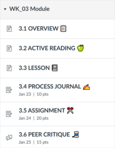
Using emojis in the Canvas Modules menu (which doesn’t otherwise permit any modification of its visual design) has been one way to increase the salience of certain items or to lend them a certain skeuomorphism. With ‘at-a-glance’ speed—faster than reading text—students can quickly identify their intended navigational path once they’ve grasped the symbolism of each emoji. I use these symbols consistently for assignments of the same type across weekly modules. Here’s how the emojis looked in a graphic design course, which itself featured a lesson on semiotics and the way icons, indexes, and symbols operate as visual shorthand:

All the emojis chosen for this course reference the domain of school or making—a scissors represents creative assignments, a spool of thread winks at the idea of “threads” in a discussion. The usage of emojis, along with other design choices related to page layout and color scheme, was a way to model the design skills being taught. Students could thus experience how thoughtful design influenced their interactions with a digital product, in this case, a college course.
Tone
I had also hoped that using emojis would communicate to students that a course was welcoming, approachable, and not all deadly serious. Much research has been done to understand how the set of emojis depicting faces influences the emotional reception of text-based messages, but my course designs have generally used non-face emojis. Research on this set of objects, the meaning and emotional valence of which might be more opaque, also shows that emoji objects communicate positive affect or playfulness, perhaps because they demonstrate that the user has invested care and emotion work in choosing an emoji appropriate for interpersonal exchange (Riordan, 2017). Whether that is appropriate within online learning is less clear; emojis were found to increase students’ perception of how caring an instructor was, but they also led students to perceive the instructor as less competent (Vareberg and Westerman, 2020). And while they might “lighten the mood,” emojis were considered inappropriate in contexts that students considered formal, such as email (Kaye, et al., 2016). Within the domain of commerce, emojis in ads were pleasing to customers when the product was perceived as hedonic rather than utilitarian, suggesting again that context is a critical factor in emoji’s reception. Another consideration to have in mind is the multiplicity of interpretations an emoji might have at the intersection of gender, language, culture, etc. (Bai, Qiyu, et al., 2019), and how that will affect your intended tone.
Considerations with Accessibility
In testing my emojis in Canvas, I relied on ReadSpeaker TextAid; this accessibility tool simply skipped emojis and read only the surrounding text aloud – which was fine, as the critical content I wanted to communicate was in text form, and the emojis were essentially decorative. Unfortunately, after reading a great post on the experience of emojis for individuals with sight impairments who use assistive technology, I discovered that the ReadSpeaker TextAid behavior wasn’t typical. Using screenreaders more commonly used by individuals with sight impairments, I then confirmed that when emojis are encountered, their official names are, indeed, read aloud. This means that my visually clever discussion title was now rendered in speech as ‘2.6 Spool of Thread Discussion,’ lengthening the time it took to get to the useful information and adding irrelevant content. Whereas an emoji can be hidden from assistive technology via html on a Canvas page or assignment, there is no mechanism to do this within the title of a page or assignment. This means that, if an emoji is a must-have, it should be placed at the end of the Canvas item title, where it will be read last and prove less bothersome to learners using screenreaders. For me, however, this creates a jagged, irregular visual appearance when viewed in the Canvas Modules menu, and coming at the end of the title, makes the emojis a less useful navigational shortcut for sighted students.

For tips on accessible emoji use, you should read Emojis: Readibility Guidelines and “Do Emojis and Accessibility Work Together?”. If you need to identify an emoji’s official title as read by a screenreader, consult the emoji’s entry in emojipedia.org, which will also show you the varied appearances an emoji takes on different platforms—another consideration you’ll need to have in mind.
Is the Party Over? 🎉
Unfortunately, with this research in mind, I can no longer sprinkle emojis throughout my Canvas courses like so much happy confetti. Now, I’ll recommend to the instructors I partner with that they use emojis sparingly, for the purposes of communicating the emotional valence of a message (to ‘smooth out the rough edges of digital life,’ as so incisively put by Stark and Crawford, 2015) or to increase salience, but always in accessible ways, and always with a few caveats in mind.
References
Aitchison, Suzanne. “Accessible Images, Icons and Emojis.” Up Your A11y.
Bai, Qiyu, et al. “A Systematic Review of Emoji: Current Research and Future Perspectives.” Frontiers in Psychology, vol. 10, Frontiers Research Foundation, 2019, pp. 2221–2221, doi:10.3389/fpsyg.2019.02224. Full Text.
Content Design London. “Emojis.” Readability Guidelines.
Finke, Beth. “Emojis and Accessibility: The DOS and Don’ts of Including Emojis in Texts and Emails.” Easterseals Blog.
Kaye, Linda K., et al. ““Turn That Frown Upside-down”: A Contextual Account of Emoticon Usage on Different Virtual Platforms.” Computers in Human Behavior, vol. 60, Elsevier Ltd, 2016, pp. 463–67, doi:10.1016/j.chb.2016.02.088. Full Text.
Mace, Di. “Do Emojis and Accessibility Work Together?” Blueprint – Blog by Tiny.
Riordan, Monica A. “Emojis as Tools for Emotion Work: Communicating Affect in Text Messages.” Journal of Language and Social Psychology, vol. 36, no. 5, SAGE Publications, 2017, pp. 549–67, doi:10.1177/0261927X17704238. Read via OSU Library.
Stark, Luke, and Kate Crawford. “The Conservatism of Emoji: Work, Affect, and Communication.” Social Media + Society, vol. 1, no. 2, SAGE Publications, 2015, p. 205630511560485, doi:10.1177/2056305115604853. Full Text.
Vareberg, Kyle R., and David Westerman. “To: -) Or to ☺, That Is the Question: a Study of Students’ Initial Impressions of Instructors’ Paralinguistic Cues.” Education and Information Technologies, vol. 25, no. 5, Springer US, 2020, pp. 4501–16, doi:10.1007/s10639-020-10181-9. Read via OSU Library.
