Recently, I was privileged to see the recommendations of  William (Bill) Tierney on the top education blogs.  (Tierney is the Co-director of the Pullias Center for Higher Education at the University of Southern California.)  He (among others) writes the blog, 21st scholar.  The blogs are actually the recommendation of his research assistant Daniel Almeida.  These are the recommendations:

  1. Free Technology for Teachers

  2. MindShift

  3. Joanne Jacobs

  4. Teaching Tolerance

  5. Brian McCall’s Economics of Education Blog

What criteria were used?  What criteria would you use?  Some criteria that come to mind are interest, readability, length, frequency.  But I’m assuming that they would be your criteria (and you know what assuming does…)

If I’ve learned anything in my years as an evaluator, it is to make assumptions explicit.  Everyone comes to the table with built in biases (called cognitive biases).  I call them personal and situational biases (I did my dissertation on those biases). So by making your assumptions explicit (and thereby avoiding personal and situational biases), you are building a rubric because a rubric is developed from criteria for a particular product, program, policy, etc.

How would you build your rubric? Many rubrics are in chart format, that is columns and rows with the criteria detailed in those cross boxes.  That isn’t cast in stone.  Given the different ways people view the world–linear, circular, webbed–there may be others, I would set yours up in the format that works best for you.  The only thing to keep in mind is be specific.

Now, perhaps you are wondering how this relates to evaluation in the way I’ve been using evaluation.  Keep in mind evaluation is an everyday activity.  And everyday, all day, you perform evaluations.  Rubrics formalizes the evaluations you conduct–by making the criteria explicit.  Sometimes you internalize them; sometimes you write them down.  If you need to remember what you did the last time you were in a similar situation, I would suggest you write them down. rubric cartoon No, you won’t end up with lots of little sticky notes posted all over.  Use your computer.  Create a file.  Develop criteria that are important to you.  Typically, the criteria are in a table format; an x by x form.  If you are assigning number, you might want to have the rows be the numbers (for example, 1-10) and the columns be words that describe those numbers (for example, 1 boring; 10 stimulating and engaging).  Rubrics are used in reviewing manuscripts, student papers, assigning grades to activities as well as programs.  Your format might look like this:generic rubric

Or it might not.  What other configuration have you seen rubrics?  How would you develop your rubric?  Or would you–perhaps you prefer a bunch of sticky notes.  Let me know.

Ever wonder where the 0.05 probability level number was derived?  Ever wonder if that is the best number?  How many of you were taught in your introduction to statistics course that 0.05 is the probability level necessary for rejecting the null hypothesis of no difference?  This confidence may be spurious.  As Paul Bakker indicates in the AEA 365 blog post for March 28, “Before you analyze your data, discuss with your clients and the relevant decision makers the level of confidence they need to make a decision.”  Do they really need to be 95% confident?  Or would 90% confidence be sufficient?  What about 75% or even 55%?

Think about it for a minute?  If you were a brain surgeon, you wouldn’t want anything less than 99.99% confidence;  if you were looking at level of risk for a stock market investment, 55% would probably make you a lot of money.  The academic community  has held to and used the probability level of 0.05 for years (the computation of the p value dating back to 1770).   (Quoting Wikipedia, ” In the 1770s Laplace considered the statistics of almost half a million births. The statistics showed an excess of boys compared to girls. He concluded by calculation of a p-value that the excess was a real, but unexplained, effect.”) Fisher first proposed the 0.05 level in 1025 and established a one in 20 limit for statistical significance when considering a two tailed test.   Sometimes the academic community makes the probability level even more restrictive by using 0.01 or 0.001 to demonstrate that the findings are significant.  Scientific journals expect 95% confidence or a probability level of at least 0.05.

Although I have held to these levels, especially when I publish a manuscript, I have often wondered if this level makes sense.  If I am only curious about a difference, do I need 0.05?  Oor could I use 0.10 or 0.15 or even 0.20?  I have often asked students if they are conducting confirmatory or exploratory research?  I think confirmatory research expects a more stringent probability level.  I think exploratory research requires a less stringent probability level.  The 0.05 seems so arbitrary.

Then there is the grounded theory approach which doesn’t use a probability level.  It generates theory from categories which are generated from concepts which are identified from data, usually qualitative in nature.  It uses language like fit, relevance, workability, and modifiability.  It does not report statistically significant probabilities as it doesn’t use inferential statistics.  Instead, it uses a series of probability statements about the relationships between concepts.

So what do we do?  What do you do?  Let me know.

A rubric is a way to make criteria (or standards) explicit and it does that in writing so that there can be no misunderstanding.  It is found in many evaluative activities especially assessment of classroom work.  (Misunderstanding is still possible because the English language is often not clear–something I won’t get into today; suffice it to say that a wise woman said words are important–keep that in mind when crafting a rubric.)


This week there were many events that required rubrics. Rubrics may have been implicit; they certainly were not explicit.  Explicit rubrics were needed.


I’ll start with apologies for the political nature of today’s post.

Yesterday’s  activity of the US Senate is an example where a rubric would be valuable.  Gabby  Giffords said it best:  

Certainly, an implicit rubric for this event can be found in this statement:

  Only it was not used.  When there are clear examples of inappropriate behavior; behavior that my daughters’ kindergarten teacher said was mean and not nice, a rubric exists.  Simple rubrics are understood by five year olds (was that behavioir mean OR was that behavior nice).  Obviously 46 senators could only hear the NRA; they didn’t hear that the behavior (school shootings) was mean.

Boston provided us with another example of the mean vs. nice rubric.  Bernstein got the concept of mean vs. nice.

Music is nice; violence is mean.

Helpers are nice; bullying is mean. 

There were lots of rubrics, however implicit, for that event.    The NY Times reported that helpers (my word) ran TOWARD those in need not away from the site of the explosion (violence).   There were many helpers.  A rubric existed, however implicit.

I want to close with another example of a rubric: 

I’m no longer worked up–just determined and for that I need a rubric.  This image may not give me the answer; it does however give me pause.


For more information on assessment and rubrics see: Walvoord, B. E. (2004).  Assessment clear and simple.  San Francisco: Jossey-Bass.


Harold Jarche shared in his blog a comment by a participant in one of his presentations.  The comment is:

Knowledge is evolving faster than can be codified in formal systems and is depreciating in value over time.


This is really important for those of us who love the printed work (me) and teach (me and you).  A statement like this tells us that we are out of date the moment we open our mouths; those institutions on which we depended for information (schools, libraries, even churches) are now passe.


The exponential growth of knowledge is much like that of population.   I think this graphic image of population (by Waldir) is pretty telling (click on the image to read the fine print).  The evaluative point that this brings home to me is the delay in making information available.

O

Do you (like me) when you say, “Look it up”, think web, not press, books, library, hard copy?  Do you (like me) wonder how and where this information originated when the information is so cutting edge?  Do you (like me) wonder how to keep up or even if you can?  Books take over a year to come to fruition (I think the 2 year frame is more representative).  Journal manuscripts take 6 to 9 months on a quick journal turn around.  Blogs are faster and they express opinion; could they be a source of information?

I’ve decided to go to an advanced qualitative data seminar this summer as part of my professional development because I’m using more and more qualitative data (I still use quantitative data, too).  It is supposed to be cutting edge.  The book on which the seminar is based won’t be published until next month (April).  How much information has been developed since that book went to press?  How much information will be shared at the seminar?  Or will that seminar be old news (and like old news, be ready for fish)?  The explosion of information like the explosion of population, may be a good thing; or not.  The question is what is being done with that knowledge?  How is it being used?  Or is it?  Is the knowledge explosion an excuse for people to be information illiterate? To become focused (read narrow) in their field?   What are you doing with what I would call miscellaneous information that is gathered unsystematically?  What are you doing with information now–how are you using it for professional development–or are you?


Today’s post is longer than I usually post.  I think it is important because it captures an aspect of data analysis and evaluation use that many of us skip right over:  How to present findings using the tools that are available.  Let me know if this works for you.


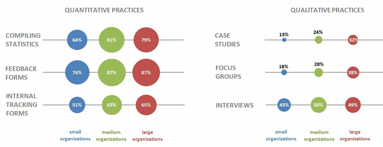
Ann Emery blogs at Emery Evaluation.  She challenged readers a couple of weeks ago to reproduce a bubble chart in either Excel or R.  This week she posted the answer.  She has given me permission to share that information with you.  You can look at the complete post at Dataviz Copycat Challenge:  The Answers.


I’ve also copied it here in a shortened format:

“Here’s my how-to guide. At the bottom of this blog post, you can download an Excel file that contains each of the submissions. We each used a slightly different approach, so I encourage you to study the file and see how we manipulated Excel in different ways.

Step 1: Study the chart that you’re trying to reproduce in Excel.

Here’s that chart from page 7 of the State of Evaluation 2012 report. We want to see whether we can re-create the chart in the lower right corner. The visualization uses circles, which means we’re going to create a bubble chart in Excel.

dataviz_challenge_original_chart

Step 2: Learn the basics of making a bubble chart in Excel.

To fool Excel into making circles, we need to create a bubble chart in Excel. Click here for a Microsoft Office tutorial. According to the tutorial, “A bubble chart is a variation of a scatter chart in which the data points are replaced with bubbles. A bubble chart can be used instead of a scatter chart if your data has three data series.”

We’re not creating a true scatter plot or bubble chart because we’re not showing correlations between any variables. Instead, we’re just using the foundation of the bubble chart design – the circles. But, we still need to envision our chart on an x-y axis in order to make the circles.

Step 3: Sketch your bubble chart on an x-y axis.

It helps to sketch this part by hand. I printed page 7 of the report and drew my x and y axes right on top of the chart. For example, 79% of large nonprofit organizations reported that they compile statistics. This bubble would get an x-value of 3 and a y-value of 5.

I didn’t use sequential numbering on my axes. In other words, you’ll notice that my y-axis has values of 1, 3, and 5 instead of 1, 2, and 3. I learned that the formatting seemed to look better when I had a little more space between my bubbles.

dataviz_challenge_x-y_axis_example

Step 4: Fill in your data table in Excel.

Open a new Excel file and start typing in your values. For example, we know that 79% of large nonprofit organizations reported that they compile statistics. This bubble has an x-value of 3, a y-value of 5, and a bubble size of 79%.

Go slowly. Check your work. If you make a typo in this step, your chart will get all wonky.

dataviz_challenge_data_table

Step 5: Insert a bubble chart in Excel.

Highlight the three columns on the right – the x column, the y column, and the frequency column. Don’t highlight the headers themselves (x, y, and bubble size). Click on the “Insert” tab at the top of the screen. Click on “Other Charts” and select a “Bubble Chart.”
dataviz_challenge_insert_chart

You’ll get something that looks like this:
dataviz_challenge_chart_1

Step 6: Add and format the data labels.

First, add the basic data labels. Right-click on one of the bubbles. A drop-down menu will appear. Select “Add Data Labels.” You’ll get something that looks like this:

dataviz_challenge_chart_2

Second, adjust the data labels. Right-click on one of the data labels (not on the bubble). A drop-down menu will appear. Select “Format Data Labels.” A pop-up screen will appear. You need to adjust two things. Under “Label Contains,” select “Bubble Size.” (The default setting on my computer is “Y Value.”) Next, under “Label Position,” select “Center.” (The default setting on my computer is “Right.)

dataviz_challenge_chart_3

Step 7: Format everything else.

Your basic bubble chart is finished! Now, you just need to fiddle with the formatting. This is easier said than done, and probably takes the longest out of all the steps.

Here’s how I formatted my bubble chart:

  • I formatted the axes so that my x-values ranged from 0 to 10 and my y-values ranged from 0 to 6.
  • I inserted separate text boxes for each of the following: the small, medium, and large organizations; the quantitative and qualitative practices; and the type evaluation practice (e.g., compiling statistics, feedback forms, etc.) I also made the text gray instead of black.
  • I increased the font size and used bold font.
  • I changed the color of the bubbles to blue, light green, and red.
  • I made the gridlines gray instead of black, and I inserted a white text box on top of the top and bottom gridlines to hide them from sight.

Your final bubble chart will look something like this:
state_of_evaluation_excel

For more details about formatting charts, check out these tutorials.

Bonus

Click here to download the Excel file that I used to create this bubble chart. Please explore the chart by right-clicking to see how the various components were made. You’ll notice a lot of text boxes on top of each other!”

Needs Assessment is an evaluative activity; the first assessment that a program developer must do to understand the gap between what is and what needs to be (what is  desired).  Needs assessments are the evaluative activity in the Situation box of a linear logic model. 

Sometimes, however, the target audience doesn’t know what they need to know and that presents challenges for the program planner.  How do you capture a need when the target audience doesn’t know they need the (fill in the blank).  That challenge is the stuff of other posts, however.

I had the good fortune to talk with Sam Angima, an Oregon  Regional Administrator who has been tasked with the charge of developing expertise in needs assessment.  Each Regional Administrator (there are 12) has been tasked with different charges to whom faculty can be referred.  We captured Sam’s insights in a conversational Aha! moment.  Let me know what you think.


The US elections are over; the analysis is mostly done;  the issues are still issues.  Well come, the next four years.  As Dickens said, It is the best of times; it is the worst of times.  Which? you ask–it all depends and that is the evaluative question of the day.

So what do you need to know now?  You need to help someone answer the question, Is it effective?  OR (maybe) Did it make a difference?

The Canadian Evaluation Society, the Canadian counter part to the American Evaluation Association has put together a series (six so far) of pamphlets for new evaluators.  This week, I’ve decided to go back to the beginning and promote evaluation as a profession.

Gene Shackman (no picture could be found) originally organized these brief pieces and is willing to share them.  Gene is an applied sociologist and director of the Global Social Change Research Project.  His first contribution was in December 2010; the most current, November 2012.

Hope these help.

Although this was the CES fourth post (in July, 2011), I believe it is something that evaluators  and those who woke up and found out they were evaluators need before any of the other booklets. Even though there will probably be strange and unfamiliar words in the booklet, it provides a foundation.  Every evaluator will know some of these words; some will be new; some will be context specific.   Every evaluator needs to have a comprehensive glossary of terminology. The glossary was compiled originally by the International Development Evaluation Association.  It is available for down load in English, French, and Arabic and is 65 pages.

CES is also posting a series (five as of this post) that Gene Shackman put together.  The first booklet, posted by CES in December, 2010 is called “What is program evaluation?” and is a 17 page booklet introducing program evaluation.  Shackman tells us that “this guide is available as a set of smaller pamphlets…” here.

In January, 2011, CES published the second of these booklets.  Evaluation questions addresses the key questions about program evaluation and is three pages long.

CES posted the third booklet in April, 2011.  It is called “What methods to use” and can be found here.  Shackman discusses briefly the benefits and limitations of qualitative and quantitative methods, the two main categories of answering evaluation questions.  A third approach that has gained credibility is mixed methods.

The next booklet, posted by CES in October 2012, is on surveys.  It “…explains what they are, what they are usually used for, and what typical questions are asked… as well as the pros and cons of different sampling methods.

The most recent booklet just posted (November, 2012) is about qualitative methods such as focus groups and interviews.

One characteristic of these five booklets is the additional resources that Shackman lists for each of the topics.  I have my favorites (and I’ve mentioned them from time to tine; those new to the field need to develop favorite sources.

What is important is that you embrace the options…this is  only one way to look at evaluation.


I spent much of the last week thinking about what I would write on November 7, 2012.

Would I know anything before I went to bed?  Would I like what I knew?  Would I breathe a sigh of relief?

Yes, yes, and yes, thankfully.  We are one nation and one people and the results of yesterday demonstrate that we are also evaluators.

Yesterday is a good example that everyday we evaluate.  (What is the root of the word evaluation?)  We review a program (in this case the candidates); we determine the value (what they say they believe); we develop a rubric (criteria); we support those values and that criteria; and we apply those criteria (vote).  Yesterday over 117 million people did just that.  Being a good evaluator I can’t just talk about the respondents without talking about the total population–the total number of possible respondents. One guess estimates that  169 million people are  registered to vote – 86 million Democrat – 55 million Republican – 28 million others registered.  The total response rate for this evaluation was 69.2%.  Very impressive–especially given the long lines. (Something the President said that needed fixing [I guess he is an evaluator, too.])

I am reminded that Senators and Representatives are elected to represent the voice of the people.  Their job is to represent you.  If they do not fulfill that responsibility, it is our responsibility to do something about it.  If you don’t hold them accountable, you can’t complain about the outcome.  Another evaluative activity.  (Did I ever tell you that evaluation is a political activity…?)  Our job as evaluators doesn’t stop when we cast our ballot; our job continues throughout the life of the program (in this case, the term in office).  Our job is to use those evaluation results to make things better.  Often, use is ignored.  Often, the follow-through is missing.  As evaluators, we need to come full circle.

Evaluation is an everyday activity.


The topic of survey development seems to be  popping up everywhere–AEA365, Kirkpatrick Partners, eXtension Evaluation Community of Practice, among others.  Because survey development is so important to Extension faculty, I’m providing links and summaries.


 AEA365 says:

“… it is critical that you pre-test it with a small sample first.”  Real time testing helps eliminate confusion, improve clarity, and assures that you are asking a question that will give you an answer to what you want to know.  This is so important today when many surveys are electronic.

It is also important to “Train your data collection staff…Data collection staff are the front line in the research process.”  Since they are the people who will be collecting the data, they need to understand the protocols, the rationales, and the purposes of the survey.

Kirkpatrick Partners say:

“Survey questions are frequently impossible to answer accurately because they actually ask more than one question. ”  This is the biggest problem in constructing survey questions.  They provide some examples of asking more than one question.


Michael W. Duttweiler, Assistant Director for Program Development and Accountability at Cornell Cooperative Extension stresses the four phases of survey construction:

  1. Developing a Precise Evaluation Purpose Statement and Evaluation Questions
  2. Identifying and Refining Survey Questions
  3. Applying Golden Rules for Instrument Design
  4. Testing, Monitoring and Revising

He then indicates that the next three blog posts will cover point 2, 3, and 4.

Probably my favorite post on survey recently was one that Jane Davidson did back in August, 2012 in talking about survey response scales.  Her “boxers or briefs” example captures so many issues related to survey development.

Writing survey questions which give you useable data that answers your questions about your program is a challenge; it is not impossible.  Dillman writes the book about surveys; it should be on your desk.

Here is the Dillman citation:
Dillman, D. A., Smyth, J. D., & Christian, L. M. (2009).  Internet, mail, and mixed-mode surveys: The tailored design method.  Hoboken, NJ: John Wiley & Sons, Inc.

Creativity is not an escape from disciplined thinking. It is an escape with disciplined thinking.” – Jerry Hirschberg – via @BarbaraOrmsby

The above quote was in the September 7 post of Harold Jarche’s blog.  I think it has relevance to the work we do as evaluators.  Certainly, there is a creative part to evaluation; certainly there is a disciplined thinking part to evaluation.  Remembering that is sometimes a challenge.

So where in the process do we see creativity and where do we see disciplined thinking?

When evaluators construct a logic model, you see creativity; you also see disciplined thinking

When evaluators develop an implementation plan, you see creativity; you also see disciplined thinking.

When evaluators develop a methodology and a method, you see creativity; you also see disciplined thinking.

When evaluators present the findings for use, you see creativity; you also see disciplined thinking.

So the next time you say “give me a survey for this program”,  think–Is a survey the best approach to determining if this program is effective; will it really answer my questions?

Creativity and disciplined thinking are companions in evaluation.