Today is the first full day of spring…this morning when I biked to the office it rained (not unlike winter…) and it was cold (also, not unlike winter)…although I just looked out the window and it is sunny so maybe spring is really here.  Certainly the foliage tells us it is spring–forsythia, flowering quince, ornamental plum trees; although the crocuses are spent, daffodils shine from front yards; tulips are in bud, and daphne–oh, the daphne–is in its glory.

I’ve already posted this week; next week is spring break at OSU and at the local high school.  I won’t be posting.  So I leave you with this thought:  Evaluation is an everyday activity, one you and I do often without thinking; make evaluation systematic and think about the merit and worth.  Stop and smell the flowers.


Harold Jarche shared in his blog a comment by a participant in one of his presentations.  The comment is:

Knowledge is evolving faster than can be codified in formal systems and is depreciating in value over time.


This is really important for those of us who love the printed work (me) and teach (me and you).  A statement like this tells us that we are out of date the moment we open our mouths; those institutions on which we depended for information (schools, libraries, even churches) are now passe.


The exponential growth of knowledge is much like that of population.   I think this graphic image of population (by Waldir) is pretty telling (click on the image to read the fine print).  The evaluative point that this brings home to me is the delay in making information available.

O

Do you (like me) when you say, “Look it up”, think web, not press, books, library, hard copy?  Do you (like me) wonder how and where this information originated when the information is so cutting edge?  Do you (like me) wonder how to keep up or even if you can?  Books take over a year to come to fruition (I think the 2 year frame is more representative).  Journal manuscripts take 6 to 9 months on a quick journal turn around.  Blogs are faster and they express opinion; could they be a source of information?

I’ve decided to go to an advanced qualitative data seminar this summer as part of my professional development because I’m using more and more qualitative data (I still use quantitative data, too).  It is supposed to be cutting edge.  The book on which the seminar is based won’t be published until next month (April).  How much information has been developed since that book went to press?  How much information will be shared at the seminar?  Or will that seminar be old news (and like old news, be ready for fish)?  The explosion of information like the explosion of population, may be a good thing; or not.  The question is what is being done with that knowledge?  How is it being used?  Or is it?  Is the knowledge explosion an excuse for people to be information illiterate? To become focused (read narrow) in their field?   What are you doing with what I would call miscellaneous information that is gathered unsystematically?  What are you doing with information now–how are you using it for professional development–or are you?


Today’s post is longer than I usually post.  I think it is important because it captures an aspect of data analysis and evaluation use that many of us skip right over:  How to present findings using the tools that are available.  Let me know if this works for you.


Ann Emery blogs at Emery Evaluation.  She challenged readers a couple of weeks ago to reproduce a bubble chart in either Excel or R.  This week she posted the answer.  She has given me permission to share that information with you.  You can look at the complete post at Dataviz Copycat Challenge:  The Answers.


I’ve also copied it here in a shortened format:

“Here’s my how-to guide. At the bottom of this blog post, you can download an Excel file that contains each of the submissions. We each used a slightly different approach, so I encourage you to study the file and see how we manipulated Excel in different ways.

Step 1: Study the chart that you’re trying to reproduce in Excel.

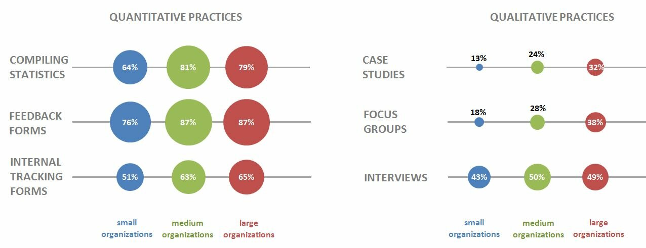
Here’s that chart from page 7 of the State of Evaluation 2012 report. We want to see whether we can re-create the chart in the lower right corner. The visualization uses circles, which means we’re going to create a bubble chart in Excel.

dataviz_challenge_original_chart

Step 2: Learn the basics of making a bubble chart in Excel.

To fool Excel into making circles, we need to create a bubble chart in Excel. Click here for a Microsoft Office tutorial. According to the tutorial, “A bubble chart is a variation of a scatter chart in which the data points are replaced with bubbles. A bubble chart can be used instead of a scatter chart if your data has three data series.”

We’re not creating a true scatter plot or bubble chart because we’re not showing correlations between any variables. Instead, we’re just using the foundation of the bubble chart design – the circles. But, we still need to envision our chart on an x-y axis in order to make the circles.

Step 3: Sketch your bubble chart on an x-y axis.

It helps to sketch this part by hand. I printed page 7 of the report and drew my x and y axes right on top of the chart. For example, 79% of large nonprofit organizations reported that they compile statistics. This bubble would get an x-value of 3 and a y-value of 5.

I didn’t use sequential numbering on my axes. In other words, you’ll notice that my y-axis has values of 1, 3, and 5 instead of 1, 2, and 3. I learned that the formatting seemed to look better when I had a little more space between my bubbles.

dataviz_challenge_x-y_axis_example

Step 4: Fill in your data table in Excel.

Open a new Excel file and start typing in your values. For example, we know that 79% of large nonprofit organizations reported that they compile statistics. This bubble has an x-value of 3, a y-value of 5, and a bubble size of 79%.

Go slowly. Check your work. If you make a typo in this step, your chart will get all wonky.

dataviz_challenge_data_table

Step 5: Insert a bubble chart in Excel.

Highlight the three columns on the right – the x column, the y column, and the frequency column. Don’t highlight the headers themselves (x, y, and bubble size). Click on the “Insert” tab at the top of the screen. Click on “Other Charts” and select a “Bubble Chart.”
dataviz_challenge_insert_chart

You’ll get something that looks like this:
dataviz_challenge_chart_1

Step 6: Add and format the data labels.

First, add the basic data labels. Right-click on one of the bubbles. A drop-down menu will appear. Select “Add Data Labels.” You’ll get something that looks like this:

dataviz_challenge_chart_2

Second, adjust the data labels. Right-click on one of the data labels (not on the bubble). A drop-down menu will appear. Select “Format Data Labels.” A pop-up screen will appear. You need to adjust two things. Under “Label Contains,” select “Bubble Size.” (The default setting on my computer is “Y Value.”) Next, under “Label Position,” select “Center.” (The default setting on my computer is “Right.)

dataviz_challenge_chart_3

Step 7: Format everything else.

Your basic bubble chart is finished! Now, you just need to fiddle with the formatting. This is easier said than done, and probably takes the longest out of all the steps.

Here’s how I formatted my bubble chart:

  • I formatted the axes so that my x-values ranged from 0 to 10 and my y-values ranged from 0 to 6.
  • I inserted separate text boxes for each of the following: the small, medium, and large organizations; the quantitative and qualitative practices; and the type evaluation practice (e.g., compiling statistics, feedback forms, etc.) I also made the text gray instead of black.
  • I increased the font size and used bold font.
  • I changed the color of the bubbles to blue, light green, and red.
  • I made the gridlines gray instead of black, and I inserted a white text box on top of the top and bottom gridlines to hide them from sight.

Your final bubble chart will look something like this:
state_of_evaluation_excel

For more details about formatting charts, check out these tutorials.

Bonus

Click here to download the Excel file that I used to create this bubble chart. Please explore the chart by right-clicking to see how the various components were made. You’ll notice a lot of text boxes on top of each other!”

Just spent the last 40 minutes reading comments that people have made to my posts.  Some were interesting; some were advertising (aka marketing) their own sites; one suggested I might revisit the “about” feature of my blog and express why I blog (other than it is part of my work).  So I revisited my “about” page, took out conversation, and talked about the reality as I’ve experienced it for the last three plus years.  So check out the about page–I also updated info about me and my family.  The comment about updating my “about” page was a good one.  It is an evaluative activity; one that was staring me in the face and I hadn’t realized it.  I probably need to update my photo as well…next time…:)


Gene Shackman shared these resources for “best practices” for doing survey research.  Since survey methodology is often used frequently and regularly by Extension professionals, these might be of interest.  I’m not endorsing any of them; only passing them on to interested individuals.  Gene posted them originally as a comment on the Evaluators Group Linkedin page.  Linkedin is another evaluator resource.


Survey Research: A Summary of Best Practices
December 31, 2004, Ethics Resource Center 2004, Leslie Altizer
A brief summary
http://www.ethics.org/resource/survey-research-summary-best-practices

AAPOR (American Association for Public Opinion Research
How to produce a quality survey
http://www.aapor.org/Best_Practices1.htm

Best Practices for Survey Research Reports: A Synopsis for Authors and Reviewers

JoLaine Reierson Draugalis and others
Am J Pharm Educ. v.72(1); Feb 15, 2008
“This article provides a checklist and recommendations for authors and reviewers to use when submitting or evaluating manuscripts reporting survey research that used a questionnaire as the primary data collection tool.”
http://www.ncbi.nlm.nih.gov/pmc/articles/PMC2254236/

Achieving Quality Survey Research: Principles of Good Practice
Labour and Immigration Research Center, August 2012
http://www.dol.govt.nz/research/about/survey-research-principles-good-practice.pdf

Ithaca College Survey Research Center
Best Practices for Survey Research
“This document provides recommendations on how to plan and administer a survey.”
http://www.ithaca.edu/ir/icsrc/docs/bestprac.pdf

International Journal for Quality in Health Care
2003; Volume 15, Number 3 pp. 261–266
Methodology Matters. Good practice in the conduct and reporting of survey research
Kate Kelley, Belinda Clark, Vivienne Brown, and John Sitzia
https://research.chm.msu.edu/Resources/Good_practice_in_survey_research.pdf


In a conversation with a colleague on the need for IRB when what was being conducted was evaluation not research, I was struck by two things:

  1. I needed to discuss the protections provided by IRB  (the next timely topic??) and
  2. the difference between evaluation and research needed to be made clear.

Leaving number 1 for another time, number 2 is the topic of the day.

A while back, AEA 365 did a post on the difference between evaluation and research (some of which is included below) from a graduate students perspective.  Perhaps providing other resources would be valuable.

To have evaluation grouped with research is at worst a travesty; at best unfair.  Yes, evaluation uses research tools and techniques.  Yes, evaluation contributes to a larger body of knowledge (and in that sense seeks truth, albeit contextual).  Yes, evaluation needs to have institutional review board documentation.  So in many cases, people could be justified in saying evaluation and research are the same.

NOT.

Carol Weiss   (1927-2013, she died in January) has written extensively on this difference and  makes the distinction clearly.  Weiss’s first edition of Evaluation Research  was published in 1972.She revised this volume in 1998 and issued it under the title of Evaluation. (Both have subtitles.)

She says that evaluation applies social science research methods and makes the case that it is intent of the study which makes the difference between evaluation and research.  She lists the following differences (pp 15 – 17, 2nd ed.):

  1. Utility;
  2. Program-driven questions;
  3. Judgmental quality;
  4. Action setting;
  5. Role Conflicts;
  6. Publication; and
  7. Allegiance.


(For those of you who are still skeptical, she also lists similarities.)  Understanding and knowing the difference between evaluation and research matters.  I recommend her books.

Gisele Tchamba who wrote the AEA365 post says the following: 

  1. Know the difference.  I came to realize that practicing evaluation does not preclude doing pure research. On the contrary, the methods are interconnected but the aim is different (I think this mirrors Weiss’s concept of intent).
  2. The burden of explaining. Many people in academia vaguely know the meaning of evaluation. Those who think they do mistake evaluation for assessment in education. Whenever I meet with people whose understanding of evaluation is limited to educational assessment, I use Scriven’s definition and emphasis words like “value, merit, and worth”.
  3. Distinguishing between evaluation and social science research.  Theoretical and practical experiences are helpful ways to distinguish between the two disciplines. Extensive reading of evaluation literature helps to see the difference.

She also sites a Trochim definition that is worth keeping in mind as it captures the various unique qualities of evaluation.  Carol Weiss mentioned them all in her list (above):

  •  “Evaluation is a profession that uses formal methodologies to provide useful empirical evidence about public entities (such as programs, products, performance) in decision making contexts that are inherently political and involve multiple often conflicting stakeholders, where resources are seldom sufficient, and where time-pressures are salient”.

Resources: