Categories
AP Style Brand Guidelines Writing

Editorial style update: Capitalizing Indigenous

We have made the editorial style decision to capitalize the word Indigenous when referring to Indigenous people. This is consistent with other racial and ethnic identities, including African American, Asian American, Pacific Islander, Latina/Latino/Latinx, Hispanic and Native American. We updated the editorial style section of the Oregon State Brand Guidelines accordingly.

Although this is a break with current AP style, the question of capitalizing Indigenous has been brought up in the Ask the Editor section of the Associated Press Stylebook online. The New York Times and international news organizations including the BBC and The Guardian are now capitalizing Indigenous, and the editors at AP may change their minds. As we all know, the AP updates the stylebook all the time. Some of us are still adjusting the using the % sign.

Our thanks to Luhui Whitebear, assistant director of the Native American Longhouse Eena Haws. In addition to bringing this to our attention, she provided an explanation for why Indigenous should be capitalized from the Diversity Style Guide, and we agree. A project of the Center for Integration and Improvement of Journalism at San Francisco State University, the Diversity Style Guide also has support from the Society of Professional Journalists.

Categories
Brand Guidelines Writing

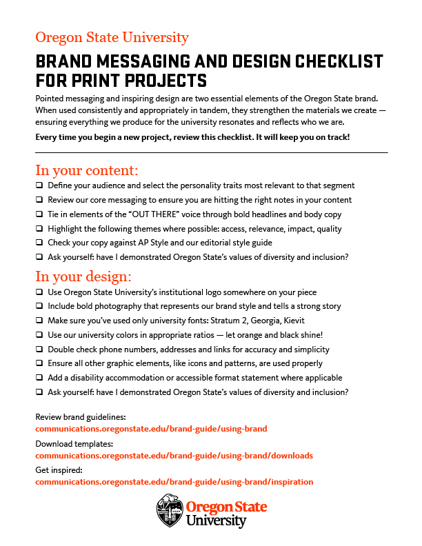
Brand Messaging and Design Checklist for Print Projects

Every time you begin a new project, review this checklist. It will keep you on track!

Pointed messaging and inspiring design are two essential elements of the Oregon State Brand. When used consistently and appropriately in tandem, they strengthen the materials we create – ensuring everything we produce for the university resonates and reflects who we are.

You can also find this checklist on our Tools and Resources page.

Categories
Social Media Tips and Tutorials

Diving into Instagram Stories and Going Live

Let’s talk Instagram Stories:

When Instagram rolled out this feature, no one really knew how to use it. But they are getting popular with lots of fun features. They’re a great way boost your Instagram game. We’ve been using it more frequently and have seen great progress.

Stories are a great way to grab followers’ attention for a short period of time. Want to get more likes on one of your posts? Want to share a post you like? Post quick updates? Share a cool video? This is where you can do that.

Highlights are a great opportunity to archive your stories. When we post to our Story, we think about which highlight bucket the content will ultimately be saved under. That way we aren’t just posting a story that doesn’t connect with our followers. At the institutional level, our goal is to showcase the Oregon State experience, and Stories do that.

We have found success in using Stories for event or gameday coverage. These truly capture what it’s like to be part of #BeaverNation. We have also seen people engage with our fall, winter and spring highlights. By simply grabbing boomerangs, photos and videos you can produce a great Story.

Additionally, the perfect length is about 4-8 slides because people will just skip past you if the story is too long. You want to make sure to have a good hook at the beginning and your followers will love it! Check out Sprout Social’s Instagram Best Practices if you still want to learn more.

Next up, going Live:

The key is to have a goal in mind. Are you going to answer follower questions? Or are you going to showcase an event or are you going to go live with someone? Once you have that figured out, you can execute a plan of how your live will go.

The feature is pretty easy to use and here are some tips we’ve learned:

  • Post an Instagram story a couple days and hours before you go live —this way your followers know it’s happening.
  • Save your live after it’s done. It will stay on your profile for 24 hours and people can revisit it.
  • Instagram live will cut you off after one hour. So make sure you keep track of the time.
  • Make sure you have a tripod or a secure place to put your phone when you go live. You don’t want to move your phone too much or it doesn’t make for a fun live.
  • Better lighting always helps.
  • Make sure the phone is charged.
  • If you want to do a Q&A, check out these helpful tips. This feature is engaging and allows you to connect with your audience. You’re able to pick questions you want to answer and won’t have to read the comments as they roll in.
  • Check out how to go live with another Instagram user here. If you have a student or researcher, this might be a fun way to interact.

Both these Instagram features are a great way to connect with your followers. These are becoming more popular among brands and helps up your Instagram game. Go have some fun!

Categories
Social Media Tips and Tutorials

Tips for a great Instagram

Instagram is the most popular with students and prospective students. This is where Oregon State can share campus beauty/ life photos and videos.

The first thing to think of is a goal. Ours was more followers and engagement, so this is how we started to up our game in the Instagram world.

We learned that you need to be consistent in posting. Basically, look at your metrics to see when followers are online and post then. Make sure you have diversity in your posts (this doesn’t just go for people). Don’t just post buildings or event info. Show your students or professors in their environment or go to an event and share photos from it. Put yourself in the shoes of your followers to know what they want to see.

Break up your feeds! Pictures are great, but Instagram is also a video sharing platform. Post videos spotlighting professors, students and your department or a fun lighthearted video (time-lapse of campus). This helps your feed look more pleasing. It’s important to make sure videos are formatted correctly and don’t cut anything off — that leads to less engagement.

IGTV is becoming more popular to use within the Instagram app. It’s a great place to post videos longer than 1:00, and you can share those as posts as well to boost viewership and reach. This is something the institutional account has started to do with event coverage.

Be active. Don’t just leave a post after it’s been posted. Look at comments, give them a like or answer any questions. Look at your feed and engage with other posts from accounts you follow. Also keep up with those DMs. All these are ways for followers to form a connection your account.

Since adapting to these best practices, Oregon State’s account hit 50K in December 2019 and continues to grow. It’s important to be able to adapt to the changes Instagram makes as you continue to grow your own accounts. The only way is up!

Categories
Adobe Photoshop

Creating Animated GIFs in Photoshop

Today I’m going to show you how to make an animated gif using Adobe Photoshop. I have text that says “Go Beavs”, over an image of campus, and what I’d like to have happen is for the Go Beavs to be spelled out over the image, looking like it’s being typed.

  1. Select the text layer, hold alt+click and drag the layer to copy it.
  2. Hide the first text layer and delete a letter from the new layer.
  3. Repeat until all letters are deleted. This is an easy way to make it look typed out. By doing it backwards like this we can design it the way we want beforehand.
  4. Open the Timeline window by going to Window>Timeline
  5. Click Create Frame Animation
  6. Select the options and click “Make Frames from Layers”
  7. To add the background image to all frames, select all layers and hide/unhide the image layer so that it is visible on all frames.
  8. Select all frames in the Timeline layer and change the delay time to .1 seconds (NOTE: what is previewed might not be what the GIF comes out to look like. Trial and error might be needed to see what speed you need.)
  9. To make the last frame hold for longer, select the frame and click the options button to select Copy Frame, and then Paste Frame…
  10. Select ‘after selection’ and click OK. Repeat until you have the length desired.
  11. Go to File>Export>Save for Web (Legacy)…
  12. Select the preset GIF 128 Dithered, and Save.

Thank you, and good luck!

Categories
Social Media Tips and Tutorials

We joined TikTok. Here’s what we’ve learned

TikTok is becoming more popular among 16-24 year olds. During fall term 2019, Oregon State launched its TikTok account with the goal to connect with prospective and current students by producing timely, authentic and relevant content that showcases the university and its community.

The most important part of this social media platform is to stay on top of trends (including music) and hashtags by spending time on the app. We have found it helpful to follow other university accounts and see what they are doing.

These are the topics or trends the OSU account will create videos from:

  • College related trends
  • Trendy hashtags/music
  • Dance and Cheer team
  • Student clubs

We’ve had success on TikTok so far with collaborating with departments, clubs and student organizations across campus. We were lucky to create a video with the OSU Dance and Cheer Team, and it’s one of our best videos since launching the account. Success will come when you collaborate creatively. We’ve also seen success when sharing our exported TikToks on Instagram Stories. This connects your followers with another channel and can help with growth. A little call to action never hurts.

While we are still learning this new platform, we need to remember that the audience we are trying to reach is not only current students but prospective students. We need to create videos that showcase campus in a positive way but also builds on nationwide trends. Sure, there’ll be some things that you cannot do because they aren’t university appropriate, but there’s always a trend/style/music track to explore. You need to put your creative hat on and be willing to put yourself in the shoes of Generation Z knowing no idea is a bad one. Go out there and get your TikToks started!

Categories
Social Media Tips and Tutorials

Event Coverage for Social Media

Getting out and covering events across campus is a fun way to engage your social media audience. They are always wanting to learn more about the Oregon State experience.

Part of the strategy for Oregon State’s institutional accounts is to attend events to help bring awareness of the culture on campus. Our goal is to reach students and prospective students by posting stories and photos to Instagram.

With this in mind let’s talk about our coverage of the 2020 Women’s Basketball Civil War. Planning is everything! You need to have a game plan and different scenarios.

Our game plan was simple. We designated jobs to certain people. Someone would be on Instagram stories, someone taking photos, and someone ready to push a tweet out if we won. Secondly, we made sure we had a plan if we did win. That was to test out going live from Instagram. The goal of that was to reach a bigger audience and celebrate a big win.

Here’s a breakdown of each job:

  • Instagram Stories– To get photos/video/boomerangs of the team, fans, cheer and Benny. With the key thing in mind: to show what it’s like to be at a game even if you aren’t there. (Make sure you have a beginning and end)
  • Photos– capturing game action, cheer, Benny, fans (before, during, and after the game)
  • Twitter– on call for if we win with great copy and a fun photo

With all of that planned out before the game we all felt prepared. Just to be clear things change all the time and you need to make adjustments. We made sure to go to the game early and feel conformable in a new environment. Sometimes that can be the challenging part but, if the crowds having fun then you will probably feed off of that energy.

Looking back at the game we didn’t win, but we put up a good fight. If you make sure to have a solid game plan heading into an event and people know what they are suppose to do you will have great content. Our Instagram stories and photos turned out fabulous and our followers enjoyed them. Our goal is to continue to share more events on our Instagram feed as time continues.

Cheers to the next events!

Categories
Tips and Tutorials

Writing for the Web

Reading a book on the beach is very different than the reading we do on the internet. But why exactly?

When reading on the web, people commonly…

  • Are looking to accomplish a task, and aren’t in a leisure reading mode
  • Don’t read word for word
  • Scan in an F-shape pattern (but, there are other scanning patterns too)
    • Literacy skills affect scanning abilities. People with lower literacy skills don’t scan, but will skip sections entirely. Keep this in mind as you consider your audience.
  • Have a limited cognitive load
    • Cognitive load is how much processing power and memory it takes to perform a task on your site. If it takes too long or is too difficult, they may give up.

Strategies

Just because people don’t read on the internet the way they read a book, doesn’t mean all is lost. There are plenty of things you can do to make your website visitors’ experience easier when they’re on the hunt for a specific piece of information.

Front-load paragraphs

Put the most important information at the beginning of the paragraph. This is a good writing practice anyway, but definitely even more so on the web.

Use clear visual hierarchy

  • Use headings to break up your content.
  • Headings should be 5-6 words. Concise headings are the most effective.

Make bullet lists

  • Not everything has to be a bullet list, but it is one of many strategies to break up content.
  • Use similar sentence structure for each bullet point.
    • For example, each one of these bullet points in this list, start with a verb.
  • Choose consistent punctuation. Use a period at the end of each bullet point if each point is longer.

Write in a conversational way

While this decision can depend on your audience, writing conversationally will make your website seem more approachable and friendly. It’s also easier to read. Write sentences with simple structure, limiting the number of clauses or phrases.

Complex sentence:
In Drupal, blocks and contexts can be used to control where content shows up on your website, whether that be through the use of a template for many pages (contexts) or through the use of one block that needs to show up on one page (blocks).

Revised version:
In Drupal, blocks and contexts can be used to control where content shows up on your website. Contexts provide a layout template applied to many pages. Blocks are chunks of content that are best for just one page.

Use Active Voice

We’ve all read something that seems like an absolute slog to get through. One thing that that contributes to that is writing in the passive voice.

Active voice: Gina hit the ball.
Passive voice: The ball was hit by Gina.

Passive voice usually adds a lot of words and make for some pretty dry reading.

Write descriptive links

Don’t write “Click Here” or “Read More.” Screen readers, assistive technology that reads websites to blind or visually impaired people, can read through all the links on the page. It is more difficult to navigate through the website if all of them say the same thing.

To benefit everyone, write links that succinctly tell people where they are headed.

Example: Request the institutional logo files to use in your print materials and websites.

Cut the fat

Write your copy, then cut it by 50%. If you want a gold star, cut 50% again.

If you want to dig deeper on this subject, I recommend looking at the articles on writing for web from the Nielson Norman group.
Categories
Digital Tips and Tutorials

Web Analytics Dashboard

If you haven’t checked out beav.es/analytics, I encourage you to do so, now, without delay. It’s a dashboard that shows the analytics for your site at a glance. It’s useful if you need to look at basic statistics or want to easily share data with your stakeholders.

By default, the dashboard will show data for all centrally hosted sites at OSU. You can filter the data by selecting your site from the list in the left hand corner.

If you’re not familiar with Google Analytics vocabulary, here’s a guide to some of the terms.

Definitions

Pageviews

The number of times your pages have been viewed. If someone hits refresh on the page 8 times, all of those instances will be counted. If someone goes to another page and then comes back, it’s also counted.

It’s normal to see a dip in traffic on Saturdays and Sundays.

Sessions

Think of this as a time that someone got on their computer and clicked around on your site, then got up and watched videos of cats on their phone while sipping a cup of coffee. This would count as 1 session, even though they viewed multiple pages. The session ends when they’ve been inactive for 30 minutes or left your site. (There are a lot of cat videos out there, so they’ve been gone for a while.)

Top Content

Shows the pages with the highest number of pageviews. It lists the path portion (the end part) of the URL and won’t include the domain name.

For example: “communications.oregonstate.edu/brand-guide” would be listed as “/brand-guide”.

When it lists only “/” that indicates the homepage of your site.

Top Mediums

Are ways people find your site. Think of these as the broad categories, rather than specific sources like “google.com” or “search.oregonstate.edu”

Organic

Someone used a search engine, like Google, Bing, or Yahoo, to find your site. They clicked a result that wasn’t an ad.

None

Can mean several things. A visitor to your site may have:

  • Typed the URL in the address bar
  • Clicked on a link to your site in a desktop program like Outlook or Thunderbird
  • Used a bookmark
  • An aggressive ad blocker that prevents tracking

It’s better to think of “none” as more of an unknown category.

Referral

People visited by clicking a link on a different website. For example, a high school student is looking at colleges on the US News College Rankings list. In the section about OSU, they click on a link that goes to the admissions site. That would count as a referral.

Referrals can also be other OSU websites that are on separate domains or aren’t centrally hosted.

CPC/SEM

This is traffic generated through paid advertising campaigns.

Email

Is just that. Someone clicked a link in an email.

Other Categories

When creating ads, you can assign names to a medium using a custom URL (UTM parameters). Other names in this list besides the default ones listed above are from these custom campaigns.

Landing/Exit Pages

Say you’re researching for your next vacation, so you Google “Hawaii beaches.” You click on the first search result that has a tranquil and idyllic picture of a pristine beach.

That page you landed on is probably not the homepage of a website, but rather a page nested within the site. That page, “Hawaii beaches,” is your landing page.

Then, say you click around on a couple of pages to check out standup paddle boarding, the snorkeling options, and then you reach the prices page. Yikes! That’s a tad out of your budget for the trip, so you go back to your search. The price page would be your exit page.

For more information about Google Analytics, you can check out their help center or come to Open Lab.

Categories
Digital Tips and Tutorials

How to use headings

Headings in a webpage are vital for creating an organized and accessible web page. Think of headings as the main points in the outline of your written content. Short and concise headings should describe sections of your web page. If someone only read the headings of your webpage, they should be able to have a good idea what your page is about.

Headings provide structure and are hierarchical–to mark most important to least important. They start with heading 1 as the most important and ending with heading 6 as least important.

Example heading structure

Let’s say I have a website that’s all about beavers. Here’s what the heading structure would look like:

  1. Beavers (Heading 1)
    1. Species (Heading 2)
      1. North American Beaver (Heading 3)
      2. Eurasian Beaver (Heading 3)
    2. Habitat (Heading 2)
      1. Dams (Heading 3)
        1. Affect on climate (Heading 4)
      2. Lodges (Heading 3)
    3. Lifespan

Why do headings matter?

“Can’t I just pick a heading based on how it makes my text look?”

Screen readers allow those with low/no vision to skim a page by reading all the headings out loud. If headings are missing or out of order, this process becomes quite difficult and frustrating. For sighted users, using headings consistently will provide a cohesive visual experience.

If you need to emphasize an announcement or exception, use bold formatting instead. Headings should not be used to change the appearance of text. Conversely, applying bold or italics to headings doesn’t give the structure needed for people who use screen readers. The screen reading software won’t pick up on the italicized or bold text as a heading.

How to add headings in Drupal

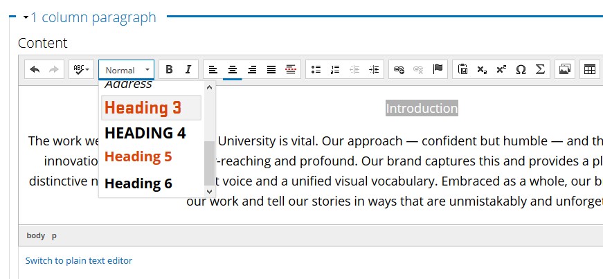
With Drupal, you can add headings to your webpage easily. You select the text and then from the formatting option, select the appropriate heading.

screenshot of text editor in Drupal to change headings

Headings start with level 3 in Drupal because headings 1 and 2 label the site and page titles. Start with heading 3 for your main points and use headings 4, 5, or 6 if you have subsections. Unless your page is very long and complex, you probably won’t use heading 6.

How to check your heading structure

Our accessibility checker, Monsido, will check for the order of the headings. (Contact Web and Mobile Services if you don’t have access to Monsido.) However, it can’t check for lengthy or irrelevant headings. That needs to be reviewed by a person looking over the content to make sure it’s current, concise, and relevant.

If your department doesn’t have Monsido, then you can use Webaim’s Wave Tool, which is free and available right in your web browser.

Writing isn’t easy! But creating well structured content gives everyone an great experience.