Categories
Brand Guidelines Icons Uncategorized

New Icons!

We have added to our library of icons! Over the past week, we have created and uploaded a number of new icons for you to use in your designs. Icons are created in eps, png and svg file formats. Icons are a great way to add some visual interest to your design. Guidelines of icon use can be found here in our brand site, as well as how to download them.

The icons are sorted into categories for ease of searching. The categories are:

  • Animals
  • Buildings and transportation
  • Food and drink, maps
  • Objects, misc
  • Outdoors
  • People and accessories
  • Research
  • Symbols
  • Tools, instruments
  • Web, electronics
Categories
AP Style Brand Guidelines Writing

Editorial style update: Capitalizing Indigenous

We have made the editorial style decision to capitalize the word Indigenous when referring to Indigenous people. This is consistent with other racial and ethnic identities, including African American, Asian American, Pacific Islander, Latina/Latino/Latinx, Hispanic and Native American. We updated the editorial style section of the Oregon State Brand Guidelines accordingly.

Although this is a break with current AP style, the question of capitalizing Indigenous has been brought up in the Ask the Editor section of the Associated Press Stylebook online. The New York Times and international news organizations including the BBC and The Guardian are now capitalizing Indigenous, and the editors at AP may change their minds. As we all know, the AP updates the stylebook all the time. Some of us are still adjusting the using the % sign.

Our thanks to Luhui Whitebear, assistant director of the Native American Longhouse Eena Haws. In addition to bringing this to our attention, she provided an explanation for why Indigenous should be capitalized from the Diversity Style Guide, and we agree. A project of the Center for Integration and Improvement of Journalism at San Francisco State University, the Diversity Style Guide also has support from the Society of Professional Journalists.

Categories
Brand Guidelines Writing

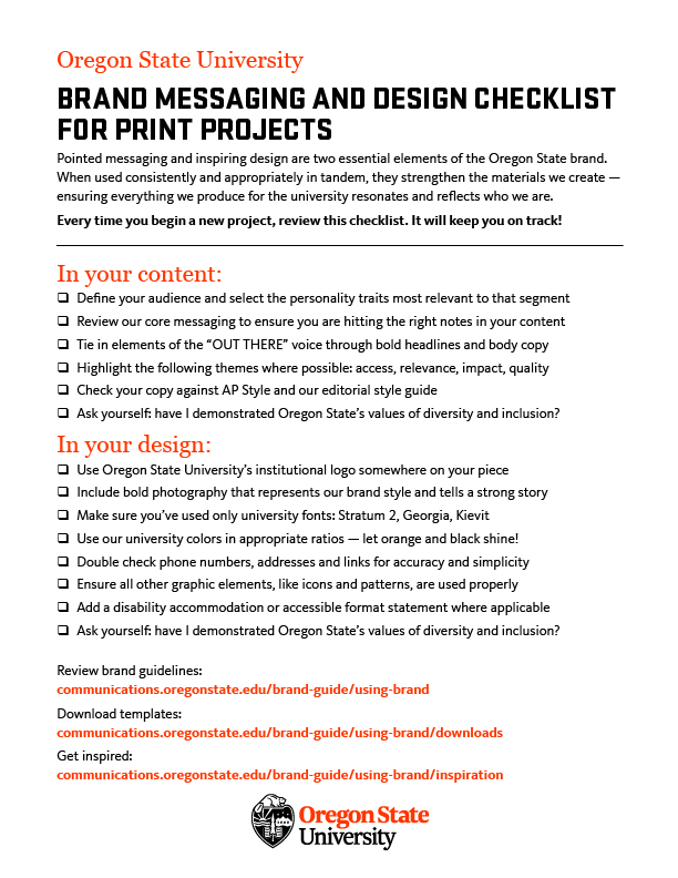
Brand Messaging and Design Checklist for Print Projects

Every time you begin a new project, review this checklist. It will keep you on track!

Pointed messaging and inspiring design are two essential elements of the Oregon State Brand. When used consistently and appropriately in tandem, they strengthen the materials we create – ensuring everything we produce for the university resonates and reflects who we are.

You can also find this checklist on our Tools and Resources page.

Categories
Brand Guidelines

OSU branding and Illustration

Our brand style uses strong photography to tell the story visually. However, there are limited circumstances where illustrations may be used because a photo would not be effective. In cases like this, we ask that the illustrations only be used for one year, because the art could be considered a logo if used for multiple years. Please note that stylized, hand-drawn or cartoon images of beavers are not allowed.

If you are unsure if you are in a situation where you can use an illustration instead of a photo, we’ve put together a flow chart to quickly reach an answer: Download a printable version.


Just as a reminder, all the information below is available at our Illustration page in the OSU Brand tools.

Illustrations are allowed for:

  • Events
  • Magazines
  • Scientific Illustrations
  • On-campus awareness campaigns (intended to educate others about specific topics or issues, ie. bike safety, illness outbreaks)
  • Holiday cards
  • Motion graphics

Illustrations are not allowed for:

  • Ongoing programs
  • Repeated use from previous years
  • Stylized, hand-drawn or cartoon images of beavers
  • Recruitment materials for prospective students
  • External advertisements

Happy designing!

Categories
Brand Guidelines

Beaver Orange – A User Guide

One of our greatest assets at Oregon State is our primary color. Beaver Orange is vibrant, distinct and provides a solid base for the larger color palette. Through the years we have worked to present a consistent color no matter the channel or medium you are working with. In conjunction with the Oregon State logo, this is the best way to present a unified visual identity to the marketplace.

To do this we provide different color builds for various uses.

  • Pantone 1665 for print jobs here on campus, through Printing and Mailing Services.
  • CMYK for off-set print jobs done through an outside vendor (bid through Printing and Mailing Services).
  • RGB for digital signage, presentations and as a fall back for less advanced design software (word, powerpoint, etc…)
  • Hex is used only for websites, applications and mobile applications.

This guide applies to our entire color palette. If you ever have a question don’t be afraid to toss it out to the OSU Communicators slack community or email University Marketing directly.

You can find our color palette in the OSU Brand Guide.

Update to RGB and Hex

Since the launch of our updated color palette, in April of 2017, we have lived with a very narrow scope for how we are able to use Beaver Orange on websites. Because we strive (and are required) to meet WCAG AA guidelines for accessibility we were unable to use orange and white together for text/background colors.

This greatly limited our creative and design staff across the university. To address this we made a very slight tweak to the Hex of Beaver Orange. Visually the change is nearly imperceptible but provides enough contrast to use orange, white and black combinations. For centrally administered web properties (through Web and Mobile Services) the colors have been updated automatically. We have been working with our decentralized partners to make sure they have anything needed to adjust to this change. If you need assistance or have questions please connect with Kegan Sims on Slack or by contacting University Marketing via email.

As a result of the update to the Hex, it made sense to update RGB as well. RGB is primarily used for material displayed digitally (signboards, email, presentations, etc..) but also in print if you are using basic programs such as Microsoft Word or Powerpoint for design. On rare occasions, graphics made using RGB colors end up on websites. In order to maintain as much consistency as possible, both the Hex and RGB were tweaked together. These changes are subtle and we don’t expect you to rush out and update your materials. As you update content or create new versions of your digital collateral that is a good time to make a change.