Categories
Adobe Animate Tips and Tutorials

Adobe Animate Basics

Explanation and demonstration of the basics of creating shapes and applying movement within symbols in the program Adobe Animate 2023.

00:00 – Introduction

00:25 – Creating your file

01:08 – Making shapes (oval tool)

02:59 – Making shapes (copied from Adobe Illustrator)

04:35 – Making shapes (classic brush tool)

05:35 – Making shapes (brush tool)

07:45 – Animating movement (keyframes)

10:14 – Animating movement (classic tween)

12:44 – Animating inside a Symbol

18:32 – Change symbol’s loop options

19:04 – Animating movement (motion tween)

20:55 – Copying symbols for different motion

21:59 – Duplicating symbols

22:52 – Creating masks

24:20 – Changing opacity and fading out

25:02 – Exporting to .mp4 or .gif

27:15 – Edit publish settings

27:56 – Looking at a finished file

30:43 – Thanks for watching!

Categories
Adobe InDesign Adobe Photoshop Tips and Tutorials

Cutting Out and Layering Subjects from Photos

Sometimes your design might call for the subject of your image to be cut out or layered: For example, Oregon State’s branding features contextual graphics, which can be integrated with your photos so they look like they’re behind the subject, or behind mountains, things like that.

I’ll show two methods today. One in photoshop that takes a lot more steps but is more precise, and another in Indesign that is quick but less precise.

The best and most precise way is to make a duplicate of your photo with a transparent background. I’ll start with opening photoshop.
-I’m using Photoshop 2021, and they’ve made it very easy to select your subject, as long as you don’t mind going in after to fix their mistakes.
-Go to Select>Subject and let it work its magic
-It did a pretty good job of guessing, so lets first refine the edge so it doesn’t have a harsh cut line
-Go to Select>modify>expand, and I like to use 2px
-Again, Select>modify>feather, and again 2 px. This gives it a softer outline so it’s not such a harsh cutout.
-At the bottom of the layers panel, select this black square with a circle to create a mask from our outline. This doesn’t delete anything, so if we make mistakes we don’t have to restart from scratch
-There’s some background that got included by accident, so let’s fix those
-Select the mask, make sure the color selected is white, and select the eraser tool
-Erase the bits of background that were included.
-Use the brush tool to bring back the bits of benny that were left out of the mask.
-Tip: Right click>disable layer mask to show the background again, and in Channels click the eye next to the mask to make it easier to see what needs fixed.
-When it’s where you like it, save as either a new Photoshop file or PNG, as those hold the transparency. A JPG will just fill in your transparent areas with white.
-Add both your original image and the one you just edited, add your contextual graphic and arrange accordingly.

Next we’ll use just InDesign with the pen tool.
-Insert your photo, decide where you want the contextual graphics to go
-select pen tool, begin going around the outline of your subject
-Close the shape
-With the selection tool, select the image and copy
-right click the new shape you just created, and paste into
-Add your contextual graphic and arrange accordingly.

And there you have it, hopefully one of these methods works well for you and gives you more freedom to make awesome designs. Thanks and good luck.

Categories
Brand Guidelines Writing

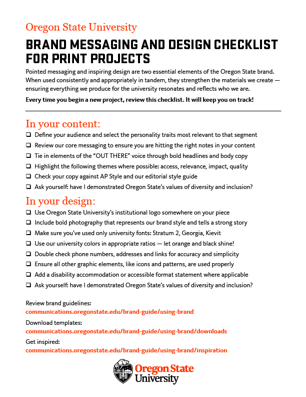
Brand Messaging and Design Checklist for Print Projects

Every time you begin a new project, review this checklist. It will keep you on track!

Pointed messaging and inspiring design are two essential elements of the Oregon State Brand. When used consistently and appropriately in tandem, they strengthen the materials we create – ensuring everything we produce for the university resonates and reflects who we are.

You can also find this checklist on our Tools and Resources page.

Categories
Adobe Photoshop

Creating Animated GIFs in Photoshop

Today I’m going to show you how to make an animated gif using Adobe Photoshop. I have text that says “Go Beavs”, over an image of campus, and what I’d like to have happen is for the Go Beavs to be spelled out over the image, looking like it’s being typed.

  1. Select the text layer, hold alt+click and drag the layer to copy it.
  2. Hide the first text layer and delete a letter from the new layer.
  3. Repeat until all letters are deleted. This is an easy way to make it look typed out. By doing it backwards like this we can design it the way we want beforehand.
  4. Open the Timeline window by going to Window>Timeline
  5. Click Create Frame Animation
  6. Select the options and click “Make Frames from Layers”
  7. To add the background image to all frames, select all layers and hide/unhide the image layer so that it is visible on all frames.
  8. Select all frames in the Timeline layer and change the delay time to .1 seconds (NOTE: what is previewed might not be what the GIF comes out to look like. Trial and error might be needed to see what speed you need.)
  9. To make the last frame hold for longer, select the frame and click the options button to select Copy Frame, and then Paste Frame…
  10. Select ‘after selection’ and click OK. Repeat until you have the length desired.
  11. Go to File>Export>Save for Web (Legacy)…
  12. Select the preset GIF 128 Dithered, and Save.

Thank you, and good luck!

Categories
Brand Guidelines

OSU branding and Illustration

Our brand style uses strong photography to tell the story visually. However, there are limited circumstances where illustrations may be used because a photo would not be effective. In cases like this, we ask that the illustrations only be used for one year, because the art could be considered a logo if used for multiple years. Please note that stylized, hand-drawn or cartoon images of beavers are not allowed.

If you are unsure if you are in a situation where you can use an illustration instead of a photo, we’ve put together a flow chart to quickly reach an answer: Download a printable version.


Just as a reminder, all the information below is available at our Illustration page in the OSU Brand tools.

Illustrations are allowed for:

  • Events
  • Magazines
  • Scientific Illustrations
  • On-campus awareness campaigns (intended to educate others about specific topics or issues, ie. bike safety, illness outbreaks)
  • Holiday cards
  • Motion graphics

Illustrations are not allowed for:

  • Ongoing programs
  • Repeated use from previous years
  • Stylized, hand-drawn or cartoon images of beavers
  • Recruitment materials for prospective students
  • External advertisements

Happy designing!

Categories
Microsoft Powerpoint Tips and Tutorials

Printing 4-up in Powerpoint


Today I’m going to show you how to print a Powerpoint template 4-up on an 8.5×11 page. I have a sample postcard that is a quarter size (5.5″x4.25″) front and back for mailing.

  • Once your design is complete, go to File>Print
  • Choose “Full Page Slides” under Print Layout, making sure “Scale to Fit Paper” and “High Quality” are checked.
  • Next, you’re going to trick the program. We want to print 4 fronts on one side, and 4 backs on the other. So in the “Slides” box, type: 1,1,1,1,2,2,2,2. This will print 4 of page 1, and 4 of page 2.
  • Select Printer Properties. Your print dialog box might look different from what is shown, but hopefully it will have a lot of the same options.
  • Under “Layout”, select “4 Pages per Sheet”. Leave the Page order as is, since it will be 4 of the same page.
  • Then under “2 sided” select “Short Edge Bind (Open Top/Left)” since this is in the Landscape view. If “Landscape” isn’t selected, choose it now.
  • Double-check that it is set to 4 Pages per Sheet, 2 Sided and say “Ok”. The view will still show a single page, but it will print 4-up on yours.
  • If you need to print multiple pages, change the number next to “Copies” at the top (ex. if you need 100 postcards, type 25 copies)


NOTE: There will be a white margin around the edge. This is common since printers aren’t able to print all the way to the edge, so you can choose to trim off that extra white, or allow for the extra buffer.


Showing the front and back


Thank you, and good luck.

Categories
Adobe Illustrator Tips and Tutorials

OSU Branded Graphs as Brushes

OSU Graph Brushes for Adobe illustrator: Download


Oregon State’s graphs have a specific style that can take a while to create in Adobe Illustrator, even for seasoned designers. To simplify the graph making process, we’ve made downloadable brushes that let you create these graphs in just a couple clicks.

First, you’ll want to save the brush file somewhere that you can remember.

Within Adobe illustrator, create your graph and enter your data. Close out of the data panel and with your graph selected, choose “no fill” from the swatches panel. Change to the direct selection tool, select the center point in the middle of your graph, and delete it. You’ll notice it retains the points where the different values were, but has turned into a circle with no pies.

Open your Brushes window, and from the options drop down, select Open Brush Library > Other library…
Navigate to the brushes file, and you’ll see we have 9 brushes to choose from. They have names like Inner Line, Inner Bar, Outer line, which relate to how the graph is put together. You can select the different brushes and see what they do to the graph.

In the examples on our website you can see there are some with inner stripes, and a yellow outline, inner bars with an outline and so on. So let’s make this graph that has these notches.

Back in the Illustrator file, make sure the stroke is highlighted, and select Inner stripes 2. Open the appearance window, and go into the contents of the graph. From the options panel, select Add New Stroke. Then select Outer Line 2. From the appearance window, you can select the color of the outer line, and individually change the color of each of the pies.

This same style can work for bar graphs as well. Create your bar graph, enter your values, and delete the right-most points of each bar, so you’re left with lines. Select those lines, and select one of the “Inner” brushes.

It’s important to note that while these are still technically graphs with the data attached to them, if a number changes the graph resets. You’ll have to reselect the brushes and colors from the appearance panel.

Thank you, and good luck.
Categories
Misc Tips and Tutorials

Printable Branding Cheat Sheets

Our brand is very robust, and we understand that it’s a lot to take in. For some, simply having a print-out to refer to is helpful, and as a result we’ve made two printable PDFs for quick reference. The first is a Branding Cheat sheet, showing quick references on logo use, color information and details on Oregon State University’s fonts. This by no means has the comprehensive information that would be found on the Oregon State Brand Site, but should help with common questions:

The second is a ‘how-to’ for navigating our templates and brand downloads, as well as using Microsoft Office to design:

Thank you, and good luck

Categories
Adobe Illustrator Adobe InDesign Tips and Tutorials

Creating OSU Branded Pie Graphs in Adobe Illustrator and InDesign

Graphs and charts have a specific look in the Oregon State Brand, and in this 10 minute video we discuss how to create those in Adobe Illustrator and Indesign:

From Adobe Illustrator:

  1. Select Pie Graph Tool (under the Column Graph Tool) and make it the size you want.
  2. A Data box will appear, allowing you to add your numbers.
  3. Close the data box, select the stroke and choose ‘None’ as the color.
  4. Select the Selection Tool (V), click on the pie chart and go to Object>Ungroup, say yes to the dialog box that appears (this warns you that you will no longer be able to edit the data, so make sure your numbers are final). Right click the pie chart and select ‘Ungroup’ again.
  5. Select the Ellipse Tool (under the Rectangle Tool) and from the center of the pie graph click and hold Shift+Alt and drag to make your circle from the center. Select the fill of this circle and change it to white.
  6. Edit>Copy the white circle and Shift+click one of the pie shapes. This should have the circle and one of the pies selected, with the white circle in front.
  7. Go to Window>Pathfinder and select ‘Minus Front’ from the Shape Mode.
  8. Go to Edit>Paste in Place (Shift+Ctrl+V). The white circle should have pasted in the exact same place as last time.
  9. Shift+click on one of the pie shapes and repeat steps 7 and 8 until all of the pies have been cut.
  10. To add gaps, select all of the shapes with the Selection Tool and go to Window>Stroke. Choose a weight that feels appropriate, and choose Rounded Corners.
  11. With the shape selected, go to Object>Path>Outline Stroke. Right Click and Ungroup.
  12. Select both the outlined stroke and the solid inside color and again select ‘Minus Front’ from the Shape Mode in the Pathfinder Window. Repeat for the remaining shapes.
  13. Change the fill of each of the shapes to be the stroke by clicking on the double arrow next to the Fill and Stroke in the toolbar.
  14. Select all and from the Stroke Window, choose Rounded Corners. Copy the entire shape.

From Adobe InDesign:

  1. Edit>Paste the shape that was made in Adobe Illustrator. Right Click>Ungroup.
  2. Select the Line Tool and draw a line down through the center of the circle. Make sure it’s the same weight as the outlines of the other shapes
  3. Edit>Copy the line and then Edit>Paste in Place (Shift+Ctrl+Alt+V).
  4. Hover over the end until the double arrows appear showing you can rotate it.
  5. Hold Shift, click and drag to rotate it 90 degrees. Copy both the lines and Edit>Paste in Place. Repeat until you’ve made a star with many points and small space between each line.
  6. Select the star only and Object>Group.
  7. Edit>Cut, select one of the shapes and Right Click>Paste Into.
  8. Select one of the shapes and go to Window>Swatches.
  9. With the Stroke selected, choose one of Oregon State’s brand colors.
  10. Hover over the shape until a circle appears. Your mouse will turn into a hand. Click to select the star shape within the container shape.
  11. From the Swatches Window, select the same color. Repeat for each of the shapes.
Categories
Microsoft Powerpoint Microsoft Word Tips and Tutorials

Theme Colors for Microsoft Office


Many of our Microsoft templates include the Oregon State color palette, but there are other ways to import the colors if you’re starting without one. This video shows how to insert the colors yourself.

Microsoft Office programs like Word and Powerpoint give you the option of choosing custom color palettes. Most of Oregon State’s templates have our color palette saved automatically, but there are a couple different ways to add the colors if you’re starting without one.
The first way is to download the .xml file from our downloads and save it in a specific folder on your computer. That location is shown in the readme, and is different for Macs and PCs.
The second way is to add the colors yourself. In Microsoft Powerpoint, Go to View> Slide master and on the color drop-down, select ‘Customize Colors’. I usually like to leave the first two as black and white, and change the rest to 10 of the University’s 19 colors. Click one of the colors and select ‘More Colors’ and the Custom Tab lets you add the RGB formula of any color.
From the Universy Brand website, you can find the formulas for any of our colors. Select OK, and when you’re done selecting your colors, you can name it and Save.
From Microsoft Word, go to the Design tab to find the Colors drop down, where you can select and customize your theme colors.
Thank you, and good luck.