Categories
Digital Tips and Tutorials

How to use headings

Headings in a webpage are vital for creating an organized and accessible web page. Think of headings as the main points in the outline of your written content. Short and concise headings should describe sections of your web page. If someone only read the headings of your webpage, they should be able to have a good idea what your page is about.

Headings provide structure and are hierarchical–to mark most important to least important. They start with heading 1 as the most important and ending with heading 6 as least important.

Example heading structure

Let’s say I have a website that’s all about beavers. Here’s what the heading structure would look like:

  1. Beavers (Heading 1)
    1. Species (Heading 2)
      1. North American Beaver (Heading 3)
      2. Eurasian Beaver (Heading 3)
    2. Habitat (Heading 2)
      1. Dams (Heading 3)
        1. Affect on climate (Heading 4)
      2. Lodges (Heading 3)
    3. Lifespan

Why do headings matter?

“Can’t I just pick a heading based on how it makes my text look?”

Screen readers allow those with low/no vision to skim a page by reading all the headings out loud. If headings are missing or out of order, this process becomes quite difficult and frustrating. For sighted users, using headings consistently will provide a cohesive visual experience.

If you need to emphasize an announcement or exception, use bold formatting instead. Headings should not be used to change the appearance of text. Conversely, applying bold or italics to headings doesn’t give the structure needed for people who use screen readers. The screen reading software won’t pick up on the italicized or bold text as a heading.

How to add headings in Drupal

With Drupal, you can add headings to your webpage easily. You select the text and then from the formatting option, select the appropriate heading.

screenshot of text editor in Drupal to change headings

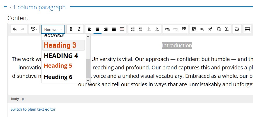
Headings start with level 3 in Drupal because headings 1 and 2 label the site and page titles. Start with heading 3 for your main points and use headings 4, 5, or 6 if you have subsections. Unless your page is very long and complex, you probably won’t use heading 6.

How to check your heading structure

Our accessibility checker, Monsido, will check for the order of the headings. (Contact Web and Mobile Services if you don’t have access to Monsido.) However, it can’t check for lengthy or irrelevant headings. That needs to be reviewed by a person looking over the content to make sure it’s current, concise, and relevant.

If your department doesn’t have Monsido, then you can use Webaim’s Wave Tool, which is free and available right in your web browser.

Writing isn’t easy! But creating well structured content gives everyone an great experience.

Categories
Brand Guidelines

Beaver Orange – A User Guide

One of our greatest assets at Oregon State is our primary color. Beaver Orange is vibrant, distinct and provides a solid base for the larger color palette. Through the years we have worked to present a consistent color no matter the channel or medium you are working with. In conjunction with the Oregon State logo, this is the best way to present a unified visual identity to the marketplace.

To do this we provide different color builds for various uses.

  • Pantone 1665 for print jobs here on campus, through Printing and Mailing Services.
  • CMYK for off-set print jobs done through an outside vendor (bid through Printing and Mailing Services).
  • RGB for digital signage, presentations and as a fall back for less advanced design software (word, powerpoint, etc…)
  • Hex is used only for websites, applications and mobile applications.

This guide applies to our entire color palette. If you ever have a question don’t be afraid to toss it out to the OSU Communicators slack community or email University Marketing directly.

You can find our color palette in the OSU Brand Guide.

Update to RGB and Hex

Since the launch of our updated color palette, in April of 2017, we have lived with a very narrow scope for how we are able to use Beaver Orange on websites. Because we strive (and are required) to meet WCAG AA guidelines for accessibility we were unable to use orange and white together for text/background colors.

This greatly limited our creative and design staff across the university. To address this we made a very slight tweak to the Hex of Beaver Orange. Visually the change is nearly imperceptible but provides enough contrast to use orange, white and black combinations. For centrally administered web properties (through Web and Mobile Services) the colors have been updated automatically. We have been working with our decentralized partners to make sure they have anything needed to adjust to this change. If you need assistance or have questions please connect with Kegan Sims on Slack or by contacting University Marketing via email.

As a result of the update to the Hex, it made sense to update RGB as well. RGB is primarily used for material displayed digitally (signboards, email, presentations, etc..) but also in print if you are using basic programs such as Microsoft Word or Powerpoint for design. On rare occasions, graphics made using RGB colors end up on websites. In order to maintain as much consistency as possible, both the Hex and RGB were tweaked together. These changes are subtle and we don’t expect you to rush out and update your materials. As you update content or create new versions of your digital collateral that is a good time to make a change.