I was reminded about the age of this blog (see comment below).  Then it occurred to me:  I’ve been writing this blog since December 2009.  That is 4 years of almost weekly posts.  And even though evaluation is my primary focus, I occasionally get on my soap box and do something different (White Christmas Pie, anyone?).  My other passion besides evaluation is food and cooking.  I gave a Latke party on Saturday and the food was pretty–and it even tasted good.  I was more impressed by the visual appeal of my table; my guests were more impressed by the array of tastes, flavors, and textures.  I’d say the evening was a success.  This blog is a metaphor for that table.  Sometimes I’m impressed with the visual appeal; sometimes I’m impressed with the content.  Today is an anniversary.  Four years.  I find that amazing (visual appeal).  The quote below (a comment offered by a reader on the post “Is this blog making a difference?”, a post I made a long time ago) is about content.

“Judging just from the age of your blog I must speculate that you’ve done something right. If not then I doubt you’d still be writing regularly. Evaluation of your progress is important but pales in comparison to the importance of writing fresh new content on a regular basis. Content that can be found no place else is what makes a blog truly useful and indeed helps it make a difference.”

Audit or evaluation?

I’m an evaluator; I want to know what difference the “program” is making in the lives of the participants.  The local school district where I live, work, and send my children to school has provided middle school children with iPads iPad.  They want to “audit” their use.  I commend the school district for that initiative (both giving the iPads as well wanting to determine the effectiveness).  I wonder if they really want to know what difference the electronics are making in the lives of the students.  I guess I need to go re-read Tom Schwandt’s 1988 book, “Linking Auditing and Metaevaluation”, a book he wrote with Ed Halpern, Tom Schwandt book  as well as see what has happened in the last 25 years (and it is NOT that I do not have anything else to read…smiley).  I think it is important to note the sentence (taken from the forward), “Nontraditional studies are found not only in education, but also in…divers fields …(and the list they provide is a who’s who in social science).  The problem of such studies is “establishing their merit”.  That is always a problem with evaluation–establishing the merit, worth, value of a program (study).

We could spend a lot of time debating the  merit, worth, value of using electronics in the pursuit of learning.  (In fact, Jeffrey Selingo writes about the need to personalize instruction using electronics in his 2013 book “College (Un)bound”college unbound by jeffry selingo–very readable, recommended.)   I do not think counting the number of apps or the number of page views is going to answer the question posed.  I do not think counting the number of iPads returned in working condition will either.  This is an interesting experiment.  How , reader, would you evaluate the merit, worth, value of giving iPads to middle school children?  All ideas are welcome–let me know because I do not have an answer, only an idea.

I had a topic all ready to write about then I got sick.  I’m sitting here typing this trying to remember what that topic was, to no avail. That topic went the way of much of my recent memory; another day, perhaps.

I do remember the conversation with my daughter about correlation.  She had a correlation of .3 something with a probability of 0.011 and didn’t understand what that meant.  We had a long discussion of causation and attribution and correlation.

We had another long conversation about practical v. statistical significance, something her statistics professor isn’t teaching.  She isn’t learning about data management in her statistics class either.  Having dealt with both qualitative and quantitative data for a long time, I have come to realize that data management needs to be understood long before you memorize the formulas for the various statistical tests you wish to perform.  What if the flood happens????lost data

So today I’m telling you about data management as I understand it, because the flood  did actually happen and, fortunately, I didn’t loose my data.  I had a data dictionary.

Data dictionary.  The first step in data management is a data dictionary.   There are other names for this, which escape me right now…know that a hard copy of how and what you have coded is critical.  Yes, make a back up copy on your hard drive…have a hard copy because the flood might happen. (It is raining right now and it is Oregon in November.)

Take a hard copy of your survey, evaluation form, qualitative data coding sheet and mark on it what every code notation you used means.  I’d show you an example of what I do, only they are at the office and I am home sick without my files.  So, I’ll show you a clip art instead…data management    smiley.  No, I don’t use cards any more for my data (I did once…most of you won’t remember that time…), I do make a hard copy with clear notations.  I find my self doing that with other things to make sure I code the response the same way.  That is what a data dictionary allows you to do–check yourself.

Then I run a frequencies and percentages analysis.  I use SPSS (because that is what I learned first).  I look for outliers, variables that are miscoded, and system generated missing data that isn’t missing.  I look for any anomaly in the data, any humon error (i. e. my error).  Then I fix it.  Then I run my analyses.

There are probably more steps than I’ve covered today.  These are the first steps that absolutely must be done BEFORE you do any analyses.  Then you have a good chance of keeping your data safe.

There has been quite a bit written about data visualization, a topic important to evaluators who want their findings used.  Michael Patton talks about evaluation use in his 4th edition of utilization-focused evaluation. Patton's utilization focused evaluation  He doesn’t however list data visualization in the index; so he may talk about it somewhere–it isn’t obvious.

The current issue of New Directions for Evaluation data visualization NDE is devoted to data visualization and it is the first part (implying, I hope, for at least a part 2).  Tarek Azzam and Stephanie Evergreen are the guest editors.  This volume (the first on this topic in 15 years) sets the stage (chapter 1) and talks about quantitative data visualization and quantitative data visualization.  The last chapter talks about the tools that are available to the evaluator and there are many and they are various.  I cannot do them justice in this space; read about them in the NDE volume.  (If you are an AEA member, the volume is available on line.)

freshspectrum, a blog by Chris Lysy, talks about INTERACTIVE data visualization with illustrations.

Stephanie Evergreen, the co-guest editor of the above NDE, also blogs and in her October 2 post, talks about “Design for Federal Proposals (aka Design in a Black & White Environment)”.  More on data visualization.

The data visualizer that made the largest impact on me was Hans Rosling in his TED talks.  Certainly the software he uses makes the images engaging.  If he didn’t understand his data the way he does, he wouldn’t be able to do what he does.

Data visualization is everywhere.  There will be multiple sessions at the AEA conference next week.  If you can, check them out–get there early as they will fill quickly.

When I did my dissertation, there were several soon-to-be-colleagues who were irate that I did a quantitative study on qualitative data.  (I was looking at cognitive bias, actually.)  I needed to reduce my qualitative data so that I could represent it quantitatively.  This approach to coding is called magnitude coding.  Magnitude coding is just one of the 25 first cycle coding methods that Johnny Saldaña (2013) talks about in his book, The coding manual for qualitative researchers coding manual--johnny saldana (see pages 72-77).  (I know you cannot read the cover title–this is just to give you a visual; if you want to order it, which I recommend, go to Sage Publishers, Inc.)  Miles and Huberman (1994) also address this topic.miles and huberman qualitative data

So what is magnitude coding? It is a form of coding that “consists of and adds a supplemental alphanumeric or symbolic code or sub-code to an existing coded datum…to indicate its intensity, frequency, direction, presence , or evaluative content” (Saldaña, 2013, p. 72-73).  It could also indicate the absence of the characteristic of interest.  Magnitude codes can be qualitative or quantitative and/or nominal.  These codes enhance the description of your data.

Saldaña provides multiple examples that cover many different approaches.  Magnitude codes can be words or abbreviations that suggest intensity or frequency or codes can be numbers which do the same thing.  These codes can suggest direction (i.e., positive or negative, using arrows).  They can also use symbols like a plus (+) or a minus (), or other symbols indicating presence or absence of a characteristic.  One important factor for evaluators to consider is that magnitude coding also suggests evaluative content, that is , did the content demonstrate merit, worth, value?  (Saldaña also talks about evaluation coding; see page 119.)

Saldaña gives an example of analysis showing a summary table.  Computer assisted qualitative data analysis software (CAQDAS)  and Microsoft Excel can also provide summaries.  He notes “that is very difficult to sidestep quantitative representation and suggestions of magnitude in any qualitative research” (Saldaña, 2013, p. 77).  We use quantitative phrases all the time–most, often, extremely, frequently, seldom, few, etc.  These words tend “to enhance the ‘approximate accuracy’ and texture of the prose” (Saldaña, 2013, p. 77).

Making your qualitative data quantitative is only one approach to coding, an approach that is sometimes very necessary.

I’m about to start a large scale project, one that will be primarily qualitative (it may end up being a mixed methods study; time will tell); I’m in the planning stages with the PI now.  I’ve done qualitative studies before–how could I not with all the time I’ve been an evaluator?  My go to book for qualitative data analysis has always been Miles and Huberman miles and huberman qualitative data (although my volume is black).  This is their second edition published in 1994.  I loved that book for a variety of reasons: 1) it provided me with a road map to process qualitative data; 2) it offered the reader an appendix for choosing a qualitative software program (now out of date); and 3) it was systematic and detailed in its description of display.  I was very saddened to learn that both the authors had died and there would not be a third edition.  Imaging my delight when I got the Sage flier of a third edition! Qualitative data analysis ed. 3  Of course I ordered it.  I also discovered that Saldana (the new third author on the third edition) has written another book on qualitative data that he sites a lot in this third edition (Coding manual for qualitative researchers coding manual--johnny saldana) and I ordered that volume as well.

Saldana, in the third edition, talks a lot about data display, one of the three factors that qualitative researchers must keep in mind.  The other two are data condensation and conclusion drawing/verification.  In their review, Sage Publications says, “The Third Edition’s presentation of the fundamentals of research design and data management is followed by five distinct methods of analysis: exploring, describing, ordering, explaining, and predicting.”  These five chapters are the heart of the book (in my thinking); that is not to say that the rest of the book doesn’t have gems as well–it does.  The chapter on “Writing About Qualitative Research” and the appendix are two.  The appendix (this time) is an “An Annotated Bibliography of Qualitative Research Resources”, which lists at least 32 different classifications of references that would be helpful to all manner of qualitative researchers.  Because it is annotated, the bibliography provides a one sentence summary of the substance of the book.  A find, to be sure.   Check out the third edition.

I will be attending a professional development session with Mr. Saldana next week.  It will be a treat to meet him and hear what he has to say about qualitative data.  I’m taking the two books with me…I’ll write more on this topic when I return.  (I won’t be posting next week).


Recently, I was privileged to see the recommendations of  William (Bill) Tierney on the top education blogs.  (Tierney is the Co-director of the Pullias Center for Higher Education at the University of Southern California.)  He (among others) writes the blog, 21st scholar.  The blogs are actually the recommendation of his research assistant Daniel Almeida.  These are the recommendations:

  1. Free Technology for Teachers

  2. MindShift

  3. Joanne Jacobs

  4. Teaching Tolerance

  5. Brian McCall’s Economics of Education Blog

What criteria were used?  What criteria would you use?  Some criteria that come to mind are interest, readability, length, frequency.  But I’m assuming that they would be your criteria (and you know what assuming does…)

If I’ve learned anything in my years as an evaluator, it is to make assumptions explicit.  Everyone comes to the table with built in biases (called cognitive biases).  I call them personal and situational biases (I did my dissertation on those biases). So by making your assumptions explicit (and thereby avoiding personal and situational biases), you are building a rubric because a rubric is developed from criteria for a particular product, program, policy, etc.

How would you build your rubric? Many rubrics are in chart format, that is columns and rows with the criteria detailed in those cross boxes.  That isn’t cast in stone.  Given the different ways people view the world–linear, circular, webbed–there may be others, I would set yours up in the format that works best for you.  The only thing to keep in mind is be specific.

Now, perhaps you are wondering how this relates to evaluation in the way I’ve been using evaluation.  Keep in mind evaluation is an everyday activity.  And everyday, all day, you perform evaluations.  Rubrics formalizes the evaluations you conduct–by making the criteria explicit.  Sometimes you internalize them; sometimes you write them down.  If you need to remember what you did the last time you were in a similar situation, I would suggest you write them down. rubric cartoon No, you won’t end up with lots of little sticky notes posted all over.  Use your computer.  Create a file.  Develop criteria that are important to you.  Typically, the criteria are in a table format; an x by x form.  If you are assigning number, you might want to have the rows be the numbers (for example, 1-10) and the columns be words that describe those numbers (for example, 1 boring; 10 stimulating and engaging).  Rubrics are used in reviewing manuscripts, student papers, assigning grades to activities as well as programs.  Your format might look like this:generic rubric

Or it might not.  What other configuration have you seen rubrics?  How would you develop your rubric?  Or would you–perhaps you prefer a bunch of sticky notes.  Let me know.

Ever wonder where the 0.05 probability level number was derived?  Ever wonder if that is the best number?  How many of you were taught in your introduction to statistics course that 0.05 is the probability level necessary for rejecting the null hypothesis of no difference?  This confidence may be spurious.  As Paul Bakker indicates in the AEA 365 blog post for March 28, “Before you analyze your data, discuss with your clients and the relevant decision makers the level of confidence they need to make a decision.”  Do they really need to be 95% confident?  Or would 90% confidence be sufficient?  What about 75% or even 55%?

Think about it for a minute?  If you were a brain surgeon, you wouldn’t want anything less than 99.99% confidence;  if you were looking at level of risk for a stock market investment, 55% would probably make you a lot of money.  The academic community  has held to and used the probability level of 0.05 for years (the computation of the p value dating back to 1770).   (Quoting Wikipedia, ” In the 1770s Laplace considered the statistics of almost half a million births. The statistics showed an excess of boys compared to girls. He concluded by calculation of a p-value that the excess was a real, but unexplained, effect.”) Fisher first proposed the 0.05 level in 1025 and established a one in 20 limit for statistical significance when considering a two tailed test.   Sometimes the academic community makes the probability level even more restrictive by using 0.01 or 0.001 to demonstrate that the findings are significant.  Scientific journals expect 95% confidence or a probability level of at least 0.05.

Although I have held to these levels, especially when I publish a manuscript, I have often wondered if this level makes sense.  If I am only curious about a difference, do I need 0.05?  Oor could I use 0.10 or 0.15 or even 0.20?  I have often asked students if they are conducting confirmatory or exploratory research?  I think confirmatory research expects a more stringent probability level.  I think exploratory research requires a less stringent probability level.  The 0.05 seems so arbitrary.

Then there is the grounded theory approach which doesn’t use a probability level.  It generates theory from categories which are generated from concepts which are identified from data, usually qualitative in nature.  It uses language like fit, relevance, workability, and modifiability.  It does not report statistically significant probabilities as it doesn’t use inferential statistics.  Instead, it uses a series of probability statements about the relationships between concepts.

So what do we do?  What do you do?  Let me know.

Today’s post is longer than I usually post.  I think it is important because it captures an aspect of data analysis and evaluation use that many of us skip right over:  How to present findings using the tools that are available.  Let me know if this works for you.


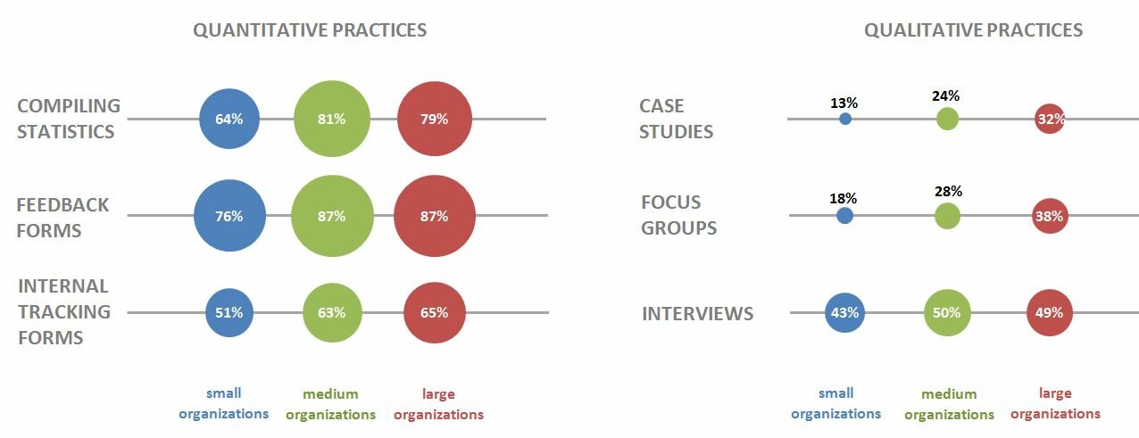
Ann Emery blogs at Emery Evaluation.  She challenged readers a couple of weeks ago to reproduce a bubble chart in either Excel or R.  This week she posted the answer.  She has given me permission to share that information with you.  You can look at the complete post at Dataviz Copycat Challenge:  The Answers.


I’ve also copied it here in a shortened format:

“Here’s my how-to guide. At the bottom of this blog post, you can download an Excel file that contains each of the submissions. We each used a slightly different approach, so I encourage you to study the file and see how we manipulated Excel in different ways.

Step 1: Study the chart that you’re trying to reproduce in Excel.

Here’s that chart from page 7 of the State of Evaluation 2012 report. We want to see whether we can re-create the chart in the lower right corner. The visualization uses circles, which means we’re going to create a bubble chart in Excel.

dataviz_challenge_original_chart

Step 2: Learn the basics of making a bubble chart in Excel.

To fool Excel into making circles, we need to create a bubble chart in Excel. Click here for a Microsoft Office tutorial. According to the tutorial, “A bubble chart is a variation of a scatter chart in which the data points are replaced with bubbles. A bubble chart can be used instead of a scatter chart if your data has three data series.”

We’re not creating a true scatter plot or bubble chart because we’re not showing correlations between any variables. Instead, we’re just using the foundation of the bubble chart design – the circles. But, we still need to envision our chart on an x-y axis in order to make the circles.

Step 3: Sketch your bubble chart on an x-y axis.

It helps to sketch this part by hand. I printed page 7 of the report and drew my x and y axes right on top of the chart. For example, 79% of large nonprofit organizations reported that they compile statistics. This bubble would get an x-value of 3 and a y-value of 5.

I didn’t use sequential numbering on my axes. In other words, you’ll notice that my y-axis has values of 1, 3, and 5 instead of 1, 2, and 3. I learned that the formatting seemed to look better when I had a little more space between my bubbles.

dataviz_challenge_x-y_axis_example

Step 4: Fill in your data table in Excel.

Open a new Excel file and start typing in your values. For example, we know that 79% of large nonprofit organizations reported that they compile statistics. This bubble has an x-value of 3, a y-value of 5, and a bubble size of 79%.

Go slowly. Check your work. If you make a typo in this step, your chart will get all wonky.

dataviz_challenge_data_table

Step 5: Insert a bubble chart in Excel.

Highlight the three columns on the right – the x column, the y column, and the frequency column. Don’t highlight the headers themselves (x, y, and bubble size). Click on the “Insert” tab at the top of the screen. Click on “Other Charts” and select a “Bubble Chart.”
dataviz_challenge_insert_chart

You’ll get something that looks like this:
dataviz_challenge_chart_1

Step 6: Add and format the data labels.

First, add the basic data labels. Right-click on one of the bubbles. A drop-down menu will appear. Select “Add Data Labels.” You’ll get something that looks like this:

dataviz_challenge_chart_2

Second, adjust the data labels. Right-click on one of the data labels (not on the bubble). A drop-down menu will appear. Select “Format Data Labels.” A pop-up screen will appear. You need to adjust two things. Under “Label Contains,” select “Bubble Size.” (The default setting on my computer is “Y Value.”) Next, under “Label Position,” select “Center.” (The default setting on my computer is “Right.)

dataviz_challenge_chart_3

Step 7: Format everything else.

Your basic bubble chart is finished! Now, you just need to fiddle with the formatting. This is easier said than done, and probably takes the longest out of all the steps.

Here’s how I formatted my bubble chart:

  • I formatted the axes so that my x-values ranged from 0 to 10 and my y-values ranged from 0 to 6.
  • I inserted separate text boxes for each of the following: the small, medium, and large organizations; the quantitative and qualitative practices; and the type evaluation practice (e.g., compiling statistics, feedback forms, etc.) I also made the text gray instead of black.
  • I increased the font size and used bold font.
  • I changed the color of the bubbles to blue, light green, and red.
  • I made the gridlines gray instead of black, and I inserted a white text box on top of the top and bottom gridlines to hide them from sight.

Your final bubble chart will look something like this:
state_of_evaluation_excel

For more details about formatting charts, check out these tutorials.

Bonus

Click here to download the Excel file that I used to create this bubble chart. Please explore the chart by right-clicking to see how the various components were made. You’ll notice a lot of text boxes on top of each other!”

Creativity is not an escape from disciplined thinking. It is an escape with disciplined thinking.” – Jerry Hirschberg – via @BarbaraOrmsby

The above quote was in the September 7 post of Harold Jarche’s blog.  I think it has relevance to the work we do as evaluators.  Certainly, there is a creative part to evaluation; certainly there is a disciplined thinking part to evaluation.  Remembering that is sometimes a challenge.

So where in the process do we see creativity and where do we see disciplined thinking?

When evaluators construct a logic model, you see creativity; you also see disciplined thinking

When evaluators develop an implementation plan, you see creativity; you also see disciplined thinking.

When evaluators develop a methodology and a method, you see creativity; you also see disciplined thinking.

When evaluators present the findings for use, you see creativity; you also see disciplined thinking.

So the next time you say “give me a survey for this program”,  think–Is a survey the best approach to determining if this program is effective; will it really answer my questions?

Creativity and disciplined thinking are companions in evaluation.


A colleague asks, “What is the appropriate statistical analysis test when comparing means of two groups ?”


I’m assuming (yes, I know what assuming does) that parametric tests are appropriate for what the colleague is doing.  Parametric tests (i.e., t-test, ANOVA,) are appropriate when the parameters of the population are known.    If that is the case (and non-parametric tests are not being considered), I need to clarify the assumptions underlying the use of parametric tests, which have more stringent assumptions than nonparametric tests.  Those assumptions are the following:

The sample is

  1. randomized (either by assignment or selection).
  2. drawn from a population which has specified parameters.
  3. normally distributed.
  4. demonstrating  equality of variance in each variable.

If those assumptions are met,  the part answer is, “It all depends”.  (I know you have heard that before today.)

I will ask the following questions:

  1. Do you know the parameters (measures of central tendency and variability) for the data?
  2. Are they dependent or independent samples?
  3. Are they intact populations?

Once I know the answers to these questions I can suggest a test.

My current favorite statistics book, Statistics for People Who (Think They) Hate Statistics, by Neil J. Salkind (4th ed.) has a flow chart that helps you by asking if you are looking at differences between the sample and the population and relationships or differences between one or more groups. The flow chart ends with the name of a statistical test.  The caveat is that you are working with a sample from a larger population that meets the above stated assumptions.

How you answer the questions above also depends on what test you can use.  If you do not know the parameters, you will NOT use a parametric test.  If you are using an intact population (and many Extension professionals use intact populations), you will NOT use inferential statistics as you will not be inferring to anything bigger than what you have at hand.  If you have two groups and the groups are related (like a pre-post test or a post-pre test), you will use a parametric or non-parametric test for dependency.  If you have two groups and are they unrelated (like boys and girls), you will use a parametric or non-parametric test for independence.  If you have more than two groups you will use different test yet.

Extension professionals are rigorous in their content material; they need to be just as rigorous in their analysis of the data collected from the content material.  Understanding the what analyses to use when is a good skill to have.