Wow!  25 First Cycle and 6 Second Cycle methods for coding qualitative data.

Who would have thought that there are so many methods of coding qualitative data.  I’ve been coding qualitative data for a long time and only now am I aware that what I was doing was, according to Miles and Huberman (1994), my go-to book for coding,  miles and huberman qualitative data is called “Descriptive Coding” although Johnny Saldana calls it “Attribute Coding”.  (This is discussed at length in his volume The Coding Manual for Qualitative Researchers.) coding manual--johnny saldana  I just thought I was coding; I was, just not as systematically as suggested by Saldana.

Saldana talks about First Cycle coding methods, Second Cycle coding methods and a hybrid method that lies between them.  He lists 25 First Cycle coding methods and spends over 120 pages discussing first cycle coding.

I’m quoting now.  He says that “First Cycle methods are those processes that happen during the initial coding of data and are divided into seven subcategories: Grammatical, Elemental, Affective, Literary and Language, Exploratory, Procedural and a final profile entitled Themeing the Data.  Second Cycle methods are a bit more challenging because they require such analytic skills as classifying, prioritizing, integrating, synthesizing, abstracting, conceptualizing, and theory building.”

He also insists that coding qualitative data is a iterative process; that data are coded and recoded.  Not just a one pass through the data.

Somewhere I missed the boat.  What occurs to me is that since I learned about coding qualitative data by hand because there were few CAQDAS (Computer Assisted Qualitative Data Analysis Software) available (something Saldana advocates for nascent qualitative researchers) is that the field has developed, refined, expanded, and become detailed.  Much work has been done that went unobserved by me.

He also talks about the fact that the study’s qualitative data may need more than one coding method–Yikes!  I thought there was only one.  Boy was I mistaken.  Reading the Coding Manual is enlightening (a good example of life long learning).  All this will come in handy when I collect the qualitative data for the evaluation I’m now planning.  Another take away point that is stressed in the coding manual and in the third edition of the Miles & Huberman book (with the co-author of Johnny Saldana) Qualitative data analysis ed. 3 is to start coding/reading the data as soon as it is collected.  Reading the data when you collect it allows you to remember what you observed/heard, allows/encourages  analytic memo writing (more on that in a separate post), and allows you to start building your coding scheme.

If you do a lot of qualitative data collection, you need these two books on your shelf.


We are approaching Evaluation 2013 (Evaluation ’13).  This year October 16-19, with professional development sessions both before and after the conference.  One of the criteria that I use to determine a “good” conference is did I get three new ideasbright idea 3 (three is an arbitrary number).  One way to get a good idea to use outside the conference, in your work, in your everyday activities is to experience a good presentation.  Fortunately, in the last 15 years much has been written on how to give a good presentation both verbally and with visual support.  This week’s AEA365 blog (by Susan Kistler) talks about presentations as she tells us again about the P2i initiative sponsored by AEA.

I’ve delivered posters the last few years (five or six) and P2i talks about posters in the downloadable handout called, Guidelines for Posters.  Under the tab called (appropriately enough) Posters, P2i also offers information on research posters and a review of other posters as well as the above mentioned Guidelines for Posters.  Although more and more folks are moving to posters (until AEA runs out of room, all posters are on the program), paper presentations with the accompanying power point are still deriguere, the custom of professional conferences.   What P2i has to say about presentations will help you A LOT!!  Read it.

Read it especially if presenting in public, whether to a large group of people or not.  It will help you.  There are some really valuable points that are reiterated in the AEA365 as well as other places.  Check out the following TED talks, look especially for Nancy Durate and Hans Rosling.  A quick internet search yielded the following: About 241,000,000 results (0.43 seconds).  I entered the phrase, “how to make a good presentation“.  Some of the sites speak to oral presentations; some address visual presentations.  What most people do is try to get too much information on a slide (typically using Power point).  Prezi gives you one slide with multiple images imbedded within it.  It is cool.  There are probably other approaches as well.  In today’s world, there is no reason to read your presentation–your audience can do that.  Tell them!  (You know, tell them what they will hear, tell them, tell them what they heard…or something like that.)  If you have to read, make sure what they see is what they hear–see hear compatibility is still important, regardless of the media used.

Make an interesting presentation!  Give your audience at least one good idea!bright idea

I’m about to start a large scale project, one that will be primarily qualitative (it may end up being a mixed methods study; time will tell); I’m in the planning stages with the PI now.  I’ve done qualitative studies before–how could I not with all the time I’ve been an evaluator?  My go to book for qualitative data analysis has always been Miles and Huberman miles and huberman qualitative data (although my volume is black).  This is their second edition published in 1994.  I loved that book for a variety of reasons: 1) it provided me with a road map to process qualitative data; 2) it offered the reader an appendix for choosing a qualitative software program (now out of date); and 3) it was systematic and detailed in its description of display.  I was very saddened to learn that both the authors had died and there would not be a third edition.  Imaging my delight when I got the Sage flier of a third edition! Qualitative data analysis ed. 3  Of course I ordered it.  I also discovered that Saldana (the new third author on the third edition) has written another book on qualitative data that he sites a lot in this third edition (Coding manual for qualitative researchers coding manual--johnny saldana) and I ordered that volume as well.

Saldana, in the third edition, talks a lot about data display, one of the three factors that qualitative researchers must keep in mind.  The other two are data condensation and conclusion drawing/verification.  In their review, Sage Publications says, “The Third Edition’s presentation of the fundamentals of research design and data management is followed by five distinct methods of analysis: exploring, describing, ordering, explaining, and predicting.”  These five chapters are the heart of the book (in my thinking); that is not to say that the rest of the book doesn’t have gems as well–it does.  The chapter on “Writing About Qualitative Research” and the appendix are two.  The appendix (this time) is an “An Annotated Bibliography of Qualitative Research Resources”, which lists at least 32 different classifications of references that would be helpful to all manner of qualitative researchers.  Because it is annotated, the bibliography provides a one sentence summary of the substance of the book.  A find, to be sure.   Check out the third edition.

I will be attending a professional development session with Mr. Saldana next week.  It will be a treat to meet him and hear what he has to say about qualitative data.  I’m taking the two books with me…I’ll write more on this topic when I return.  (I won’t be posting next week).


You implement a program.  You think it is effective; that it makes a difference; that it has merit and worth.  You develop a survey to determine the merit and worth of the program.  You send the survey out to the target audience which is an intact population–that is, all of the participants are in the target audience for the survey.  You get less than 4o% response rate.  What does that mean?  Can you use the results to say that the participants saw merit in the program?  Do the results indicate that the program has value; that it made a difference if only 40% let you know what they thought.

I went looking for some insights on non-responses and non-responders.  Of course, I turned to Dillman  698685_cover.indd(my go to book for surveys…smiley).  His bottom line: “…sending reminders is an integral part of minimizing non-response error” (pg. 360).

Dillman (of course) has a few words of advice.  For example, on page 360, he says, ” Actively seek means of using follow-up reminders in order to reduce non-response error.”  How do you not burden the target audience with reminders, which are “…the most powerful way of improving response rate…” (Dillman, pg. 360).  When reminders are sent they need to be carefully worded and relate to the survey being sent.  Reminders stress the importance of the survey and the need for responding.

Dillman also says (on page 361) to “…provide all selected respondents with similar amounts and types of encouragement to respond.”  Since most of the time incentives are not an option for you the program person, you have to encourage the participants in other ways.  So we are back to reminders again.

To explore the topic of non-response further, there is a booksurvey non-response (Groves, Robert M., Don A. Dillman, John Eltinge, and Roderick J. A. Little (eds.). 2002. Survey Nonresponse. Wiley-Interscience: New York) that deals with the topic. I don’t have it on my shelf, so I can’t speak to it.  I found it while I was looking for information on this topic.

I also went on line to EVALTALK and found this comment which is relevant to evaluators attempting to determine if the program made a difference:  “Ideally you want your non-response percents to be small and relatively even-handed across items. If the number of nonresponds is large enough, it does raise questions as to what is going for that particular item, for example, ambiguous wording or a controversial topic. Or, sometimes a respondent would rather not answer a question than respond negatively to it. What you do with such data depends on issues specific to your individual study.”  This comment was from Kathy Race of Race & Associates, Ltd.,  September 9, 2003.

A bottom line I would draw from all this is respond…if it was important to you to participate in the program then it is important for you to provide feedback to the program implementation team/person.


The question of the week is:

What statistical test do I use when I have pre/post reflective questions.

First, what is a reflective question?

Ask says: “A reflective question is a question that requires an individual to think about their knowledge or information, before giving a response. A reflective question is mostly used to gain knowledge about an individual’s personal life.”

I assume (and we have talked about assumptions before assume) that these items were scaled to some hierarchy, like a lot to a little, and a number assigned to each.  Since the questions are pre/post, they are “matched” and can be compared using a comparison test of dependence, like a t-test or a Wilcoxon.  However, if the questions are truly nominal (i.e., “know” and “not know”) and in response to some prompt and DO NOT have a keyed response (like specific knowledge questions),  then even though the same person answered the pre questions and the post questions there really isn’t established dependence.

If the data are nominal, then using a chi-square test would be the best approach because it will tell you if there is a difference from what was expected and what was actually observed (responded).  On a pre/post reflective question, one would expect that they respondents would “know” some information before the intervention, say 50-50 and after the intervention, that difference would shift to say 80 “know” to 20 “not know”.  A chi-square test would give you a statistic of probability that that distribution on the post occurred by chance.  SPSS will run this test; find it under the non-parametric tests.

I was reminded recently about the 1992 AEA meeting in Seattle, WA.  That seems like so long ago.  The hot topic of that meeting was whether qualitative data or quantitative data were best.  At the time I was a nascent evaluator having been in the field less that 10 years and absorbed debates like this as a dry sponge does water.  It was interesting; stimulating; exciting.  It felt cutting edge.

Now 20+ years later, I wonder what all the hype was about.  Now, there can be rigor in what ever data are collected, regardless of type (numbers or words); language has been developed to look at that rigor.   (Rigor can also escape the investigator regardless of the data collected; another post, another day.)  Words are important for telling stories (and there is a wealth of information on how story can be rigorous) and numbers are important for counting (and numbers have a long history of use–Thanks Don Campbell).  Using both (that is, mixed methods) makes really good sense when conducting an evaluation in community environments, work that I’ve done for most of my career (community-based work).

I was reading another evaluation blog (ACET) and found the following bit of information that I thought I’d share as it is relevant to looking at data.  This particular post (July, 2012) was a reflection of the author. (I quote from that blog).

  • § Utilizing both quantitative and qualitative data. Many of ACET’s evaluations utilize both quantitative (e.g., numerical survey items) and qualitative (e.g., open-ended survey items or interviews) data to measure outcomes. Using both types of data helps triangulate evaluation findings. I learned that when close-ended survey findings are intertwined with open-ended responses, a clearer picture of program effectiveness occurs. Using both types of data also helps to further explain the findings. For example, if 80% of group A “Strongly agreed” to question 1, their open-ended responses to question 2 may explain why they “Strongly agreed” to question 1.

Triangulation was a new (to me at least) concept in 1981 when a whole chapter was devoted to the topic in a volume dedicated to Donald Campbell, titled Scientific Inquiry and the Social Sciences. scientific inquiry and the social sciences   I have no doubt that this concept was not new; Crano, the author of this chapter titled “Triangulation and Cross-Cultural Research”, has three and one half pages of references listed that support the premise put forth in the chapter.  Mainly, that using data from multiple different sources may increase the understanding of the phenomena under investigation.  That is what triangulation is all about–looking at a question from multiple points of view; bringing together the words and the numbers and then offering a defensible explanation.

I’m afraid that many beginning evaluators forget that words can support numbers and numbers can support words.

Ever wonder where the 0.05 probability level number was derived?  Ever wonder if that is the best number?  How many of you were taught in your introduction to statistics course that 0.05 is the probability level necessary for rejecting the null hypothesis of no difference?  This confidence may be spurious.  As Paul Bakker indicates in the AEA 365 blog post for March 28, “Before you analyze your data, discuss with your clients and the relevant decision makers the level of confidence they need to make a decision.”  Do they really need to be 95% confident?  Or would 90% confidence be sufficient?  What about 75% or even 55%?

Think about it for a minute?  If you were a brain surgeon, you wouldn’t want anything less than 99.99% confidence;  if you were looking at level of risk for a stock market investment, 55% would probably make you a lot of money.  The academic community  has held to and used the probability level of 0.05 for years (the computation of the p value dating back to 1770).   (Quoting Wikipedia, ” In the 1770s Laplace considered the statistics of almost half a million births. The statistics showed an excess of boys compared to girls. He concluded by calculation of a p-value that the excess was a real, but unexplained, effect.”) Fisher first proposed the 0.05 level in 1025 and established a one in 20 limit for statistical significance when considering a two tailed test.   Sometimes the academic community makes the probability level even more restrictive by using 0.01 or 0.001 to demonstrate that the findings are significant.  Scientific journals expect 95% confidence or a probability level of at least 0.05.

Although I have held to these levels, especially when I publish a manuscript, I have often wondered if this level makes sense.  If I am only curious about a difference, do I need 0.05?  Oor could I use 0.10 or 0.15 or even 0.20?  I have often asked students if they are conducting confirmatory or exploratory research?  I think confirmatory research expects a more stringent probability level.  I think exploratory research requires a less stringent probability level.  The 0.05 seems so arbitrary.

Then there is the grounded theory approach which doesn’t use a probability level.  It generates theory from categories which are generated from concepts which are identified from data, usually qualitative in nature.  It uses language like fit, relevance, workability, and modifiability.  It does not report statistically significant probabilities as it doesn’t use inferential statistics.  Instead, it uses a series of probability statements about the relationships between concepts.

So what do we do?  What do you do?  Let me know.

Today’s post is longer than I usually post.  I think it is important because it captures an aspect of data analysis and evaluation use that many of us skip right over:  How to present findings using the tools that are available.  Let me know if this works for you.


Ann Emery blogs at Emery Evaluation.  She challenged readers a couple of weeks ago to reproduce a bubble chart in either Excel or R.  This week she posted the answer.  She has given me permission to share that information with you.  You can look at the complete post at Dataviz Copycat Challenge:  The Answers.


I’ve also copied it here in a shortened format:

“Here’s my how-to guide. At the bottom of this blog post, you can download an Excel file that contains each of the submissions. We each used a slightly different approach, so I encourage you to study the file and see how we manipulated Excel in different ways.

Step 1: Study the chart that you’re trying to reproduce in Excel.

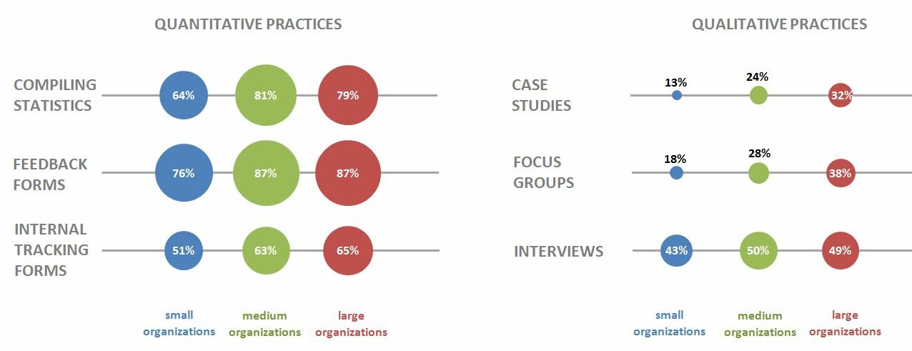
Here’s that chart from page 7 of the State of Evaluation 2012 report. We want to see whether we can re-create the chart in the lower right corner. The visualization uses circles, which means we’re going to create a bubble chart in Excel.

dataviz_challenge_original_chart

Step 2: Learn the basics of making a bubble chart in Excel.

To fool Excel into making circles, we need to create a bubble chart in Excel. Click here for a Microsoft Office tutorial. According to the tutorial, “A bubble chart is a variation of a scatter chart in which the data points are replaced with bubbles. A bubble chart can be used instead of a scatter chart if your data has three data series.”

We’re not creating a true scatter plot or bubble chart because we’re not showing correlations between any variables. Instead, we’re just using the foundation of the bubble chart design – the circles. But, we still need to envision our chart on an x-y axis in order to make the circles.

Step 3: Sketch your bubble chart on an x-y axis.

It helps to sketch this part by hand. I printed page 7 of the report and drew my x and y axes right on top of the chart. For example, 79% of large nonprofit organizations reported that they compile statistics. This bubble would get an x-value of 3 and a y-value of 5.

I didn’t use sequential numbering on my axes. In other words, you’ll notice that my y-axis has values of 1, 3, and 5 instead of 1, 2, and 3. I learned that the formatting seemed to look better when I had a little more space between my bubbles.

dataviz_challenge_x-y_axis_example

Step 4: Fill in your data table in Excel.

Open a new Excel file and start typing in your values. For example, we know that 79% of large nonprofit organizations reported that they compile statistics. This bubble has an x-value of 3, a y-value of 5, and a bubble size of 79%.

Go slowly. Check your work. If you make a typo in this step, your chart will get all wonky.

dataviz_challenge_data_table

Step 5: Insert a bubble chart in Excel.

Highlight the three columns on the right – the x column, the y column, and the frequency column. Don’t highlight the headers themselves (x, y, and bubble size). Click on the “Insert” tab at the top of the screen. Click on “Other Charts” and select a “Bubble Chart.”
dataviz_challenge_insert_chart

You’ll get something that looks like this:
dataviz_challenge_chart_1

Step 6: Add and format the data labels.

First, add the basic data labels. Right-click on one of the bubbles. A drop-down menu will appear. Select “Add Data Labels.” You’ll get something that looks like this:

dataviz_challenge_chart_2

Second, adjust the data labels. Right-click on one of the data labels (not on the bubble). A drop-down menu will appear. Select “Format Data Labels.” A pop-up screen will appear. You need to adjust two things. Under “Label Contains,” select “Bubble Size.” (The default setting on my computer is “Y Value.”) Next, under “Label Position,” select “Center.” (The default setting on my computer is “Right.)

dataviz_challenge_chart_3

Step 7: Format everything else.

Your basic bubble chart is finished! Now, you just need to fiddle with the formatting. This is easier said than done, and probably takes the longest out of all the steps.

Here’s how I formatted my bubble chart:

  • I formatted the axes so that my x-values ranged from 0 to 10 and my y-values ranged from 0 to 6.
  • I inserted separate text boxes for each of the following: the small, medium, and large organizations; the quantitative and qualitative practices; and the type evaluation practice (e.g., compiling statistics, feedback forms, etc.) I also made the text gray instead of black.
  • I increased the font size and used bold font.
  • I changed the color of the bubbles to blue, light green, and red.
  • I made the gridlines gray instead of black, and I inserted a white text box on top of the top and bottom gridlines to hide them from sight.

Your final bubble chart will look something like this:
state_of_evaluation_excel

For more details about formatting charts, check out these tutorials.

Bonus

Click here to download the Excel file that I used to create this bubble chart. Please explore the chart by right-clicking to see how the various components were made. You’ll notice a lot of text boxes on top of each other!”

Just spent the last 40 minutes reading comments that people have made to my posts.  Some were interesting; some were advertising (aka marketing) their own sites; one suggested I might revisit the “about” feature of my blog and express why I blog (other than it is part of my work).  So I revisited my “about” page, took out conversation, and talked about the reality as I’ve experienced it for the last three plus years.  So check out the about page–I also updated info about me and my family.  The comment about updating my “about” page was a good one.  It is an evaluative activity; one that was staring me in the face and I hadn’t realized it.  I probably need to update my photo as well…next time…:)


At the end of January, participants in an evaluation capacity building program I lead will provide highlights of the evaluations they completed for this program.  That the event happens to be in Tucson and I happen to be able to get out of the wet and dreary northwest is no accident.  The event will capstone WECT (Western [Region] Evaluation Capacity Training–Say ‘west’) participants evaluations of the past 17 months.  Since each participant will be presenting their programs and the evaluations they did of those programs.  There will be a lot of data (hopefully).  The participants and those data could use (or not) a new and innovative take on data visualization.  Susan Kistler, AEA’s Executive Director, has blogged in AEA365 several times about data visualization.  Perhaps these reposts will help.


Susan Kistler says • “Colleagues, I wanted to return to this ongoing discussion. At this year’s conference (Evaluation ’12), I did a presentation on 25 low-cost/no-cost tech tools for data visualization and reporting. An outline of the tools covered and the slides may be accessed via the related aea365 post here http://aea365.org/blog/?p=7491. If you download the slides, each tool includes a link to access it, cost information, and in most cases supplementary notes and examples as needed.

A couple of the new ones that were favorites included wallwisher and poll everywhere. I also have on my to do list to explore both datawrapper and amCharts over the holidays.

But…am returning to you all to ask if there is anything out there that just makes you do your happy dance in terms of new low-cost, no-cost tools for data visualization and/or reporting. (This is a genuine request–if there is something out there, let Susan know.  You can comment on the blog, contact her through AEA (susan@eval.org), or let me know, I’ll forward it.

Susan also says in Saturday’s (December 15 , 2012) blog (and this would be very timely for WECT participants):

Enroll in the Free Knight Center’s Introduction to Infographics and Data Visualization: The course is online, and free, and will be offered between January 12 and February 23. According to the course information, we’ll learn the basics of:

“How to analyze and critique infographics and visualizations in newspapers, books, TV, etc., and how to propose alternatives that would improve them.

How to plan for data-based storytelling through charts, maps, and diagrams.

How to design infographics and visualizations that are not just attractive but, above all, informative, deep, and accurate.

The rules of graphic design and of interaction design, applied to infographics and visualizations.

Optional: How to use Adobe Illustrator to create infographics.”