Today’s post is longer than I usually post. I think it is important because it captures an aspect of data analysis and evaluation use that many of us skip right over: How to present findings using the tools that are available. Let me know if this works for you.
Ann Emery blogs at Emery Evaluation. She challenged readers a couple of weeks ago to reproduce a bubble chart in either Excel or R. This week she posted the answer. She has given me permission to share that information with you. You can look at the complete post at Dataviz Copycat Challenge: The Answers.
I’ve also copied it here in a shortened format:
“Here’s my how-to guide. At the bottom of this blog post, you can download an Excel file that contains each of the submissions. We each used a slightly different approach, so I encourage you to study the file and see how we manipulated Excel in different ways.
Step 1: Study the chart that you’re trying to reproduce in Excel.
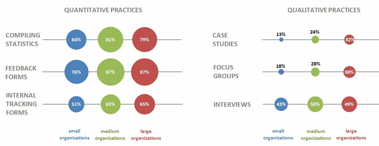
Here’s that chart from page 7 of the State of Evaluation 2012 report. We want to see whether we can re-create the chart in the lower right corner. The visualization uses circles, which means we’re going to create a bubble chart in Excel.
Step 2: Learn the basics of making a bubble chart in Excel.
To fool Excel into making circles, we need to create a bubble chart in Excel. Click here for a Microsoft Office tutorial. According to the tutorial, “A bubble chart is a variation of a scatter chart in which the data points are replaced with bubbles. A bubble chart can be used instead of a scatter chart if your data has three data series.”
We’re not creating a true scatter plot or bubble chart because we’re not showing correlations between any variables. Instead, we’re just using the foundation of the bubble chart design – the circles. But, we still need to envision our chart on an x-y axis in order to make the circles.
Step 3: Sketch your bubble chart on an x-y axis.
It helps to sketch this part by hand. I printed page 7 of the report and drew my x and y axes right on top of the chart. For example, 79% of large nonprofit organizations reported that they compile statistics. This bubble would get an x-value of 3 and a y-value of 5.
I didn’t use sequential numbering on my axes. In other words, you’ll notice that my y-axis has values of 1, 3, and 5 instead of 1, 2, and 3. I learned that the formatting seemed to look better when I had a little more space between my bubbles.
Step 4: Fill in your data table in Excel.
Open a new Excel file and start typing in your values. For example, we know that 79% of large nonprofit organizations reported that they compile statistics. This bubble has an x-value of 3, a y-value of 5, and a bubble size of 79%.
Go slowly. Check your work. If you make a typo in this step, your chart will get all wonky.
Step 5: Insert a bubble chart in Excel.
Highlight the three columns on the right – the x column, the y column, and the frequency column. Don’t highlight the headers themselves (x, y, and bubble size). Click on the “Insert” tab at the top of the screen. Click on “Other Charts” and select a “Bubble Chart.”

You’ll get something that looks like this:

Step 6: Add and format the data labels.
First, add the basic data labels. Right-click on one of the bubbles. A drop-down menu will appear. Select “Add Data Labels.” You’ll get something that looks like this:
Second, adjust the data labels. Right-click on one of the data labels (not on the bubble). A drop-down menu will appear. Select “Format Data Labels.” A pop-up screen will appear. You need to adjust two things. Under “Label Contains,” select “Bubble Size.” (The default setting on my computer is “Y Value.”) Next, under “Label Position,” select “Center.” (The default setting on my computer is “Right.)
Step 7: Format everything else.
Your basic bubble chart is finished! Now, you just need to fiddle with the formatting. This is easier said than done, and probably takes the longest out of all the steps.
Here’s how I formatted my bubble chart:
- I formatted the axes so that my x-values ranged from 0 to 10 and my y-values ranged from 0 to 6.
- I inserted separate text boxes for each of the following: the small, medium, and large organizations; the quantitative and qualitative practices; and the type evaluation practice (e.g., compiling statistics, feedback forms, etc.) I also made the text gray instead of black.
- I increased the font size and used bold font.
- I changed the color of the bubbles to blue, light green, and red.
- I made the gridlines gray instead of black, and I inserted a white text box on top of the top and bottom gridlines to hide them from sight.
Your final bubble chart will look something like this:

For more details about formatting charts, check out these tutorials.
Bonus
Click here to download the Excel file that I used to create this bubble chart. Please explore the chart by right-clicking to see how the various components were made. You’ll notice a lot of text boxes on top of each other!”


