Categories
Adobe Illustrator Adobe InDesign Adobe Photoshop Digital Tips and Tutorials

Ultimate Guide: Align Objects with Keyboard Shortcuts in Adobe Apps

One of the most underrated features in Adobe creative apps are the various object alignment tools (left align, right align, align top edges, horizontal align middle, etc.) If you’re anything like me, you use these tools regularly. And while they are conveniently — and sometimes even dynamically — located in multiple locations, you may find yourself moving your cursor back-and-forth from your artwork to the alignment panel more often than you’d like. This can slow down — or even disrupt — your workflow. The solution? Keyboard shortcuts!

In this guide we setup keyboard shortcuts for the most common alignment actions. I also include notes about variations you can explore on your own.

Adobe apps come chalk full of keyboard shortcuts (see official keyboard shortcuts lists for InDesign, Illustrator, Photoshop and XD), so finding a combination of keystrokes that are not already designated to a shortcut can be tricky, and you’ll likely need to press several keys to employ any new shortcut. In this guide, most of our shortcuts will involve only three keys, but, luckily, they don’t require years of finger yoga to be able to get your hands in the positions required to press them all at the same time.

We’re going to start with Adobe InDesign.

For our keyboard shortcuts we’ll consistently press Control+Command and then add a modifier key.

Note: for ease of research, writing and reading this tutorial, I’ll be using Mac keys only, Windows users willl need to adjust accordingly. I.e. Command on MacOS = Ctrl on Windows.

As much as I tried to get directly into the setup of these shortcuts, there is at least one more thing that needs clarification.

Adobe uses different names for the same action, in different locations within the same app. Here’s what I mean. When you position your cursor over the first button in the Alignment panel, the tooltip says “Align left edges,” but, when you setup your keyboard shortcuts, the name for this action is “Horizontal Align Left.” Why Adobe would use two names for the same action is beyond me, but this is what we have to work with. And, if that isn’t bad enough, these same alignment actions get different names in different Adobe apps. For example, the tool tip in InDesign and Photoshop is “Align left edges,” but in Illustrator it is “Horizontal Align Left” and simply “Align Left” in XD.

Due to these inconsistencies, while writing this guide, I nearly created a keyboard shortcut for inserting the face palm emoji.

So, in the lists of the shortcuts we’ll create, I include the action’s name (from the shortcut creator dialog box), then the tooltip, then the shortcut itself.

Action nameTooltipShortcut
Horizontal Align CenterAlign horizontal centersControl+Command+C
Horizontal Align LeftAlign left edgesControl+Command+Arrow-Left
Horizontal Align RightAlign right edgesControl+Command+Arrow-Right
Vertical Align BottomAlign bottom edgesControl+Command+Arrow-Down
Vertical Align CenterAlign vertical centersControl+Command+M *
Vertical Align TopAlign top edgesControl+Command+Arrow-Up
*I use the letter M for the Vertical Align Center shortcut to differentiate between C for Horizontal Align Center and M for Vertical Align Center Middle. I find it helpful to think that you can find the shape of the letter V (for vertical) in the shape of the letter M.

Setup keyboard shortcuts in Adobe InDesign

  1. Select Edit > Keyboard Shortcuts…
    1. Recommended but optional: Create a new set, just in case something goes wrong you can revert to the default set. Or, like in the case of the latest InDesign release, when settings don’t migrate, you can simply select your set to restore all of your keyboard shortcuts!
  2. Set Product Area: to Object Editing
  3. Under Commands: Scroll to and click on Horizontal Align Center
    1. Note: this list is alphabetical, so this will be the first of our shortcuts to create).
  4. Click in the New Shortcut: text box and press down the following keys: Control + Option + Command + C
  5. Click Assign
    1. Repeat for all the other shortcuts in the list above.
  6. Click Save
  7. Click OK

Use your new shortcuts!

And, you’re done!

… Kind of.

To create shortcuts in other Adobe apps, keep reading.


Adobe Abnormalities

Understanding that Adobe apps are developed by app-specific teams helps us understand why each app handles very similar tasks so differently. Organizations the size of Adobe cannot have an entirely flat org. structure, so silos exist, and this affects how we interact with their apps. In this section, we’ll uncover some of these dissimilarities and how to overcome them.

Adobe InDesign

Adobe InDesign doesn’t list the object alignment actions anywhere in the app’s menus, which is why, when setting up the shortcuts you must find them in Product Area: Object Editing. This isn’t bad, it’s just different than the rest of the apps we cover in this guide.

Adobe Illustrator

The Adobe Illustrator shortcut setup is a bit different than that of InDesign. One of the reasons for this is that the alignment actions can be found in the app’s menus, so that’s where you find the actions in the keyboard shortcut setup process.

Adobe Illustrator does not let you use the Control key or the arrow keys in keyboard shortcuts, so I’ve substituted the Option key for the Control Key and letter keys for the arrow keys.

Setup keyboard shortcuts in Adobe Illustrator

  1. Select Edit > Keyboard Shortcuts…
  2. Select Menu Commands
  3. Under Command: Twirl open the arrow next to Object, then Align
    1. Note: this list is kind of alphabetical, it appears in the same order as it does in the menu.
  4. Click twice in the Horizontal Align Left row and the Shortcut column
  5. Press down the following keys: Option+Command+L
    1. Repeat for all the other shortcuts using the list below as a guide.
  6. Click OK
    1. You will be prompted to save the Set of keyboard shortcuts. Name it, save it and you’re good to go.
Action nameShortcut
Horizontal Align LeftOption+Command+L
Horizontal Align CenterOption+Command+C
Horizontal Align RightOption+Command+R
Vertical Align TopOption+Command+T
Vertical Align CenterOption+Command+M *
Vertical Align BottomOption+Command+B
* Remember M is for Middle

Adobe Photoshop

Adobe Photoshop does allow you to use the Command key, but doesn’t allow you to use Arrow keys in keyboard shortcuts. So, similar to Adobe Illustrator, my solution is to use the first letter from each action’s directional component. I.e. C for Center, L for Left, R for Right, etc. as the modifier key in the shortcut.

The shortcut setup is a bit different in Photoshop, too.

Setup keyboard shortcuts in Adobe Photoshop

  1. Select Edit > Keyboard Shortcuts…
  2. Set Shortcuts For: to Application Menus
  3. Under Application Menu Command: Scroll to Align > Top Edges and click in the right half of the Top Edges row.
    • Note: this list is not alphabetical, it appears in the same order as it does in the menu
  4. Press down the following keys: Control+Option+Command+T
    • Repeat for all the other shortcuts using the below guide.
  5. Click OK
Action nameShortcut
Top EdgesControl+Option+Command+T
Vertical CentersControl+Option+Command+M *
Bottom EdgesControl+Option+Command+B
Left EdgesControl+Option+Command+L
Horizontal CentersControl+Option+Command+C
Right EdgesControl+Option+Command+R
* Remember M is for Middle

Adobe XD

Adobe XD doesn’t allow you to create custom — or modify existing — keyboard shortcuts. (It has been a feature request since 2018.) This limitation is one of the reasons we used the specific shortcuts key combinations that we did — they are the defaults in XD, so no additional setup is necessary … in XD.

That’s not to say that XD is perfect. XD does its part in confusing all these alignment matters. XD is the only app that lists the vertical alignment options before the horizontal options.

XD also groups the horizontal distribution action with the vertical alignment actions and the vertical distribution action with the horizontal alignment actions. I really gotta think Adobe is just screwing with us in this case.  But, it appears that XD is going by the wayside, so maybe I shouldn’t include this section at all.


Further customization

In InDesign, each of the alignment actions can be modified further by setting the Align to: option in the Align panel. We created our shortcuts based on the default option: Align to Selection, but you may find yourself aligning objects to Key Object, Margins, Page or Spread more often than Selection. In this case, you can change your designated actions and/or setup additional shortcuts for multiple Align to settings. I find I use Selection, Key Object and Page most often. Key Object alignment doesn’t require additional keyboard shortcuts, you just have to define the key object before you use the shortcuts we’ve already set up, and it will work as expected — the alignment action will determine its position based on the key object.

Align to Page

To setup additional keyboard shortcuts for Align to Page, I’ve simply added the Option key to the shortcut.

Action nameShortcut
Horizontal Page Align CenterControl+Option+Command+C
Horizontal Page Align LeftControl+Option+Command+Arrow Left
Horizontal Page Align RightControl+Option+Command+Arrow Right
Vertical Page Align BottomControl+Option+Command+Arrow Down
Vertical Page Align CenterControl+Option+Command+M
Vertical Page Align TopControl+Option+Command+Arrow Up

Align to Margin

To setup additional keyboard shortcuts for Align to Margin, I’ve simply added the Option and Shift key to the shortcut.

Action nameShortcut
Horizontal Margin Align CenterShift+Control+Option+Command+C
Horizontal Margin Align LeftShift+Control+Option+Command+Arrow-Left
Horizontal Margin Align RightShift+Control+Option+Command+Arrow-Right
Vertical Margin Align BottomShift+Control+Option+Command+Arrow-Down
Vertical Margin Align CenterShift+Control+Option+Command+M
Vertical Margin Align TopShift+Control+Option+Command+Arrow-Up

Distribute spacing

Let’s address the elephant in the room. All these Adobe apps’ alignment panel also include Distribute Spacing actions. Let’s set up some shortcuts for these actions as well.

Action nameShortcut
Horizontal Distribute SpaceShift+Control+Option+Command+H
Vertical Distribute SpaceShift+Control+Option+Command+V

Notes:

  1. Each app handles the modifications of this action a bit differently, but this guide is far past TLDR-qualified, so I won’t cover that here. 
  2. InDesign had default keyboard shortcuts for both Control+Command+H and Control+Option+Command+H, which is why we used the more complicated Shift+ Control+Option+Command+H, but you’re welcome to override default keyboard shortcuts if you never (or rarely) use them and will use this one more often. 
  3. XD, by default, uses the simpler Control+Command+H and Control+Command+V, respectively.

Okay, now you’re done.

I hope you learned a thing or two and that these shortcuts prove as useful to you as they have to me.

Remember, give yourself time and grace to learn these new skills. Soon enough you’ll get the hang of them and be glad you did.

Happy creating,
Nick

Nick Saemenes 🗣


P.S.

Some third party apps allow you to setup app-specific keyboard shortcuts, which allow you to create more consistent keyboard shortcuts for like actions across multiple Adobe apps. I have used BetterTouchTool for such. I have no affiliation with BetterTouchTool. I am a paying customer and find it useful for MacOS customizations.

Categories
Digital Tips and Tutorials

New WordPress Themes

There are now 2 new WordPress themes available for an updated look.

  1. Branch, which is ideal for a blog or small and simple website. This blog has the Branch theme applied.
    • 1 column full width theme with a footer available for widgets
preview of Branch theme
  1. Sapling, which is ideal for a portfolio site or picture-heavy blog
    • Left sidebar for widgets with a main content area for a feed
Sapling theme preview

Before you take the plunge, you can see a live preview of your site with the new theme applied.

How to change your theme

  1. Log into your WordPress site: https://blogs.oregonstate.edu/
  2. Navigate to the front page of your site, and then click Customize in the upper left.
  3. Click Change next to the name of your current theme.
  4. Hover over the theme that you’d like to apply and then click on Live Preview.
  5. This will show you what your site will look like with the new theme applied. No changes have been made to your live site yet. You can click on the links to see how each page would look.
    • Note: if your site has a lot of customization and overrides, then you’ll most likely need to make more adjustments when applying a new theme.
  6. Click on Publish to apply the changes to your live site.

A theme change can be a good time to evaluate your content and structure. For example, if you switch from one of the older themes that has a sidebar widget area to the Branch theme, which has 1 full width column, any widgets in the sidebar will automatically move to the footer. This might prompt you to re-evaluate what you include as a widget and its contents. You might move an important link to the menu and leave the rest at the footer. Or remove the widget altogether. Each site is unique with its needs.

If you need help with changing over your theme, come to Open Lab.

Categories
Digital Tips and Tutorials

Web Analytics Dashboard

If you haven’t checked out beav.es/analytics, I encourage you to do so, now, without delay. It’s a dashboard that shows the analytics for your site at a glance. It’s useful if you need to look at basic statistics or want to easily share data with your stakeholders.

By default, the dashboard will show data for all centrally hosted sites at OSU. You can filter the data by selecting your site from the list in the left hand corner.

If you’re not familiar with Google Analytics vocabulary, here’s a guide to some of the terms.

Definitions

Pageviews

The number of times your pages have been viewed. If someone hits refresh on the page 8 times, all of those instances will be counted. If someone goes to another page and then comes back, it’s also counted.

It’s normal to see a dip in traffic on Saturdays and Sundays.

Sessions

Think of this as a time that someone got on their computer and clicked around on your site, then got up and watched videos of cats on their phone while sipping a cup of coffee. This would count as 1 session, even though they viewed multiple pages. The session ends when they’ve been inactive for 30 minutes or left your site. (There are a lot of cat videos out there, so they’ve been gone for a while.)

Top Content

Shows the pages with the highest number of pageviews. It lists the path portion (the end part) of the URL and won’t include the domain name.

For example: “communications.oregonstate.edu/brand-guide” would be listed as “/brand-guide”.

When it lists only “/” that indicates the homepage of your site.

Top Mediums

Are ways people find your site. Think of these as the broad categories, rather than specific sources like “google.com” or “search.oregonstate.edu”

Organic

Someone used a search engine, like Google, Bing, or Yahoo, to find your site. They clicked a result that wasn’t an ad.

None

Can mean several things. A visitor to your site may have:

  • Typed the URL in the address bar
  • Clicked on a link to your site in a desktop program like Outlook or Thunderbird
  • Used a bookmark
  • An aggressive ad blocker that prevents tracking

It’s better to think of “none” as more of an unknown category.

Referral

People visited by clicking a link on a different website. For example, a high school student is looking at colleges on the US News College Rankings list. In the section about OSU, they click on a link that goes to the admissions site. That would count as a referral.

Referrals can also be other OSU websites that are on separate domains or aren’t centrally hosted.

CPC/SEM

This is traffic generated through paid advertising campaigns.

Email

Is just that. Someone clicked a link in an email.

Other Categories

When creating ads, you can assign names to a medium using a custom URL (UTM parameters). Other names in this list besides the default ones listed above are from these custom campaigns.

Landing/Exit Pages

Say you’re researching for your next vacation, so you Google “Hawaii beaches.” You click on the first search result that has a tranquil and idyllic picture of a pristine beach.

That page you landed on is probably not the homepage of a website, but rather a page nested within the site. That page, “Hawaii beaches,” is your landing page.

Then, say you click around on a couple of pages to check out standup paddle boarding, the snorkeling options, and then you reach the prices page. Yikes! That’s a tad out of your budget for the trip, so you go back to your search. The price page would be your exit page.

For more information about Google Analytics, you can check out their help center or come to Open Lab.

Categories
Digital Tips and Tutorials

How to use headings

Headings in a webpage are vital for creating an organized and accessible web page. Think of headings as the main points in the outline of your written content. Short and concise headings should describe sections of your web page. If someone only read the headings of your webpage, they should be able to have a good idea what your page is about.

Headings provide structure and are hierarchical–to mark most important to least important. They start with heading 1 as the most important and ending with heading 6 as least important.

Example heading structure

Let’s say I have a website that’s all about beavers. Here’s what the heading structure would look like:

  1. Beavers (Heading 1)
    1. Species (Heading 2)
      1. North American Beaver (Heading 3)
      2. Eurasian Beaver (Heading 3)
    2. Habitat (Heading 2)
      1. Dams (Heading 3)
        1. Affect on climate (Heading 4)
      2. Lodges (Heading 3)
    3. Lifespan

Why do headings matter?

“Can’t I just pick a heading based on how it makes my text look?”

Screen readers allow those with low/no vision to skim a page by reading all the headings out loud. If headings are missing or out of order, this process becomes quite difficult and frustrating. For sighted users, using headings consistently will provide a cohesive visual experience.

If you need to emphasize an announcement or exception, use bold formatting instead. Headings should not be used to change the appearance of text. Conversely, applying bold or italics to headings doesn’t give the structure needed for people who use screen readers. The screen reading software won’t pick up on the italicized or bold text as a heading.

How to add headings in Drupal

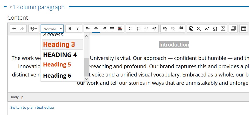
With Drupal, you can add headings to your webpage easily. You select the text and then from the formatting option, select the appropriate heading.

screenshot of text editor in Drupal to change headings

Headings start with level 3 in Drupal because headings 1 and 2 label the site and page titles. Start with heading 3 for your main points and use headings 4, 5, or 6 if you have subsections. Unless your page is very long and complex, you probably won’t use heading 6.

How to check your heading structure

Our accessibility checker, Monsido, will check for the order of the headings. (Contact Web and Mobile Services if you don’t have access to Monsido.) However, it can’t check for lengthy or irrelevant headings. That needs to be reviewed by a person looking over the content to make sure it’s current, concise, and relevant.

If your department doesn’t have Monsido, then you can use Webaim’s Wave Tool, which is free and available right in your web browser.

Writing isn’t easy! But creating well structured content gives everyone an great experience.

Categories
Digital Tips and Tutorials

How to create a segment in Google Analytics

Here at OSU, we have Google Analytics already set up on most sites. All the data lives under one account so we can get a sense of the big picture. But, if you work for an individual department or unit, you probably only want to see the data for your site, not everyone’s.

You can create a segment to see only your site’s data.

  1. Log into Google Analytics.
  2. Click on the property menu in the upper left-hand corner
  1. Under the Oregon State University – Core account, select the Universal property and the Unfiltered view
  1. Click on the Audience, then click on Overview
  1. Click on +Add Segment
  1. Click on New Segment
  1. Type a name into the Segment Name next to the blue Save button.
  2. Click on Conditions under Advanced
  1. Then click on Ad Content to change the dimension that you will filter by. 
  2. Click in the search bar and start typing Hostname
  1. Click on the search result to select it. 
  2. Change the Contains option to Exactly Matches.
  3. In the text box, type in your site’s hostname. For example: communications.oregonstate.edu. Don’t include “www” or “https.” 
  4. Then click the blue Save button.

You can now apply this segment to any report in Google Analytics to only see the data for your website. Here’s how:

  1. When viewing any report, click on the All Users segment, which is selected by default. 
  2. This will bring up a list of all the segments you have created. Select the one you just created to see only your website data. 
  1. Click on Apply, which will apply the segment to the data in the report. You can apply this to any report in Google Analytics, such as Behavior or Acquisition.

You can also check out pre-built segments that show a subset of data: visitors from the state of Ohio or people viewing your website with a tablet. There are a lot of options already there if you don’t want to build your own.

If you want to delve deeper, check out Google’s documentation on segments.

Categories
Digital Tips and Tutorials

Getting Started with Google Analytics

Google Analytics is a tool that shows you how people are using your website. You now have a few options for using it here at Oregon State University.

  1. Request access to the universal Google Analytics account if you want to just want to pop in and grab your data. We take care of the account level management for you. You will need to create a segment in order to see only your site’s data.
  2. Go to beav.es/analytics to view the university-wide dashboard. You can select your own site to see any date range of analytics. This is useful for sharing your data with stakeholders or if you don’t want to learn Google Analytics layout.
  3. Create your own Google Analytics account if you want to manage your own account and have more autonomy. You can manage user access, share with 3rd party companies, and do more advanced tasks. Once you’ve created your account, you’ll need to add the tracking ID to your Drupal site. Be sure to check with us first to see if there is already an account that we could transfer ownership to you.

You can get started on your own or come to Open Lab if you want some help.

Categories
Digital Tips and Tutorials

Search Engine Optimization (SEO) Tips

You’ve created a beautiful webpage that has the most important information your department or organization can offer. It’s got great pictures, an attractive layout,  and well written, organized content. And you want the world to see it. Yet you get complaints that it can’t be found with a thorough Google search. Have no fear–there are a few simple things you can do to help your website become more visible in search results. The methods and techniques to increase findability of a site are called Search Engine Optimization (or SEO).

Create Good Content

One of the best things you can do for your SEO is to have well-written content that provides the information what your visitor is looking for. Clear and concise language will take you far. Search engines are about connecting people to the information they need. So if your webpage doesn’t accomplish the user’s goal, then it won’t show up high up in search results.

Hone Your Keywords

Keywords refer to what people type into the search bar. On a basic level, if your website has those same words, the search engine will display your website as a result. The keywords you choose should reflect the essence of your webpage. What answer does your webpage provide? What is your webpage about? What is your goal for this page? You can include keywords in your headings and copy of the page. But, don’t force them into every nook and cranny–the language should still be natural.

Don’t limit yourself to one word for each concept. Google’s ability to understand natural language is getting better every day, so be sure to include other words that you think your audience would use to find what you’re offering. Google Search Console will give you a good idea of what terms people are using to get to your site. If you have access to your department’s Google Analytics account, then you can set up Google Search Console.

Take Advantage of Meta Descriptions

Meta descriptions are the little blurb in a search result below the page title. OSU Drupal will pull the first sentences of your page as your meta description. However, sometimes, this isn’t the best source for an overall summary.

A solid meta description should draw someone to your site, but also provide an accurate description of the content. Meta descriptions in a search result display around 300 characters, so you have a small window to accomplish both of these things.

In OSU Drupal, you can add a meta description to any page. When editing the page, scroll to the bottom of the page and click on the Meta tags tab. Fill out the Description field with whatever you’d like to include. (Erase the “[node:summary]”) Click on Save to update your page with your newly minted meta description.

Write Accurate, Short, and Unique Page Titles

This one sounds basic, but it’s a common challenge. A title needs to describe succinctly what the webpage is all about. If you were plopped here without any other context from the rest of your site, would you know what this page is about? That’s how your visitor is often getting there–they didn’t carefully follow the navigation of your site, but rather they Googled what they needed and this is where they landed.

In OSU Drupal, the page title field feeds what is called the title meta tag. This tag is part of the metadata code for your page. Metadata code provides some basic information about your site to search engines. Whatever’s in the title meta tag will be displayed in the Google search result and on the browser tab when you’re on the page. There isn’t an exact word count or character limit for what will show up in a search result since it’s based on 600 pixel width. A good guideline is to keep it at 50-60 characters. So, if your page title is well written, there’s no further configuration you need to do.

Each page title should be unique, as in you shouldn’t have 2 pages with the same title. Generally speaking, it isn’t a good strategy to have duplicate content on your site anyway.


Follow these few steps and you’re well on your way to improving the visibility of your webpage. There’s a lot more to SEO, so if you want to learn more, check out Moz.com.