Onnit has Mastered the Art of Online Brand Management

Onnit started off as a health supplements company providing products relevant to increasing performance in athletes. The reason why I feel they have mastered their online presence is the way they captured multiple segments,

  • Search Engine optimization:

Onnit has secured many keywords such as “mct oil”, “health supplements”, “brain enhancing performance “ and many more. The key to mastering online business is to master the search engines with relatively good keywords. Onnit has been open about their use of these keywords on their website itself were they published a case study on it.

Links: https://leadplanmarketing.com/digital-marketing-case-study-onnit/

  • Roping in right “Youtube” channels:

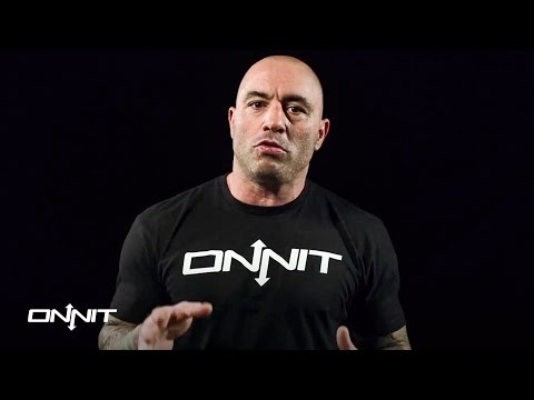
      Onnit’s influence on “Youtube” is massive as it advertises on famous podcasts such as “Joe Rogan experience”, “fighter and the kid”, and many more. These youtube channels give the company an authenticity thereby making customers realise that the company has a formidable backing by elite athletes and celebrities.
  • Use of social media:

The company has further established a great presence on websites such as “Facebook” and “Twitter” were the handles are updated on a daily basis providing information or opinions on current issues. The company websites have links to their social media portals as well as opinions and reasons on why they took a stand for certain issues. Furthermore, the company has partnered with athletes or instagram influencers to showcase their product. Athletes all over the world who have partnered with Onnit regularly showcase the products through merchandise or product wise in order to improve their online presence.

  • Backing up with researches and publishing it:

The company has an entire forum dedicated to answering questions of customers. I believe this is their main way to connect with customers. As the health industry has faced many scandals in the past it is necessary for supplement companies to provide correct information. The latest scandal being faced by “GNC” who were accused of having steroids in their products led to more scrutiny against supplement companies. In light of this scandal Onnit had provided a brief explanation of all the ingredients the company used and published on online portals such as “Reditt”, “Onnit performance” and many such formals along with their youtube channels.

I believe as a the company has mastered their online presence by providing customers a space where they can provide discontent, questions or appreciation for the company. The campaigns follow these up with athletes over multiple sports have come out and openly given testimonials about the authenticity of the company. These testimonials are published in their company websites. This is great way to be open on digital platforms where some companies are scrutinized over not being transparent enough.

In addition to this the company has published and continue to publish on their online portals various researches conducted by Phd’s on the ingredients used in their products. In today’s age were the supplement industry hide from criticism, Onnit not only provides full transparency but takes a forward step in improving by partnering with scholars in the health industry.

To conclude, Onnit has an aggressive online strategy were they hold seminars inviting health enthusiast and celebrities to come on the events and showcase their talents along with lectures on why selecting the right products are importance. All these steps have made Onnit one of the most popular brands on online portals in a highly competitive industry.

Sources:

Forbes.com. (2019). Council Post: Digital Marketing Techniques That Will Help You Dominate Online. [online] Available at: https://www.forbes.com/sites/forbescommunicationscouncil/2017/10/25/digital-marketing-techniques-that-will-help-you-dominate-online/#1081dca14ecb [Accessed 6 Dec. 2019].

SkuVault. (2019). Onnit Health, Wellness, & Fitness Case Study | SkuVault. [online] Available at: https://www.skuvault.com/resources/casestudies/onnit/ [Accessed 6 Dec. 2019].

Benefits of Social Media Certification

In past weeks I have worked and completed certification program provided by Hubspot Academy in Social Media marketing. I chose the coursework as I felt it was essential in today’s world to master social media platforms. The coursework too a total of 50 plus hours including the final exams. As an avid marketing enthusiast this was a great program to sharpen my tools to become good at mastering social media marketing.

The best part of the coursework will definitely be the online lectures which comprises of specialists in the field talking about their experiences. The lectures are informal and easy to understand which makes it pleasant to listen. The quizzes which follow each section helped me get a grasp at times of some things I might have missed during the lectures. The quizzes helps you keep your attention if you are completing multiple sections in one sitting. I look at this certification as a learning curve hence I won’t say I did not like any part of the coursework. The coursework is structured well and as it was my choice to opt for this certification my ambition was to learn as much as I can.

The knowledge I am taking out of this coursework spreads all across marketing strategies around Social Media platforms. First, the coursework highlighted simple points on how to reach customers and be productivity. This perhaps helped me realise the smaller things which holistically is of great importance. I believe sometimes we look past the obvious but the coursework does a good job of providing a great overview of the industry. Second, Social media campaigns and how to design those were covered broadly and helped me understand key elements to be included to make it efficient. Finally, I believe the certification gave me the knowledge of how to take in consideration the stakeholders and provide them incentives to keep investing and be happy on their ROI.

As shown in the graph above Social media marketing is here to stay. The fact that currently companies are investing more into this industry is proof that every marketer should learn about Social media marketing. As platforms on digital media are easiest way and the quickest to reach consumers, certification like these come in handy. As the digital world improves on a daily basis and more and more platforms being launched, learning the basic strategies to tackle some issues one might face. The increasing platforms is making it more competitive and people are looking to find new ways to reach customers and this is where exploring and researching helps to come up with new techniques. Furthermore, this certification will give you an edge over someone who is not familiar with this course.

On a scale of 1-5  I would recommend a 5 for people to take up this course. As I feel the field of business is something that evolves on a monthly basis. As mentioned before in the article increasing platforms is giving people the incentive to try new things and believe it or not Social media marketing is here to stay. Therefore, in order to create buzz around your product or to deliver your products to people, social media marketing strategies will be at the forefront of success. This certification encapsulates these strategies with expert comments and compiled into a manageable 40 hours and recognition from the academy on completion.

USING PERSONAS IN EMAIL MARKETING

What kind of people do you think will buy your product? In this ever changing business world email marketing still holds 87% of communication between business and customers. Thus, making email marketing one of the finest tools to connect with customers or business. In order to improvise and better know your customers, creating personas relatable to your desired target customers comes in handy.

What is a persona template and its use?

A persona template helps a business create a mock personality which resembles their actual target market. The need for this is purely to have a small idea of who we are looking at to sell our products. A persona template can cover a variety of attributes such as:

• Gender

When you are creating a profile it can be any gender. This plays an important role in case of gender specific products. Therefore, go ahead and select a gender.

• Age

Is your customer base in a certain age group? Example would be kids products which would demand the target audience to be young parents or a products appealing more to millennials. Subjecting a target customer to age would make it easier when you plan mediums further in the template.

• Profession

A profession comes into play when you are targeting a company or professional. An example would be a B-B online business such as Udemy.com which provides courses for professional development in business. However, a profession can be used in multiple areas if it helps segmenting the customers.

• Lifestyle choices

In case of lifestyle choices it plays an important role if the product appeals to a certain segment of the population. An example would be weight loss or healthy food products. This helps thereby to segment the customers lifestyle choices and target them for the best results.

• Medium to connect with the customer

When all the segmentation is done, finally it comes down to how you can communicate with the customers. There are few things to keep in mind with respect to email marketing. A good subject line goes a long way ! in this case it is necessary to understand what kind of customers we are targeting. A millennial target market can be driven through social media sign ups or google sign ups on the other hand an older generation customer base could be receptive to more traditional channels.

These attributes in the template can be designed as per the product which the business intend to sell. This plays an important role as product demands a certain personality at times as well. Therefore, finalising on a product is very important and in the long view it plays a good importance to drive the email marketing. Furthermore, the strategies could change with different products.

An example would be, A diet Pepsi, now this product can look at college students who love their beverages, at the same time are trying to eliminate or use less sugar drinks and something to socialise with. This makes deciding on a product initially much more important as it will give you a proper base to design your persona template.

What next?

Once the personality template is created one can segment the offers, discount coupons or deals provided by one’s company to this target audience created through the template. This is a fine way to target customers and making sure that right emails are send to right customer profiles. Conclusion:

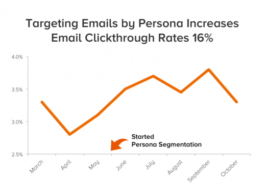
Email marketing still is one of the finest mediums to connect with customers. While creating email marketing templates one of the important things would be to come up with a good subject line. As subject line could make or break customers mentality to open or discard the email. Therefore, further emphasising the use of personality templates which would make it easier to come up with a subject line as you already know the way of living and inner desires of the customers you are targeting. It has shown that using personality templates for email marketing increases the click through rate by 16%. This is a considerable advantage when it comes to driving your customer base to sales. In a competitive market a business has to use multiple channels and forces to gain an upper advantage. Therefore, this template would definitely give every business an edge over their competitors and thereby driving their email marketing to desired success.

REFERENCES:

Smart Insights. (2019). Using Personas for Email Marketing | Smart Insights. [online] Available at: https://www.smartinsights.com/email-marketing/using-personas-email-marketing/ [Accessed 26 Nov. 2019].

Stukent. (2019). The New Way of Email Marketing – Stukent. [online] Available at: https://www.stukent.com/expert-sessions/the-new-way-of-email-marketing/ [Accessed 26 Nov. 2019]. OSU MediaSpace. (2019). MRKT 484

Ashley on Personas. [online] Available at: https://media.oregonstate.edu/media/t/0_gdmjk9hb [Accessed 26 Nov. 2019].

Online Advertising good or bad?

Online advertising has become one of the prominent ways to advertise in modern society. As more and more companies are looking to sell their ads on various websites with the hope of attracting more customers. This is currently favoring the advertisers as this method is creating a presence in the industry. As of today, the industry is a billion-dollar industry and various methods such as pay per click and banner advertising mediums have become a part of online portals. As the current generation prefers internet shopping or for knowledge gain than retail stores, this industry has maximized its potential. The current poor form of retail shopping is proof of the boom in the online industry.

The Potential Hazard:

•    Online advertising can cause customers what one may call a”d blinding”. This is a concept where the number of ads is so heavy on the internet that customers can be blinded by them and the decision making of the customers can be affected.

•    Privacy is a big issue as more and more companies gather the data of users and their search history, customers can have a sense of insecurities which can cause them to ignore or go for adblocking.

•    Safety is also an issue where some ads can be misleading and this could have grave consequences.

•    One other major issue the number of advertisements that have increased over the years and made the zone a cluttered one. This could hurt customers as the authenticity of ads can be lost in the mix because of a few bad ones.

Is it bad or good for customers?

Rating 2/5

Online advertising according to me is good if done the right way. As customers around the world are constantly using the internet services and online sales booming is a major sign that online advertising is being appreciated. As in this modern era, we are all looking for convenience, online advertising epitomizes convenience by bringing all that is new in the market to your desktop. Even though companies like google chrome have introduced ad blocking, customers are still not completely in favor of it. The main focus of online advertising is reminding the customers of what they searched or give them hooks to reach to a place where they can buy their desired products.

There have been instances in the past of brands misusing online advertising concerning invading privacy policy and using data for other purposes than programming it to find what the customers need however on larger scale protection provided by browsers nowadays have restricted that to large extent and continuing to do so. The method used is by ad blocking which gives the power for the customers to block ads on certain platforms. Therefore, big-picture online advertising is still a reputed form of advertising in the current scenario (Larson&Draper, 2018).

Code Of Ethics:

•    Deliver the product: One thing that frustrates customers more than anything is advertisement not living up to the promises. If any advertiser is advertising a product on a website the customers on their clicking should be able to go to the destination where they can buy it.

•    Don’t Invade privacy: Online advertisers have to keep in mind that the collection of data on users’ search history should not be leaked or used for any illegal purposes.

•    Landing page design: When a customer clicks an ad they do desire to get into a landing page which shows what they were looking for. This page should not cheat customers by showing extra ads or products which are not displayed on the online ads.

•    Appropriate ads: Online advertisers have to keep in mind that when they design an ad they should be sensitive and see to it that the message is clear. Furthermore, ads cannot be insensitive to customers or any segment of the people in the society.

•    Similar ads: The websites should try and place ads that are similar concerning products. An example would be a gym ad that can be shared along with ads that promote weight loss methods or health products. This will encourage people to click on ads.

Therefore, online advertising I believe is here to stay. The concerns raised over the past few years of security can be improved by better laws. Furthermore, customers can choose ad blockers and thereby laying out good platforms to showcase their products. This is also a boom for upcoming new brands that may not have an influence in the market as some traditional brands. This is a great method to empower entrepreneurship and boost for upcoming companies and traditional companies to improve on their sales.

Sources:

Larson, & Draper. (2018). Digital Marketing Essentials. Student.

The Global State of Digital in October 2019 – We Are Social. (2019). Retrieved 8 November 2019, from https://wearesocial.com/blog/2019/10/the-global-state-of-digital-in-october-2019

THE NEW WAVE OF DIGITAL AD FORMATS. (2019). Retrieved 8 November 2019, from https://www.impactonnet.com/cover-story/the-new-wave-of-digital-ad-formats-6319.html

What to do when your webpage doesn’t rank

The digital revolution brought about a change in the way the company’s communication with customers. Google is one of the preferred search engines today, the ranking of the webpage becomes of at most importance. A poorly designed webpage will lead to a poor rank and thereby failing to reach the desired level of traction. Here are the top 4 techniques out of the many ones that can use to develop a formidable webpage and have a high rank.

1.    Title Tag: One of the important things to keep in mind while developing a website is to have a high click-through rate. This means a customer should know by the keywords what exactly they might be getting through this webpage. In addition to this one has to keep in mind to do the same concerning the URL provided and the meta description. This is fairly important as this is the first step before the customer enters the website.

2.    A good Landing page: The second step deals with the potential customer entering your webpage and what they see first is important on the webpage. This is where the landing page becomes an integral part. To ensure that the webpage has a low bounce rate which means fewer people leave the website sooner, the landing page should encompass similar details as describes in the search phrase.

A good example would be a search like “memory foam shoes” and if you go to the webpage of companies like New Balance or Nike their landing page shows exactly what the potential customer is looking for which is memory foam shoe collections.

https://www.crazyegg.com/blog/landing-page-essentials/

3. Short loading time: It is important to know the difference between server speed and website loading speed. These terms have different strategies to improve. In line with this topic, here are some ways to improve your webpage loading speed. A good website should have minimal content as HTML needs to download components and thereby to load them. Make sure the landing page has enough content to cover the search but nothing more or unnecessary. Keeping the previous point in mind one can combine files or reduce bloated codes and plugins.

For more details on how well you can host a website check out this link:

https://www.crazyegg.com/blog/speed-up-your-website/

4.    Good quality updated content: There is no substitute for good content. As any customer comes into the website the first and only thing they look for is quality content. Does your webpage provide what you pitched in the results? This is an important and final nail to build a good webpage that ranks well. The content on the website should be updated for example if it is a merchandise website, then the products on the website should be available and as recent as possible. It should match the keywords and meta descriptions provided. This will increase the traction and more the people visit better the rank will be for the webpage.

There is no substitute other than having a great architecture for your webpage to rank it better. To learn more about designing and help to get a better-ranked webpage you can read on,

The Daily Egg. (2019). 20 Ways to Speed Up Your Website – and Improve Conversion by 7%. [online] Available at: https://www.crazyegg.com/blog/speed-up-your-website/ [Accessed 25 Oct. 2019].

The Daily Egg. (2019). How to Create a High Converting Landing Page (12 Essential Elements). [online] Available at: https://www.crazyegg.com/blog/landing-page-essentials/ [Accessed 25 Oct. 2019].

Kusinitz, S. (2019). The Ultimate Guide to Google Ranking Factors in 2019. [online] Blog.hubspot.com. Available at: https://blog.hubspot.com/marketing/google-ranking-algorithm-infographic [Accessed 25 Oct. 2019].

5 ways to increase Landing Page Conversions

The online markets are booming and currently at a point where it is popular than physical stores. This means a fight for position on the internet. This is where the landing page plays an important role. Therefore, one has to keep in mind these simple 5 steps which could be the difference between making a sale or losing a customer.

1. Set a goal: Before one designs a landing page it is very important to understand what exactly is the page going to communicate. Therefore, to design the content on a landing page one should develop a clear set of goals for their campaign so that there is uniformity all along and the context is clear.

2. Design: The design of the website initially could decide if the potential customer landed on the page will click the “back” button or continue to browse. To design a good landing page make sure to not overload the website with information. It can be tempting to fill the website with as much information as one can but this will only lead to distractions and poor attention ratio. The attention ratio should be as close to 1:1 where there is “go-to information” about the one product that the customer searched. This will perhaps take away the risk of customers leaving the website.

3.Information Hierarchy: Once you set the goal and design the website make sure to check the information hierarchy which means if the order of the information is aligned as per need. let us consider an example of a landing page for running shoes, in which case the first information which the customer should see would be the name of the product followed by the visual representation of the shoe followed by the price and sizes or choices and finally the reviews which give it credibility. In this case, every step would match with one has to go through in a real-life shopping experience and thereby there is no hindrance in between.

4. The Closing: This is the space where landing page designers should be careful. On any page where the customers have more than one decision to make at the point of buying there will be hesitancy and his could lead to a loss. To make sure that the deal is finally closed with customers, one should make sure there are no negative or choices customers have to make at the point of clicking the buying option. Any sort of messages like “Trust Us” or on those lines which could create a doubt in customers’ minds which previously may not have existed could only lead to possible loss. Therefore, on following the previously mentioned 3 steps it’s important to keep the motto of “to the point” in mind while designing this part of the landing page.

5. Continuance: It is very important to note that one should not design the final part of the page taking the customer for granted. As per the final part, one should make sure there is not a huge leap of commitment that s been asked from the customer. A simple membership form which is short and quick or a form which could help one notify the customer of offers or an invite to their public event. This part is to make sure that customer ends on a good note at the same time the page is giving them enough detail to retain them. In the end, what matters the most is promoting the “the feel-good factor”. If the customer if feeling good from the time he lands on the page until he leaves, the chances of making the sale will always be good.

References:

Jones, B. (2019). Understanding Visual Hierarchy in Web Design. [online] Web Design Envato Tuts+. Available at: https://webdesign.tutsplus.com/articles/understanding-visual-hierarchy-in-web-design–webdesign-84 [Accessed 9 Oct. 2019]. Unbounce. (2019). Principle 7: Continuance – Conversion Centered Design. [online] Available at: https://unbounce.com/conversion-centered-design/continuance.html [Accessed 9 Oct. 2019]. Larson and Draper (2018). Digital Marketing Essentials. [online] Stukent. Available at: https://www.stukent.com/ [Accessed 10 Oct. 2019].