Virtual Reality and Design

It seems as though environmental design is becoming more and more popular as of recently, in part due to its ties in accessibility and unification. It only makes sense that eventually environmental design will be adopted by digital mediums. VR is still far from accessible to a large number of people but, similarly to the smartphone I think it will slowly creep into people’s daily lives. If not VR then augmented reality will perhaps have some revolution in the future.

Design related fields will without a doubt be affected by a rise in virtual/ augmented reality. VR can create experiences that wouldn’t be possible otherwise during the design process. The most obvious applications would be in architecture and environmental design. With VR we can present and explore an area before it is constructed and finalized. We can also use VR to see how a 2d design might interact in a certain environment as well. This could make it a needed tool for designers of the future.

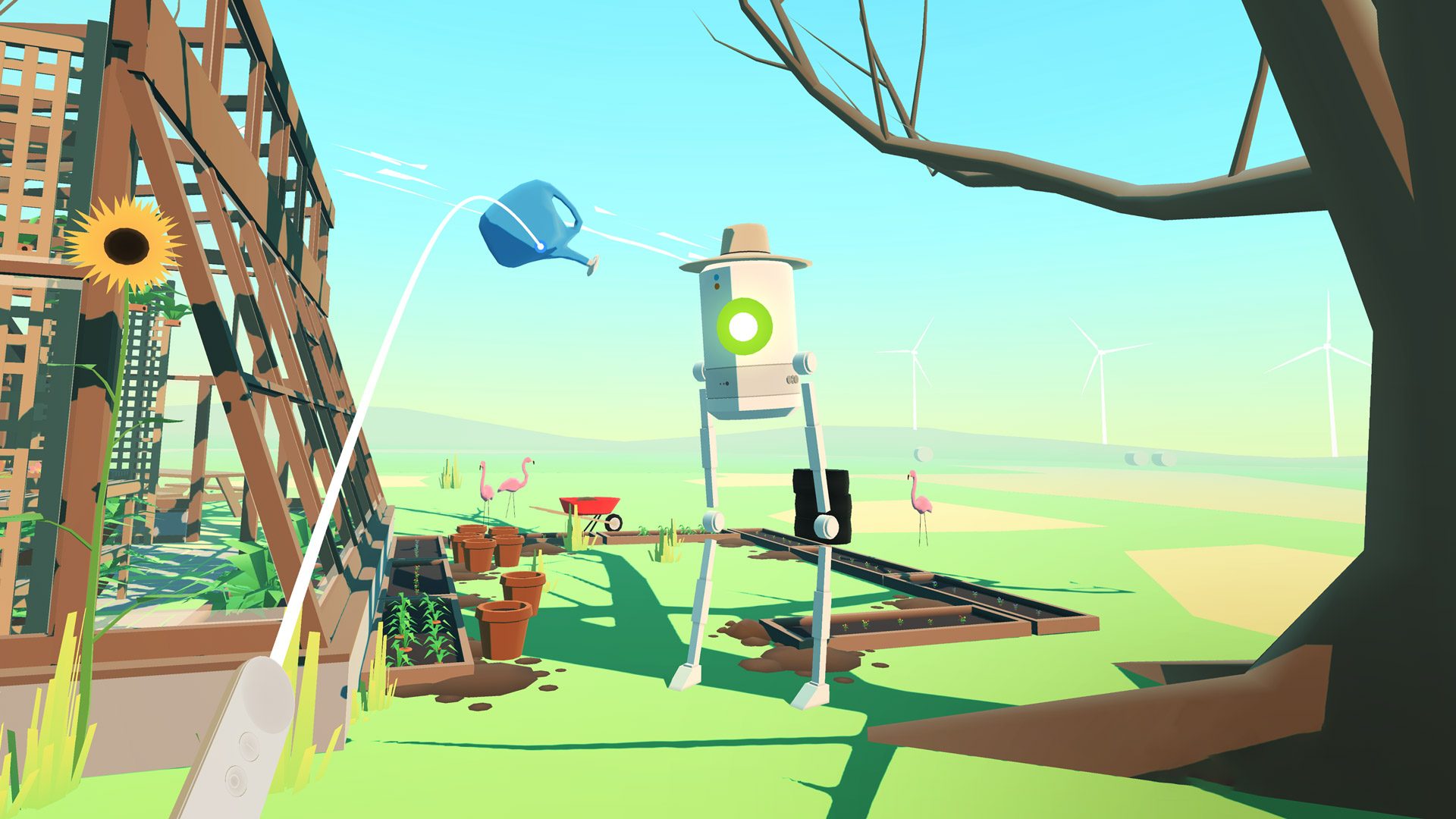
VR won’t only change the design process, it will change how everyone interacts with design and the perception of design as well. VR will give designers and creatives a whole new digital medium to explore. With this exploration will come many new creative projects and inspiration. There are already some interesting interactive pieces being created for VR. Samantha Gorman is the founder of Tender Claws which is an award winning games and art studio. They create interactive stories through VR experiences. Their work shows that powerful stories and messages can have a playful exterior that is boosted by the fact that it is done through VR.

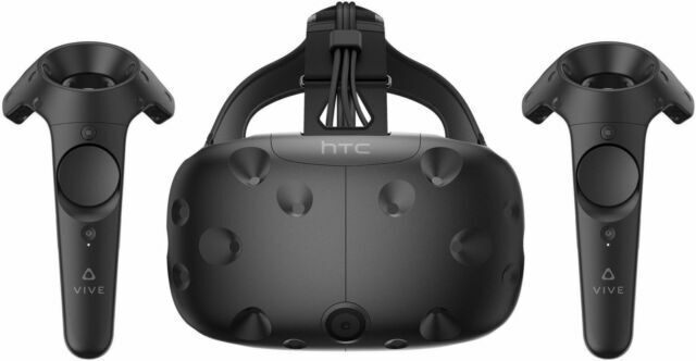
Despite all the great stuff that VR could do for the field of design there are still major accessibility issues currently. VR can be pretty expensive with cheaper VR headsets coming in at around 200-300$. On top of that VR headsets don’t have the same global appeal as smart phones or computers. The VR headset is too much of an accessory still for it to become a new standard. There are promising signs that point towards the growth of VR in the future. In surveys people often say they would buy a VR headset if it was cheaper. VR headsets also may become more popular for architectural work as well as other fields that deal in 3d design or development.

Hazelwood School

I think graphic designers and others can learn a lot from architectural design, especially when it comes to inclusivity. The Hazelwood School in Glasgow is a good example of design that serves the needs of the community. The Glasgow City Council arranged a competition for the design of a new school building for kids with varying disabilities. The winner of this competition, Alan Dunlop, worked closely with parents, teachers, and students to create an environment that would serve the needs of that community. For kids with visual impairments walls in the halls were made from a cork material that allows for textural navigation. There is also plenty of natural light as well. These types of designs not only serve people with visual impairments. Anyone can benefit from easier navigation and more natural light. We can take these concepts and apply them anywhere to not only make design more approachable for a wider audience, but to also enhance enjoyment and interaction with the design in general.

Architectural design is really interesting to look at because the entire point of architectural design is to serve the person or community that will inhabit that space. This means that architectural design often is trying to fix a foundational issue. This way of looking at design is important for sustainability, inclusivity, and other social issues. The question is how can we make this approach in other design fields such as graphic design? I think the key may lie in awareness and designing for a space rather than a function. Designing for a space means looking at the medium and material usage when applying a design, as well as how that design lives and breathes in the space. When I think about function I am thinking about the formal qualities that the design has. These formal qualities mean nothing if the design isn’t approachable in the first place. In graphic design I feel like we are always looking at the formal qualities opposed to medium, material usage, sustainability, etc.

Graphic Design and the Anthropocene: An Argument for More Sustainable Design Thinking–and Thus a More Sustainable World

Boylston, Scott. “Graphic Design and the Anthropocene: An Argument for More Sustainable Design Thinking–and Thus a More Sustainable World.” Print (New York) 71.3 (2017): 80. Web.

This short but impactful article talks about how the world has entered a new epoch with an emphasis on limited world resources and ecological necessity. Graphic designers control the image and brand of this new epoch and therefore have an unbelievable amount of power in how things change in the future.

Scott Boylston is an art director and entrepreneur in social and ecological design. He has founded several companies with focuses in sustainability and repurposing material. He has two published books which include Designing Sustainable Packaging, and Creative Solutions for Unusual Projects.

Sustainable Packaging

Sustainable Packaging. Bristol, England: Pumpkin TV, 2010. Web.

This video explained the processes and the thought behind sustainable packaging design. In order to reach higher levels of sustainability in the food packaging industry consumers need to start changing their preconceived notions of how things should be packaged. Looking at the processes behind the potential change gives graphic designers a better context in which to design with sustainability in mind.

Towards a More Sustainable Graphic Design Philosophy

Graham, Lisa M. “Towards a More Sustainable Graphic Design Philosophy.” The International Journal of the Arts in Society: Annual Review 6.5 (2012): 169-76. Web.

Lisa Graham describes sustainable philosophy and how it can be applied to graphic design practices and ways of thinking. Graphic design is behind compared to other design fields when it comes to sustainable philosophy and implementation of guidelines and certifications. Graphic designers need to look at the issue of sustainability holistically instead of applying small bandaids here and there to solve the issue.

Lisa Graham is an accomplished graphic designer and professor at the University of Texas at Arlington. Her publications include Sustainability Research by Designers, Basics of Design: Layout and Typography for Beginners, and Principle of Interactive Design. She has also published many papers, presentations, and articles on various topics primarily relating to graphic design. 

Sustainable Graphic Design Tools, Systems, and Strategies for Innovative Print Design

Jedlicka, Wendy, Andre, Paul, McNamara, Amelia, and ProQuest. Sustainable Graphic Design Tools, Systems, and Strategies for Innovative Print Design. Hoboken, N.J.: John Wiley & Sons, 2010. Web.

Chapter 5: Materials and Processes goes into great detail in the history and background of many materials we use as graphic designers. Paper is a huge contributor to CO2 and methane emissions globally. Graphic designers rely on paper for all sorts of print media and because of that can push to make more sustainable choices in working with print. Ink and printing process is largely dependent on the designer and therefore we can make a change.

Wendy Jedlicka’s primary focus is in sustainable packaging design. Jedlicka is an adjunct faculty member at the Minneapolis College of Art and Design. Jedilicka has also contributed to the writing of Sustainable Graphic Design, Applied Sustainability, as well as Packaging Sustainability. She is also the president of Jedlicka Design which is a packaging design firm that specializes in sustainable design.

Environmental and Social Design

Naturally for me I think I lean more towards the environmental side of things when it comes to graphic design. I think this is mostly due to my mom emphasizing the importance of being ecologically aware when it comes to pollution and climate change when I was a child. I still greatly consider important social aspects in my design but I think environmental issues are something that I’m a bit more passionate towards. Last Wednesday’s lecture made me think more about material usage and research to practice sustainable design. Previously as a graphic designer I hadn’t given much thought to physical material usage since most of my work is done digitally but I think I will try to prioritize and be more aware of stuff like what brand of paper I am buying as well as other things along those lines. I decided to write my research paper about creating a sustainable work environment in regards to design because I wanted to develop a better understanding of the background and usage of materials globally so that I could make more informed decisions when working with physical materials for design related projects.

I think everyone in my generation has a responsibility to be the change they want to see. There are some issues that are largely systemic that can’t be helped in some cases but at least at a micro level I think people should do there best within reason. It isn’t too difficult to make personal changes such as supporting more ecologically friendly companies. You could also recycle more and make other smaller changes that wouldn’t change your quality of life. In terms of graphic design I think it is kind of similar. The lack of ecological concern is primarily a systemic issue. Because of this I wouldn’t expect everyone to push towards a more ecologically friendly design process, but for the people who have the option to I think they should always take it if they can afford to without losing their own well being. Of course everyone has their own subjective opinion of what well being may be for themselves. I think the most important thing overall is that designers are aware of the gravity of their choices when it comes to ecological impact.

Bio mimicry is a very interesting topic when it comes to designing functional products such as architecture, apparel, and so on. The example of the building in Nairobi, Kenya probably stood out the most to me in the Wednesday lecture. I imagine you could also use the idea of bio mimicry in visual design as well to potentially create more satisfying or efficient visual solutions.

Design and Politics

I think design in politics is very important because it can rally a group of people behind a specific design that has with it, an idea or concept that drives into the hearts of people. As a designer/artist myself I feel empowered by this but, also kind of worried at the same time. Design can be interpreted in many ways based on context, just like art. I’m worried that in the future a design could be interpreted in an unforeseen way by some amount of people, which could lead to confusion and distrust. The more eyes that will be on a design, the more responsibility placed on the designer and anyone involved. In general I think design will help lower the barrier of entry for political discourse, and the sharing of ideas.

One piece of political design that I find particularly interesting is the Polish solidarity logo. The logo was developed from stencil graffiti in the Gdansk shipyards. The movement that the word mark represented was born from unfair working conditions from a failing economy in Poland. The movement started out in Gdansk but soon grew to the entire nation and beyond. The solidarity logo is incredibly simplistic and informal yet, it holds immense meaning and social importance within the context of the movement and where it originated from. The logo is also extremely malleable in implementation. You could recreate it yourself to put on signs for protest as well as combine imagery with it to enhance the meaning or give new meaning. The red that is used in the logo is very powerful and demands attention. The logo’s worldwide recognition speaks to the design’s effectiveness.

I haven’t really paid too much attention to recent examples of political design. From what I’ve seen, more recent political design has been pretty bland for the most part. To be fair I haven’t engaged with much political design recently so there might be some less mainstream stuff that is really cool that just doesn’t get as much traction. Specifically when looking at recent design in US presidential races I think the idea to have the MAGA hat was pretty interesting. It kind of hearkens back to that oversimplified nature that the solidarity logo shares. The solidarity logo and MAGA hat have opposite messages in a way but they still both use the same conceptual foundation to their designs.

Comparative Critique (Google)

Google has grown to the point where it has become synonymous with the internet. The Google homepage is iconic for its simplicity and its ease of use. With this integration into online media, Google has a lot of responsibility in keeping its search engine clean in terms of design because of its global use. I never feel limited while using google. There is just enough customizability and the content is always the main focus. Simplicity has always been at the forefront of Google which is made evident through their logo and branding systems.

In 2013 Google changed from a 3d logo to a primarily flat one. It seems like the 2013-2015 logo still had some sort of gradient making it appear 3d to me. I think the variance in the girth of the type also contributed to this 3d effect in the old logo. The newest Google logo has eliminated any doubt that it is even slightly 3d. It is truly flat and feels a lot more stable compared to the old logo.

With the rebranding of Google in 2015 they also released a new Product Sans typeface to be paired with Google products. The type in the new logo is derived from this typeface as well. The simple typographic shapes and forms in the new logo are interactive and fun. It  feels very architectural in form due to the type’s rectangular structure and stability. The  previous logo feels sophisticated while the new logo feels more approachable and kind hearted. This duality in nature is found primarily in the two logo’s type choices. The new typeface provides more interesting negative space within the logo while the old is more about the form and movement of the positive space.

The color scheme has not changed in the new logo however the G icon now sports the full arrangement of color instead of just solid blue. This change to the G icon makes it more versatile in my opinion. The use of the full color scheme adds depth and complexity that is potentially lost in the flattening of the main logo. I really appreciate how the G icon and main logo compliment each other in their different applications.

Google released a design rollout video that accompanied the new logo and brand systems. The video featured a lot of new animation elements that linked different design elements together in a pretty fun way. The video also focused a lot on the new voice recognition software and how it could be used with newer devices such as smart watches. This is a cool feature however it takes center stage away from more important conceptual changes in the rebrand.

In addition to the new G icon there is also a new microphone icon which falls in line with their focus on voice recognition. This microphone icon follows the same color scheme as the main logo similar to how the new G icon looks. The shapes combined with the color and the flatness make this icon feel strange compared to the other design elements. There is no implied depth like with the new G icon making the microphone feel out of place. The variance in rounded versus sharp corners adds to this strangeness.

Overall I think the ideas and concept behind the rebrand are really well thought out and make a lot of sense with Google’s history. I think the simplistic nature of the new logo brings a new perspective on Google for me. When I was a child I mainly thought of Google as a source for information and studying. This rebrand gives a gentle push away from the formal perception that I had previously.

Marshall McLuhan’s Communication Theory

McLuhan’s idea of “hot and cold” media comes off as deceptively simple and inconsistent when looking at the consumption of media today. One of my main issues with this idea is that it relies on everyone having a similar perception of media, which is just not the case. From my experience levels of engagement with a certain piece of media have more to do with the context as well as the perception of the viewer than the medium itself. I think the reason for this binary scale, that McLuhan utilized, was the fact that there were a set number of electronic media mediums that could be viewed at the time. Today there is such a wide range of mediums and technology that the line becomes blurred.

Another idea that McLuhan wrote about was that “the medium is the message”. This phrase is a bit over the top but it does help give us an understanding of how medium and message correlate. I’d say the medium provides a range of perception that the message can sit in. This range can inform peoples opinion of the message to an extent but the message is still there and able to exist on its own. With how fast messages and content can be shared these days it is especially important to consider how ones message will be perceived in different mediums. This applies to graphic designers of course. Being conscious of other mediums and how they inform your design choices is necessary as a graphic designer since we often spend 90% of the design process in front of the computer.

Today we live in a media filled world. Media guides us constantly and often times distracts us from the real world. Recently with the rise of social media people now rely more and more on social interaction through digital means. This trend is kind of scary in a way and is becoming more of a concern with people working and schooling online. Social media is kind of a double edged sword in a way. It can give us ways to make new friends and stay in touch with friends who have moved but at the same time it can mess with people’s minds and change how we perceive the world in damaging ways. With all that said I don’t see a clear way to deal with this oversaturation of social content through design alone. Perhaps designers need to be more aware of visual stimuli and how images and messages can affect the brain.