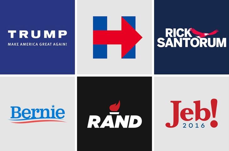
On the topic of politics, I am not a huge fan of it. I understand that learning and understanding politics is important but that doesn’t mean that I have to like it. For me, I guess it’s because I cannot directly relate. Growing up, I associated politics with the news and old white men that people loved or hated. I also associated it with arguments and fighting. That’s primarily why I tried to avoid it. Now that I’m an adult I understand why we must keep up with politics. Especially after having a bad president.
My intersectionalities are that I’m an Asian-American woman. I have never seen someone like me in a leadership position for my county, state, or country. I believe that will soon change in the future (hopefully). With the design in politics, it makes me feel disconnected. The designs in the previous years from the Republican side are the worst. They reject the whole idea of graphic design because they believe that is a very left-wing thing. They use a lot of serif fonts which are outdated at this point. But I guess that represents who they are targeting. But on the other hand, I’m excited to see that the democratic side has embraced the power of design and is creating powerful campaigns because of it.
Political design can be powerful when done correctly. Like large companies, they already understand the power of branding. That’s part of the reason for their success. Political design could learn a thing or two. According to Nadja Sayej from PrintMag they say, “Red and blue will always separate the two national parties, but over the past 10 to 15 years, we’ve seen a shift from branding being less about party and more about the candidate,” said Ghanem. “What works for a DC progressive may not work for a Shelby County progressive—the typeface, fonts and styles are now more catered to the message of the candidate, and how they want to be seen”. Times are ever changing and these political candidates must be able to adapt with the design trends.
Although, if you do try to adapt to the trends make sure you are doing it correctly otherwise it looks cringey. The two that I think are working well are Kamala Harris and Julian. It is unique and different but tastefully done. Julian with his little accent shows that he is a Latino and wants people to know that he represents them. Kamalas is even more straight forward. You can see that it is designed to look like American flag but with the blue bigger to represent her party. Versus Tulsi, Warren, and Gillibrand they look like they took it too far. The ombre in Tulsi would be difficult to replicate in other media. Gillibrand and Warren look like they are trying too hard to scream “girl”.
Overall, I think that design in politics should be taken seriously if you want to capture a large audience to win. Design is what will speak to people before anything else.


