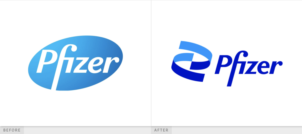
By March of 2019 the pandemic hit the United States hard. We grappled with new concepts of wearing masks, isolating from others, and being excessively hygienic. Pre-pandemic, I honestly didn’t pay much attention to pharmaceutical corporations. They only seemed to show up in the news when there was a merger or lawsuit. The virus thrusted them into the spotlight, especially Pfizer Inc. To my surprise, Pfizer had been around for quite some time and is considered to be one of the largest pharmaceutical corporations in the world. Their scientific breakthroughs and research gave them their name. As they raced alongside others to rapidly produce the first vaccine and save millions of lives from COVID, a New York based design team was quietly rebranding their entire visual identity. Pfizer officially revealed their new identity a few weeks ago. The timing was impeccable.
Albert Bourla, CEO of Pfizer announced, “After 171 years, we arrive at a new era. A time of extraordinary focus on science and dedication to patients. Pfizer is no longer in the business of just treating diseases — we’re curing and preventing them.”
(Pfizer)
At this moment, more than 400,000 lives have been lost to the pandemic. People are looking to Pfizer for hope and a brighter future. Now more than ever, their brand must evoke the spirit of innovation and progress.

The largest adjustment to the logo is the replacement of the oval-shaped pill with the DNA symbol. At first glance, I question why they would make such a drastic change to something that was working. Can Pfizer really just claim the symbol of DNA? DNA is essential to all science and many other healthcare brands. I decided to dig a little deeper into their justification.
“Pfizer has become much more than a pharmaceutical company. Our new logo signals this shift from commerce to science. We’ve unlocked the pill form to reveal the core of what we do: a double helix, spiraling upward.
The logo is constructed of two interlocking forms. Their unity reflects our passion and dedication to the science behind our innovations, and to the wellbeing of our patients.”
Official Statement from Pfizer
After reading that, I am mostly convinced. I should acknowledge that the context behind this change does matter. As a pharma giant, they need something holistic, forward-moving, and impactful. DNA is pretty powerful.
The curvature of the DNA lines exist in motion and wrap around nicely. If you look closely, the two corners touch in the center which connects the two segments conveying the idea linkage. And, to make it even better the top curve follows the fluidity around the P of ‘Pfizer.’ This leads my eyes to the word Pfizer itself. The type is on a solid baseline and matches with the middle points of the DNA. I would be intrigued to see what the ‘f’ would look like if it matched the bottom most point of the DNA. Although, I do think the elongated ‘f’ allows the viewer to learn how to pronounce the company’s name. It’s almost as if they are sending us a clue that the ‘P’ is silent. That’s clever.
Since the DNA is the heart of the new identity, Pfizer makes sure to take it a step further by incorporating a 3D element of this logo. The double helix can be seen from various angles, with different textures, and at times in conjunction with other bacteria-like visuals. It’s made specifically to account for digital mediums. There are some areas within their marketing materials where the helix is abstracted to the point where we just see blue 3D shapes or lines. This is where I feel they lost the essence of the symbol. Their attempt to communicate a ‘new-era’ through complex dimensions generally works, but the 3D formatting needs some work.

Pfizer picked a bold color palette and I think this risk was worth it. They need something that draws attention, sparks energy, and feels pure. That being said, the application of the palette can be improved. The use of the cyan, dark blue, and white look spectacular in their 3D mockups, yet many of their 2D advertisements only utilize the dark blue and white. Their secondary palette seems almost unnecessary at this point in time.

As for their typeface (Noto Sans), I’m a fan of the clean lettering. There is a lot going on with their new logo so balancing this out with a universal font was a sound decision. In practice, the tracking looks comfortable and pairs well with their photographic visuals. The framing is consistent on their collaterals regardless of the language the type is in. For a company that plays an integral role in saving lives, simple is definitely better.
Overall, I thought Pfizer designed a beautiful visual identity. The DNA took some time to grow on me and their applications of it are imperfect, but ultimately I feel that it communicates what their company is all about. Curing and preventing diseases is no simple task; their new identity gives them the credibility that they will do it.
Sources
“A New Pfizer.” Pfizer, www.pfizer.com/new-pfizer.
Bruell, Alexandra. “Pfizer Introduces New Logo Playing Up Role in Drug Creation.” The Wall Street Journal, Dow Jones & Company, 5 Jan. 2021, www.wsj.com/articles/pfizer-introduces-new-logo-playing-up-role-in-drug-creation-11609844400.
“Our Visual Identity.” Pfizer, www.pfizer.com/our-visual-identity.
Piper, Daniel. “Pfizer Tries to Inject Some Life into Its Logo (but Does It Succeed?).” Creative Bloq, Creative Bloq, 6 Jan. 2021, www.creativebloq.com/news/pfizer-new-logo.
UnderConsideration. “Hold Your Pfire.” Brand New: New Logo and Identity for Pfizer by Team, www.underconsideration.com/brandnew/archives/new_logo_and_identity_for_pfizer_by_team.php.
Wong, Henry. “Pfizer Rebrands to Mark a ‘New Era’ of Science and Research.” Design Week, 7 Jan. 2021, www.designweek.co.uk/issues/4-10-january-2021/pfizer-rebrand/.


