Last year I debated for weeks whether or not to get an iPad or a Wacom tablet. I was looking for something that would allow me to practice my illustration skills. Wacom had the credibility as it had been creating these specialized tablets for creatives for years. It’s also compatible with the full desktop versions of Adobe Illustrator and Photoshop. At the time, the iPad seemed enticing as well, but the features didn’t really justify the higher cost for me so I went with the Wacom.
I realized pretty quickly that the Wacom was going to take some time to get used to. I had to use it with my laptop because it only worked with the desktop versions of Adobe software. In addition to that, I had to learn how to do blind illustrations because when you touch the pen on the tablet it essentially gives you full control of your pen on the illustrator. For my purpose of just wanting to work on some quick digital sketching, this wasn’t really the right product for me. I needed something portable and seamless to use. I also wanted that similar experience of drawing on paper.
So when the iPad Air 4th generation came out in October, I was pretty excited. Apple was definitely targeting creatives for this product. When referencing the iPad they literally say it’s “Your creative studio on the go.” Apple now uses their new A14 Bionic chip which enables the product to have 30% higher graphics in comparison to their last model. Not only that, machine learning performance was advanced by 10x. For us creatives that means faster photo, video (even 4K), music editing, and so much more. The iPad is light with a 10.9 inch diagonal which in my opinion is the perfect size. The way I see it is this wouldn’t necessarily be a replacement of your laptop, but rather a complementary device that makes design processes more efficient. To top all of that off the 2nd generation pencil is the cherry on top. When illustrating, details matter. The pen has incredible pressure sensitivity which imitates the real-life drawing experience. It also maintains a high level of pixel precision which is crucial when working with lots of elements in a design.
As you can see, I made it a point to do in-depth research before deciding to purchase because as we all know Apple’s expensive and I wasn’t just going to immediately drop $700+. Unfortunately, the cost is one barrier with all of these devices especially as a college student. Although after seeing all the advanced features and maybe falling for their incredible marketing, I came to the conclusion that it was worth the investment. Apple has definitely captured the hearts of designers and continue to keep making products that benefit our needs. Looking forward, it’ll be intriguing to see if they can make the iPad even more affordable because I’m sure that millions of creatives would be quick to purchase it if they haven’t already.
I was having a conversation with my mom the other day who is a substitute teacher for K-12 students. We got into the discussion of how students with disabilities are at a disadvantage in the education system. She mentioned that not all teachers are able to account for the numerous difficulties each individual child may have. They do their best to use visuals, audio, and other methods when possible. There have been improvements and efforts in this realm, such as building individual plans, but there’s still immense pressure on educators to make sure their students don’t get left behind.
Technology companies have been integrating more features into their products to ensure that they are accessible to all. Microsoft, one of the largest technology companies in the world, holds hackathons where their employees can innovate and develop software for passion projects. In 2015, the winning team came up with a solution that would improve the education of millions of students and teachers. After in-depth UX research and collaboration with educators, Immersive Reader, was designed. The tool aims to assist students with ‘learning differences.’ while also challenging the stigma revolving around learning disabilities. There was an emphasis on the idea that designing for accessibility benefits more than just those who are labeled as disabled.
Source: Microsoft Education
As designers we are constantly practicing typography skills. Legibility, proper kerning, and tracking are even more essential when designing for literacy purposes. Here are just a few examples of research the company conducted which stresses the importance of using these design principles.
Font Spacing: “Findings point to a subtype of dyslexia involving elevated crowding and demonstrate that individuals benefit from interventions personalized to their specific impairments.”
Line Length: “27% increase in reading speed when using short line lengths”
Sitka Font: “During the typeface’s development, we tested how well people could read each of the letters in the typeface, and used the test results to inform design decisions”
Readers across the world (literally, they offer translation in 60 different languages) now have the ability to read outloud to themselves, change the color of the page, see syllable breaks, and so many other things that make it easier to read and write. Whether students have learning disabilities or not, the tool breaks many pre-existing barriers.
Overall, when actually building this literacy feature, Microsoft did a spectacular job of making sure that it was inclusive. They built it as an extension on their Office platform so that it can be fully integrated with all of their other applications, such as Word or Powerpoint. They also recognized that many schools primarily use Google and made sure that the extension would be compatible with Google accounts.
I felt that Immersive Reader was an example of how others can make design more accessible to all. It’s obviously not perfect, but it doesn’t try to fix the individual like many other products out there. Instead it attempts to increase comprehension for all students which greatly helps those who struggle with learning disabilities.
Of course, there’s always limitations. Designing these tools requires time, a lot of money, and a good amount of people. But, if companies like Microsoft, who have the resources to fund these projects continue to take a lead, our education systems have the potential to change and be more accessible to all.
As a 20 year-old that loves nature and living on this beautiful Earth, climate change terrifies me. I see the science, I see our current path, and it definitely feels like we are doomed. There are so many aspects of it that we cannot control, but as graphic designers we can take small steps to design for the social good and move in the right direction.
I’ve seen a lot of agencies branding themselves as green designers. One business I found interesting is called Little Fox Design. Little Fox ensures that the work they create, whether that’s brand design, packaging, or web design, is environmentally-friendly from start to finish.
Photo from Little Fox Design
They also emphasize that the clients they take on must share the same beliefs and accept that green materials will be used. Although this could limit their clients, I admire that they are willing to stay true to their values and take that risk for the greater cause.
Little Fox Design voices, “Our green design work is based on years of research into climate, forestry, printing, and how this interacts with branding to provide our clients with cutting-edge scientific recommendations for choosing the most sustainable option available. We think our approach should be normalized within the design industry.”
That last sentence resonated with me. While this is a great way to advocate for sustainable design, why isn’t it just a normal thing to integrate into our daily processes? I am no expert on this topic, but the concept of sustainability in graphic design is really fascinating to me. If we approach design from a holistic perspective, we could ideally merge sustainable practices into everything we do – which would hopefully lead us to designing more for social good.
First, I think it’s crucial to recognize that the Earth is such a complex system, filled with subsets of even more complicated systems (both human-built and natural), yet everything is somehow interconnected. So how can designers even begin to tackle this large issue of climate change?
I think we can begin with a simple approach: learn about the issue, do lots of research, ask the important questions, and find people who have similar motivations to make our planet and lives healthier. In my opinion, this all should be a part of the design process. Before we can even begin to create designs or products we should know the problem inside and out. Only then, would we be able to find viable solutions that work for the user and the planet. At the end of the day, we can’t change the world overnight, but small actions will make a difference.
This article written by Dr. Robyn Cook and Kwon Sekyeong presents ideas on how machine learning will impact the graphic design industry. It brings up various implications that could arise from using AI in design. Through a project led by Sekyeong herself, she aims to explore both the present and future possibilities of these technologies. The paper begins with the topic of Graphic Design and Automation. Cook and Sekyeong offer a short overview of the history of relationships between human-computer interaction and ‘graphical user interfaces.’ They then go on to discuss the more recent developments in regards to machine learning and computer aided design software. One example they provide states,
“And, looking ahead, Autodesk is presently developing Project DreamCatcher – a generative design system that will be capable of producing thousands of design options in a matter of seconds…”
Page 262
One of the differentiating factors of this source is Sekyeong’s project called Michael Barnes. This gives a real-life perspective on how AI could change the course of the graphic design industry. Michael Barnes is a portfolio site that seems ordinary, but all the pieces of work on there were computer generated using data from other designs and places. After analysis of the project and discussing how it can show AI in application, Cook and Sekyeong emphasize that their intention is to spark conversation in hopes of getting more designers and educators to recognize this new world we live in.
Robyn Cook has a national diploma in graphic design from Wits Technikon, a BA in Fine Arts and a MA from Wits University, and a Doctorate of Philosophy in Visual Arts from the University of Pretoria. Aside from his academic achievements, he has several honors and awards from the National Research Foundation in South Africa. Cook is interested in research going deep into topics such as participatory, critical design, and ethics in design. He currently works at Falmouth University and leads the MA Communication Design program.
Kwon Sekyeong is from London, UK and currently a product designer at Acre. She received two Bachelor degrees in Visual Communication Design and Media Information Communication from Handong Global University. In addition, she has a MA in Communication Design from Falmouth University. Sekyeong has had several design experiences at various companies like PwC and Comuzi as a UI/UX designer, Design Researcher, and a Visual Designer.
Cook, Robyn, and Kwon Sekyeong. DeSForM19 Proceedings, 2019, pp. 262–266, Speculating on the Future of Graphic Design in the Age of Intelligent Machines.
This source was published in the Online Journal of Art and Design in October 2018. Ezgi Karaata’s paper dives into the ongoing debate on whether graphic design systems and software can be as creative as a graphic designer. She also touches on the overall impact of artificial intelligence on businesses. The paper is split into four sections including: 1) Introduction; 2) The Relationship of AI, Creativity and Graphic Design; 3) Examples of Graphic Design Programs Working with Artificial Intelligence and Machine Learning Method and; 4) Discussion and Conclusion. Within the introduction, Karaata outlines definitions for intelligence and artificial intelligence and other necessary terms. She then goes on to broadly talk about how the debate of machines thinking like humans is not new (providing examples). However, she emphasizes that in the context of graphic design the discussion is necessary because AI gives us the ability to create designs without designers. In the second section, Karaata reports on several tests that have been conducted revolving around how computers are taught creativity. She uses these tests to describe the concept of ‘computational creativity.’ The entire third section of the paper is a detailed brief of design programs (Logojoy, Adobe Sensei, Designscape, Firedrop) that have integrated AI. Karaata wraps up her article by stating that graphic design training may have to adapt depending on how AI progresses in the future, but that overall AI will give us more time to do our work.
Ezgi Karaata has a MFA in Design and Visual Communications from Istanbul Bilgi University and a BFA in Graphic Design from Marmara University. She also has several years of experience working in industry. She was a graphic designer for Yordam, then an art director at Sihirli Fasulye, Margin, and Anabilim Eğitim Kurumları. Currently, Karaata is an assistant professor at Marmara University in Istanbul, Turkey. Her work ranges from illustration, logo design, and typography but also has experience with film and cinema.
Karaata, Ezgi. vol. 6, Online Journal of Art and Design, 2018, pp. 183–197, Usage of Artificial Intelligence in Today’s Graphic Design, www.researchgate.net/publication/331431169_Usage_of_Artificial_Intelligence_in_Today%27s_Graphic_Design.
This short article was published on Toptal’s blog, a company that connects businesses to designers, developers, product managers, and finance experts. Philips begins by emphasizing that the concept of artificial intelligence is still relatively new to design and that we are still navigating how it will impact design as a whole. He outlines that,
“With AI, new relationships will need to be established between customer and products…Designers will bring the necessary empathetic context for innovation, which is how a business will succeed with AI.”
One hotly debated topic revolving around artificial intelligence and design is that the robots will replace designers. Philips stresses that this will not happen. In the future, he sees AI focusing on optimization and speed which in fact, could make designers processes more efficient. This includes both the systems that designers use and the data collected from the intelligence. Following this, he also discusses how artificial intelligence is already integrated and impacting the design work done today. He gives examples of companies like AirBnb who are using sketches to produce computer generated prototypes. Similarly, Netflix who is testing the concept of banners in various languages using personalized artwork or Nutella who is playing around with patterns and packaging designs. Overall, the article aims to make the point that designers should embrace the technology because it is going to make us smarter and more efficient.
Miklos Philips is from the United Kingdom and has over 18 year of experience in user experience and product design. He has worked at a range of companies in the industry including: Autodesk Location Services, Guitar Center, Sunpower, Rubicon Project, SeeFlight, Pubmatic, and DoubleVerify. He currently works at Toptal as a Principal User Experience Designer working on various contracting UX projects for the company.
Philips, Miklos. “The Present and Future of AI in Design.” Toptal Design Blog, Toptal, 10 July 2018, www.toptal.com/designers/product-design/infographic-ai-in-design.
The Adoption of AI in Digital Design is a senior thesis that examines the impact artificial intelligence is having on the digital design industry. The designers chose to conduct a qualitative study asking designers a series of questions regarding their experience with AI. Some questions included:
“Are you aware of any AI technologies in your profession/daily tasks? or “Has AI changed the way you work? The creative process/the way you approach a project? Has it opened up for new possibilities? Or do the traditional tasks remain but are performed with AI as an aid?”
Page 29
Following the data collection processes, Beck and Edberg also outline their data analysis. They factor in the credibility of the designer, the limitations of the study, any field notes that were taken, and patterns noticed across various interviews. Then their conclusions are categorized into six sections: 1) Awareness and knowledge of AI; 2) Effects of AI on work processes; 3) Feelings towards AI; 4) External factors; 5) Expectations of AI and; 6) AI within Creative Work. Their findings show that AI does in fact have an impact on design work but there is a general lack of knowledge among designers on how AI is integrated into software and systems.
This source contains a final thesis presented by design students from Jönköping University in Sweden. Their work was supervised by Einav Peretz Andersson who is a Programme Manager Al Engineering and a faculty member at their School of Engineering. Emelie Edberg has a Bachelor in Informatics, New Media Design and a Bachelor of Science in Business and Economics. She participated in an exchange semester in 2019 at the University of Technology in Sydney, Australia. More recently in 2020, she had an internship with a design and content agency called Studio Bon. Lea Beck also received a Bachelor in Informatics, New Media Design with a focus on graphic design and web development. Her internship took place at a media design agency called BeckDesign in Bochum, Germany where she focused on logo development, corporate design, and web design layout.
Beck, Lea, and Emelie Edberg. “Adoption of AI in Digital Design.” Jönköping University , 2020, pp. 1–24.
Graphic Design has always played some role in politics and we’ve been able to see how there’s been changes in its purpose over time. During both the World Wars, there was a focus on rallying support. The posters and messaging were all incredibly nationalistic – the designs were meant to spread propaganda and instill pride within the people. Fast forward to post-war and we began to see this drastic shift in who controlled the messaging. Independent designers began to focus on individual campaigns, policies, and it became acceptable to speak out against the government. New voices began to emerge, intertwining graphic design and politics more than ever before.
The intersection of design and politics makes me feel uneasy, yet hopeful at the same time. The past four years of politics were a wild journey filled with high anxiety and stress. I don’t think it’s an overstatement to claim that design played a large part in the outcome of the 2016 U.S. election. In fact, I think it is the perfect case study to expose just how powerful design is.
We all know that graphic design is more than just choosing the right colors and fonts. If this was the case, Hillary Clinton would have won the race. Although there was some criticism on the details, such as which way the arrow was supposed to go, fundamentally the logo was ‘better designed’ than Trump’s. But as mentioned in some of my earlier posts, design is all about communication. As a designer, we always ask ourselves a set of questions: how can we reach the right audience, how can we ensure they understand the message we hope to communicate to them, and how will they react to that message?
Donald Trump’s creative team was ingenious. Just to be clear, I do not think that they made ethical choices – that’s a different conversation to be had. There’s this common misconception that good actions equals intelligence, yet some of the most intelligent people are criminal – and yes, that’s frightening. But ethics aside, I do believe that the graphic designers that worked on Trump’s campaign helped him win the 2016 election.
Over the past several years, we’ve seen how politics has become more tied to our value and identity systems. Trump’s entire campaign was targeted towards individuals that felt they were getting left behind and that America was changing too fast. The people resonated with him, they weren’t ready to let go of ‘their America’. Trump tapped into these feelings and his campaign team used this to shape their messaging.
A New York Times article, provides a solid example regarding immigration. The whole concept of “building a wall” stems from this fear of immigrants taking jobs and putting ‘American’ lives at risk. On one advertisement the line reads, “America’s Safety is at Risk” then flashes another piece of text, “This is a National Emergency.” The border wall and immigration is only one example of this. Billions of dollars were spent on these advertisements. Using micro-targeting on Facebook, the Trump campaign infiltrated key communication channels. Thousands and thousands of these types of messages were sent to individuals consistently over long periods of time. The graphic designers used all the right text, colors, motion, and placement to capture the attention of the audience. They evoked the right emotions, made the right decisions, and even though the statements were entirely false, they achieved their goal of building the MAGA base. That is what makes me feel uneasy.
Source | New York Times
This brings back that question of how much power does a graphic designer hold in making a change in the world? After seeing how the 2016 election turned out my answer would be: a whole lot of power. The assumption we often make is that good design will equal a good outcome, but this is a perfect example of where this statement may not hold. These designers had the ability to use their talent for good, but they chose to instead spread lies and hurt millions of people in the process. As graphic designers, we have to recognize that our choices make an impact and we carry that responsibility, especially in politics. And, that is what makes me feel hopeful – that we have the power to create change for the good.
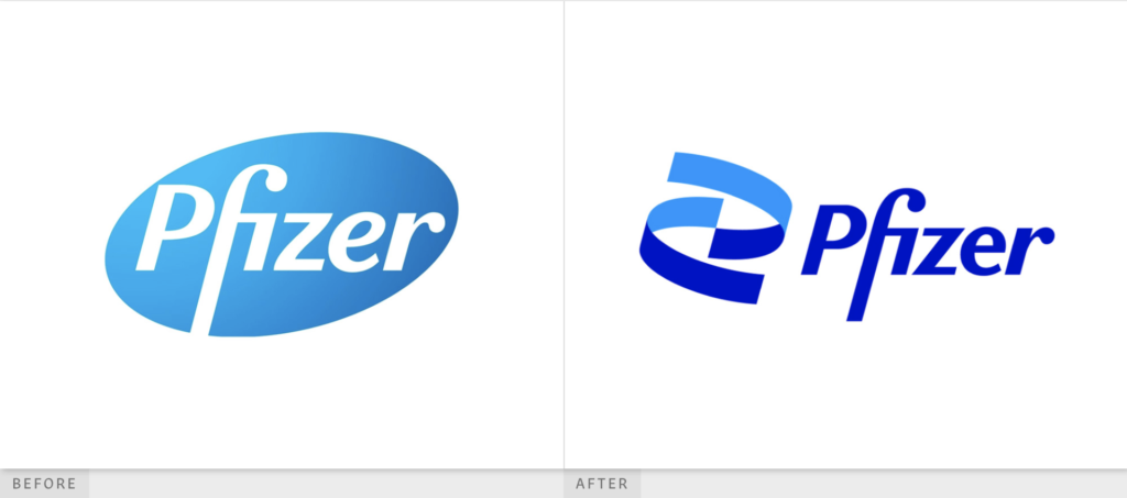
By March of 2019 the pandemic hit the United States hard. We grappled with new concepts of wearing masks, isolating from others, and being excessively hygienic. Pre-pandemic, I honestly didn’t pay much attention to pharmaceutical corporations. They only seemed to show up in the news when there was a merger or lawsuit. The virus thrusted them into the spotlight, especially Pfizer Inc. To my surprise, Pfizer had been around for quite some time and is considered to be one of the largest pharmaceutical corporations in the world. Their scientific breakthroughs and research gave them their name. As they raced alongside others to rapidly produce the first vaccine and save millions of lives from COVID, a New York based design team was quietly rebranding their entire visual identity. Pfizer officially revealed their new identity a few weeks ago. The timing was impeccable.
Albert Bourla, CEO of Pfizer announced, “After 171 years, we arrive at a new era. A time of extraordinary focus on science and dedication to patients. Pfizer is no longer in the business of just treating diseases — we’re curing and preventing them.”
(Pfizer)
At this moment, more than 400,000 lives have been lost to the pandemic. People are looking to Pfizer for hope and a brighter future. Now more than ever, their brand must evoke the spirit of innovation and progress.
Photo from Brand New
The largest adjustment to the logo is the replacement of the oval-shaped pill with the DNA symbol. At first glance, I question why they would make such a drastic change to something that was working. Can Pfizer really just claim the symbol of DNA? DNA is essential to all science and many other healthcare brands. I decided to dig a little deeper into their justification.
“Pfizer has become much more than a pharmaceutical company. Our new logo signals this shift from commerce to science. We’ve unlocked the pill form to reveal the core of what we do: a double helix, spiraling upward.
The logo is constructed of two interlocking forms. Their unity reflects our passion and dedication to the science behind our innovations, and to the wellbeing of our patients.”
Official Statement from Pfizer
After reading that, I am mostly convinced. I should acknowledge that the context behind this change does matter. As a pharma giant, they need something holistic, forward-moving, and impactful. DNA is pretty powerful.
The curvature of the DNA lines exist in motion and wrap around nicely. If you look closely, the two corners touch in the center which connects the two segments conveying the idea linkage. And, to make it even better the top curve follows the fluidity around the P of ‘Pfizer.’ This leads my eyes to the word Pfizer itself. The type is on a solid baseline and matches with the middle points of the DNA. I would be intrigued to see what the ‘f’ would look like if it matched the bottom most point of the DNA. Although, I do think the elongated ‘f’ allows the viewer to learn how to pronounce the company’s name. It’s almost as if they are sending us a clue that the ‘P’ is silent. That’s clever.
Photos from Brand New: Posters (Left), Booklet Covers (Right)
Since the DNA is the heart of the new identity, Pfizer makes sure to take it a step further by incorporating a 3D element of this logo. The double helix can be seen from various angles, with different textures, and at times in conjunction with other bacteria-like visuals. It’s made specifically to account for digital mediums. There are some areas within their marketing materials where the helix is abstracted to the point where we just see blue 3D shapes or lines. This is where I feel they lost the essence of the symbol. Their attempt to communicate a ‘new-era’ through complex dimensions generally works, but the 3D formatting needs some work.
Photo from Pfizer
Pfizer picked a bold color palette and I think this risk was worth it. They need something that draws attention, sparks energy, and feels pure. That being said, the application of the palette can be improved. The use of the cyan, dark blue, and white look spectacular in their 3D mockups, yet many of their 2D advertisements only utilize the dark blue and white. Their secondary palette seems almost unnecessary at this point in time.
Photo from Pfizer
As for their typeface (Noto Sans), I’m a fan of the clean lettering. There is a lot going on with their new logo so balancing this out with a universal font was a sound decision. In practice, the tracking looks comfortable and pairs well with their photographic visuals. The framing is consistent on their collaterals regardless of the language the type is in. For a company that plays an integral role in saving lives, simple is definitely better.
Overall, I thought Pfizer designed a beautiful visual identity. The DNA took some time to grow on me and their applications of it are imperfect, but ultimately I feel that it communicates what their company is all about. Curing and preventing diseases is no simple task; their new identity gives them the credibility that they will do it.
Photos from Pfizer
Sources
“A New Pfizer.” Pfizer, www.pfizer.com/new-pfizer.
Bruell, Alexandra. “Pfizer Introduces New Logo Playing Up Role in Drug Creation.” The Wall Street Journal, Dow Jones & Company, 5 Jan. 2021, www.wsj.com/articles/pfizer-introduces-new-logo-playing-up-role-in-drug-creation-11609844400.
Piper, Daniel. “Pfizer Tries to Inject Some Life into Its Logo (but Does It Succeed?).” Creative Bloq, Creative Bloq, 6 Jan. 2021, www.creativebloq.com/news/pfizer-new-logo.
UnderConsideration. “Hold Your Pfire.” Brand New: New Logo and Identity for Pfizer by Team, www.underconsideration.com/brandnew/archives/new_logo_and_identity_for_pfizer_by_team.php.
Wong, Henry. “Pfizer Rebrands to Mark a ‘New Era’ of Science and Research.” Design Week, 7 Jan. 2021, www.designweek.co.uk/issues/4-10-january-2021/pfizer-rebrand/.
This week we studied media theorist and philosopher Marshall Mcluhan, who is most known for the phrase “The Medium is the Message.” He presented the idea that while we have the power to shape the tools we use, our tools also shape us. I think it is crucial to analyze the effects of media platforms in order to understand design’s role. At a high level, graphic design and media work hand in hand to communicate messages through interactive visual content with a goal of engaging users.
Marshall Mcluhan’s theories were definitely relevant during his time, but I think there has been such a drastic shift in the way we receive messages that the topic at hand is more complex. We do not live in an equitable world, our methods of communication have changed, and the way we interact with others is not what Mcluhan entirely imagined it would be.
In my opinion, Mcluhan’s “hot” and “cold” classifications are too binary for the world we live in today. There’s another factor in place which is that each individual values platforms differently. This can impact how immersed we are in the media. The theory is also based on how active the viewer is in the consumption of media. Between social media, regular news outlets, and other forms of consumption there is now a huge issue with oversaturation. When we consume but not absorb, this theory and classifications lose their full value.
Aside from the hot and cold theory, the concept of a “global village” was incredibly thought provoking. This builds the foundation for conversation regarding mediums, interactions, and immersivity. To some extent our current state lines up with Mcluhan’s initial idea; We do exist in this massive bubble and have the potential to reach millions of people we couldn’t have before. It is remarkable that people hypothetically have access to the same information. That said, there are so many implications that we are seeing with the technological advancements of media platforms.
As we’ve seen in the past few years, social media companies have gained immense power. They now have the ability to create 2-way communications between multiple users. I was listening to a talk on CBSN a few days ago about Facebook’s Cambridge Analytica scandal. A whistleblower, Christopher Wylie, walked through what had happened with the reporter. Essentially, millions of users’ personal data was being used for political advertising purposes. This brought up various ethical questions including how social media can be used for divisiveness and turning people against each other. Wylie approached the concept of segregation in social media communities. If these platforms aim to connect their users to others with same-minded views, then are we really being connected to a broader global community?
I think these questions are really important when talking about how we target our designs to specific audiences. In marketing and design we often see ‘segmentation’ as a tool for creating a preferred experience for our users through specific mediums. Visual content has a lasting impact and can shape the ways communities interact with one another. As designers, I personally think we have a duty to be educated on the complexities of this digital age.