A critique of the accessibility of Sans Forgetica.

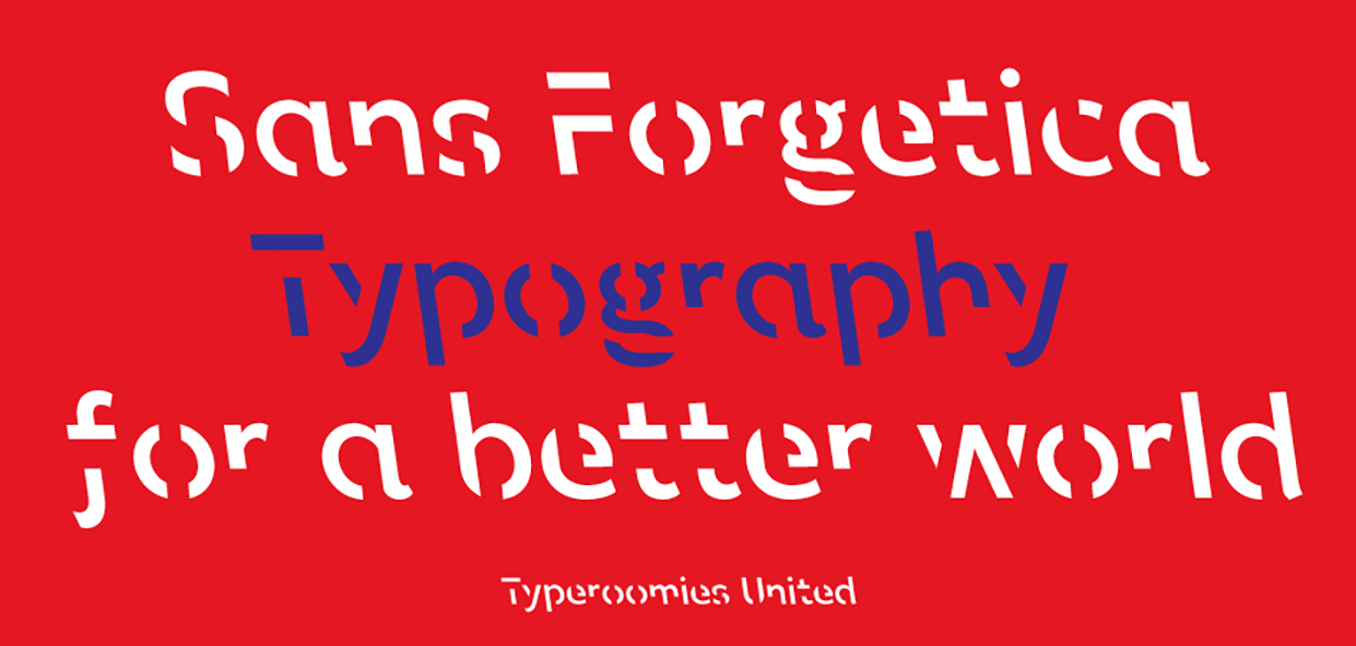
Sans Forgetica, a font developed by researchers at Melbourne’s RMIT University, claims to be a font that assists in the development of memories from reading. Below are some images of the typeface.

The science of type: Sans Forgetica is probably the world's ultimate study  hack | TypeRoom
Sans Forgetica font - free for Personal

I chose Sans Forgetica as my topic because I have incredibly mixed feelings. Sans Forgetica is, in my opinion, an equally gigantic step in the positive and negative direction for accessibility of students and differentially abled individuals.

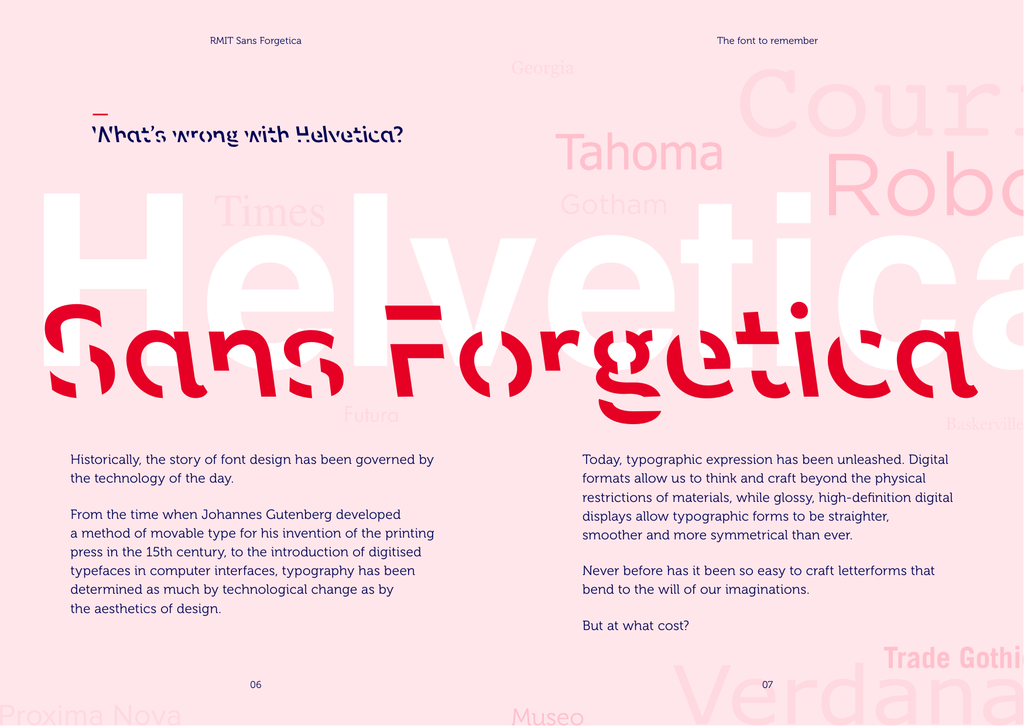
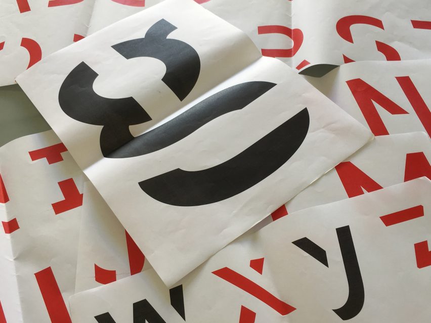
Supposedly, the function of this typeface is to utilize the psychological principle of Desired Difficulty — utilized through adding strikethroughs, adding slants, and missing elements to the typeface to make it more difficult to read — to increase the amount of the text that is remembered. As best put by the creators themselves, “Faced with an unfamiliar set of characters, the mind seeks to complete the shapes, which slows it down. By dwelling longer on each word, the brain has more time to engage in deeper cognitive processing, which enhances information retention.”

Through a case study performed at the university where this typeface was created, it was found that amongst all test subjects, an average of 7% increase in memory retention was generated by the use of the typeface.

This font, while not utilized anywhere or commonly known about, stands as a massive step towards accessibility for those with retention deficit disorders and other learning disabilities. Interestingly, however,

I think it is incredibly difficult to say who this font would be good for, and who it would be terrible for.

Researchers at Melbourne's RMIT University have created a font that aids memory

My first thought seeing this typeface is that it would obviously be terrible for those with dyslexia, off the bat that’s obvious. However, upon further inspection, were this font to become standardized, (I have no grounds to make this statement other than stipulation) it may hypothetically have a positive impact, as these strikethroughs make each character EVEN MORE distinct from one another compared to what is typically possible with most fully legible typefaces. Or, maybe it’s just outright awful like my gut feeling tells me. It’s really difficult to say without more data.

My second thought is that this may actually be an incredibly advantageous typeface for those — like me — that have ADHD. By demanding an additional level of processing, this typeface may actually satisfy some of the multitasking needs of brains like mine when it comes to extended reading sessions. OR, it may just be outright absolutely terrible, and cause brains like mine to simply become distracted by the process of deciphering the text rather than actually reading it.

Again, I feel that this typeface is incredibly controversial. There are some groups that it is obviously terrible for, some groups that it may be incredibly good for, and a WIDE RANGE of differential abilities that it’s impossible to say whether it would be great or awful.

Regardless of all of that, I think more testing into this subject of differential typography could produce wildly interesting and beneficial data regarding how fully legible fonts could be developed for everyone as well.

Annotated I-Search Bibliography.

APA Style. Accessible Typography. American Psychological Association. Accessed Feb
23 2021. Link.

APA, the “author”, is the American Psychological Association responsible for the commonly used APA writing guidelines, in addition to many other contributions to the field of Psychology and English.

This source was surprisingly insightful regarding various misunderstandings that even I — someone who suffers from accessibility issues regarding my adhd and its negative interaction with various typefaces — believed. For instance, the myth that essentially created my motivation for this project — that serif fonts are inaccessible. That stated, however, the failing of this article in my opinion is that it primarily if not solely addresses typography from the reading perspective, not the writing perspective. For instance, it talks at length about the accessibility provided by screen readers, however — while this is a fantastic tool for many — this won’t assist me or many like me when attempting to write in a specific typeface for an assignment. That quarrel aside, there were many highly valuable notes about factors other than just typeface that are important for accessible typography design, “including size, color, justification, letter spacing, word spacing, line spacing, character thickness, screen resolution, print readiness, and other audience and media issues.”

Typography For Lawyers. A brief history of Times New Roman. Accessed Feb 22 2021.
Link.

Typography For Lawyers (2nd Edition) is a resource printed by Brian A. Garner (A Lawyer and Writer) and Matthew Butteric (An American Typographer). It was created to attempt to improve the state of typography within the legal system.

While this source is brief, I investigated this source in attempts to find out why Times New Roman (hereafter referred to as “TNR”) is such a universal standard for typography. It was an interesting read for sure, like learning the history of why the font is thinner than other fonts due to its daily newspaper conception. That said, I really wish this short article continued as it concluded abruptly right as it began to address my learning objective; ending on a paragraph about to NOT USE IT if you’re given the choice, then not explaining why. Oh well.

Williams, Gareth Ford. A Guide to Understanding What Makes a Typeface Accessible.
UX Collective. Aug 14. 2020. Accessed Feb 22 2021. Link.

Gareth Ford Williams is the head of UX design at the BBC, with a stated speciality and focus on User Accessibility and “Universality”.

This source was an incredibly useful read as — while I am familiar with many accessibility issues within typography — this covered a wide range of issues on a level deeper than simply “Serifs are bad” or “Serifs are good” — speaking to specific ways that various ability differences interpret various assets of a typeface. This source breaks down many of these factors through explanation of the development of one of their own typefaces, BBC Reith and Qalam, wherein they used neuroscientists and psychologists to vet the accessibility of the typeface at every step. 

Wood, Jennifer M. Times New Roman is Bad for your Career. MentalFloss. January 22
2016. Accessed Feb 24 2021. Link.

Jennifer M. Wood appears to be a bit informal of a source, but is a lead editor at MentalFloss, and has previously been a writer for WIRED, Rolling Stone, and more.

This article, while comparatively informal, was wildly interesting and brings up the longitude of the debate I hope to focus on: Is Times New Roman an innately poor choice to standardize? It references a variety of studies that show that a résumé written in Times New Roman is more likely to be ignored, in addition to general other typography styles that will get ignored or represent oneself poorly. While not entirely relevant to my topic ideal, the studies it referenced may be.

Design, Politics, Ethics, and their crossover.

“How does the inevitable intersection of design and politics make you feel?”

I think an important distinction to be made is the difference between politics and ethics, with the distinction being best put by a Quora answer I found while researching this topic:

Ethics is concerned with the moral behavior of people.”

Politics is concerned with the management of society and its compliance with the law including the legislation that has been based on ethics.”

Personally speaking, I believe that the intersection between politics, ethics, and design is not only inevitable but also important, as — logistically speaking — good design is the effective communication of ideas, and all ethics are ideas. Design being used to communicate ethics is inevitable. That said, as politics are rules-based upon these things, for politics to also be involved in design is an important part of the political process.

A political world without the involvement of design is a world created with inaccessibility in mind. The primary function of design in politics, aside from persuasion, is typically accessibility and communication, so for that to be removed would be to remove people from their own political process. I believe that designers have an ethical responsibility to remain vigilant in acknowledgment of their role and responsibility in the political climates they work in and contribute to.

The classic example, of course, is the danger of being hired as a designer for an ecologically irresponsible oil company, tasked with communicating a new eco-friendly face for the company. While this isn’t necessarily “politics”, it is ethical in nature, which — in my opinion — should be treated as one and the same by any designer.

It is important to stand up for what you believe in as a core right of being human. I, for example, have very opinionated ethical beliefs that I stand by firmly in both my speech and my design. Being a passionate debater myself, it wouldn’t be possible to remove that part of myself from my design, nor would I want to!

A Comparative Critique of the Pentagram Warner Bros. Rebrand

When speaking to design students and peers about the various works of Pentagram — the design firm hired for the Warner Bros. redesign in 2019 — the receival is always mixed. Some rave about the beauty of minimalism and the iconic and recognizable form of a Pentagram design, while others tote their frustrations with how everything falls to the wayside of monochromatic sans-serif designs. When looking through the Pentagram catalogue, I can understand this critique. While I personally am a huge fan of minimalism and the use of “simple is sexy” in design, you’d be hard pressed to find more than a gradient or two in their entire design catalogue. That all said, despite its controversy online for being the death of a nostalgic classic, I personally love the redesign of the Warner Bros. logo due to it’s respect of the source material and attention to detail in both design system and application.

When looking at the transition from left to right, I understand the negative gut reaction of many, as at a first context-free glance, they took an iconic staple of our collective childhood conscious and flat-ironed it into another bank-of-america logo. From a distance this rebrand can be interpreted as disrespectful to the depth and cultural significance of the original. That said, having researched this rebrand with the initial goal of explaining why it is so bothersome, I found nothing but reasons to appreciate it – not through explanation or defence from the designers but rather through the visual applications of the rebrand itself.

For instance, when looking at the typeface designed to accompany this new “modern” Warner Bros. logo, I actually find joy in the amount of character and feeling they’ve retained from the original. It could’ve been some random helvetica clone like everyone and everything else, but they made a very intentional choice to leave the playfulness and childhood wonder in even the most menial details. It’s not the world’s most clean or professional typeface, but it screams Warner Bros from the lungs of each and every character.


This opinion isn’t a common one, however, as shown by Visual Objects Logo Redesign Survey 2020. This survey, conducted by Visual Objects, surveyed 1001 random individuals across the US in regards to their feelings on the Warner Brothers redesign amongst others. From this survey, they found that 89% of respondents had a strong preference of the original, while only 11% like the new look.

My belief is that the two following sets of images explain why. They showed the fans too much of the first — the flat bank-of-america style white and blue logo — and not enough of the second — the actually soulful application of this branding to the identity that fans care about.

What I think they showed too much of:

What I think they showed too little of:

In the examples from set two, — what they needed to show more of — the actual intention, application, and soul of the redesign shows itself. The issue I have with the presentation of this rebrand is that — from an outside perspective — the pride of the designers in the logo itself outshone the pride in the company and Warner Bros. IP.

My honest opinion, looking through the various applications of the design system Pentagram designed; is that it’s beautiful, respectful to the IPs, and thoughtfully designed. My issue with the rebrand as a whole is that they forgot to do the part where they show people 99% of what they actually made. It appeared from an outside perspective like they slapped a thoughtless golden ratio in there and dusted off their shoulders, because they failed to fully represent the amount of attention to detail that went into the works. 

Honestly, it’s a shame. It’s a beautiful rebrand with nothing but frustrated eyes to look upon it due to its presentation.

NieR Automata as Disproval of the Hot/Cold Theory of Marshall McLuhan

For the given prompt to assess the accuracy of McLuhan’s “hot” and “cold” media theory, I provide the example of NieR Automata — a video game developed by Square Enix — to prove the outdatedness and illegitimacy of categorizations of forms of media by their mandated or assumed level of user participation and “thought”.

To begin, it stands to be noted that I agree wholeheartedly with his statement that the medium is the message. As I will explain through this post, NieR Automata is a piece that would not function to a fifth of a percent as well as it does in storytelling if it were portrayed in any medium other than a video game. It would not work as an art form in the way that it does without the strength and interactivity of the medium in context of its message.

(As a side note, so this doesn’t come off as the heated ramblings of a nerd, it stands to be noted that NieR automata received NAVGTR nominations and awards for “Best Writing in a Drama”, “Character Development”, “Camera Direction”, “Best Score”, and many more. This is a piece of artwork that is internationally acknowledged, despite being frequently ignored due to it’s medium by professionals in the art and design scene.)

To summarize for context, NieR Automata is a game about philosophy that hides its true intention under layers of analysis and attention to detail. It is a game that requires being played through five times, despite giving no mandate that the player do so. On your first playthrough, it intentionally presents itself as a very non-serious arcade-style game, wherein you are an android with a sidekick that is deployed to save the earth by killing robots: A very stereotypically fighter-type videogame that is meant to be played for fun with no deeper meaning. In this first playthrough, the medium itself is red hot. Everything is provided for you, and you are — by design — intended to play through it mindlessly for simple enjoyment with little work needed to be done for interpretation or “definition”. When you beat the game, there is a small hint saying you should play it again, but — by design — you feel satisfaction having done your job, beat the bad guys, and having needed little participation other than holding the controller to have enjoyed the piece.

It is in pressing the “New Game” button that the application of McLuhan’s theory falls apart, and the true nature of the piece reveals itself. This time, you play as the goofy sidekick, who is useless in combat (the purpose of the original playthough) but has the added “gimmick” that he can read the robot’s thoughts. It is through playing through the game again as the useless sidekick that the meaning of the story gets flipped on it’s head, and the dark philosophical underbelly of the piece becomes clear. Through an understanding of your opponents’ thoughts, you learn that they view you identically to how you view them — and that there are a variety of different schools of ethical thought at play in how you determine your actions through the game, through deep analysis of rule-utilitarianism through the applications of socialism versus laissez-faire capitalism. While it is far too complicated for me to continue to summarize, I fully encourage you to research it — or just play it — to truly understand the depth of this game, and how it intentionally causes the viewer / player to analyze their own thoughts of the world outside of the game, their political beliefs, their ethics and definition of virtue, and even in a final masterstroke, question whether or not videogames can be used as a true and respected art form, or if they are limited to being just silly things meant for enjoyment — all through the relationships of the various parties, factions, and characters within the same plotline, played through multiple times from multiple perspectives. I consider it the video game equivalent of Ender’s Game in relation to its sequels. A true masterstroke.

It is at this point that I would entirely view this game as an example of the coldest piece of media I have ever experienced, despite previously and concurrently being an unimaginably hot piece of media. Not only are you experiencing it in “high definition”, but it now requires you to analyze your views of life, research various political and ethical topics, and fully call into question your ethical views on psychological concepts like in-group and out-group and how they apply to your own life. Not once have I ever experienced even a book, as a frequent reader of philosophy, ethics, and psychological theory, that has called such active participation and interpretation (to such a degree as the internal analysis of self.) as this video game.

In the same manner that this video game proves that any medium can be either infinitely cold or infinitely hot by McLuhan’s theories, I put forward the claim that this is only one example from the infinite possible examples that the “hotness” or “coldness” of a medium is decided entirely by it’s use and by the level of participation put forth by the viewer themselves, based upon the infinite complexities of the persona that lead them to that viewing of that media. A book can either be low definition and require high user participation, but could also be a book designed as to be high definition in a masterstroke to defy the medium. A movie could be considered hot, but if it is a movie designed to call into question the world itself and call in outside thought and personal interpretation to fully understand the levels of detail and complexities of itself, does that not make it also cold?

It is for this reasoning that I explain that McLuhan’s theory of hot and cold are completely irrelevant and in many ways restrictive to the content creators of every medium — an attempt to categorize and minimize the infinite complexity of the human mind and ability to make individual meanings of every medium from the viewer, and a limitation upon the content creator themselves. It is for this reason that I strongly dislike this theory and disagree with it.

James T. Hartman

About Me

Howdy! My name is James, and I’m a designer with a passion for making things. Not just digital designs, but physical tangible things. From model atoms to roller coasters to board games, my happy place is a maker space with a woodshop, a laser cutter, and a 3d printer. In fact, I began my career in design from such a space, learning how to use adobe illustrator initially just to create CAD files for a laser engraver!

My dream job would be to take my design knowledge and my maker training and apply them in the field of children’s prosthetics, pairing with a bioengineering team to design prosthetics that do not make the wearer feel self-conscious, but rather empowered, like the “Iron Man Arm” project that was based out of the University of Central Florida.

Outside of that, I spend my free time designing content overlays and animating content for content creators on youtube and twitch, and helping people grow their audiences online through visual identity.