Reality BYTES

Parzizal, ReadyPlayerOne

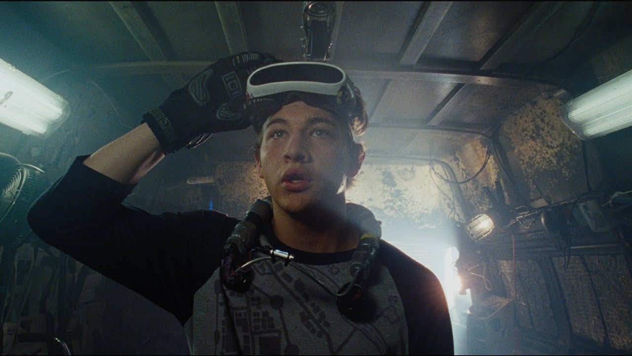
The future is here, and it looks a lot better with goggles on. VR technology is nothing new, in fact it has been around since the mid-80’s. If you want a history click the link below. https://www.fi.edu/virtual-reality/history-of-virtual-reality#:~:text=The%20use%20of%20the%20term,technologists%20were%20developing%20simulated%20environments.

What I saw in the 90’s is nothing compared to what we are using today. Virtual Reality is being utilized in such a way now that the visions of my younger self only dreamt of as a possibility. With the accessibility of VR increasing for that of consumers and the drop in cost. It doesn’t seem so far fetched for a dystopian future of that of Ready Player One. But outside of the gaming and entertainment industries, there are many other realms of possibilities for VR.

  • Military
  • Healthcare
  • Education
  • Design

This is just a short list but each one encompasses a lot of potential uses. The US military uses VR in all branches for use in combat training and in flight simulators. Also in the realm of military and breaching into healthcare is the use of VRET (Virtual Reality Exposure Therapy) . Which is being used for the treatment of PTSD in Veterans returning from combat. In Healthcare VR can be used in ways similar to that of combat training in the way one would prepare for surgical situations and learning how to perform different procedures. Which not only would save money but could also save lives.

Educational aspects are that imagine a class in high school social studies learning about Ancient Rome or Pompeii. “Okay class, everyone don your goggles and were going to visit the Colosseum and then we’ll go to Pompeii.” Being a visual learner I would love that class.

What I find most interesting and see as a compelling future use for VR in in the way of design. As you see in about every aspect of life and in our desire to be part of social media, seems to be marketability for advertising within the digital space. AR (Augmented Reality) although slightly different can produce similar results. Where VR- removes the user from the physical environment thru a headset. AR- allows the user to become part of the experiential environment. This is usual thru a mobile device and QR codes, that allows you to find “easter eggs” throughout the world you are traversing. So say like Pokemon GO for example. These items in your environment that you would find has computer generated information embedded within it.

Companies like Scope AR, which is a global leader in developing augmented reality solutions and products for industrial clients focused around field maintenance, manufacturing, and training. This company makes not only goggles but also develops the software that is needed for this function. So a company can have an environment built that has all the specs to a specific piece of machinery. And all the information needed to make repairs or run diagnostics on that machinery. Simply place the Scope goggles on and you can make repairs on that equipment with real time instruction and guidance

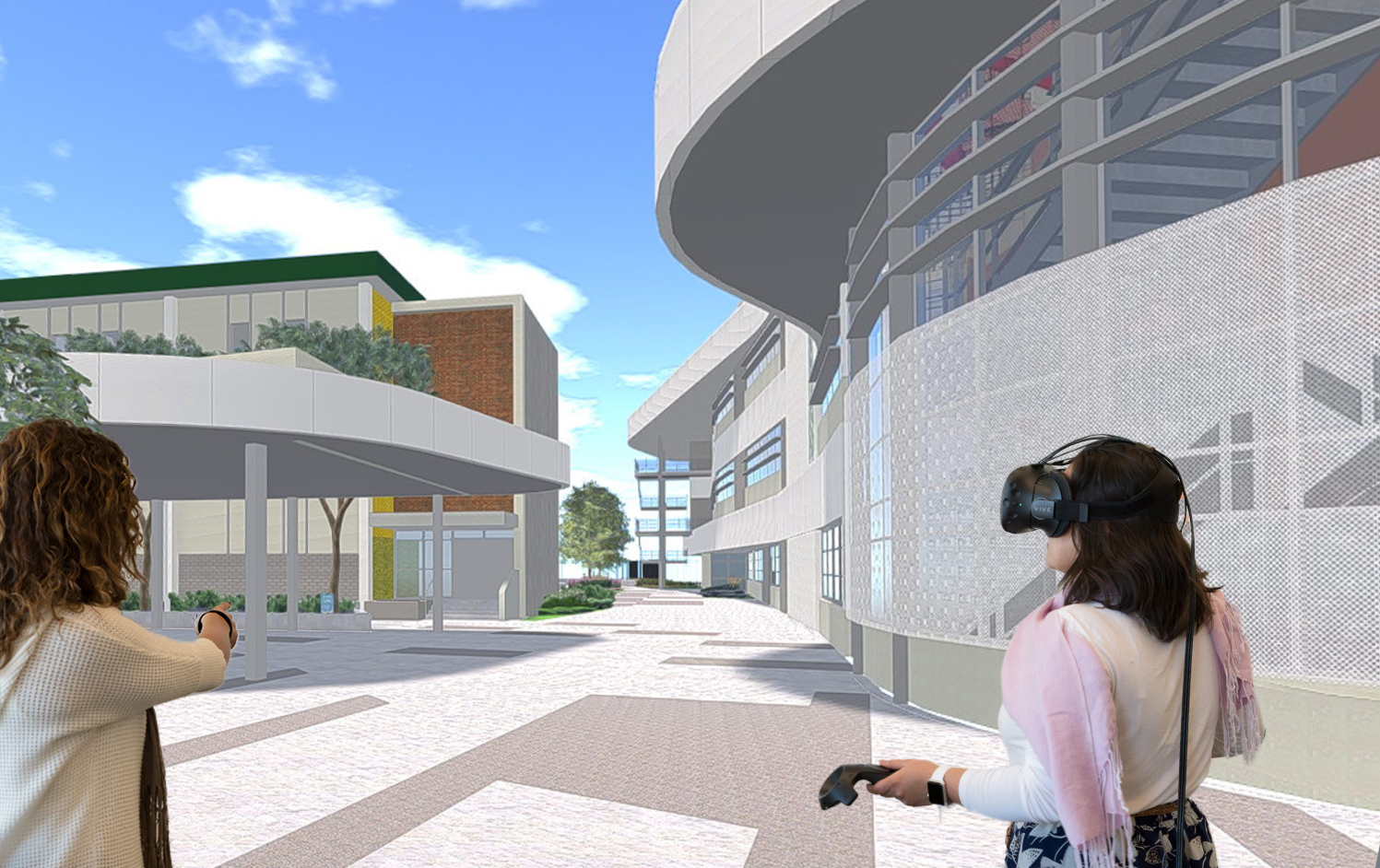
I see so many possibilities within graphic design that I could being used. Like in the process of environmental design. I’m sure programs like Sketch up are used in ways to be able to show the client how the existing environment would turn out after a design campaign is brought to completion. But making it possible to walk thru a space in VR both before and after a design implement has to be a nice option.

Where the initial audience and usage may have been within the gaming community the increased availability, size and cost reduction of computers has opened a new realm of possibilities for VR . Perhaps a Virtual or Augmented Reality Renaissance is apon us.

This is not what I asked for!?

There are a myriad of inventions out there that I could talk about with the intent of assisting a disabled audience. However, I don’t find the benefit of tearing apart products that assist those with needs. So we are going to discuss the Roomba! Yes thats right!! Likely the only robot that you will own in your lifetime. Not what I envisioned as a young child when watching the Jetson’s.

So, lets bring the attention to the robot on the right. This item was built to serve a purpose and that one was to clean your floors. To sweep being more specific. Some might think that to own a Roomba by iRobot is excessive, or even lazy. But the invention and the design of the Roomba meets the mark on many levels. Yes the concept for the Roomba is to clean your floors. But the real winner in the idea is those that have limitations to continual cleaning of there house. Even at the entry level model of the Roomba it meets all requirements of someone who has barriers allowing them to clean their home.

Design

Simplifying the overall design of the vacuum was the first success in my opinion. The old design is really bad if you think of it. Sure it’s nice you can stand upright while operating a vacuum but it’s impossibly difficult at times to clean under things. So building the Roomba with a very low profile makes absolute sense. Leaving the ability to clean under all those hard to reach areas.

Cost

Admittedly the Roomba is not the expensive nor is it all that affordable. Many folks who really can benefit from the function and ability of the Roomba, likely wouldn’t have the ability to attain one or have the means within their disposable income. Ranges vary in price from $299.99 up to $899.99. I don’t care what you say ,that is a hefty purchase, that many can’t afford.

Problem Solving

The Roomba fixes the problem and not the person. Looking at the user as a person with a disability with mobility. It solves the problem with the ability to perform a task as simple as sweeping. The entry model basically starts and goes forward until it bumps into something and them turns and keeps on until it bumps into something and repeat. All you have to do is empty the hopper. Unless you want to invest $$$ it traverse your home with much more efficiency by mapping out your home.

Conclusion

As i said this is a purchase that answers an easy issue that many have. The inability to clean your floors, due to physical limitations or due to lack of time or desire to perform the menial task of sweeping. I don’t find that anyone is really excluded from the design of the Roomba at least not in the sense of its capabilities but more some in the realm of being able to afford the product. If the actual purpose for this product was to assist those with a decreased ability to clean then the price should be lowered to offer more people a chance to own one. Otherwise sale it for exactly what it is… a vacuum.

Designing for Environmental Good

We need to wake up and realize that our efforts to promote social and environmental good are at best flawed. Many a woman and man has come forward and given everything to fight for civil rights and social justice. Yet, here we are in 2021 and people are still at each others throats and sound one way while on Social Media. But present differently through the way the lead there lives. Colin Kapernick, in efforts to bring a spotlight to the continued police brutality and systemic racism, gave up his professional career as an NFL quarterback. In reaction to him being “persona non gratis”, there was a large call for the NFL to be boycotted. Yet, millions continued to support their teams and players continued to play.

I believe this campaign is how we need to move forward with everything. Social good and justice in my opinion will always be an uphill battle. Until we are all the same color or classified as one race; there will always be resistance. Cynical but true, at lest in my opinion.

So lets design to change something that we can effectively change. Environmental good is not only good for us but good for future generations. But we can no longer design like this. This is clearly an ineffective way to talk about serious climate change or environmental good. Yes this is great to reach the next generation but there also needs to be a more effective message that reaches the ones in power.

Designing in regards to promoting environmental good. Instead of building new structures to house people, that require the use of new materials. Convert old spaces into viable living spaces for our increasing population. Or go a step further and instead of completely changing the landscape, design to the fit the landscape.

Admittedly there comes an issue with that of turning old buildings into new living and retail spaces. The ugly head of gentrification. That is a whole-nother level of social good discussion. So instead of going down the rabbit hole and getting lost in climate change lets take a look at some effective efforts in design and the positivity of environmental design.

I think these are two examples of effective efforts to bringing attention to environmental good. They are not generalized ads to save (insert cause). These are to very specific messages. Yes the sugar cone with the melting earth is a little broad, but I think we get the point of climate change and global warming. Now the gun turning to smoke stack is brilliant!! Nothing more synonymous with killing than a gun. Straight forward and I think understood across many generations.

Now in the realm of packaging design and beyond, these are but a few examples. Loop is brought to us from parent company TERRACYCLE, whose global mission to eliminate the idea of waste. By giving another option other than recycling. Basically, its what many people have been doing for years when going to markets that promote using your own containers or the reuse of containers for bulk products. Their goal of breaking from the cycle of use and toss to use and reuse seems to be taking traction as there increasing presence in worldwide grocers. My new favorite is packaging that has a second life. These compostable packaging of the oranges also promotes the lessening of food waste.

There is a way to a better world in both the realm of the environment and social good. We just need to find a way to combine the two .

The only thing is that we need to do this on all levels of society. Not just in white suburbia, this has to be a change in every neighborhood.

What Rock the Vote!! Meant to me.

Its hard to think for myself as to… wait I actually remember when I became aware that politicians were speaking to me! As a young 17yr old, dying to escape the backward values of Oklahoma.I remember Bill Clinton taking questions on MTV and Rock The Vote. Unfortunately I missed the opportunity to help “ROCK THE VOTE”.

Rock the Vote, founded in 1990 by Jeff Ayeroff

BILLS MANY PINS

I mean this spoke to many of us in High School. I grew up as an Army Brat; for those who are not familiar with the term it means: a kid whose parent (usually dad) was in the military and kinda lived in a strange limbo between on base and off base realities. Being the son of an enlisted man also meant a couple different things. 1) your mom was usually from another country( Korea,Germany or somewhere in Central America) 2) by default you were Republican. Well for me my mom is from Panama and I’ve been a democrat since being able to vote except I did vote Republican once. Good ol’ boy George W. Bush. Anyhow it was a strange new feeling that our opinions mattered. Many of us paraded around the school with the Seniors wearing our Clinton or Perot pins. Some wore Bush. Other than the design of different ways to make your name an running mate look like a flag. The design for us was through that of MTV and publications like the Rolling Stone. But the pins really say alot.

Wow, that last one I’m sure is very disheartening for many. I wonder how it makes people question the values of this campaign? I’m sure that the men and women who voted for Clinton in ’92 and ’96 felt the same way about that flag as they feel about it today and another flag that was flown about as blatantly in the past 4 years.

DANGEROUS GROUND

The flag to the right speaks to and warrants the same feelings as the image of the confederate flag in the Clinton/Gore pin above. So how is it that a campaign that spoke to so much change and created a lot of positive change for our country chose to use that pin to promote their political campaign? Surely part of it comes from the fact that Bill was once the Governor of Arkansas and that just so happens to be in the “South”. But does it work? When your also pushing for racial equality?

There was a direct approach to the MTV generation. A smart design to get the youth activated and to go and vote. Young people with fresh ideas and the desire to be part of Al Gores drive to end climate change. At this time in life I felt empowered to make a change. Having multiple candidates to choose from. Where there seemed at least a slight glimmer of hope from any of the 3 candidates. Unlike this past election, where the only hope that our world around us wouldn’t burn is by removing the incumbent by whatever means.

The Rock The Vote approach should have been the glance into the future of running a campaign. Either through the use of the WorldWideWeb that was so new to us or through the designing of different approaches to the same campaign (as we saw above in the Clinton pins). Now instead of MTV we have social media.

With the growing use of social media and its influence. A lot of the thought and research to which politician you backed and the platform or campaign that their promoting has been designed and gift wrapped for our consumption. So as to make it easier to discover what they are really for and who that they stand for. But with this ease should also come a sense of precaution. Because no matter your thinking on the validity of the person running for office and the campaign that they run, there are a myriad of influencers behind them. The South has been historically a Democratic Party. But just because your a Democrat or a Republican shouldn’t automatically define your principles.

The rock the vote campaign was very successful and its mark is still felt today. But I really wish there had been more voice to the blatant use of the confederate flag on the pins in the ’93 election. Regardless of the pin thank you for exercising your ability to go out and ROCK THE VOTE!!

UPS and its strange love affair with Brown and Gold

I’m certain that everyone has seen this logo show up outside their door on the side of a large brown truck, or be handed a box with its logo attached and have had some feeling of excitement.

I mean, Everyone loves a package. Apart from that feeling of joy, the excitement ends there with this new UPS logo.

At least for me…

In, 1907 a young James Casey started The American Messenger Company. They delivered small packages to retail stores until 1913 when they acquired their first delivery vehicle (a Model-T). In 1916 they merged with a competitior and formed Merchants Parcel Service. This growth allowed them to expand delivery outside of Seattle. They then changed their name to UPS and adopted its first Logo, a depiction of a Eagle flying with a package within its claws. From the evolution of the Nazi-esque Eagle carrying a parcel to the present rendition of the UPS logo. There has been only one constant; the use of the original colors of Brown And Gold and the shield. 

My original thoughts of what the logo meant were that of the sun rising on the Earth and perhaps that, UPS was always working to deliver your mail promptly. Sounds good but not what it means. UPS has evolved from that of “swift,safe,secure” to “The Delivery System of Stores of Quality”, which seems pretty elitist to me. But I guess you have to promote your business, especially if you’re trying to survive the Great Depression.

To the third update in 1961 designed by Paul Rand. Which like many other people happens to be my favorite of the company’s different variations.

It really is a great design that not only touches on the original design of the shield but represents what they’re most none for (packages).

To the update back to the Brown and Gold shield with the weird reflection above the U, which was to give the logo a “3D” feel? Thankfully they changed it in 2014 and took away the voluminous look and to the now more relevant flat look.

The Brand colors are pretty simple and I’m sure most would agree, boring. But seemed to have worked well for UPS. That odd combination has made UPS stand out amongst its competitors for a century. 

And like a lot of companies UPS has there own propritery font, which makes absolute sense. Not that it’s as noticeable a font, as say NIKE’s Futura but along with the Brown and Gold it works.  

The marketing for UPS seems to be predominately on two fronts. On the automotive side; in their use of the traveling bill boards on their signature (BIG BROWN TRUCK), which is usually blank. Here we see it emblazened with a promotion for a Taylor Swifts album, Reputation. Which, simultaneously hints to the reputable and swift delivery of UPS. Well done. 

And there is also the sponsorships of Golf, NASCAR and Formula 1 Ferrari. 

Outside of the above mentioned sponsorships and the  Taylor Swift promotion. UPS has focused more of its advertisements and commercial content to promoting the use of The UPS Store and all the things you can do for your business or for yourself. Funny commercial but the highlight to me is perhaps how boring or one dimensional the woman is during the speed dating session. Which even though not shown until the end reminds me of the boringness of the UPS logo.  

In closing it seems that without the strange combination of the Brown and Gold colors, UPS is nothing more than a strange direction or part of an exercise that you do at the gym. A 100 year relationship with two colors that scream your company name when seen together, I can only imagine is a hard one to break from. But maybe its worth a change. I still think the logo is pretty boring but like they say, “if it ain’t broke don’t fix it.” 

The Medium Is The Message

China.org.cn

The medium is the message. What does that exactly mean? According to Marshal McLuhan it means the nature of a medium is more important than the message itself. This I find pretty much right on point and also very disturbing.

We live in a world that is dependent on information and the ease of receiving such information. Where we once had to wait for travelers to bring us news from the far reaches of our imagination to newspapers and then radio and then to our modern age of the cell phone, the importance and integrity in the message seems to have been diminished as well as the we were receiving such message.

The phrase “Don’t shoot the messenger”, I’m sure comes from some violence brought upon an individual that had the hard job of delivering some type of bad news. It seems today we don’t even bat an eye to the messenger and at many times for a certain sect of people don’t even question the message. The messenger (the medium) for this thread has evolved from being a worthy source of truth into a vehicle of 1/2 truths and political agendas. We used to place a lot integrity in the way the medium delivered the message to us. Probably the last form of media that is still given that “trust” is through print. Newspapers place an immense amount of research into the stories they chose to run with. Unfortunately in our Hi speed age it has become hard to decide where to place that full trust. The same news story is told differently when comparing from FoxNews, CNN, and ABC. That skew in information to specific audiences are what I believe is the danger in our society.

As our world continues to become more connected digitally and up to the second news, we seem to become more divided by the sources that play upon our differences. As our nation sits on a powder keg full of fears and anxiety we feel a moment of relief by removing a near by flame. But is it enough?? Or has the medium of the last 4 years played to the fears and insecurities of those receiving a message filled with hate shrouded with false patriotism, done irreparable harm? I guess we will have to wait and see….

GREETINGS AND SALUTATIONS

Hi, my name is Garland Nichols. I am a “nontraditional” student? Whatever that means. Basically, I’m like the rest of you and have found a desire to feel my life with things that I find inspiring and beautiful. I was in the USNavy and have lived mostly in Oklahoma and Texas. I’m married to a kickass RN and have a 13yr old son and toooo many animals, 5cats/5dogs.

As far as design, I’ve always been interested in typography the way we used to make things. I find myself always questioning how and why did we as people trade away beauty for convenience? I find design inspiration in many things, but mainly in vintage advertising and packaging. Which has fueled my vice of collecting random items from fruit labels to the packaging for a single straight razor and cameras. I also love photography but more of the product photography aspect. My desires after graduation is to work within a company large or small filled with creative folk of all degrees and will give me the feeling that I did something that is fruitful to our society.