Launched in January 2021, Riot Games launched a complete rebrand of their League of Legends Championship Series (LCS). Beyond the more modern aesthetic and color changes, this redesign marks the start of something new for Riot. With a complete redesign of their logo, the addition of a punchy motto, and structural game changes, the LCS rebrand sets the stage for a new era in competitive gaming. But does the rebrand stray too far from its roots in an effort to reach new players?
League of Legends is a unique, team-strategy game that began as a philosophy towards game production. Co-founders Marc Merrill and Brandon Beck wanted to foster a community around the game by making it free-to-play and continuously releasing updates to the content. The gameplay itself is multiplayer, and it’s built on cooperation and team dynamics. This aspect of the game builds a community of players that continue to return to the game because of the evolving gameplay. In turn, the game itself is quite literally built by many as it requires a community of players for it to thrive.
After an explosion in popularity after its release, Riot saw an opportunity to host a tournament for cash-prize and dubbed it the LoL Championship Series.
The first LCS was held in 2011 in Sweden, and its identity was built off of League’s colors and values. Using the gold and blue from the game’s colors, Riot created a badge-like emblem for the tournament logo [Figure 1]. As you can see from the images above, the LCS even uses a very similar typeface as the game itself does. At the time of its creation, LCS needed to attract people using the renown of the game.
[Figure 1: LCS launch logo 2011]
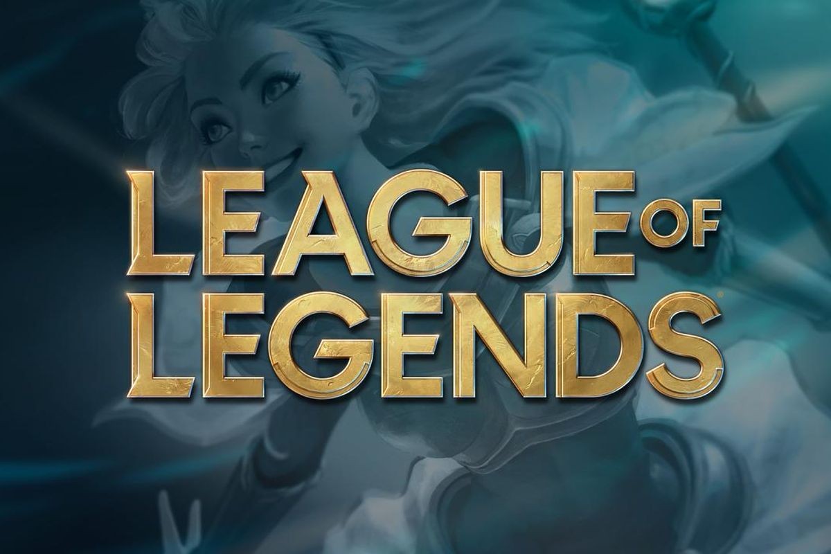
[Figure 2: LoL game title]
Personally, the original launch logo is strong in my opinion. The badge or shield emblem backing the type immediately makes me think of a competition and the gold color connects to what the players are striving for: first place.
However this shield/badge emblem lasted a long ten years and in the 2019 redesign [Figure4], it was reduced to a clunky, muddy looking logo. They removed all of what made the LCS a spectacle; it looks like a neighborhood youth soccer team logo.

[Figure 2: LCS logo 2019]
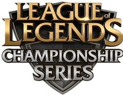
Now, after ten years since its creation and a reputation of its own, LCS launched a new brand identity after New Year’s 2021. It is a stark contrast to the old emblems, and branches out by using a new color palette, totally different type, and gets rid of the old badge look. Now the logo stands by itself, apart from the aesthetic of the game.

[Figure 3: New LCS logo 2021]
The new LCS logo launched with the motto “Made by Many.” The motto definitely speaks to the game and tournament’s origin. It incorporates and recognizes the players that built the community that is now so widely popularized. It was smart to add this motto to a new, more modern logo as it brings the past into the relevant here and now. Also, the composition of the logo itself speaks to the multiplayer aspect of the game itself.
Among the gaming community however, the new logo received mixed reviews. While many players recognize that the old LCS logo looks ancient in comparison to its European counterpart, who produced a wildly successful rebrand in 2019, they say that the new logo seems rushed and is too far from what LCS represents.
The difference between the mixed reviews of this rebranding and the success of the European leagues redesign can be seen in the composition of the logos themselves. The new LCS logo does make a strong impression through the bold choice of color, but the simplicity cheapens it. The new typeface is condensed and missing its ornate serifs, and the logo itself is lacking the strong black that gave the previous logo versions a sense of formality and strength. I think the thing holding this logo back is the mark itself. The violet could have worked, and the new font could have worked, but the logo is simple without having depth. Yes the letters together make a diamond symbol that is similar to the final’s trophy, but there is nothing more. This logo feels shallow.
In contrast to this, the European logo [Figure 5] is simple, but also has a depth to it. The black crown logo elevates the composition by giving off a sense of seriousness and status. The red is bold and the subtle gradient backing the lettering leaves a strong impression for viewers.
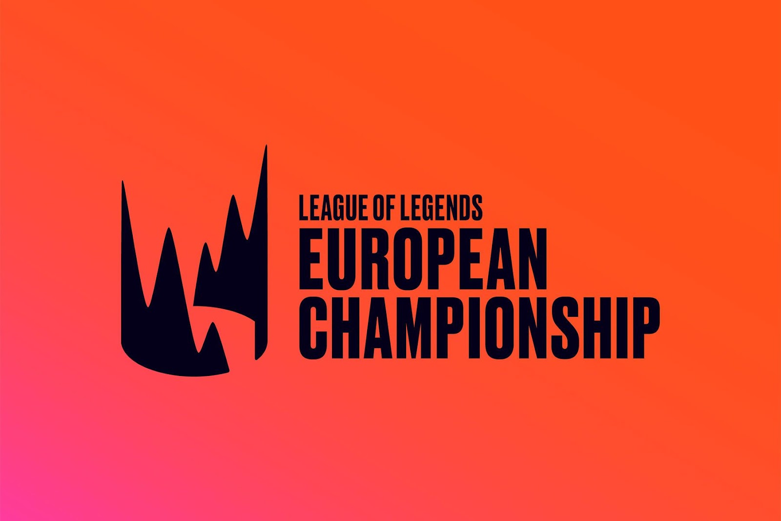
[Figure 4: European Championship logo 2019 -]
Regardless of the critiques, this new LCS logo marks the start of an identity of its own. I think there are definitely more changes to come for this logo in the future, but the most important part of this rebranding is that it sets the stage for a new era for its own brand. The recognition of the fact that after ten years, LCS is a large event within the gaming community makes this composition stronger. However I fear that this logo’s lack in depth and stature inhibit the competition’s appeal for both new viewers and old players alike.