Having implemented an access point for board designers to enter into the Board Editor from the main Mahjong app, the next phase for this project involved conjuring up what we want the user interface to look like and thinking about how we will interact with the Board Editor.
Upon entering the Board Editor for the first time, I felt the designer should see a blank backdrop, which can be accomplished by essentially just removing the GameView to have the MainView displayed with the BoardEditorView laid on top/pushed into the Views vector.
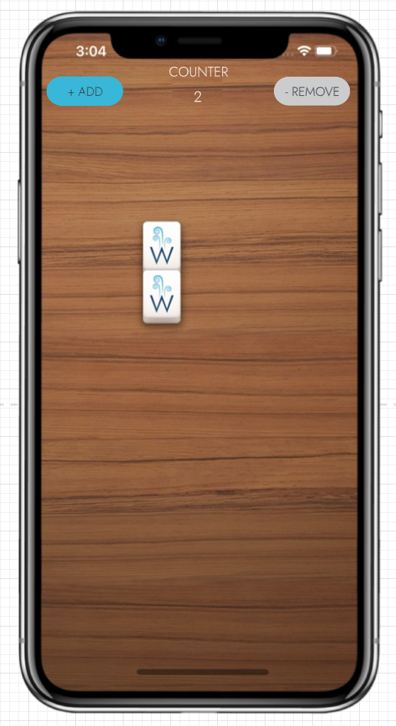
Besides the tile free background, there needs to be a way to specify that touches to the backdrop are for adding more tiles or, alternatively, that selecting a specific tile that you no longer want in that position allows the tile to be removed. Two pill buttons at the top of the backdrop could accomplish this, one for triggering an add mode and one for triggering a remove mode, and an indication of which mode is currently selected. Brainium often uses a specific blue color in toggle switches and in the Options Menus of our games to show a specific option is selected, so it makes sense to use this as an indicator that the particular mode is selected.
Finally, one of the important features of a valid board design is that the board includes an even number of tiles. While making a board design, it would be very easy to lose track of the number of tiles that have been placed and thus it makes a lot of sense to include a counter that increments/decrements as tiles are added/removed from the board. Our Mahjong games include an optional Timer that can be enabled and appears at the top of the game screen. This position is a suitable spot for a Counter to appear with a label “Counter” and the current count of tiles displayed below.
Bringing this altogether, the initial UI design for the Board Editor looks something like this:

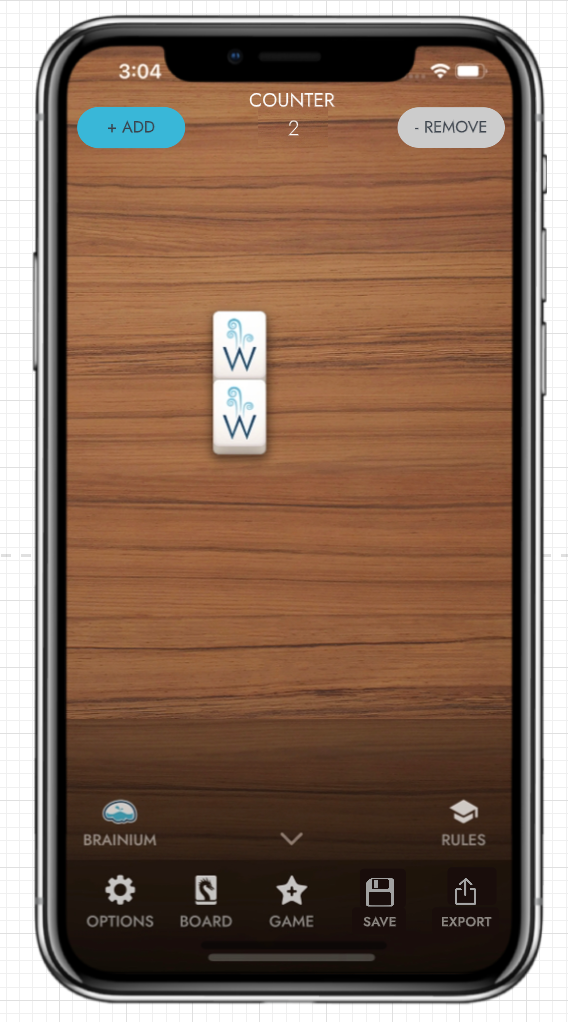
The other crucial UI component of the Board Editor is the Toolbar, which is part of the MainView. The Toolbar as it is designed for the game includes access to the Options Menu, Themes Menu and Game Menu, as well as the ability to call upon hints to solving a puzzle with the Hint button and the ability to go back a step in one’s progression of moves in the game with the Undo button. Much of the Toolbar functionality could still be used in the Board Editor for the purpose of changing the Backdrop in Themes or exiting the Board Editor through the Game Menu > New Game, however Hint and Undo would not need to be utilized within the Board Editor, so either they could be removed when in the Board Editor or replaced with some other functionality of importance.
Luckily for me, I needed to find a logical place to put two buttons for exporting and saving board designs, and two sensible spaces for buttons just became available.
All told, here is the very basic prototype of the UI for the Board Editor:

Looks pretty good, right? Now I just need to figure out how to program these UI elements in C++. More on that later.

