New worlds, New environments, a developing frontier for design.

Modern society is more connected to technology than it has ever been; school is online and we meet with friends through zoom. With a screen in front of us for longer, there is a growing need for immersive, interactive design for digital platforms. 3D modeling is one of the most powerful tools for experiential design. 

     3D modeling began as 3D visualization. There has been attention to perspective within art since the Renaissance, but the intent of making an abstract object look dimensional really came in the 20th century. Early artists like El Lessitsky employed geometry to construct these forms, but the introduction of the computer completely changed the landscape of 3D creation. It offered a new, digital space for objects to exist. 

     Today, studios like Pixar and Disney create worlds and stories through 3D modeling alone. Marvel movies use special effects to fantasize our reality. Oculus Go enables the user to explore the digital realm themselves. Companies like Bitmoji and Genies make avatars for people to create and use for digital communication. These technologies paired with our deeper attachment to technology makes me question the possibilities of design and effective communication within this medium.

     Hotels like marriot are using technology like 360 videos and 3D tours to take users through their spaces. But this technology isn’t perfect, and it’s noticeably clunky for the user. I’d argue that this medium is underutilized and thus underdeveloped. 

     3D spaces can be made for classrooms and specifically science or physics classes that benefit from visual learning. With so many schools only offering online education, so much of the educational experience is lost whether it happens during learning, or the lack of meaningful collaboration, or the fact that there are more barries to open conversations with peers. If more designers put energy into thinking about digital, virtual communication and education more time will be spent developing this possibly limitless medium.

Braille Bricks by Lego

Around August of 2020, Lego revealed a brick design that incorporates braille. Instead of being even rows and columns, the studs are organized to represent the numbers and letters in the Braille alphabet. Lego’s intention is to help blind children learn braille while also enabling vision impared and sighted children play together. This is a wonderful use of the Lego brick design. There is so much potential for this product as it has the capability to be an educative tool, a bridge, and even a way of structuring specialized kits. 

     Vision impared people learning braille often have to resort to audiobooks, but this doesn’t allow for physical use of the language. This method of teaching provides people with a way of learning braille through the actual use of the language. This immersion into the language and the immediate use of it to build lego structures is a very strong way of ensuring comprehension. 

     The letters and numbers on the bricks also can be used as a way of communication and constructing sentences. The kits themselves can be designed so that the structure model actually spells out a message once complete. The letters and numbers also could be used for extremely specific directions for model creation. 

     Lego announced that these bricks will not be available for public use. Instead, kits will be sent to “select institutions, schools and services catering to the education of blind and visually impaired children.”

     I think the prioritization of rolling out these learning devices to institutions in service of Lego’s intended audience is a great way to implement the toy as a learning tool. It also provides access to those who need it most. The delay in public release also allows for design tweaks to be made if users have notes or feedback.

Sustainability and Design

Design has the capacity to amplify, inform, unite and organize people. Successful design impacts people and sticks with them through efficient communication. It also could be our biggest tool in limiting the effects of climate change. 

Beyond just impactful communication, design also has the power to make quality, lasting goods for the masses. This can be seen in many countries, but Russia in particular really took this ideology to the extreme. At the turn of the 20th century, Russian civilians were in dire need of a new government. One that served the people and didn’t leave them to starve. Ideas on collective good, action, and change permeated every asset of society. Even Art. During this time traditional art didn’t have a place in Russian society, and this is what gave rise to Russian constructivism. Most of the traditional artists went into product development at the industrial scale. They sought to take steps towards a better future through making goods for and rallying the people. 

In the United States, we can see that design can also be used to make production costs easier while not sacrificing the integrity of the product. After the second world war, Charles and Ray Eames designed the molded plastic chair. The entire seat of the chair is one molded piece of plastic, or fiberglass, which makes the production really easy. Also plastic offers a wide range of possibilities for standardized, well made goods. 

However plastic production has been proven to contribute to climate change. The worst thing about plastic though is its inability to be broken down naturally. This is why sustainable construction and production is such a necessity today. There is a dire need for change in our stewardship of this planet, and as a designer, we have to impact society and make a market for sustainable design. 

“Writing, Thoughts on a Paper or Screen” a chapter from a book by Steven Heller.

Steven Heller was the art director of NY Times for 33 years and currently writes the visual column in the NY Times Book Review. He is a giant in the design industry and has practiced for many years.

This chapter lays out the advantages of writing out and structuring ideas during the preliminary stages of a design project. Heller discusses how the a fundamental aspect of design was communication. He advocates that the designer has to have a firm grasp on the idea in order to communicate it well. Writing is a great tool for this as it makes your ideas tangible and workable. I’m really interested in his statements on this subject in the beginning of the chapter. He says, “Even if visual literacy is your forte, verbal literacy – and that means the transcription of thoughts and ideas through words – is essential to being a designer.” After this comment Heller talks about voice. I’m really interested in this section as it relates to messaging in design. I want to connect this to design in politics and how agencies have designed depending on the clients political beliefs.

“Writing, Thoughts on a Paper or Screen.” Writing and Research for Graphic Designers:

a Designer’s Manual to Strategic Communication and Presentation, by Steven

Heller, Rockport Publishers, 2015, pp. 31–41.

“Can Graphic Design Help Mend a Political Divide?” by Madeleine Morley

Madeleine Morley is a senior art director and senior editor who works in Berlin. She posts articles on AIGA about design in Berlin.

This article is a discussion on design’s role in politics. Morley interviews the two authors of a book on this subject called The Other Side. The authors, Lucienne Rogers and Rebecca Wright, say the focus of their book is to have people consider the perspectives of those they disagree with politically. After some introduction, Morley asks the authors why they chose to design the pages the way they did. The authors related it back to the goal of the book and said that they wanted to give people the space and time to reflect. This means more empty space and impactful typography. They say the entire book is built off of a central axis and halfway through, the pages flip upside down. The details of this interview also go into the explanation of font choice. The authors go on to discuss their effort to remain neutral in their design choices.

Morley, Madeleine. “Can Graphic Design Help Mend a Political Divide?” Eye on

Design, AIGA, 13 Mar. 2020, eyeondesign.aiga.org/can-graphic-design-help-mend-a-

political-divide/.

“The Power of Political Graphic Design on Elections” by Nadja Sayej

Nadja Sayej is a culture journalist that covers contemporary art, film, TV and music. She’s writes for publications like Harper’s Bazaar, The New York Times, The Guardian, The Economist and more.

Nadja Sayej outlines the roll that partisanship plays in political design agencies. She uses Three Creative Communications as a case study to examine design in politics. TCC is a design agency based in Tennessee and they usually design for liberal political candidates. Though the designers recognize that they share political beliefs with their candidates, they see their work as informing voters of the heart of the issue and showing them a solution.

Sayej, Nadja. “The Power of Political Graphic Design on Elections.” PRINT, PRINT, 16

Sept. 2020, www.printmag.com/post/the-power-of-political-graphic-design-on-

elections.

“The History of Ballot Design is the History of Democracy” by Alicia Cheng

Alicia Cheng is a professional designer who currently works for the Cooper-Hewitt National Design Museum in Manhattan as the director of design. She also works for the high end women’s boutique agency mgmt in New York. She earned a masters degree in design at Yale. She also wrote a book on the subject of this article which is called, “This Is What Democracy Looks Like: A Visual History of the Printed Ballot.”

Within this article, Cheng discusses the history of ballot design in relation to social change to show how instrumental ballot design is to democracy. In the mid 19th century, ballots weren’t cast for votes, and instead people voiced their votes more publicly. This grew more difficult as the US population grew, but there were still problems once the ballot system was implemented. Ballots were originally designed by political parties, and they would often contain propaganda on the ballot itself. By the end of the 18th century, America looked to the Australian ballot system as a structure to base their own off of. The Australian government was in charge of creating a nonpartisan, standardized ballot. By the turn of the century, American ballots were state standardized. Cheng ends with a quote from Richard Childs: “The people must take an interest in all their electoral work if they are to be masters.” This makes me wonder how much voting will change now that people do care.

Cheng, Alicia. “The History of Ballot Design Is the History of Democracy.” Eye on

Design, AIGA, 24 Sept. 2020, eyeondesign.aiga.org/the-history-of-ballot-design-is-

the-history-of-democracy/.

A new era for LCS comes with a rebrand. What does it leave behind?

     Launched in January 2021, Riot Games launched a complete rebrand of their League of Legends Championship Series (LCS). Beyond the more modern aesthetic and color changes, this redesign marks the start of something new for Riot. With a complete redesign of their logo, the addition of a punchy motto, and structural game changes, the LCS rebrand sets the stage for a new era in competitive gaming. But does the rebrand stray too far from its roots in an effort to reach new players?

League of Legends is a unique, team-strategy game that began as a philosophy towards game production. Co-founders Marc Merrill and Brandon Beck wanted to foster a community around the game by making it free-to-play and continuously releasing updates to the content. The gameplay itself is multiplayer, and it’s built on cooperation and team dynamics. This aspect of the game builds a community of players that continue to return to the game because of the evolving gameplay. In turn, the game itself is quite literally built by many as it requires a community of players for it to thrive. 

After an explosion in popularity after its release, Riot saw an opportunity to host a tournament for cash-prize and dubbed it the LoL Championship Series. 

The first LCS was held in 2011 in Sweden, and its identity was built off of League’s colors and values. Using the gold and blue from the game’s colors, Riot created a badge-like emblem for the tournament logo [Figure 1]. As you can see from the images above, the LCS even uses a very similar typeface as the game itself does. At the time of its creation, LCS needed to attract people using the renown of the game. 
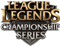
[Figure 1: LCS launch logo 2011]
[Figure 2: LoL game title]

Personally, the original launch logo is strong in my opinion. The badge or shield emblem backing the type immediately makes me think of a competition and the gold color connects to what the players are striving for: first place. 

However this shield/badge emblem lasted a long ten years and in the 2019 redesign [Figure4], it was reduced to a clunky, muddy looking logo. They removed all of what made the LCS a spectacle; it looks like a neighborhood youth soccer team logo. 


[Figure 2: LCS logo 2019]

Now, after ten years since its creation and a reputation of its own, LCS launched a new brand identity after New Year’s 2021. It is a stark contrast to the old emblems, and branches out by using a new color palette, totally different type, and gets rid of the old badge look. Now the logo stands by itself, apart from the aesthetic of the game. 

[Figure 3: New LCS logo 2021]

The new LCS logo launched with the motto “Made by Many.” The motto definitely speaks to the game and tournament’s origin. It incorporates and recognizes the players that built the community that is now so widely popularized. It was smart to add this motto to a new, more modern logo as it brings the past into the relevant here and now. Also, the composition of the logo itself speaks to the multiplayer aspect of the game itself. 

Among the gaming community however, the new logo received mixed reviews. While many players recognize that the old LCS logo looks ancient in comparison to its European counterpart, who produced a wildly successful rebrand in 2019, they say that the new logo seems rushed and is too far from what LCS represents. 

The difference between the mixed reviews of this rebranding and the success of the European leagues redesign can be seen in the composition of the logos themselves. The new LCS logo does make a strong impression through the bold choice of color, but the simplicity cheapens it. The new typeface is condensed and missing its ornate serifs, and the logo itself is lacking the strong black that gave the previous logo versions a sense of formality and strength. I think the thing holding this logo back is the mark itself. The violet could have worked, and the new font could have worked, but the logo is simple without having depth. Yes the letters together make a diamond symbol that is similar to the final’s trophy, but there is nothing more. This logo feels shallow. 

In contrast to this, the European logo [Figure 5] is simple, but also has a depth to it. The black crown logo elevates the composition by giving off a sense of seriousness and status. The red is bold and the subtle gradient backing the lettering leaves a strong impression for viewers. 
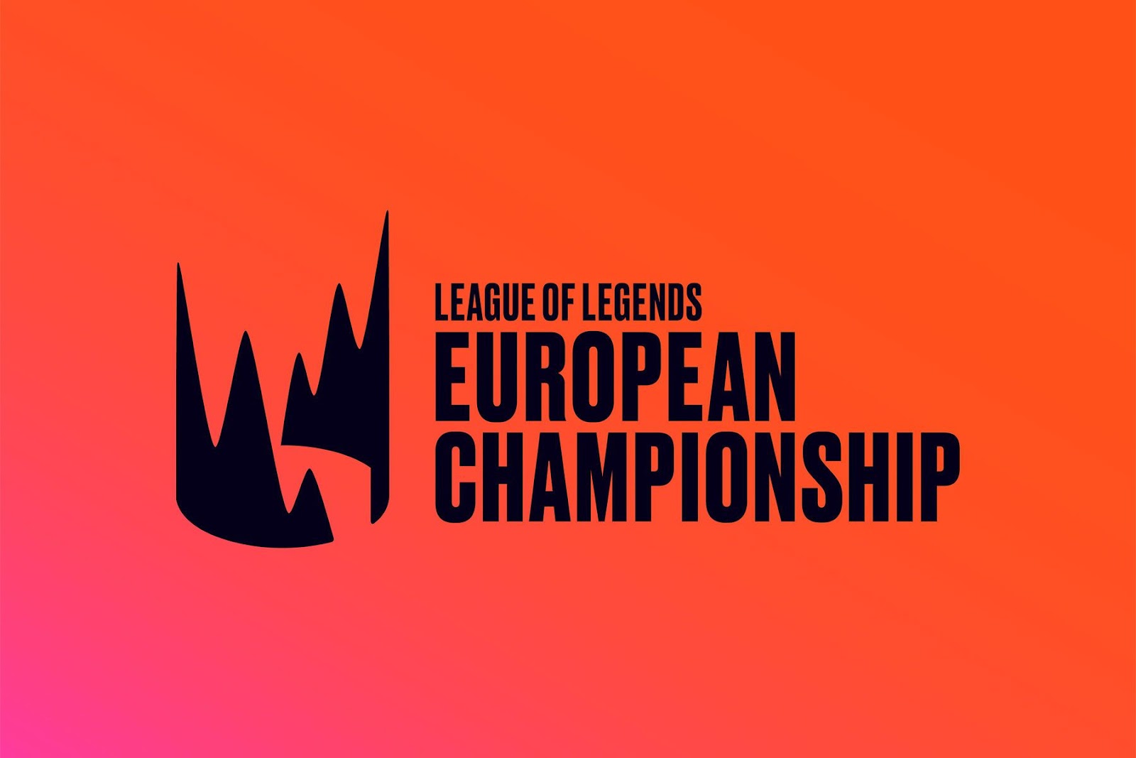

[Figure 4: European Championship logo 2019 -]

Regardless of the critiques, this new LCS logo marks the start of an identity of its own. I think there are definitely more changes to come for this logo in the future, but the most important part of this rebranding is that it sets the stage for a new era for its own brand. The recognition of the fact that after ten years, LCS is a large event within the gaming community makes this composition stronger. However I fear that this logo’s lack in depth and stature inhibit the competition’s appeal for both new viewers and old players alike.

Hot or Cold?

Donovon Horst – Ink and Watercolor 2021

Marshall McLuhan was a communication theorist that looked at different media through a binary lense. He believed that mediums were either hot or cold. Things he considered hot were highly stimulating and didn’t require as much viewer engagement. On the other hand, cold media required effort from the user. 

McLuhan’s theory about how user engagement changes based on the medium is something that I agree with. Watching a movie is a different experience than reading a book, and reading a book is different still from reading a magazine. Something that McLuhan failed to realize though, is that there are cascading levels of classification for the different media we engage with. Not only do the mediums themselves contain multitudes, but the medium can be experienced differently by different people. 

For example, if I were to watch a movie, I would need to follow the action on screen and recognize the visual cues the actors portray on screen. I’d also need to listen to and experience the atmosphere of the movie. If I were watching an American superhero movie, I am familiar with the language, myths/legends/histories that are within our sphere of influence, and the music that compliments the visual story. This would change if I were to watch a French Noir film or a Japanese Animation. I don’t know the language, and I won’t get all the cultural references made within the film. 

As the viewer, there are different ways I can experience the same movie as well. There is an unspoken agreement between the production team and the viewer. It is the job of the production team to make an immersive dream-like experience for the audience, while the audience suspends their disbelief to go along with the movie. If I decide to put on a superhero movie there are different ways I can choose to experience it. If I wanted to be taken along for the ride, I can relax and just go with the flow of the movie. The movie is predictable but colorful and dreamlike which makes sitting back and watching them feel like eye-candy (perhaps this is why they are so popular). But if I wanted to critically analyze how the visual effects were made to look cohesive with the action on screen, my experience would change. It would require more effort. 

Though regardless of who the viewer is and what they seek from the media, the information they are given is what makes their experience different. In a movie, viewers are provided with actors to embody characters, scenery to set the background, and even a camera to tell them where to look. Reading is usually dense with description which requires imagination. In the end, if the viewer has no stake in the content, they’ll only choose to engage with media if the hard work is done for them. 

This is why pop-up ads are so prevalent today, but also why billboards and posters are a large proponent of advertising. Each is placed at eye level and has a message that can be read and understood in less than 5 seconds. Good design is making the viewer take an extra second and making that message stick.