Week 9: Design & Technology
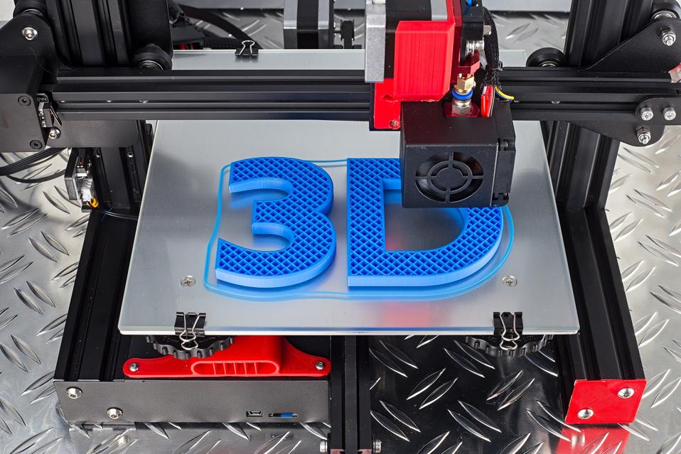
Design and technology are and always have been heavily intertwined, and as humans continue creating more tools, designers will continue finding new ways to incorporate new developments in their designs. A relatively recent technology is the 3D printer. First created for the market in the 90’s by Stratasys and IBM, the printers have come a long way since, now being used in conjunction with CAD programs to create a variety of things, from art and sculptures to computer parts and even cars.
I think 3D printers are theoretically a great asset and tool for designers, currently and in the future as well. With an in-house printer and a CAD program, anybody is able to print out a tool they need. A painter can print out a palette knife, a designer could print out a stylus for their tablet, an architect can print out a piece for their mockup. Having a printer in your possession opens up countless more possibilities.
However, actually obtaining that printer in the first place proves itself to be difficult for multiple reasons, the first and biggest being cost. Even the most affordable 3D printers on the market go for hundreds of dollars, and oftentimes the price range isn’t affordable for most. Additionally, 3D printing entails the use of CAD programs, which isn’t the most accessible. Not everybody has a computer, and people with disabilities might not be able to use the program.
3D printing currently is being used for nearly every design medium, including graphic design, car design, and architecture. It’s also heavily used in the intersection of design and engineering, like with AI. I think 3D printing will not be going away anytime soon, it will only get more prominent in the design world. As people’s roles become more and more automated, 3D printers will become more and more popular, replacing one person’s hours of labor with a simple robot in a significantly less amount of time.
For the last few decades since its creation, 3D printing has become more and more popular and more accessible. What was once a fancy machine you could take a peak at in a robot lab is now something that can be purchased for your own living room with the help of some money. At this rate, hopefully it’ll become more accessible in the years to come, and a common tool for all designers.
Week 8: Accessible Design
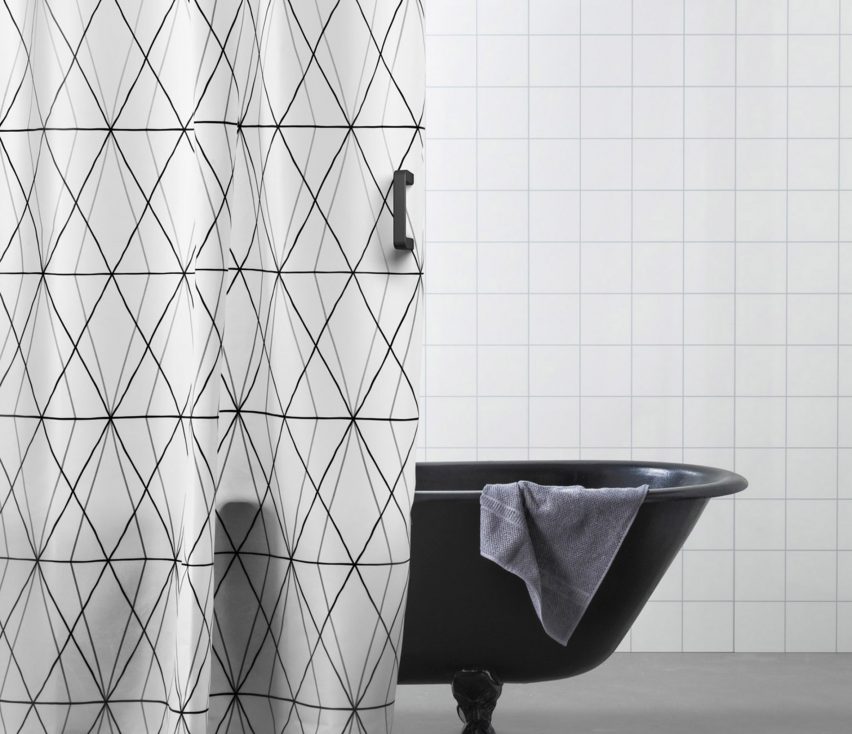
Ikea launched their initiative, ThisAbles, alongside non-profits Milbat and Access Israel in 2019. The concept is an important one: supplying free furniture additions for anybody to download anywhere and 3D print, in order to make furniture accessible, rather than buying completely new furniture.
In the project launch video, the narrator is a person with cerebral palsy, and he speaks about how all his disability-centered furniture “cry out ‘cripple'”, and that he wants to be able to use regular furniture. Ikea is successful at this. They have managed to create simple, easy solutions that are applicable to their already existent furniture that you may have already purchased. You can add a handle to a shower curtain to make it easier to push aside, or you can add a few pegs to the bottom of your couch’s feet to make it easier to sit down on and get up from. All you have to do is dish out a couple hundred (thousand?) dollars for a 3D printer, and you’re all set!
Ikea has a strong vision when it comes to creating accessible furniture and design, and wanting to add a feature to already existing designs is probably a very efficient use of resources. However, I don’t think the initiative is quite as effective as it’s supposed to be. Not everybody had access to a 3D printer or to the money needed for one, and at that rate, somebody might as well just buy completely new furniture that they don’t have to add anything to.
Additionally, if it’s this easy to make a piece of furniture that much more accessible and inclusive, why doesn’t Ikea implement that idea in the actual design, itself? The idea is to allow disabled people to not feel othered by their furniture, so why not create furniture that doesn’t other them from the beginning? Say, a shower curtain that already has that handle on it, or a couch that is delivered with attachable pegs, already in the box. Ikea is one of the largest, leading furniture companies, I’m sure they can afford a couple more additions to their products much easier than most everybody else can afford 3D printing accessibility.
Ikea’s “ThisAbles” is a strong idea that takes important steps towards making more accessible design–in terms of being for those with disabilities, but also in being a global resource that nearly anybody can access. However, some of the drawbacks are big enough that they make the entire initiative, itself, useless for many.
Week 6: Design & Social Good

The best design process is the one informed by current issues within the industry, specifically with the environment and social good. While environmental effects are a huge aspect that I take into consideration when purchasing a product or supporting a brand and their design, social good is something that I really want to focus on in my personal design process, at this point in time. Ideally, I would be incorporating practices in favor of both environmental and social good for my process, but at this point, social good is something I find myself centering most of my efforts around.
As a minority studying visuals, it’s impossible for me to separate diversity and inclusion from media, especially graphic design. While not realizing the lack of diverse representation when I was younger, at some point I noticed it for the first time, and it’s something I haven’t stopped seeing (or not seeing) everywhere around me. It’s something I’ve now thought about nearly every day–whether it’s in movies, books, or just advertisement design, I always pay attention to representation, or its lack, thereof.
As a Muslim, Asian, queer woman in design, I feel varying levels of responsibility when it comes social good, and, more specifically, the representation that feeds it. On one hand, I don’t feel as though I have the same level of responsibility that, say, a white person should have when it comes to creating more design opportunities for BIPOC. I do think that if I ever make it in an industry, I have the responsibility to create more opportunities for more young people in the communities I’m part of. However, it isn’t my obligation to be constantly thinking about my minority identities while designing, I am allowed to design just for the sake of it, and to create things that don’t directly reflect my experiences as a minority. On the other hand, there are minority groups that are more oppressed than the ones I’m a part of, and it is my responsibility to constantly be creating and opening doors for them. For example, as a non-Black POC, I have an obligation to design with a sensitivity for the Black community. This might manifest itself in the form of designing pro bono for Black organizations and initiatives, or incorporating more Black representation within an advertisement.
A huge part of designing with social good in mind is simply hiring more designers from the communities that deserve more representation. These designers are the ones who know themselves best, and they’re also just great designers who have no doubt dealt with years of rejection based on their identities. If businesses and design agencies want to truly implement design for good, it isn’t difficult for them to take those steps. Awareness only goes so far; actual action is how more agencies can start designing for social good.
Week 5: Annotated Bibliography
What Is Hauntology?
Mark Fisher
Fisher, Mark. “What Is Hauntology?” Film Quarterly, vol. 66, no. 1, 2012, pp. 16–24. Crossref, doi:10.1525/fq.2012.66.1.16.
Mark Fisher, born in 1968, was a British writer, critic, cultural theorist, philosopher, and teacher with a focus on writing about radical politics, music, and popular culture. He taught in the Department of Visual Cultures at Goldsmiths, University of London, and was first acclaimed as a writer when he began blogging under the alias k-punk in the early 2000s. Fisher popularized the concept of hauntology, originally penned by Jacques Derrida, and used it to focus on music trends in the 2000s with critic Simon Reynolds.
An article within Film Quarterly, 2012-09-01, “What Is Hauntology?” by Mark Fisher analyzes the concept of hauntology. Part of a greater post-modernist concept, and a pun on “ontology,” the term refers to the idea that, much like a haunting ghost, elements from the past persist in the present. Additionally, we as humans are always looking forward to nostalgia. In Specters of Marx, a repeated phrase is taken from Hamlet: “the time is out of joint.” In Martin Hagglund’s recent Radical Atheism: Derrida and the Time of Life, he argues that the “broken sense of time is crucial,” to both hauntology, as well as his entire deconstructive project. Hauntology is created in contrast to ontology, which is thinking and creating based on existing in terms of “self-identical presence,” or in imitation of what we actually see in real life. Hauntology, on the other hand, is about never being fully in the present–it’s about being in relation to what is in the past (no longer) and what is in the future (not yet). Hauntology can take on two directions: what has already happened but still persists in the present, sort of as a pattern or inclination to repeat; and what may happen in the future, but again persists already, creating an anticipation that shapes our current behavior and reality.
The article connects the concept to many forms of media, including film, music, and literature. There’s also mention of fringe concepts, such as “non-places,” which are places such as airports, grocery stores, gas stations, etc., that resemble more each other than the spaces they are meant to resemble. Both hauntology and non-places are prominent themes in Stanley Kubrick’s The Shining. Hollywood, as a whole, is big on hauntology, in that movies are constantly being created to reminisce the past and create nostalgia, but through constantly progressing and new technology, like obvious CGI.
The Hauntology of the Digital Image
Charlie Gere
Gere, Charlie. “The Hauntology of the Digital Image.” A Companion to Digital Art, edited by Christiane Paul, 1st ed., Wiley-Blackwell, 2016, pp. 203–25.
Charlie Gere is an academic, as well as a professor of media theory and history at The Lancaster Institute for the Contemporary Arts at the University of Lancaster. He has penned several books, and was previously the director of research at the Institute for Cultural Research at The University of Lancaster. He writes on new media art, art and technology, continental philosophy, and technology, focusing on the cultural effects and meanings of technology and media.
This article covers a more general subject that links hauntology to digital imaging and media forms. Representational images are the product of a direct visual encounter, for example a painter painting what they have seen in the real world, or a camera photographing the actual light in a scene. This basically goes back to the entire idea of everything being a remix and nothing being original. In order to create something in the present, at least something of the past is referenced and used, nothing is created for the first time. Art imitates life.
Hauntology is referred to that which is “neither living nor dead, present nor absent: it spectralizes,” according to this reading’s reference of Specters of Marx by Derrida. Hauntology can be seen in the mediums, themselves (also connecting to the concept of the medium is the message), in that there is always a trace or chance of something either “potentially or actually absent, all representations are hauntological.” A digital image is not any more connected to hauntology than an analog image is, but a digital image does present to the viewer a representation that is much more “complex and less immediate” than they might at first believe.
https://ebookcentral.proquest.com/lib/osu/reader.action?docID=4443200#
Keeping track of cycles
Hugh Pearman
Pearman, Hugh. “Keeping track of cycles: trends in architecture, clothes, graphic and product design are all cyclical, as Hugh Pearman points out, but some cycles are longer and more confusing than others. (Private View).” Design Week, vol. 16, no. 15, 2001, p. 12. Gale Academic OneFile, link.gale.com/apps/doc/A97392858/AONE?u=s8405248&sid=AONE&xid=68fd12b0.
Hugh Pearman is an architectural writer, editor, and consultant. He received a degree in English Language and Literature from St Chad’s College, Durham University, then went on to write several books about architecture and design. He was also the architecture and design critic at The Sunday Times from 1986 to 2016, and has contributed to many other newspapers, including The Guardian, The Observer, Wall Street Journal, and The New York Times. He’s also written for many magazines, including Newsweek, Art Quarterly, Royal Academy Magazine, Architectural Record, and several others. He became an Honorary Fellow of the Royal Institute of British Architects in 2001.
Hugh Pearman’s article, “Keeping track of cycles” covers a multitude of mediums and the way design in all of its forms follows a very cyclical pattern. Every trend and style within design has been seen and done before. Most of the article covers fashion and clothing design, specifically, which this concept of trend recycling can be seen most clearly in, through runways and magazines. The fashion designs running and leading the industry, the ones going to art museums to search through historical fashion to find the next new, big thing, aren’t actually doing anything original. They’re leading the movement of picking from the past. As times and technology advances, we go back to wearing what we wore decades ago, just with different materials.
This same concept is seen in other forms of media and design, including building architecture, graphic, and product design. Graphic design trends are killed and revived just as fast as fashion trends are–maybe even quicker, due to the almost purely digital aspect of it. This can be seen easily on internet visual databases, like Pinterest. Product design, on the other hand, is much slower in creating and ending trends because there is so much more that goes into it, physically. From designing, to printing, to creating, it takes more to create product design trends.
Hauntological Shifts: Fear and Loathing of Popular (Visual) Culture
Kevin Tavin
Tavin, Kevin. “Hauntological Shifts: Fear and Loathing of Popular (Visual) Culture.” Studies in Art Education, vol. 46, no. 2, 2005, pp. 101–17. Crossref, doi:10.1080/00393541.2005.11651784.
Kevin Tavin is Professor of International Art Education and Head of the Department of Art at Aalto University in Finland. He has received a BFA, MEd, and PhD in art education, and has been teaching since 1990. His research is focused on art education, visual culture, critical pedagogy, and psychoanalytic theory, and has been published in international art and education journals and books.
Hauntological Shifts connects hauntology to popular culture, specifically visual culture. Hauntology refers to traces of discourses that have helped and currently help us as people form our ways of being and understanding ourselves, as well as the world. There have been many hauntological shifts within art education and its struggle with and against popular visual culture. Many deem popular culture as the bane of the art world, and the “embodiment of aesthetic and artistic suffering.” This is ironic, in a way, given that all art and visuals have been based upon the past–if not current, then at least past popular culture.
The argument against popular culture is rooted in the idea that there is culture, and then its opposite: high culture. Critique of popular culture arose with the rise of the industrial revolution and the lower class’ rise to power, and high culture became something referred to as what “made life worth living,” based on many famous writers, such as T.S. Eliot and Ezra Pound. Dwight MacDonald described popular culture as “a parasite, a cancerous growth on high culture.” He also believed that popular culture “destroyed” moral values and forced adults to “regress into a state of infantil overstimulation.” This distaste for popular culture might be connected to the arts and the high regard originality is held in when it comes to the scene, but it’s also connected to wealth and disparity–a distaste for the underclass.
Week 5: Design & Politics
As society continues to grow and heal, politics and its connection to virtually everything becomes more and more apparent. I think the intersection of design and basically anything is inevitable, and it only makes sense that something as people-oriented as politics would rely on visuals so heavily. Politics are about appealing to specific groups of people. Whether the group is older or younger, white or BIPOC, or countless other communities, it makes a difference on what sort of design will be appealing to them.
The intersection of politics and design doesn’t surprise me, but it does make me trust politicians even less than I already do. While a good logo does a lot to appeal to groups of people–especially younger audiences who grew up in a heavily visual culture–it does have less of an effect than a small, sustainable clothing brand’s logo might. While branding for any for-profit organization is ultimately about selling a product more than it is about being for a group of people, a smaller company always seems to have more of an air of authenticity about it.
Unrelated, but related, I’m reminded of countless Nike advertisements and campaigns. Specifically, the ones they have created in support of the Black Lives Matter movement. In 2016, Colin Kaepernick knelt during the national anthem at a football game as a form of peaceful protest that caused one of the biggest uproars that I had ever witnessed so far in my short sixteen years of life. Two years later, Nike released an advertisement that somehow created also a large amount of controversy: Kaepernick’s face, centered, close up, and black and white, with some inspirational words thrown on top. At the bottom, the Nike swoosh and slogan.

While this ad led some people to invest even more money into the brand, it also led others to burn their Nike sneakers on Instagram. I’ve always had a confusing relationship with the Nike ad, as well as the more recent spot they put out over this past summer during the rise of the BLM movement. Would I have been less cynical of the brand’s intentions, had it been smaller? I’m assuming Nike kind of has to put the logo and slogan on anything they put out, even if they just want to show their support for a movement, but do they actually have to, or do we just find ourselves making excuses for companies over and over again? Is it truly possible for a company to take a political stance without also subtly (or not so subtly) pushing their products at the same time? Does a company ever truly care enough to take a political stance unless it comes with a potential growth in their sales?
Going back to politics, the increasing use of visuals and graphics seems almost like a trap, at times. These people in power who should, in theory, have our best intentions in mind, are using beautiful logos and great designers to push their agenda. It works well, too, at least on me. I mean, I don’t vote based on how good a logo design is, but that definitely does help. A politician knows their audience, but do they know their audience in order to help them, or just to win? Good design is a double edged sword, but I think I do end up leaning more in favor of it–I am a design student, after all.
In Madeleine Morley’s Can Graphic Design Help a Political Divide?, Lucienne Roberts says, “I wonder whether the things that are not trying to take over the world, that are just small marks, inevitably have a greater sense of authenticity?” Similar to (or, exactly like) huge corporations, politicians do the most to appeal to the greater audience, convincing them that they’re no different. But they are different, and at the end of the day, politicians are for themselves, be it with or without a good logo.
Week 4: IFC Logo Comparative Critique

IFC, originally known as the Independent Film Channel, went through a brand refresh by Gretel in 2018. The channel is known for its “offbeat, unexpected” comedies, like Portlandia and Documentary Now!. Its claim is that it’s “always on. Slightly off,” as seen in its at-times uncomfortable, cult classic television shows and movies. If cable channels were one big family, IFC would be the funny, slightly mean, older brother.
IFC is really good about reflecting its focus on comedy with the casual and at times ironic language and phrasing used in their advertisements. I expected to see this in the brand refresh, and was surprised–pleasantly or unpleasantly, I wasn’t quite sure at first glance.
Gretel, the design firm that originally rebranded IFC in 2015, set out to create a brand identity system that was versatile, this time. They came back to the branding system in hopes of helping IFC along with its transition from featuring mostly independent films to airing movies and improv comedy “back to back”. The system definitely is versatile: it’s composed of literally just two typefaces and a single logo.

GT America Black and Editor Regular, the two typefaces utilized in the identity system, go well together. The pairing is clean and sophisticated, which, while usually a good thing, struck me as a little weird when I first saw it. The combination of a serif and sans-serif is beautiful, which is why I found a dissonance between the system and IFC. While good-looking, the serif really reminded me of a newly launched skincare company directed towards Instagram influencers in their twenties. (Some (I) might also say it’s very reminiscent of Time magazine, which is even weirder and more inconsistent). It seemed a little too pretty to be part of the brand guidelines of a company so committed to its indie presence and keeping its tongue-in-cheek voice alive.
However!
IFC’s motto is “always on. Slightly off,” and after sitting on it for a minute, I’ve come to the conclusion that I think that’s actually a pretty great descriptor for the brand system. Analyzing the typography next to the motto makes it instantly ten times more clever and intentional, even if it wasn’t actually. Also, the fact that IFC is satisfied with a simple, typographical branding system plays into the fact that it isn’t confused about who it is, or what it produces as a channel. The simplicity yells that it isn’t trying hard, that it’s secure with itself.

In addition to the branding makeover, Gretel refreshed the logo, as well. The only difference was the removal of the key-line around the letters, making the wordmark more clean and seamless. IFC advertises by layering text on top of clips of their movies and television shows or plain, colored screens, and the logo looks great in practice. I like the removal of the line. I think it makes the logo look less Cartoon Network, but still keeps the very playful and fun energy correlated with the channel at the same time. The logo melts back into every background while simultaneously popping out in a really neat way.

IFC knows who it is, and it knows how it’s seen. The brand refresh was a refresh: seemingly simple improvements that did lots to solidify the brand’s message and overall, for lack of a better term, vibe. I like the logo: it’s nothing crazy, but it works better than the last. I also like the new branding system, after a few days of deliberation: it’s intentional, and it’s cool. It isn’t what you would expect, and that makes the design system feel almost like IFC’s own little inside joke.
Week 1: The Medium Is the Message

Marshall McLuhan spent a lot of time thinking about communication. More specifically, what was communicated, and more importantly, how it was communicated. His claim that “the medium is the message” delves deeper into how the mode of content delivery is just as, if not more, important than the content, itself. Furthermore, McLuhan classifies each form of media as either “hot” or “cold”, referring to how engaged with the media the audience needs to be. While McLuhan’s theory held up at the time he wrote it, time and technology have had a great effect on the classifications of current medias.
McLuhan’s concept of “hot” and “cold” medias doesn’t seem to be very intuitive at first read. He claims that medias that are more engaging with a single sense, such as radio or film, are hot. Medias that demand more engagement and effort from the audience, such as television or phone calls, are considered cold. This concept has become more and more outdated with time, as technology advances and people become increasingly connected with each other.
What were once one-way, fragmentary experiences, are now more tribal ones–a prominent example being cinema. While movie-watching used to be an experience meant for a smaller group of people all in the same theater at the same time, it has since become a global one. People can watch the same movie from different countries, all at the same time and in the same virtual room. Now a more tribal experience with the expansion of technology, movies become a colder media.
Furthermore, technological advancements have resulted in better quality television, which continues to straddle the line between hot and cold. Being more high quality, television becomes similar to cinema, leading to both medias being very easy to understand (hotter), or both demanding the same level of audience interaction (colder).
All medias, whether hot or cold, have an effect on human discourse. As technology evolves and the internet expands, every form of media seems to inch a bit closer to the cold side of the spectrum. We have evolved into a global village, connecting every mode of communication back to the internet. The web has created smaller spaces for virtually anybody with access to form connections over similar interests. Somebody can watch a movie (a hot media, according to McLuhan) and can exchange reviews and thoughts with somebody on the other side of the world right after. Film thereby becomes a colder and more tribal media.
Years after McLuhan’s theory, technological advancements have forced nearly all medias to become colder. The internet has created new ways for people to connect through anything. Radio shows are recorded and posted online, where a listener can stream whenever, wherever, at high quality, and then leave a comment below. Another listener can respond, creating more accessible discourse, and more interaction when it comes to the radio. While it was simple to classify medias as hot or cold at the time of McLuhan, media and content delivery have come a long way, especially with the internet’s ability to connect everybody and everything at all times. In 2021, a completely hot form of media seems hard to come by.