

Endless Bad Design Iterations
Pretty much how I would describe my frontend web development until recently. In more detail the process would go like:
-
1. Get excited about building
some website.
2. Choose a tech stack &
get started.
3. Build site structure &
start styling the home page.
4. Keep styling until I'm
happy with how it looks.
5. Never become happy -
CHASE MY TAIL - get nowhere.
Does this happen to you? My issue was that I was unwilling to make bad sites, but that is all I kept doing…soul crushing.
Salvation From a Youtube Video 🙏
No I am not preaching (although I do know Jesus lol). My favorite web dev’ YouTuber, Brad Traversy, hosted a web designer in a video teaching web design basics for developers. I knew the guy was speaking my language when he used used a Javascript function to teach design.
goodDesign(color_contrast,
white_space, scale,
visual_hierarchy,typography) {
}
Just applying these principles helped me make way better looking sites. Best of all though, I finally got my tail. I am going to go over these principles in the following paragraphs, but I won’t get my feelings hurt if you just go watch the video. It’s pretty great.
color_contrast
The purpose of a website is to communicate information right? So why make your text barely visible. This is obvious, but it is soooo easy to mess this up. So, let’s be decent humans: put light text against dark backgrounds and dark text against light backgrounds.
white_space
Do you like feeling like you are crammed in an elevator (pre-covid) with max occupancy? No… yea I don’t either. When you don’t allow for space between elements on a page, this is how your make a site user feel. Notice on this post, I make sure to properly use headings so there is consistent space throughout the post. The effect is my post is more readable. To make my final point, just look at this site. Take a deep breath before you go there, though.
scale
Does the size of the element make sense? Is it too big or small? If it is, it’s just gonna look bad. You kinda have to eyeball this one. One thing that helps is thinking about the size of an object in relation to other objects (I think that is the definition of scale 🤣). Is the button bigger than the text asking you to press it?
visual_hierarchy
Back to the point of a website’s purpose. Yes, it’s all about communicating info, but some information is just more important. Here is an unnecessary example to demonstrate my point.
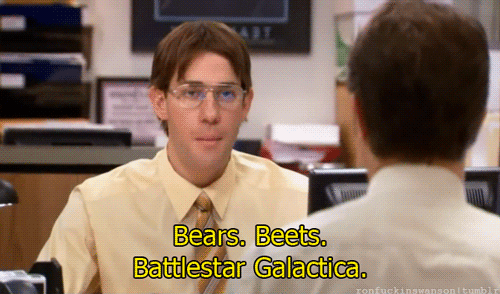
Someone walks into a room and only stays for 10 seconds. You are there and you are selling paper to them (at or near Dunder Mifflin). With such little time, you need to be precise with the information you give them. You can’t go on a tirade about Bears. Beats. Battlestar Galactica. No, you’d probably mention a discount.
Visual hierarchy is all about using the size of elements to communicate importance. That doesn’t mean just making the important things huge. You make some elements smaller TO HELP EMPHASIZE OTHERS 👀. If a user is going to only see three things on the site, encourage them to see the stuff you want by being precise with sizing.
typography
Some fonts just look good. Design is concerned about making things look good, and if you have read this far, it’s fair to say you care about design (and making things look good). The tips I learned were to avoid overused fonts like Times New Roman, sticking closer to Sans-serif, and to be consistent with font types.
Yay, we done.
In conclusion, you can do it. I made some pretty laughable sites before learning these principles but I have gotten pretty decent at design now. And, I really only internalized three of the principles I went over – white space, visual hierarchy, and scale. Take care.
– The Coding Hotdog