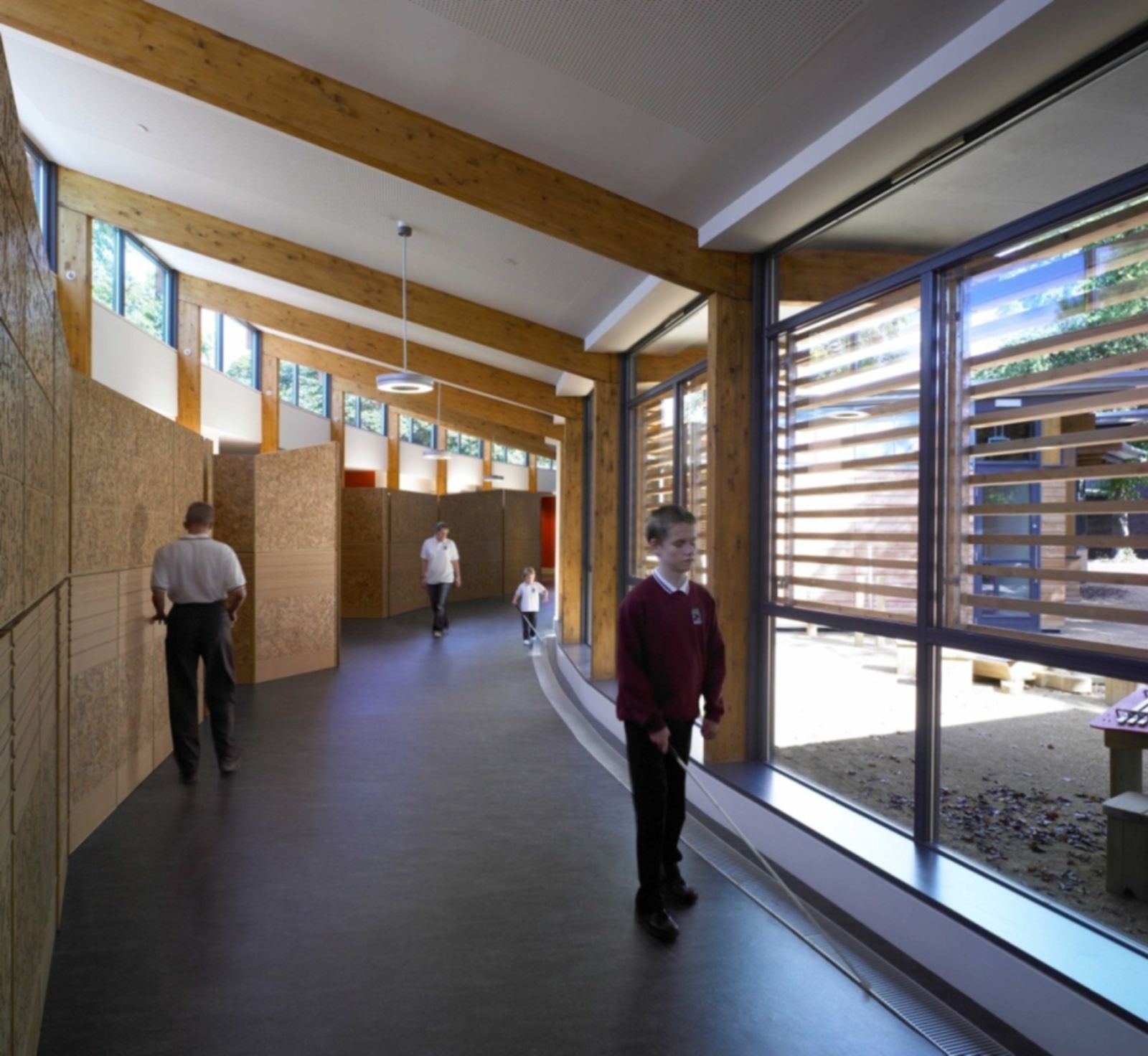
I think graphic designers and others can learn a lot from architectural design, especially when it comes to inclusivity. The Hazelwood School in Glasgow is a good example of design that serves the needs of the community. The Glasgow City Council arranged a competition for the design of a new school building for kids with varying disabilities. The winner of this competition, Alan Dunlop, worked closely with parents, teachers, and students to create an environment that would serve the needs of that community. For kids with visual impairments walls in the halls were made from a cork material that allows for textural navigation. There is also plenty of natural light as well. These types of designs not only serve people with visual impairments. Anyone can benefit from easier navigation and more natural light. We can take these concepts and apply them anywhere to not only make design more approachable for a wider audience, but to also enhance enjoyment and interaction with the design in general.

Architectural design is really interesting to look at because the entire point of architectural design is to serve the person or community that will inhabit that space. This means that architectural design often is trying to fix a foundational issue. This way of looking at design is important for sustainability, inclusivity, and other social issues. The question is how can we make this approach in other design fields such as graphic design? I think the key may lie in awareness and designing for a space rather than a function. Designing for a space means looking at the medium and material usage when applying a design, as well as how that design lives and breathes in the space. When I think about function I am thinking about the formal qualities that the design has. These formal qualities mean nothing if the design isn’t approachable in the first place. In graphic design I feel like we are always looking at the formal qualities opposed to medium, material usage, sustainability, etc.
