Author Archives: ubauz

Welcome To WordPress 3.9: What’s New & How Does It Work?

by 17 Apr 201435 Comments

The latest version of WordPress, given the nickname “Smith” and the version number of 3.9, brings a bunch of great new features to the board.

In this tutorial, you’ll learn about what’s new and how all the new features work.

If you’re an existing WordPress user, you can upgrade your site through the WordPress dashboard. It’s always highly recommended that you backup your full site beforehand as mistakes do happen.

There are seven main new features:

  1. Improved Visual Editing
  2. Easier Image Editing
  3. Drag & Drop Image Capabilities
  4. Gallery Previews
  5. Media Playlists
  6. Live Widget and Header Previews
  7. New Theme Browser

With that said, let’s take a look at each of these in detail!

Improved Visual Editing

The visual editor is now better than ever, with improved speed, accessibility, and support for mobile devices. Pasting in content from your word processor will no longer suffer from styling issues, and posts are now even easier to edit and publish.

So, how can you take full advantage of this feature?

Step 1

Open up your favorite word processor, and select the text you want to publish.

Step 2

Paste it into the improved WordPress post editor.

It’s as simple as that – pasting from your writing software is now super simple and extremely efficient.

Easier Image Editing

WordPress 3.9 offers a much faster way of editing your images, including rotation, flipping, cropping and resizing tools. This can be done within the post editor, and is yet again, extremely fast and easy to use.

Let’s add, flip, crop and resize an image.

Step 1

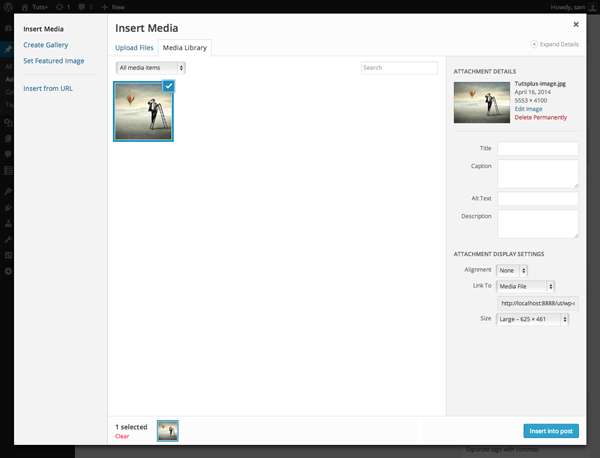
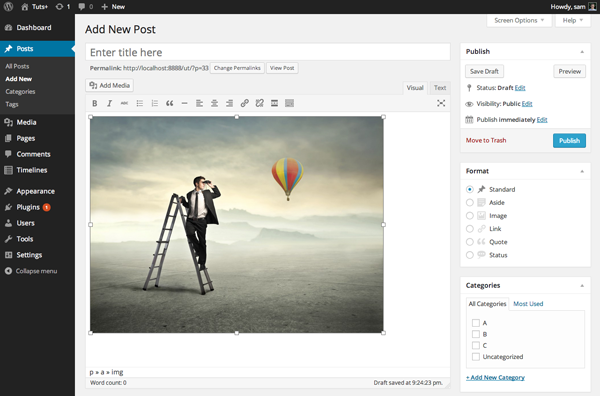
Adding an image into a WordPress post is the same as it always has been: Click the “Add Media” button in the top left corner of the post editor, select the image, and click the “Insert Into Post” button.

Step 2

To resize the image within the post, simply drag the corners. Easy, isn’t it?

Step 3

Once the resized image is in the post, hover over it and select the edit icon, which looks like a pencil. This will display the following window:

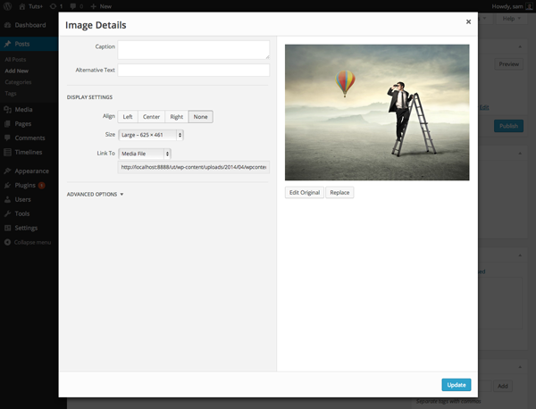
Now, click the “Edit Original” button.

Step 4

You’ll now be presented with the “Edit Image” screen. Here you can rotate, flip, crop, and scale the image.

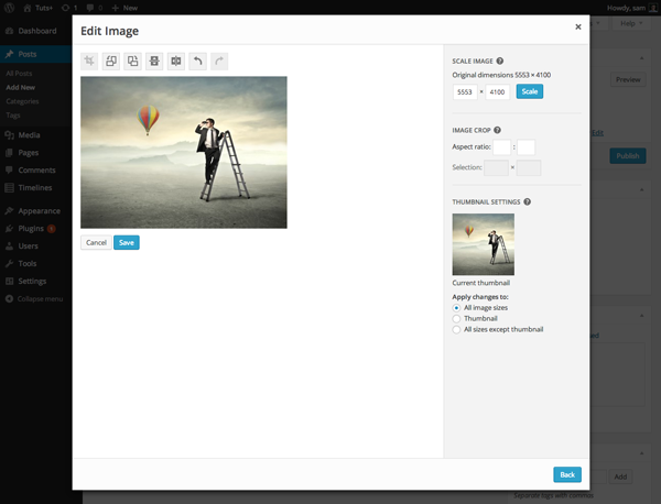
We’re going to flip the image, which can be easily achieved by clicking the corresponding icon from the menu bar above the image.

Step 5

To crop the image, you can simply begin dragging a rectangle on top of the image, and the cropping box will appear. When you’ve adjusted this to your liking, save your changes.

Step 6

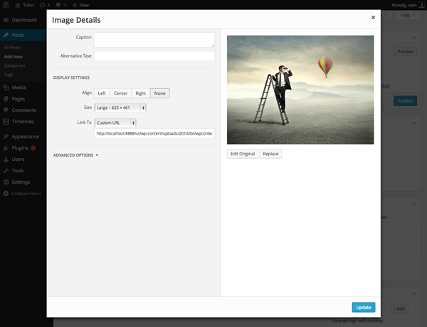
When you’ve returned back to the “Image Details” screen, click the “Update” button to replace the old image with our newly edited image.

Step 7

That’s it – you’ll now see your new image within the post editor.

I’m sure you’ll agree that the new editing features within WordPress 3.9 are really useful, and are definitely going to be a big hit with both new and legacy users.

Drag & Drop Image Capabilities

As more of a simple productivity feature, the ability to drag and drop images directly into a post will be quite useful, especially for image heavy posts.

Step 1

Importing an image using the drag-and-drop method is really simple. Open up your file manager (for example, this is Finder on Mac OS X or Windows Explorer on Windows) and select – but don’t open – the file you want to upload.

Step 2

Drag the selected file onto the post editor until the blue “Drop files to upload” message appears.

Step 3

Once this message appears, drop the file – that is, release the mouse – and wait for the file to upload.

Yet again, another incredibly simple feature that will save a lot of time for both casual and frequent bloggers.

Gallery Previews

In the past, when adding a gallery to a WordPress post, a generic placeholder was used to show where the gallery was. In WordPress 3.9, you can now preview the gallery right within the post editor.

Step 1

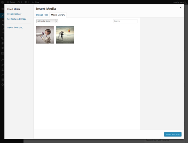
To add a new gallery, click the “Add Media” button above the main post content box. The “Insert Media” window will appear.

Step 2

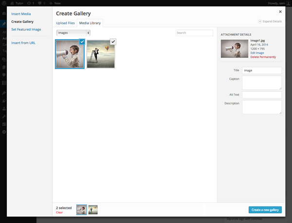
Select the “Create Gallery” tab on the left of the new popup window and select the images you want to include – simply click on each image.

Step 3

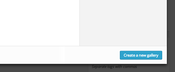
When you’ve done that, click the “Create a new gallery” button, and then amend your gallery’s settings.

Step 4

Finally, click the “Insert gallery” button.
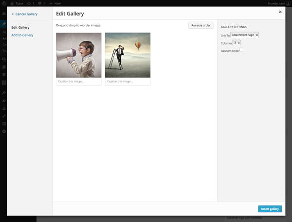
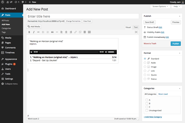
Step 5

You should now see a preview of your new gallery within the post editor as illustrated in the following image:

In my opinion, some work could be done on the appearance of the gallery previews, but it’s definitely a promising start!

Media Playlists for Audio & Video

WordPress 3.9 allows you to create audio and video playlists in order to show off your work or some of your favorite media. In this quick demo, we’ll be creating an audio playlist; however, note that the steps are the same for creating a video playlist.

Step 1

Click the “Add Media” button above the post editor and upload your audio files.
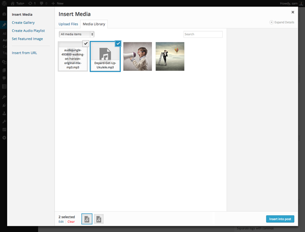
Step 2

Next, click the “Create Audio Playlist” tab on the left of the “Insert Media” window. Make sure all the audio files you want to include are selected, rearrange them, and click the “Create a new playlist” button.
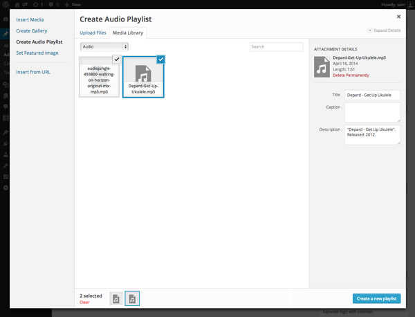
Step 3

Confirm the playlist’s settings and amend them if necessary.
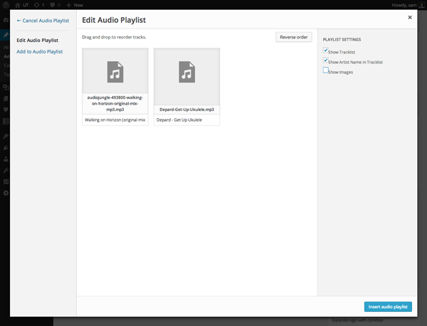
Step 4

Finally, click the “Insert audio playlist” and you’re good to go!

Another really useful feature for WordPress 3.9 – with a little bit of styling and extra customization, these players can be customized even further.

Live Widget and Header Previews

This is quite possibly the most useful feature in WordPress 3.9 as it allows you to manage your widget areas and header images in real time as well as preview them before you push the save button.

Again, it’s really simple to get going with this feature. Let’s take a look at the Live Widget Previews.
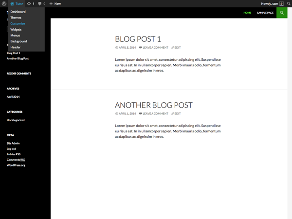
Step 1

From the frontend of your site, over over your site’s name in the admin bar and select “Customize”.

Step 2

You’ll see a bunch of different options, including the new options for the widget areas. Selecting a widget area will allow you to reorder and update the settings straight away.
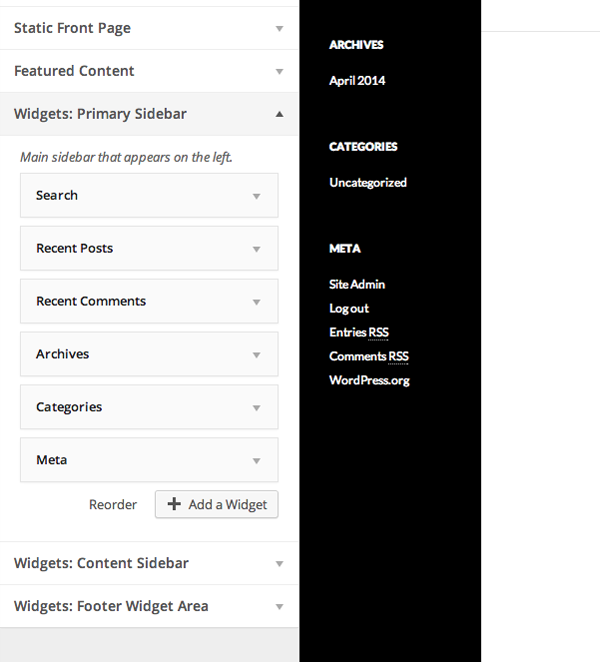
Step 3

Click the “Add a Widget” button and you’ll see a vertical menu appear.
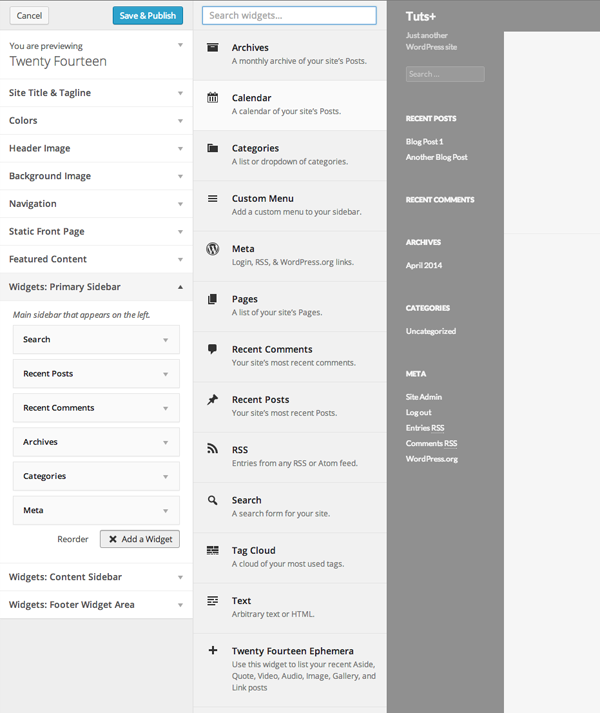
Step 4

Choose the widget you’d like to add, update its settings, and you’re done.

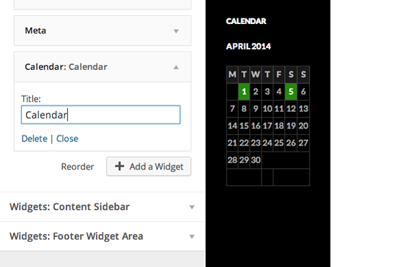
An awesome feature, and another reason for theme developers to begin using the Theme Customizer.

New Theme Browser

The final new feature in WordPress 3.9 is the new Theme Browser, which offers a totally new experience for choosing, previewing, and activating new WordPress themes.
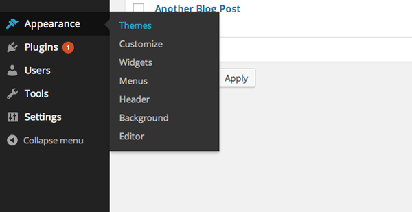
Step 1

Open the “Manage Themes” page by hovering over the “Appearance” menu and selecting “Themes”.
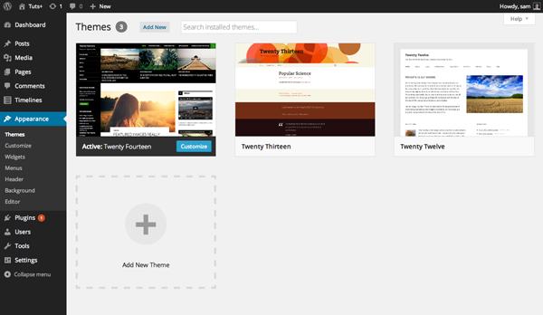
Step 2

Click the “Add New Theme” button to launch the new Theme Browser.

Step 3

You’re now looking at the redesign for the Theme Browser – you can filter and search for themes using the tools available towards the top of the page.
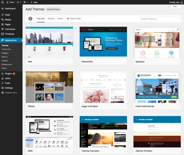
Step 4

Select a theme to learn more and to have the option to install it.

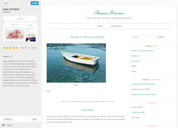
This is a great feature for those who don’t want to buy premium themes, and just want to browse the free themes directory for use or for inspiration.

In Summary

You’ve just learned about all seven of the great new features in WordPress 3.9. Like I mentioned at the beginning, you can upgrade your WordPress installation to the newest version through your WordPress dashboard. This usually takes less than one minute to complete, but may be longer depending on your host.

I hope you’ve enjoyed this rundown of the new features – if you’ve got any questions, please leave a comment and I’ll be sure to help you out.

Link

There are a plethora of ways to treat a portrait, for a myriad of uses, but that is for another feature. Let’s tackle adding drama or a cinematic quality to a regular, humdrum portrait. Let’s even throw in a little bit of faking HDR. That way if you work on a project that requires a stunning shot without the stunning photography, you’ll be able to cobble something together using your mad skillz!


Update: This tutorial was originally published on Psdtuts in April 2009.

Video Tutorial

Our video editor Gavin Steele has created this video tutorial to compliment this text + image tutorial.

Asset Preparation

The images I’ve used are: The man, the cloud, the water drops 1, and water drops 2. As always feel free to use your own images, however you may need to tweak the settings of any of the steps to get the right effect with different assets.

Step 1

Open the man image from iStockphoto and separate him from the background. Use whichever method you’re comfortable with, I would usually use the Pen Tool, but I’ll be honest, as he’s got no hair to worry about and the background is white I kinda cheated. I used the, ahem, Magic Wand Tool to select the white. I then Feathered the selection by 1 pixel (Select > Feather), expanded it by 2 pixels (Select > Modify > Expand) and hit delete 2-3 times until the white halo disappeared. Call this layer “MAN.” Select the Dodge Tool, set the Range to Highlights and the Exposure to 15% and run it over the Iris a couple of times. This should bring the eyes out a bit.

Step 2

Open up the cloud image from sxc.hu and import it into the document underneath the “MAN” layer. Resize it to about 130% and drag (Use the Select Tool, hold Alt and simply drag the cloud around the canvas) three duplicates. Overlap them as in the image below. Then select the eraser, set as a large soft-edged brush, and run it along the hard-edges where the cloud layers meet.

Step 3

Finally, select the Clone Tool, set it to a large (around 400 pixels) soft-edged (0% hardness) brush and clone out the obvious pattern repetitions. Choose multiple source points to avoid more obvious patterns.

Step 4

These next few steps are a lot easier if you have access to a graphics tablet, however you can still do it with a mouse. Create a Curves Adjustment Layer just above the “MAN” layer and check the box that’s marked Use Previous Layer to Create a Clipping Mask. Set it up as shown and call it “CURVES_DARK.” Select the “CURVES_DARK” layer mask and fill it with black, this should hide the effects of the Curves.

Select the Paintbrush Tool and set it to 0% Hardness, 15% Opacity and 65% Flow. Change the Brush size to suit the part of the image you’re treating. Obviously the bigger the brush, the smoother the transition. Set the Foreground Color to White and begin painting directly on the Layer Mask. Some areas require more work than others so don’t be scared of going over some patches several times.

Check the image below for approximate brush sizes to use. Cover both the skin and clothing. There is no exact science to this, it’s a lot of trial and error.

To get the finer details you’ll need to reduce the brush size right down. The eyelashes as an example required a 3 pixel brush, but I increased the opacity to around 40 percent. I did the same with the wrinkles and other hard-edges.

Ultimately, your Layer Mask should resemble this (press Alt and click on the Layer Mask to see where you’ve painted on the mask). I didn’t quite do enough on the Mask and there are three ways to rectify this. Option 1 is to double-click on the Layer Thumbnail (this is represented, in this case, by a circle that’s half black and half grey). Adjust the Curves to produce a darker result. Option 2 is to continue painting on the Layer Mask, but you risk messing up your good work. Option 3 is to duplicate the Curves Adjustment Layer, then you can scale back the effect by tweaking the Layer Opacity.

Step 5

Again, all you peeps with a graphics tablet are going to find this a lot easier. Create another Curves Adjustment Layer above “MAN” and “CURVES_DARK” on the layer palette. Check the box that’s marked Use Previous Layer to Create a Clipping Mask and call it “CURVES_LIGHT.” Pull the upper part of the line upwards to lighten the image. Note: How much you manipulate the Curves layers (including “CURVES_DARK”) affects how much you’ll need to draw on the Layer Mask and how much you’ll need to tweak the overall exposure later on.

Fill the “CURVES_LIGHT” Layer Mask with black and Draw directly onto it with a soft-edged brush loaded with white. Again pick the brush size and opacity to match the area you’re treating. If you overdo an area, load your brush with black and go over the problem area.

You’re looking to paint over all the areas where there are highlights. To strengthen things like the wrinkles, you should paint light next to the dark but not over it. Paint up to hard-edges with a small brush and then away from it with a large brush to diffuse the transition.

Alt-click on your Layer Mask thumbnail to see where you’ve painted on it. It should resemble the image below. Note the Layers palette as well, all my layers are currently on Normal at 100% Opacity and Fill. The little arrow next to the Layer thumbnail signifies that it’s using the lower layer as a clipping mask.

If yours don’t, then select the “CURVES” layer and go to Layer > Create clipping mask. To mask off any areas you require a hard-edge such as the bottom of the nose, simply draw around it using the Pen Tool, turn the path into a selection and paint onto the appropriate Layer Mask.

Step 6

Create a Gradient Map Adjustment Layer above “MAN,” “CURVES_DARK” and “CURVES_LIGHT.” Use the underlying layers as a Clipping Mask. Set the Gradient Map as shown below and then change the Layer Blending Mode to Soft Light and the Opacity to 75%. Now you could tweak the hue/saturation, play with the channel mixer and add a nice studio-esque background and stop there for now. But let’s carry on and add some real drama to this.

Step 7

Add a Gradient Map Adjustment Layer below “MAN” and above “CLOUD.” Input the darker color as #164370 (a darkish blue) and the lighter color as #e2dc9a (a muddy yellow). OK this, then set the Layer Blending Mode as Soft Light and change the Layer Opacity to 68%. Add a Curves Adjustment Layer directly below the Gradient Map. Adjust as shown and then change the Layer Opacity to 60%. Your Layers palette should that shown below.

Step 8

Add a new layer directly above “CLOUD” and fill it with 60% black. Set the Blending Mode to Overlay (it should disappear). Select the Burn Tool and set to a big brush (917 diameter, 0% hardness), set the Range to Midtones and the Exposure to around 15%. Then burn around the corners to create a vignette. Call the layer “VIGNETTE” and adjust the Opacity to suit. Mine ended up at 77%.

Step 9

Create a new layer directly above “MAN” (using “MAN” as a Clipping Path) and another directly below the “CLOUD_CURVES” and “GRADIENTMAP” layers. Call the new layers “WHITEGLOW.” Select the Paintbrush Tool, load it with white and work on the layers as shown below. Create a soft, white glow below the man to lift him from the background. Then create a white glow above to bleed light from the background over the subject. Follow the pink path as shown, then go over a second time.

Step 10

This next step is a stylistic choice as we’re going for a stylized look. However, if you want a more naturalistic finish you can skip this part. Select all the layers currently linked with “MAN.”

Then go to Filter > Stylize > Glowing Edges and set up as shown.

We want to knock out the midtones on this so go to Image > Adjustments > Levels and set up as shown.

Then change the Layer Blending Mode to Screen and drop the Opacity down to around 34%. Duplicate this layer and set the duplicate Blending Mode to Overlay, change the Opacity to around 13%. I also masked off areas around the chin on the original Glowing Edges Layer (Screen, 34%).

Step 11

Duplicate the “CLOUD” layer and drag it above the “GLOW_EDGES” layers. Apply a 2-3 pixel Gaussian Blur, then set the Layer Blending Mode to Screen and the Opacity to 50%. Take a soft-edged Eraser and delete all parts of the cloud that spill over the face and details. Duplicate the layer and drag it until you get a fairly even coverage of mist at the bottom of the image. Call these layers “CLOUD_BLURRED.”

Step 12

Download the water drops 1 image from sxc.hu and open it. Go to Image > Rotate Canvas > 180 degrees. Erase the bigger ball of water and the broken balloon part.

Then select the Burn Tool, set it to Shadows with an Exposure of 35% and run it along where you’ve erased. This should give a more realistic blend.

Paste it into your document directly above the “CLOUD_BLURRED” layers and set the Blending Mode to Screen. Position on the shoulder so that the condensed drips line up with the mans shoulder. You will need to rotate it to fit. Then drag a duplicate of this layer along the shoulder, rotate and fit. Call these layers “DROPS_RIGHT.”

Duplicate both “DROPS_RIGHT” layers and with the duplicates selected go to Edit > Transform > Flip Horizontal. Rotate them to fit the line of the shoulder and rename them both “DROPS_LEFT.”

Download and open the water drops 2 image from sxc.hu. We only want the drops here so delete the Balloon and the denser part of the water (Eraser and then Burn Tool). Paste into the Working document, change Blending Mode to Screen. To get smaller bits of spray simply resize to make them smaller.

To get drops of rain, drag a duplicate and resize bigger. Make several copies until you get a good spread. Use the Clone Tool to get a more precise covering. Then group the layers, select the group and go to Layer > Layer Mask > Reveal all. Use this Mask to soften the impact of the rain, remove any drops covering detail and give it an overall clean up.

Step 13

Create a new layer directly above the “WATER_DROPS” group (the rain and stuff) and call it “STARBURST.” Fill it with 60% black and go to Filter > Noise > Add Noise and set up as shown below.

Then go to Filter > Blur > Radial Blur. Apply a Zoom blur as shown. The Blur center should be just on the mans shoulder. If you don’t hit that, then just reposition the layer and resize it so it fills the entire canvas.

Finally, adjust the Levels as in the image below and set the Layer Blending Mode to Overlay. As 60% is pretty much an overlay neutral color, and the levels are well balanced out, it shouldn’t affect the whole image. Add a Layer Mask to mask out any areas that you don’t want rays. I masked out parts of the face and shirt.

Step 14

Create a new layer directly above “STARBURST” and call it “FAKE_RAIN.” Fill it with 60% black, add noise (as you did for “STARBURST”) and then resize it.

Then go to Filter > Blur > Motion Blur.

Bring up the blending options (click the f symbol in the black circle at the bottom of layers palette) and pull the black Layer Slider across to 130.

Apply a Small Gaussian Blur.

And a Smart Sharpen filter.

Finally, tweak the Levels and set the Layer Blending Mode to Hard Light.

Step 15

Duplicate “FAKE_RAIN,” call it “FAKE_RAIN_BGROUND” and move it below the “VIGNETTE” layer on the layers palette. Rotate it 10 degrees or so and change the Layer Opacity to 75%.

Step 16

Create a new Gradient Map Adjustment Layer directly above “FAKE_RAIN.” Set the darker color as #075053 and the lighter color as white. Then set the Layer Blending Mode to Color with an Opacity of 55%. Add a Layer Mask (Layer > Layer Mask > Reveal All), grab a large soft-edged brush, load it with black, reduce brush Opacity to 20% and paint over the face area a couple of times.

Step 17

Add a Hue/Saturation Adjustment Layer directly above the Gradient Map you just created. Pull the Saturation slider down to -68% and OK it. At this staged I added a Layer Mask and masked off some of the red tie using the a soft-edged brush at 25% Opacity.

Step 18

Add a Curves Adjustment Layer above that and set up as shown below. It’s looking pretty moody now, time to add the finishers on this.

Step 19

Create a new layer above the three new Adjustment Layers and call it “OVERLAY_DODGE/BURN.” Fill it with 60% black and change the Layer Blending Mode to Overlay. Using the Dodge and Burn Tools we’re going to further boost some highlights and a couple of shadows.

Here’s how it looks with the changes.

Here’s roughly what your “OVERLAY_DODGE/BURN” layer should look like on Normal Blending Mode. Notice that some areas are whiter than others, those areas have been painted on more times than the darker parts. Layering it up is the key to a smooth and natural transition.

Step 20

As a little salad garnish I’ve added a lens flare. Fill a new layer with black. Go to Filter > Render > Lens Flare and pick 105mm prime. The default settings should be fine. Set the lens flare Layer Blending Mode to Screen and position it above the shoulder. It’s worth mentioning that I also applied a small amount of noise, followed by a Gaussian Blur (around 4 pixels) and then a smart sharpen (around 150 at 7 pixels).

Step 21

Select all of your layers and duplicate them. Merge all the duplicated layers into one, making sure you leave the originals untouched. Duplicate the merged layer and name one “HIGH_PASS” and one “INVERTED.” Select “HIGH_PASS” and go to Filter > Other > High Pass. OK a 2 pixel pass and then set the Layer to Overlay. Mask off any sections you feel are too strong, I did the starburst area a little.

Step 22

Select the “INVERTED” layer and desaturate it (Command + Shift + U). Then invert it (Command + I), apply a 40 pixel Gaussian Blur and then set the Layer Blending Mode to Overlay. It’s a little much so drop the Layer Opacity to around 45% or whatever you’re comfortable with.

Conclusion

You should be left with a highly editable image. Adjust Layer Opacities, fine-tune Layer Masks, play with Adjustment Layers or even turn visibility of some of the layers off. Even without the rain and the clouds and whatnot, what you’re left with is a way to make portraits punchier. View the final image below or a larger version here.

Final

Subscribe to the Psdtuts+ RSS Feed for the best Photoshop tuts and articles on the weAbout James Davies

I am JamesZilla. I write tutorials for various magazines and websites when I’m not designing gig posters, t-shirts, catalogues, magazine, etc.