Virtual Reality for Design

I believe that one of the coolest accessible experiences that has come out in recent years is virtual reality (VR) technology. While most notably used in the gaming/entertainment industry, I’m convinced that this technology could act as a dominant asset to designers and artists alike. With headsets and hand controllers sold in complete sets for as low as $300, it’s surprising why more designers aren’t seeing the potential in this technological investment.
Firstly, putting on a virtual reality headset feels like stepping into that environment. While the rest of your senses tell you you’re not actually in this ‘virtual world’, it provides an incredible sense of immersion for what it is. While I primarily use my VR headset for video games, I have entertained its use as an ‘infinite’ workspace for accessing several windows, applications, and tabs all at the same time. In this case, designers would find this technology incredibly useful and an alternative to multiple monitor setups.
Secondly, virtual reality can be used more immersively as a means to view and experience designs in a physical space. While we all know and love our 4k photorealistic PSD mockups, being able to virtually step into, around, and away from a piece simply doesn’t compare. In fact, this technology allows for multiple individuals joining into the same virtual lobby, meaning other designers on your team can all virtually interact with the same space/object in real-time from wherever each individual has a suitable internet connection. In a Covid-world where we are all encouraged to socially distance and be away from each other, technology like VR can allow members of design teams to be more collaborative and engaging among each other then say, a skype call or zoom meeting.
Given all of the potential of virtual reality, it surprises me that there aren’t more applications that are tailored towards designers. Should manufacturers of VR headsets market to designers and artists and similar levels as they do to gamers, I believe that the graphic design community would find itself with a widespread and invaluable tool.

Braille in Baseball

https://www.mlb.com/cut4/the-orioles-wore-braille-jerseys-c295144612

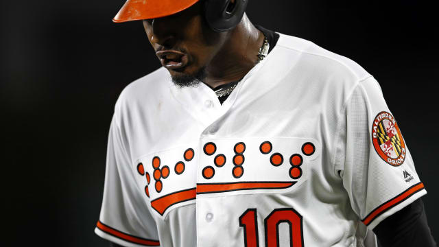
Photo showing the Orioles' Braille jersey design.
Photo showing the Orioles’ Braille jersey design.

The Baltimore Orioles became the first professional sports team to don their uniforms with braille lettering. While this isn’t a solution to a direct problem faced by those that are blind, it was effective in spreading awareness of the disability. While the relationship between how braille is read and the fact that it was on jerseys not intended to be felt by others did face criticism by the general public, I commend the Orioles organization for using their platform as a professional sports team to help spread this message. With that said, it would be nice to see other organizations and teams around the professional sports scene to follow through and include more usable and practical instances of design for those that are blind. Anything from sports programs to team schedules, to items such as baseballs and ballcaps, would all be more inclusive if they featured embossed braille or other design elements that spread awareness to blindness or other forms of disability.

Being that the Orioles are the first professional sports team to successfully attempt such a means of spreading awareness to blindness is amazing and shocking, to say the least, I still feel as though resources could have been put to better use if otherwise allocated towards making actual fan-usable items more inclusive. On the contrary, many teams across all levels of competitive sports have a tradition of ‘theming’ their uniforms per awareness event (camouflage jerseys on veteran’s day, pink uniforms for breast cancer awareness month, etc.) With this design, the Orioles became cannon fodder for memes, but it was successful in spreading awareness. I don’t follow Major League Baseball myself, but it was through a meme poking irony at the design that I was made aware of it.

Working Toward the Environmental/Social Good.

“Consider how you can begin to work either environmental or social good into your personal design process. Which of these directions most interests you? What do you feel your level of responsibility is here? Is there an example of environmental or social design that you find inspiring? How can businesses or design agencies implement design for good into day to day work?”

Environmental/social good can be integrated and applies to many aspects of our lives. Through the products we shop for and the companies we support, as well as the messages we send through the stances we take, designers (as well as anyone) can take do their part to support particular causes. As far as the personal design process, being aware of others’ sensitivities and coming to terms with the fact that you cannot (by yourself) speak for everyone, can help make you work towards supporting the environmental/social good. While it sounds cliche, being kind and showing respect for others is just one step anyone can take in integrating social good into their routine.

Through providing designs/products intended and made to last long durations of time, designers can do their part in working for the environmental good. The “throw-away” culture that has become synonymous with today’s first world societies is something that can be mediated through the promotion and implementation of products designed to last decades. While inexpensive to manufacture and convenient to dispose of, cheaply produced products often fail under much use, creating a system where manufactured waste inherently outnumbers quality products. In day to day design life, this can mean using white/chalkboards rather than post-it notes, recycling older computers/laptops when we upgrade to more capable machines, and using items such as mechanical pencils, that promote a reuse/refill model rather than a single-use or disposable system.

Something to understand is that the graphic design industry (any tech-based industry for that matter) is nowhere close to being environmentally friendly. The environmental damage and carbon footprint left behind by the manufacture and maintenance of electronic devices is something we cannot ignore. By taking small steps in each of our daily routines, together we can help reduce the waste and damage we create to benefit the environmental/social good. From the companies we support and the products we use, to how we use them, all play a major part in how we can improve the environment through our professions.

Pulling Stripes! : Annotated Bibliography

The Dying Art of Pinstriping…on the Cusp of a Renaissance? by Mag Boddington

Mag Boddington is a writer for The Engine Block, a company that tracks and showcases automotive trends, culture, and niches.

Mag informs readers that pinstriping (in some form) has been around ever since the Ancient Era. Where island tribes, members of the Greek and Egyptian empires, etc. adorned their weapons, clothes, and vehicles, with ornate line art and hand-painted designs.

Boddington, Mag. “The Dying Art of Pinstriping…on the Cusp of a Renaissance?” The Engine Block, 22 Sept. 2020, www.theengineblock.com/dying-art-pinstriping-renaissance/. 

https://www.speedwaymotors.com/the-toolbox/the-art-of-pinstriping-part-1/29270

The Art of Pinstriping – Part 1 by Alanna Crawford

Alanna touches on the detail and steps that go into pinstriping your own design. A point that many don’t realize is that pinstriping can adapt itself to any object. Nothing is an unsuitable canvas for this style of art form.

Crawford, Alanna. “The Art of Pinstriping – Part 1.” Speedway Motors, 9 Oct. 2017, www.speedwaymotors.com/the-toolbox/the-art-of-pinstriping-part-1/29270. 

http://letterflypinstriping.com/Pages/historicOrigins.html

Pinstriping Origins by Dave “Letterfly” Knoderer

Dave is a prominent figure in the airbrush scene, most famous for his airbrushed mural designs on motor homes. With a pedigree of formal education at the Ringling School of Art & Design in Sarasota, Florida and a prolific artist, teacher, exhibitor, and author, Dave is a source one can trust.

In this article, Dave details the historic birth of modern pinstriping, which first began on horse-drawn carriages during a time where ornate embellishments were a testament to craftsmanship and quality. Over the years, the art form has adapted to the modern automobile. Being that no two designs are the same, those who paint and don pinstriped designs are beneficiaries to a unique and personalized art form.

Knoderer, Dave. Pinstriping Origins, letterflypinstriping.com/Pages/historicOrigins.html. 

https://garage.eastwood.com/eastwood-chatter/history-pinstriping/

History of Pinstriping by Matt M.

Matt is an author for Eastwood, a well-known distributor of professional automotive paints and finishes. 

Matt explores the general history of pinstriping and some of its most influential artists. The article primarily touches on the work of Kenny “Von Dutch” Howard, one of the most prominent figures the custom car world has ever seen.

“The History of Pinstriping.” Eastwood Auto Restoration Blog Free Howto Automotive Tech Advice for Everything DIY Automotive, garage.eastwood.com/eastwood-chatter/history-pinstriping/. 

Design and Politics is Dirty Water.

Question:

“How does the inevitable intersection of design and politics make you feel? Do you feel included, ignored, galvanized, patronized, disillusioned, or something else entirely? Perhaps you’re most interested from a historical perspective: is there some moment in the design of political messages that you find particularly interesting?”

Answer:

“Just like anything else in our world, design plays a major role in politics. Every step of a political campaign requires sufficient attention to marketing in order to best pitch their ideals to interest groups and the American people. Across political history, design has been used to inspire revolt against standing governments, belittle political opponents, and spread blatant lies into the eyes and ears of the people. While design and politics birth some amazing design, it isn’t as pure as other design marriages. The sheer corruption present in politics yields some illegitimate fruit when paired with design, a fair comparison being a nun having an affair with a prostitute.

A particular detail worth noting is the definitive prominence of good design across the left side of politics. Whereas that kind of attention and support appears rather absent in right-leaning politics. Being that major design hubs and creative opportunities are centered in major cities, this observation makes sense. The real mystery lies in how any major political faction can suffer so greatly from lackluster design and poor attention to detail in this regard. Even above the bipartisan level at the Central Intelligence Agency, we see their redesign as something more indicative of a poor appeal to teenage gamers and cybersecurity recruits than anything else.

Personally, I enjoy exploring design from a historical perspective. Being a fan of most things antique, vintage, retro, etc. has led me to gather influence from older examples of design. I believe this works to my benefit, where most might look towards trends, I tend to dust off trends of days gone by and remaster/pay homage to them through my designs. In a world so heavily centralized around electronics and the digital realm, I like to see where the new and the old can merge. That said, I’m a major fan of old campaign buttons across the entire political spectrum (think Eisenhower era design across local, state, and national levels). I’ve found that adopting these bold, eye-catching patterns and layouts to digital platforms has the potential to create some amazing pieces.”

Comparative Critique: Sportman’s Warehouse

New Sportsman’s Warehouse Logo
Old Sportsmans’s Warehouse Logo

After my hockey practices as a kid, I remember me and my dad would always stop by McDonald’s or Roy’s Western Smorgy for food, and then take a shop walk through Sportsman’s Warehouse on Canal Drive. This was one of two places where people in the Tri-Cities and Umatilla county could count on finding the latest and greatest in hunting, fishing, and general outdoor equipment. I grew up going to this store, and because of that, have seen this location sell itself to another franchise, change its identity, and all the while, maintain its famous cork ‘bragging board’, where photos from local outdoorsmen show the best hunting and fishing harvest from the around the area.

When I was six, I viewed anyone not in elementary school as being old. Therefore, I considered the majority of Sportsman’s Warehouse customers to be old. As I look back though, the old logo with its beige gradient and an awkward scaling of letters leads me to believe I was right all along. It truly is synonymous with the word “Grandpa”. While this look may provide a sense of nostalgia and comfort, I believe that the new logo with its reworked type and flat color palette accurately represents the marketed hunting majority, which is currently men in their mid-to-late twenties making a decent living, who may or may not be in a relationship where their spouse is less enthusiastic about hunting and fishing as they are. That being said, the official Sportsman’s Warehouse statement on company values brings images of entire families and men much older:

“We’re committed to being good stewards of the outdoors and wildlife habitats. Sportsman’s Warehouse supports the communities we serve by donating to local causes and partnering with wildlife and conservation groups like the Mule Deer Foundation, NRA, National Wild Turkey Federation, Rocky Mountain Elk Foundation, and Ducks Unlimited, among several others. Many of our employees are also contributing, active members of such groups, volunteering their own money and time for the causes we collectively cherish and believe in.”

While the talk of service to the community keeps consistent with images of active young adults, the mention of active members in the listed conservation groups bring images of men and their families who are closer to middle-age. Being that this group is realistically first in client demographic to that store, you can say that Sportsman’s Warehouse pretty much covers its bases with this statement.

ATTENTION: After further deliberation, author now yeets prior opinion out the window.

Okay, so after investing about an hour after the first word of this essay and thinking more on the logo, I believe that there are a few design choices that actually do represent the TRUE (not marketed) majority of Sportsman’s Warehouse clients. Let me explain.

Firstly, the choice to keep the iconic serif typeface was a smart one. This is what makes the logo “multi-generational” so-to-speak. This retains the image of family. A sans-serif typeface of any kind and then BOOM, the logo screams young twenty-something year old guy like I originally believed. It is clear that whoever remastered this logo for Sportsman’s Warehouse understood the old logo’s problems and fixed them. They made the new logo digital-ready and overall better by the simplification of the mountain illustration, the elimination of gradient and list of product categories the store sells, and through correction warping/arching of type (the old logo had this awkward rescaling of individual letter thing going on).

To wrap this thing up, I’ll start by saying this logo redesign was a success. I believe it accurately represents its target audience all the while paying homage to the old Sportsman’s Warehouse logo. While I stated prior that the logo represents the 20-something-year-old guy making a nice chunk of change, I think that there could have been other choices made that would have made this opinion more accurate. For example, the new logo could have used sans-serif type, appear more aggressive (young guy hunting shows used a lot of aggressive, heavy metal-esque vibes). All in all, I believe this logo redesign is a rather successful one.

My Thoughts on Marshall McLuhan | Week 1 Blog Post

The following response is the first of many for GD312, one of my classes in Winter Term 2021. Enjoy. . . I guess?

The theories brought forth by Marshall McLuhan, which grade varying forms of media over a hot/cold spectrum determined by levels of immersion/engagement, respectively, are what I believe to be a rather inaccurate and incomplete way of categorizing media. As technologies merge, split, and coexist, any definitive means of categorization in accordance with McLuhan’s theories simply fail to make sense over any period of time. In fact, individuals themselves and how they interact with a particular form of media is much more accurate in determining the level of hot/cold according to McLuhan’s spectrum. As society has evolved, we have seen user intimacy vary and bounce from object to object. While an AM radio may have magnetized a mid-century nuclear family into the corner of their living room, the same cannot be said today, where an object such as a television or gaming console would be much more appropriate. While new technologies rarely succeed in fully replacing more obsolete forms of media, it is safe to say that more primitive devices often get placed on the “back burner” in terms of daily use in modern society.

With that said, I am curious as to what possessed McLuhan to come up with such a system. If one was to classify multiple forms of media, wouldn’t it make greater sense to create a scale based on engagement with the user alone. I feel as though this would be much more effective and potentially less confusing that the spectrum that McLuhan brought forth. Rather than saying something HAS to be immersive OR engaging, couldn’t we simply say that (x) form of media results in greater user interaction than not?

McLuhan had his merits in that he sought a categorical means of inclusivity for all forms of media. However, we now understand that this system wasn’t without its wrongs and often misleading results, especially as time and technologies evolved. What we can learn from McLuhan is that there often simpler means of making categorizations that are just as, if not more effective in sorting forms of media. As the bridge between reality and virtuality grows closer, it will be interesting to see how McLuhan’s theories and principles will apply.

A Little ‘Bout Me! (An Introduction)

Hi everyone, I’m Tristan Cole, a Class of 2022 Graphic Design Major at Oregon State University. My aesthetic is currently inspired by the aesthetic of old school advertising, swiss-style, and pop art comics. Below you will find my answers to generic Icebreaking questions.

What’s your favorite music? Johnny Horton, Eddie Cochran, Buddy Holly, 90s Country, and really anything popular from the 1940s through 1960s.

What do you do in your free time? Well, I listen to music, play games on my PC, hunt waterfowl, go fishing, doodle cartoons, work on my El Camino, watch ice hockey, and paint on items probably better left unpainted.

What got you into art and design? My dad always sketched different species of waterfowl. So seeing a ton of realistic drawings of ducks and geese growing up. And Bob Ross. I owe a lot of my initial and lasting interest in art to the man with chipmunks on his shoulder and happy little trees. Nothing like spending childhood mornings staring at Pthalo Blue, Yellow Ochre, and Cadmium Red.

Well, I hope that gives you a glimpse into who I am!