https://www.mlb.com/cut4/the-orioles-wore-braille-jerseys-c295144612

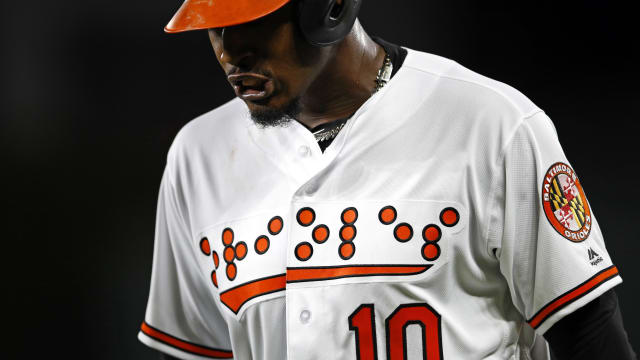
The Baltimore Orioles became the first professional sports team to don their uniforms with braille lettering. While this isn’t a solution to a direct problem faced by those that are blind, it was effective in spreading awareness of the disability. While the relationship between how braille is read and the fact that it was on jerseys not intended to be felt by others did face criticism by the general public, I commend the Orioles organization for using their platform as a professional sports team to help spread this message. With that said, it would be nice to see other organizations and teams around the professional sports scene to follow through and include more usable and practical instances of design for those that are blind. Anything from sports programs to team schedules, to items such as baseballs and ballcaps, would all be more inclusive if they featured embossed braille or other design elements that spread awareness to blindness or other forms of disability.
Being that the Orioles are the first professional sports team to successfully attempt such a means of spreading awareness to blindness is amazing and shocking, to say the least, I still feel as though resources could have been put to better use if otherwise allocated towards making actual fan-usable items more inclusive. On the contrary, many teams across all levels of competitive sports have a tradition of ‘theming’ their uniforms per awareness event (camouflage jerseys on veteran’s day, pink uniforms for breast cancer awareness month, etc.) With this design, the Orioles became cannon fodder for memes, but it was successful in spreading awareness. I don’t follow Major League Baseball myself, but it was through a meme poking irony at the design that I was made aware of it.


