Welcome back to Sean’s Syntax. In this blog I will be going over what I have been working on for the past few weeks for my algorithmic trading project, which includes 2 different interactive graphs.
Solution Comparison Chart.
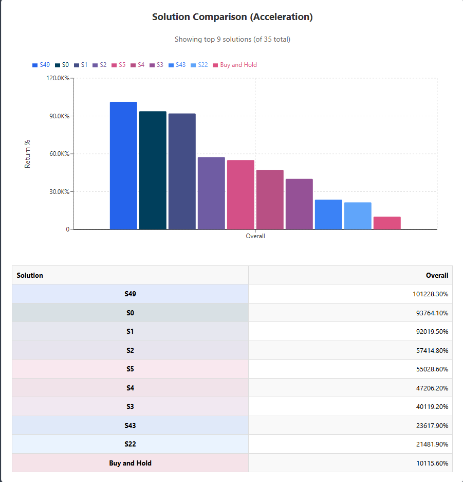
The first chart I implemented is the “Solution Comparison” chart. It’s a color-coded bar chart that compares each top strategy’s return to a “Buy and Hold” benchmark. With dozens of potential solutions available, this visual allows you to quickly identify the top performers. And below the chart, I’ve included a table with the exact percentage return of each strategy. So we have both a rapid visual at a glance and accurate data to make final decisions.
Price Chart with Trading Signals
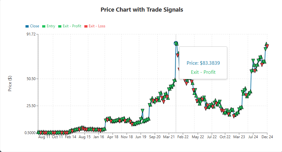
The 2nd interactive graph I implemented was a Price chart with trading signals. It shows market prices as a smooth line and uses triangle symbols to indicate entry and exit locations. Green upward triangles indicate purchases, while the descending triangles in green or red indicate lucrative and losing exits, respectively. Seeing these signals in a visual context has been super helpful for debugging. Being able to visually see when solutions become trapped in sideways markets or have a flaw in the stop loss, allows us to tweak the algorithm easier.
Technical Obstacles
Building these charts presented its own issues. Our trade timestamps arrived in various formats, so I had to create a standardizer that converted everything to ISO timestamps before plotting. Also, when we loaded hundreds of trades across several years, the charts slowed down. To fix this, I added a preprocessing step that aggregates data when zoomed out but retains complete information when zoomed in.
That concludes this blog. Thank you for reading!