Category Archives: Uncategorized

Figma.com

Figma is an online platform that allows for UX/UI design through a collaborative process. Its essentially like if Adobe XD were a Google Doc – multiple users can be on and making changes at the same time. This allows for teams to work together without having to send files back and forth or trying to merge different files for an end project. Overall, it seems like a really great concept to make designing with a team more streamlined.

My very first thought to this was “I wonder how it compares to Adobe” because I am programmed to worship Adobe and buy their yearly subscriptions. Luckily, they have an extensive comparison section to their website with extensive details on how their program holds up against the giant like XD and Sketch as well as some other alternatives. Below are just a few of the highlights they mention.

Comparison of Figma to Adobe XD from their website

Just clicking around their website, I can see they have a lot to offer. You can work on many different project styles collaboratively, they offer plug-ins and templates, there’s even a pretty extensive looking help center. The website is pretty clean black and white with some bold pops of color in illustration, it’s relatively appealing and feels simple to navigate (without me actually testing their design tools). I just have a major grievance with this custom font they use- it’s hideous.

horrible custom font on the Figma website

Their pricing feels pretty reasonable compared to Adobe, although it doesn’t include the extensive library of apps. But if you were doing almost solely UX/UI design I think you could manage with paying for this site and then using free design softwares for your other adobe needs. I know trying to combine people’s work in XD sucks so I think if you were working on a team like this on the daily, it’d be a pretty worthy investment. Their starter tier is free and supports up to 2 editors and lets you store 3 projects- which is perfect for students doing class projects who might not ever work in UX/UI again. The Professional tier is $12/per month per editor. So everyone on your team would have to be paying $12 a month to work with it but that’s less than 50¢ a day which sounds a lot less bad. With that version, you can create unlimited projects with unlimited version history. There’s also an Organization tier billing at $45 per editor/month (with annual billing only) that allows companies to save their design systems to the platform.

Overall, I think this is a great idea for people who would be using this method of working on a daily basis. Now I’m wishing that Adobe programs existed in a collaborative form so that I wouldn’t have to keep collecting people’s files to combine for presentations. So much of design is collaborative that I could see other softwares following suit. I didn’t actually test out any of the design tools because UX/UI is not my wheelhouse so I wouldn’t have a good opinion but the website itself was easy to navigate so I feel like that’s a positive indication.

Bus rapid transit identity meets universal design

Bitterman, Alex, and Daniel Baldwin Hess. “Bus Rapid Transit Identity Meets Universal Design.” Disability & Society, vol. 23, no. 5, 2008, pp. 445–459., doi:10.1080/09687590802177015.

Alex Bitterman, works in the School of Design at Rochester Institute of Technology in Rochester, New York and Daniel Baldwin Hess works in the Department of Urban and Regional Planning at State University of New York in Buffalo, New York.

This article discusses how Bus Rapid Transport (BRT) can utilize the principles of Universal Design to be more accessible. As the need for these services continues to grow with population growth in urban areas, “information design components and various graphic components and collateral products that together constitute the basis of a BRT identity system must not only be barrier free but accessible to all users regardless of age, physical ability or cognitive ability” (Bitterman). BRT is able to provide many more advantages than normal bus service, majorly featuring level or zero-step passenger boarding that will meet or exceed the Americans with Disabilities Act (ADA) recommendations. Because there is so little information given to the public on these resources, the “perception-making components are as integral to the future success of BRT systems as are the physical components” so that people are even aware that these improved services exist. If there is no community awareness through successful design campaigns, there will be less funding directed toward these services that are meant to benefit everyone. Bitterman and Hess note, “For designers, planners and evaluators of the
hypothetical BRT system the ADAAG may serve as an objective checklist for components
of a BRT and a BRT identity system, and while the ADA mandates are a step in the right
direction toward inclusive usability, designers, planners and evaluators must recognize
these as minimum thresholds which result in a minimal degree of accessibility and which
do not necessarily accommodate an ability-diverse public” (Bitterman). If designers continue to use the minimum standards as a checklist, they are continuing to ignore the voices of the communities that actually need improvements on these services and are effectively making their design worse. Bitterman and Hess also touch on the way that universal design shifts the responsibility of functionality from the user to the designer, contradictory to how many design practices and mindsets run.

Accessible doorknobs are the hill I’m choosing to die on

Image of Sammons Preston Rubber Doorknob Extension, an adapter for round doorknobs.

While I was looking into designs meant to help people with disabilities, I saw a few images of door handle adapters. I was very aware of the problem round doorknobs can pose since my parents always made a comment when a doorknob wasn’t ADA approved (honestly, I have no clue why they did this they both have fully functioning hands). I hadn’t ever considered that these doorknobs could be adapted, I just thought they should all be replaced with the handle style so that they were easier for people with limited mobility. The adapters I saw ranged in design success but almost all of them seemed to be trying to fix the problem, not the person. If a place can’t for some reason replace their doorknobs with the handle style (which would be cheaper than buying one of these adapters so I don’t know why) then this is the least they could do. I think that it satisfies the need of having a door handle that is easier to grip/move and just generally makes it easier to open. This style is good for anyone who finds it easier to pull down than to grab and twist, or even someone using a tool to open things. The image I included at the top was the best design that I saw because it allows for that downward pulling motion. Now let’s look at some worse ones.

I think this EZ Door Knob Grip sold at Home Depot is about a 2/5 stars for accessibility. It would hypothetically make the knob grippier and provide some leverage but it still would require a hand to make a grabbing and twisting motion. The image that they included shows someone opening it with their elbow which I cannot figure out how successful that would be. I can’t imagine it working well. This design leaves out anyone using a tool or aide that might have a hooked shape because the grips on it are small and flat.

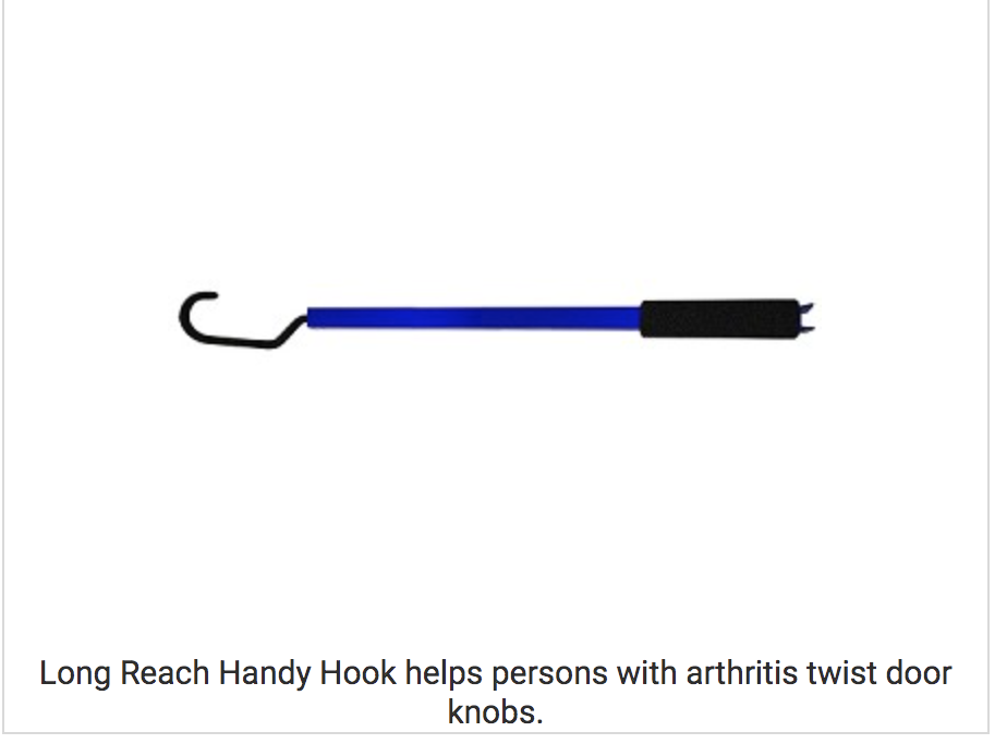
The Long Reach Handy Hook sold on www.arthritissupplies.com confuses me. It says it’s good for people in wheelchairs because it allows you to open a door out of its swing path, which I think might be its only redeeming function. It definitely feels like it’s trying to fix the person though. The description says, “The non-slip hook is placed underneath the doorknob, letting it freely rest. The user then holds the cushion grip and simply turns the handle to open the doorknob. The other end has a special tool designed for unlocking deadbolts and twist locks. The long handle and non-slip grip hook increases torque for the user to easily turn the doorknob or lock.” And the image shows it opening a round-knobed door. But I have no clue how that would work plus it requires someone to be able to hold onto a pole AND carry it around with them. The single reviewer of the item on the website had the same doubts:

(When I try to add alt text it yells at me so) the review says, “This ‘Long Reach Handy Hook’ doesn’t look like it could do what is claimed, but actually does allow a person to open doors, etc. My situation is that I need a long handled gadget to pull up the handle of the sliding door on my van so it will release & close, from the driver’s seat area, after loading the electric wheel chair. This actually allows me to do that, with a bit of effort. But, the square metal handle scratches the car door. We are going to wrap it with leather or some other material, gluing it, at the place it scratches the car. It should be OK. Thank you for offering these types of products of assistance.”

It sounds like from this review that it maybe can open this style of doors? But they also mentioned that the things they needed it for still required a “bit of effort” and that it scratched their car door so I don’t think that any disable people were consulted when designing this product. 1/5 stars from me.

I am specifically addressing ways to improve round doorknobs so I didn’t necessarily see any other designs despite a few variations on the first one. I think that, should someone want to make their round doorknobs more accessible but refuse to replace them, that style of adapter would probably be the best from the current choices on the market. I don’t know if I’m missing something but I have no clue why someone would choose a round doorknob at this point, why not just choose the more accessible option? I have round doorknobs in my house right now after growing up with the handle style and every time my hands are full I curse those round doorknobs. Accessible ones just make life easier for everyone, as many accessible products do. As the ADA guidelines say, “Door hardware that can be operated with a closed fist or a loose grip accommodates the greatest range of users.

(Again with the alt text errors, sorry) This is a screenshot of the ADA requirements, “Door Hardware – ADA compliant locks, exit devices, handles, pulls, latches, and other operable parts on doors shall comply – Operable parts of such hardware shall be 34 inches minimum and 48 inches maximum above the finish floor or ground.
Operable parts shall be operable with one hand and shall not require tight grasping, pinching, or twisting of the wrist. Most lever-operated mechanisms, push-type mechanisms, and U-shaped handles are acceptable designs. The force required to activate operable parts shall be 5 pounds (22.2 N) maximum.
Door hardware that can be operated with a closed fist or a loose grip accommodates the greatest range of users. Hardware that requires simultaneous hand and finger movements require greater dexterity and coordination, and is not recommended.”

The Role of Environmental Graphic in the Identification of Urban Public Spaces

Torbati, Hanieh Eshaghzadeh. “The Role of Environmental Graphic in the Identification of Urban Public Spaces.” Civil Engineering Journal, Aug. 2018, www.civilejournal.org/index.php/cej/article/view/1097/369.

Hanieh Eshaghzadeh Torbatia is a part of the Department of Visual Communication, Faculty of Art, at the University of Bojnord, in Bojnord, Iran. (Sourced from article)

This article focuses on the way that public spaces are influenced by designers. Knowing the values, cultures, and norms of the community in which you designing a space is a mandatory step to making sure that that space will be functional. If a designer knows the people with which their design will interact, they are able to create a deep connection with them and is able to better understand the way that their design strategies interact with the world overall. Creating a beautiful urban space that acknowledges the different communities, people, and cultures that will use it is going to create a better connection between those different people and overall increase the welcoming level of that area. If the designer neglects these different aspects, the urban area feels hostile and will not be a useful space at that point. Torbati says, “Public spaces are environments to cultural exchange, enjoyment, fun, leisure, social life, exchange thoughts, views, beliefs, and comments. The spaces play the important role in providing social harmony and practical realization of join citizens in community, because the spaces are multi purposes and provide many activities and usages for residents” The accessibility of these spaces needs to be the leading factor in all design considerations so that the most amount of people are able to get the most amount of use out of them.

Social Engagement through Environmental Graphic Design: Design for Struggling Small Communities

Fontaine, Lisa. “Social Engagement through Environmental Graphic Design: Design for Struggling Small Communities.” SEGD, 12 Oct. 2015, segd.org/social-engagement-through-environmental-graphic-design-design-struggling-small-communities.

Lisa Fontaine is Associate Professor, Graphic Design, at Iowa State University and an active member of the SEGD academic education community. She has presented her research and curriculum innovations at numerous SEGD Academic Summits and other educational events. Her research interests include graphic design in the built environment, Main Street design and revitalization, interactive exhibition design, wayfinding design, placemaking, symbology, and ecological issues in graphic design education and practice. (Sourced from article)

This article focuses on the way that designers view smaller communities and the way that prevents them from improving. If designers think that a small community isn’t worth working on and those communities might not even realize that design services are available, then there will never be an improvement in the design which is essential to keep those businesses afloat. When design students are presented with the challenge of improving an area like this, the first instinct is to modernize it and just slap on the same design principles that a big urban city would want without considering the needs of the community. By listening to community members, designers can create a level of accessibility to the people who live there that cannot be achieved either without professional design help or without considering what that specific area needs. If these locations are not having their social needs met (teen centers, senior centers, food assistance, art spaces) then it is a lot harder for these small towns to focus on bringing in new businesses to fill their main streets. This results in a loss of local business to the big chains and box stores that are not concerned with these social issues. Designers can help to create spaces that the community needs to be strong so that they can focus on improvement. This is rather than designers skipping over community needs and trying to market existing businesses to a community that requires more basic level needs to be met first.

MOVING BEYOND HOMELESSNESS. HOW DESIGN CAN BE AN INSTRUMENT FOR CHANGE

Cecilia Loschiavo dos Santos, Maria. MOVING BEYOND HOMELESSNESS. HOW DESIGN CAN BE AN INSTRUMENT FOR CHANGE . International Association of Societies of Design Research, Nov. 2007, www.sd.polyu.edu.hk/iasdr/proceeding/papers/Moving%20Beyond%20Homelessness%20How%20design%20can%20be%20an%20instrument%20for%20change.pdf.

Maria Cecilia Loschiavo dos Santos is a philosopher and an associate professor of Design at the School of Architecture and Urbanism, University of São Paulo. She got her MA at University of São Paulo, Philosophy, in Aesthetics, 1975 and her Ph.D. at the University of São Paulo, Philosophy, in Aesthetics, 1993. She is a scientific consultant for Brazilian Research Agencies, such as FAPESP and CNPq. Dr. Loschiavo dos Santos current research is about Discarded Products, Design, and Homelessness in Global Cities, and she is deeply committed to design and social responsibility issues. http://www.closchiavo.pro.br/site/profile.html

This article discusses the way that urban settings are beneficial to disadvantaged populations because of the abundance of wasted resources. Focused on Brazil, this study shows how people can collect recyclable materials as a survival strategy. It explores the ways that design could be used to give a better image to these people who collect materials to survive since they are essential to help keep the cities clean. Although they play an important role in the city’s ecosystem, these people are still disregarded by society and are undervalued for their work if they are working for an employer. Maria Cecilia Loschiavo dos Santos also wants designers to reevaluate the ways that they can lift the environmental burden of keeping cities clean from the shoulders of minority communities. Loschiavo dos Santos ran a course that required design students to directly interact with material collectors at different levels to properly analyze the problem and generate ideas. In her conclusion, she states “faced with the catastrophe of unemployment and deprivation in their lives, the collectors of recyclables created an alternative that is this central point of mutation in world awareness. In these difficult times, with increasing destruction caused by climate change, and greater environmental destruction in general, and the hyper-consumption accelerated by globalization, collectors are building a solidary, human alternative.” How can designers as a whole design products that might still head to the landfill, but that might be more beneficial to the communities who might access the landfill as a resource?

Sustainable and inclusive design: a matter of knowledge?

Heylighen, Ann. “Sustainable and Inclusive Design: a Matter of Knowledge?” Local Environment, vol. 13, no. 6, 2008, pp. 531–540., doi:10.1080/13549830802259938.


Ann Heylighen is a design researcher with a background in architectural engineering. Heylighen studied at KU Leuven and ETH Zürich, and obtained her MSc in Engineering: Architecture in 1996. In 2000 she obtained her PhD with a study of design knowledge embedded in design projects. As a research professor of design studies at the University of Leuven (KU Leuven), she co-chairs the Resarch[x]Design group. https://rxd.architectuur.kuleuven.be/ann-heylighen/

This article researches the disconnect between people who study architecture design, the practicing architects who did not attend school for it, and the users of these spaces. Academic research and knowledge into the design of city buildings frequently does not trickle down into the actual application of these places. Architects are usually considered to be experts in the design of buildings because they both study it and are users of buildings but they lack the insight of people who use the specific buildings they create. This article states that people with certain limitations or need are able to “detect misfits that most architects are not even aware of” and thus have a completely separate base of knowledge from the people who do not have these needs. There is a serious disconnect between these different groups that lead to cities being designed in ways that are exclusionary to many groups of people. This touches on the ways that there could be a stronger line of communication from the people through policy, but that it would be impossible to enact a policy that rightfully included all of the needs that are in existence. This disconnect is not exclusive to architecture, but architecture, in particular, fails to agree on if knowledge should come by doing or by higher education. This can be seen in graphic design as well.

Responsibility and Design

Ocean 11 club beach clean up field trip, Nov. 2020

I’ve been overly concerned with the environment since I took AP Environmental Science sophomore year of high school. As a child, I would beg my mom to let me go collect trash on Earth Day (an activity I still actively do for fun) but that AP class took my concern to the next level. At my church, I started a battery recycling collection and took that on as my own project. In college, I joined the Waste Watcher’s club (which was basically all about recycle education) and I did multiple events teaching my peers to recycle properly. I have my county’s recycling guide up on the fridge and if my roommates don’t adhere to it, I’ll sort through the trash and do it myself. All things considered, I’d say that if I were to design a product that sustainable choices would be on the top of my priority list. But I also know that all of those little actions are basically useless. The vast majority of pollution is created by Big Corporations. I’m also not really interested in that level of product design. Personally, I think I will be dealing a lot more with social design in my career.

I am deeply fascinated by the way that design can genuinely help people who are disadvantaged in a situation. I think even if I designed the most sustainable, most environmentally conscious, zero waste perfect product I would still have a guilty conscience about marketing products to people. When I chose design as a major I just wanted to go work for a corporation until I pay off my student loans and then do whatever I wanted after that. Now I have some weird thing in my head that says “yes but if I create packaging that perfectly speaks to a target audience then I am directly pressuring someone into buying something they might not need or necessarily be able to afford.” Gee, I need to get over that. Anyways, I am much more interested in doing things in the non-profit sector (my student loans are laughing menacingly at the thought of how much interest I’ll have to pay) because I don’t want to make people think that my product will improve their life if they buy it. I want to give people products that will improve their life if they have them. I recently saw an ad for a jacket that turns into a tent and they supposedly donate one for every one purchased but the jacket was like $450 and nobody with that kind of cash would need a jacket that turns into a tent? All of the comments on it were like “take that $450 and buy 20 regular tents and donate those” and I’d have to agree. Weird marketing strategy aside, I actually did think the design was pretty thoughtful and well-executed and I see how they could be useful. I was pretty inspired by that because although it might not be the best approach, it would make someone’s life better hypothetically. I also am pretty inspired by wayfinding type materials. I love making sure that people are fully aware of all of the resources available to them. I was regularly scouting events on campus with free food, or reading up on different services our fees pay for so that I could tell other students about these resources and how to access them. If there are clearly designed posters or pamphlets that could communicate these resources, that could be very helpful to a lot of people. Another stray thought I’m having on social responsibility in design is to make sure that your work is inclusive and representative. That goes for language and imagery. Is the event at an accessible location? Say it! Do people of multiple ethnicities use the product? Show it! I always feel like there’s a thin line between trying too hard and genuinely caring but if someone is used to being excluded, it can mean the world to them to see your design and feel like they were thought of (but not in a Burger-King-only-put-people-of-color-in-their-brand-photography targeting kind of way).

The Design of Politics

I’ll admit it. If there are two people running for a local office like “judge #5” and neither of them submitted a bio to the voter’s guide and their issues are identical, I base my vote off of which candidate has the better website. Is this the most ethical approach? Absolutely not, and I don’t completely agree with it myself. But if it’s midnight the night before the ballot deadline and you’ve spent hours researching more consequential positions that are being voted on as more than a formality, why not vote for the person who put more effort into running? If the website is hard to navigate, hard to find information on, generally sloppy, or worst of all nonexistent, I assume that the candidate does not actually care about if the voters know who they are or what they stand for. Clearly, design can really influence the way voters think about a candidate whether or not those voters think that they are above such things. Although I can admire a beautifully made campaign wordmark (or find glee in recognizing a default font in an opponent’s) I am not so much interested in this corporate world of political design. At this point, every political candidate large or small should have at least one designer’s eyes on their materials before they even announce running. This is not the case, but it should be due to the nature of politics.

1967 Weisser print from Center for the Study of Political Graphics

I, however, find much more inspiration in the grassroots world of supporter design. So many talented artists use their abilities to support or tear down certain candidates. I’m sure that this goes back much further but when I think of colorful, artistic, political design I’m pulled to the 60s and 70s. So many protesters stick to the effective black text on scrap cardboard method but as the counterculture movement flourished, so did artistic protest signs. This is much more common in current day, I think because if your sign is clever and pretty people will be more inclined to photograph it, which will end up spreading it around Twitter, which ultimately gets your message much more wildly seen.

ARTUR WIDAK/NURPHOTO VIA GETTY IMAGES

Like most revolutions, this concept seems to be rooted in youth. Maybe we were forced to make one too many poster boards in school but now if you look at a climate change rally, almost every sign has a clever phrase or a creative design. Obviously, these youth aren’t professional designers, but they are creatively-fueled and know the power of imagery in the digital age. This translates quite well to a physical medium- going back to the knowledge that creative signs get photographed and put online anyways. If you show up physically with a good sign and then it also makes rounds on Twitter, it is essentially like making your point twice. Although a sea of black text on white paper can be compelling in a black and white photograph, it is much more inspiring to me to see so many people realize how impactful good design can be when dealing with these issues. I know any person who’s spent time making Instagram graphics hoping to inspire social action or put a few hours into making a good protest sign will be much more likely to value graphic design as a whole. This is both good and bad for the next generation of designers because anyone with a Canva account thinks they can spark justice however those less creatively inclined would still recognize that a designer is needed to accomplish their goals. I think this makes the future of political design overall look a lot brighter than default white serif type on a red hat, which means that we can expect a lot of interesting political design movements to come as the people representing the world get younger.

King Arthur Baking Company: a Comparative Critique of their 2020 Logo

King Arthur Flour has a special place in my cupboard, as it has in many other homes over its 250-year history. In 2020 they underwent a brand overhaul which involved renaming their company to King Arthur Baking Company and getting a whole new set of graphics. Unlike many companies that try to do away with their historic charm, King Arthurs’s redesign is classy and modern while maintaining the dignity and sophistication that should come with a well-established brand.

The existing logo on the left with the 2020 logo on the right

There was no “grand vision” for this as far as I can tell, they just wanted to recognize that they had expanded to sell more than just flour and to better reflect the range of the company. The website description of why they changed the name includes this charming image of their 1996 website design, which really cheesily plays into the old-timey castle vibe of the brand. Although I personally love the unabashed embracing of the tacky medieval theme, their new website is sleek and modern without being too sparse like so many are these days.

King Arthur’s old website homepage

The design was done by Little Co, who has worked with the likes of Target and Lowes. Their website has one of those popular animations of the old logo turning into the new logo which is actually quite cute. It shows the horse on the old logo riding out of frame and then gives us an image of a wheat stalk growing into what becomes the front of the crown. Little Co. states, “At the center of the new logo, the wheat crown. Representing King Arthur’s heritage, quality, commitment to agriculture and, most of all, baking.” And honestly? It totally works for them. It gives a strong nod to the root of their company, the flour, and still acknowledges the name of the brand and the medieval theme. The crown is very well done in my opinion, there are plenty of ways to draw a simple crown that might fit the modern times but the extra detailing of the wheat, as well as the splash of red underneath it to tie in that color, speaks to both the old and the new.

The wheat symbolism was used a lot in the launch, Little Co had a large social media campaign since they launched it during a pandemic. We got to see the wheat pattern in most of the deliverables, from Instagram stories to swag, to even seeing real wheat laid next to bread.

One of the ways wheat was visually present in the launch

This didn’t come across as “we get it you sell flour” to me at all, it was very tastefully done and was variant enough that it tied it together without overdoing it. I think their mock-ups and brand photography was really well done overall. There was lots of variety with it, from a rustic measuring cup to a well-loved cutting board to a very charming and sleek delivery van. Really, I can’t get over this van. It only uses the neutral colors from the branding so it wouldn’t be a driving hazard on the road but it still somehow perfectly captures the spirit of the redesign. 

The world’s best delivery van

The brand photography we got with this had a very comfortable amount of diversity. You can tell an effort was made without them completely overstepping. Not only did we get race diversity but there was also a good amount of age diversity which I probably wouldn’t have thought of but it encapsulates the spirit of baking really well.

Launch photo shoot with diverse models

The color palette used in all of the places I have shown so far is tasteful and subdued, perfect for the natural qualities of the brand and the deep rich colors for the richness of the company history. However, in a few spots on the launch, they used this awful eye-attacking neon red. I see that they needed a brighter and a darker red for the packaging as well as some of the merchandising, but this other red is a particular eye-sore. At this point, I believe there are four different reds being worked with which is altogether unnecessary. I can’t quite tell which red is used for the red on the flour bag, but it works well in contrast to the simple colors or the rest of the bag and to stand out on the shelf. I was very particularly grieved by this set of graphics, which I’m not even sure was used anywhere other than Little Co’s website but they really stood out as bright and tacky in contrast to everything else I saw. I hate them.

Ugly gifs from Little Co’s website

It looks like some of these designs were also applied as a button set but those are much more subdued and work much better.

The button set I would totally put on my apron

In conclusion? I think this brand overhaul was very successfully done and was pleasing to me as a customer and designer, with the exception of the tacky little animations that were included with the launch packet.