Regardless of whether or not you have heard of responsive design I want to take a moment to share some learnings I’ve had over the course of the last 3 years that I’ve been working as a software engineer. Despite the word “design” being a part of the name, this actually is geared towards engineers so buckle up and let’s jump in!
Topics
- What responsive design is
- Mistakes I made
- What I learned from them
What is responsive design?
Here’s an explanation based off of the mobile development course I just finished because I found this helpful:
Responsive design: individual UI element moves or shrinks based on viewport size (or how much room it has). This often looks like font sizing changes and using more or less columns to display cards of information.
Adaptive design: UI layout completely changes based on viewport size (or how much room it has). Imagine viewing a website on your computer vs on your phone. Components like the navbar often get condensed into a hamburger menu which is an entirely different kind of layout compared to the typical horizontal list of anchors.
It’s not too hard to find examples of responsive websites online. One I found easy to compare responsiveness vs adaptivity was https://www.papertiger.com/.
If you play with the viewport size, you’ll notice how the website responds:
- buttons turn into menus
- multiple columns collapse into one
- scroll behavior changes
The point of this article isn’t just to talk about the nomenclature in the world of design though. So from here on out, I’ll use the phrase “responsive design” to encapsulate both responsiveness and adaptivity. It’s good to know the difference but honestly, I haven’t heard anyone at work make this distinction thus far.
When you would use responsive design
While there may be more instances of when this is relevant, the two I have come across are basically either (1) responsiveness based on the viewport and (2) responsiveness based on how much room is being used by a neighboring element.
If this whole entry was about (1), there wouldn’t be much to say because detecting the viewport size is usually trivial. The second scenario, however, has the potential for things to go wrong very easily. So this will mostly be about my learnings in that particularly complex arena.
Mistakes I made in attempting responsive design
My attempt at a responsive sidebar
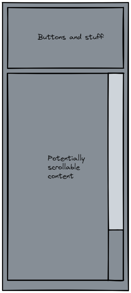
When I was still a junior engineer, I was tasked with a project that was high in product value but ambiguous in how much engineering effort it would take. The gist was that the sidebar had some additional buttons and information that we wanted to hide to make more room for any scrollable content, should there be any. This would allow more of that scrollable content to be displayed on the screen at once which was of high value to customers.

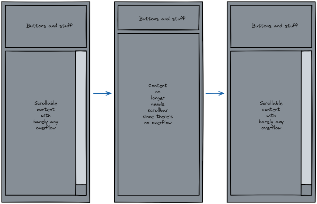
The mistake I made here was that I accidentally created a circular dependency. The buttons that would collapse would only do so if there was a scrollbar (i.e. if there was overflow). Yet, in circumstances where there was a small amount of overflow to begin with, the collapsing of the buttons would potentially remove the scrollbar altogether. This would cause a loop where the overflow was gone, but the buttons would re-expand.

You can see how this would look god awful in the UI because the buttons would keep expanding and collapsing essentially all on their own.
It didn’t take long to realize I was in over my head with this one and basically we decided to drop this project.
Making a responsive horizontal toolbar
My second attempt at making some kind of responsive UI was actually very recently. In this situation, we wanted to achieve a fairly similar kind of effect as in the sidebar example but it was horizontal and the “scrollable content” was a potentially long line of text.

In this case, we wanted to make the buttons to the right of the text collapse if the line of text was overflowing (i.e. if it had an ellipsis).
I wish I could say that I didn’t go off and make the exact same mistake as I did the first time I attempted responsiveness 2 years ago, but I would be lying. In my first attempt at this, I used logic that looked like
If the line is long:
   collapse the buttons
else:
   fully show the buttons
Of course this logic falls apart just like in the sidebar example because if the text just happens to be a little long but not very long, you might collapse the buttons only to find that now the text is fully visible. This starts another sad glitchy UI loop that makes you question your life choices and wonder why you were ever hired.
What I learned
The story doesn’t end here fortunately! After working through my brain-fart, I was able to discover that I was approaching this all wrong. Well ok maybe not ALL wrong, but still there was a piece of the puzzle I was missing. I realized I couldn’t make both variables depend solely on each other so I pulled in a third variable: how much space was available.

In between the line of text and the buttons, there was a spacer div. By attaching a ref to the spacer div, I could examine how much clientWidth was available in between the text and the buttons. Using this information I could now change the logic accordingly:
If the line is long AND the spacer is smaller than the space needed by the expanded buttons:
    collapse the buttons
else if the line is not overflowing and there's enough space:
    fully show the buttons
This felt like a breakthrough for me because I was able to remove the direct dependency that the text and buttons elements had with each other.
This might sound a little cheesy but I’m glad I didn’t give up on this one. It was truly starting to feel impossible to do this kind of responsiveness and it definitely tested my tenacity.
As much as this article was mainly about how to implement responsive design, I hope you can also takeaway the fact that a lot of software engineering involves trial and error learning. The best way to approach a potentially complex problem like this is to make sure you are taking time to step away and start from scratch so you can really push yourself to think outside of the box.
