Alright! So third part in the four part series on accessibility in design. Written specifically for CS 352 Intro to Usability Engineering.
Hi again everyone,
Since this week you are conducting a heuristic evaluation, I thought I would partially analyze a little application called Canvas, maybe you’ve heard of it. Last year Canvas rolled out Dark Mode on their mobile application and Computer Scientist students everywhere cried tears of joy. And to Canvas’ credit they did a relatively good job with their side of the implementation. But there have been some hiccups, and I’ll list a few examples for you.
Take for example, the code for MatrixMultiplication() from CS 325 Analysis of Algorithms. (This is currently still a problem)

The code should be located in the white box on the bottom of the image (granted the screenshot has made the problem worse). The text is indistinguishable from the background, when viewing this natively in the mobile application, it’s slightly better with white text on perhaps an slightly gray background. Natively on light mode, the text is black on a slight gray background. In dark mode the foreground color has inverted (white), but the background color has not (light gray).
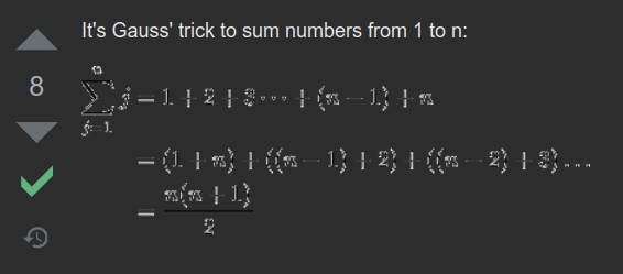
My second example is one that has since been fixed (at least as far as I’m aware, let me know if you’re still seeing this). But when viewing LaTeX equations, this is what the original view was like.

Something has gone horribly wrong here. The edges of the text are competing with the fill color, creating a very confusing contrast. Leading to many of the symbols and numbers becoming unbearable to read, or worse unreadable!
I hope I don’t have to tell you that Color Contrast is important when presenting your content! Whether you are a developer or a content creator, you should always consider whether or not people can actually see what you are trying to convey. But this is easier said than done. Especially when making digital content.
Color Contrast and Heuristics
Coming back to our Usability Heuristics, poorly chosen color palettes can unintentionally lead to violations. Take for example Number 1: Visibility of system status, if you’re making a map and you place down a “You are Here” indicator, you can say that your design has sufficiently fulfilled the heuristic. However, if your map has a white background and your indicator is white, then nobody will know where the indicator is! You can easily use this same logic for many of the usability heuristics. Especially Number 8 Aesthetic and Minimalist Design.
How can we make an visibly accessible design then?
One way to determine if people can view your content is to measure the Contrast Ratio between your foreground and background colors. This is a brightness difference ratio that ranges from 1:1(White on White) to 21:1(Black on White). Generally, if you want to be at a AA standard for accessibility (according to Web Content Accessibility Guidelines) your color contrast should be at least 4.5:1 (No rounding up allowed!).
But why is dark mode an issue sometimes?
An important concept that makes dark mode work is that color contrast ratios remain the same when you invert BOTH the foreground and background colors. i.e. Black text on white bg, or white text on black bg. Therefore, there should be no issues. Right? Riight??
But some content does not automatically invert their colors from light to dark mode. Images I’m looking at you! Some content inverts the foreground but leaves the background alone. Like the first Canvas example. Make sure to pay close attention to the elements you’re adding and how different color themes will affect them.
For more info…
If you want to learn more about Color and Contrast then I strongly recommend you read this WebAIM article, WebAIM Understanding WCAG 2 Contrast and Color Requirements. You can also use their free tool for checking if your color choices meet the Web Content Accessibility Guidelines, WebAIM Contrast Checker.
Lastly
In the Canvas Dark Mode roll out post by jozsefdavid, they do mention Accessibility at the top of their priority list! So I really should mention that, Canvas is a platform for content creators (Instructors/Schools) and therefore should by no means take all the blame for any Dark Mode issues. Content creators like the instructing team for CS 325 should now be looking to update their courses for students using dark mode. Perhaps they could change their code blocks to be images with text (Without transparent backgrounds), but then they’ll need to provide a large alt-text block for those who use screen readers. More accessibility issues! Regardless, with the release of Dark Mode, all courses should revamped to make sure color choices fit to at least WCAG AA color contrast ratios.

