Hello and welcome back to my blog! Today I wanted to mix-up the project update with a bit of UI comparison. I’ll be displaying some of the app’s progress thus far PLUS compare the current app screens to the planned wireframes.
Let’s begin with the Home/Login Screen – the left image is the planned wireframe and the right image is the current screen:
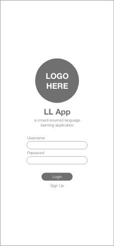
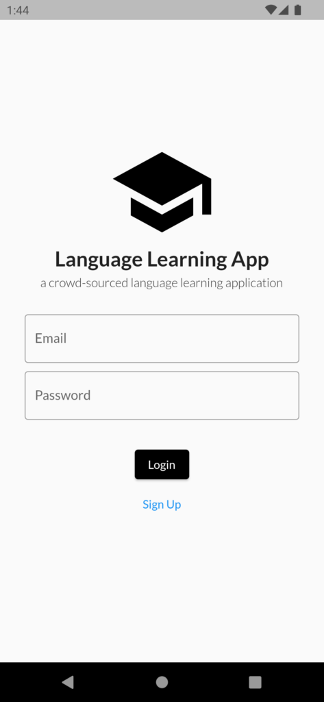
The rough layout remains the same between the prototype and app – icon, title, subtitle, email entry, password entry, and buttons are stacked in the same order for both screens. The entry boxes have been altered to rounded squares for input visibility; the oval shape of the prototype entry boxes would’ve limited the visibility of the user’s text input. We are still developing an icon and title for the app, and the Auth0 login functionality is in the works!
Next screen is the Selection Screen. This screen is displayed to the user after signing up and/or logging in to the app. A user can select a language, plus whether they want to learn the selected language (‘I want to learn’) or contribute translations to the app (‘I want to contribute’):
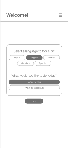
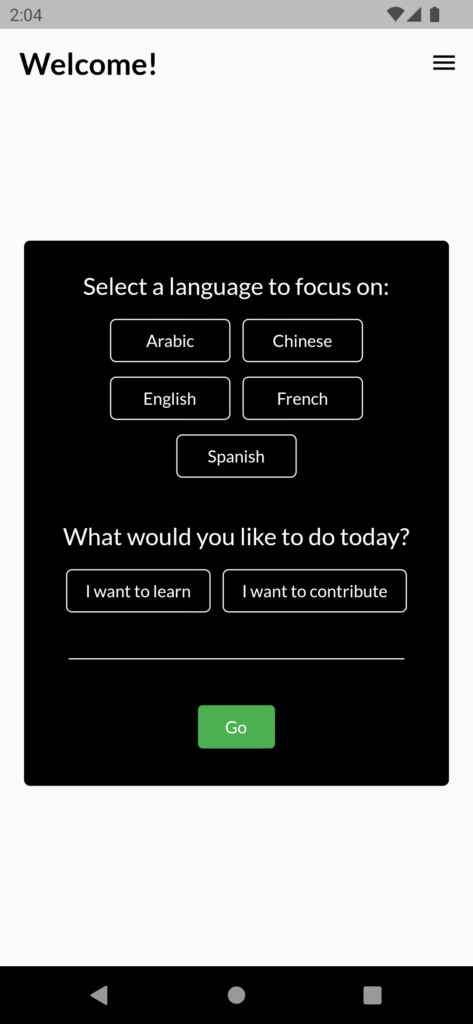
A number of changes were implemented on this screen. For the sake of uniformity, many of the buttons and boxes were changed to be less rounded than their wireframe counterparts. The separating line for the navigation bar was also removed to make the screen appear more combined (this is also implemented on other screens). The ‘Go’ button is now contained within the container – this was an implementation adjustment, as Flutter form selections require buttons to be contained within one group. This is a great example of how designs must be adjusted according to the coding constraints!
The last screen we’ll be comparing is the Language Learner Scenario Selection Screen (I know, kind of a mouthful). After the user makes their language and focus choice in the previous selection screen (see above), the user is directed to one of two scenario selection screens (i.e. if a user chose ‘Spanish’ and ‘I want to learn’, they will be directed to the Language Learner Scenario Selection Screen). The other screen (the Content Provider Scenario Selection Screen) is provided to users who choose ‘I want to contribute’. Each screen is filtered by language scenario completion – completely translated scenarios will only appear in the Language Learner Scenario Selection screen, while untranslated/unfinished scenarios will only appear in the Content Provider Scenario Selection Screen – this way, there is no redundancy between the two screens:
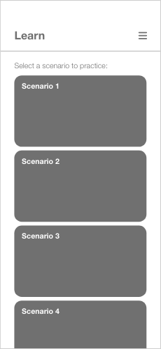
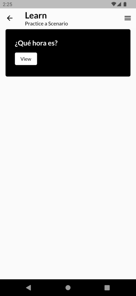
The biggest UI differences here lie in the placement of the description text and the scenario tile format. As we were developing the screen, we noticed that the description text disappears as the user scrolls; to fix the solution, we added the description as subtext to the navigation bar. With this adjustment, the user can continuously see the screen’s description text while scrolling. The additional view button on the scenario tile was added to keep with the UI style of previous screens – it wouldn’t make sense to go from rounded square button inputs to giant tile buttons. Consistent UI makes for a better user experience!
This marks the end of the project update! Hope you gained some insight on the development process, as well as an understanding on how wireframes do (and don’t) translate to final product.
