One of the major advantages of digital learning is that we can ensure our materials are accessible to all students. As such, at Ecampus, we are striving – and encouraging others to strive – for universal design, that is, design that anyone can use comfortably regardless of any impairments. In past posts, we have covered various ways of improving accessibility in a course, including how to fix PowerPoint or Word files. Today I’d like to focus on making Canvas pages accessible and making use of the on-page Accessibility Checker available in the Canvas Rich Content Editor.
Common Issues
Here are the main things you can do to ensure your Canvas pages (including assignments, discussions etc.) are accessible:
Use proper hierarchy of headings and do not skip heading levels. You want to start with Heading 2 (Heading 1 is the title), then subordinate to that will be Heading 3 and so on. This is especially useful for screen reader users because it helps with logical page navigation. Some people choose their headings by the font size – not a good idea! If you want to adjust the size of your text, use the “Font sizes” option in the editor, after designating the correct heading level.
Add an alt text description to any image or mark it as decorative. This is helpful for screen reader users and people for whom the images are not loading.
Make the link names descriptive, rather than just pasting the url. For example, you would write Student Resources instead of https://experience.oregonstate.edu/resources. Also, avoid linking “click here” type of text. This helps screen reader users (which would read a url letter by letter), and it also makes it easier for everyone to scan the page and find the needed information.
Ensure good color contrast. I often see instructors making their text colorful – in particular, red seems to be very popular. Indeed, a touch of color can make the page more visually pleasing and help bring out headings or important information! The danger lies in using colors that don’t have enough contrast with the background. This is especially problematic for people with less-than-optimal eyesight, but good contrast really just makes it easier for all of us to read. Also, a word of caution: Canvas has recently rolled out dark mode for mobile platforms and many people like to use it. Some colored or highlighted text may not look clear in dark mode.
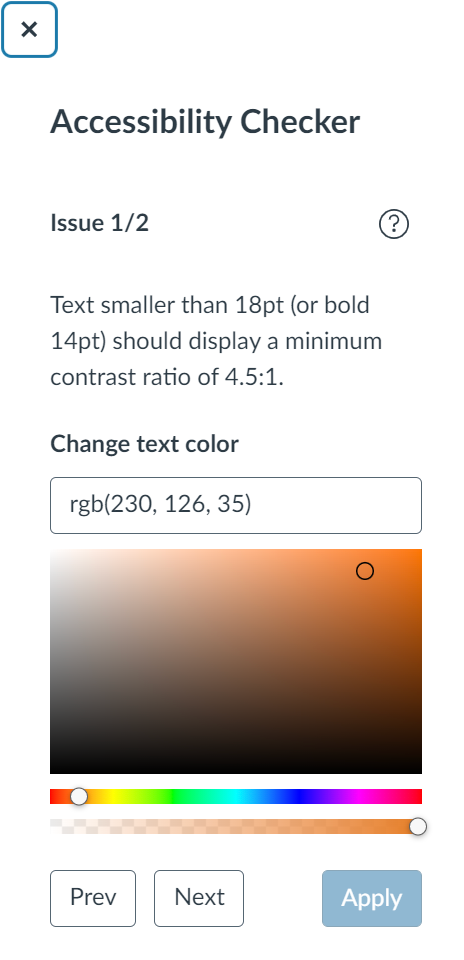
Add caption and header row to tables. These are extremely helpful for screen reader users, and the caption helps everyone to quickly see what the table is about. To add these things, you actually have to rely on the on-page accessibility checker – it will flag the issues and walk you through fixing them. While we’re on the subject of tables, you also want to avoid complex tables with merged cells because they are hard to navigate for a screen reader.
Avoid underlining text. Underlining is normally reserved for links. Try using other means of highlighting information, such as bold, italics or caps.
Find and Fix
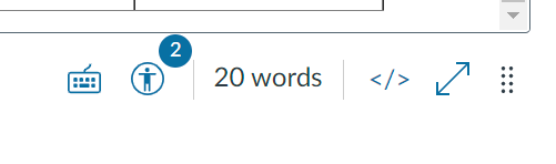
Canvas has a very useful tool that can help you find some accessibility issues as you edit your page. At the bottom of the editor, the icon representing a human in a circle will show notification when something is amiss.
When you click on that icon, the checker will open on the right-hand side, explaining each issue and allowing you to fix it right there.
This tool can find:
Skipped heading levels/starting with the wrong heading
Missing alt text
Insufficient color contrast – you can find a suitable color right here
Missing table caption and header row
It will NOT flag poorly formatted links or underlined text. So, for these issues, you’ll have to watch out yourself!
When you’ve finished building your course, you can also use UDOIT, the global accessibility checker, or Ally, if your institution has installed it. These tools can help you find additional problems, including embedded materials with accessibility issues.
To conclude, following these simple rules can greatly enhance the usability of your Canvas course. The built-in accessibility checker will help you spot and fix some common issues. Once you start paying attention, building instructional content with accessibility in mind will become second nature!
In this post I’m returning to an important topic: accessibility. In a previous blog my colleague Susan Fein explained how everyone benefits from more accessible materials and that a large number of our students have some degree of disability.
Word documents are ubiquitous in our courses, as well as for other work-related activities. If a Word document is designed for digital consumption – such as posting in the Learning Management System or on a website – it needs to comply with accessibility standards. Fortunately, Word includes excellent tools for making your file accessible! I will first go over the main accessibility features, and then show you how to implement them in the video below.
Accessibility checker: Word includes a tool that helps you check your work. It is useful but it doesn’t catch all the errors.
Structure: headings, spacing, lists: Marking these properly will let screen reader users skim the content and understand its organization easily. Structure a document in a hierarchical manner: the title should be Heading 1 (NOT the “Title” style – that one just gets read as simple text). The next major sections should be Heading 2, subsections of a Heading 2 are Heading 3, and so on. Do not skip levels. You can change the appearance of all these styles to match your aesthetic. If you wish, you can also save style sets to have them ready to use.
Images: There are two main things to take care of here: adding alt text (so screen reader users can listen to the description) and making sure that the image is in line with the text (to keep the reading order clear).
Colors: If you use colors, make sure there is enough contrast between text and background. Even people with good eyesight can struggle to read something if the contrast is not strong. In addition, remember that many people are color blind, so do not rely on color to convey essential information. For example, avoid something like “The readings in blue are very important, make sure you read them carefully! The optional resources are in green”. Use other means of signaling instead, such as bold or italics.
Links: Links need to include meaningful text rather than the URL. A screen reader will read the URL one letter at a time, which is not very helpful. In addition, descriptive links help both screen reader users and sighted users skim the document to get an idea of the content or find specific information.
Tables: Tables can cause trouble to screen reader users – do not use them for layout! Only use them for actual tabulated information. When you use tables, the main rule is to keep them simple and avoid split cells, merged cells and nested tables. Then, make sure you have a designated header row, which helps screen reader users navigate the data.
Document properties: The document needs to have a title set in its properties. This title is helpful for blind users because the screen reader announces it as the document is loaded in the program.
Save to PDF – yay or nay? Avoid turning your document into a PDF file, if the document is meant for online reading. PDFs are hard to make accessible. If you must make a PDF, start with a fully accessible Word file. It is recommended to use PDFs only when the design includes complex or unusual elements (for example special/technical fonts, musical notes etc.). If you are using a PDF because you have a complex layout, consider posting both the PDF and a simplified Word file, in case someone needs the fully accessible version.
Watch this 10-minute video that walks you through an example of making a document accessible. I’m using Microsoft 365 on Windows – if you’re using another version of Word or platform, things may look slightly different. Timestamps:
Accessibility checker – 00:38
Headings – 01:46
Lists – 04:56
Spacing – 05:27
Images – 06:16
Colors – 07:29
Links – 08:09
Tables – 08:49
Title Property – 09:33
As you can see, the process of creating accessible Word documents is straightforward. Turning this into a standard practice will greatly help people who access information electronically, with or without assistive devices. Let’s make it happen!
If you use slide presentations to deliver information and then provide a digital version of the slides to support learners, this post is for you!
Instructors teaching online or who use a companion LMS or website to accompany in-person classes often upload the slide file to aid students in notetaking. However, you may not be aware that digital files are not automatically accessible to those using assistive technologies, such as screen readers. Following a few simple and easy guidelines will improve accessibility of your materials for all students and demonstrate your thoughtful attention to inclusivity and equity.
Who Benefits from Accessibility?
Everyone, not only those with disabilities, benefit from accessible learning materials. The U.S. Census Bureau estimates that there are more than 40 million people in the U.S. with a disability, so odds are good that some of them will be in your courses.
Accessibility practices support all learners, not just those who require them. In 2016, the OSU Ecampus Research Unit conducted a nationwide survey about student use of video closed captions. In that study, 70% of respondents who did not self-identify as having a disability used captions at least some of the time.
I asked OSU’s disability access center how many online students request disability-related accommodations. So far this year, 23.9% of those served by their office are Ecampus students. Last year, nearly 40% of all Ecampus courses had at least one student with an accommodation, and nearly 15% of all online-only students used a disability-related accommodation.
To ensure equity, regardless of who does or does not depend on accessibility support, it is vital to make all learning materials compliant with accessibility standards. When educators intentionally create fully accessible materials, we more equitably serve all online learners.
What Can You Do?
Here are five easy-to-follow tips that elevate your commitment and ability to create accessible materials.
Tip #1. Use a template. Templates are important because basic formatting for accessibility is already built in. By inserting your content into designated sections, you preempt some accessibility issues without any extra effort. For example, when you insert the topic of each slide into the designated title field, the slide structure maintains the correct sequence in which a screen reader encounters the various elements on the slide. If you are concerned about being too constrained or predictable, these designated fields accommodate your creativity! It is okay to reshape, resize, or reposition a field if you do not like its default appearance or location.
Regardless of which end of the design spectrum you lean, always start with a template. If you are not fond of colorful designs or fancy formats, there is a basic, unadorned template you can use. If you are a fan of fun, frivolity, or fabulous, select one of many free template options found online to suit your theme or topic. Check out the different templates Ecampus has developed with college-specific themes. One of them might be a good fit for you.
Tip #2. Enter a unique title on each slide. Each slide in your presentation must have a unique title. This permits a screen reader to navigate easily from one slide to the next. What happens when you have segments of the presentation that require two or more slides to fully deliver the information? No problem! There are various ways to address this.
When several slides focus on a different aspect of the primary topic, use that in the title. For example, you are creating a presentation about Health and Wellness and have multiple slides on the topic of Cooking. You want to introduce the topic, describe meal preparation, and offer ideas for healthy snacks. Since these are three distinct subtopics, a good approach is to label the slides as Cooking: Overview, Cooking: Meal Preparation, and Cooking: Healthy Snacks. Repeating the main topic in the title helps the learner connect each segment but still delineates separate subtopics.
If the subject matter does not neatly break into clear subgroups, it is fine to use a sequential number, such as Cooking Part 1, Cooking Part 2, etc. Since most creators develop a presentation’s content, sequence, and flow thoughtfully and logically, if you take a moment to consider why you grouped together specific ideas, the unique titles will likely emerge.
Tip #3. Follow best practices. If you search online for guidance about how to create effective slide presentations, you will discover that many sources offer similar suggestions. Most of these include recommendations about text (contrast, font size, font style), use of images, page structure, and so on. Use this short list as a helpful reminder of these other accessible-friendly best practices.
Text should be easy to read, with good contrast. Black text on a white background is ideal and classic. Be cautious of templates with too subtle contrast. They might not meet accessibility guidance for visually disabled learners. Use 18-point (or larger) sans serif font for readability.
Use images judiciously. Pictures convey themes, present an idea, or evoke a mood. However, too many can detract from the message, be confusing, or appear unprofessional. Aim for a “less is more” approach. (Learn more about accessibility for images in the next tip.)
Include adequate white space to separate and group content. Bullets are optional. Keep slide structure simple. Use phrases or a few words rather than full sentences. Break up content into multiple slides to avoid crowding.
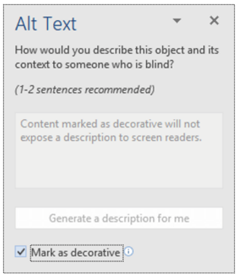
Tip #4. Create alt-tags for images. A screen reader recognizes the presence of an image but it cannot discern the content. To be accessible, that information is provided as a text description or alt-tag.
If you have images in your slide deck, each must have an alternate text description. The alt-tag describes and explains the content of an image. Usually it is not accessible or helpful to use the file name. And beware of tools that try to divine the content of an image and insert descriptions. These are usually wildly inaccurate and unhelpful.
The majority of images in an effective presentation should be essential to the learner’s experience; the image is required for accurate comprehension of the content. The are images such as charts, graphs, photos, maps, or data. Other images may be optional or decorative; nice to have but not essential to the learning and, if not seen by the student, do not impede the learner’s ability to grasp the material.
For essential images, write a brief (1-3 sentences) text description. No need to include lead-in words like “this is an image of…” Describe the key educational value of that image. What about it is important to the learner? What is the essence of the information you want the learner to know about that chart, graph, or photo?
Screen image from Office 365 PowerPoint
Decorative images have two options: enter a description or skip over the image. To skip, enter null text (“ ”) as the alt tag or, if available in your version of PowerPoint, select the “decorative” option. Both choices direct the screen reader to ignore the image. If you prefer to tag a non-essential image, use a simple description, such as “team logo” or “Professor Kumar.”
Understand that writing good alt tags is a challenging skill that takes time and practice to master, so do your best. You may want to confer with the Disability Access Center, an instructional designer, or other faculty support group if you need assistance.
For more information about how to write effective alt tags, refer to these or other resources.
Tip #5. Use meaningful text to format links. Please do not insert a full URL on your slide. Screen readers recognize a URL link and read aloud every individual letter and symbol, often in a monotone mechanical voice, depending on the specific assistive tool. Think about how frustrating, confusing, and unhelpful that is. Instead, format each link using meaningful text, as demonstrated in this post. For example, the two resources linked above use the article’s full title as the meaningful text. Also, avoid the over-used, too generic “Click here for more information,” with the word “here” formatted as the hyperlink. Instead, select text that specifically identifies the URL content, such as “Visit the Disability Access Services web page for more information.”
Accessibility Supports Equity
Demonstrate your commitment to equity! With just a few extra minutes, you can easily meet minimum accessibility standards by following these tips and using the accessibility checker tool built right into PowerPoint!
Reference
Linder, K. (2016). Student uses and perceptions of closed captions and transcripts: Results from a national study. Corvallis, OR: Oregon State University Ecampus Research Unit.
The LMS Canvas by Instructure comes with a decent set of styled elements to start with, but diving into the HTML editor is where you can really modify content, giving it a specific look and feel. Recently I have found that I am going to these customized elements more often to help achieve learning outcomes and provide a different look and feel for accessible course pages.
It is not limitless, however, or even as open as regular web development would be. Canvas has an HTML Editor Allowlist for elements, styles and classes (though some absent from this list will work if you give it a go!). Many of these are activated by using in-line class or style, but other attributes are also available.
Without further ado, here are three of the more popular elements I have been drawn to when creating courses over the past few terms.
Accessible Rich Internet Applications (ARIA)
Defined as
a set of attributes that define ways to make web content and web applications more accessible to people with disabilities Source
These attributes are some of the most popular because they help with accessibility (particularly, screen readers) on the course site. Where native HTML5 elements are not available, these ARIA attributes help to explain what a particular piece of content does and how a learner should interact with it. By using these, we help to make courses open to a wider set of learners.
You want to include an element on your course site that expands to reveal more content. You will need to make a screen reader aware that the content is there, and what it does. Using the following should get you off to a good start:
<spanclass="element_toggler" role="button" aria-controls="something"
aria-label="longer description of the element" aria-expanded="false">
Click here to see the explanation</span>
<divid="something" style="display: none;">
The explanation.
</div>
aria-controls="something"
combines with id="something" later on in the code. The value must match the id value for it to work correctly. This is used to interact with the element.
aria-label="longer description of the element"
used to describe the functionality of the element if it is not explained prior to the interaction.
aria-expanded="false
used to tell the screen reader the button is initially closed.
Example 2: Descriptions
You have a particularly visual element on the page, and you want to write a larger piece of text for a screen reader to explain this. You can use aria-describedby and then link it to the id of an element (in the <span> below):
<p><imgsrc="close_up.jpg" aria-describedby="close_up">
<br>
<spanid="close_up">A close-up view of the rock target named "Máaz" from the SuperCam
instrument on NASA's Perseverance Mars rover.</span>
Analysis of SuperCam data shows that Máaz has a basaltic composition.
It is either an igneous rock or consists of fine grains of igneous material
that were cemented together in a watery environment.<br>
Full image and caption from
<ahref="https://www.jpl.nasa.gov/images/supercam-close-up-of-maaz">
NASA Jet Propulsion Labratory.</a> NASA/JPL-Caltech/LANL/CNES/CNRS
</p>
Device specific content
Next up, is hidden content. So you added the element_toggler above, but your learners with the Canvas Mobile App let you know they cannot click it!
Some of the projects I work on with these elements require an entirely different way of accessing the content on a mobile device.
A potential fix
Create different versions of the content by hiding each one depending on the device.
To do this, you will need to divide the content using two containers. Using the same element_toggler code from above, we can easily add a separate, but hidden part underneath for Canvas app users.
<spanclass="element_toggler" role="button" aria-controls="something"
aria-label="longer description of the element" aria-expanded="false">
View the explanation</span>
<divid="something" style="display: none;">
The explanation.
</div>
<divclass="hidden-desktop hidden-tablet hidden-phone">
The explanation.
</div>
The addition of the class="hidden-desktop hidden-tablet hidden-phone" attributes will hide this container for most users. As it is sitting outside of the element toggler, however, mobile app users do not need to click the element toggler to see the explanation! This provides a more accessible option for users of those devices.
Note: if you have access to the stylesheet for your institution, it would be more beneficial to add these changes there than on a per-page basis.
Anchoring to part of a page
If you have ever seen text content that says something similar to this…
As we discussed before…
As I mentioned previously…
Back in Module 3, we talked about…
…then you need to use this simple feature of the anchor element!
I use this a lot on course content that requires students to refer to previous material. Everyone will have heard of a hyperlink using the <a> tag, but you can also use this anchor to link to a certain part of the page. I regularly use it to send learners to particular headings or content that they would find relevant for assignments. If you set up your course from the start with this in mind, it can be a fast way to group revision material from certain parts of a page, or create more accessible navigation menus.
Give an element an id, like this:
<h3 id="section_2">Section 2</h3>
Then, when you want to send a learner back to that part of the page, just reference it by adding the id to the end of the page link with a `#`. For example:
This will take the learner directly to the heading with the id of ‘section_2’, which you set up before.
You can even do this within the same page to jump to that part of the page. Just link it like this without the rest of the URL.
<a href="#section_2”>Section 2</a>
Conclusion
These are a sample of the elements, classes, and styles I have used to enhance content over the last few terms. With each, accessibility has been a must, which requires a bit of reflection on how learners would interact with the content. There are a lot more available, and you have a list in the Canvas HTML Editor Allowlist to start experimenting. By thinking of accessibility from the early stages of course design, more users can appreciate these page elements and content.
In 1989, Kimberlé Williams Crenshaw, a lawyer and scholar of Critical Race Theory (CRT), coined the term intersectionality to describe the multiple and layered oppressions experienced by African American women. Over time, this term has been used to describe many aspects of social identity, particularly focusing on race, gender, and class oppression. Intersectionality allows us to consider the impact of multiple oppressions on individuals and groups. For example, asking what it means to be poor in the United States is different from asking what it means to bea poor, Black, woman in the United States, which is different from asking what it means to be a poor, Black, disabled woman in the Southern United States.
Intersectionality matters because, if we don’t recognize and support our most marginalized citizens, they will continue to fall through the cracks. In colleges and universities, this means that our most marginalized students may need additional support to perform to their full potential. Addressing one source of oppression may not provide enough support to students who are working to overcome multiple sources of oppression.
Disability in Higher Ed
Disability is an obstacle for many college students. Consider these statistics:
19% of undergraduate students report having a disability.
28% of American Indian/Alaska Native students reported a disability.
21% of White students reported having a disability (rounded to nearest percent).
17% of the students with disabilities are Black. (National Center for Educational Statistics [NCES], 2019).
When considering disability–or any other identity–we need to consider how other characteristics might compound the marginalization of students with disabilities. Let’s consider how race intersects with disability.
While the percentage of Black people with disabilities in higher education is lower than the percentage of White people with disabilities in higher education, in the general population, the reverse is true. According to Courtney-Long, E.A., Romano, S.D., Carroll, D.D. et al. (2017), 1 in 4 Black people have a disability, while 1 in 5 White people have a disability. This means that more white people with disabilities are accessing and progressing through higher education.
It is also important to recognize that the actual percentages of students with disabilities is higher as many students choose not to disclose their disabilities to their institutions. According to one study, “9% of students who identified as disabled did not disclose this information to their college or university” (Taylor & Shallish, 2019, p. 10).
There are clearly opportunity and equity issues that disproportionately impact students of color with disabilities in higher education.
Yet, when we work to create learning environments that are inclusive of students with disabilities, we often neglect to address intersecting sources of oppression. For example, accessibility requirements do not consider how disability intersects with other oppressions, such as class or race.
Universal Design for Learning
Universal Design for Learning (UDL) is an approach that is commonly cited as a way to meet the needs of all learners. UDL includes a framework with three general principles (multiple means of engagement, multiple means of representation, and multiple means of action and expression) each of which includes multiple guidelines and checkpoints for actual practice (CAST.org, n.d.). The goal of UDL is to increase access and usability for the greatest number of people possible. A UDL approach is structured and practical and, despite the critiques included here, is lauded for its utility by course designers and teachers alike.
UDL, however, does not meet the needs of all learners, particularly our most marginalized learners. Let me repeat: UDL does not meet the needs of our most marginalized learners, as much as we would like to believe it does. Let me highlight a few of the reasons for this.
As Dolmage (2017) explains in the book Academic Ableism: Disability and Higher Education, UDL’s emphasis on universality is problematic because universality is connected to normativity. (p. 134). Dolmage (2017) states that UDL has gained recognition by appealing to the majority, but in doing so “the needs of the majority once again trump the needs of those who have been traditionally excluded—people with disabilities” (p. 135). UDL is viewed as a framework for addressing the needs of disabled students, but its actual emphasis is on meeting the needs of the majority.
With its emphasis on “multiple means” UDL aims to include multiple learner identities and preferences; however, it “overlooks the importance of feedback from its own users” (Dolmage, 2017, p. 126). In this way, UDL ignores the individual circumstances of actual students.
By focusing on the “means,” over the students themselves, UDL is not an intersectional approach to design and teaching. Defining what a Universal Design looks like without considering the particularized realities of actual students results in the continued marginalization and erasure of students who are not in the majority.
UDL has popularized educational practices that serve many students, but in doing so, it has effectively erased the needs of some of the most marginalized students–those with disabilities. Those students with disabilities who are also part of other oppressed groups are increasingly at a disadvantage.
There’s no doubt that UDL is an incredibly useful tool and makes our course designs better, but we must not fail to recognize that UDL is not a panacea. UDL should be one of many tools we use to meet the needs of students, but let’s not forget that we need a truly intersectional approach to design and teaching. Without this, we, unwittingly or not, are contributing to the marginalization and erasure of our most disadvantaged students.
Courtney-Long, E.A., Romano, S.D., Carroll, D.D. et al. (2017). Socioeconomic Factors at the Intersection of Race and Ethnicity Influencing Health Risks for People with Disabilities. J. Racial and Ethnic Health Disparities, 4, 213–222. https://doi.org/10.1007/s40615-016-0220-5
Dolmage, J. (2017). Universal Design. In Academic Ableism: Disability and Higher Education (pp. 115-152). Ann Arbor: University of Michigan Press. Retrieved June 8, 2020, from www.jstor.org/stable/j.ctvr33d50.7
Taylor, A. & Shallish, L. (2019). The logic of bio-meritocracy in the promotion of higher education equity, Disability & Society, DOI: 10.1080/09687599.2019.1613962
U.S. Department of Education, National Center for Education Statistics. (2019). Digest of Education Statistics, 2017 (2018-070), Chapter 3. Retrieved June 10, 2020 from https://nces.ed.gov/fastfacts/display.asp?id=60
The other day, my six-year-old asked me what the word “industrious” means, and I was overcome with pride and, moments later, mild panic as I tried to answer his question and couldn’t clearly articulate the meaning of the word.
This experience ended well (thanks, Alexa), but prompted me to think about how often we use words without fully understanding what they mean. We don’t question the meaning of these words when they are used in our work or daily interactions. We may use these words ourselves on occasion–or with regularity–but when we stop and try to define these words, the proper associations and descriptions don’t come immediately to mind.
In my work as an instructional designer, it’s common to talk about universal design or inclusive design, and in many cases, to use these descriptors interchangeably, when talking about design that is usable by a wide range of people. To a lesser extent, accessibility is used in a similar way, but, I think, our shared understanding of this term is more reliable.
For this blog post, I would like to spend some time defining and distinguishing these terms and grounding them in a historical context to more fully convey the nuances and layers of meaning ascribed to each term. I’ll wrap up with some strategies for designing courses to better meet the needs of all learners.
Accessibility
According to the Web Accessibility Initiative (WAI), “Web accessibility means that websites, tools, and technologies are designed and developed so that people with disabilities can use them.” It’s clear from this definition that accessibility is intended to address the needs of users with disabilities, so let’s consider disability.
Prior to 2001, the World Health Organization (WHO) defined disability as a personal health condition. This definition placed emphasis on the individual. However, in 2001, the WHO redefined disability as a mismatched interaction between a person and their environment. This new definition places emphasis on the environment, rather than the individual. As a result, the onus is no longer only on the disabled individual to manage their health condition; rather, those who have influence over the environment need to make changes to the environment to better accommodate everyone who is interacting with it. In our case, the learning environment is the web, or more specifically, online courses.
Unlike the other two design approaches we’ll consider, accessibility is intended to address the needs of users with disabilities. Another distinguishing feature of accessibility is that it describes an end goal. Our web content should be presented in such a way that the end result is an accessible website or technology. While this post will not go into the how of making web content accessible, here are some elements you may be familiar with: alternative text (alt tags), headings (H1, H2, H3, etc.), color contrast, captions and/or transcripts, reading order, keyboard navigation, and descriptive URLs are all examples of accessibility elements. All of these elements define what our design should look like, not how to get there.
Another distinguishing feature is that accessibility is required by law. We won’t delve into the specifics here, but it’s important to recognize that accessibility is a legal compliance issue.
Universal Design for Learning (UDL)
While accessibility addresses specific features of a website or online learning environment, Universal Design for Learning (UDL) takes a broader approach. UDL guidelines still emphasize accessibility, but the emphasis is not solely on making disability accommodations or complying with the law. The goal of UDL is to provide the greatest degree of access and usability for the widest range of individuals.
UDL includes a framework with three general principles, each of which includes multiple guidelines and checkpoints for actual practice. A UDL approach is structured and practical and, similar to accessibility, UDL defines an end goal: a product that is usable by the widest range of individuals possible. The framework, however, emphasizes the design, which is only one aspect of creating an online course.
To broaden our understanding of UDL, it’s important to understand that UDL emerged from universal design, which is an architectural concept. Architecture, unlike the web, is physically fixed, and as such, the emphasis is on a single design that works for everyone.
Inclusive Design
While UDL emerged from architecture, inclusive design was “born out of digital environments,” and, while architecture is fixed, the web is flexible and ever-changing. As such, inclusive design emphasizes flexibility and process. Inclusive design is iterative. With an emphasis on iteration and process, inclusive design cannot be separated from the lived experience of actual users. In other words, if the users (in our case, students) are contributing to and evaluating the design, then we can no longer separate the design and delivery–the creation and facilitation activities.
With a focus on process, inclusive design emphasizes co-creation and frequent feedback from multiple developers as well as end users. In particular, seeking contributions from excluded communities during the entire design and evaluation process is critical to an inclusive process.
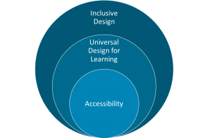
Unlike accessibility and UDL, inclusive design is focused on process and iteration. To help illustrate how we see these three design approaches working together, my colleague, Elisabeth McBrien and I created the figure below (figure 1).
Figure 1. An inclusive design process will always include UDL and accessibility as end goals.
We see accessibility compliance as core to any design. UDL goes beyond the requirements of accessibility to meet the needs of all users. In an inclusive design process, UDL and accessibility are always the end goal, but inclusive design emphasizes the importance of feedback and iteration. We can always improve and we always have more work to do.
In Practice
Now that we have a better understanding how accessibility, UDL, and inclusive design work together to contribute to a learning environment that meets the needs of all learners, how do we apply them and improve? Ecampus has many guidelines and templates that help us to meet the goals of accessibility and UDL, but how can we be more inclusive throughout this process?
Here are some inclusive approaches that you might consider integrating into your course facilitation and teaching:
Build rapport with students. This is accomplished by infusing instructor presence whenever possible. Respond to Q&A questions and emails within 24-48 hours. Share resources. Deliver feedback promptly. An important element of rapport and presence is showing your personality, so consider using video to welcome students and to encourage them throughout the course.
Solicit feedback. One of the easiest ways to solicit feedback from your students is to use a survey. Keep surveys short and consider asking students to share in a few words how the course is going or what they find most challenging.
Establish clear criteria and structure. Rubrics, templates, examples, and consistent naming and organization of course materials are just a few ways to provide clarity and structure.
Acknowledge student contributions. Praise is an instant confidence booster. Do you have a student–particularly, an underrepresented student–who did an exceptional job on one of your assignments? Let them know. Consider sharing their work as an example–with their permission, of course.
Feature counter-stereotypical examples of people in your field. One common barrier to success for underrepresented students is that they don’t see themselves reflected in a particular discipline. Make sure your readings, examples, and other course materials represent a variety of identities. If there’s a lack of diversity in your field, find a way to acknowledge this to your students.
Promote student agency and autonomy by giving them choice, whenever possible. Providing choice and promoting agency allow students to connect your course to their own experiences and values.
Emphasize real world applications of course work. Often, we assume that our students understand the purpose of course activities, but this is not always the case. Sharing real world applications will help students to see the value and greater purpose of their studies.
Final Thoughts
We’ve covered a lot in this post, and I hope that we’ve come away with a better understanding of disability, accessibility, Universal Design for Learning (UDL), and inclusive design. One of the most important takeaways is that inclusive design is an ongoing process of feedback and iteration. As our student body changes, so do their needs. In an upcoming blog post, Elisabeth McBrien will share more details about student needs and how you might use student personas to design more inclusively.
As we continue the challenging–yet meaningful–work of creating welcoming online learning environments, it’s important that we have a shared understanding of what that work entails, what work we have done, and what work we have yet to do.
Online education provides access to all types of students and from all across the world. Each student is unique and has unique educational needs. To better attend to our student’s needs, we can develop course materials from the beginning to be more accessible for everyone.
What can I do?
Provide the equivalent alternative to multimedia
When creating or selecting multimedia for a course, an equivalent option should be provided for students that cannot access the multimedia. As an example, if you are creating lectures you should create a word for word transcript that can be posted or better yet, be used to create closed captions.
Provide “alternative” description for images
For students who use screen readers, adding an “ALT-TAG” on all images used in the course helps them to “see” images or skip over unnecessary decorative images efficiently. The ALT-Text should describe the educational value of that image. What they are they supposed to gain from that image and why is it essential to the course material?
Make all file types accessible
When creating or selecting documents to use in your class, you’ll want to make sure that all files are accessible to students. Using built-in accessibility feature in Word, PowerPoint and PDF documents will help to develop an accessible structure for that document.
Creating meaningful link names
All students will benefit from having a link that describes where they are going to link out to. Students who use screen readers will be especially grateful if they have a link that says “Oregon State University Library resources” instead of “click here” or simply the URL.
Use contrasting colors
Credit: Zero Project Conference
Dark text on light backgrounds or light text on dark backgrounds will help all students read your important information easier than, perhaps, orange text on a red background. Doing this also limits the trouble that students who are color blind to see the difference between the background and text. Remember to not use color as the only form of meaning. If you have red and green text showing students what to and not to include in a paper, make sure there are headings that also state that information. Want to know what colors and backgrounds work? Check out WebAIM’s Color Contrast Checker.
If you have any tips or questions, please leave them in the comment area below.
“Universal design is the design of products and environments to be usable by all people, to the greatest extent possible, without the need for adaptation or specialized design” –Ron Mace, NCSU Center for Universal Design
A fundamental of online instructional design is that learning materials should be accessible to all students. Ecampus works closely with faculty to ensure accessibility of course content for everyone. For example, since some students cannot hear an audio track on a lecture video, it’s essential that a transcript of the narration or closed captioning is provided.
Martha Smith and Gabe Merrell are OSU campus leaders in universal design and accessibility, and frequently discuss universal design for instruction with OSU faculty and staff. Martha is Director of Disability Access Services, and Gabe is Senior Accessibility Associate and Deputy ADA Coordinator in the Office of Equity and Inclusion. They note that the principles of universal design offer guidance for the design of every element of an instructor’s “toolkit,” from syllabi to presentation of content, course activities and assessments. They point out that universal design benefits all learners. For instance, some students who can hear the audio track on a lecture video find that they learn more if they take a few extra minutes to read the companion transcript.
Gabe and Martha emphasize the importance of considering universal design up front in the development of teaching materials, instructional methods and means of assessing student learning. This is the approach the Ecampus Course Development and Training team takes with online and hybrid course development. As Ecampus serves an increasingly diverse student population, universal design enhances learning in the online classroom.
Ecampus instructional designer Melanie Kroening has created a great guide called 5 Accessibility Tips for “DIY” Course Designersthat provides practical techniques for instructors to enhance the accessibility of course content.