This article has its roots in a discussion I had with an Ecampus intern about going on the job market. This intern is working in an academic technologies role at a higher ed institution already, but also getting the Instructional Design certificate here at OSU. It was my first time thinking about what the growth of instructional design certificate and degree credentials means for all instructional designers. Very few of the instructional designers I’ve met and worked with here or at my previous institutions actually have degrees in instructional design, including myself. The field of instructional design emerged out of a specific institutional and educational need in higher education and corporate education, which makes for an ever-growing, ever-changing, but always innovative membership. How do we, as a field, continue to be inclusive of all instructional designers, regardless of their academic or educational backgrounds? 

One potentially positive fact is that academia moves very slowly, so we have some time to strategize. Instructional design is still an emerging speciality within higher education, with each institution classifying that role differently, and providing that role with different levels of support. Some institutions, even today, do not have any instructional designers. Current research indicates that this must change. One of the best sources of data about the field of instructional design in higher education and instructional designers is the Changing Landscape of Online Education (CHLOE) Project. The participants in the CHLOE survey are “the senior online officer at each participating institution.” This survey pool recognizes the variance in organizational structures at different institutions by focusing on the COO’s purview. In the 2019 CHLOE 3 survey, it was reported that the median number of instructional designers employed at 2-year colleges, and public and private 4-year institutions, was four, regardless of enrollment or institution size. In CHLOE 7, one of the conclusions was that “insufficient instructional design staffing may be one of online learning’s most serious long-term vulnerabilities,” with only 10% of Chief Online Officers surveyed describing their ID capacity as sufficient for their current needs, and only 3% believing they would be able to meet anticipated need. 

These findings signal that universities should be moving towards a significant fiscal investment in hiring instructional designers. Joshua Kim wrote a few key takeaways from the CHLOE 7 in CHLOE 7: The Present and Future of Instructional Design Capacity. Kim predicts that universities will need to not only hire more instructional designers, but that these roles will need to be hybrid or remote to attract the post-pandemic workforce. In addition to hybrid and remote options, Kim posits that, “Forward-thinking universities may find that they need to start offering star non-faculty educators the same recognition and incentives that have long been necessary to recruit and retain star tenure-line faculty.” But what does this mean for instructional designers? How would an instructional designer even be able to become identified as a “star” within the field or even at a specific institution? 

Understanding Branding for Faculty and Non-Faculty Educators

Circling back to my initial inquiry about what instructional designers can do to ensure the field stays inclusive, I believe an individual enterprise will have a collective impact that will benefit the largest number of people: personal branding. In What’s the Point of a Personal Brand? Executive coach Harrison Monarth uses the story of his client, Mike, to illustrate how important it is for employees to think about how personal branding is now a strategy for gaining visibility within organizations, and that visibility is now a key component when employers are thinking about promotion. Monarth observes that “In high-performing organizations, at certain levels, everyone is exceptional. To clearly differentiate your value and what you bring to the table, you need to do more than have a good reputation. You need to have an outstanding personal brand.” Having a brand isn’t the same thing as being a celebrity, although I think many would agree that there are celebrities in every field, even instructional design. 

Creating a personal brand is a successful career strategy outside of the corporate world as well, and one of the fields that is encouraging faculty to think about branding is not, as one might think, business but medicine. In 2019, the Academic Medicine blog published Knowing Your Personal Brand: What Academics Can Learn From Marketing 101, the purpose of which was to persuade medical professionals that a brand identity can be empowering. According to the article,

[K]nowing one’s academic brand can (1) help faculty members approach projects and other responsibilities through the lens of building or detracting from that brand, (2) provide a framework for determining how faculty members might best work within their institutions, and (3) help faculty members better understand and advocate their own engagement and advancement.

Although this article specifically speaks to and about academic teaching faculty, Instructional designers at institutions are often placed in the professional faculty role, along with librarians or program directors, and have many of the same professional demands on their job descriptions. As former faculty, I can attest that both of my careers have included independent  research, departmental service, and conference or publication responsibilities. 

Finding Your Personal Brand

If a brand is defined as opinions that people have about you based on your work, it is important to be self-aware, and intentional about the work that you do. Creating your brand can be a difficult task if, like me, you have a variety of experiences and interests. It requires self-reflection about one’s accomplishments and body of work as a whole, and the need to generalize what are sometimes very disparate activities. In Using Your Personal Mission Statement to INSPIRE and Achieve Success, an article published in Academic Pediatrics, the official journal of the Academic Pediatric Association, the authors describe a framework for building a personal mission statement (INSPIRE):

  • Identify Your Core Values
  • Name the Population You Serve
  • Set Your Vision
  • Plan How You Will Achieve Your Vision
  • Identify Activities That Align With Your Mission
  • Review, Revise, and Refine Your Mission Statement
  • Enlist Others to Help You Accomplish Your Mission

A slimmed down version of this same framework can be a helpful starting point for creating a brand identity. It enables you to identify your core values, name the population you serve, and identify activities that support those values and populations. But unlike a mission statement, this framework is best completed in reverse; a backwards brand design, if you will. (Sidenote: Instructional designers love to do things backwards). I call this framework SIFT:

  • Start with your experience and accomplishments
  • Identify keywords or topics
  • Frame your work and interests
  • Tie everything together

I believe that SIFT-ing has the potential to be a reflective process that will lead to a changing self-awareness of different types of instructional designers, for ourselves, and collectively. 

Start with your experience and accomplishments

The best place to begin is with your complete resume or CV. It might be tempting to start with the tailored version you used to get your last position, but you don’t want to limit your view to only things that you think are relevant to instructional design. I can trace some elements of my brand back to my undergraduate and graduate degrees. I also include my two years as a contracted captioner for 3play and Rev within the same brand. Finding a brand that encompasses all that you are will only be successful if you use the most complete picture of yourself.

Identify keywords or topics

Your brand is more than just the places that you’ve worked at, the committees you’ve served on, and projects you’ve worked on. To understand your brand, you should begin by identifying a perspective, or positionality, that informs the decisions you’ve made in the past, however unconsciously that might have been, and looks towards the future. Keywords can be a useful next step, but you will want to avoid the potential to find yourself trapped within categories! In a field like medicine, there are already established research interests and specialties. As a field, instructional design hasn’t reached the point of specialization, but we are trending towards accepting that there are too many topics that fall under the broad umbrella of instructional design for everyone to be experts in everything. For example, the Quality Matters Instructional Designers Association has 21 expertise categories that you can select from when joining the association that others can use to find you to connect with you. 

A screencapture of the list of categories from the QM IDA website

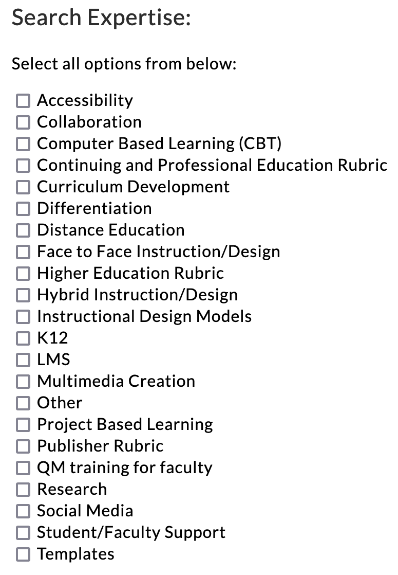
When I first joined the QM IDA, I didn’t know what boxes to check, or even what some of these categories were. And since they are presented without explanation, the criteria for self-identification are unclear. I can check almost all of these boxes as things I have experience in—with the exception of K12 and the Continuing and Professional Education Rubric, but is experience the same thing as expertise? It might be my imposter syndrome talking, but I am more inclined to identify with interests than areas of expertise. (Sidenote: I still haven’t checked any boxes.) 

Frame your work and interests

I hadn’t noticed a pattern to my interests while I was doing them, but by reflecting on my professional journey, I realized that I could trace one interest all the way back to my undergraduate honors thesis, through to my current career as an instructional designer. I’ve always had an interest in communities and the community spaces they inhabit—especially if they are online. Community doesn’t appear on QM’s list of categories, but it is the lens through which I approach many of the categories on that list. Accessibility, Computer-Based Learning, Distance Education, Hybrid instruction/Design, LMS, Multimedia Creation, Problem-Based Learning—all of these categories need to address questions of community by addressing inclusivity, access, equity, and authentic student-student and student-teacher interactions. Community is the keyword I use to frame my research interests and approach to instructional design, in all of its various forms.

Tie everything together

If you go to my LinkedIn profile, you’ll see that I have “Humanities girl in an instructional technology world” as my headline. That’s my brand. You might notice that it does not include “instructional design” or “community.” But at the same time, by labeling myself a humanist, I am evoking the words associated with humanities and humanism–things like communities, kindness, compassion, human potential, and the arts. Technology is often viewed either as the savior of humanity, or its destruction. In reality, of course, it’s both. By framing myself as a humanist working with technology, I am clueing people in that my perspective on technology will incorporate potential negative impacts for people. The playful nature of the headline i.e. using “girl” to rhyme with “world” also reveals my personality. Compare this headline with something like, “I am interested in humane approaches to technology used in education.” It’s true, but it doesn’t tell you about me as a person outside of my interests. 

Being “On Brand”

To declare a brand is not to limit your interests, nor should it be criticized as promoting a non-interest in other topics. Another observation from Kim is that instructional designers are likely very busy, and overstretched. In his words, there is “a significant mismatch between institutional demand for instructional design services and the available supply.” To avoid burnout, instructional designers need to be strategic with the projects they commit to. A brand can also help you be selective about which conferences you attend, or committees you serve on. Being “on brand” can be a way of focusing your energy, and also a touchstone of your identity. 

Using the SIFT framework, you can reflect on your professional values, and your professional goals. One of my colleagues in the field is an accessibility expert, and gets called in to consult on all things related to accessibility in addition to her daily work as an instructional designer. She recently became a certified Accessibility Professional with the IAAP, and this credential is visible on her LinkedIn profile as an emblem of her brand. Knowing her brand allowed her to appeal to her institution to allow her this opportunity that enriches not only her own skillset, but the prestige of her institution by having an IAPP certified accessibility professional on their staff. In that sense, personal branding can also help institutions build diverse departments that are teams of specialists.

To return to the three benefits of branding for faculty outlined in the Academic Medicine article, knowing my brand helps me decide where to devote my limited bandwidth by pursuing professional activities that are “on brand” for me. I can also use my brand to search for specific opportunities that will build my brand, even if those fall outside the typical skillset of instructional designers. However, moving towards a “branding” mindset also benefits my colleagues, who are equally, individually, uniquely talented, and should be recognized for their specialties and allowed to follow their passions, rather than be constrained to their job duties. As instructional design teams at universities grow, having a team of specialists can also help alleviate burnout by allowing people to play to their strengths. This can ensure that instructional design remains a space where all career pathways are valid and not contingent on specific credentials.

References

Borman-Shoap, Emily, Li, Su-Ting T., St Clair, Nicole E., Rosenbluth, Glenn, Pitt, Susan, and Michael B. Pitt. Knowing Your Personal Brand: What Academics Can Learn From Marketing 101 Academic Medicine 94(9):p 1293-1298, September 2019.

Kim, J. CHLOE 7: The Present and Future of Instructional Design Capacity InsideHigherEd (2022)

Li, Su-Ting T., Frohna, John G. and Susan B. Bostwick. Using Your Personal Mission Statement to INSPIRE and Achieve Success View from the Association of Pediatric Program Directors 17(2): p107-109, March 2017.

Monarth, H. What’s the Point of a Personal Brand? Harvard Business Review (2022)

Uranis, J. Definition Update: Chief Online Learning Officer (COLO) (2023)

As educators and instructional designers, one of our tasks is to create online learning environments that students can comfortably use to complete their course activities effectively. These platforms need to be designed in such a way as to minimize extraneous cognitive load and maximize generative processing: that is, making sure that the learners’ efforts are spent on understanding and applying the instructional material and not on figuring out how to use the website or app. Research and practice in User Experience (UX) design – more specifically, usability – can give us insights that we can apply to improve our course page design and organization.

Getting Started: General Recommendations

Steve Krug, in his classic book Don’t Make Me Think: A Common Sense Approach to Web Usability, explains that, in order for a website or app to be easy to use, the essential principle can be stated as “don’t make me think” (Krug, 2014). That may sound like a strange principle in an educational context, but what Krug referred to is precisely the need to avoid wasting the users’ cognitive resources on how a particular platform works (thus reducing extraneous cognitive load), and to make them feel comfortable using that product (enhancing generative processing). When looking at a web page or app, it should be, as much as possible, obvious what information is on there, how it is organized, what can be clicked on, or where to start; this way, the user can focus on the task at hand.

Krug (2014) provided a few guidelines for ensuring that the users effortlessly see and understand what we want them to:

  • Use conventions: Using standardized patterns makes it easier to see them quickly and to know what to do. Thus, in online courses, it helps to have consistency in how the pages are designed and organized: consider using a template and having standard conventions within a program or institution.
  • Create effective visual hierarchies: The visual cues should represent the actual relationships between the things on the page. For instance, the more important elements are larger, and the connected parts are grouped together on the page or designed in the same style. This saves the user effort in the selection and organization processes in the working memory.
  • Separate the content into clearly defined areas: If the content is divided into areas, each with a specific purpose, the page is easier to parse, and the user can quickly select the parts that are the most relevant to them.
  • Make it obvious what is clickable: Figuring out the next thing to click is one of the main things that users do in a digital environment; hence, the designer must make this a painless process. This can be done through shape, location or formatting—for example, buttons can help emphasize important linked content.
  • Eliminate distractions: Too much complexity on a page can be frustrating and impinges on the users’ ability to perform their tasks effectively. Thus, we need to avoid having too many things that are “clamoring for your attention” (Krug, 2014, Chapter 3). This is consistent with the coherence principle of multimedia learning, which states that elements that do not support the learning goal should be kept to a minimum and that clutter should be avoided. Related to this, usability experts recommend avoiding repeating a link on the same page because of potential cognitive overload. This article from the Nielsen Norman Group explains why duplicate links are a bad idea, and when they might be appropriate.
  • Format text to support scanning: Users often need to scan pages to find what they want. We can do a few things towards this goal: include well-written headings, with clear formatting differences between the different levels and appropriate positioning close to the text they head; make the paragraphs short; use bulleted lists; and highlight key terms.

Putting It to the Test: A UX Study in Higher Education

The online learning field has yet to give much attention to UX testing. However, a team from Penn State has recently published a book chapter describing a think-aloud study with online learners at their institution (Gregg et al., 2020). Here is a brief description of their findings and implications for design:

  • Avoid naming ambiguities – keep wording clear and consistent, and use identical terms for an item throughout the course (e.g., “L07”, “Lesson07)
  • Minimize multiple interfaces – avoid adding another tool/platform if it does not bring significant benefits.
  • Design within the conventions of the LMS – for example, avoid using both “units” and “lessons” in a course; stick to the LMS structure and naming conventions as much as possible.
  • Group related information together – for example, instead of having pieces of project information in different places, put them all on one page and link to that when needed.
  • Consider consistent design standards throughout the University – different departments may have their own way of doing things, but it is best to have some standards across all classes.

Are you interested in conducting UX testing with your students? Good news: Gregg et al. (2020) also reflected on their process and generated advice for conducting such testing, which is included in their chapter and related papers. You can always start small! As Krug (2014, Chapter 9) noted, “Testing one user is 100 percent better than testing none. Testing always works, and even the worst test with the wrong user will show you important things you can do to improve your site”.

References

Gregg, A., Reid, R., Aldemir, T., Gray, J., Frederick, M., & Garbrick, A. (2020). Think-Aloud Observations to Improve Online Course Design: A Case Example and “How-to” Guide. In M. Schmidt, A. A. Tawfik, I. Jahnke, & Y. Earnshaw (Eds.), Learner and User Experience Research: An Introduction for the Field of Learning Design & Technology. EdTech Books. https://edtechbooks.org/ux/15_think_aloud_obser

Krug, S. (2014). Don’t make me think, revisited: A common sense approach to Web usability. New Riders, Peachpit, Pearson Education.

Loranger, H. (2016). The same link twice on the same page: Do duplicates help or hurt? Nielsen Norman Group. https://www.nngroup.com/articles/duplicate-links/

Image by Benjamin Abara from Pixabay 

My family and I were preparing for a move. We packed up some of our things, removing extraneous items from our walls and surfaces and preparing our house to list and show. Not willing to part with these things, we rented a small storage unit to temporarily warehouse all this extra “stuff.” Well, as it turned out, we ended up not moving at all, and after a few months went to clear out the storage unit and retrieve our extra things. The funny thing was, we could hardly remember what had gone in there, and as it turns out, we did not miss most of the items we had packed away. We ended up selling most of what was in that storage unit, and shortly thereafter, we did even more “spring cleaning.” One of the bedrooms, which also doubles an office, needed particular attention. The space was dysfunctional, in that multiple doors and drawers were blocked from fully opening. After a little purging and reorganization this room now functions beautifully, with enough space to open every door and drawer. I have been calling this process “moving back into our own house,” and it’s been a joy to rethink, reorganize, and reclaim our living spaces.

Course Design Connection

As I have been working with more instructors who are redeveloping existing courses, I have been trying to bring this mindset into my instructional design work. How can we reclaim our online learning spaces and make them more inviting and functional? How can we help learners open all the proverbial doors and operate fully within the learning environment? You guessed it: While our first instinct might be to add more to the course, the answer might lie in the other direction. With a little editing and a keen eye on alignment, we can very intentionally remove things from our courses that might be needless or even distracting. We can also rearrange our pages and modules to maximize our learner’s attention.

Memory and Course Design

Our working memories, according to Cowan (2010), can only store 3-5 meaningful items at a time. Thus, it becomes essential to consider what is genuinely necessary on any given LMS page. If we focus on helping learners to achieve the learning outcomes when choosing the content to keep in each module, we can intentionally remove distractors. There can be a place for tangential or supplemental information, but those items should not live in the limelight. To help get us started on this “cleaning process,” we can ask ourselves a few simple questions. Are there big-ticket items (assignments, discussions, readings) that are not directly helping learners reach the outcomes? Are we formatting pages and arranging content in beneficial and progressive ways? Might we express longer bodies of text in ways that are more concisely or clearly? Can we break text up with related visuals? Below are some tips to help guide your process as you “clean” up your course and direct your learners where to focus.

Cut out the Bigger Extraneous Content

It is simple to assume that for your learners to meet the course outcomes, they must read and comprehend many things and complete a wide variety of assignments. When planning your learning activities, it’s crucial to keep in mind the limits of the brain and also that giving learners opportunities to practice applying content will be more successful than asking them to memorize and restate it. For courses with dense content, lean into your course outcomes to guide your editing process. Focusing on the objectives can help you remove extraneous readings and activities.  This will allow your learners to concentrate on the key points. (Cowden & Sze, 2012)

Review Instructions

For the items you choose to keep in your course, reviewing assignment instructions, and discussion prompts is helpful.  Consider inviting a non-expert to read these items.  An outside eye might help you to simplify what you are asking your learners to accomplish by calling to your attention any points of confusion. You may be tempted to add more detail, but try to figure out where you can remove text when possible. Why use a paragraph to explain something that only needs a few sentences? Simplifying your language can enable learners to get to the point faster. (For more on this, see the post by intern Aimee L. Lomeli Garcia about  Improving Readability). When reviewing your instructions and prompts, think about what learners want to know:

·       What should they pay attention to?

·       Where do they start?

·       What do they do next?

·       What is expected?

·       How are they being assessed/graded?

(Grennan, 2018)

Utilize Best Practices for Formatting

Use native formatting tools like styles, headers, and lists to help visually break up content and make it more approachable. Here are some examples:

If I were to list my favorite animals here without a list, it would look like this: dogs, turtles, hummingbirds, frogs, elephants, and cheetahs. 

Suppose I give you that same list using a header and number list format. In that case, it becomes much easier to digest mentally, and it looks nicer on the page:

Julie’s Favorite Animals

  1. Dogs
  2. Turtles
  3. Hummingbirds
  4. Frogs
  5. Elephants
  6. Cheetahs

Provide High-Level Overviews

If an assignment does need a more thorough explanation, and your instructions are running long, you can always create a high-level overview, calling out the main points of the page. You could place this in a call-out box or its own section (preferably at the top). This is where learners can quickly look for reminders about what to do next and how to do it. Providing a high-level overview alongside detailed instructions will cater to a variety of learning preferences and help set up your learners for success.

Module Organization

Scaling up beyond single pages and assignments to module organization, consider the order you want learners to encounter ideas and accomplish tasks. Don’t be afraid to move pages around within your modules to help learners find the most efficient and helpful pathway through your material (Shift Elearning, n.d.).

Wrapping It Up

The culture of “more is better” is pervasive, and it’s almost always easier to add rather than to remove information. In online learning, when we buy into the “culture of more” we can impede the success of our learners. But more isn’t always better; sometimes more is just more. Instead, don’t be afraid to dust off that delete button and start reclaiming and reorganizing your course for ultimate learner success. Sometimes less is best. For more on the art of subtraction, see Elisabeth McBrien’s blog post from February of 2022.

References

Cowan, N. (2010). The magical mystery four. Current Directions in Psychological Science, 19(1), 51–57. https://doi.org/10.1177/0963721409359277

Cowden, P., & Sze, S. (2012). ONLINE LEARNING: THE CONCEPT OF LESS IS MORE. Allied Academies International Conference.Academy of Information and Management Sciences.Proceedings, 16(2), 1-6. https://oregonstate.idm.oclc.org/login?url=https://www.proquest.com/scholarly-journals/online-learning-concept-less-is-more/docview/1272095325/se-2

Grennan, H. (2018, April 30). Why less is more in Elearning. Belvista Studios – eLearning Blog. Retrieved April 4, 2023, from http://blog.belvistastudios.com/2018/04/why-less-is-more-in-elearning.html

Lomeli Garcia, A. L. (2023, January 17). Five Tips on Improving Readability in Your Courses. Ecampus Course Development and training. Retrieved April 4, 2023, from https://blogs.oregonstate.edu/inspire/2023/01/17/five-tips-on-improving-readability-in-your-courses/

McBrien, E. (2022, February 24). Course design challenge: Try subtraction. Ecampus Course Development and training. Retrieved April 4, 2023, from https://blogs.oregonstate.edu/inspire/2022/02/24/course-design-challenge-try-subtraction/

Parker, R. (2022, June 30). Why less is more for e-learning course materials. Synergy Learning. Retrieved April 4, 2023, from https://synergy-learning.com/blog/why-less-is-sometimes-more-when-it-comes-to-your-e-learning-course-materials/

Shift Elearning. (n.d.). The art of simplification in Elearning Design. The Art of Simplification in eLearning Design. Retrieved April 4, 2023, from https://www.shiftelearning.com/blog/the-art-of-simplification-in-elearning-design

University of Waterloo, Queen’s University, & University of Toronto; and Conestoga Colleg (n.d.). Module 3: Quality course structure and content. In High Quality Online Courses . essay, Pressbooks Open Library, from https://ecampusontario.pressbooks.pub/hqoc/chapter/3-1-module-overview/

Announcements are among the most basic yet effective ways to communicate with students, whether in person or online. In our Ecampus asynchronous online courses, announcements are often the primary way instructors pass on important information to students and can be a formidable tool for fostering instructor presence. They can be used to welcome and orient students, summarize and reiterate key concepts, and remind students about upcoming assignments, projects, and exams. Some instructors send out weekly announcements that reflect on the prior week and provide general feedback on student performance, while others only use announcements for course related logistics such as schedule changes or instructor unavailability. No matter how you use announcements, the following suggestions can help ensure you are leveraging the power of the announcements feature in Canvas. 

Best Practices

  • Keep announcements concise. Students have a limited amount of cognitive capacity and lengthy announcements may not be read in full.
    • Consider your purpose before composing and resist the urge to rehash what you have written elsewhere. 
    • If you need to remind students of an assignment, consider linking to the instructions rather than rehashing them in the body of the announcement. 
  • Send announcements on a regular schedule. If you plan to send weekly announcements, do so on the same day of the week and general time if possible.
    • Sending out a recap of the prior week and preview of what to expect in the upcoming week is most valuable if sent at the beginning of the week. If you start your course week on Monday, send your announcements on Monday mornings. 
  • Give announcements meaningful titles to reflect the content of the announcement. Labeling announcements as “week X update”, “Important date change for assignment X”, or another such descriptive title will help students find the correct announcement if they need to revisit it.

Canvas Tips

  • Delete old announcements from imported course content. Old announcements from previous courses or instructors copy over when a Canvas course is copied and are visible to students in the announcements tab unless deleted, including your own prior term announcements or those from a previous instructor. This could be very confusing for students as some instructors provide the class with quiz or test answers or information about exams in announcements that may be disadvantageous for current term students to read. 
  • Schedule out your announcements in advance using ‘delay posting’ (see image below). If you do want to reuse announcements imported from a previous term, be sure to open each message, edit the content for the current term, and choose when you would like to post each one. New announcements can also be scheduled to post on whatever day and time you choose.

  • You can set up your homepage to show recent announcements at the top of the page, ensuring students see them when logging into the course (see below). Go to the main Settings menu item at the bottom left course menu. From there, scroll down and click the “more options” link at the bottom. You’ll then see further course options- click the box next to “Show recent announcements…” and then choose how many to display. Don’t forget to save your choices by clicking “Update Course Details”.

We begin with a ghost story.

This story may sound familiar. It begins in a space of learning. You enter as a student. You know you will be in this place for the next two or three months with other students and an instructor. But although you know you are all there in the same space, you can’t see or hear any other students. You wander alone until you discover a pre-recorded message telling you what to do. This should be reassuring, but the person in the video doesn’t look like the instructor listed on your course schedule.

“Welcome,” says the man in the video. “In this course you will learn how to apply theoretical concepts in the real world.”

You wander around the space. An announcement appears, welcoming you to the course. It includes a picture of the instructor listed on your schedule.

“So they do exist,” you think to yourself. And yet, as you look around, all the recordings you see are of someone else. This isn’t really their class, you realize. Someone else built this place. It’s unsettling to be in this space and feel like your instructor doesn’t belong here. Maybe you don’t belong here either.

Eventually, you find the one place where you can talk to other students, but even this space feels strange and isolating. There’s writing on the wall.

Please introduce yourself.

You can see writing by other students in the class, but the instructor never makes a comment. You come back to this room several times during the term to write more, as directed. You write replies to what other students have written, but it doesn’t really feel like talking. It feels like a performance, judged by the unseen, unheard instructor who exists only in writing.

The weeks go by. You listen to a disembodied voice talking over a slideshow lecture. Your instructor makes their ghostly presence known through weekly announcements and in the grades that appear on your homework. On one assignment, you see a comment in addition to the grade:

If you would like to talk to me about your grade, please make an appointment to meet during my office hours.

But you don’t. The idea of meeting your mysterious instructor is more terrifying than a bad grade.

The term ends, and the doors open for the students to leave. Even though you did well, you feel unsatisfied with the experience. You can’t wait to leave and put this strange, unsettling experience behind you. You learned what you were supposed to learn, but the instructor was a ghost; their presence an afterimage of a creator from long ago. Months later, you realize you’ve forgotten your instructor’s name, but you never forget the man in the videos.


My ghost story was partly inspired by the story I read last year about automated courses that are still using the videos created by someone who has since passed away. Sometimes it takes a true story like this to remind us that students know when an online instructor is present, and when they are absent. They know what it’s like to be taught by a ghost–even if that instructor is still living. This story was also a stark reminder to me as an instructional designer that it doesn’t matter how well-designed a course is if the students do not feel like the instructor is actually there and present with these students, while the course is running. 

What it means for an instructor to be present in an online course was challenged by the forced shift to online teaching in the early days of the pandemic lockdown. Many teachers used Zoom or other web conferencing software to meet with students during their scheduled class times, to varying degrees of success, and varying degrees of exhaustion. Suddenly, we were not in a classroom or office and neither were our students. We saw bedrooms, kitchens, living rooms, cars, parks, and parking lots. We saw parents and kids and intrusive cats. We saw a lot of camera malfunctions, heard a lot of microphone feedback, and experienced many technical difficulties.

But because this was a global crisis, there was a collective understanding that it is more important to be present than to be perfect. While online students may have already experienced the ghost in the course shell, for the first time, instructors were experiencing the other side of that ghost story. Previously embodied in a physical classroom, they were now reduced to digital images, speaking into the void of black boxes; ghosts of their former selves. They found the experience just as eerie as their students. And just like a ghost who struggles to get a message to their loved ones from beyond the grave, a lot of instructors struggled to find a way to reach their students from beyond the classroom.

In the early days of lockdown, a colleague of mine asked for help with one of his online course videos. He always recorded his video announcements the same way he recorded his lectures: inside his office, wearing a suit, looking very formal and professional. This time he wanted to do something different. He wanted to show his students that he was also feeling the strain of lockdown, and that they were all in this lockdown together. An avid walker himself, he decided that he wanted to encourage his students to go for a walk outside, and then show himself walking outside.

“How can I do that?” he asked. 

He had no idea how to make a video that did that, because he’d never seen anyone make a video like that–and no one to teach him.

“Go for a walk,” I told him. “Record a video on your phone while you’re walking and send it to me–I’ll do the rest.”

That experience led me to think about how students engage with video content that is formal and compare that to how they interact with content that is informal. Instructors can tap into what makes some of the best internet content these days–authenticity and informality–if they know how. Video is the easiest and most successful way to create authentic presence and build a sense of community with the students taking the course, and it only requires using one technology that most people use every day: a smart phone.

As an instructional designer, I want to enable and empower the faculty I work with, and that includes providing resources and support to prepare them to deliver their course as well assist with the design. I can find many articles written for educators about how to create home recording studios for professional-looking lecture videos, but I have yet to find an article that explicitly focuses on advising faculty how to make informal videos for course delivery purposes that goes beyond the theoretical to the practical, so I decided to write one. 

I’m going to focus on TikTok as the model for these videos not because I think faculty should be on TikTok, but because TikTok changed the game for authentic video engagement. Like many of my generation, I’m not on TikTok, and I needed my younger Gen Z friends to explain it to me. (PBS just premiered a documentary on TikTok as explained by Gen Z, so I am clearly not alone in this). But what I do understand, and what I think faculty can bring to their course videos, is the importance of the creator-viewer dynamic popularized by TikTok. 

What goes viral on TikTok tends to encapsulate a mood, and not require any particular technical expertise to create–like the video by the guy who recorded himself on his skateboard, sipping cranberry juice while listening to Fleetwood Mac. That kind of realness is increasingly important in a digital age where there’s a growing disconnect between “brand” and “authenticity.” It’s why corporations like Wal-Mart have moved from brand partnerships with well-known influencers on Instagram to creating their own “influencer” platform where they will pay for “real” testimonials of their products, and NBCUniversal just announced a initiative with TikTok stars to create television shows.

So how can instructional designers, media producers, and instructors tap into this zeitgeist? How do you prove to your students that you’re not a ghost lurking in the course shell? Good design for videos is often invisible–just like good design in an online course–because we experience them as a whole and they have a cumulative effect. But by looking at examples, we can identify specific elements that are associated with TikTok videos that are visually distinct from traditional videos. They also serve a different purpose, and that purpose can be supplemental to a traditional video. I’ve separated out eight individual elements in the two video examples where the design decision has a different effect on the audience. 

Design Element

YouTube

TikTok

Purpose

Educational/entertainment Announcement/call to action

Orientation

Horizontal (optimal for viewing on a television or desktop browser) Vertical (optimal for recording and viewing on a phone)

Setting

In a studio On location

Lighting Source

Stage/studio overhead Hand-held ring light

Camera Angles

Medium, multiple shots from multiple camera angles Medium, close up, extreme close up, one continuous shot

Wardrobe

“Formal” “Casual”

Audience

Speaking to a group Speaking to an individual 

Length

15 minutes 1 minute

There’s one additional element that is important to understanding why TikTok creates an immediacy with the viewer even beyond the timeliness of the video. TikTok videos are both ephemeral (in the sense that social media platforms are themselves ephemeral and therefore so is the content) and time-specific (in the sense that the content is only relevant until the event takes place). This time-specific framing and call to community is what makes the video feel so immediate and inclusive. Instructors often try to connect with students in this way through announcements or discussion boards, but it is far more difficult to try to accomplish with those tools. Video, because it is visual, and because it is such a large part of students’ daily lives, is able to make that connection far more easily.

And now the moment you’ve all been waiting for: here are some strategies for how to create a video with TikTok vibes using existing pre-scripted announcements. 

  • Record your video on your phone. You do not need to have the latest iPhone or Pixel with a 4k camera. Remember that amateur videos are better than professional-looking videos in creating the “person to person” connection. Your students don’t all have the latest phone, and so they don’t expect you to either. There are a couple of different ways to get video from your phone to your online course. At Oregon State, we use Kaltura to host videos, and you can either upload a video from your phone directly to Kaltura, or record your video using the Zoom app on your phone, which will automatically upload to Kaltura. 
  • Keep it current. Students want to feel like their instructors are existing at the same moment in time as they are and are in a specific location–even if it’s not in the same location as they are. You can comment on the weather or changing of the seasons. And don’t hesitate to go outside! Nothing signifies real time than the weather, and think of the impact of a term-long video sequence in front of a tree as it goes from green summer, to red fall, and finally bare winter. If there are events happening on OSU’s campus, or holidays, those are also good opportunities to connect with students at a specific time.
  • Keep it short. Most of the video content students consume on social media platforms is under 5 minutes. Any longer than that and you risk losing their attention. Keeping the videos short reinforces their purpose as timely, especially if they see a new video every week.
  • Make students feel “seen.” You might comment on work that has been received, or point to meaningful discussion board posts they might have missed. You might address a question that a student brought up during office hours or by email. Students value this kind of acknowledgement, even if they are not one of the students being acknowledged. Even the tone you use in recording to the video can create that relationship between speaker and audience. Talk to the camera as if it is a person, and not just a recording device. Students want to feel like you are talking to them, not at them. 
  • Change the way they see you–visually. If all of your videos in your class are studio productions or voiceover slideshows, your students have only one idea of what you are like. Move locations. If your students only see you behind a desk or in the studio, find another location. If you can find a location that relates to the week’s topic, fantastic, but even going to your living room or kitchen will be a welcome change. Change your wardrobe. Go casual. If your formal lecture videos have you in a suit and tie in a library, dress down in a fleece or t-shirt and go outside the office–or even outdoors! (climate YMMV). Even being in a kitchen, living room, or patio will create an informality that feels authentic.

One of the major advantages of digital learning is that we can ensure our materials are accessible to all students. As such, at Ecampus, we are striving – and encouraging others to strive – for universal design, that is, design that anyone can use comfortably regardless of any impairments. In past posts, we have covered various ways of improving accessibility in a course, including how to fix PowerPoint or Word files. Today I’d like to focus on making Canvas pages accessible and making use of the on-page Accessibility Checker available in the Canvas Rich Content Editor.

Common Issues

Here are the main things you can do to ensure your Canvas pages (including assignments, discussions etc.) are accessible:

  1. Use proper hierarchy of headings and do not skip heading levels. You want to start with Heading 2 (Heading 1 is the title), then subordinate to that will be Heading 3 and so on. This is especially useful for screen reader users because it helps with logical page navigation. Some people choose their headings by the font size – not a good idea! If you want to adjust the size of your text, use the “Font sizes” option in the editor, after designating the correct heading level.
  2. Add an alt text description to any image or mark it as decorative. This is helpful for screen reader users and people for whom the images are not loading.
  3. Make the link names descriptive, rather than just pasting the url. For example, you would write Student Resources instead of https://experience.oregonstate.edu/resources. Also, avoid linking “click here” type of text. This helps screen reader users (which would read a url letter by letter), and it also makes it easier for everyone to scan the page and find the needed information.
  4. Ensure good color contrast. I often see instructors making their text colorful – in particular, red seems to be very popular. Indeed, a touch of color can make the page more visually pleasing and help bring out headings or important information! The danger lies in using colors that don’t have enough contrast with the background. This is especially problematic for people with less-than-optimal eyesight, but good contrast really just makes it easier for all of us to read. Also, a word of caution: Canvas has recently rolled out dark mode for mobile platforms and many people like to use it. Some colored or highlighted text may not look clear in dark mode.
  5. Add caption and header row to tables. These are extremely helpful for screen reader users, and the caption helps everyone to quickly see what the table is about. To add these things, you actually have to rely on the on-page accessibility checker – it will flag the issues and walk you through fixing them. While we’re on the subject of tables, you also want to avoid complex tables with merged cells because they are hard to navigate for a screen reader.
  6. Avoid underlining text. Underlining is normally reserved for links. Try using other means of highlighting information, such as bold, italics or caps.

Find and Fix

Canvas has a very useful tool that can help you find some accessibility issues as you edit your page. At the bottom of the editor, the icon representing a human in a circle will show notification when something is amiss.

Screenshot of bottom of editor showing the accessibility checker icon

When you click on that icon, the checker will open on the right-hand side, explaining each issue and allowing you to fix it right there.

Screenshot of the accessibility checker dialog window

This tool can find:

  • Skipped heading levels/starting with the wrong heading
  • Missing alt text
  • Insufficient color contrast – you can find a suitable color right here
  • Missing table caption and header row

It will NOT flag poorly formatted links or underlined text. So, for these issues, you’ll have to watch out yourself!

For a full list of problems verified by this checker, see this article from Canvas Community.

When you’ve finished building your course, you can also use UDOIT, the global accessibility checker, or Ally, if your institution has installed it. These tools can help you find additional problems, including embedded materials with accessibility issues.

To conclude, following these simple rules can greatly enhance the usability of your Canvas course. The built-in accessibility checker will help you spot and fix some common issues. Once you start paying attention, building instructional content with accessibility in mind will become second nature!

Ashlee M. C. Foster, MSEd | Instructional Design Specialist | Oregon State University Ecampus

This is the final installment of a three-part series on project-based learning. The first two articles, Architecture for Authenticity and Mindful Design, explore the foundational elements of project-based learning. This article shifts our attention to generating practical application ideas for your unique course. This series will conclude with a showcase of an exemplary Ecampus course project. 

Over the last couple of years, as an instructional designer, I have observed my faculty developers shifting how they assess student learning. Frequent and varied low-stakes assessments are replacing high-stakes exams, in their courses. Therefore, students increasingly have more opportunities to actively engage in meaningful ways. What an exciting time!

Activity Ideas

Instructors commonly express that adopting a new, emerging, or unfamiliar pedagogical approach can be challenging for two reasons: 1) identifying an appropriate activity and 2) thoughtfully designing the activity into a course. Sometimes a brainstorming session is just the ticket. Here are a few activity ideas to get you started.

TitleDescriptionResource
Oral HistoryStudents pose a problem steeped with historical significance (e.g., racism). Students conduct research using primary sources which corroborate and contextualize the issue. Experts and/or those with direct/indirect experience are interviewed. Interviews are documented with multimedia. 
Oregon State University SCARC Oral History Program
Renewable Course MaterialsStudents write, design, and edit a course website that takes the place of a course textbook.Open Pedagogy Notebook
App LabStudents collaboratively design an application that will serve a relevant societal need, resolve barriers, or fix a problem.CODE
Problem solved!Students select a problem that affects the local, regional, state, national, or global community and conduct research. Students collaboratively create scenarios that authentically contextualize the problem. Students develop solutions that utilize the main course concepts while engaging with the problem within a real-world context.Oregon State University Bioenergy Summer Bridge Program
GenderMag ProjectGenderMagis a process that guides individuals/groups through any form of technology (e.g., websites, software, systems) to find gender inclusivity “bugs.” After going through the GenderMag process, the investigators can then provide recommendations and fix the bugs.The GenderMag Project

Take a moment to explore a few of the following resources for additional project ideas:

While exploring project-based activities and/or assessments, it may also be helpful to consider the following questions: 

  • Does this activity align with the course learning outcomes? 
  • What type of prerequisite knowledge and skills do students need?
  • What types of knowledge and skills will students need after completing the project?
  • Can the activity be modified/customized to fit the needs of the course?
  • What strategies will be employed to foster authentic learning? 
  • What strategies can be used to guide and/or coach teams through the activity?
  • How will the activity foster equitable engagement and active participation?
  • What strategies can be utilized to nurture and build a strong learning community?

Project Spotlight

Becky Crandall

Becky is an Associate Professor of Practice in the Adult and Higher Education (AHE) program at Oregon State University. We had the pleasure of collaborating on the Ecampus course development for AHE 623, Contemporary Issues in Higher Education. With two decades of experience in postsecondary settings, Becky came to the table with a wealth of knowledge, expertise, and strong perspectives grounded in social justice, all of which situated her to create a high-quality, engaging, and inclusive Ecampus course. When interviewing her for this article, she shared her pedagogical approach to teaching online and hybrid courses, which provides a meaningful context for the project design

“At the start of every term, I take time to explain the idea that shapes the approach I take as an educator and the expectations that I have of the class: ‘we are a community.’ Inspired by educational heroes like Paulo Freire, bell hooks, and Marcia Baxter Magolda, as well as the excellent teachers who shaped me as a student, I take a constructivist approach to teaching. I also center the ‘so what’ and ‘now what’ of the material we cover through active learning exercises that create space for students to reflect on their learning and its applicability to the real world. Admittedly, such active learning exercises are engaging. Research also highlights their effectiveness as a pedagogical strategy. More importantly, however, they provide a means of disrupting power structures within the classroom (i.e., the students are positioned as experts too), and they serve as mechanisms through which the students and I can bring our full selves to the course.” ~Becky Crandall

The Project

In AHE 623, students complete a term-long project entitled the “Mini-Conference.” The project situates students as the experts, “by disrupting traditional classroom power structures” and provides an opportunity to “simulate the kind of proposal writing and presenting they would do at a professional conference.” The project’s intended goal is to foster deep learning through the exploration of contemporary real-world higher education issues.

Design

The project is a staged design with incremental milestones throughout the 11-week academic term. The project design mimics the process of a professional conference, from proposal to presentation. The project consists of “two elements: (1) a conference proposal that included an abstract, learning outcomes, a literature review, policy and/or practice implications, and a presentation outline and (2) a 20-minute presentation.”  As the term concludes, students deliver the presentation (i.e., conference workshop) that actively engages the audience with the self-selected topic. Students have varied opportunities to receive peer and instructor feedback. The information gleaned from the feedback helps to refine student proposals for submission to a professional organization.

Becky shared how she conceptualized and designed the project using backward design principles. “Specifically, I began by considering the goals of the course and the project. I then researched professional associations’ conference proposal calls to determine what elements to include in the project. When developing learning exercises, I often ask, ‘How might the students use this in the real world?’” By using an intentional design process, the result is a project which is strongly aligned, structures learning, and has authentic application.

Project Overview Page

Delivery

The first delivery of AHE 623 was successfully launched in the Spring of 2022 with minimal challenges other than the limited time. “The students engaged fully in the mini-conference. As reflected in the outcomes, they not only learned but were left hungry for more.”  Requests flew in for additional opportunities to apply what they had learned! The students raved about this project such that they even asked if they could host a virtual conference using their presentations.The project proved to be a transformational experience for students. “Multiple students noted that this opportunity helped them refine their dissertation ideas and related skills.” As Becky looks forward, she hopes to consider restructuring the design into a rotating roundtable format. Doing so will ensure that students are exposed to their peers’ perspectives in the course.

Remember that course design and development is an iterative process. Please know you do not have to get it right the first time or even the tenth. Your students do value your enthusiasm for the subject and appreciate the effort you have put into crafting valuable learning experiences for them. You have got this!

Inspire!

Visit the Ecampus Course Development and Training team blog for application tips, course development and design resources, online learning best practices and standards, and emerging trends in Higher Education. We look forward to seeing you there.

Acknowledgments

Dr. Becky Crandall, thank you for candidly sharing your core pedagogical approaches, philosophy of teaching, and the course project with the Oregon State community. Your commitment to social justice continues to shine in your course designs and instructional delivery.

In my last post, I wrote about how designing an ‘open course‘ empowers others to make desired edits more easily. One major component of an open course is providing adequate and accurate documentation for your intended audience. If you were handed a course to teach or redesign, what aspects about the course would you like to know? Probably as much as possible, which would require a strong set of documentation detailing design processes and decisions, learning outcomes, tutorials for using novel course elements, and so on. If you care about having a solid set of documentation for your courses, then you may be a ‘Documentarian‘. In this post, I look into some components of good documentation design from the software field, and apply them to instructional design.

Informing the recommendations of this post are the Documentation Principles of Write the Docs, a “global community of people who care about documentation”. As described by the Write the Docs authors, their set of principles:

“seeks to define similar standards for software documentation that, when practiced, will foster clean and intuitive content”

https://www.writethedocs.org/guide/writing/docs-principles/#documentation-principles

While software is the stated primary purpose of these principles, much of it is applicable across a wider range of subjects, with aspects of instructional design (such as design and code choices) falling into similar categories.

Why is documentation important?

Every Instructional Designer will work with many different people, known as stakeholders, across every project. The stakeholders of a project fulfill different roles and have distinct requirements. Fellow Instructional Designers, eLearning Developers, Middle and Senior Managers, Subject Matter Experts, and the learners themselves are all examples of stakeholders with different needs and roles. Each of the stakeholders on any particular project will require a certain level of documentation matching their needs. Use of an external tool, for example warrants instructions for how to incorporate the tool into an LMS and its functions for designers, but also instructions on how to use the tool as a user for the learners on the course.

Perhaps some of the most important people to consider when designing a course are the ones who will inherit it later on when the original designers have moved onto other projects. Because of this inevitability, proper documentation is key to understanding how a course was designed, the original intended audience or needs analysis (in case any prerequisite courses are changed in a way that breaks the flow of this one – example: switching from one programming language to another in the classes leading up to this, resulting in it not being fit for purpose), decisions made and why they were taken, how certain features work, just to name a few.

With these reasons for well-structured documentation in mind, what should designers include in documentation? For that, Write the Docs has some advice.

Write the Docs breaks down “good documentation” into multiple components. The full explanation of each can be found on their Documentation Principles page. Here, I will just use the summary of each one from the page.

The components state:

Documentation should be:

Precursory
Begin documenting before you begin developing.
Participatory
In the documentation process, include everyone from developers to end users.

The content (meaning how documentation is written) should be:

Arid
Accept (some) Repetition In Documentation.
Skimmable
Structure content to help readers identify and skip over concepts which they already understand or see are not relevant to their immediate questions.
Exemplary
Include (some) examples and tutorials in content.
Consistent
Use consistent language and formatting in content.
Current
Consider incorrect documentation to be worse than missing documentation.

Sources (meaning where content creators store documentation) should be:

Nearby
Store sources as close as possible to the code which they document.
Unique
Eliminate content overlap between separate sources.

Each publication (meaning the end product that users see) should be:

Discoverable
Funnel users intuitively towards publications through all likely pathways.
Addressable
Provide addresses to readers which link directly to content at a granular level.
Cumulative
Content should be ordered to cover prerequisite concepts first.
Complete
Within each publication, cover concepts in-full, or not at all.
Beautiful
Visual style should be intentional and aesthetically pleasing.

A documentation body should be:

Comprehensive
Ensure that together, all the publications in the body of documentation can answer all questions the user is likely to have.

Documenting course designs

Taking the above principles, which were initially designed for software, as a guide, we can see how they would fit into the field of instructional design.

General ideas

The principles of documentation being precursory and participatory are simple to follow, especially if one takes on a project management role in course design. Intake meetings and early plans are the first steps to crafting course design documentation. It is at this stage that the initial course design plans are mapped out by the stakeholders on the project. This includes Designers, Faculty, Project Managers and Product Owners (if these are separate people), to name a few. The initial plans for learning outcomes, assessments, and general ideas for activities on a more granular scale can all be converted into documentation on the structure of the course. These would usually fit into a ‘Design Solution’ document that gives an overview of how higher level course decisions are put into practice, or at least intended to be, once the course is running. An ID and the rest of the course design team could revisit this documentation during an evaluative stage to see if things were still going to plan, or modify it based on feedback.

Intended learner journey

I use the phrase “learner journey” a lot, but I am not entirely sure how well known it is, nor if I am using it in a standard way. So for this instance, my meaning of “learner journey” is the following: How the course developer is expecting the learner(s) to interact with the course site. This includes things such as: what learners are expected to click on when reaching the course landing page, the order in which they are expected to complete modules, how assignments are completed, etc. There is room here for interpretation, but it does not hurt to note the intended learner interactions and progression through a course. That way, other faculty members who may be teaching the course in the future can quickly understand learner progression too. This could take the form of a more technical document for fellow instructors, and a quick video for students (or more, depending on how in-depth you wish to go in the learner-facing side of things).

As an Instructional Designer, I often take on the role of the learner sometime during a course development. I will set out a specific meeting time with a faculty member to go through how I would approach this content as a learner, and ask them if this was an intended way for the learners to interact with the content. I usually start by following the order of the module, which is usually set up in the order a learner should complete tasks. What happens, though, if a learner decides that they are just not going to bother reading the Overview page for that week (or any week) and skips right to the Assessments? Is there anything preventing the learner from completing an assignment before they know important background information? Maybe some sort of purpose statement would help (e.g. “This assignment will test your knowledge of learning materials for Week 3. You should complete this week’s background reading tasks before submitting your work.”)?

Content, or how documentation is written

Most Instructional Designers will know about how to make a page more readable by including headings, descriptive hyperlinks, and other stylized formatting like ample paragraph breaks and correctly set up list items (ordered and unordered, for example). If you can create documentation in this way, it meets the skimmable principle and helps readers quickly identify the section they are looking for. I would also recommend adding a unique ID to each distinct section of each page so readers can quickly jump to it using a navigation menu. To find out more about this, see the W3Schools HTML id Attribute page. Once these are set up, you can link anyone to a specific part of the page.

In the previous article on designing the open course, I included a section on the “Side by Side Code Block Tutorials” I use to demonstrate new and complex course elements. This aims to hit the exemplary principle, as it gives readers a quick example of how certain elements work and how to manipulate them in the future.

Video tutorials

Video tutorials are another way to give examples using a step by step process, and provide an additional level of personalization that is often missing from text-only tutorials. There are some downsides to video tutorials, however, which may influence the decision to create them.

Each of the following involve the time commitment required to create videos in the first place, and the principle of staying current.

  1. Scripting and editing
    • Usually a video tutorial, or series of videos, involves scripting what the person giving the tutorial is going to say. With written documentation, this would usually be the end of the process – but with videos, it is only step one. The written form then needs to be spoken, correctly, and edited to make sure any mistakes are removed or audio synched up with what is happening on the screen.
  2. Editing mistakes or changes
    • It advisable before creating a video tutorial to check if the procedure, process, or system is going to remain in place for long enough to make the time investment making a decent tutorial video worth it. It is a lot easier to change text-based tutorials when something changes than record another video. Additionally, videos are a more personalized version of a tutorial, and if the initial video creator moves on to another position or institution, it would no longer be possible to keep the consistency of any other videos in the documentation.

Those who write documentation with others will know about the importance of an agreed upon style guide. Using the same style of writing, formatting, and terminology across pages and writers ensures that no one section or page stands out or looks jarring in comparison to another, thus fulfilling the consistency principle.

Sources, or where content creators store documentation

For an Instructional Designer, it is not always possible to include documentation directly next to the thing it is explaining. For example, certain Learning Management Systems will remove code comments from all pages, leaving just the content. This is contrary to software development in general, where comments can be left inside code without issue. Therefore I recommend expanding the definition of ‘nearby’ when it comes to documentation for online courses to get around this potential problem.

How you, or your institution, store documentation will have a large effect on how people interact with it. Some institutions use specialized software such as the well-known Confluence by Atlassian, which allows collaboration between users. Other platforms such as Google Workspace are easier to start using for universities and colleges, which often already have Google accounts ready to go, and can be used without extra costs. A similar outcome is offered by other platforms such as a WordPress installation with multiple users creating and contributing to existing articles. Depending on the Learning Management System, it is possible to include documentation closer to the course files (such as attaching files to pages), which is recommended under the nearby principle. Using a single repository for documentation is important so that similar and identical information (such as tutorials on the same topic) are not unnecessarily duplicated (i.e. kept unique) in multiple places such as on an LMS, blog, shared docs. For example, a user of Canvas duplicating tutorial pages across courses leads to problems if part of the tutorial needs to change. This means numerous edits across multiple courses as opposed to pointing to one central location that requires edits only once.

Publications, or how someone can find what they are looking for

Continuing from the previous paragraph on Sources (where the writers store documents), the discoverability of the documentation is key. Where are faculty, designers, and support staff likely to look for help on various topics? Consider linking to the established repository where possible – rather than duplicating it across multiple sites. This will make it easier for others to find the help they require. In a previous section, I included a link to the W3Schools HTML id Attribute page. Specifically here, we are interested in the “HTML Bookmarks with ID and Links” section which tells us about how to jump to different “bookmarks” of a very long page. This is handy when you want to point someone directly to a smaller part of a more complicated and longer page. Doing this manually, however, can take a lot of time, but there are shortcuts for creating these IDs.

When writing documentation, I often use Markdown and then export to HTML. During this conversion process, the headings are automatically given a unique ID in HTML. When pointing people to this part of the documentation, I just need to append a # and the ID name of the heading to the end of the URL. This is known as making the documentation addressable, and links the reader directly to where they would be helped the most. For example, I might want you to go directly to the General recommended documentation principles section of this page, and you can do so with that previous link.

The Write the Docs authors ask the following question:

Can a reader follow your entire body of documentation, linearly, from start to finish without getting confused?

Answering “yes” to this would fulfill the requirements of being cumulative, and this is important when writing something like a tutorial for faculty from start to finish. I try to structure HTML tutorial documentation with the absolute basics first, using headings to structure the page, so that if an instructor already knows basic HTML/CSS principles, they can just skip to the sections that are important to them. If they know nothing about it, however, they should be able to start at the beginning and go through the steps in order.

Completeness of a document increases in complexity depending on what you are writing about. Rather than overpromising what will be in the documentation, state to the reader which parts are covered and stick to those. For example, if there are five assessment criteria for an essay titled Essay 1, only covering three of those in a document titled “Assessment Criteria for Essay 1, Explained” would be misleading.

The beauty of a page is subjective, but proper document structure can help enormously. Things like logical reading order of headings, use of whitespace, properly sized images with captions/alt-text go a long way to making documents more readable.

Documentation Body

The time required to make your institution’s documentation comprehensive also depends on the complexity of the systems in use. Write The Docs defines comprehensive documentation as being able to answer all the questions a user is likely to have. Instructional Designers are often connected to all aspects of the course, and can work with the various teams involved to provide the informative questions and answers required to be as comprehensive as possible for all stakeholders.

Conclusion

Creating successful documentation in the Instructional Design field starts from the inception of a project. It begins with the very first needs analysis and ends with a fully comprehensive set of publications that are easy to access by both writers and readers. It is a collaborative process and involves promotion and discoverability. but once created, it provides opportunities for learning, understanding, and importantly, modification and revisions to existing projects. For those thinking of designing an open course, or if you simply like learning more about how things work, perhaps you too are a Documentarian.

References

  1. Chambers, P. (2022, May 23). Designing the open course: Why Instructional Designers should follow a “right to repair” plan. Ecampus Course Development & Training Inspire Blog. https://blogs.oregonstate.edu/inspire/2022/05/23/designing-the-open-course-why-instructional-designers-should-follow-a-right-to-repair-plan/.
  2. HTML id Attribute. Retrieved from https://www.w3schools.com/htmL/html_id.asp.
  3. Mundorff, M. (2022, April 18). An Introduction to Markdown. Ecampus Course Development & Training Inspire Blog. https://blogs.oregonstate.edu/inspire/2022/04/18/an-introduction-to-markdown/.
  4. Write the Docs, CC BY-NC-SA 4.0.

Ashlee M. C. Foster, MSEd | Instructional Design Specialist | Oregon State University Ecampus


Whether a pedagogical approach is affirmed by research and/or practical evidence intentional design and effective deployment of pedagogical strategies are essential. We will begin with an exploration of evidence-based design components, which build upon the characteristics of Project-based Learning (PjBL), as discussed in Project-based Learning (Part 1) – Architecture for Authenticity.

Getting Started

Begin with the end in mind. Take a moment to establish the outcomes, goals, and real-world connections that will underpin the project. Consider using the following elements as your guide.  

  • Identify the Course Learning Outcomes (CLO) students should be able to demonstrate upon successful completion of the course
  • Identify the intended project outcomes and the alignment to the course learning outcomes
  • Identify skills students will practice and master while engaging with the project 
  • Articulate the purpose of the project within the contexts of the course, academic program, field of study, and profession
  • Articulate authentic connections between the project, across academic disciplines, and professional practice
  • Connect the project to an authentic purpose that extends beyond the confines of the course

Course Design Elements

Next, reflect on how you can design your project to incorporate most of the following PjBL core design elements.  

Project-based learning process

Image credit: Gold Standard Project Based Learning by PBLWorks is licensed under CC BY-NC-ND 4.0.

Authentic Challenge

Initially, consider creating an opportunity for students to self-select a challenge. This can be anything from finding a solution to existing problems, a remedy for historical barriers, answers for disciplinary relevant questions, or asking new questions. Whatever the challenge may be, a best practice is to contextualize it within a real-world context. Affirm student voice and choice by explicitly sharing how the project connects to the academic discipline, professional field of practice, and real issues by providing feedback. Lastly, help students to see how they can connect the challenge to themselves.

Authentic Product

Development of an artifact that is relevant, timely, impactful, and piques personal interest help to bridge the concepts to the real world. To effectively create an artifact that produces a public good, students should engage in an iterative process that includes: planning, prototyping, seeking and applying feedback from diverse stakeholders (i.e., public, target audience, instructor, peers, Subject Matter Expert), personal reflection, and revisions. To determine whether your project is authentic, consider whether the product(s) create a lasting and meaningful impact beyond the classroom. Examples of authentic products could include a business plan to innovate an existing accessibility tool, a podcast to share about (DEI) Diversity Equity and Inclusion practices or to generate oral histories (i.e., audio interviews) of underrepresented populations. 

Sustained Inquiry

Incorporation of formal and informal opportunities for students to question, research, gather information, conduct analysis, apply new knowledge, generate additional inquiries, and highlight evidence is key to the design. These opportunities should be integrated into the architecture of the project, but the actions should be student-driven. This strategy will help promote knowledge construction.

Student Autonomy

Create varied opportunities for students to make their own choices, both collectively and individually. Student-driven choice can extend to such elements as question development, selection of public a product, identification of target audiences, establishment of collaboration protocols, application of knowledge and feedback, and prototype revision methods. Doing so situates students as the diver of their own learning process and creates space for students to hone their metacognitive skills (i.e., self-regulation, monitoring, and self-directed learning).

Reflection

Due to its roots in constructivism, reflection is commonly used in PjBL. Reflection is used as a strategy to foster deep learning, personal ownership of learning, assimilation of new knowledge, integration of lived experiences, effective inquiry, assessment of quality, and the navigation of challenges. While serving as a guide on the side, consider integrating activities to foster ongoing reflection of critical questions. Such questions may include:

  • What is known?
  • What needs to be known?
  • What evidence exists?
  • Will the product have an impact on the world outside of the course? How?
  • Do I/we bring any personal biases to the project which impacts the design of the product?
  • Does the design of the product represent the diversity of the target audiences?  
  • What works or does not work? Why?
  • How can the product be improved? What is the rationale behind the recommended changes?
  • How can the quality and efficacy of the product be tested?
  • Does the project extend on what the academic domain and professional field have established? If not, how can the project be modified to contribute additional knowledge or insights?
  • How does the project connect to my life, my lived experiences, and that of others?
  • How will the project help me to develop my professional skills?

An example of a PjBL reflective activity is a design journal. Design journals can include text, visualization, and media elements. Each entry can be structured to cover the following: knowledge gained, ideas, sustained inquiry (i.e., questions, additional research needed), the rationale for product changes, and next steps.

Critique & Revision

Integrating activities, such as a design journal, provides students the opportunity to actively critique, revise, and obtain feedback throughout the duration of the project. There is a multitude of scenarios that may call for critique. Students may find their initial idea to be too broad or specific. The original line of inquiry may have been faulty. One may find the product does not generate the intended public good or service. Therefore, revising the goal and creating a new product may be necessary. Alternatively, situations can arise where students learn of a product’s unintended harm, so a new prototype may need to be created. The goal is to create a course climate that is psychologically safe enough to encourage iteration.

Success Tips

Please note that these best practices and design elements offer a framework. Your course is unique. There is an unending list of potential factors that can impact the design of your course and project (e.g., accreditation, professional competencies, academic rigor, program outcomes, administrative expectations, etc.).

  • Keep in mind that you do not have to incorporate everything and the kitchen sink. Take what you can from existing literature, practitioner testimonials, industry needs, professional practices, real-world examples, and lessons learned from your own lived experiences.
  • Begin with small additions to your course, assess the impact of those changes, and revise as you deem appropriate.
  • Remember that nothing will be perfect, and there are always opportunities to improve. Design with the best fit in mind!

Looking Ahead!

You are cordially invited to revisit the Ecampus Course Development and Training Blog for Project-based Learning (Part 3) – Practical Preparation. In the final installment of this series, we will explore additional project-based learning activities, identify opportunities to integrate technology and examine actual project samples.

References

Over the last couple of terms, I joined a series of reading sessions with instructional design colleagues to read Alfie Khon and Susan Blum’s book Ungrading. Why Rating Students Undermines Learning (and What to Do Instead) and discuss the practices and implications of this approach to reconceptualize assessment design and the place of grading. This two-part blog aims to capture the takeaways from those discussions including the main concepts, approaches, types of activities, implications, and challenges of adopting ungrading practices. This first part of the blog covers a brief overview of the concept of ungrading, its major benefits, and design considerations; and the second blog will include a summary of the types of ungrading practices and challenges to implementation ––all derived from the authors’ extensive arguments and examples. For a detailed review and summary of the book chapters, you can also check the blog Assessment Design: Ideas from Ungrading Book.

Overview of Ungrading

The concept of ungrading is sparking widespread interest only recently even though educators have been studying and using ungrading approaches for quite some time. The foundational premise of ungrading is to move away from a focus on grades that judge, rank, sort, and quantify student learning to adopting an approach that focuses on using alternative and authentic means to assess learning such as self-evaluation, reflection, student-generated questions, peer feedback, to name a few. Along with that premise is the questionable ranking that comes with grading which makes students compete with one another in an artificial way. Sorensen-Unruh (chapter 9) sees ungrading as a conversational method that facilitates the communication between instructors and students about how students perform in the class. If, as underscored by the authors, grading and the fact of assigning point values to students’ performance makes more harm than good, then, why use grading? Considering that grading is rooted in our educational systems, many of these authors conclude that it becomes inevitable to grade student learning as it is currently done today.  

A clock and a checklist

Several scholars and instructors consider grading to be problematic. First, grades are not good indicators of learning. Blum (chapter 3) argues that grading assumes all students are the same, does not provide accurate information about student learning gains, is consequential, adds fear and avoidance of negative consequences, and is arbitrary and instructor-led. Second, the overemphasis on grades can lead to a decrease in intrinsic motivation, students’ excessive anxiety, and the complexity of quantifying how learning happens (Stommel, chapter 1). Third, it can also decrease interest in learning, students may feel inclined for easier tasks, and critical thinking is lacking (Alfie Khon, foreword). Fourth, grading makes students be fixated more on their grades than on the process of learning, leading them to believe that grades are all that matters in school (Khon & Blum; Talbert, 2020). And finally, too much focus on grades can be detrimental to students’ mental health (Eyler, 2022). However, ungrading does not mean dismissing grades altogether. Instead, Stommel proposes creating a learning space that fosters critical thinking, reflection, and metacognition– all skills that are valuable for 21st-century education. Likewise, Alfie Khon contends that grading can be participatory since it does not require a unilateral decision, and thus, students can also propose their own grades (with the instructor’s reservation to accept them). 

“Ultimately ungrading— eliminating the control-based function of grades, with all its attendant harms— means that, as long as the noxious institutional requirement to submit a final grade remains in place, whatever grade each student decides on is the grade we turn in, period.”

(Khon, 2020, p. xv)

While ungrading may be an innovative approach to assessments, it should be thought of carefully and adopted with a clear objective. Ungrading, as pointed out by Katopodis and Davison (chapter 7), needs a structure to be effective, allowing students to envision themselves as authoritative, creative, confident, and active, thus achieving a high impactful goal. As ungrading requires instructors to evolve in their approach to assessment, it does too for students who are expected to engage in a process of self-evaluation, self-assessment, and reflection. This requires engagement in metacognitive practices that many students might not be ready to embark on or don’t know how to do it. In addition, while ungrading is believed to be student-centered, it can deepen equity gaps if guideposts are entirely removed. Sorensen-Unruh (chapter 9) believes that ungrading is a matter of social justice –going beyond the expected student agency and aiming at having students exercise their voice and participate in assessment decisions. 

As a whole, Blum (introduction chapter) provokes us all to rethink the nature of grading considering that students’ learning conditions vary, with many enduring inequities at many levels. Blum wants us to keep focused on how “varying assessment and feedback methods contribute to the real learning of real individual learners, rather than imposing an arbitrary method of sorting.” (p. xxii); all for the sake of healthy learning. 

These are a few key points about the arguments for ungrading. While this assessment practice is taking force in higher education, there are also many critics and skeptics. The purpose of this blog is not to enter into the discussion and controversy of ungrading, but to share a few perspectives and takeaways after an intense and well-structured book club discussion. In the following section of this part-one blog, I will share considerations for designing for ungrading. 

Assessment Design Considerations

Tasks and activities from a laptop computer

The educational system requires all instructors to submit grades at the end of every term. There is dissatisfaction with the current grading practices among many instructors and students as explained at large in the book. Here is where the ungrading movement takes force to provide alternative ways to account for evidence of student learning. Riesbeck (chapter 8) argued that by implementing ungrading practices, students can focus more on the content and feedback than on the grades. The use of critique-driven learning allows for more easily quantifiable efforts, progress, and accomplishment. Each ungrading consideration is dependent on a myriad of factors that may or not apply to each instructor’s context. The bottom line in ungrading is re-envisioning the teaching and learning process, engaging students in active learning, and active self-assessment through feedback. The following are design considerations:

Decenter grading and communicate (un)grading practices

Instructors can encourage students to focus on the process of learning, instead of talking about grades, Blums says, we should talk about the purpose and goals of the activities with students. These conversations can help develop relationships with students to encourage them to own their learning and have a voice in that process. Decentering grades also involves having an ongoing conversation with students, colleagues, and administrators about assessment decisions. Although each instructor exercises their academic freedom, it is also essential to share assessment practices that work and possible changes to implement.  In these conversations, it is also important to carefully use language that conveys a clear understanding of the concept and practice of ungrading to avoid confusion, anxiety, misunderstandings, and reactions that prevent its implementation. Having these kinds of conversations can help shift the mind from a grade-focused to a learning-focused approach. A key element in these conversations is to ensure that the pedagogical reason behind the adoption of ungrading practices is not only clear but well understood (and this may take time).

Set a structure for ungrading

As with other elements of exemplary course design considerations, the structure of assessment practices is necessary. Adding a structure for ungrading assignments gives students a clear objective, steps, and flow that allow them to be consistent and accountable to their own learning goals and strategies. 

Reflect on pedagogical and assessment practices

Instructors are invited to examine more in-depth their grading policies, why they grade in the way they do, what they are grading, and how they grade. In many cases, the path to ungrading is a response to dissatisfaction with grading policies. Aaron Blackwelder (chapter 2) says that, over time, he turned into a gatekeeper; he lost focus and was more interested in meeting institutional and “rigor” requirements than building relationships with students. His students had turned into competitive grade seekers. He questioned what a grade really suggests and posits that grades fail to communicate learning. The fact that grading allocates a specific number or letter that can bring some negative feelings to students, can also negatively affect the potential for learning. Sackstein (chapter 4) calls for a change in mindset to identify the way in which learning can be communicated and understood beyond the traditional use of numbers and letters.  While Blum also argues for assessing the entire learning experience (with portfolios, for example), Sacksatein suggests considering changes in the language of grading which can provide students with an opportunity to shift the way they feel and think about their own learning. 

Teach students to view mistakes as a necessary step in the learning process

Instructors are invited to reflect on how traditional grading practices are punitive, dehumanizing, and demotivating. Gibbs (chapter 6) points out that a system that punishes students for making mistakes reinforces the notion that all learning is flawless and therefore mistakes need to be avoided. Ungrading, on the other hand, aims to implement and cement the idea that learning is a process that needs constant feedback for that learning to be consolidated. Therefore, students need to be given opportunities not only to learn from their mistakes but to act on them in an interactive way. This requires instructors to plan for assessments that include steps for review (e.g., self, peer) to help the student build their skills, and knowledge over time.

Care for students and their learning

Instructors are also invited to demonstrate more explicitly that they care and validate students’ work. Further, Gibbs (Chapter 6) argues that her teaching philosophy is better summarized by the word “freedom”, the freedom that learners have to learn and grow at their rhythm and the freedom to make mistakes and learn from them. The role of the instructor is then to be supportive in that process through feedback and empathy. Ungrading, as it is overall discussed throughout the book, does not mean that there are no assessments or grading at all. On the contrary, the assessments should focus on helping students build their knowledge and understanding in less stressful ways, allowing students to build learning habits, develop creativity, become better communicators, and connect to their lived experiences and contexts. Caring for students also involves valuing their identity as learners and what they bring into the learning environment.  

Be aware that ungrading can increase student anxiety and uncertainty

It is critical that instructors who are considering ungrading be cognizant that it involves a high level of anxiety and uncertainty on the part of students. Let’s recognize that students are so used and “conditioned” to grades that they will find it confusing not to have a grade associated with each assignment in the course. Many students consider being successful if they score a perfect grade which can be overwhelming and obscure the value of learning. Instructors who adopt ungrading should explain why and how ungrading will be done in certain classes. This will add transparency to the expectations and assumptions that instructors have about students.

Implement student voice and choice supported with personalized feedback

Instructors can help students take ownership of their learning through hands-on, real-life activities that allow students to use the content they are learning in projects of their interest, conduct research, and solve problems. Students can choose their topics and projects and the instructors can guide them to narrow topics and ensure the projects are feasible within the course timeframe. Consider feedback as a formative assessment approach that enables students to make choices about their learning strategies and needs to improve their learning tasks. Sackstein (chapter 4 ) suggests teaching students to collect feedback and identify the strategies that work for different kinds of assignment revisions. This way, students can develop better strategies that move them from lower-thinking to higher-thinking processes. 

Since ungrading promotes the use of student-self assessment and reflection practices, it implies that instructors will need to personalize and tailor feedback to meet students where they are. In addition, instructors can consider setting a culture of feedback (Gibbs, chapter 6) where instructors teach students to use feedback to improve their work, provide peer feedback effectively, and see the value of learning from their mistakes. 

Promote peer support

Authors of several chapters in this book have posited that students are more likely to give each other better feedback in the absence of grades. This kind of feedback can allow students to help each other, learn from one another, expand their awareness of their own understanding, and develop skills for life. Peer support will also help students build their confidence and autonomy to learn from each other. 

Trust students

One critical aspect of assessment is trust –trust that students do the work they are expected to do by themselves. Instructors have legitimate reasons to express their concerns and create course policies about academic integrity that lead them to adopt plagiarism systems and surveillance tools to monitor and proctor students’ work. In adopting ungrading, trust is fundamental to change the way learning and performances are assessed. It involves helping students think differently about what it means to learn. Instructors can help students evolve in their approach to learning to move away from grades to focus on their learning by including in assessments strategies for building capacity for metacognition, confidence in their skills, life-long learning goals, and owning their learning. 

Ungrading does not mean instructors don’t grade and students don’t receive grades on their work. Ungrading, as posited by the authors in the Ungrading book, is a mindset to approach student learning differently. In the second part of this blog, I will share the types of ungrading practices, implications, and challenges as presented in the book. 

References