What is the spatial pattern of juvenile O. mykiss abundance, presence/absence, and survey sites and how do these patterns compare to one another?
I used a hot spot analysis to illustrate these spatial patterns.
To begin, I queried my data to visualize survey points within 5-year timeframes.
I ran a hot spot analysis for juvenile steelhead abundance for each window of time in separate maps.
I then added a presence/absence attribute and calculated the field using the reclassify operator on the steelhead count column. This function categorizes values greater than zero and equal to zero as ones and zeroes respectfully.
The hotspot analysis of abundances did not result in any cold spots, which differed from the analysis of presence/absence data. I am not certain why this would be but speculate that it may be because there is more variability in the abundances. Hotspots in the northern range of the Oregon Coast are consistent in both analyses.
I found this method helpful in visualizing basic trends in these data and assessing the extent to which the sampling design achieved spatially balanced survey site selection. However, I find this method to be fairly “black box” in that it is difficult to identify where these hot spots and cold spots are derived. It is my understanding that these hotspots are based on certain thresholds of p-values and Z-scores, but it is unclear what that threshold is. It is also unclear what distance was used for the fixed distance band, as it is automatically calculated. Due to my surface-level understanding of this method, I would not use it to draw conclusions about my data, but rather to illustrate broad trends.
Kernel Density Plots
What is the spatial pattern of juvenile coho compared to juvenile O. mykiss?
Above is the kernel density analysis of juvenile coho density data from 1998-2020 in the Oregon Coast range. The hot pink circle indicates the only visible area of high kernel density values. Below is the same analysis applied to juvenile O. mykiss abundance data from 2002-2020 also within the Oregon Coast.
In the future I hope to rerun these analysis and adjust the parameters in ArcPro to hopefully yield results which communicate patterns better in the coho dataset. I also think I should create a new variable of O. mykiss density based on abundance per survey length as a way creating a more standardized comparison.
Background: Climate change is predicted to influence the upwelling and ecological conditions in the North Pacific Ocean (Tynan et al., 2005). Predictive ocean-atmosphere general circulation models of the area are showing a northward shift of seasonal cycles with a decrease of phytoplankton productivity in the spring and an increase in the winter (Peirce, 2004). A marine heat wave with extreme warm water anomalies in the Northern California Current during 2014-2016 caused unique zooplankton community in the region that had not been recorded previously (Peterson et al., 2017). Such shifts in zooplankton biomass could impact prey availability and migratory patterns of large cetaceans, such as fin whales.
Fin whales are an endangered species, primarily due to extreme hunting pressure during the age of whaling. While the population has recovered slightly, the population in the northeast Pacific faces threats from increasing anthropogenic activity. Thus, research on fin whale population trends and distribution patterns is needed to assess impacts and inform regulatory decisions to improve population management in the NE Pacific. Environmental drivers of fin whales as they relate to space and time to behaviors such as breeding cycles and spatial memory are essential to providing proper habitat management (Scales et al., 2017).
The eastern North Pacific along the coast of Oregon and Washington experiences seasonal upwelling of colder, nutrient-rich low layers of ocean waters which drives environmental richness and biodiversity. This heavy productivity invites marine mammals close to the coast, including fin whales. Recent studies suggest that breaking ice caps are signaling fin whales to move northward earlier in the Spring, meaning that fin whale presence in the North Pacific could be changing with increasing temperature (Ramp et al., 2015). The far northern areas of the Pacific are not as overfished as others, thus providing a more lucrative and biodiverse foraging ground for large baleen whales (Litzgow et al., 2014). There are no current holistic fin whale population assessments for the North Pacific (Miksis-Olds et al., 2019). Sporadic and indeterminable geographical seasonal patterns of fin whales suggest the species might not engage in the same migration patterns as other large baleen whales (Oleson et al., 2014).
Research question: How is fin whale presence related to environmental characteristics, such as sea surface temperature, as upwelling causes characteristics to change?
How does fin whale distribution from 2018-2021 in the NE Pacific relate to the environmental drivers, such as sea surface temperature, that are subject to change with shifts in upwelling? Upwelling influences sea surface temperature and provides nutrients which produce chlorophyll, and hence zooplankton. Fin whales seek zooplankton, therefore, A = fin whales are related to B=zooplankton as it is affected by C=upwelling.
Data: The data from my analysis was derived from multiple sources. Fin whale observational sightings data points from 2018-2021 were provided in spreadsheets from the Geospatial Ecology of Marine Megafauna lab, Marine Mammal Institute, OSU. This sightings data was collected via both helicopter surveys, ship-based line transects surveys, citizen reported sightings data and coast guard reports. The sea surface temperature will be collected as satellite raster data from a government run website to be determined based on product quality.
Hypothesis 1: Decreased sea surface temperature (SST) off the U.S. Pacific NW coast increases the likelihood of fin whale observations.
Hypothesis 2: Increased chlorophyll concentration off the U.S. Pacific NW coast increases the likelihood of fin whale observations.
Analysis approach: Using the fin whale sightings data, I aimed to organize yearly sightings and compare those aggregations of fin whale location (lat/long coordinates) to the mean sea surface temperature and the mean chlorophyll concentration for each year, 2018-2021.
After acquiring satellite raster data of the environmental variables (B), I will analyze the concentrated or variable presence for B in the matching years (2019, 2020, and 2021). If there is a relatively constant presence or consistent SST, I will derive rasters calculating the mean concentration and SST for the year and attempt to autocorrelated the points to these rasters. If there appears to be a significant change in either SST or chlorophyll concentration over the course of each year, then I will split out the rasters by season (or whatever appears to make sense relative to the change in concentration or SST).
Expected outcomes: I intended to develop both plotted graphs, as well as maps. The spatial pattern if fin whales will vary based on the environmental characteristics. However, fin whale presence could also be determined by a multitude of variables, to include proximity to anthropogenic noise pollution. These spatial patterns can affect prey density and the likelihood of interaction with other conspecifics, meaning that aggregation for prey could lead to the benefits of reproduction.
Results: Parsing the points out by year gave me a clearer visual product moving forward with the analysis. Fin whales appear to favor one spot off the Oregon coast for multiple years. As shown in the follow figures, I conducted point pattern analysis and then proceeded focusing on year 2020 using both nearest neighbor and Ripley’s K methods to find that the data for this year was clustered. According to the kernel density analysis, there is one hotspot that appears to have a near-close hotspot to what we see in other years of data. NASA raster data along the Northern California compared to the 2020 fin whale observation points appears to show all points correlated to one temperature range, suggesting that fin whale distribution is dependent on SST.
OPAL Project fin whale sightings data along the Pacific Northwest coast of the United States from 2018 – 2021.Nearest neighbor analysis of fin whale sightings data for year 2020. Ripley’s K function of fin whale observation data for year 2020.
How do the fin whale data points vary each year when Kernel Density Analysis is applied?…
Kernel density analysis of OPAL project fin whale sightings data for year 2020. Fin whale observation points from Spring – Summer season 2020. NASA raster data along the Northern California compared to the 2020 fin whale observation points.Transforming the SST raster data into a multidimensional layer for analysis, showing an even more significant relationship between SST and fin whale distribution.Generalized linear regression of 2020 fin whale data points.Fin whale data distribution of standardized residual.
Significance: Fin whale are endangered species and opportunistic records indicate that they reside in the NE Pacific. Stakeholders, fishermen, the public, shipping industries, and government operations would benefit to know more about predictive fin whale behaviors and their potential for negative interaction. Noise pollution and ship strikes from anthropogenic activity pose a threat the livelihood of crucial actors of biodiversity, such as fin whales. The more these endangered species are depleted, the more the health of the ocean’s productivity will suffer, meaning less resources for humans as well.
Future Techniques: Moving forward, learning how to display multiple environmental characteristics in a logistic regression tree to determine the highest likelihood of fin whale presence would be ideal. I hope to also learn how to run many of the tools I used in ArcGIS this term in program R.
Resources:
Litzow, M., Mueter, F., Hobday, A. 2014. Reassessing regime shifts in the North Pacific: incremental climate change and commercial fishing are necessary for explaining decadal-scale biological variability. Global Change Biology, doi:10.1111/gcb.12373.
Miksis-Olds, J., Harris, D., Mouw, C. 2019. Interpreting fin whale (Balaenoptera physalus) call behavior in the context of environmental conditions. Aquatic Mammals, 45 (6), 691-705.
Oleson, E., Sirovic, A., Bayless, A., Hildebrand, J. 2014. Synchronous seasonal change in fin whale song in the North Pacific. Plos ONE, 9 (12), e115678.
Peterson, W., Fisher, J., Strub, P., Du, X., Risien, C., Peterson, J., Shaw, C. 2017. The pelagic ecosystem in the Northern California Current off Oregon during the 2014-2016 warm anomalies within the context of the past 20 years. Journal of Geophysical Research: Oceans, 122, 7267-7290.
Pierce, D. 2004. Future changes in biological activity in the North Pacific die to anthropogenic forcing of the physical environment. Climatic Change, 62, 389-418.
Ramp. C., Delarue, J., Palsboll, P., Sears, R., Hammond, P. 2014. Adapting to warmer ocean – Seasonal shift of baleen whale movements over three decades. PloS ONE, 10 (3): e0121374.
Scales, K., Schorr, G., Hazen, E., et al. 2017. Should I stay or should I go? Modelling year-round habitat suitability and drivers of residency for fin whales in the California Current. Biodiversity Research, 23, 1204-1215.
Tynan, C.T., Ainley, D.G., Barth, J.A., Cowles, T.J., Pierce, S.D. & Spear, L.B. (2005) Cetacean distributions relative to ocean processes in the northern California Current System. Deep Sea Research Part II: Topical Studies in Oceanography,52, 145-167.
The research question that you asked (provide one question for each exercise).
How is gray whale foraging distribution related to zooplankton abundance, life history and community composition across sampling sites due to visibility (secchi depth)? (for A)
What is the probability gray whales are foraging in a given location in Port Orford? (for one part of B, using kernel density) and Are the annual values of factors correlated to themselves at some point in time? (for the second part of B, using time series ACF/PACF).
How are upwelling and zooplankton abundance correlated in time during the 2017-2021 seasons? Are there patterns at more than one scale? (for exercise C, using CCF/wavelet)
A description of the dataset you examined, with spatial and temporal resolution and extent.
For the first part of exercise B, I used the GPS points of foraging whales in the Port Orford study site for all years. This was the only spatial analysis I conducted.
For the second part of exercise B, I used the number of GPS points, secchi depth, and zooplankton abundance (both net tow and GoPro abundance). These were mean annual values for site-wide occurrences.
For exercise C, I used the daily upwelling index (CUTI) and daily zooplankton CPUE (gopro) at each station for the 2017-2021 sampling seasons.
Hypotheses: predictions of patterns and processes you looked for.
For the first part of exercise B, I hypothesized that there would be higher probabilities of foraging in areas close to the rocky reef structures.
For the second part of exercise B, I hypothesized that the value of each variable would be more related to itself at a closer point in time.
For C, I hypothesize that upwelling will be cross-correlated with zooplankton abundance at a certain lag time. I also hypothesized that zooplankton abundance and upwelling would have variability at more than one temporal scale.
Approaches: analysis approaches you used.
For the first part of exercise B, I used the kernel density approach for spatial analysis using the adehabitatUD package in R.
For the second part of exercise B, I used the acf/pacf function.
For C, I used the ccf function and cross-wavelet analysis in Passage software.
Results: what did you produce — maps? statistical relationships? other? Present the key, important results you created.
For the first part of B, I produced a kernel density map.
For the second part of B, I produced several time series plots with acf/pacf plots.
For C, I produced a time series plot, a ccf plot, and two wavelet plots.
What did you learn from each of the analyses you conducted (i.e., from each exercise)?
For the first part of B, I learned so much about kernel density. First, I learned the “nuts and bolts” of the code. Then, I learned more about what is behind the calculations for density probability and understood home range estimation better.
For the second part of B, it was reinforced how just 5 data points may not be sufficient to find significant patterns in a dataset. I also learned that we saw very small size classes in 2018 compared to any other year (by comparing the net tow vs. gopro abundances).
For C, I learned that there are certain lags that are correlated between upwelling and zooplankton. I also found that variability may be scale dependent for both zooplankton and upwelling.
Significance. How are these results important to science? to resource managers?
My preliminary results for the first part of B are not quite yet significant for science and resource managers. However, when I refine that analysis and potentially overlay a benthic map I may be able to uncover the statistical relationship between habitat and probability density. If significant, resource managers would be able to determine which areas (bull kelp reefs, etc.) should be targeted for monitoring/restoration.
Similarly, my second part of B was not particularly significant, however, when I incorporate daily/weekly values instead of just annual mean I may be able to uncover correlations and understand the statistical relationships between sampling years for each of those variables.
For C, it is important to know how timings of upwelling impact zooplankton abundance. While there is not much managers can (or should) do to intervene with upwelling, it is important to gain a better holistic understanding of the ecosystems that gray whales forage to better allocate resources for conservation considerations.
Software learning. Your learning: what did you learn about software (a) Arc-Info, (b) GIS programming in Python, (c) programming in R, (d) Modelbuilder in Arc,or (e) other?
For the first part of B, I had the opportunity to hone my skills in R more by learning a brand new package and conducting kernel density analysis
For the second part of B, I got to understand time series analysis more. Overall, however, I was able to learn to wrangle my dataset more than ever before and feel much more organized than when I started this term.
For C, I learned the ccf function and worked in the Passage software more for the wavelet analysis.
Statistics learning. What did you learn about statistics, including (a) hotspot, (b) spatial autocorrelation (including correlogram, wavelet, Fourier transform/spectral analysis), (c) cross-correlation/regression (cross-correlation, geographically weighted regression [GWR], regression trees, boosted regression trees), (d) multivariate methods (e.g., PCA, multiple component analysis), (e) other techniques (change detection/confusion matrices, other)?
I learned much more about how PACF actually works, and how kernel density functions are calculated.
I also learned much more about my own dataset and my own workflow as a coder. I learned more about data input requirements and interpretation of the wavelet process. And that I might need to use an R package instead of the Passage software in order to do a more customized analysis.
Evolving question. How did the results of each analysis lead you to change/refine your question? Write out the original question you stated at the beginning of the class, and restate the question(s) you now plan to address.
I think my final question for C is a much more honed question than the previous questions I was asking. This whole process has allowed me to realize I need to scale down the spatial and temporal extent of my questions, and for data management purposes – start with a smaller dataset and learn the methods before I progress.
Future techniques. What techniques would you like to explore to answer your research questions in the future?
I would like to actually continue with the wavelet analysis but conduct a more customized analysis using an R package. I also would like to either try boosted regression trees or GAMs so I can assess the impact of multiple environmental variables on my biological response metrics.
How are the spatial and temporal patterns of land use change from grass seed to hazelnut, with and without vegetation suppression, related to infiltration rate via ecologically developed soil structure?
Questions from each exercise:
Ex. 1) What is the spatial and temporal (chrono sequence) distribution of the infiltration rates in fields transitioning from grass seed to hazelnut orchards?
Ex. 2) Of fields which have transitioned, can I identify and predict which fields have had vegetation suppression using imagery?
Ex. 3)
i. Can I detect vegetation suppression of intercropped rows on a higher spatial scale (i.e. orchard level)?
ii. Can I detect vegetation suppression of intercropped rows on a wider temporal scale (i.e. 2000-2020 level)?
What is meant by vegetation suppression?
Figure 1) a conceptual diagram showing full vegetation suppression (left) and partial vegetation (right). Note that the tree row always has vegetation suppression.
Data Set:
I used the infiltration data I gathered from August/September 2021 from 3 farms in the Willamette Valley (the northern extent near Albany and the southern extent near Harrisburg.
For the imagery data I used first the National Agricultural Imagery Program (NAIP) of Oregon from 2009 and 2016, again over the same spatial extent. Finally, I used Landsat data from 2000 and 2021.
Hypothesis:
For exercise 1, I expected that infiltration rates would increase by since transition.
For exercise 2, I expected that I would be able to find differences in the change in Normalized Difference Vegetation Index (NDVI) from 2009 to 2016. I expected NDVI to decrease (2009 subtracted by 2016) for areas with increasing greenness and to go up for areas with decreasing greenness.
For excercise 3, I expected that I would be able to find a similar trend at a larger spatial scale and longer temporal period.
Analysis:
Ex 1) I first simply geolocated the values of the infiltration and then ran an autocorrelation function on those infiltration rate values.
Ex 2) I first learned how to calculate NDVI from NAIP data.
I then did a logistic regression of the NDVI values along a point and an autocorrelation of those points.
Ex 3) I did a logistic regression of the NDVI values within different polygons covering the hazelnut orchards.
Results:
Ex.1) I created a map which I hope to use for my first poster this month.
Figure 2 Showing the locations of the infiltration measurements and their values.
Figure 3 An example of the early boxplot I made for each of my sites. Later, we came to the conclusion that for the small sample size a box plot isn’t the best.
Figure 4 A more recent plot of my data, with log infiltration rate vs. years since transition for values with vegetation suppression. Note the very slight negative trend in the data.
Figure 5 A more recent plot of my data, with log infiltration rate vs. years since transition for values without vegetation suppression. Note the positive trend in the data, but the lack of replicates.
Ex. 2) I created a NDVI map and a statistical relationship between vegetation suppression on a small scale and the change in NDVI.
Figure 6 Upper showing an example of the change in NDVI from 2009 to 2016 in an area with vegetation suppression. Lower showing the distribution of those values along the points, note the positive values.
Figure 7 Upper showing an example of the change in NDVI from 2009 to 2016 in an area without vegetation suppression. Lower showing the distribution of those values along the points, note the negative values.
Figure 8 Autocorrelation of NDVI points along the line of the transect in the orchard.
Ex 3) I found the relationship between vegetation suppression on a larger scale and change in NDVI and created a map of the NDVI over a larger time period with a different imagery (Landsat). I was not able to detect vegetation suppression with the Landsat imagery however.
Figure 9 NDVI with a higher spatial scale (polygons representing orchards) . I used Zonal Statistics to calculate the mean NDVI for each polygon.
Figure 10 Regression analysis for the orchard scale change in NDVI
Figure 11 Change in NDVI on a longer temporal scale 2000-2021. Unfortunately, I wasn’t able to detect the change NDVI from vegetation suppression.
Analysis Learning:
Ex 1) I learned that my infiltration values were not spatially autocorrelated. I also learned that there were big differences in infiltration values with and without vegetation suppression.
Ex 2) I learned that the NDVI values were spatially autocorrelated and that there was a relationship between vegetation suppression and change in NDVI.
Ex 3) I learned that I could predict the NDVI values on the orchard scale as well as on the point scale. I had a harder time doing this on the
Significance:
Scientifically, this project can provide an indication of how soil structure forms following a disturbance (i.e. tilling) and seems to show the importance that vegetation plays in the development of the that structure (fields with vegetation suppression do not seem to develop this structure).
Practically, while the role of soil structure is still being understood, there are strong indications that it is important to soil carbon cycling, soil health, soil hydraulic properties, and the general regional hydrology. Increasing (or decreasing) infiltration can have a large impact on the water availability for a land.
Software learning:
ArcPro- I learned how to make a layout and make a map I was proud of. I learned how to work with imagery and NDVI analysis. I learned how to do raster calculations.
R- I learned how to do an autocorrelation function and a regression analysis. I also just felt more comfortable working with my own data in R.
Statistics learning:
I learned about neighborhood analysis, spatial autocorrelations, and logistic regressions.
I also learned how to do a power analysis which will be helpful for resampling.
Evolving question.
The results first showed me that there was a large difference between fields with vegetation suppression and those without. This led me to use imagery to see if I could not only find the transition from grass seed to hazelnut, but also the farms suppressing vegetation and those not.
Original: How is the spatial pattern of infiltration capacity related to the land use change in the Willamette Valley via ecological accommodation?
Current: How are the spatial and temporal patterns of land use change from grass seed to hazelnut, with and without vegetation suppression, related to infiltration rate via ecologically developed soil structure?
Future Goals: I would like to do some neighborhood analyses to see if there was clustering of transition sites. I would also like to apply some of what I learned to predict possible field sites here in Oregon, as well as in Chile with the transition from wheat to forestry.
My question remained relatively the same between all of the exercises: how does the spatial pattern of surface water availability affect duck departure from their wintering grounds? Each exercise was a step towards answering this question. For Exercise 1, my goal was to determine the departure date and location for a subset of my data. For Exercise 2, I determined the statistical relationship between my variable A (departure date) and variable B (surface water) and repeated this process for Exercise 3 to further examine the relationship at different spatial scales.
Dataset
I examined GPS tracking locations for four species of migratory dabbling ducks (northern pintail, wigeon, green-winged teal, and northern shoveler) collected between 2015-2022. Ducks were captured and marked with GPS backpack transmitters in the Central Valley during fall and early winter; prior to the initiation of spring migration for their northern breeding grounds (typically Alaska or Prairie Pothole Region, Canada depending on species). Locations were collected at 30-min to 6-hour intervals. I focused on a subset from 2020 for analysis that only included ducks that departed from the Sacramento Valley, northern portion of the Central Valley, for spring migration, February 1 to June 1. Only ducks that exhibited migratory behavior (i.e. departed Central Valley boundary line). A total of 50 ducks departed the Sacramento Valley during the spring of 2020.
Figure 1. GPS locations of all individuals for each dabbling duck species collected within the Central Valley between 2015-2022.
Figure 2. GPS locations of all individuals for each dabbling duck species collected within the Sacramento Valley during 2020. Using these locations, departure was determined for each individual.
Hypotheses
My hypothesis was that departure timing would be affected by surface water (i.e. habitat) availability. I predicted that as proximate surface water on the landscape decreased, the probability of duck departure would increase. It would also be expected that the relationship would change based on spatial scale since ducks are likely making decisions based their immediate surroundings.
Analysis Approaches
Exercise 1
To estimate the departure dates and locations I used maximum displacement methods. I calculated the daily movement distances (total distance between consecutive points per day) of each individual and created a threshold distance that would define migration movement. I validated each departure date based on the last date the bird was located in the Central Valley. Departure location was determined as the last stationary location before the individual initiated migratory flight movement.
Figure 3. Example of movements for a Northern pintail (Anas acuta) individual based on calculated daily distances exhibiting winter departure from the Central Valley, stopover movement within spring staging site, and final migration to Prairie Pothole Region, Canada.
Exercise 2 and 3
I used logistic regression to assess the probability of departure given the proximate amount of surface water on the landscape. I used Google Earth Engine to obtain satellite imagery covering the extent of the Sacramento Valley for 2020 and calculate NDWI for each image. I randomly selected non-departure locations to categorize my response variable 0 (non-departure) or 1 (departure). Then I used 2km radius buffers to estimate the mean NDWI around each departure and non-departure location. I performed logistic regression to determine the relationship and repeated the process with a larger buffer size (4km radius) to examine at a larger spatial scale.
Figure 4. Example of NDWI classification for the Sacramento Valley from the Sentinel-2 imagery taken in February 2020. Red values [1] are water surfaces and purple [-1] are non-aqueous surfaces.
Figure 5. Example of NDWI classification for the Sacramento Valley from the Landsat-8 imagery taken April 2020. Red values [1] are water surfaces and purple [-1] are non-aqueous surfaces.
Results
I produced statistical relationships and visual maps for my results.
Exercise 1
Figure 6. Last winter departure locations for each individual dabbling duck that migrated from the Sacramento Valley; each color represents the month in 2020 during spring migration that the individual departed.
Exercise 2 and 3
Figure 7. Example of NDWI for buffered (2 km) departure locations in the Sacramento Valley taken from multiple satellite images and clipped based on date.Figure 8. Logistic regression plot showing the relationship between departure probability and mean NDWI using buffer of 2 km.Figure 9. Logistic regression plot showing the relationship between departure probability and mean NDWI using buffer of 4 k
What did you learn from each of the analyses you conducted (i.e., from each exercise)?
Exercise 1: I was able to define migration based on a distance threshold and the relationship between surface water and probability of departure. I learned that inter-basin (i.e. exploratory) movements were under 150 km while local movements were only 3 km on average. Any distances greater than 150 km were considered migratory movements and were validated in ArcGIS Pro.
Exercise 2 and 3: Logistic regression analysis provided the probability of departure associated with surface water. I found that duck departure and NDWI are negatively correlated at both spatial scales based on a significant p-value (p<0.05) and negative coefficient. The increased presence of surface water reduces the odds of duck departure. However, ducks are more likely making decisions based on smaller spatial scales of proximate habitat conditions and for future analysis, I will be using the average daily local movement of my marked birds calculated for each year and species.
Significance
Understanding the drivers of spring migration departure timing in dabbling ducks using the Central Valley is important for regional conservation planners. My results will provide empirical duck behavior metrics to be included in bioenergetic models used for assessing the impacts of changing climatic conditions on migratory waterfowl. Improved accuracy of model performance will ensure that the habitat needs of target waterfowl populations are being met, which is critical due to persistent water shortages that threaten to diminish vulnerable wetland habitats on their wintering grounds. It will inform resources managers of the potential impacts that water allocation and decision making will have on duck migration behavior in an increasingly arid system.
Software learning
I gained experience using Google Earth Engine, a software that I have never used before. I was able to obtain satellite imagery of my study site and calculate NDWI for different time periods across spring migration. One of the most important steps for my research that I accomplished in this course was identifying and defining migration. It may seem simple, but all subsequent analysis for my thesis depends on this step. I will continue to validate this process as I move forward; however, it has provided the necessary framework to select departure dates and locations that will pave the way for my research.
Statistics learning
Most importantly, I learned logistic regression techniques and how to apply it to my research question. Understanding how to use logistic regression opens the door for exploring many more relationships between departure and changes in surface water.
Evolving questionand future directions
My question actually hasn’t changed that much! My research question will likely become more refined and specific as I continue to learn more about my study system. Overall this was exactly the task that I was hoping I could accomplish in this course – I was able to explore the relationship between departure and water availability. It also got me thinking deeper about the different strengths of relationships each dabbling duck species may have with water availability on the landscape based on diet, migration behavior, etc. Even further, I am thinking it would be useful to explore the different wetland types (i.e. seasonal wetlands, flooded agriculture, semi-permanent wetlands) that may influence the timing of departure for spring migration as well. For example, flooded agricultural fields will likely experience more dramatic drawdown periods earlier in the season and species that tend to use those types (i.e. pintail) will may have a stronger relationship to changes in water availability. While species that are utilizing semi-permanent wetlands may not have a strong relationship to changes in water availability. Also, it is clear that the water availability on the landscape changes throughout the season and it will likely be impacted by precipitation trends as well. This was a great first start to exploring this relationship, and I am looking forward to seeing the trends across years.
Exercise 1: What are the spatial patterns of vegetation species distribution across sampled points?
Exercise 2: Is there spatial cross-correlation between pairs of plant species presence along a sampled transect? Is there spatial cross-correlation between the presence of a given plant species and elevation along sampled transects?
Exercise 3: How did vegetation presence change between 2015 and 2019? Where was there a gain or loss of vegetation, and what areas remained vegetated or unvegetated?
Datasets
For the first component of Exercise 1, I examined a 2021 elevation and vegetation dataset. Elevation was collected with an RTK-GPS and vegetation species presence and maximum height were recorded at each point. Sampling was done every 50m on a grid. For the second component (autocorrelation) of Exercise 1, and for Exercise 2, I used an elevation and vegetation dataset from 2021 resampling of permanent transects (which have been sampled nearly annually since 2009). The same sampling method was used as the previously described dataset, except sampling was done every 1m along each 50m transect. Additional data was collected but was not used for these analyses.
For Exercise 3, I used 4-band multispectral aerial imagery from with 0.25m resolution from 2015 and 2019.
Hypotheses
I predicted that broadly, the spatial pattern of plant species would be clustered at the site scale, due to differences in abiotic conditions (i.e. salinity and elevation). I predicted that there would be some differences between spatial patterns, which I expected is due to smaller scale differences in abiotic conditions as well as biological interactions (not being investigated). In terms of site-wide vegetation change, I predicted there would be a net gain in the extent of emergent high marsh over time, if with the restoration of tidal influence there has been sufficient sediment availability for vertical accretion to occur via a positive feedback loop between accretion and vegetation growth (Kirwan et al. 2013). (I did not end up looking at specific habitat types or plant communities, but still would predict vegetation gain on the mudflat in higher elevation areas.)
Approaches
Exercise 1: point pattern analysis (average nearest neighbor) and autocorrelation
Exercise 2: cross-correlation
Exercise 3: confusion matrix and change detection map
Results
In Exercise 1, I produced maps displaying the presence and absence of two marsh plant species, marsh jaumea and saltgrass. I produced statistical relationships for the average nearest neighbor analysis. For this analysis, I selected a subset of points so that there would not be gaps in the sampling coverage; the sites sampled were not contiguous, creating gaps that would have affected results. The observed mean distance for saltgrass is 48.61m, which reflects the 50m sampling grid. The observed mean distance for marsh jaumea is 70.14m.
Presence/absence of saltgrassClipped area for nearest neighbor analysis and results of analysis for saltgrass
For the autocorrelation component, I produced plots. For one of the transects, I found significant autocorrelation for lags 1-4. I then appended two transects from a different restoration unit to increase the sample size to 100 points, and found significant autocorrelation at all lags, decreasing over space.
Top: auto-correlation for saltgrass presence/absence on appended transects in Phase II; Bottom: presence/absence of saltgrass along transects in Phase II
For Exercise 2, I produced cross-correlation plots for the relationship between saltgrass and jaumea presence/absence along two transects and between saltgrass presence/absence and elevation. For the pairs of species, there was no significant cross-correlation on one of the transects. For the other transect, there is some significant cross-correlation (maximum ~0.35) for lags -4 to -13, decreasing over space. I believe this indicates significant cross-correlation of saltgrass to the left of a point with jaumea. For elevation and saltgrass, there is significant cross-correlation between lags -2 to 2, and the plot is fairly symmetric. For the other transect, there is significant cross-correlation from lags -4 to 6. These findings make sense to me, as I tended to see saltgrass at higher elevations within the tidal frame.
Cross-correlation for saltgrass and marsh jaumeaCross-correlation for elevation (m, NAVD88) and saltgrass
For Exercise 3, I produced a map of vegetation change, and a sort of confusion matrix (summary statistics for the percent represented by each category). I believe that there are inaccuracies in this analysis (see next section), but it does appear that by 2019 there was some vegetation colonization surrounding vegetation that existed in 2015.
Analysis Learnings
In Exercise 1, the average nearest neighbor analysis didn’t turn out to work well for my data, due to gaps between sampled areas, as well as observer-determined sampling points (50m grid). For the autocorrelation analysis I used the transect data because pulling out a transect from the grid wasn’t enough data to use. I learned that the presence (or absence) of saltgrass at one point did tell me something about the presence (or absence) at the next few points for one transect, and when I appended transects for another unit, there was autocorrelation at every point.
In Exercise 2, I used a very limited set of data (one pair of species for two transects, and one species and elevation for two transects). The plots look relatively different for the sets of transects, which I expected as I consciously chose two that would be different (different habitat, one with a transition from mudflat to vegetation, etc.). There was significant cross-correlation between saltgrass and elevation, and I’m interested in investigating relationships for more species and transects. Additionally, I think using salinity instead of elevation will be informative.
Exercise 3 was primarily useful for learning the process of a basic change detection analysis and becoming aware of data issues I’ll need to address. For example, some parallel patterns of vegetation gain and loss on the northeastern island indicated that the channels are not lining up well and I will likely need to do new georeferencing. Additionally, I believe there are areas of the large mudflat that were categorized as vegetated but are actually algae, showing up as a loss of vegetation.
Significance
The results from autocorrelation and cross-correlation in Exercises 1 and 2 show some promise for predicting the presence of vegetation. If this is the case upon further investigation, this may be useful in modeling future post-restoration trajectories (i.e. under different sediment accretion scenarios, where would vegetation be predicted to colonize?). Additionally, cross-correlation between species may provide information on common plant associations. I think that these analyses are likely most useful as initial steps that might inform future analyses.
The “confusion matrix” and map of change detection give a site-wide view of vegetation change (though currently without the nuance of habitat type). Once some issues are addressed and new results are produced, the map will be a helpful visual of patterns of change over time. For example, a freshwater wetland transitioned to mudflat post-levee breach in 2009, and there need to be elevation gain for vegetation colonization to be possible. Maps such as this produce a visual of whether this has occurred, whether it’s occurring in specific areas and/or as a result of known or unknown processes (i.e. the eastern side where it was predicted there would be more sediment input). This analysis contributes to monitoring efforts, and can inform resource managers with adaptive management decision-making (I.e. could plantings or sediment application be warranted)? This research fits into a larger monitoring framework at the site. Additionally, monitoring contributes to knowledge about the time frame and trajectory of restoration, which may inform the design of future restoration projects.
Software learning
I used ArcGIS Pro for data visualization, point pattern analysis, and the confusion matrix and change map. The steps involved in these analyses introduced me to more geoprocessing/spatial analysis tools in Arc. I used R for data manipulation (into the presence/absence and elevation format I needed) and for spatial autocorrelation and cross-correlation, which were new R functions for me. I did not end up using Python or Modelbuilder in Arc.
Statistics learning
I learned that point pattern analysis is a good option for presence absence data, though my sampling points being observer-determined hindered the average nearest neighbor analysis (as well as gaps between sampling sites). I chose spatial autocorrelation because I have evenly spaced count data, and determined that presence/absence data would indeed work as a count. In the limited bit I’ve heard about autocorrelation in the past, it’s been in terms of checking for violations of model assumptions (I.e. regression analyses), so it was helpful to learn about new applications for univariate analysis.
Cross-correlation was a new statistical method to me. One limitation I found was that I was unable to run this analysis in the instance where a species was present at every sampling point. In working on change detection, I was able to think through ways to deal with the issue of NDVI not being standardized between years, and using unsupervised classification. I hadn’t run these analyses before, so I learned a lot about the process!
Evolving question
My objective in “My Spatial Problem” was to explore the spatial patterns of vegetation species and communities, how vegetation community structure has changed since restoration, and how this related to geomorphological change via changes in sediment delivery and inundation regimes.
Wow, that was a broad question! For the first two exercises, I ended up focusing on individual vegetation species, rather than tackling any sort of community analysis (to come in future research questions). My original question was missing relating vegetation species presence to a variable B (elevation for exercise 2); I had skipped ahead to broadly stating that I wanted to relate vegetative change to geomorphic change.
My restated questions are: How is species distribution related in space to physical environmental variables (i.e. elevation, salinity, proximity to channels)? How are patterns of vegetation change related to geomorphic change?
Future techniques
I would like to continue working on change detection, looking more into habitat classification methods. For example, I would like to learn more about unclassified habitat supervision and whether manual adjustments need to be made for areas of potential misclassification (such as algae being classified as veg). In the future, I will incorporate empirical data to classify points on spectral signatures, and then do image classification. Additionally, I’d like to look into other values for classification such as the Soil Adjusted Vegetation Index (SAVI) that adjust for soil reflectance, or other classification methods such as object-based classification. Ultimately, I will want to perform change detection by habitat type (mudflat, salt marsh, riparian floodplain, etc.) to better quantify restoration progress.
I would like to explore dissimilarity analyses, such as Bray Curtis, to look at changes over time in resampled vegetation quadrats. I’ll be exploring ordination techniques once I’m further along in thinking about vegetation community analysis. I’ll also be doing a lidar change detection analysis and relating this to vegetation change (technique options to be explored!).
My project this term was exploring abundance and distribution estimates collected during native and invasive fish surveys in 2007 in the Goose Lake basin. Analysis of this data will support my master’s research project – performing updated abundance and distribution estimates in the basin. The wetlands and riparian areas within this ecosystem are highly sensitive to climate-mediated disturbances such as shifting thermal regimes, drought, and wildfire. Increased frequency of these disturbance events may limit the quantity and quality of available habitat for native fishes, while increasing range expansion of non-native fishes may put undue stress on vulnerable species. Analyzing the distribution and abundance of native fishes in the basin will be beneficial as a comparison tool with current distribution and abundance. I explored various explanatory variables that could explain distribution and abundance of fish species throughout the basin.
Exercise 1 Question:
What are the patterns of distribution of redband trout around the Goose Lake subbasin?
Exercise 2 Question:
How are redband trout populations related to land cover use within the watershed area upstream of the survey sites?
Exercise 3 Question:
Is there spatial autocorrelation amongst the sites sampled in 2007 to inform our site selection methods for the field season this summer?
Dataset Description
The dataset I was analyzing included sample sites chosen using a GRTS sample design to select representative sample sites from a pre-determined distribution of fish within a stream network. Each sample site was associated with UTM coordinates. Distribution data of native (Goose Lake redband trout, Goose Lake lamprey, Goose Lake tui chub, Goose Lake sucker, Modoc sucker, speckled dace, Pit roach, pit sculpin) and non-native species (fathead minnow, brown bullhead, white crappie, yellow perch, pumpkinseed, brook trout) was collected throughout the Oregon portion of the Goose Lake basin in 2007. Completed sample sites were geographically stratified throughout the Goose Lake sub-basin, with 40 sites in the Drews Creek drainage, 35 sites in the Cottonwood Creek drainage, 38 sites in the Thomas Creek drainage, 17 sites in the small tributaries on the east side of Goose Lake, and 13 sites in the Dry Creek drainage. Sites that occurred in irrigation canals to be part of the nearest drainage for the totals listed. The data collected at each site included water temperature, site dimensions (mean depth, maximum depth, thalweg length, average width), and physical habitat variables (number of pieces of large wood, number of aggregates of large wood, substrates, channel roughness, percentage of bank with undercut banks, number of channels) to characterize habitat complexity. Each fish captured was identified to species level (when possible), then measured and counted. Dominant land use type was collected at each native fish sample site in the Oregon portion of the Goose Lake basin. The land use data consists of the dominant land-use type at each site where fish were sampled. The possible land-use types include shrub/rangelands, orchard/vineyards, row crops, forest, grass/pasture/hay lands, grain crops/water/wetlands, and developed/barren.
Hypotheses
I expected to see that species composition and relative abundance varied between sites. I was also expecting to find patterns of species preferring sites within a certain range of habitat characteristics (.i.e. temperature, dominant land cover use, and elevation). I expect the distribution of some native fish in the Goose Lake basin to be clustered following my prediction that each species prefers habitat characteristics associated with a specific land use category. I expected some species to have preferences in regards to habitat characteristics which lead their distribution to be clustered throughout the area, while other species that are more generalist will have a more even distribution.
Analysis Approaches Used
For Exercise 1, I compared and contrasted the use of trend, spline, and IDW interpolation techniques to estimate distribution of redband trout around the basin. I also used the acf function in R to determine if broad connections could be made between redband trout counts and bands of longitude or redband trout counts and bands of latitude.
For Exercise 2, I used a form of neighborhood analysis to see how redband trout populations are related to land cover use within the watershed area upstream of the sampled points.
For Exercise 3, I used the R package gstat to create all-directional, North-South, and East-West directional semivariograms for all 19 fish species sampled in 2007. I also created semivariograms for the total fish count at each site.
Results
Exercise 1
Using the three different interpolation methods, I was able to produce three maps predicting the presence of redband trout at unsampled points throughout the Goose Lake Basin. The interpolation maps produced lead me to conclude that the redband trout population is clustered at different locations around the basin. These results can be seen in Figure 1.
Interpolation maps predicting the presence of redband trout at unsampled points throughout the Basin
Exercise 2
After following the steps described above, I was able to produce these 2 bar graphs depicting land use at the surrounding land cover for the upstream reaches of each site (Figures 2 and 3). These plots lead me to notice some pretty big differences between land cover at upstream reaches between the sites that have high numbers of trout and low numbers of trout. The low trout sites have high areas of hay/pasture land, and the high trout sites all have no hay/pasture land in the surrounding land cover of the upstream reaches. The low trout sites also have higher levels of cultivated crops and developed land use types in the surrounding land cover of the upstream reaches than the high trout sites. This would lead me to think that there is some aspect about hay/pasture land and developed land that makes downstream reaches inhospitable to redband trout (I would postulate aspects of these land use types such as fertilizer runoff, pollution, or contamination from grazing animal sewage). There also looks to be a higher prevalence of shrub/scrub land in the surrounding land cover of the upstream reaches in the low trout sites. I would hypothesize this is due to shrub/scrub land having less canopy cover than evergreen forest land, leading to higher stream temperature and less ideal trout habitat.
Exercise 3
None of the semivariograms I produced indicated spatial autocorrelation amongst the sites sampled in 2007 (Figures 5 and 6). There is no discernable trendline in any of the semivariograms.
all-directional semivariogram
N-S, E-W directional semivariogram
In a semivariogram that indicates spatial autocorrelation, the line starts closer to a semivariance of 0 and has a strong line (Figure 7).
model semivariogram
What was learned from each analysis?
From Exercise 1, I learned that interpolation is a useful method to visually display what the distribution of redband trout would look like across the entire Goose Lake basin. It was a bit difficult to use interpolation to display distribution amongst the basin – as the survey sites were in tributaries and the interpolation method was difficult to apply across the entire map area (including land, tributaries and Goose Lake itself). It would be interesting to repeat this analysis using the torgegram method.
From Exercise 2, I learned that the method of neighborhood analysis works well for fine scale analysis of a certain area of land (an irregular polygon surrounding the upstream reaches) as opposed to a standardized buffer around each point. I also learned that completing neighborhood analysis in this manner could have led to some inaccuracies due to the freehand drawing of the polygon layers around all upstream reach areas.
For Exercise 3, I learned that creating directional semivariograms was great at analyzing spatial autocorrelation between data with a single x variable, single y variable, and single z variable. While I was able to conform my data to fit this structure, it was not great at analyzing spatial autocorrelation between sites with many z variables.
Significance
Identifying where native fish are in the Goose Lake basin and why has importance to science and to resource managers because it can inform state and federal managers because it can inform state and federal managers as to the population status of at-risk native fish species, while an assessment of habitat quality will support actionable management outcomes (such as restoration efforts). Also, analyzing the data collected in the system in 2007 is beneficial to setting up my sampling design and site selection for my field season this summer.
Software Learning
I learned about a lot of available options for how to access and where to download publicly available raster and vector datasets and how to import them to use them in my analysis (such as watershed boundaries and elevation layers). I learned about the torgegram as a method for characterizing spatial dependence among observations of a variable on a stream network. I learned about the pros and cons for trend, spline, and IDW methods of interpolation. I learned about how to run an autocorrelation function and how to determine what lags stand for. I learned how to run a neighborhood analysis, and how to use ggplot2 in R to create plots that are efficient at visually communicating your results. I learned how to use the gstat package in R to create a semivariogram to investigate spatial autocorrelation between points.
Statistics Learning
I learned about the importance of keeping potential statistical power in mind when selecting sites for a study. When only able to hit a certain amount of sites due to time and budgeting constraints, it is important to be very deliberate when choosing study sites to extend spatial extent of the study and statistical power of the conclusions we will be able to draw.
Evolving Question
My original question was to explore abundance and distribution estimates collected during native fish surveys in 2007 in the Goose Lake basin. The analyses I ran throughout the course led me to refine my question into multiple questions as follows: what are the features that lead different land use types to influence fish numbers at downstream sites (pollution, shade cover, fertilizer runoff, etc.), what do the bray Curtis dissimilarity vs. distance semivariograms look like for the 2007 sites, and is there a negative correlation between numbers of invasive species and native species at each site?
Future Techniques
My next steps for analysis follow the questions I am interested in exploring for my master’s thesis. The next analysis I am interested in exploring is to complete a geographically weighted regression in order to investigate whether there is a negative correlation between invasive and native species in the system. I am also interested in putting what I learned about the torgegram into practice, and apply it to this dataset to investigate spatial correlation in the system along the stream networks. In furthering my semivariogram analysis, I want to conduct a Bray-Curtis dissimilarity curve for all of my sites.
The research question that you asked (provide one question for each exercise).
E1: How are precipitation and streamflow characterized at each site and how are they correlated across sites?
E2: How are precipitation and streamflow characterized at each site? Does the catchment area, latitude, and or longitude relate to streamflow at each site?
E3: How can I relate the ACF and CCF of each collocated station to observed residence times at the same stations?
A description of the dataset you examined, with spatial and temporal resolution and extent.
The data is from the National Ecological Observatory Network (NEON), which spans across North America. I am using stations where there is stream and precipitation data, both with the amounts and isotopes. This reduces my dataset to 22 collocated stations. Stations are often collocated with nearby stations that fulfill my four data source requirements (precipitation amount, streamflow amount, precipitation isotope, streamflow isotope). For this project, I am interested in water residence times, for which I need isotope data from precipitation and streamflow. The data begins at different time periods from 2013-2016 but continues through the present. There are occasional gaps in data records, but they are relatively small, and I am not too worried about these effects. For this project, I am only using precipitation and streamflow amounts.
Hypotheses: predictions of patterns and processes you looked for.
I predicted to see patterns of precipitation and streamflow across the country based on climate patterns. I also expected the catchment area to affect precipitation and streamflow patterns. I expected precipitation and streamflow to relate to each other at sites across the country but knew there would be outliers to this as well. I wanted to correlate the precipitation and streamflow to each other for the collocated precipitation and streamflow sites. I was hoping to see characteristics that I could then relate to water residence times from my research at OSU.
Approaches: analysis approaches you used.
For Exercise 1, I used the ACF function in python and the CCF function in R. For Exercise 2, I used the data from the ACF function to compare it site characteristics in excel. For exercise 3, I used Excel to relate the ACF and CCF data.
Results: what did you produce — maps? statistical relationships? other? Present the key, important results you created.
What did you learn from each of the analyses you conducted (i.e., from each exercise)?
E1: I learned how to step back my research ideas to start with the basics. I wanted to relate isotope data right away but decided to proceed with the precipitation and streamflow amount data. I learned about ACF and CCF statistical analyses to relate precipitation and streamflow data separate but also together.
E2: There is a lot to take away from these functions and experimenting with different lags, I learned processes to best represent my data, and what the results mean. I experimented with ArcMap a bit to visualize some plots and how to add my csv files to ArcMap. This did not prove to be useful but was a skill that I learned.
E3: I learned how to relate all of my parts together to produce something meaningful and useful for my research. Doing simple analyses in excel proved useful by creating ‘classes’ for the different ACF and CCF functions.
Significance. How are these results important to science? to resource managers?
These results show how precipitation and streamflow are characterized at various long term ecological sites across North America. The results show which stations have a relation of precipitation and streamflow to each other at various lags or time periods, as well as which do not. These results help me characterize my results from the mean residence time at each site. This allows for a greater understanding of how quickly water cycles through these systems. This has implications for climate changes impact on water resources as well as potential water quality concerns.
Software learning. Your learning: what did you learn about software (a) Arc-Info, (b) GIS programming in Python, (c) programming in R, (d) Modelbuilder in Arc,or (e) other?
I learned how to use the ACF and CCF function in R as well as using the ACF in python. Python was easier for me to use, and it was a definite learning curve using R. I used a bit of ArcMap to visualize some of my data. This was a nice refresher since it has been a while since I used it.
Statistics learning. What did you learn about statistics, including (a) hotspot, (b) spatial autocorrelation (including correlogram, wavelet, Fourier transform/spectral analysis), (c) cross-correlation/regression (cross-correlation, geographically weighted regression [GWR], regression trees, boosted regression trees), (d) multivariate methods (e.g., PCA, multiple component analysis), (e) other techniques (change detection/confusion matrices, other)?
I learned quite a bit about temporal autocorrelation and statistical analysis of precipitation and streamflow. I learned how to use the ACF and CCF function, and how to interpret the results are various lags based on my input data. I briefly used a geographically weighted regression in ArcMap but realized it was not helpful with the data I have. I still learned about it, and how I might be able to use it in the future. Overall, I learned the power of statistics to show conclusions and relate data to each other. This allowed myself to obtain a greater understanding of my data.
Evolving question. How did the results of each analysis lead you to change/refine your question? Write out the original question you stated at the beginning of the class, and restate the question(s) you now plan to address.
Original Question: How do isotope concentrations in precipitation and streamflow vary across the NEON network and what does this tell us about water residence times?
I changed my first research question several times to step back and start with the basics of my data. Once I fine-tuned and made my first research question, I did not know how I could continue from there. The results of each analysis allowed me to develop my research questions throughout the class, while investigating the next step during this process. It allowed me to ask other questions with the data. For question 3, I ended up going back to results from question 1 to gain a further understanding. This allowed me to have a nice final product using each research question to gain an understanding for precipitation and streamflow characteristics as well as the interrelation at each of my sites. I would like to continue to relate my data in the future to catchment characteristics as well as obtain more catchment characteristics from the sites.
Future techniques. What techniques would you like to explore to answer your research questions in the future?
I want to get stream length and catchment gradient data to further understand the relationship of catchment characteristics to streamflow and precipitation. This would further help me understand how precipitation and streamflow influence water residence times through these additional catchment characteristics. I can do this in GIS or python but am not exactly sure how to. This would be an additional tool I can learn and add to my toolbox.
Two invasive beachgrasses were introduced to Pacific Northwest coastal dunes in the last two centuries. In 2012, the research group I am part of at OSU discovered that the two beachgrasses have bred, forming a hybrid. The two parent beachgrasses have different characteristics that affect the amount of sand they capture, and thus the shape of dunes they form. The hybrid beachgrass displays greater stem height and, in some cases, greater stem density than its parents, two traits positively correlated with sand capture.
The research question that you asked (provide one question for each exercise).
Exercise 1: How does sand accretion along a transect within hybrid beachgrass patches compare to sand accretion outside of hybrid patches?
Exercise 2: How is species richness correlated with elevation every 2 m along a transect, using cross-correlation analysis?
Exercise 3: How does species richness vary with change in elevation every 2 m along a transect, using geographically weighted regression?
A description of the dataset you examined, with spatial and temporal resolution and extent.
In this dataset, I have 26 GPS transects were ran in the shore-perpendicular direction that stretch from the waterline along the beach into the back of the dune. These intersect the hybrid patches at various points along the transect, although most hybrid patches have been found at the toe and face of the dune. I also have species richness data every 2 m along a transect. They were all collected over the course of 3 months in Summer 2021, are accurate to within 1 cm, and extend from Pacific City, OR in the south to Ocean Shores, WA in the north.
Fig. 1 (left): The cross-shore visualization of elevation along a GPS transect that intersects a hybrid beachgrass patch (points within the patch are shown by black points) near Fort Stevens, Oregon. Fig. 2 (right): The intersection of the GPS transect with the hybrid beachgrass patch, which is not depicted to scale.
Hypotheses: predictions of patterns and processes you looked for.
For the first exercise, I predicted that sand accretion would be greater within the hybrid patches than outside, because of the hybrid’s taller and denser stems compared to its parents.
For the second and third exercises, I predicted that there would be lower elevation and less species richness at the area of the dune nearest the ocean, and greater elevation and more species richness in the area more inland. Thus, I expected to see high correlation values and coefficients at the start and ends of the transects, but not necessarily in the middle, with intermediate elevations and intermediate species diversity.
Approaches: analysis approaches you used.
Exercise 1: For this first exercise, I conducted an informal slope analysis among all points in the dataset & visualized it in a plot. While this is not necessarily a formal/established approach, this step represented an initial stage of the analysis.
Exercise 2: I used the cross-correlation function (ccf() from the stats package) in R. However, prior to using this tool, I was required to do many pre-processing steps for the two datasets I was using: 1) my ecological species occurrence data at 2 m intervals along the transect, and 2) elevation data shown above, collected with a real-time kinematic GPS backpack.
Exercise 3: I used geographically weighted regression in R to look at how the regression coefficients vary along the transect.
Results: what did you produce — maps? statistical relationships? other? Present the key, important results you created.
Exercise 1: The box and whisker plots of the slopes along the 26 transects display a wide variety of patterns. One transect from Ocean Shores, WA is shown below (Fig. 3). Not surprisingly, the points outside the patch have a much greater range and variation than those within the patch. The slope of many of these points is likely influenced by much more prominent factors than grass species, including wave energy, sand supply, and the pre-existing topography of the beach and dunes in the area.
Fig. 3: Box and whisker plots of the slope between all points along a transect, grouped by the x-axis into inside and outside of hybrid beachgrass patches.
Exercise 2: For exercise two, I produced a cross-correlation plot for each of my transects (Fig. 4). Overall, it seems that the majority of transects display a higher autocorrelation when lag values are low. However, as lag (or elevation) moves further away from 0, autocorrelation between species richness and elevation generally decreases. Many of these positive ACF values also range as high as 0.6 or 0.8 at a maximum.
Fig. 4: Cross-correlation function plot outputs from transects in Ocean Shores, WA.
Exercise 3: I produced plots for my dune transects and their coefficient values from the geographically weighted regression analysis, which illustrate the relationship between species richness and change in elevation. Many of the transects have coefficients that vary along a transect, although most transects show an increase in magnitude of coefficients steadily (Fig. 5).
Figure 5: Points (as latitude and longitude) along five dune transects, colored according to coefficient value size.
What did you learn from each of the analyses you conducted (i.e., from each exercise)?
Exercise 1: I learned new techniques in MATLAB, and also how difficult it was to answer my Exercise 1 question as it was currently written. I realized that I need to think more deeply about my question, and how I would answer it using my current knowledge of my data and statistical techniques.
Exercise 2: I was able to do useful pre-processing and cleaning of my data and carry out new techniques I hadn’t tried before in cross-correlation. One of the main things I learned was that species richness and elevation along these coastal dune transects are generally positively correlated, although the strength of their correlation decreases as the magnitude of the lag increases.
Exercise 3: It was useful to learn that, for most transects, there is a steady increase in coefficient values that represent the relationship between species richness and change in elevation. Additionally, I learned that these geographically weighted regression results were complimentary, but not always consistent, with my cross-correlation results on a transect by transect basis.
Significance. How are these results important to science? to resource managers?
These results begin to address questions of how the hybrid beachgrass will impact dune ecosystem services, including sand accretion and dune shape. Dune shape, in turn, may affect how well the hybrid protects against storms and sea level rise. Although these results aren’t able to answer that question directly, they nonetheless represent progress toward answering them. Managers may be able to use these results to decide how to interact with the hybrid: whether to encourage its spread, or control and even remove it.
Software learning. Your learning: what did you learn about software (a) Arc-Info, (b) GIS programming in Python, (c) programming in R, (d) Modelbuilder in Arc,or (e) other?
I learned how to do several new techniques with new packages, including geographically weighted regression and cross-correlation analysis, in R. In addition, I improved my MATLAB skills and was able to successfully code several nested for loops. I also learned new data management techniques, such as how to more effectively annotate my code
Statistics learning. What did you learn about statistics, including (a) hotspot, (b) spatial autocorrelation (including correlogram, wavelet, Fourier transform/spectral analysis), (c) cross-correlation/regression (cross-correlation, geographically weighted regression [GWR], regression trees, boosted regression trees), (d) multivariate methods (e.g., PCA, multiple component analysis), (e) other techniques (change detection/confusion matrices, other)?
By far, I made the most advances in learning for c). Specifically, I was able to conduct cross-correlation analysis and geographically weighted regression in R. Geographically weighted regression proved most difficult to conduct and visualize, especially considering the multiple steps and reformatting of my data I was required to do.
Evolving question. How did the results of each analysis lead you to change/refine your question? Write out the original question you stated at the beginning of the class, and restate the question(s) you now plan to address.
My initial question overarching question that I attempted to answer for exercise 1 was: Does the hybrid capture more sand than its parents?
What I found, from the difficult of the first exercise, and after pivoting my question in the second exercise, is that it would be very difficult to answer this question with the data I have. With my current data, I am able to qualitatively characterize things like slope or volume inside and outside the hybrid patches. Additionally, I think it will be important to focus on sand accretion for patches closest to the beach (at the toe/crest of the dune), which receive the most sand deposition.
My new, tentative question that will likely evolve by Friday, and well beyond it, is: Do areas within the hybrid patch along a transect display greater changes in volume after a year, than at the same distance along a nearby, paired transect not within the hybrid patch? I can address this question using data from an upcoming field season, although I will need to think about this much more deeply before carrying out these collection methods.
Future techniques. What techniques would you like to explore to answer your research questions in the future?
I need to continue to refine my methods of data collection and the data I will collect this upcoming field season, before I can answer my questions. However, I’d be interested in exploring other techniques with different data that I’m planning collecting on factors other than sand accretion. For instance, I’d be interested in undertaking hotspot analysis with point data of the occurrences of the hybrid and its parents on the dunes, which I will collect this upcoming field season. Additionally, I’d like to do a comparison of species richness within and outside of the hybrid patches, such as through a neighborhood or another hotspot analysis.
1. The research question that you asked (provide one question for each exercise).
Ex 01: How do offshore wind energy installation locations affect distributions of groundfish, Pacific hake, and northern anchovy along the US West Coast?
Ex 02:
How is variable A (sablefish density) affected by variable B (offshore wind energy locations)?
Then (revised): How does variable A (sablefish population estimates/distributions) change in response to variable B (% of available survey locations)?
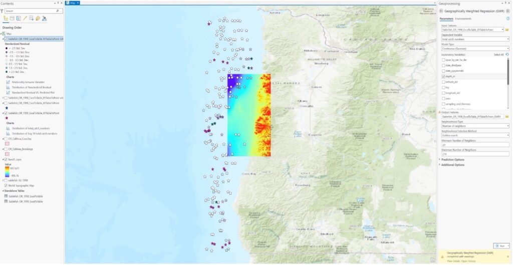
Ex 03: How are the spatial patterns of variable A (sablefish population estimates/distributions) influenced by various spatial scales of B (seafloor bathymetry in this case)?
2.A description of the dataset you examined, with spatial and temporal resolution and extent.
Ex 01:
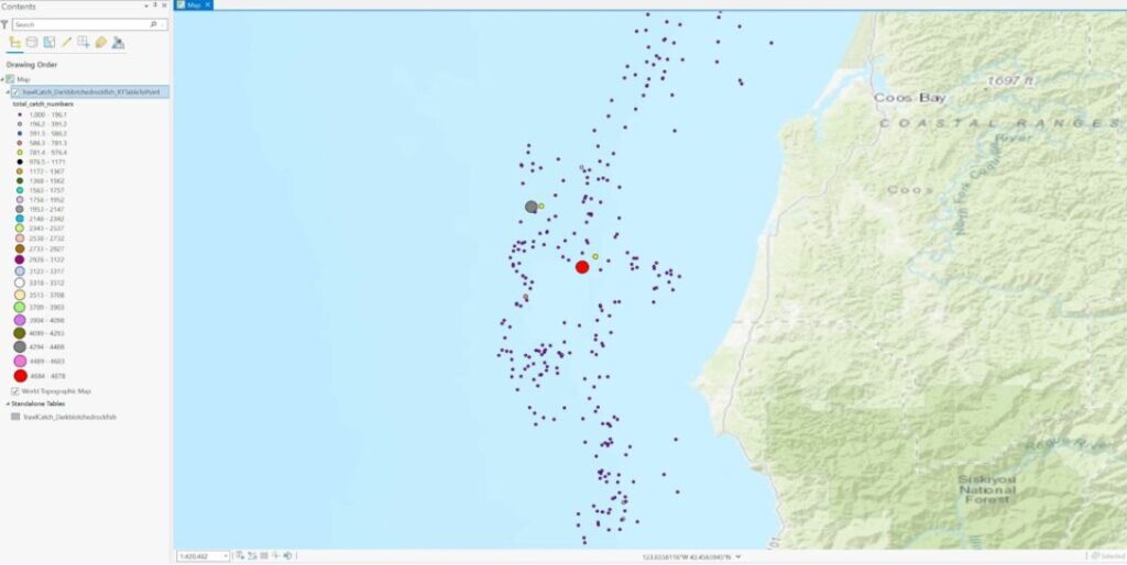
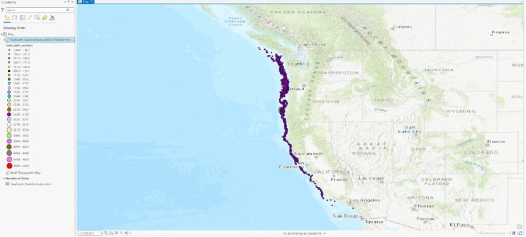
Variable A: groundfish survey data (dark blotched rockfish) from NOAA’s historical survey sites off the coasts of Washington, Oregon, and California which has been gathered consistently over the last 20 years. Temporal resolution/extent is 20 years and the spatial resolution/extent is the whole US West Coast N to S (approx. 50,207 square miles in area).
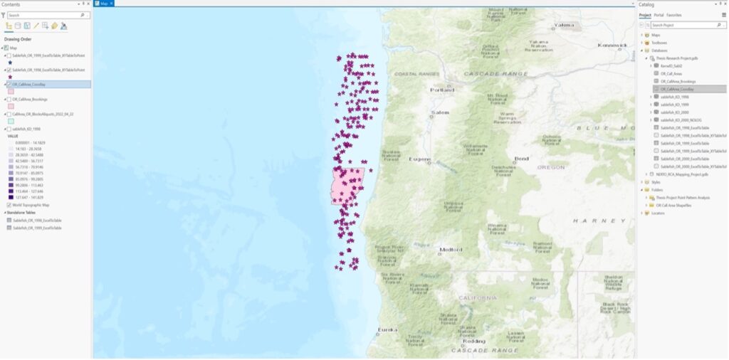
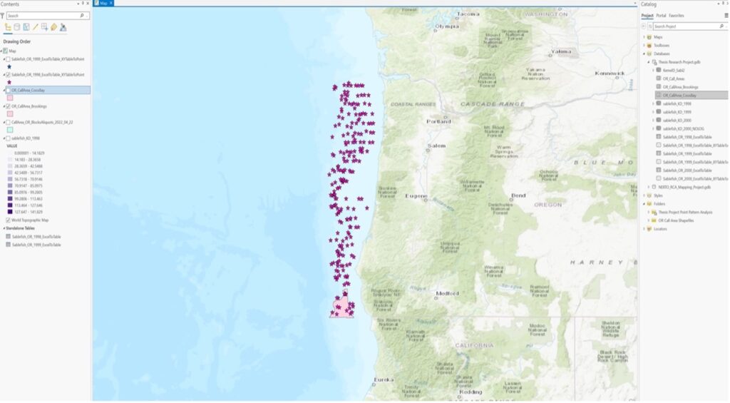
Variable B: offshore wind energy installation locations off the coasts of Oregon, and California (Oregon call sites add up to1810 square miles of total area and California wind areas add up to 583 square miles of total area).
Ex 02:
Variable A: groundfish survey data (sablefish) from NOAA’s historical survey sites off the coast of Oregon which has been gathered consistently over the last 20 years. Temporal resolution/extent is 20 years and the spatial resolution/extent is the whole US West Coast N to S (approx. 65,816 square miles in area).
Variable B: offshore wind energy locations off the coast of Oregon (call sites add up to1810 square miles in area).
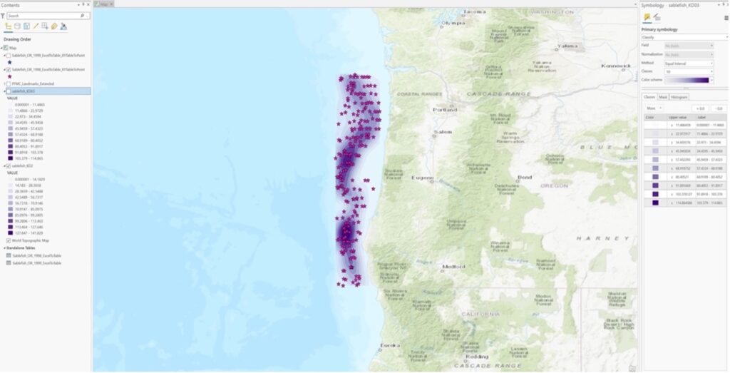
Ex 03:
Variable A: groundfish survey data (sablefish) from NOAA’s historical survey sites off the coast of Oregon which has been gathered consistently over the last 20 years. Temporal resolution/extent is 20 years and the spatial resolution/extent is the whole US West Coast N to S (approx. 65,816 square miles in area).
Variable B: Bathymetry of the Oregon Coast. Downloaded a NOAA NetCDF file and converted it to a raster file in ArcGIS. I can probably download bathymetry for the whole West Coast on ArcGIS Earth. I couldn’t download the program on the school computers so I will do this at home going forward.
3.Hypotheses: predictions of patterns and processes you looked for.
Ex 01:
Groundfish avoid offshore wind energy locations due to unsuitable habitat parameters, intra or interspecies territoriality/competition, lack of appropriate prey species, etc.
Groundfish are attracted to offshore wind energy locations as they have the potential to function as artificial reefs and attract suitable prey species.
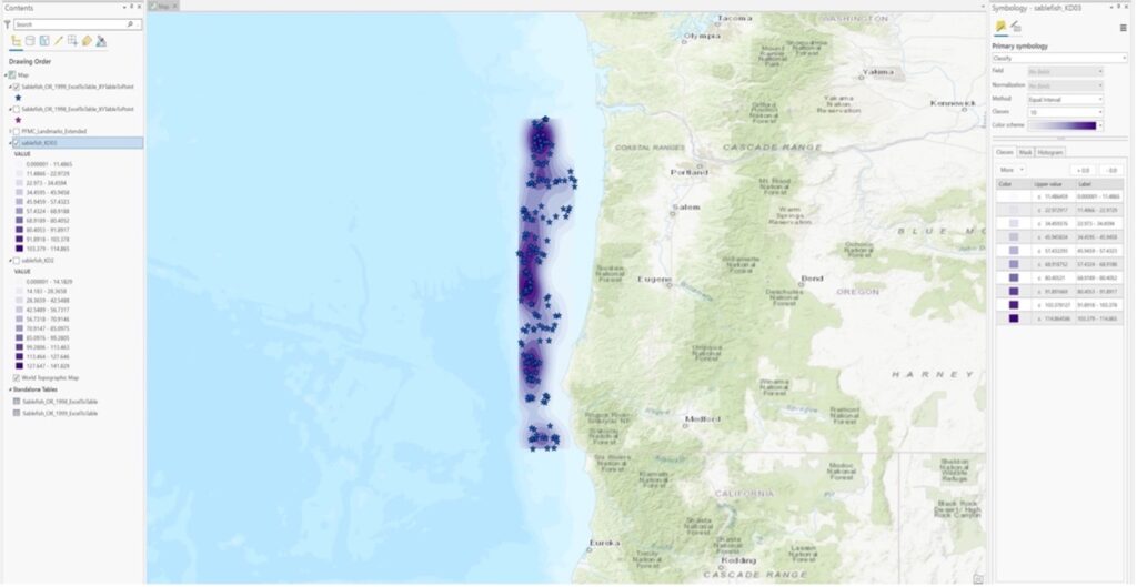
Ex 02:
First: What are the relative patterns of sablefish densities within offshore wind energy locations Vs. outside offshore wind energy locations in Oregon.
Then (revised): What are the relative patterns of Sablefish population estimates/distributions within offshore wind energy locations Vs. outside offshore wind energy locations in Oregon.
Ex 03: The presence/abundance of sablefish will be positively correlated with deeper oceanic bathymetry on the US West Coast.
4. Approaches: analysis approaches you used.
Ex 01: Point pattern analysis in ArcGIS Pro of dark blotched rockfish using a 20-year time series of raw survey data that was gathered by NOAA through the agency’s scientific trawl survey efforts on the US West Coast. I exported the Excel data into a table, and then digitized the table into XY points using geoprocessing tools in ArcGIS Pro. I then represented the comparative abundance/distribution of dark blotched rockfish through the use of graduated symbology.
Ex 02:
First: Kernel density analysis in ArcGIS Pro of sablefish for the years 1998 and 1999 to understand population densities all along the US West Coast and then within and outside offshore wind energy locations in Oregon.
Then (revised): Calculation of sablefish population estimate statistics, with standard deviations, as a function of the % of available survey locations through time in ArcGIS Pro. Ended up doing this within offshore wind energy locations Vs. outside of them for the purpose of completing exercise 02 for this class. I will keep working on this methodology going forward.
Ex 03: A Geographic Weighted Regression in ArcGIS Pro of sablefish population estimates/distributions and Oregon Coast bathymetry.
5.Results: what did you produce — maps? statistical relationships? other? Present the key, important results you created.
Ex 01:
Figure 1. Relative dark blotched rockfish abundances and distributions in Coos Bay, Oregon from 1998 to 2021 (highest abundances are represented by larger symbology).
Figure 2. Relative dark blotched rockfish abundances and distributions along the Oregon Coast from 1998 to 2021.
Figure 3. Scatterplot representing a log10 transformation of total abundance of dark blotched rockfish along the Oregon Coast from 1998 to 2021 as a function of latitude location from N to S.
Ex 02:
Figure 4. Kernel density map of sablefish off the Oregon Coast in 1998.
Figure 5. Kernel density map of sablefish off the Oregon Coast in 1999.
Figure 6. Sablefish population estimates for the year 1998 overlaid upon the Coos Bay call area off the Oregon Coast (need to figure out how to exclude points within the polygon so I can calculate population estimate statistics).
Figure 7. Sablefish population estimates for the year 1998 overlaid upon the Brookings call area off the Oregon Coast (need to figure out how to exclude points within the polygon so I can calculate population estimate statistics).
Ex 03:
Figure 8. A Geographic Weighted Regression (GWR) map of sablefish population estimates/distributions in 1998 with bathymetry of the Oregon Coast.
6.What did you learn from each of the analyses you conducted (i.e., from each exercise)?
Ex 01:
Dark blotched rockfish seem to have an extensive distribution along the US West Coast, from northern WA to southern CA.
The highest densities of dark blotched rockfish seem to be off the Coast of OR near the Portland area, whereas the highest abundances of dark blotched rockfish in single observations (4684-4878) occurred off the coast of Oregon near Coos Bay, which is very close to one of OR’s proposed offshore wind energy locations.
Observations of 200-1000 individuals are the most common along the West Coast and these observations occurred in the highest densities.
There are small gaps in population distributions South of Sacramento, CA. This is the same north of WA but that is not within my study area.
Ex 02:
I successfully created kernel density maps of sablefish densities in Oregon for 1998 and 1999. Densities shifted slightly between the two years but overall were quite similar.
Moderately high densities of sablefish were observed within the Coos Bay offshore wind energy call area as well as within the Brookings offshore wind energy call area, which I think is good.
I was unable to compute statistics of population estimates with standard deviations within and outside offshore wind polygons as I ran out of time this week. I will keep working on this methodology and work on this analysis going forward.
Ex 03:
Sablefish population estimates/distributions were negatively correlated with depth according to the statistics calculated.
These results do not make sense to me because sablefish distributions should be positively correlated with depth according to the specie’s life history. I think that I did not correctly include the bathymetry raster in this analysis which is why I got negative correlations.
I tried to use the “extract values to points” geoprocessing tool before rerunning a Geographic Weighted Regression analysis.
I think I executed the tool correctly, however, the GWR tool failed when I tried to rerun it. I attempted to troubleshoot with the class TA, but we could not figure it out, other than maybe the bathymetry data that I have is too limited. I can try this again once I have downloaded data from ArcGIS Earth which I could not do on the school computers without an admin password. The error message that I got was Geographically Weighted Regression (GWR) failed- “Unable to estimate at least one local model due to multicollinearity (data redundancy)”.
I can retry this in R or with a different bathymetry dataset going forward.
7.Significance. How are these results important to science and resource managers?
It is vital for the scientific community to gain an understanding of the socioecological impacts of installing and operating OWE off the US West Coast, particularly with regard to NOAA’s fisheries independent biological surveys. These surveys have taken place over many decades and survey designs may have to change in response to OWE operations. Geographic Information Science (GIS) could be a very useful tool for illustrating the impacts to NOAA’s fisheries independent biological surveys by answering research questions in a spatially explicit manner. The analyses that were conducted for this class have informed me about groundfish population estimates and distributions along the US West Coast and how those estimates and distributions may change in response to offshore wind energy development. Ultimately, the approach that I come up with will essentially allow users to calculate how the uncertainty surrounding population estimates will change as a function of the % of area excluded. The tool that I create will function as an optimization approach, to test the sensitivity of surveys to partial surveying.
8. Software learning. Your learning: what did you learn about software (a) Arc-Info, (b) GIS programming in Python, (c) programming in R, (d) Modelbuilder in Arc, or (e) other?
Arc-Info: nothing.
GIS programming in Python: I learned some basic Python code from my classmates which I can apply to my own research.
Programming in R: I learned basic R code from my classmates which I can apply to my own research. I will likely use R a lot going forward.
Model builder in Arc: not much, however, model builder in ArcGIS Pro may be important for my research going forward as I need to automate my process either in R or ArcGIS Pro.
9.Statistics learning. What did you learn about statistics, including (a) hotspot, (b) spatial autocorrelation (including correlogram, wavelet, Fourier transform/spectral analysis), (c) cross-correlation/regression (cross-correlation, geographically weighted regression [GWR], regression trees, boosted regression trees), (d) multivariate methods (e.g., PCA, multiple component analysis), (e) other techniques (change detection/confusion matrices, other)?
Hotspot: I did not complete this analysis but I learned a little more about it from my classmates in terms of its applications.
Spatial autocorrelation: same as above.
Cross-correlation/regression (Geographic Weighted Regression [GWR]): I conducted a GWR analysis so I learned quite a lot more about it, its applications, and how to interpret its outputs.
Multivariate methods: I did not complete this analysis but I learned a little more about it from my classmates in terms of its applications.
10. Evolving question. How did the results of each analysis lead you to change/refine your question? Write out the original question you stated at the beginning of the class, and restate the question(s) you now plan to address.
Ex 01:
First: How do wind energy installation locations affect current and future distributions of groundfish?
Then (revised): How do offshore wind energy installation locations affect distributions of groundfish, Pacific hake, and northern anchovy along the US West Coast?
Ex 02:
First: How is variable A (sablefish density) affected by variable B (offshore wind energy locations)?
Then (revised): How does variable A (sablefish population estimates/distributions) change in response to variable B (% of available survey locations)?
Ex 03: How are the spatial patterns of variable A (sablefish population estimates/distributions) influenced by various spatial scales of B (seafloor bathymetry in this case)?
11.Future techniques. What techniques would you like to explore to answer your research questions in the future?
Download bathymetry for the whole West Coast on ArcGIS Earth and rerun my GWR analysis in R or ArcGIS Pro.
Calculate sablefish population estimate statistics, with standard deviations, as a function of the % of available survey locations through time in R or ArcGIS Pro.
Keep working in R or use Python code/model builder in ArcGIS Pro to automate the process with some kind of four-loop process over the course of the Summer.
Questions, methods, and analysis of aerial imagery and topographic surveys of Alsea Spit in Bayshore, Oregon
Background
Foredunes are important features on Oregon’s coast; they provide essential habitat, recreational opportunities, and protection from coastal hazards. Managing foredunes, both for human benefit in developed areas and for habitat restoration, has proven to be a difficult task, as there is not a common goal that homeowners, planners, and managers agree on. The dunes we see today were built by the introduction of invasive beach grass over a century ago that changed how sand accumulated. The invasive European beach grass promotes vertical growth and the establishment of tall ridges of stable foredunes, while the original ecosystem was composed of lower, more variable hummocked dunes. While these taller, heavily vegetated dunes provide coastal protection to developed areas, homeowners often flatten (grade) the dunes to restore or establish a view of the ocean. This also removes any established vegetation. After an area is graded, homeowners are required to revegetate the dune to promote sand stabilization, but some homeowners purposely remove or kill the new vegetation. The biophysical feedbacks between vegetation, sand supply, and dune growth are well-studied, but there is lacking research on the morphology of managed dunes (i.e., dunes that have been graded and replanted). I am interested in using vegetation cover change as a proxy for dune grading events, and then exploring how these changes in vegetation cover affect future dune morphology.
Questions and Hypotheses
Question 1: How can I detect vegetation change with aerial imagery on coastal dunes?
Hypothesis: I was looking for changes in vegetation cover using two methods of classification (NDVI change and unsupervised classification). I expected to see distinct “rectangles” of vegetation loss.
Question 2: How are vegetation change and elevation change along one shore-normal transect related?
Hypothesis: I predicted that an increase in NDVI would be correlated with an increase in elevation, i.e., where NDVI change is high, elevation change is high.
Question 3: How have the dunes on Alsea Spit changed over time?
Hypothesis: I expected to see general seaward progradation of the dunes and more variability in the Alsea1 dune crest elevation and position, since it is in a more variable and managed area.
Datasets
NAIP imagery from 2014 and 2016 (1-m pixels, 4 bands [B,G,R,NIR]), clipped to study area (approx. 1 km2, imagery clipped to bounding rectangle).
18 topographic surveys of 3 shore-normal transects on Alsea Spit. 1-m resolution along transects and transects are ~400 m long (map not representative of actual transect length).
Approaches
Exercise 1: NDVI and vegetation cover change. All analysis performed in ArcGIS Pro using raster tools and image analysis
Calculated NDVI for two clipped images (2014 and 2016)
Subtracted 2014 NDVI raster from 2016 NDVI raster to get the NDVI change
Classified NDVI change > 0 as vegetation increase and NDVI change < 0 as vegetation decrease
Ran unsupervised image classification (ISOcluster algorithm) to classify both years of imagery
Reclassified the images into three classes (vegetation, sand, other/structure/shadow).
Set the “other” class to null
Subtracted 2014 reclassified raster from 2016 reclassified raster to get the cover change
Exercise 2: Cross-correlation function in Matlab (crosscorr) with elevation change and NDVI change along a transect.
Extracted NDVI change values (from result from Exercise 1) to points spaced 1-m along the “Alsea3” transect in ArcGIS Pro
Calculated elevation difference by subtracting the 2013 topo survey data from the 2016 topo survey data in Matlab
Loaded the NDVI change data into Matlab and ran the crosscorr function with NDVI change and elevation change
Created a bivariate symbology along the transect in Matlab to visually inspect the NDVI change and elevation change
Exercise 3: I used various Matlab scripts to plot the timeseries and compute the following dune morphometrics: shoreline location, dune toe elevation, dune toe location, dune crest elevation, dune crest position, dune heel elevation, dune heel position, backshore slope, dune face slope, dune back slope, beach width, dune width, dune small volume, and dune big volume.
Modified an existing script to read the topography data provided by DOGAMI
Picked the shoreline, dune toe, dune crest, and dune heel locations on each profile
Wrote a new script to calculate and plot the between-survey change in dune crest elevation and dune crest cross-shore position
Results
Exercise 1: I produced a map to show the vegetation change from both techniques.
Exercise 2: I produced two plots and a map that show NDVI change and elevation change.
Exercise 3: I produced time series plots of profiles and dune crest metric changes.
This was probably the most useful result (that isn’t just a learning opportunity); in the dune crest and position change plots, we can actually see the offshore movement of the dune crest for transect Alsea3, which is likely the formation of a new incipient foredune seen in the time series profiles. Additionally, in Alsea1, we can see seaward progradation and the formation of a slightly more flat top, which could indicate that the area was graded or sand was moved mechanically.
Lessons Learned
Exercise 1: NDVI change is hard to use! The range of NDVI values was different between images; for example, areas that were open sand in both images had different NDVI values. In order to make NDVI useful, I need to correct the images or determine the appropriate adjustment to align the NDVI values. I also learned that ISO classification works well for what I’m looking for—it picked up the areas of vegetation pretty accurately so I could see the areas of vegetation that we removed when a dune area was graded.
Exercise 2: I tried to use NDVI again, but I learned that I still need to find a better way to measure vegetation change. There are discrepancies in the 2014 and 2016 imagery, so if I can normalize those, or find a better way to measure NDVI change, I could likely get better results. Once I do that, the cross-correlation might be more useful in determining the effect that vegetation change has on elevation change.
Exercise 3: This was extremely useful for me! Being able to see the evolution of the different metrics over time is really important and helped me start to pick out some patterns. However, I need to change some of my “rules” for picking out the dune toe, crest, and heel. To make accurate comparisons within one profile’s timeseries, I need to establish a static “dune compartment”. For example, I could determine that this compartment is from the 4-meter contour to a set cross-shore position near the back of the dune. That way, only one variable is moving along the cross-shore direction (the 4-meter contour), so I can more accurately measure accretion/erosion on the dune.
Significance
Understanding how dunes change after grading/replanting events is important and very relevant to current management problems. Coastal foredunes, especially in developed areas, provide the first line of defense against rising sea levels, storms, and even tsunamis. However, homeowners like to see the ocean, which is why view grading is a common practice. So, exploring how dunes respond to grading events will allow us to understand how dunes will look in the future if grading continues. Managers can use this information to guide dune management implementations, and potentially change policies to further prohibit dune grading (if coastal protection is seen as the important ecosystem service to manage for).
Software Learning
In exercise 1, I got more practice with the suite of image classification and processing tools in ArcGIS Pro. In exercise 2, I was able to perform statistical tests in Matlab for the first time, and I explored bivariate symbology in ArcGIS Pro. Finally, in exercise 3, I got more comfortable with the scripts I already had in Matlab and was able to modify them for the DOGAMI data.
Statistics Learning
I learned a lot more about autocorrelation and cross-correlation and how to interpret spatial lags, which is still something I’m trying to grasp. I learned the most from hearing my classmates’ tutorials and working through questions together. Additionally, I learned more about image classification techniques and experienced how one parameter can really affect the results. Understanding what the algorithm is doing, at least at a basic level, is crucial. I read some literature about change detection, specifically using LandTrendr, which is something I hope to try in the future.
Evolving Question
My first question was how does vegetation change affect coastal foredune morphology?
Over the course of this term, I learned more about the data I was using and how I can better analyze it to answer my question. I thought that NDVI change would be a good indicator of vegetation change in the context of my research, but it’s not! I care more about larger “chunks” of areas that can more easily be detected by a classic image classification technique.
I still have the same fundamental question, but plan to approach it differently. I want to be able to pick out dune grading events from vegetation change, and then use that to build a “management history” or “grading history” of the area. Then, I can observe the changes in dune topography at different time steps after a distinct grading event. So, my new questions are:
What is the dune management history of Alsea Spit?
How have dunes changed 1 year, 5 years, and 10 years after being graded?
What role is vegetation playing in dune morphology at this site?
Future Techniques
I want to fine-tune the image classification I used to optimize it for my question and data. I might try to do it in Matlab since my topography data is already in Matlab. I would like to perform more statistical tests on my topography data after I calculate various metrics—this might have a spatial component if I look at metrics across the area. Overall, I think I have a much better handle on the data I’m using, and more refined research questions, so my analyses can be more focused going forward.