Inference, and the intersection of ecology and statistics

By Dawn Barlow, PhD student, OSU Department of Fisheries and Wildlife, Geospatial Ecology of Marine Megafauna Lab

Recently, I had the opportunity to attend the International Statistical Ecology Conference (ISEC), a biennial meeting of researchers at the interface of ecology and statistics. I am a marine ecologist, fascinated by the interactions between animals and the dynamic ocean environment they inhabit. If you had asked me five years ago whether I thought I would ever consider myself a statistician or a computer programmer, my answer would certainly have been “no”. Now, I find myself studying the ecology of blue whales in New Zealand using a variety of data streams and methodologies, but a central theme for my dissertation is species distribution modeling. Species distribution models (SDMs) are mathematical algorithms that correlate observations of a species with environmental conditions at their observed locations to gain ecological insight and predict spatial distributions of the species (Fig. 1; Elith and Leathwick 2009). I still can’t say I would identify as a statistician, but I have a growing appreciation for the role of statistics to gain inference in ecology.

Figure 1. A schematic of a species distribution model (SDM) illustrating how the relationship between mapped species and environmental data (left) is compared to describe “environmental space” (center), and then map predictions from a model using only environmental predictors (right). Note that inter-site distances in geographic space might be quite different from those in environmental space—a and c are close geographically, but not environmentally. The patterning in the predictions reflects the spatial autocorrelation of the environmental predictors. Figure reproduced from Elith and Leathwick (2009).

Before I continue, let’s take a look at just a few definitions from Merriam-Webster’s dictionary:

Statistics: a branch of mathematics dealing with the collection, analysis, interpretation, and presentation of masses of numerical data

Ecology: a branch of science concerned with the interrelationship of organisms and their environments

Inference: a conclusion or opinion that is formed because of known facts or evidence

Ecological data are notoriously noisy, messy, and complex. Statistical tests are meant to help us understand whether a pattern in the data is different from what we would expect through random chance. When we study how organisms interact with one another and their environment, it is impossible to completely capture all elements of the ecosystem. Therefore, ecology is a field ripe with challenges for statisticians. How do we quantify a meaningful biological signal amidst all the noise? How can we gain inference from ecological data to enhance knowledge, and how can we use that knowledge to make informed predictions? Marine mammals are notoriously difficult to study. They inhabit an environment that is relatively inaccessible and inhospitable to humans, they occur in low numbers, they are highly mobile, and they are rarely visible. All ecological data are difficult and noisy and riddled with small sample sizes, but counting trees presents fewer logistical challenges than counting moving whales in an ever-changing open-ocean setting. Therefore, new methodologies in areas like species distribution modeling are often developed using large, terrestrial datasets and eventually migrate to applications in the marine environment (Robinson et al. 2011).

Many presentations I attended at the conference were geared toward moving beyond correlative SDMs. SDMs were developed to correlate species occurrence patterns with features of the environment they inhabit (e.g. temperature, precipitation, terrain, etc.). However, those relationships do not actually explain the underlying mechanism of why a species is more likely to occur in one environment compared to another. Therefore, ecological statisticians are now using additional information and modeling approaches within SDMs to incorporate information such as species co-occurrence patterns, population demographic information, and physiological constraints. Building SDMs to include such process-explicit information allows us to make steps toward understanding not just when and where a species occurs, but why.

Machine learning is an area that continues to advance and open doors to new applications in ecology. Machine learning approaches differ fundamentally from classical statistics. In statistics, we formulate a hypothesis, select the appropriate model to test that hypothesis (for example, linear regression), then test how well the data fit the model (“Is the relationship linear?”), and test the strength of that inference (“Is the linear pattern different from what we would expect due to random chance?”). Machine learning, on the other hand, does not use a predetermined notion of relationships between variables. Rather, it tries to create an algorithm that fits the patterns in the data. Statistics asks how well the data fit a model, and machine learning asks how well a model fits the data.

Machine learning approaches allow for very complex relationships to be included in models and can be excellent for making predictions. However, sometimes the relationships fitted by a machine learning algorithm are so complex that it is not possible to infer any ecological meaning from them. As one ISEC presenter put it, in machine learning “the computer learns but the scientist does not”. The most important thing when selecting your methodology is to remember your question and your goal. Do you want to understand the mechanism of why an animal is where it is? Or do you not need to understand the driver, but rather want to make the best predictions of where an animal will be? In my case, the answer to that question differs from one of my PhD chapters to the next. We want to understand the functional relationships between oceanography, krill availability, and blue whale distribution (Barlow et al. 2020), and subsequently we want to develop forecasting models that can reliably predict blue whale distribution to inform conservation efforts (Fig. 2).

Figure 2. An example predictive map of where we expect blue whales to be distributed based on environmental conditions. Warmer colors represent areas with a higher probability of blue whale occurrence, and the blue crosses represent locations where blue whales were observed.

ISEC was an excellent opportunity for me to break out of my usual marine mammal-centered bubble and get a taste of what is happening on the leading edge of statistical ecology. I learned about the latest approaches and innovations in species distribution modeling, and in the process I also learned about trees, koalas, birds, and many other organisms from around the world. A fun bonus of attending a methods-focused conference is learning about completely new study species and systems. There are many ways of approaching an ecological question, gaining inference, and making predictions. I look forward to incorporating the knowledge I gained through ISEC into my own research, both in my doctoral work and in applications of new methods to future research projects.

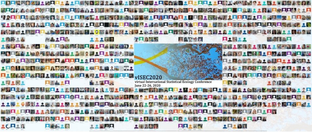
Figure 3. The virtual conference photo of all who attended the biennial International Statistical Ecology Conference. Thank you to the organizers, who made it a truly excellent and engaging conference experience!

References

Barlow, D.R., Bernard, K.S., Escobar-Flores, P., Palacios, D.M., and Torres, L.G. 2020. Links in the trophic chain: Modeling functional relationships between in situ oceanography, krill, and blue whale distribution under different oceanographic regimes. Mar. Ecol. Prog. Ser. doi:https://doi.org/10.3354/meps13339.

Elith, J., and Leathwick, J.R. 2009. Species Distribution Models: Ecological Explanation and Prediction Across Space and Time. Annu. Rev. Ecol. Evol. Syst. 40(1): 677–697. doi:10.1146/annurev.ecolsys.110308.120159.

Robinson, L.M., Elith, J., Hobday, A.J., Pearson, R.G., Kendall, B.E., Possingham, H.P., and Richardson, A.J. 2011. Pushing the limits in marine species distribution modelling: Lessons from the land present challenges and opportunities. doi:10.1111/j.1466-8238.2010.00636.x.

Data Wrangling to Assess Data Availability: A Data Detective at Work

By Alexa Kownacki, Ph.D. Student, OSU Department of Fisheries and Wildlife, Geospatial Ecology of Marine Megafauna Lab

Data wrangling, in my own loose definition, is the necessary combination of both data selection and data collection. Wrangling your data requires accessing then assessing your data. Data collection is just what it sounds like: gathering all data points necessary for your project. Data selection is the process of cleaning and trimming data for final analyses; it is a whole new bag of worms that requires decision-making and critical thinking. During this process of data wrangling, I discovered there are two major avenues to obtain data: 1) you collect it, which frequently requires an exorbitant amount of time in the field, in the lab, and/or behind a computer, or 2) other people have already collected it, and through collaboration you put it to a good use (often a different use then its initial intent). The latter approach may result in the collection of so much data that you must decide which data should be included to answer your hypotheses. This process of data wrangling is the hurdle I am facing at this moment. I feel like I am a data detective.

Data wrangling illustrated by members of the R-programming community. (Image source: R-bloggers.com)

My project focuses on assessing the health conditions of the two ecotypes of bottlenose dolphins between the waters off of Ensenada, Baja California, Mexico to San Francisco, California, USA between 1981-2015. During the government shutdown, much of my data was inaccessible, seeing as it was in possession of my collaborators at federal agencies. However, now that the shutdown is over, my data is flowing in, and my questions are piling up. I can now begin to look at where these animals have been sighted over the past decades, which ecotypes have higher contaminant levels in their blubber, which animals have higher stress levels and if these are related to geospatial location, where animals are more susceptible to human disturbance, if sex plays a role in stress or contaminant load levels, which environmental variables influence stress levels and contaminant levels, and more!

Alexa, alongside collaborators, photographing transiting bottlenose dolphins along the coastline near Santa Barbara, CA in 2015 as part of the data collection process. (Image source: Nick Kellar).

Over the last two weeks, I was emailed three separate Excel spreadsheets representing three datasets, that contain partially overlapping data. If Microsoft Access is foreign to you, I would compare this dilemma to a very confusing exam question of “matching the word with the definition”, except with the words being in different languages from the definitions. If you have used Microsoft Access databases, you probably know the system of querying and matching data in different databases. Well, imagine trying to do this with Excel spreadsheets because the databases are not linked. Now you can see why I need to take a data management course and start using platforms other than Excel to manage my data.

A visual interpretation of trying to combine datasets being like matching the English definition to the Spanish translation. (Image source: Enchanted Learning)

In the first dataset, there are 6,136 sightings of Common bottlenose dolphins (Tursiops truncatus) documented in my study area. Some years have no sightings, some years have fewer than 100 sightings, and other years have over 500 sightings. In another dataset, there are 398 bottlenose dolphin biopsy samples collected between the years of 1992-2016 in a genetics database that can provide the sex of the animal. The final dataset contains records of 774 bottlenose dolphin biopsy samples collected between 1993-2018 that could be tested for hormone and/or contaminant levels. Some of these samples have identification numbers that can be matched to the other dataset. Within these cross-reference matches there are conflicting data in terms of amount of tissue remaining for analyses. Sorting these conflicts out will involve more digging from my end and additional communication with collaborators: data wrangling at its best. Circling back to what I mentioned in the beginning of this post, this data was collected by other people over decades and the collection methods were not standardized for my project. I benefit from years of data collection by other scientists and I am grateful for all of their hard work. However, now my hard work begins.

The cutest part of data wrangling: finding adorable images of bottlenose dolphins, photographed during a coastal survey. (Image source: Alexa Kownacki).

There is also a large amount of data that I downloaded from federally-maintained websites. For example, dolphin sighting data from research cruises are available for public access from the OBIS (Ocean Biogeographic Information System) Sea Map website. It boasts 5,927,551 records from 1,096 data sets containing information on 711 species with the help of 410 collaborators. This website is incredible as it allows you to search through different data criteria and then download the data in a variety of formats and contains an interactive map of the data. You can explore this at your leisure, but I want to point out the sheer amount of data. In my case, the OBIS Sea Map website is only one major platform that contains many sources of data that has already been collected, not specifically for me or my project, but will be utilized. As a follow-up to using data collected by other scientists, it is critical to give credit where credit is due. One of the benefits of using this website, is there is information about how to properly credit the collaborators when downloading data. See below for an example:

Example citation for a dataset (Dataset ID: 1201):

Lockhart, G.G., DiGiovanni Jr., R.A., DePerte, A.M. 2014. Virginia and Maryland Sea Turtle Research and Conservation Initiative Aerial Survey Sightings, May 2011 through July 2013. Downloaded from OBIS-SEAMAP (http://seamap.env.duke.edu/dataset/1201) on xxxx-xx-xx.

Citation for OBIS-SEAMAP:

Halpin, P.N., A.J. Read, E. Fujioka, B.D. Best, B. Donnelly, L.J. Hazen, C. Kot, K. Urian, E. LaBrecque, A. Dimatteo, J. Cleary, C. Good, L.B. Crowder, and K.D. Hyrenbach. 2009. OBIS-SEAMAP: The world data center for marine mammal, sea bird, and sea turtle distributions. Oceanography 22(2):104-115

Another federally-maintained data source that boasts more data than I can quantify is the well-known ERDDAP website. After a few Google searches, I finally discovered that the acronym stands for Environmental Research Division’s Data Access Program. Essentially, this the holy grail of environmental data for marine scientists. I have downloaded so much data from this website that Excel cannot open the csv files. Here is yet another reason why young scientists, like myself, need to transition out of using Excel and into data management systems that are developed to handle large-scale datasets. Everything from daily sea surface temperatures collected on every, one-degree of latitude and longitude line from 1981-2015 over my entire study site to Ekman transport levels taken every six hours on every longitudinal degree line over my study area. I will add some environmental variables in species distribution models to see which account for the largest amount of variability in my data. The next step in data selection begins with statistics. It is important to find if there are highly correlated environmental factors prior to modeling data. Learn more about fitting cetacean data to models here.

The ERDAPP website combined all of the average Sea Surface Temperatures collected daily from 1981-2018 over my study site into a graphical display of monthly composites. (Image Source: ERDDAP)

As you can imagine, this amount of data from many sources and collaborators is equal parts daunting and exhilarating. Before I even begin the process of determining the spatial and temporal spread of dolphin sightings data, I have to identify which data points have sex identified from either hormone levels or genetics, which data points have contaminants levels already quantified, which samples still have tissue available for additional testing, and so on. Once I have cleaned up the datasets, I will import the data into the R programming package. Then I can visualize my data in plots, charts, and graphs; this will help me identify outliers and potential challenges with my data, and, hopefully, start to see answers to my focal questions. Only then, can I dive into the deep and exciting waters of species distribution modeling and more advanced statistical analyses. This is data wrangling and I am the data detective.

What people may think a ‘data detective’ looks like, when, in reality, it is a person sitting at a computer. (Image source: Elder Research)

Like the well-known phrase, “With great power comes great responsibility”, I believe that with great data, comes great responsibility, because data is power. It is up to me as the scientist to decide which data is most powerful at answering my questions.

Data is information. Information is knowledge. Knowledge is power. (Image source: thedatachick.com)


Why Feeling Stupid is Great: How stupidity fuels scientific progress and discovery

By Alexa Kownacki, Ph.D. Student, OSU Department of Fisheries and Wildlife, Geospatial Ecology of Marine Megafauna Lab

It all started with a paper. On Halloween, I sat at my desk, searching for papers that could answer my questions about bottlenose dolphin metabolism and realized I had forgotten to check my email earlier. In my inbox, there was a new message with an attachment from Dr. Leigh Torres to the GEMM Lab members, saying this was a “must-read” article. The suggested paper was Martin A. Schwartz’s 2008 essay, “The importance of stupidity in scientific research”, published in the Journal of Cell Science, highlighted universal themes across science. In a single, powerful page, Schwartz captured my feelings—and those of many scientists: the feeling of being stupid.

For the next few minutes, I stood at the printer and absorbed the article, while commenting out loud, “YES!”, “So true!”, and “This person can see into my soul”. Meanwhile, colleagues entered my office to see me, dressed in my Halloween costume—as “Amazon’s Alexa”, talking aloud to myself. Coincidently, I was feeling pretty stupid at that moment after just returning from a weekly meeting, where everyone asked me questions that I clearly did not have the answers to (all because of my costume). This paper seemed too relevant; the timing was uncanny. In the past few weeks, I have been writing my PhD research proposal —a requirement for our department— and my goodness, have I felt stupid. The proposal outlines my dissertation objectives, puts my work into context, and provides background research on common bottlenose dolphin health. There is so much to know that I don’t know!

Alexa dressed as “Amazon Alexa” on Halloween at her office in San Diego, CA.

When I read Schwartz’s 2008 paper, there were a few takeaway messages that stood out:

  1. People take different paths. One path is not necessarily right nor wrong. Simply, different. I compared that to how I split my time between OSU and San Diego, CA. Spending half of the year away from my lab and my department is incredibly challenging; I constantly feel behind and I miss the support that physically being with other students provides. However, I recognize the opportunities I have in San Diego where I work directly with collaborators who teach and challenge me in new ways that bring new skills and perspective.

    Image result for different ways
    (Image source: St. Albert’s Place)
  2. Feeling stupid is not bad. It can be a good feeling—or at least we should treat it as being a positive thing. It shows we have more to learn. It means that we have not reached our maximum potential for learning (who ever does?). While writing my proposal I realized just how little I know about ecotoxicology, chemistry, and statistics. I re-read papers that are critical to understanding my own research, like “Nontargeted biomonitoring of halogenated organic compounds in two ecotypes of bottlenose dolphins (Tursiops truncatus) from the Southern California bight” (2014) by Shaul et al. and “Bottlenose dolphins as indicators of persistent organic pollutants in the western north Atlantic ocean and northern gulf of Mexico” (2011) by Kucklick et al. These articles took me down what I thought were wormholes that ended up being important rivers of information. Because I recognized my knowledge gap, I can now articulate the purpose and methods of analysis for specific compounds that I will conduct using blubber samples of common bottlenose dolphins

    Image result
    Image source: memegenerator.net
  3. Drawing upon experts—albeit intimidating—is beneficial for scientific consulting as well as for our mental health; no one person knows everything. That statement can bring us together because when people work together, everyone benefits. I am also reminded that we are our own harshest critics; sometimes our colleagues are the best champions of our own successes. It is also why historical articles are foundational. In the hunt for the newest technology and the latest and greatest in research, it is important to acknowledge the basis for discoveries. My data begins in 1981, when the first of many researchers began surveying the California coastline for common bottlenose dolphins. Geographic information systems (GIS) were different back then. The data requires conversions and investigative work. I had to learn how the data were collected and how to interpret that information. Therefore, it should be no surprise that I cite literature from the 1970s, such as “Results of attempts to tag Atlantic Bottlenose dolphins, (Tursiops truncatus)” by Irvine and Wells. Although published in 1972, the questions the authors tried to answer are very similar to what I am looking at now: how are site fidelity and home ranges impacted by natural and anthropogenic processes. While Irvine and Wells used large bolt tags to identify individuals, my project utilizes much less invasive techniques (photo-identification and blubber biopsies) to track animals, their health, and their exposures to contaminants.

    Image result for that is why you fail yoda
    (Image source: imgflip.com)
  4. Struggling is part of the solution. Science is about discovery and without the feeling of stupidity, discovery would not be possible. Feeling stupid is the first step in the discovery process: the spark that fuels wanting to explore the unknown. Feeling stupid can lead to the feeling of accomplishment when we find answers to those very questions that made us feel stupid. Part of being a student and a scientist is identifying those weaknesses and not letting them stop me. Pausing, reflecting, course correcting, and researching are all productive in the end, but stopping is not. Coursework is the easy part of a PhD. The hard part is constantly diving deeper into the great unknown that is research. The great unknown is simultaneously alluring and frightening. Still, it must be faced head on. Schwartz describes “productive stupidity [as] being ignorant by choice.” I picture this as essentially blindly walking into the future with confidence. Although a bit of an oxymoron, it resonates the importance of perseverance and conviction in the midst of uncertainty.

    Image result for funny t rex
    (Image source: Redbubble)

Now I think back to my childhood when stupid was one of the forbidden “s-words” and I question whether society had it all wrong. Maybe we should teach children to acknowledge ignorance and pursue the unknown. Stupid is a feeling, not a character flaw. Stupidity is important in science and in life. Fascination and emotional desires to discover new things are healthy. Next time you feel stupid, try running with it, because more often than not, you will learn something.

Image may contain: 1 person, sitting, table, child and outdoor
Alexa teaching about marine mammals to students ages 2-6 and learning from educators about new ways to engage young students. San Diego, CA in 2016. (Photo source: Lori Lowder)

Finding the right fit: a journey into cetacean distribution models

Solène Derville, Entropie Lab, French National Institute for Sustainable Development (IRD – UMR Entropie), Nouméa, New Caledonia

 Ph.D. student under the co-supervision of Dr. Leigh Torres

Species Distribution Models (SDM), also referred to as ecological niche models, may be defined as “a model that relates species distribution data (occurrence or abundance at known locations) with information on the environmental and/or spatial characteristics of those locations” (Elith & Leathwick, 2009)⁠. In the last couple decades, SDMs have become an indispensable part of the ecologists’ and conservationists’ toolbox. What scientist has not dreamed of being able to summarize a species’ environmental requirements and predict where and when it will occur, all in one tiny statistical model? It sounds like magic… but the short acronym “SDM” is the pretty front window of an intricate and gigantic research field that may extend way beyond the skills of a typical ecologist (even so for a graduate student like myself).

As part of my PhD thesis about the spatial ecology of humpback whales in New Caledonia, South Pacific, I was planning on producing a model to predict their distribution in the region and help spatial planning within the Natural Park of the Coral Sea. An innocent and seemingly perfectly feasible plan for a second year PhD student. To conduct this task, I had at my disposal more than 1,000 sightings recorded during dedicated surveys at sea conducted over 14 years. These numbers seem quite sufficient, considering the rarity of cetaceans and the technical challenges of studying them at sea. And there was more! The NGO Opération Cétacés  also recorded over 600 sightings reported by the general public in the same time period and deployed more than 40 satellite tracking tags to follow individual whale movements. In a field where it is so hard to acquire data, it felt like I had to use it all, though I was not sure how to combine all these types of data, with their respective biases, scales and assumptions.

One important thing about SDM to remember: it is like a cracker section in a US grocery shop, there is sooooo much choice! As I reviewed the possibilities and tested various modeling approaches on my data I realized that this study might be a good opportunity to contribute to the SDM field, by conducting a comparison of various algorithms using cetacean occurrence data from multiple sources. The results of this work was just published  in Diversity and Distributions:

Derville S, Torres LG, Iovan C, Garrigue C. (2018) Finding the right fit: Comparative cetacean distribution models using multiple data sources and statistical approaches. Divers Distrib. 2018;00:1–17. https://doi. org/10.1111/ddi.12782

There are simply too many! Anonymous grocery shops, Corvallis, OR
Credit: Dawn Barlow

If you are a new-comer to the SDM world, and specifically its application to the marine environment, I hope you find this interesting. If you are a seasoned SDM user, I would be very grateful to read your thoughts in the comment section! Feel free to disagree!

So what is the take-home message from this work?

  • There is no such thing as a “best model”; it all depends on what you want your model to be good at (the descriptive vs predictive dichotomy), and what criteria you use to define the quality of your models.

The predictive vs descriptive goal of the model: This is a tricky choice to make, yet it should be clearly identified upfront. Most times, I feel like we want our models to be decently good at both tasks… It is a risky approach to blindly follow the predictions of a complex model without questioning the meaning of the ecological relationships it fitted. On the other hand, conservation applications of models often require the production of predicted maps of species’ probability of presence or habitat suitability.

The criteria for model selection: How could we imagine that the complexity of animal behavior could be summarized in a single metric, such as the famous Akaike Information criterion (AIC) or the Area under the ROC Curve (AUC)? My study, and that of others (e.g. Elith & Graham  H., 2009),⁠ emphasize the importance of looking at multiple aspects of model outputs: raw performance through various evaluation metrics (e.g. see AUCdiff; (Warren & Seifert, 2010)⁠, contribution of the variables to the model, shape of the fitted relationships through Partial Dependence Plots (PDP, Friedman, 2001),⁠ and maps of predicted habitat suitability and associated error. Spread all these lines of evidence in front of you, summarize all the metrics, add a touch of critical ecological thinking to decide on the best approach for your modeling question, and Abracadabra! You end up a bit lost in a pile of folders… But at least you assessed the quality of your work from every angle!

  • Cetacean SDMs often serve a conservation goal. Hence, their capacity to predict to areas / times that were not recorded in the data (which is often scarce) is paramount. This extrapolation performance may be restricted when the model relationships are overfitted, which is when you made your model fit the data so closely that you are unknowingly modeling noise rather than a real trend. Using cross-validation is a good method to prevent overfitting from happening (for a thorough review: Roberts et al., 2017)⁠. Also, my study underlines that certain algorithms inherently have a tendency to overfit. We found that Generalized Additive Models and MAXENT provided a valuable complexity trade-off to promote the best predictive performance, while minimizing overfitting. In the case of GAMs, I would like to point out the excellent documentation that exist on their use (Wood, 2017)⁠, and specifically their application to cetacean spatial ecology (Mannocci, Roberts, Miller, & Halpin, 2017; Miller, Burt, Rexstad, & Thomas, 2013; Redfern et al., 2017).⁠
  • Citizen science is a promising tool to describe cetacean habitat. Indeed, we found that models of habitat suitability based on citizen science largely converged with those based on our research surveys. The main issue encountered when modeling this type of data is the absence of “effort”. Basically, we know where people observed whales, but we do not know where they haven’t… or at least not with the accuracy obtained from research survey data. However, with some information about our citizen scientists and a little deduction, there is actually a lot you can infer about opportunistic data. For instance, in New Caledonia most of the sightings were reported by professional whale-watching operators or by the general public during fishing/diving/boating day trips. Hence, citizen scientists rarely stray far from harbors and spend most of their time in the sheltered waters of the New Caledonian lagoon. This reasoning provides the sort of information that we integrated in our modeling approach to account for spatial sampling bias of citizen science data and improve the model’s predictive performance.

Many more technical aspects of SDM are brushed over in this paper (for detailed and annotated R codes of the modeling approaches, see supplementary information of our paper). There are a few that are not central to the paper, but that I think are worth sharing:

  • Collinearity of predictors: Have you ever found that the significance of your predictors completely changed every time you removed a variable? I have progressively come to discover how unstable a model can be because of predictor collinearity (and the uneasy feeling that comes with it …). My new motto is to ALWAYS check cross-correlation between my predictors, and do it THOROUGHLY. A few aspects that may make a big difference in the estimation of collinearity patterns are to: (1) calculate Pearson vs Spearman coefficients, (2) check correlations between the values recorded at the presence points vs over the whole study area, and (3) assess the correlations between raw environmental variables vs between transformed variables (log-transformed, etc). Though selecting variables with Pearson coefficients < 0.7 is usually a good rule (Dormann et al., 2013), I would worry of anything above 0.5, or at least keep it in mind during model interpretation.
  • Cross-validation: If removing 10% of my dataset greatly impacts the model results, I feel like cross-validation is critical. The concept is based on a simple assumption, if I had sampled a given population/phenomenon/system slightly differently, would I have come to the same conclusion? Cross-validation comes in many different methods, but the basic concept is to run the same model several times (number of times may depend on the size of your data set, hierarchical structure of your data, computation power of your computer, etc.) over different chunks of your data. Model performance metrics (e.g., AUC) and outputs (e.g., partial dependence plots) are than summarized on the many runs, using mean/median and standard deviation/quantiles. It is up to you how to pick these chunks, but before doing this at random I highly recommend reading Roberts et al. (2017).

The evil of the R2: I am probably not the first student to feel like what I have learned in my statistical classes at school is in practice, at best, not very useful, and at worst, dangerously misleading. Of course, I do understand that we must start somewhere, and that learning the basics of inferential statistics is a necessary step to, one day, be able to answer your one research questions. Yet, I feel like I have been carrying the “weight of the R2” for far too long before actually realizing that this metric of model performance (R2 among others) is simply not  enough to trust my results. You might think that your model is robust because among the 1000 alternative models you tested, it is the one with the “best” performance (deviance explained, AIC, you name it), but the model with the best R2 will not always be the most ecologically meaningful one, or the most practical for spatial management perspectives. Overfitting is like a sword of Damocles hanging over you every time you create a statistical model All together, I sometimes trust my supervisor’s expertise and my own judgment more than an R2.

Source: internet

A few good websites/presentations that have helped me through my SDM journey:

General website about spatial analysis (including SDM): http://rspatial.org/index.html

Cool presentation by Adam Smith about SDM:

http://www.earthskysea.org/!ecology/sdmShortCourseKState2012/sdmShortCourse_kState.pdf

Handling spatial data in R: http://www.maths.lancs.ac.uk/~rowlings/Teaching/UseR2012/introductionTalk.html

“The magical world of mgcv”, a great presentation by Noam Ross: https://www.youtube.com/watch?v=q4_t8jXcQgc


Literature cited

Dormann, C. F., Elith, J., Bacher, S., Buchmann, C., Carl, G., Carré, G., … Lautenbach, S. (2013). Collinearity: A review of methods to deal with it and a simulation study evaluating their performance. Ecography, 36(1), 027–046. https://doi.org/10.1111/j.1600-0587.2012.07348.x

Elith, J., & Graham  H., C. (2009). Do they? How do they? WHY do they differ? On finding reasons for differing performances of species distribution models . Ecography, 32(Table 1), 66–77. https://doi.org/10.1111/j.1600-0587.2008.05505.x

Elith, J., & Leathwick, J. R. (2009). Species Distribution Models: Ecological Explanation and Prediction Across Space and Time. Annual Review of Ecology, Evolution, and Systematics, 40(1), 677–697. https://doi.org/10.1146/annurev.ecolsys.110308.120159

Friedman, J. H. (2001). Greedy Function Approximation: A gradient boosting machine. The Annals of Statistics, 29(5), 1189–1232. Retrieved from http://www.jstor.org/stable/2699986

Mannocci, L., Roberts, J. J., Miller, D. L., & Halpin, P. N. (2017). Extrapolating cetacean densities to quantitatively assess human impacts on populations in the high seas. Conservation Biology, 31(3), 601–614. https://doi.org/10.1111/cobi.12856.This

Miller, D. L., Burt, M. L., Rexstad, E. A., & Thomas, L. (2013). Spatial models for distance sampling data: Recent developments and future directions. Methods in Ecology and Evolution, 4(11), 1001–1010. https://doi.org/10.1111/2041-210X.12105

Redfern, J. V., Moore, T. J., Fiedler, P. C., de Vos, A., Brownell, R. L., Forney, K. A., … Ballance, L. T. (2017). Predicting cetacean distributions in data-poor marine ecosystems. Diversity and Distributions, 23(4), 394–408. https://doi.org/10.1111/ddi.12537

Roberts, D. R., Bahn, V., Ciuti, S., Boyce, M. S., Elith, J., Guillera-Arroita, G., … Dormann, C. F. (2017). Cross-validation strategies for data with temporal, spatial, hierarchical or phylogenetic structure. Ecography, 0, 1–17. https://doi.org/10.1111/ecog.02881

Warren, D. L., & Seifert, S. N. (2010). Ecological niche modeling in Maxent: the importance of model complexity and the performance of model selection criteria. Ecological Applications, 21(2), 335–342. https://doi.org/10.1890/10-1171.1

Wood, S. N. (2017). Generalized additive models: an introduction with R (second edi). CRC press.

The Land of Maps and Charts: Geospatial Ecology

By Alexa Kownacki, Ph.D. Student, OSU Department of Fisheries and Wildlife, Geospatial Ecology of Marine Megafauna Lab

I love maps. I love charts. As a random bit of trivia, there is a difference between a map and a chart. A map is a visual representation of land that may include details like topology, whereas a chart refers to nautical information such as water depth, shoreline, tides, and obstructions.

Map of San Diego, CA, USA. (Source: San Diego Metropolitan Transit System)

Chart of San Diego, CA, USA. (Source: NOAA)

I have an intense affinity for visually displaying information. As a child, my dad traveled constantly, from Barrow, Alaska to Istanbul, Turkey. Immediately upon his return, I would grab our standing globe from the dining room and our stack of atlases from the coffee table. I would sit at the kitchen table, enthralled at the stories of his travels. Yet, a story was only great when I could picture it for myself. (I should remind you, this was the early 1990s, GoogleMaps wasn’t a thing.) Our kitchen table transformed into a scene from Master and Commander—except, instead of nautical charts and compasses, we had an atlas the size of an overgrown toddler and salt and pepper shakers to pinpoint locations. I now had the world at my fingertips. My dad would show me the paths he took from our home to his various destinations and tell me about the topography, the demographics, the population, the terrain type—all attribute features that could be included in common-day geographic information systems (GIS).

Uncle Brian showing Alexa where they were on a map of Maui, Hawaii, USA. (Photo: Susan K. circa 1995)

As I got older, the kitchen table slowly began to resemble what I imagine the set from Master and Commander actually looked like; nautical charts, tide tables, and wind predictions were piled high and the salt and pepper shakers were replaced with pencil marks indicating potential routes for us to travel via sailboat. The two of us were in our element. Surrounded by visual and graphical representations of geographic and spatial information: maps. To put my map-attraction this in even more context, this is a scientist who grew up playing “Take-Off”, a board game that was “designed to teach geography” and involved flying your fleet of planes across a Mercator projection-style mapboard. Now, it’s no wonder that I’m a graduate student in a lab that focuses on the geospatial aspects of ecology.

A precocious 3-year-old Alexa, sitting with the airplane pilot asking him a long list of travel-related questions (and taking his captain’s hat). Photo: Susan K.

So why and how did geospatial ecology became a field—and a predominant one at that? It wasn’t that one day a lightbulb went off and a statistician decided to draw out the results. It was a progression, built upon for thousands of years. There are maps dating back to 2300 B.C. on Babylonian clay tablets (The British Museum), and yet, some of the maps we make today require highly sophisticated technology. Geospatial analysis is dynamic. It’s evolving. Today I’m using ArcGIS software to interpolate mass amounts of publicly-available sea surface temperature satellite data from 1981-2015, which I will overlay with a layer of bottlenose dolphin sightings during the same time period for comparison. Tomorrow, there might be a new version of software that allows me to animate these data. Heck, it might already exist and I’m not aware of it. This growth is the beauty of this field. Geospatial ecology is made for us cartophiles (map-lovers) who study the interdependency of biological systems where location and distance between things matters.

Alexa’s grandmother showing Alexa (a very young cartographer) how to color in the lines. Source: Susan K. circa 1994

In a broader context, geospatial ecology communicates our science to all of you. If I posted a bunch of statistical outputs in text or even table form, your eyes might glaze over…and so might mine. But, if I displayed that same underlying data and results on a beautiful map with color-coded symbology, a legend, a compass rose, and a scale bar, you might have this great “ah-ha!” moment. That is my goal. That is what geospatial ecology is to me. It’s a way to SHOW my science, rather than TELL it.

Would you like to see this over and over again…?

A VERY small glimpse into the enormous amount of data that went into this map. This screenshot gave me one point of temperature data for a single location for a single day…Source: Alexa K.

Or see this once…?

Map made in ArcGIS of Coastal common bottlenose dolphin sightings between 1981-1989 with a layer of average sea surface temperatures interpolated across those same years. A picture really is worth a thousand words…or at least a thousand data points…Source: Alexa K.

For many, maps are visually easy to interpret, allowing quick message communication. Yet, there are many different learning styles. From my personal story, I think it’s relatively obvious that I’m, at least partially, a visual learner. When I was in primary school, I would read the directions thoroughly, but only truly absorb the material once the teacher showed me an example. Set up an experiment? Sure, I’ll read the lab report, but I’m going to refer to the diagrams of the set-up constantly. To this day, I always ask for an example. Teach me a new game? Let’s play the first round and then I’ll pick it up. It’s how I learned to sail. My dad described every part of the sailboat in detail and all I heard was words. Then, my dad showed me how to sail, and it came naturally. It’s only as an adult that I know what “that blue line thingy” is called. Geospatial ecology is how I SEE my research. It makes sense to me. And, hopefully, it makes sense to some of you!

Alexa’s dad teaching her how to sail. (Source: Susan K. circa 2000)

Alexa’s first solo sailboat race in Coronado, San Diego, CA. Notice: Alexa’s dad pushing the bow off the dock and the look on Alexa’s face. (Source: Susan K. circa 2000)

Alexa mapping data using ArcGIS in the Oregon State University Library. (Source: Alexa K circa a few minutes prior to posting).

I strongly believe a meaningful career allows you to highlight your passions and personal strengths. For me, that means photography, all things nautical, the great outdoors, wildlife conservation, and maps/charts.  If I converted that into an equation, I think this is a likely result:

Photography + Nautical + Outdoors + Wildlife Conservation + Maps/Charts = Geospatial Ecology of Marine Megafauna

Or, better yet:

? + ⚓ + ? + ? + ? =  GEMM Lab

This lab was my solution all along. As part of my research on common bottlenose dolphins, I work on a small inflatable boat off the coast of California (nautical ✅, outdoors ✅), photograph their dorsal fin (photography ✅), and communicate my data using informative maps that will hopefully bring positive change to the marine environment (maps/charts ✅, wildlife conservation✅). Geospatial ecology allows me to participate in research that I deeply enjoy and hopefully, will make the world a little bit of a better place. Oh, and make maps.

Alexa in the field, putting all those years of sailing and chart-reading to use! (Source: Leila L.)


What REALLY is a Wildlife Biologist?

By Alexa Kownacki, Ph.D. Student, OSU Department of Fisheries and Wildlife, Geospatial Ecology of Marine Megafauna Lab

The first lecture slide. Source: Lecture1_Population Dynamics_Lou Botsford

This was the very first lecture slide in my population dynamics course at UC Davis. Population dynamics was infamous in our department for being an ultimate rite of passage due to its notoriously challenging curriculum. So, when Professor Lou Botsford pointed to his slide, all 120 of us Wildlife, Fish, and Conservation Biology majors, didn’t know how to react. Finally, he announced, “This [pointing to the slide] is all of you”. The class laughed. Lou smirked. Lou knew.

Lou knew that there is more truth to this meme than words could express. I can’t tell you how many times friends and acquaintances have asked me if I was going to be a park ranger. Incredibly, not all—or even most—wildlife biologists are park rangers. I’m sure that at one point, my parents had hoped I’d be holding a tiger cub as part of a conservation project—that has never happened. Society may think that all wildlife biologists want to walk in the footsteps of the famous Steven Irwin and say thinks like “Crikey!”—but I can’t remember the last time I uttered that exclamation with the exception of doing a Steve Irwin impression. Hollywood may think we hug trees—and, don’t get me wrong, I love a good tie-dyed shirt—but most of us believe in the principles of conservation and wise-use A.K.A. we know that some trees must be cut down to support our needs. Helicoptering into a remote location to dart and take samples from wild bear populations…HA. Good one. I tell myself this is what I do sometimes, and then the chopper crashes and I wake up from my dream. But, actually, a scientist staring at a computer with stacks of papers spread across every surface, is me and almost every wildlife biologist that I know.

The “dry lab” on the R/V Nathaniel B. Palmer en route to Antarctica. This room full of technology is where the majority of the science takes place. Drake Passage, International Waters in August 2015. Source: Alexa Kownacki

There is an illusion that wildlife biologists are constantly in the field doing all the cool, science-y, outdoors-y things while being followed by a National Geographic photojournalist. Well, let me break it to you, we’re not. Yes, we do have some incredible opportunities. For example, I happen to know that one lab member (eh-hem, Todd), has gotten up close and personal with wild polar bear cubs in the Arctic, and that all of us have taken part in some work that is worthy of a cover image on NatGeo. We love that stuff. For many of us, it’s those few, memorable moments when we are out in the field, wearing pants that we haven’t washed in days, and we finally see our study species AND gather the necessary data, that the stars align. Those are the shining lights in a dark sea of papers, grant-writing, teaching, data management, data analysis, and coding. I’m not saying that we don’t find our desk work enjoyable; we jump for joy when our R script finally runs and we do a little dance when our paper is accepted and we definitely shed a tear of relief when funding comes through (or maybe that’s just me).

A picturesque moment of being a wildlife biologist: Alexa and her coworker, Jim, surveying migrating gray whales. Piedras Blancas Light Station, San Simeon, CA in May 2017. Source: Alexa Kownacki.

What I’m trying to get at is that we accepted our fates as the “scientists in front of computers surrounded by papers” long ago and we embrace it. It’s been almost five years since I was a senior in undergrad and saw this meme for the first time. Five years ago, I wanted to be that scientist surrounded by papers, because I knew that’s where the difference is made. Most people have heard the quote by Mahatma Gandhi, “Be the change that you wish to see in the world.” In my mind, it is that scientist combing through relevant, peer-reviewed scientific papers while writing a compelling and well-researched article, that has the potential to make positive changes. For me, that scientist at the desk is being the change that he/she wish to see in the world.

Scientists aboard the R/V Nathaniel B. Palmer using the time in between net tows to draft papers and analyze data…note the facial expressions. Antarctic Peninsula in August 2015. Source: Alexa Kownacki.

One of my favorite people to colloquially reference in the wildlife biology field is Milton Love, a research biologist at the University of California Santa Barbara, because he tells it how it is. In his oh-so-true-it-hurts website, he has a page titled, “So You Want To Be A Marine Biologist?” that highlights what he refers to as, “Three really, really bad reasons to want to be a marine biologist” and “Two really, really good reasons to want to be a marine biologist”. I HIGHLY suggest you read them verbatim on his site, whether you think you want to be a marine biologist or not because they’re downright hilarious. However, I will paraphrase if you just can’t be bothered to open up a new tab and go down a laugh-filled wormhole.

Really, Really Bad Reasons to Want to be a Marine Biologist:

  1. To talk to dolphins. Hint: They don’t want to talk to you…and you probably like your face.
  2. You like Jacques Cousteau. Hint: I like cheese…doesn’t mean I want to be cheese.
  3. Hint: Lack thereof.

Really, Really Good Reasons to Want to be a Marine Biologist:

  1. Work attire/attitude. Hint: Dress for the job you want finally translates to board shorts and tank tops.
  2. You like it. *BINGO*

Alexa with colleagues showing the “cool” part of the job is working the zooplankton net tows. This DOES have required attire: steel-toed boots, hard hat, and float coat. R/V Nathaniel B. Palmer, Antarctic Peninsula in August 2015. Source: Alexa Kownacki.

In summary, as wildlife or marine biologists we’ve taken a vow of poverty, and in doing so, we’ve committed ourselves to fulfilling lives with incredible experiences and being the change we wish to see in the world. To those of you who want to pursue a career in wildlife or marine biology—even after reading this—then do it. And to those who don’t, hopefully you have a better understanding of why wearing jeans is our version of “business formal”.

A fieldwork version of a lab meeting with Leigh Torres, Tom Calvanese (Field Station Manager), Florence Sullivan, and Leila Lemos. Port Orford, OR in August 2017. Source: Alexa Kownacki.