Pretty science

By Solène Derville, Postdoc, OSU Department of Fisheries and Wildlife, Geospatial Ecology of Marine Megafauna Lab

Ever since I was a teenager, I have been drawn to both arts and sciences. When I decided to go down the path of marine biology and research, I never thought I would one day be led to exploit my artistic skills as well as my scientific interests.

Processing data, coding, analyzing, modeling… these tasks form the core of my everyday work and are what generates my excitement and passion for research. But once a new result has come up, or a new hypothesis has been formed, how boring would it be to keep it for myself? Science is all about communication, exchanges with our peers, with stakeholders, and with the general public. Graphical representations have always been supported in research throughout the history of sciences, and particularly the life sciences (Figure 1).

I have come to realize how much I enjoy this aspect of my work, and also how much I wish I was better prepared for it! In this blogpost I will talk about visual communication in science, and tackle the question of how to make our plots, diagrams, powerpoints, figures, maps, etc. convey information that goes beyond any spoken language? I have compiled a few tips from the design and infographics fields that I think could be reinvested in our scientific communication material.
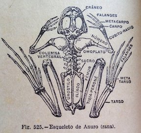
Figure 1. Illustration from anonymous biology book (credit: Katie Garrett)

Plan, order, design

This suggestion may appear like a rather simplistic piece of advice, but any form of communication should start with a plan. What is the name of my project, the goal, and the audience? A scientific conference poster will not be created with the same design as a flyer aimed at the general public, nor will the same tools be used. Libre office powerpoint, canva, inkscape, scribus, R, plotly, GIMP… these are the open-source software I use on a regular basis but there so many more possibilities!

For whatever the type of visual you want to create, there are two major rules that need to be considered. First, embrace the empty space! You may think that you are wasting space that could be filled by all sorts of extremely valuable pieces of information… but this empty space has a purpose all by itself. The empty space brings forward the central elements of your design and will help focus the attention of the viewer toward them (top panel of Figure 2). Second, keep it neat and aligned. Whether you choose to anchor elements to each other or to an invisible grid, pay attention to details so that all images and text in the design from a harmonious whole (bottom panel in Figure 2).


Figure 2. Empty spaces and alignment principles of design – examples presented by Kingcom (http://kingkom.net/12-criteres-hierarchie-visuelle/)

Alignment is also an essential aspect to consider when editing images. More than any text, images will provide the first impression to the viewer and may subjectively communicate ideas in an instant. To make them most effective, images may follow the ‘rule of thirds’. Imagine breaking the image down into thirds, hence creating four directive lines over it (Figure 3). Placing the points of interest of the image at the intersections or along the lines will provide balance and attract the viewer’s attention. In marine mammal science where we often use pictures of animals with the ocean as a background, aligning the horizon along one of these horizontal lines may be a good technique (which I have not followed in Figure 3 though!).
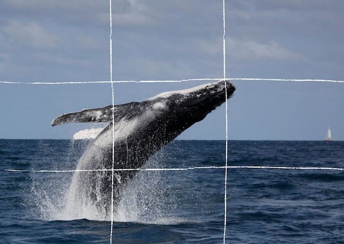
Figure 3. Rule of thirds example applied to a photo of a humpback whale calf (South Lagoon New Caledonia, credit: Opération Cétacés – Solène Derville). Notice how the tip of the calf’s jaw is at the intersection of two lines.

When adding text to images, it is important to not overwhelm illustrations with text by trying to use extensive written material (which happens much too often). I try to keep the text to the strict minimum and let the visuals speak for themselves. When including text over or next to an image, I place the text in the empty spaces, where the eye is drawn to (Figure 4). When using dark or contrasted images, I add a semi-transparent layer in between the text and the image to make my text pop out.
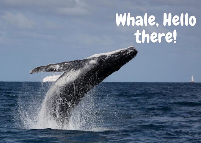
Figure 4. Text embedding example applied to a photo of a humpback whale calf (South Lagoon New Caledonia, credit: Opération Cétacés – Solène Derville). Notice how I placed the text in the empty space so that the nose of the calf would point to it.

Fonts

Tired of using Arial, Times and Calibri but don’t know which other font to pick? One good piece of advice I found online was to choose a font that complements the purpose of the design. To do so, it is necessary to choose the message before picking the font. There are three categories of fonts (show in Image 1):

– Serif (classic style designed for books as the little feet at the extremities of the letters guide the eye along the lines of text)

– Sans serif (designed to look clean on digital screen)

– Display (more personality, but to be used in small doses!)

Image 1. Examples of each font category

I have also learned that pairing fonts together is often about using opposites (Figure 5). Contrasting fonts are complementary. For instance, it is visually appealing to combine a very bold font with a very light font, or a round font with something tall. And if you need more font choices than the ones provided by your usual software, here is a web repository to freely download thousands of different fonts: https://www.dafont.com
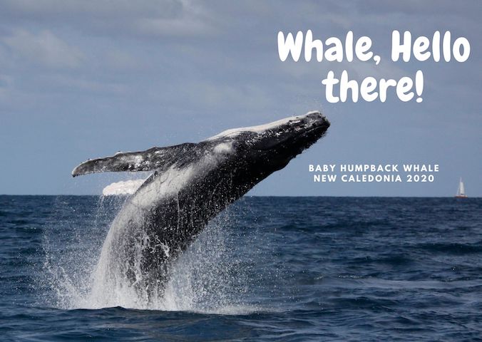
Figure 5. Paired fonts example applied to a photo of a humpback whale calf (South Lagoon New Caledonia, credit: Opération Cétacés – Solène Derville). Notice how I combined a rounded  font with  a smaller  sans serif font.

Colors

Colors have inherent meaning that depends on individual cultures. Whether we want it or not, any plot, photo, or diagram that we present to an audience will carry a subliminal message depending on its color palette. So better make it fit with the message!

Let us go passed the boring blue shades we have used for all of our marine science presentations so far, and instead open ourselves up to an infinite choice of colors! Color nuances are defined by three things: hue (the color itself), saturation (intensity, whether the color looks more subtle or more vibrant), and value (how dark or light a color is, ranging from white to black). The color wheel helps us visualize the relationships between hues and pick the best associations (Figure 6).
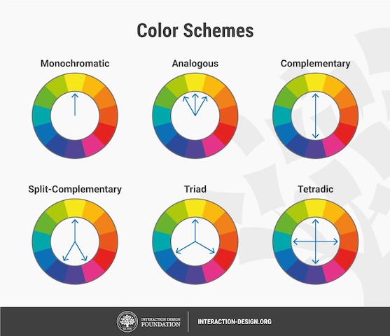
Figure 6. The color wheel helps us visualize the relationships between hues and pick the best associations. Any of the principles above should work, from the simple monochromatic schemes to the more complex triad or tetradic schemes.

First, pick the main color, the hero color for your design. Choose a cool color (blues and greens) if you want to provide a calming impression or a warm color (reds and yellows) for something more energizing. This basic principle of color theory made me think back on the black/blue dark shaded presentations that I might have attended in the past and had trouble staying awake!

Now, create your color palette, which are the three to four colors that will compose your design, ideally combining some vibrant and some more neutral colors for contrast. For instance, in a publication, a color palette may be used consistently in all plots or figures to represent a set of variables, study areas, or species . Now how do you pick the right complementary colors? The color wheel provides you with a few basic principles that should help you choose a palette (Figure 6). From monochromatic to tetradic schemes, the choice is up to you:

– monochromatic colors: varying values or saturation of a given color picked in the wheel

– analogous colors: colors sitting next to each other in the wheel

– complementary color: colors sitting opposite to each other

If you are an R user, there are a myriad of color palettes available to produce your visuals. One of the most comprehensive list I have found was compiled by Emil Hvitfeldt in github (https://github.com/EmilHvitfeldt/r-color-palettes). For discrete color palettes, I enjoy using the Canva palettes, which are available both in the Canva designs and in R using the ‘canva’ library in combination with the ‘ggplot2’ library (https://www.canva.com/learn/100-color-combinations/).

In practice, this means I can produce R plots or maps with color codes that match those I use in my canva presentations or posters. And finally, thumbs up to Dawn and Clara for creating our very own GEMM lab color palette based on whale photos collected in the field (Figure 7: https://github.com/dawnbarlow/musculusColors)!
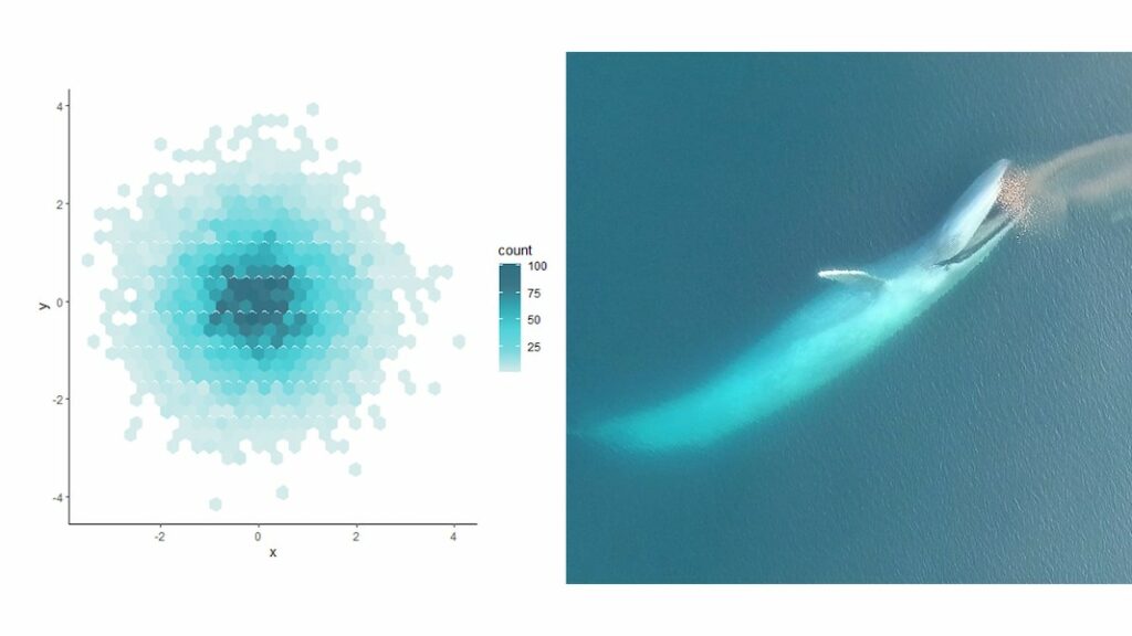
Figure 7: Example of a R plot colored with the musculusColors package using the blue whale “Bmlunge” palette (credit: Dawn Barlow & Clara Bird)

I hope these few tips help you make your science as look as pretty as it is in your mind!

Sources:

A lot of the material in this blog post was inspired by the free tutorials provided by Canva: https://designschool.canva.com/courses/graphic-design-basics/?lesson=design-to-communicate

About the rule of thirds: https://digital-photography-school.com/rule-of-thirds/

About alignment: https://blog.thepapermillstore.com/design-principles-alignment/

Digging to uncover the roots of scientific writing and publication: how much (if anything) has changed?

By Lisa Hildebrand, MSc student, OSU Department of Fisheries and Wildlife, Geospatial Ecology of Marine Megafauna Lab

In our most recent lab meeting, the GEMM lab discussed a recent paper about how blue whale migrations may be driven by memory and resource tracking (Abrahms et al. 2019). Most of our discussion was about the choices made by the authors in terms of their analyses used and the figures produced, as Leigh always pushes us graduate students to think critically about the scientific papers we read. However, a portion of our discussion focused less on the actual science behind the paper, but more on the language used. This change in direction was initiated by myself as I mentioned how much I liked the phrase “goldilocks zone”, which the authors used to describe an area between 15-17ºC that blue whales tended to occupy for the majority of the annual migration cycle.

The classic goldilocks tale vs. the blue whale version of goldilocks. Source: Slideshare.

What I liked so much about using this phrase was that the authors were using a childhood fairy tale that probably every 5-year old kid knows of to explain some pretty complex science and analysis. Our team then proceeded to go down a rabbit-hole for
a few minutes where we discussed uses of creative words in scientific writing. Although during our meeting we got back on track quite quickly, my mind has still continued down this rabbit-hole for quite some time. I started to wonder about the origins of scientific publication, when and why the structure and style of writing became so rigid, and when and why authors have decided to become a little more creative or colloquial in their writing since then. So, sit back and delve into the history of scientific writing with me…

Humankind has made scientific observations for thousands of years. Perhaps the earliest known culture to have done this are the Mesopotamian peoples who recorded observations of their surroundings around 3,500 BC in Sumer, which is now known as Iraq (Rochberg 2004). Most of the observations relate to astronomy, however there is some evidence to suggest that the Mesopotamians had recognized the existence of Pythagorean triplets (3, 4, 5; 5, 12, 13), long before Pythagoras himself was alive (Hoffman 1999).

However, formal publication of scientific observations is still a relatively new occurrence compared to when the Mesopotamians first started to note down their observations since such documentation of science first occurred in 1665. Interestingly, the birth of scientific publication was achieved by not one journal, but two; Journal des Sçavans in France and Philosophical Transactions of the Royal Society in London. Even though Journal des Sçavans beat out Philosophical Transactions of the Royal Society by publishing its first journal two months before the other, it ultimately lost the fight since it ceased publication in 1792, whereas Philosophical Transactions of the Royal Society is still in print, making it the world’s longest running scientific journal.


Journal covers for the first editions of Journal des Sçavans and Philosophical Transactions of the Royal Society from 1665. Source: Wikipedia.

Early publications were descriptive by nature. Instead of planning experiments, carrying them out, detailing results and interpreting them, authors described observations they made about their surroundings. An example is by a certain Mr. R.W. S.R.S from 1693. The opening lines of his publication entitled ‘Some Observations in the Dissection of a Ratt’ are as follows:

“The fore-feet of a Rat resemble those of the Castor. The Hair is also some fine, some course; as in that Animal. The Tail scaly, with Hairs between every Scale, like the Castors, which shews these two Animals to be something akin; and indeed the Water-Rat comes very near to the Beaver, and makes it’s Holes in the bank-sides of Ponds after the same manner.”

While not all publications were as purely descriptive as this example, those that did undertake experiments discussed them in a very chronological and almost basic manner. An example is by Allen Moulen in his publication ‘Some experiments on a black shining sand brought from Virginia, suppos’d to contain iron, made in March 1689’. An excerpt of the paper is as follows:

“6. I flux’d another parcel of it with Salt-Peter and Flowers of Brimstone, without being able to procure any Regulus. 7. I pour’d good Spirit of Salt on a parcel of this Sand, but could observe no Luctation thereby produc’d. 8. I pour’d Spirit of Nitre both strong and weakned with Water on parcels of the same Sand, without being able to discover any Conflict.”

Publications continued to be written in this nature for quite some time, however by the second half of the 19th century, science and the publication thereof distinctly changed and a lot of this can be credited to Louis Pasteur.

Louis Pasteur. Source: Wikipedia.

When Pasteur first had breakthroughs that provided evidence for the germ theory of disease, he was met by a lot of criticism by fellow scientists that were firm believers in the theory of spontaneous generation. As a way to prove that he was right, Pasteur started to document his experiments in extreme detail. This situation and Pasteur’s recognition of the importance of methodology resulted in the idea of reproducibility and essentially in the IMRaD structure we still follow today.

IMRaD stands for Introduction, Methods, Results and Discussion, which for scientists nowadays is probably as comforting as a cuddly blanket or a hot chocolate on a cold day. We find comfort in this structure because in a way it makes writing scientific papers less daunting because it tells us exactly what we need to do. It’s like a checklist with boxes that we can neatly tick off as we fill in the details of each section.

While IMRaD was first initiated during Pasteur’s era, it became widely adopted in the late 1950s when there was a strong boost in scientific output as more money was being funneled to the sciences. The result of this boost was strong pressure on scientific journals and their editors as authors were submitting papers at a never before seen rate. In an effort to keep up with the influx of submissions, editors felt the need to become more stringent and so enforced strict rules on article length, organization and structure, in order to weed out papers that didn’t make the cut right off the bat. This included IMRaD becoming more widely used in journals as a way to bring conformity to the sciences. This resulted in strong pressure on authors to be concise in their writing, which means that there isn’t much room for creativity.

The topic of creativity in scientific writing has long been debated and many suggest that the writing style in publications should be as objective and frank as possible in order to avoid masking the science (Massoudi 2003). However, it has also been suggested by many that by limiting the creativity in scientific writing, you might actually be limiting the creativity going into the scientific process (Bohm & Peat 1987). While I do believe that objectivity and clarity in scientific writing is important, I do not see the harm in authors trying to be a little creative in the communication of their work. Sir Peter Medawar, a Nobel Prize winning biologist summed up this sentiment very nicely in his book ‘Advice to a Young Scientist’ published in 1979:

“Scientists are people of very dissimilar temperaments doing different things in very different ways. Among scientists are collectors, classifiers and compulsive tidier-up; many are detectives by temperament and many are explorers; some are artists and others artisans. There are poet-scientists and philosopher-scientists and even a few mystics. What sort of mind or temperament can all these people be supposed to have in common? Obligative scientist must be very rare, and most people who are in fact scientists could easily have been something else instead.”

I don’t know whether there is a right or a wrong answer on this matter. What I do know though is that I always give an emphatic nod of approval when I see a word not typically seen in scientific writing used creatively in a scientific publication and it often conjures a smile on my face and makes the paper more memorable to me.

It’s interesting to muse about the direction in which scientific writing is heading now. We are still seeing a proliferation in papers that are being submitted and published, and journals being established. However, I think we are starting to see a shift in how strict scientists are in the language that they use for their publications. That is not to say that manuscripts are now submitted filled with colloquialisms, poor grammar and punctuation, but I think there is a certain flexibility in how much creativity can be incorporated into publications. The extent of this flexibility is, I believe, still largely dependent on the journal. Journals that provide very limited word count and space on the page for a publication, like Nature for example, may limit the creative capabilities of authors. However, some of the more “liberal” journals (liberal in terms of length and space), like PLoS ONE, may allow authors to explore their creative writing abilities to a greater extent. In my personal opinion, I would quite like to see more authors take creative risks in their writing.


References

Abrahms, B., et al., Memory and resource tracking drive blue whale migrations. PNAS, 2019. 116(12): 5582-5587.

Bohm, D., & Peat F.D. Science, Order, and Creativity.1987. Bantam Books, New York City.

Hoffman, P. The Man Who Loved Numbers: The Story of Paul Erdos and the Search for Mathematical Truth. 1999. Hyperion Books, New York City.

Massoudi, M. Can scientific writing be creative? Journal of Science Education and Technology, 2003. 12(2): 115-128.

Medawar, P. Advice to a Young Scientist. 1979. Basic Books, New York City.

Moulen, A. Some experiments on a black shining sand brought from Virginia, suppos’d to contain iron, made in March 1689. By Allen Moulen, M.D. and Fellow of the Royal Society, since dead. Philosophical Transactions of the Royal Society, 1693. 17: doi.org/10.1098/rstl.1693.0009.

Rochberg, F. The Heavenly Writing: Divination, Horoscopy, and Astronomy in Mesopotamian Culture. 2004. Cambridge University Press, Cambridge.

S.R.S., R.W. Some observations in the dissection of a ratt, communicated by Mr. R.W. S.R.S.Philosophical Transactions of the Royal Society, 1693. 17: doi.org/10.1098/rstl.1693.0006.