Marine megafauna as ecosystem sentinels: What animals can tell us about changing oceans

By Dawn Barlow1 and Will Kennerley2

1PhD Candidate, OSU Department of Fisheries, Wildlife, and Conservation Sciences, Geospatial Ecology of Marine Megafauna Lab

2MS Student, OSU Department of Fisheries, Wildlife, and Conservation Sciences, Seabird Oceanography Lab

The marine environment is dynamic, and mobile animals must respond to the patchy and ephemeral availability of resource in order to make a living (Hyrenbach et al. 2000). Climate change is making ocean ecosystems increasingly unstable, yet these novel conditions can be difficult to document given the vast depth and remoteness of most ocean locations. Marine megafauna species such as marine mammals and seabirds integrate ecological processes that are often difficult to observe directly, by shifting patterns in their distribution, behavior, physiology, and life history in response to changes in their environment (Croll et al. 1998, Hazen et al. 2019). These mobile marine animals now face additional challenges as rising temperatures due to global climate change impact marine ecosystems worldwide (Hazen et al. 2013, Sydeman et al. 2015, Silber et al. 2017, Becker et al. 2019). Given their mobility, visibility, and integration of ocean processes across spatial and temporal scales, these marine predator species have earned the reputation as effective ecosystem sentinels. As sentinels, they have the capacity to shed light on ecosystem function, identify risks to human health, and even predict future changes (Hazen et al. 2019). So, let’s explore a few examples of how studying marine megafauna has revealed important new insights, pointing toward the importance of monitoring these sentinels in a rapidly changing ocean.

Cairns (1988) is often credited as first promoting seabirds as ecosystem sentinels and noted several key reasons why they were perfect for this role: (1) Seabirds are abundant, wide-ranging, and conspicuous, (2) although they feed at sea, they must return to land to nest, allowing easier observation and quantification of demographic responses, often at a fraction of the cost of traditional, ship-based oceanographic surveys, and therefore (3) parameters such as seabird reproductive success or activity budgets may respond to changing environmental conditions and provide researchers with metrics by which to assess the current state of that ecosystem.

The unprecedented 2014-2016 North Pacific marine heatwave (“the Blob”) caused extreme ecosystem disruption over an immense swath of the ocean (Cavole et al. 2016). Seabirds offered an effective and morbid indication of the scale of this disruption: Common murres (Uria aalge), an abundant and widespread fish-eating seabird, experienced widespread breeding failure across the North Pacific. Poor reproductive performance suggested that there may have been fewer small forage fish around and that these changes occurred at a large geographic scale. The Blob reached such an extreme as to kill immense numbers of adult birds, which professional and community scientists found washed up on beach-surveys; researchers estimate that an incredible 1,200,000 murres may have died from starvation during this period (Piatt et al. 2020). While the average person along the Northeast Pacific Coast during this time likely didn’t notice any dramatic difference in the ocean, seabirds were shouting at us that something was terribly wrong.

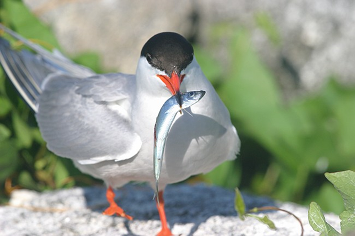
Happily, living seabirds also act as superb ecosystem sentinels. Long-term research in the Gulf of Maine by U.S. and Canadian scientists monitors the prey species provisioned by adult seabirds to their chicks. Will has spent countless hours over five summers helping to conduct this research by watching terns (Sterna spp.) and Atlantic puffins (Fratercula arctica) bring food to their young on small islands off the Maine coast. After doing this work for multiple years, it’s easy to notice that what adults feed their chicks varies from year to year. It was soon realized that these data could offer insight into oceanographic conditions and could even help managers assess the size of regional fish stocks. One of the dominant prey species in this region is Atlantic herring (Clupea harengus), which also happens to be the focus of an economically important fishery.  While the fishery targets four or five-year-old adult herring, the seabirds target smaller, younger herring. By looking at the relative amounts and sizes of young herring collected by these seabirds in the Gulf of Maine, these data can help predict herring recruitment and the relative number of adult herring that may be available to fishers several years in the future (Scopel et al. 2018).  With some continued modelling, the work that we do on a seabird colony in Maine with just a pair of binoculars can support or maybe even replace at least some of the expensive ship-based trawl surveys that are now a popular means of assessing fish stocks.

A common tern (Sterna hirundo) with a young Atlantic herring from the Gulf of Maine, ready to feed its chick (Photo courtesy of the National Audubon Society’s Seabird Institute)

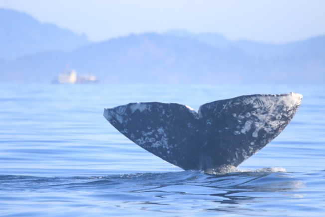
For more far-ranging and inaccessible marine predators such as whales, measuring things such as dietary shifts can be more challenging than it is for seabirds. Nevertheless, whales are valuable ecosystem sentinels as well. Changes in the distribution and migration phenology of specialist foragers such as blue whales (Balaenoptera musculus) and North Atlantic right whales (Eubalaena glacialis) can indicate relative changes in the distribution and abundance of their zooplankton prey and underlying ocean conditions (Hazen et al. 2019). In the case of the critically endangered North Atlantic right whale, their recent declines in reproductive success reflect a broader regime shift in climate and ocean conditions. Reduced copepod prey has resulted in fewer foraging opportunities and changing foraging grounds, which may be insufficient for whales to obtain necessary energetic stores to support calving (Gavrilchuk et al. 2021, Meyer-Gutbrod et al. 2021). These whales assimilate and showcase the broad-scale impacts of climate change on the ecosystem they inhabit.

Blue whales that feed in the rich upwelling system off the coast of California rely on the availability of their krill prey to support the population (Croll et al. 2005). A recent study used acoustic monitoring of blue whale song to examine the timing of annual population-level transition from foraging to breeding migration compared to oceanographic variation, and found that flexibility in timing may be a key adaptation to persistence of this endangered population facing pressures of rapid environmental change (Oestreich et al. 2022). Specifically, blue whales delayed the transition from foraging to breeding migration in years of the highest and most persistent biological productivity from upwelling, and therefore listening to the vocalizations of these whales may be valuable indicator of the state of productivity in the ecosystem.

Figure reproduced from Oestreich et al. 2022, showing relationships between blue whale life-history transition and oceanographic phenology of foraging habitat. Timing of the behavioral transition from foraging to migration (day of year on the y-axis) is compared to (a) the date of upwelling onset; (b) the date of peak upwelling; and (c) total upwelling accumulated from the spring transition to the end of the upwelling season.

In a similar vein, research by the GEMM Lab on blue whale ecology in New Zealand has linked their vocalizations known as D calls to upwelling conditions, demonstrating that these calls likely reflect blue whale foraging opportunities (Barlow et al. 2021). In ongoing analyses, we are finding that these foraging-related calls were drastically reduced during marine heatwave conditions, which we know altered blue whale distribution in the region (Barlow et al. 2020). Now, for the final component of Dawn’s PhD, she is linking year-round environmental conditions to the occurrence patterns of different blue whale vocalization types, hoping to shed light on ecosystem processes by listening to the signals of these ecosystem sentinels.

A blue whale comes up for air in the South Taranaki Bight of New Zealand. photo by L. Torres.

It is important to understand the widespread implications of the rapidly warming climate and changing ocean conditions on valuable and vulnerable marine ecosystems. The cases explored here in this blog exemplify the importance of monitoring these marine megafauna sentinel species, both now and into the future, as they reflect the health of the ecosystems they inhabit.

Did you enjoy this blog? Want to learn more about marine life, research and conservation? Subscribe to our blog and get a weekly email when we make a new post! Just add your name into the subscribe box on the left panel.

References:

Barlow DR, Bernard KS, Escobar-Flores P, Palacios DM, Torres LG (2020) Links in the trophic chain: Modeling functional relationships between in situ oceanography, krill, and blue whale distribution under different oceanographic regimes. Mar Ecol Prog Ser 642:207–225.

Barlow DR, Klinck H, Ponirakis D, Garvey C, Torres LG (2021) Temporal and spatial lags between wind, coastal upwelling, and blue whale occurrence. Sci Rep 11:1–10.

Becker EA, Forney KA, Redfern J V., Barlow J, Jacox MG, Roberts JJ, Palacios DM (2019) Predicting cetacean abundance and distribution in a changing climate. Divers Distrib 25:626–643.

Cairns DK (1988) Seabirds as indicators of marine food supplies. Biol Oceanogr 5:261–271.

Cavole LM, Demko AM, Diner RE, Giddings A, Koester I, Pagniello CMLS, Paulsen ML, Ramirez-Valdez A, Schwenck SM, Yen NK, Zill ME, Franks PJS (2016) Biological impacts of the 2013–2015 warm-water anomaly in the northeast Pacific: Winners, losers, and the future. Oceanography 29:273–285.

Croll DA, Marinovic B, Benson S, Chavez FP, Black N, Ternullo R, Tershy BR (2005) From wind to whales: Trophic links in a coastal upwelling system. Mar Ecol Prog Ser 289:117–130.

Croll DA, Tershy BR, Hewitt RP, Demer DA, Fiedler PC, Smith SE, Armstrong W, Popp JM, Kiekhefer T, Lopez VR, Urban J, Gendron D (1998) An integrated approch to the foraging ecology of marine birds and mammals. Deep Res Part II Top Stud Oceanogr.

Gavrilchuk K, Lesage V, Fortune SME, Trites AW, Plourde S (2021) Foraging habitat of North Atlantic right whales has declined in the Gulf of St. Lawrence, Canada, and may be insufficient for successful reproduction. Endanger Species Res 44:113–136.

Hazen EL, Abrahms B, Brodie S, Carroll G, Jacox MG, Savoca MS, Scales KL, Sydeman WJ, Bograd SJ (2019) Marine top predators as climate and ecosystem sentinels. Front Ecol Environ 17:565–574.

Hazen EL, Jorgensen S, Rykaczewski RR, Bograd SJ, Foley DG, Jonsen ID, Shaffer SA, Dunne JP, Costa DP, Crowder LB, Block BA (2013) Predicted habitat shifts of Pacific top predators in a changing climate. Nat Clim Chang 3:234–238.

Hyrenbach KD, Forney KA, Dayton PK (2000) Marine protected areas and ocean basin management. Aquat Conserv Mar Freshw Ecosyst 10:437–458.

Meyer-Gutbrod EL, Greene CH, Davies KTA, Johns DG (2021) Ocean regime shift is driving collapse of the north atlantic right whale population. Oceanography 34:22–31.

Oestreich WK, Abrahms B, Mckenna MF, Goldbogen JA, Crowder LB, Ryan JP (2022) Acoustic signature reveals blue whales tune life history transitions to oceanographic conditions. Funct Ecol.

Piatt JF, Parrish JK, Renner HM, Schoen SK, Jones TT, Arimitsu ML, Kuletz KJ, Bodenstein B, Garcia-Reyes M, Duerr RS, Corcoran RM, Kaler RSA, McChesney J, Golightly RT, Coletti HA, Suryan RM, Burgess HK, Lindsey J, Lindquist K, Warzybok PM, Jahncke J, Roletto J, Sydeman WJ (2020) Extreme mortality and reproductive failure of common murres resulting from the northeast Pacific marine heatwave of 2014-2016. PLoS One 15:e0226087.

Scopel LC, Diamond AW, Kress SW, Hards AR, Shannon P (2018) Seabird diets as bioindicators of atlantic herring recruitment and stock size: A new tool for ecosystem-based fisheries management. Can J Fish Aquat Sci.

Silber GK, Lettrich MD, Thomas PO, Baker JD, Baumgartner M, Becker EA, Boveng P, Dick DM, Fiechter J, Forcada J, Forney KA, Griffis RB, Hare JA, Hobday AJ, Howell D, Laidre KL, Mantua N, Quakenbush L, Santora JA, Stafford KM, Spencer P, Stock C, Sydeman W, Van Houtan K, Waples RS (2017) Projecting marine mammal distribution in a changing climate. Front Mar Sci 4:413.

Sydeman WJ, Poloczanska E, Reed TE, Thompson SA (2015) Climate change and marine vertebrates. Science 350:772–777.

Demystifying the algorithm

By Clara Bird, Masters Student, OSU Department of Fisheries and Wildlife, Geospatial Ecology of Marine Megafauna Lab

Hi everyone! My name is Clara Bird and I am the newest graduate student in the GEMM lab. For my master’s thesis I will be using drone footage of gray whales to study their foraging ecology. I promise to talk about how cool gray whales in a following blog post, but for my first effort I am choosing to write about something that I have wanted to explain for a while: algorithms. As part of previous research projects, I developed a few semi-automated image analysis algorithms and I have always struggled with that jargon-filled phrase. I remember being intimidated by the term algorithm and thinking that I would never be able to develop one. So, for my first blog I thought that I would break down what goes into image analysis algorithms and demystify a term that is often thrown around but not well explained.

What is an algorithm?

The dictionary broadly defines an algorithm as “a step-by-step procedure for solving a problem or accomplishing some end” (Merriam-Webster). Imagine an algorithm as a flow chart (Fig. 1), where each step is some process that is applied to the input(s) to get the desired output. In image analysis the output is usually isolated sections of the image that represent a specific feature; for example, isolating and counting the number of penguins in an image. Algorithm development involves figuring out which processes to use in order to consistently get desired results. I have conducted image analysis previously and these processes typically involve figuring out how to find a certain cutoff value. But, before I go too far down that road, let’s break down an image and the characteristics that are important for image analysis.

Figure 1. An example of a basic algorithm flow chart. There are two inputs: variables A and B. The process is the calculation of the mean of the two variables.

What is an image?

Think of an image as a spread sheet, where each cell is a pixel and each pixel is assigned a value (Fig. 2). Each value is associated with a color and when the sheet is zoomed out and viewed as a whole, the image comes together.  In color imagery, which is also referred to as RGB, each pixel is associated with the values of the three color bands (red, green, and blue) that make up that color. In a thermal image, each pixel’s value is a temperature value. Thinking about an image as a grid of values is helpful to understand the challenge of translating the larger patterns we see into something the computer can interpret. In image analysis this process can involve using the values of the pixels themselves or the relationships between the values of neighboring pixels.

Figure 2. A diagram illustrating how pixels make up an image. Each pixel is a grid cell associated with certain values. Image Source: https://web.stanford.edu/class/cs101/image-1-introduction.html

Our brains take in the whole picture at once and we are good at identifying the objects and patterns in an image. Take Figure 3 for example: an astute human eye and brain can isolate and identify all the different markings and scars on the fluke. Yet, this process would be very time consuming. The trick to building an algorithm to conduct this work is figuring out what processes or tools are needed to get a computer to recognize what is marking and what is not. This iterative process is the algorithm development.

Figure 3. Photo ID image of a gray whale fluke.

Development

An image analysis algorithm will typically involve some sort of thresholding. Thresholds are used to classify an image into groups of pixels that represent different characteristics. A threshold could be applied to the image in Figure 3 to separate the white color of the markings on the fluke from the darker colors in the rest of the image. However, this is an oversimplification, because while it would be pretty simple to examine the pixel values of this image and pick a threshold by hand, this threshold would not be applicable to other images. If a whale in another image is a lighter color or the image is brighter, the pixel values would be different enough from those in the previous image for the threshold to inaccurately classify the image. This problem is why a lot of image analysis algorithm development involves creating parameterized processes that can calculate the appropriate threshold for each image.

One successful method used to determine thresholds in images is to first calculate the frequency of color in each image, and then apply the appropriate threshold. Fletcher et al. (2009) developed a semiautomated algorithm to detect scars in seagrass beds from aerial imagery by applying an equation to a histogram of the values in each image to calculate the threshold. A histogram is a plot of the frequency of values binned into groups (Fig. 4). Essentially, it shows how many times each value appears in an image. This information can be used to define breaks between groups of values. If the image of the fluke were transformed to a gray scale, then the values of the marking pixels would be grouped around the value for white and the other pixels would group closer to black, similar to what is shown in Figure 4. An equation can be written that takes this frequency information and calculates where the break is between the groups. Since this method calculates an individualized threshold for each image, it’s a more reliable method for image analysis. Other characteristics could also be used to further filter the image, such as shape or area.

However, that approach is not the only way to make an algorithm applicable to different images; semi-automation can also be helpful. Semi-automation involves some kind of user input. After uploading the image for analysis, the user could also provide the threshold, or the user could crop the image so that only the important components were maintained. Keeping with the fluke example, the user could crop the image so that it was only of the fluke. This would help reduce the variety of colors in the image and make it easier to distinguish between dark whale and light marking.

Figure 4. Example histogram of pixel values. Source: Moallem et al. 2012

Why algorithms are important

Algorithms are helpful because they make our lives easier. While it would be possible for an analyst to identify and digitize each individual marking from a picture of a gray whale, it would be extremely time consuming and tedious. Image analysis algorithms significantly reduce the time it takes to process imagery. A semi-automated algorithm that I developed to count penguins from still drone imagery can count all the penguins on a one km2 island in about 30 minutes, while it took me 24 long hours to count them by hand (Bird et al. in prep). Furthermore, the process can be repeated with different imagery and analysts as part of a time series without bias because the algorithm eliminates human error introduced by different analysts.

Whether it’s a simple combination of a few processes or a complex series of equations, creating an algorithm requires breaking down a task to its most basic components. Development involves translating those components step by step into an automated process, which after many trials and errors, achieves the desired result. My first algorithm project took two years of revising, improving, and countless trials and errors.  So, whether creating an algorithm or working to understand one, don’t let the jargon nor the endless trials and errors stop you. Like most things in life, the key is to have patience and take it one step at a time.

References

Bird, C. N., Johnston, D.W., Dale, J. (in prep). Automated counting of Adelie penguins (Pygoscelis adeliae) on Avian and Torgersen Island off the Western Antarctic Peninsula using Thermal and Multispectral Imagery. Manuscript in preparation

Fletcher, R. S., Pulich, W. ‡, & Hardegree, B. (2009). A Semiautomated Approach for Monitoring Landscape Changes in Texas Seagrass Beds from Aerial Photography. https://doi.org/10.2112/07-0882.1

Moallem, Payman & Razmjooy, Navid. (2012). Optimal Threshold Computing in Automatic Image Thresholding using Adaptive Particle Swarm Optimization. Journal of Applied Research and Technology. 703.

Zooming in: A closer look at bottlenose dolphin distribution patterns off of San Diego, CA

By: Alexa Kownacki, Ph.D. Student, OSU Department of Fisheries and Wildlife, Geospatial Ecology of Marine Megafauna Lab

Data analysis is often about parsing down data into manageable subsets. My project, which spans 34 years and six study sites along the California coast, requires significant data wrangling before full analysis. As part of a data analysis trial, I first refined my dataset to only the San Diego survey location. I chose this dataset for its standardization and large sample size; the bulk of my sightings, over 4,000 of the 6,136, are from the San Diego survey site where the transect methods were highly standardized. In the next step, I selected explanatory variable datasets that covered the sighting data at similar spatial and temporal resolutions. This small endeavor in analyzing my data was the first big leap into understanding what questions are feasible in terms of variable selection and analysis methods. I developed four major hypotheses for this San Diego site.

The study species: common bottlenose dolphin (Tursiops truncatus) seen along the California coastline in 2015. Image source: Alexa Kownacki.

Hypotheses:

H1: I predict that bottlenose dolphin sightings along the San Diego transect throughout the years 1981-2015 exhibit clustered distribution patterns as a result of the patchy distributions of both the species’ preferred habitats, as well as the social nature of bottlenose dolphins.

H2: I predict there would be higher densities of bottlenose dolphin at higher latitudes spanning 1981-2015 due to prey distributions shifting northward and less human activities in the northerly sections of the transect.

H3: I predict that during warm (positive) El Niño Southern Oscillation (ENSO) months, the dolphin sightings in San Diego would be distributed more northerly, predominantly with prey aggregations historically shifting northward into cooler waters, due to (secondarily) increasing sea surface temperatures.

H4: I predict that along the San Diego coastline, bottlenose dolphin sightings are clustered within two kilometers of the six major lagoons, with no specific preference for any lagoon, because the murky, nutrient-rich waters in the estuarine environments are ideal for prey protection and known for their higher densities of schooling fishes.

Data Description:

The common bottlenose dolphin (Tursiops truncatus) sighting data spans 1981-2015 with a few gap years. Sightings cover all months, but not in all years sampled. The same transect in San Diego was surveyed in a small, rigid-hulled inflatable boat with approximately a two-kilometer observation area (one kilometer surveyed 90 degrees to starboard and port of the bow).

I wanted to see if there were changes in dolphin distribution by latitude and, if so, whether those changes had a relationship to ENSO cycles and/or distances to lagoons. For ENSO data, I used the NOAA database that provides positive, neutral, and negative indices (1, 0, and -1, respectively) by each month of each year. I matched these ENSO data to my month-date information of dolphin sighting data. Distance from each lagoon was calculated for each sighting.

Figure 1. Map representing the San Diego transect, represented with a light blue line inside of a one-kilometer buffered “sighting zone” in pale yellow. The dark pink shapes are dolphin sightings from 1981-2015, although some are stacked on each other and cannot be differentiated. The lagoons, ranging in size, are color-coded. The transect line runs from the breakwaters of Mission Bay, CA to Oceanside Harbor, CA.

Results: 

H1: True, dolphins are clustered and do not have a uniform distribution across this area. Spatial analysis indicated a less than a 1% likelihood that this clustered pattern could be the result of random chance (Fig. 1, z-score = -127.16, p-value < 0.0001). It is well-known that schooling fishes have a patchy distribution, which could influence the clustered distribution of their dolphin predators. In addition, bottlenose dolphins are highly social and although pods change in composition of individuals, the dolphins do usually transit, feed, and socialize in small groups.

Figure 2. Summary from the Average Nearest Neighbor calculation in ArcMap 10.6 displaying that bottlenose dolphin sightings in San Diego are highly clustered. When the z-score, which corresponds to different colors on the graphic above, is strongly negative (< -2.58), in this case dark blue, it indicates clustering. Because the p-value is very small, in this case, much less than 0.01, these results of clustering are strongly significant.

H2: False, dolphins do not occur at higher densities in the higher latitudes of the San Diego study site. The sightings are more clumped towards the lower latitudes overall (p < 2e-16), possibly due to habitat preference. The sightings are closer to beaches with higher human densities and human-related activities near Mission Bay, CA. It should be noted, that just north of the San Diego transect is the Camp Pendleton Marine Base, which conducts frequent military exercises and could deter animals.

Figure 3. Histogram comparing the latitudes with the frequency of dolphin sightings in San Diego, CA. The x-axis represents the latitudinal difference from the most northern part of the transect to each dolphin sighting. Therefore, a small difference would translate to a sighting being in the northern transect areas whereas large differences would translate to sightings being more southerly. This could be read from left to right as most northern to most southern. The y-axis represents the frequency of which those differences are seen, that is, the number of sightings with that amount of latitudinal difference, or essentially location on the transect line. Therefore, you can see there is a peak in the number of sightings towards the southern part of the transect line.

H3: False, during warm (positive) El Niño Southern Oscillation (ENSO) months, the dolphin sightings in San Diego were more southerly. In colder (negative) ENSO months, the dolphins were more northerly. The differences between sighting latitude and ENSO index was significant (p<0.005). Post-hoc analysis indicates that the north-south distribution of dolphin sightings was different during each ENSO state.

Figure 4. Boxplot visualizing distributions of dolphin sightings latitudinal differences and ENSO index, with -1,0, and 1 representing cold, neutral, and warm years, respectively.

H4: True, dolphins are clustered around particular lagoons. Figure 5 illustrates how dolphin sightings nearest to Lagoon 6 (the San Dieguito Lagoon) are always within 0.03 decimal degrees. Because of how these data are formatted, decimal degrees is the easiest way to measure change in distance (in this case, the difference in latitude). In comparison, dolphins at Lagoon 5 (Los Penasquitos Lagoon) are distributed across distances, with the most sightings further from the lagoon.

Figure 5. Bar plot displaying the different distances from dolphin sighting location to the nearest lagoon in San Diego in decimal degrees. Note: Lagoon 4 is south of the study site and therefore was never the nearest lagoon.

I found a significant difference between distance to nearest lagoon in different ENSO index categories (p < 2.55e-9): there is a significant difference in distance to nearest lagoon between neutral and negative values and positive and neutral years. Therefore, I hypothesize that in neutral ENSO months compared to positive and negative ENSO months, prey distributions are changing. This is one possible hypothesis for the significant difference in lagoon preference based on the monthly ENSO index. Using a violin plot (Fig. 6), it appears that Lagoon 5, Los Penasquitos Lagoon, has the widest variation of sighting distances in all ENSO index conditions. In neutral years, Lagoon 0, the Buena Vista Lagoon has multiple sightings, when in positive and negative years it had either no sightings or a single sighting. The Buena Vista Lagoon is the most northerly lagoon, which may indicate that in neutral ENSO months, dolphin pods are more northerly in their distribution.

Figure 6. Violin plot illustrating the distance from lagoons of dolphin sightings under different ENSO conditions. There are three major groups based on ENSO index: “-1” representing cold years, “0” representing neutral years, and “1” representing warm years. On the x-axis are lagoon IDs and on the y-axis is the distance to the nearest lagoon in decimal degrees. The wider the shapes, the more sightings, therefore Lagoon 6 has many sightings within a very small distance compared to Lagoon 5 where sightings are widely dispersed at greater distances.


Bottlenose dolphins foraging in a small group along the California coast in 2015. Image source: Alexa Kownacki.

Takeaways to science and management: 

Bottlenose dolphins have a clustered distribution which seems to be related to ENSO monthly indices, and likely, their social structures. From these data, neutral ENSO months appear to have something different happening compared to positive and negative months, that is impacting the sighting distributions of bottlenose dolphins off the San Diego coastline. More research needs to be conducted to determine what is different about neutral months and how this may impact this dolphin population. On a finer scale, the six lagoons in San Diego appear to have a spatial relationship with dolphin sightings. These lagoons may provide critical habitat for bottlenose dolphins and/or for their preferred prey either by protecting the animals or by providing nutrients. Different lagoons may have different spans of impact, that is, some lagoons may have wider outflows that create larger nutrient plumes.

Other than the Marine Mammal Protection Act and small protected zones, there are no safeguards in place for these dolphins, whose population hovers around 500 individuals. Therefore, specific coastal areas surrounding lagoons that are more vulnerable to habitat loss, habitat degradation, and/or are more frequented by dolphins, may want greater protection added at a local, state, or federal level. For example, the Batiquitos and San Dieguito Lagoons already contain some Marine Conservation Areas with No-Take Zones within their reach. The city of San Diego and the state of California need better ways to assess the coastlines in their jurisdictions and how protecting the marine, estuarine, and terrestrial environments near and encompassing the coastlines impacts the greater ecosystem.

This dive into my data was an excellent lesson in spatial scaling with regards to parsing down my data to a single study site and in matching my existing data sets to other data that could help answer my hypotheses. Originally, I underestimated the robustness of my data. At first, I hesitated when considering reducing the dolphin sighting data to only include San Diego because I was concerned that I would not be able to do the statistical analyses. However, these concerns were unfounded. My results are strongly significant and provide great insight into my questions about my data. Now, I can further apply these preliminary results and explore both finer and broader scale resolutions, such as using the more precise ENSO index values and finding ways to compare offshore bottlenose dolphin sighting distributions.